Category Archives: Book as Object

The Architecture of the Medieval Page

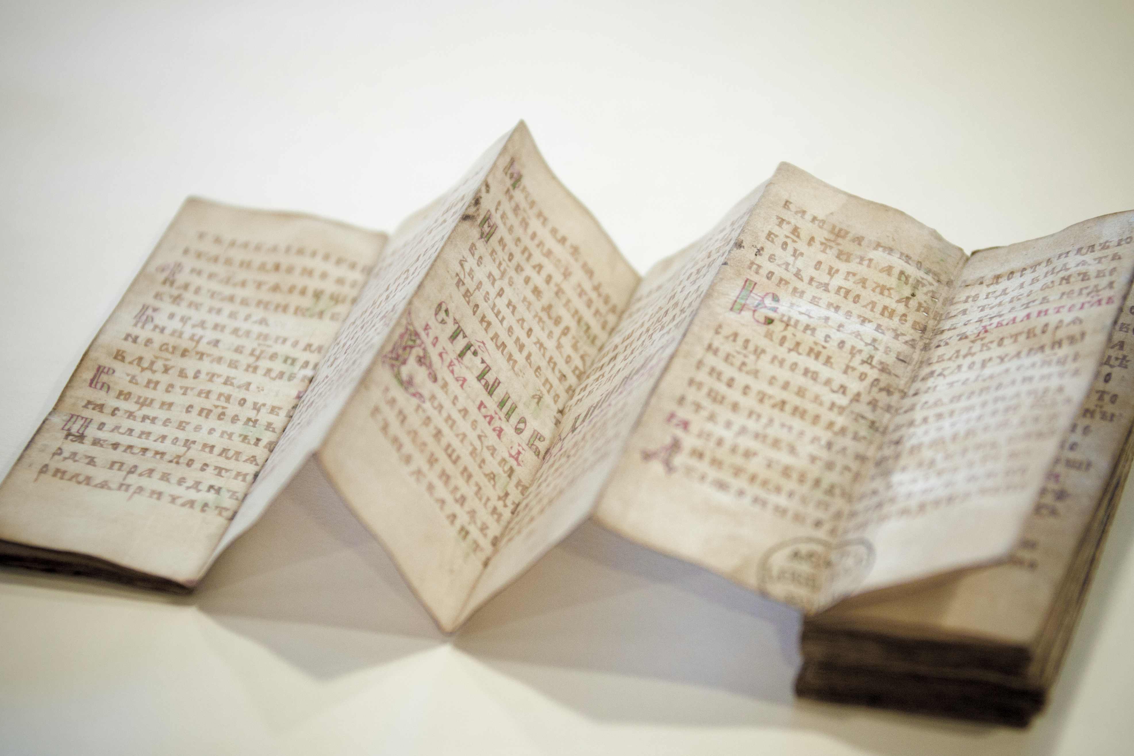
It may seem a stretch to compare page design with architecture, but the comparison really works, I think. Looking at the medieval page, it is not difficult to regard it as an engineered construction: a convoluted space defined by columns and corridors, with rooms inhabited by thoughts and ideas (Figure 1). Nothing encountered on the medieval page is a coincidence. Everything is there for a reason and serves a specific purpose; and so, too, is the manner in which the text was spread out over the page. Like other material features of the manuscript, page design is usually reflective of how the book would be used, but in their choices scribes also responded to the preferences – demands, even – of the individuals who would ultimately use the manuscript.

Readers, in turn, preferred their books – and the pages in them – to be formatted in certain ways because they planned to use them for performing particular tasks: to educate or be educated (teachers and students), to entertain or to be entertained (minstrels and courtiers), or to gather a body of information and consult it (scholars, preachers, physicians, lawyers). How and where words were placed on the page – their size and script, and their location – were important considerations in this process of turning the book into a tool that was up to the task. Indeed, it can be argued that a page’s design was (and is) key to a book’s success. What are some of the variables in play? And how did the choice for a certain design affect, positively and negatively, the manner in which the medieval book could be used effectively?

OXford_Bodleian_LaudLat.9_16r
Figure 1. Oxford, Bodleian Library, Laud lat. 9, fol. 16r (Commentary to the Bible, 1220-30). Source

Blueprint

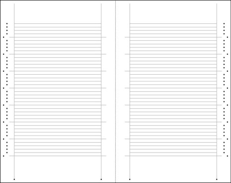
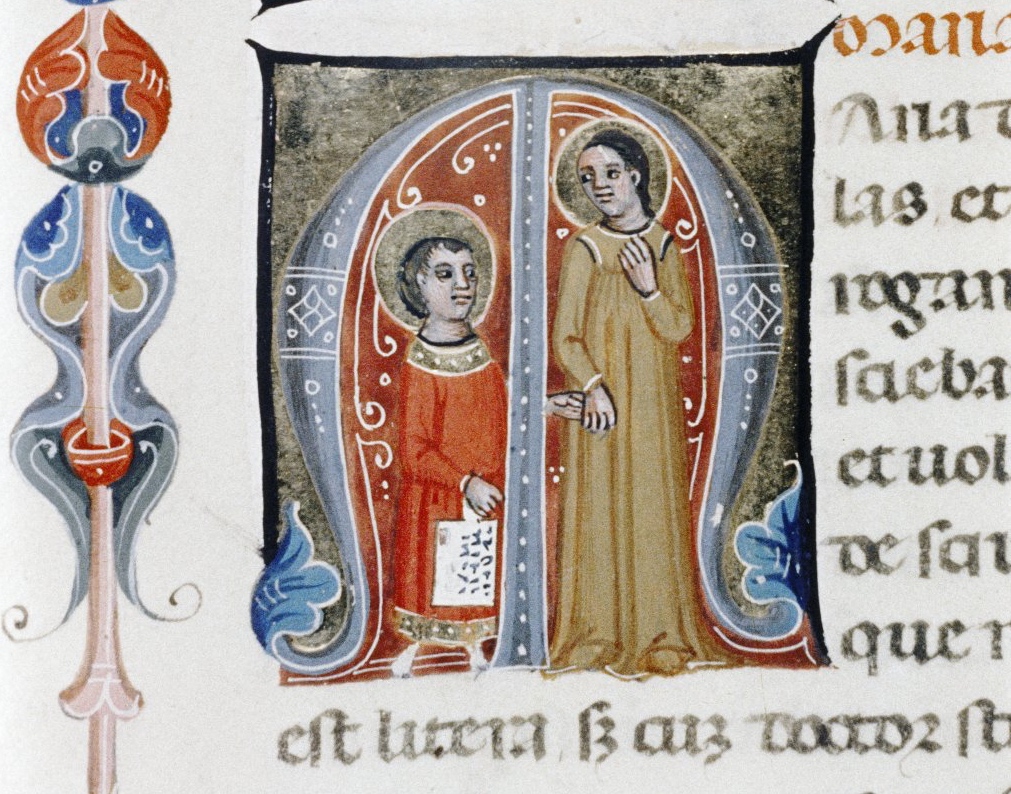
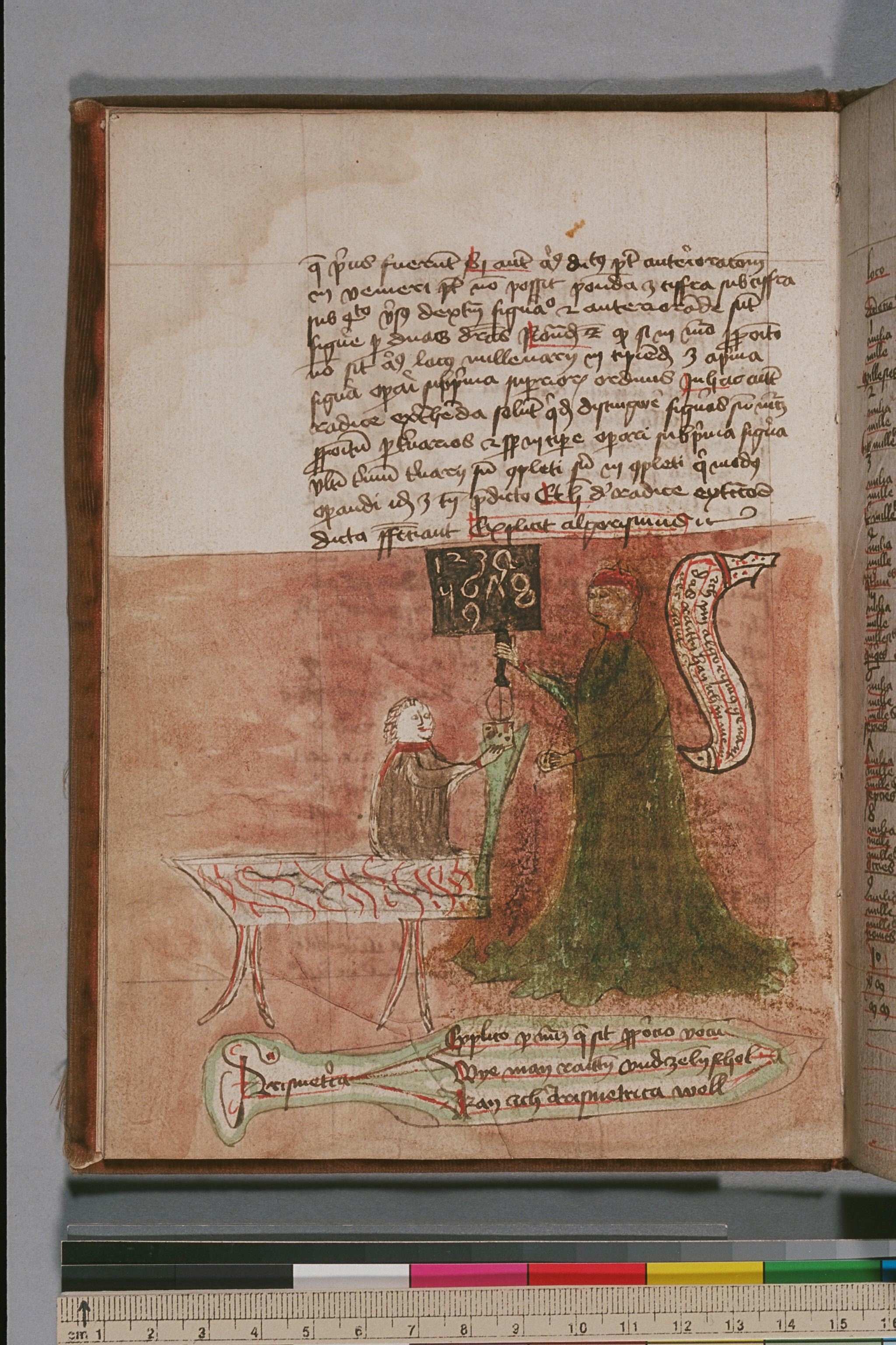
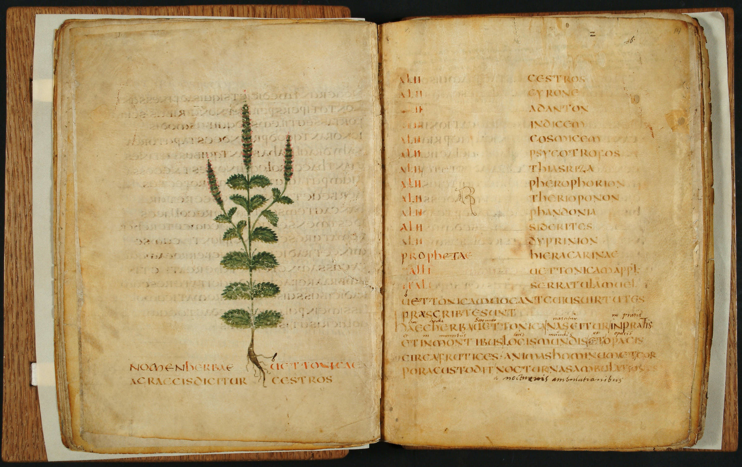
If the page is a building, its foundation was laid in an early stage of a manuscript’s production. After the scribe had figured out how to tackle a particular book – he knew how it would be used, having had input from the patron or the monastery’s librarian – he would start designing the page by grabbing two tools that were fundamental for what the page would ultimately look like. The first was a pointy device that allowed him to punch holes in the parchment or paper leaves, which appear like dots along the long edges of the book. The second was a tool with which he could add ruling to the page. Up to c. 1150, a sharp object was used to produce gutters – indentations in the parchment – which created pathways for the lines of text flowing out of the pen. After that date a piece of lead or a pen and ink produced the ruling (this miniature shows a scribe using a ruler to produce the ruling; at the top of this post is another).

Connecting the dots in this fashion, the scribe placed a web of lines on the page (Figure 2). The resulting grid formed the outline of the future text: it defined – and confined – the number and location of the columns, the number of lines they would hold, as well as the dimensions and positioning of the four margins. Even the ultimate presence of reading aids was construed during this early production stage. An extra line was added in the upper margin to guide the running title, if one was planned, while in preparation for marginal commentaries extra ruling was added to the marginal space (both not present in Figure 2). In a way this grid of horizontal and vertical lines functioned as the blueprint of the manuscript: it defined the ultimate page even before a single letter was written down on it. The still empty lines, yet to be complemented with words, determined what the book would look like and how it could be used later.

ruling_pattern
Figure 2. Ruling pattern, showing two pages with horizontal and vertical ruling, and marginal prickings. Source

Rooms and Corridors

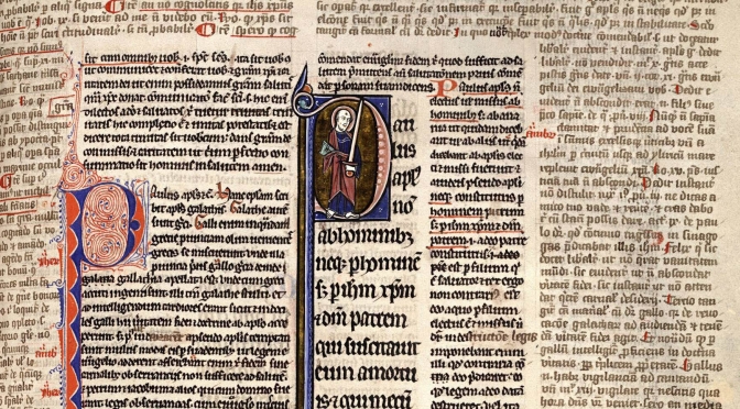
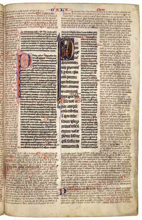
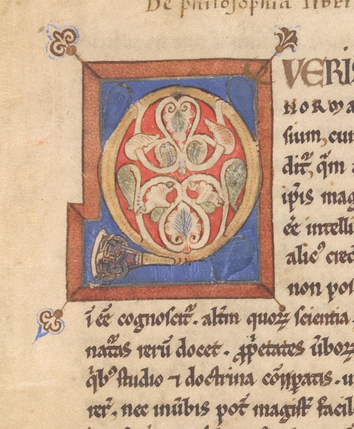
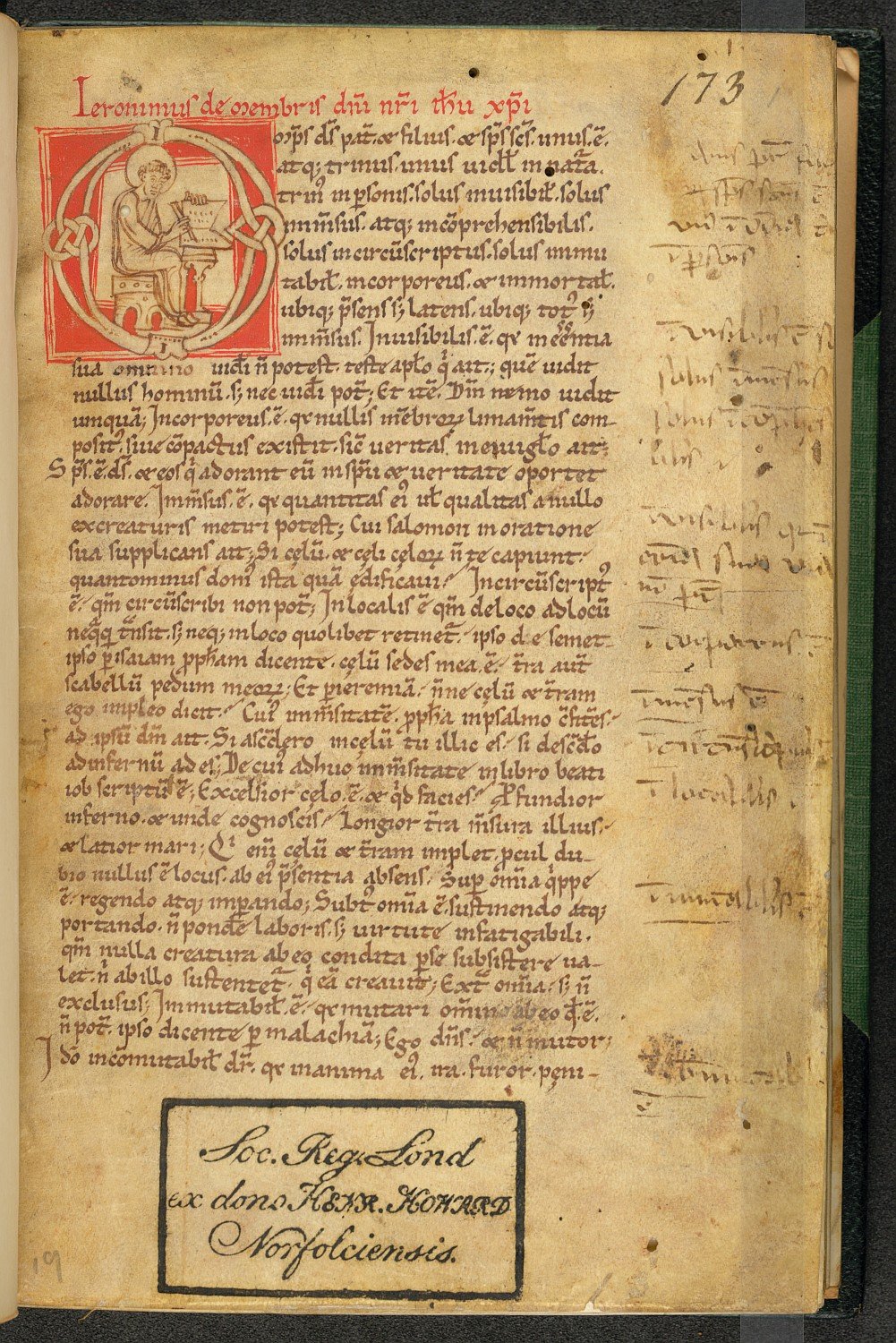
The quill would bring this blueprint to life: it placed words onto the ruling, thus producing text and meaning. The main text of the book could be flanked by commentaries, which in turn formed additional columns. When several commentaries were present, the design of the page can be quite daunting – and must have been a nightmare to produce (see for example Figure 1). However, this complexity is relative. The example in Figure 3 shows a central text column, written in a large letter and deep-dark black ink, which contains the biblical text (the page shows St Paul’s Letter to the Galatians). Around it, in equally dark ink, Peter Lombard’s commentary to St Paul’s letter is encountered. This part was produced in Paris during the second half of the 13th century and illuminated in the Du Prat workshop (source).

The margins around this text and commentary remained empty until 1412, when an additional commentary by Peter Tarentasia was added to the page in a smaller script. The result is a complex page, but also a remarkably organised one. After all, the information was placed in relatively isolated text compartments – “rooms,” as it were – which were separated by blank corridors. In other words, it was crystal clear to the reader what was what: the larger size of the letter identified the main text, while the smaller script of the commentaries as well as their positioning on the page, identified the occupants of the other rooms. Complex manuscripts like these, which present a textus inclusus or “square-bracket” glossing pattern, contain pages inhabited by a maze of corridors, which “snake” between the columns and sometimes even underneath or above them.

Figure_1_KBH_71A22_180r_low-res
Figure 3. The Hague, Koninklijke Bibliotheek, 71 A 22, fol. 180r (Lombard, Glossa in epistolas Pauli, 1250-1300). Source

Pillars

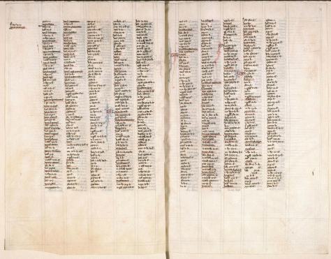
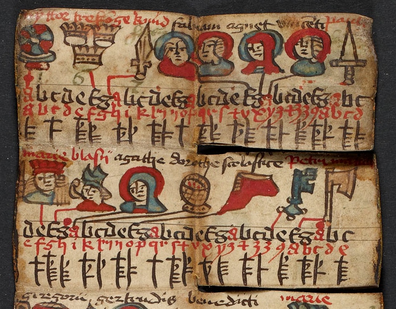
The manuscripts in Figures 1 and 3 are so complex that it is difficult to say how many text columns they consist of. Evidently, however, in both cases the main text is copied out in a single column, a firm pillar written in a bold letter. Most medieval manuscripts hold either one or two columns of main text. Three or four are occasionally encountered. Usually it concerns a dictionary or encyclopedia (read about an example of four columns here). A page with more than four columns is extremely rare. In fact, I only know of one such manuscript (Figure 4). It is kept in Amiens and holds a concordance of the Bible, a tool that enabled readers to identify where in the Bible certain concepts and figures were mentioned.

The entries in this manuscript – often a name followed by a bible book and a chapter number – are short, which is why the scribe decided to place five of them on a single page. The book measures 310×208 mm and is thus not even unusually large, which tells you just how small the script is. Equally remarkable, the page has room for a sixth column, which is crammed into the outer margin. Here the reader could add remarks; one was added on the spread seen in Figure 4, all the way in the top left corner. In the lower margins, too, there is room planned for comments. A grid of square boxes is seen here, produced by pencil lines. This is a popular design for university textbooks, which contain many such penciled squares, sometimes over forty of them on one page. They act as comment boxes in which the student could jot down his notes (this is an example of such a manuscript; more about this practice in this blog post).

Figure_2_Amiens_BM_95_31v-32r_low-res
Figure 4. Amiens, Bibliothèque municipale, 95 (Concordance, c. 1300). Source

The page as a house, the scribe as its architect: they are attractive comparisons, which highlight just how much an effective page depended on crafty design, careful planning, and meticulous calculations. Like an architect, the scribe made sure to create a comfortable home for future inhabitants.

More on medieval page design:

Raymond Clemens & Timothy Graham, Introduction to Manuscript Studies (Ithaca/London: Cornell University Press, 2007), pp. 14-17 (“Preparations prior to writing”). Discusses layout and the preparation of the sheets.

Erik Kwakkel, “Decoding the Material Book: Cultural Residue in Medieval Manuscripts,” in The Medieval Manuscript Book: Cultural Approaches, ed. Michael Van Dussen and Michael Johnson (Cambridge: Cambridge University Press, 2015), 60-76. Discusses the rationale behind the choice of a manuscript’s materials features.

Erik Kwakkel, Books Before Print (Leeds: Arc Humanities Press, 2018), pp. 30-70 (“Filling the Page: Script, Writing, and Page Design”). Overview of page design through case-studies.

Elaine Treharne, “The Architextual Editing of Early English,” in A. G. Edwards and T. Takako (eds.), Poetica 71 (2009), 1-13. Architectural context used as a metaphor in the editing of medieval texts.

The Incredible Expandable Book

Like most objects, books are confined to the space they occupy, obedient as they are to the laws of nature. That is to say, unlike the Incredible Hulk, they do not normally expand beyond the limits of their own physicality. This post will challenge your beliefs if you agree with this statement. It draws attention to types of medieval books that do expand beyond their physical limits: with a flick of the finger or a gesture of the hand the dimensions of these special objects increased dramatically, up to ten times their original size. As if defying the laws of nature, this miraculous expansion increased the available writing space in objects that were principally designed to be small and portable. The examples in this post suggest that this given of “doing more with less” was an important drive behind the clever design of expandable books.

1. The folding almanac

London, Wellcome Library, MS 8932 (15th century)
Fig. 1a – London, Wellcome Library, MS 8932 (15th century) – Source
London, Wellcome Library, MS 8932 (15th century)
Fig. 1b – London, Wellcome Library, MS 8932 (15th century) – Source

If you are a frequent reader of this blog, you are no stranger to small books made for portability. The same goes for the almanac seen in Fig. 1. Produced in England in 1415-1420, it contains a calendar as well as astrological tables and diagrams. The information was used by physicians to diagnose and prognosticate, while the calendar provided information about feasts. Most of these almanacs, some thirty of which survive, look more scruffy than the pretty specimen in the Wellcome Library, which may not have seen much practical use (more here).

London, Royal Society, MS 45 (c. 1400)
Fig. 2 – London, Royal Society, MS 45 (c. 1400) – Source

Folding almanacs were especially popular in late-medieval England, assuming surviving specimens form an accurate representation. The objects are particularly interesting from a material point of view. During production the folding almanacs looked very much like a regular book: the scribe filled regular pages with text. However, in a completed state, when the binding was added, the pages were folded in a very clever way, giving the object an “unbookish” look. The precise manner of folding differed, as Figs. 1-2 show. Both fold in three steps, but the folding sequence is different. The leaves ‘sit’ different too. The specimen in Fig. 2 seems more prone to damage than the other almanac, because the expanding part (the four zones that are slightly lighter) are attached to the actual book by means of a delicate hinge.

2. The accordion book

Copenhagen, Royal Library, MS NKS_901 (dated 1513)
Fig. 3 – Copenhagen, Royal Library, MS NKS_901 (dated 1513) – Source

Both almanacs above provide six times more writing/reading space in their expanded form, which is quite amazing. However, this is still considerably less than another type of expandable manuscript: the accordion book. Fig. 3 shows illustrated specimen (a calendar) made in Denmark in 1513. While in its folded state the object is as small as a matchbox, it expands to a full page of considerable proportions, comparable to a regular-sized medieval book (more information here, facsimile here). Curiously, the calendar has a most unusual way of unfolding: sections of the sheet expand independently, like little flaps from a pop-up book (note the “incisions” on the right half of the object, as seen in Fig. 4 – full image here).

Copenhagen, Royal Library, NKS 901
Fig. 4 – Copenhagen, Royal Library, NKS 901, detail – Source

The Copenhagen accordion book is a very small portable object. Even though in its expanded state it became much larger, due to the limited size of the object in its folded state, the expansion produced a relatively small writing/reading surface. The remarkable thing about accordion books, however, is that their surface space could be considerable, even when the actual object (in its folded state) was still of modest proportions. My own Leiden University Library owns a copy from fourteenth-century Russia which is only 120 mm in height. The whole thing resembles the dimensions of an iPhone (Fig. 5). In expanded state, however, the book becomes no less than 3750 mm wide, meaning that the surface actually increases by an astonishing factor of ten.

Leiden, University Library, SCA 38 B (14th century)
Fig. 5 – Leiden, University Library, SCA 38 B (14th century) – Photo Giulio Menna

It is hard to say what the upside is of this book format. After all, if the same pages had been bound in a regular (non-accordion) fashion, it would accommodate the same amount of text. Perhaps the format was favoured because of a certain ease of use? It is easier, for example, to access the information in the book without using one’s hands. Also, without flipping any pages, the reader had access to a great deal more than the usual two pages of a book opening, which may perhaps have been handy in certain modes of use.

3. Rolls

Manchester, Chetham's Library, Armburgh 02 1024 (1430-1450)
Fig. 6 – Manchester, Chetham’s Library, Armburgh 02 1024 (1430-1450) – Source

What looks like a cigar, is actually the most common and oldest expandable bookish object: the roll (Fig. 6). This object probably held the most information in relation to its dimensions. Rolls had been in use for a long time when the book finally came around in the fourth century (see my post What is the Oldest Book in the World? and more information on rolls here). During the Middle Ages the roll format remained in use longest in administration. It was not until the late thirteenth century, for example, that cities in North-West Europe switched to the book form to write down their income and expenses – the city of Bruges still used rolls for this purpose in the 1280s.

Rolls can be quite long. One of the longest that survives from the medieval period is a mortuary roll that was carried to 253 monasteries, nunneries and cathedrals across England and France during the 1110s (source). Mortuary rolls were produced to commemorate the death of a prominent person, in this case Abbess Mathilda of Holy Trinity Abbey in Caen. Like writing a joint birthday card today, clerics in France would add their say to the roll, which grew and grew, until it finally reached a length of 22 meters (72 feet). Genealogical rolls could also be quite long (Fig. 7), though not as exceptionally long as the mortuary roll made for Abbess Mathilda.

Christchurch, University of Canterbury, MS 1 (15th century)
Fig. 7 – Christchurch, University of Canterbury, MS 1 (15th century) – Source

From time to time unusual rolls are encountered, like the one seen in Fig. 8. This one is special because the fourteenth-century object comes rolling out of a book (of slightly later date), which functions as its sleeve. The end of the roll (again holding a calendar) is simply pasted onto the book. The full roll measures an astonishing 130 cm (a little over 4 feet). One wonders whether the owner created this remarkable hybrid because it allowed for easy storage on the book shelf. A book placed among its peers, albeit with an unusual content.

The Hague, Royal Library, 130 E 26 (late 14th century)
Fig. 8 – The Hague, Royal Library, 130 E 26 (late 14th century) – Photo EK

What the Incredible Expandable Books in this post share is an effort to hold a lot of text in an object that occupies a modest amount of space, usually in one’s pocket. When there is a dire need to take information with you on the go, medieval readers were quite inventive, as my post Bag it, Box it, Wrap it shows. Interestingly, the expandable information carrier lives on in our own day. Not only are there still book designers who produce accordion books in the medieval fashion (like Peter Thomas, whose recent email correspondence inspired this post), but the expandable almanac at the outset of this post has actually become ubiquitous in the form of pocket maps, displaying such things as the layout of cities and underground stations.

R. Sutton, Petroleum Pocket Map (1886)
Fig. 9 – R. Sutton, Petroleum Pocket Map (1886) – Source

Echoing the roll hidden in a book, some of these maps hide in (and take on the form of) an actual book, like the 1886 edition that shows the location of oil wells (Fig. 9). As with their medieval peers, ease of use and portability are the driving forces behind getting a lot of information in an object with a tiny footprint. “Doing more with less” is clearly a universal urge.

Book on a Stick

Both medieval manuscripts and their modern counterparts are designed to accommodate human readers. Our two hands can keep an open book under control with ease by applying gentle pressure on the outer margins of the pages. Release the pressure with your right hand and a page lifts up in the air, just enough to conveniently flip it. With a rustling sound it travels from right to left, moved along by an impatient reader that is left in suspense for a second or two. The proportions of the page, too, are designed to accommodate consumption by human beings. Our eyes can handle only a small number of consecutively placed words, no more than eight or so, depending on the size of the letter. As a consequence, medieval page design shifted to presenting a text in two columns rather than one, a transition that occurred over the course of the twelfth century.

This relationship between book design and human anatomy is seen most vividly in a particularly peculiar bookish object that thrived in the sixteenth, seventeenth and eighteenth centuries: the hornbook (Fig. 1).

Washington, Folger Shakespeare Library, STC 13813.6 (dated 1625)
Fig. 1 – Washington, Folger Shakespeare Library, STC 13813.6 (dated 1625) – Source

This charming device is a primer: a text used by children as they were learning to read. It contains the alphabet (naturally), but also a small collection of short texts, such as the Lord’s Prayer and Hail Mary (more here and here). Its design reflects perfectly how the material format of books was customised for use by human beings: its user could easily grab a hornbook with one hand and hold it up at eye height. With his other hand the user could then duplicate the letters before his eyes. Two important things stand out when one observes the tradition: the variety of materials used to produce hornbooks – which were made of such materials as wood, lead and gingerbread – and its time of invention, which predate the proposed origins in current scholarly literature.

Materials
The heart of the hornbook is text, albeit a very small amount of it. In fact, it may well be the shortest read to survive from the early-modern period. Most hornbooks from that time are made out of wood. The pupil’s “required readings” were printed on a sheet of paper that was subsequently covered by a thin piece of horn for protection – hence the object’s name. The result is a remarkably sturdy object, which you can drop without damaging it, a minimum requirement for something used by young kids.

Washington, Library of Congress, 102.3 (18th century)
Fig. 2 – Washington, Library of Congress, 102.3 (18th century) – Source

Several surviving hornbooks show that the device was also used to teach kids to add and subtract. The one seen in Fig. 2, which dates from the eighteenth century, has a nifty add-on: an abacus. This particular specimen shows the end of the hornbook’s development, which appears to have become more sophisticated over time. The one in Fig. 2 contains another novel feature: the sheet of paper can be removed from behind the horn and replaced by another text, which may perhaps even be found on the reverse (here is another example). This late model is rather like an iPad with several apps loaded, one of which can even be updated when needed!

Other hornbooks were made out of even sturdier materials, such as ivory and lead (Fig. 3). The last one must have been particularly cheap and easy to produce, probably with the help of a mould. This specimen shows that the hornbook was subject to mass production, like its cousin, the printed book.

Timeline Acutions, Lot_903 (17th century)
Fig. 3 Timeline Acutions, Lot 903 (17th century) – Source

Quite different is the hornbook seen in Fig. 4. This wooden slab could be used to produce a gingerbread hornbook, handle and all. The tradition of this particularly tasty type of hornbook goes back to the seventeenth century. The English poet Matthew Prior (d. 1721) mentions it in one of his poems: “To Master John the English maid / A horn book gives of ginger-bread / And that the Child may learn the better / As he can name, he eats the letter / Proceeding thus with vast delight / He spells, and gnaws from left to right” (source). Although a peculiar book, the gingerbread version of the hornbook probably wins the prize for best didactical tool: what better reward than to eat the letter you were just able to read out loud?

Columbia University Library, RBML, Plimpton Hornbook 6 (England, 18th century?)
Fig. 4 – Columbia University Library, RBML, Plimpton Hornbook 6 (England, 18th century?) – Source

Medieval origins
While the heyday of the hornbook was no doubt the early-modern period, the scholarly literature will also tell you that this bookish device was in used in the fifteenth century, during the late medieval period. In fact, publications on the topic stress that there are also handwritten – medieval – versions of the device. Peculiarly, I wasn’t able to find one, except for this early-sixteenth-century specimen. Even illustrations showing hornbooks “in the wild” date from the seventeenth century at best, such as the pair hanging from the chapman’s basket in an engraving from 1646 (Fig. 5).

Annibale Carracci, 'Tavolette, e Libri per li putti’ (1646)
Fig. 5 – Annibale Carracci, ‘Tavolette, e Libri per li putti’ (1646) – Source and more

So is the hornbook a post-medieval invention? I was about to draw this conclusion, given the lack of evidence predating the early-modern period, when I coincidentally encountered the following illustration in a 14th-century Italian manuscript with an unidentified devotional text about Mary, the mother of Christ (Fig. 6-7).

Oxford, Bodleian Library, Canon. Misc. 476 (14th century).
Fig. 6 – Oxford, Bodleian Library, Canon. Misc. 476 (14th century) – Source
Detail of Fig. 0.
Fig. 7 – Detail of Fig. 6.

The image shows Christ being brought to school by his mother. He is bringing his “textbook” to class: a hornbook, which dangles from his wrist by a string, just like many of the later specimens did (see the hole in the handle in Fig. 1). Quite intriguingly, we are shown a real medieval snapshot of how children carried their hornbook to and at school. More importantly, it shows that the hornbook was indeed a medieval invention. Some further digging revealed additional visual evidence of hornbooks being used in before the age of print (Fig. 8).

Columbia University, Plimpton MS 184 (15th century)
Fig. 8 – Columbia University, Plimpton MS 184 (15th century) – Source

The manuscript, which was produced in Germany in 1440-1460, shows a teacher holding up a hornbook, using it to show Arabic numerals to a pupil in front of him. The German text bubble next to the scene is very positive about this teaching moment: “With calculus and numbers, I can be a star in arithmetic!” While it was produced somewhat later than the Italian example in Fig. 6, the setting in which the hornbook was used is the same: a context where basic information about letters and digits is conveyed to young pupils. While no actual hornbooks appear to survive from the medieval period, these visual representations show that educating young children was also the driving force behind the production of hornbooks in the age before print.

Medieval Speech Bubbles

This blog frequently highlights parallels between medieval and modern technology and media. My recent posts on SpamGPS and Selfies in medieval times are good examples of that. As odd as this may sound, as a medieval book historian I see such parallels with modern concepts all the time: all you need is a pair of eyes and a little imagination. A few days ago, however, I encountered (and tweeted) a parallel I had never seen before: a drawing with the appearance of a page from a modern comic book (Fig. 1, tweet here).

British Library, Stowe 49 (14th century)
Fig. 1 – British Library, Stowe MS 49, fol. 122r (c. 1300) – Source

The drawing from c. 1300 shows a group of people walking, some of them with a walking stick in their hand. You can almost hear the sing-songs in the background. As it turns out, this merry scene bears more than one parallel to a modern comic book story.

Speech bubbles
According to the description of the British Library we are looking at a group of travellers conversing in English. What the description does not mention, however, is something that is rarely seen in medieval drawings: the different parts of conversation are given the appearance of speech bubbles. That is to say, just like in modern comic books, sentences are visually connected to the individual who utters them, by means of a tiny line (Fig. 2).

British Library, Stowe 49, fol. 122r, detail
Fig. 2 – British Library, Stowe MS 49, fol. 122r, detail

Also in parallel to modern comic books, the story that unfolds is funny and familiar. The art historian Lucy Freeman Sandler has devoted considerable attention to this scene (a transcription and literal translation is found in this publication). Using her work, while rewording her literal translation, the following conversation may be overheard:

The figure on the left starts, with a strange mantra: “They die because of heat, they die because of heat.” Then the two young people on his right speak, probably addressing their father [according to Sandler], who is walking behind them: “Sir, we die of cold!” The father, carrying a heavy toddler, orders them to stop whining: “Behold your little brother in front of us, he is only wearing a hood.” (He is right, because he is otherwise naked.) Then the toddler speaks, uttering universal toddler sounds: “Wa we”. Finally the two children in the back come into play (Fig. 2). “Sir, I am carrying too much weight,” says the one on the left.  The one on the right closes the conversation by comparing his own misery to that of his brother and father, stating “It is not they who carry the heaviest burden.”

The Middle English scene is familiar to many of us. We are shown a family en route to an unknown location (as if it were an alternative version of the Canterbury Tales). The young ones are verbally poking at each other, and complain about the temperature and the weight of their suitcases. It is the medieval version of a modern parent’s nightmare: being on the road with a crying toddler and whiny kids that egg each other on.  “Are we there yet?”

Banderole

Lons Angeles, Getty Museum, MS 66 (
Fig. 3 – Los Angeles, Getty Museum, MS 66 – Source

Books before print had another way to make a silent figure on the page speak: the banderole. This clever device gave the decorator the ability to make someone deliver a short statement. Short, because it had to fit on a tiny scroll (see a collection of them here and in this blog post). In Fig. 3, for example, we see a fool repeat the words whispered in his ear by the devil: “There is no God” (Non est deus). The speaker holds the tip of the scroll in his hand, so as to claim the words as his own. It also happened that the speaker was pointing at the banderol, often touching it with his finger.

Schøyen Collection MS 33 (14th century)
Fig. 4 – Schoyen Collection MS 33 (14th century) – Source

Such points of contact (holding the scroll or touching it) were particularly important when an image presented more than one speaking person. It allowed the viewer to identify who was saying what. Fig. 4 shows a classroom where two teachers appear to be in a lively debate. One is holding the scroll, the other is pointing at it, each firmly securing the text to their own person.

Interesting in light of the comic book parallel is that the banderole was not always held in or close to the speaker’s hand: it could also flow from his or her mouth. While such cases are less common, they have a strikingly modern appearance because of the banderole’s white background, which creates the illusion of a real text bubble (Fig. 5).

Paris, BnF, lat. 11978 (15th century)
Fig. 5 – Paris, BnF, lat. 11978 (15th century) – Source, found via
Frankfurt, Staatsbibliothek Ms. barth. 42
Fig. 6 – Frankfurt, Staatsbibliothek, Ms. barth. 42 (12th century)

Not all banderoles present such a “live” text. Some label a scene, while others clarify the identity of a person. For example, the banderole in Fig. 6 introduces the twelfth-century illuminator Guda, who decorated the book in question, but it does not present direct speech (more about the image in this post). Instead, it is the medieval equivalent of tagging a person in an image.

No bubbles
Then there are, finally, manuscripts where direct speech is written in mid air, unsupported by a banderole or a bubble. In order to relate the uttered text to a given person, the scribe wrote the lines in such a way that they appeared to flow from the speaker’s mouth. The result are wavy lines of text that dance across the page. A great example is seen in Fig. 7. This miniature is part of a cycle on the life and work of the scholar Raymond Lull (d. 1316). Here he is shown discussing with Thomas Méysier, his student and disciple. The images in the cycle were made under personal supervision of Thomas, who also compiled the contents of the manuscript, which presents a compilation of Lull’s work called the Electorium parvum sue breviculum (more here).

Karlsruhe, Badische LandesBibliothek, St Peter Perg. 92 (14th century)
Fig. 7 – Karlsruhe, Badische LandesBibliothek, St Peter Perg. 92 (14th century) – Source

Although serious in subject matter, the conversation between the master and the student has a funny, almost grotesque appearance. Over a big and authoritative pile of books we see the scholars engaged in a lively discussion. Arguments fly across the page. It looks like the scribe is trying to help the viewer keep track of the discussion through the use of different colours (red and black). Also, the scribe presents the conversation in such a way that each component begins with a line that sticks out slightly. Cleverly, the extended tip is found next to the speaker’s mouth, leaving no doubt as to who is saying what. No bubble required.

Acknowledgments – I wish to thank Thijs Porck (Leiden) for his help with the Middle English translation of the scene in Fig. 1. My PhD student Jenneka Janzen (Leiden) introduced me to the Karlsruhe manuscript in Fig. 7.

Medieval Apps

How about this for a truism: a book is a book, and something that is not a book is not a book. This post will knock your socks off if you are inclined to affirm this statement, because in medieval times a book could be so much more than that. As it turns out, tools were sometimes attached to manuscripts, such as a disk, dial or knob, or even a complete scientific instrument. Such ‘add-ons’ were usually mounted onto the page, extending the book’s primary function as an object that one reads, turning it into a piece of hardware.

Adding such tools was an invasive procedure that involved hacking into the wooden binding or cutting holes in pages. In spite of this, they were quite popular in the later Middle Ages, especially during the 15th century. This shows that they served a real purpose, adding value to the book’s contents: some clarified the text’s meaning, while others functioned as a calculator or, astonishingly, allowed the reader to tell time. These fascinating add-ons  – which are really not that different from the apps on our smartphones – turned a static handwritten book into an interactive object.

The Volvelle

British Library, Egerton MS 848 (15th century)
Fig. 1 – British Library, Egerton MS 848 (15th century) – Source

A volvelle is an instrument that consists of one or more rotating disks mounted on the page. Volvelles allowed the reader to make a variety of complex calculations, such as the position of the sun and the moon, or the precise date of Easter – which was, like the volvelle, a moving feast. The one seen in Fig. 1 contains no less than three revolving disks, which are pinned to the page in a central point: two show the cycle of sun and moon (note the charming depictions at their pointers), while a third presents the Zodiac.

In spite of its simplicity, the device provides a surprising wealth of data, which could be read if one knew how to interpret the dials. However, volvelles were not always crude instruments providing dry data. Some are actually a pleasure to look at (Fig. 2). Others added an entertaining touch to the moving parts. The one in Fig. 3, for example, calculates the date of Easter, a popular application of the volvelle, but in this case the answer is pointed out by a spinning lady.

Heidelberg, Universitätsbibliothek, Cod. Pal .833 Ger. (early 16th century)
Fig. 2 – Heidelberg, Universitätsbibliothek, Cod. Pal .833 Ger. (early 16th century) – Source, more here
British Library, Harley MS 941 (15th century)
Fig.3 – British Library, Harley MS 941 (15th century) – Source

The oldest volvelles are connected to the scientific explorations of Raymond Lull, a thirteenth-century scholar, who introduced the clever device from Arabic scholarly culture. It explains why the earliest volvelles date from the 13th century (there are no older manuscripts that hold them, as far as I am aware), but also why the oldest ones are found in books holding works by Raymond Lull. These oldest specimens are less sophisticated: they have a limited number of disks and present less data on and around the dials (see a Lull specimen from the early 14th century here).

Maastricht, Regionaal Historisch Centrum Limburg (15th century)
Fig. 4 – Maastricht, Regionaal Historisch Centrum Limburg (15th century) – Photo EK, source

Such crude medieval computers could make a page very bulky. It is surprising, however, how much volume a volvelle could take up without compromising how well the book could be handled.The one I encountered in an archive some time ago even makes use of pieces of wood, giving it the appearance of a real instrument, but also adding a certain clunkiness (Fig. 4).

Cogwheel

Oxford, Bodleian Library, Digby MS 46 (14th century)
Fig. 5 – Oxford, Bodleian Library, Digby MS 46 (14th century) – Source

Volvelles are not the only instruments mounted onto the medieval book. Fig. 5 shows a page from a manuscript containing various texts about fortune telling. The page holds a text on Geomancy, which is a method of divination that allowed someone to calculate one’s ‘key number’. Random rows of numbers were drawn up  and marked down (as seen on the page), after which they were connected by lines. The number you ultimately ended up with was then looked up in a table with lunar and solar information, which was also included in the manuscript (image here).

Oxford, Bodleian Library, Digby MS 46 (15th century)
Fig. 6 – Oxford, Bodleian Library, Digby MS 46 (14th century) – Source

There was another method to calculate this number: by turning a wheel (information here). It is here that the Oxford manuscript becomes relevant for us. Remarkably, the user of the book carved a hollow space into the wooden front board of the binding and fitted a pair of cogwheels into it (Fig. 6). Turning these produced the number that could subsequently be looked up in the table.

The last word: sundial

Oxford, Bodleian Library, Brox._46.10 (17th century)
Fig. 7 – Oxford, Bodleian Library, Brox._46.10 (17th century) – Source

The last example of an instrument that was added to a book also has to do with the sun. Like an iPad, the book in Fig. 7 has a smart cover. The front of the sheepskin bookbinding is not filled with blind-stamped decoration, as was often the case, but rather a sundial was pasted on it. The reader could put the book in the sun and place a stylus on the cover, which would reveal what time it was. While it may not have been a very practical clock, the cover reveals that it was likely used to this end: the ‘footprints’ of the stylus are still visible (note the small circle and the black stain near the letters IHS, at the bottom). Moreover, the severity of the stain suggests the book was frequently used to tell time.

Just like our modern smartphones, the medieval book could be a versatile tool that combined contents with an untold number of applications – giving the scriptorium the feel of an App Store.

Meet the Medieval Manuscript

By Erik Kwakkel and Giulio Menna (@SexyCodicology)

While this and other blogs introduce you to particular aspects of medieval book production, there are few places on the web that provide a full overview of how handwritten books – or “manuscripts” – were made, especially for those new to the topic. To fill this gap, we (Erik and Giulio) have produced a website called Quill: Books Before Print, through generous support of various institutions (below). The site is now live and available for free to anyone who wants to know more about the handwritten book in the medieval period.

Navigating through Quill shows you what made the manuscript “tick”, and how it ticks. Each of the fifty-odd segments contains an artistic photograph (made by Giulio, who is a professional photographer) and some 150 words of light reading (written by Erik, who is a professional book historian). This post introduces our work, explains how and why we made it, and what we like best about it.

Leiden, Universiteitsbibliotheek, BPL 14 D (13th century)
Fig. 1 – Leiden, Universiteitsbibliotheek, BPL 14 D (13th century) – Photo GM (Quill source)

Writing about manuscripts (by Erik Kwakkel)
I love writing about manuscripts. Not only do I do so frequently in academic publications (find a list here), but also for an audience beyond the university, for example through social media (this blog, Tumblr) and magazines (I have a regular column in Quest Historie). Writing for non-specialists is fun in that you can just tell a story. However, it also requires a certain approach and tone. The texts I wrote for Quill are first and foremost meant to be entertaining – learning something is a close second. The entries are therefore written in a “light” tone and use “speaking” comparisons. Thus I discuss fragments hidden in bindings as “stowaway“, bookmarks become the “fossilized taste” of medieval readers, and parchment sheets are seen as “dead cows“.

To get this tone right, images are crucial. To write an inspired post about a manuscript, an image needs to “grab” me. Moreover, the trick (both for Quill and my blog posts) is to find a single guiding principle that can carry the text. My blog post on Medieval Selfies is a good example of this, but the same is seen in the entries for Quill. Each of the clickable segments are built around a single observation or angle, which is usually reflected in the title: “Add-on” for the segment on marginal glosses, “One, two, three” for page numbers,  and “Mind the gap!” for blank spots on the page.

Leiden, Universiteitsbibliotheek, BPL 304 (15th century)
Fig. 2 – Leiden, Universiteitsbibliotheek, BPL 304 (15th century) – Photo GM (Quill source)

My favourite sections to write are those related to medieval handwriting – script. It is notoriously difficult to do so in clear terms, even in academic papers, when everybody knows precisely what you are talking about. I liked the challenge of providing clear information about such a complex matter as the development from one manner of handwriting to another. Playing with verbal imagery I discuss early-medieval script under the label “The unifier“, while script it develops into is seen as “The divider“. As far as my favourite images are concerned, I’m attached to all of them. Particularly pretty, however, are those that show things you normally don’t see, like a the palimpsest (scratches-away text, vaguely visible) or the backs of the quires, as in Fig. 3.

Leiden, Universiteitsbibliotheek, SCA 28
Fig. 3 – Leiden, Universiteitsbibliotheek, SCA 28 – Photo GM  (Quill source)

Photographing manuscripts (by Giulio Menna)
When I was asked to take pictures of medieval manuscripts for this project I was thrilled; when I was told I would essentially have unlimited access to the manuscripts from the exquisite collection in the Leiden University Library, I was as excited as the proverbial child in the candy store. What an opportunity! But then it dawned on me: How do you take photos of manuscripts? How do I make photos that will interest someone who has never seen a manuscript before?

Thanks to Erik’s MA course in manuscript studies I knew exactly what had to be photographed and where to find it in the books. I spent most of the time browsing through manuscript catalogs and manuscripts’ descriptions, searching for the right book to use for the shots. Once the desired detail was found, the actual photography began. First things first: respect the manuscript! I might find a detail that could make a perfect picture, but to get the photo right I would  have had to mishandle the manuscript in some way: those pictures did not get taken.

Leiden, Universiteitsbibliotheek, VLQ 4 (15th century)
Fig. 4 – Leiden, Universiteitsbibliotheek, VLQ 4 (15th century) – Photo GM (Quill source)

Once an ideal manuscript was found, I used the oldest trick in the book for directing viewer’s attention towards the detail described: depth of field. This would ensure that only the detail in question would be in focus in the picture, and the surroundings would be blurred (Fig. 5 is a good example). I have a very good lens (f/2.8) that allows me to do just that. The lighting was a bit of a problem. Since I was shooting in the Special Collections room I had no direct control over the light. Most of the time I had to wander around the table and find the right angle at which there would be no shadows or reflections.

Leiden, Universiteitsbibliotheek, VLQ 38 (12th century)
Fig. 5 – Leiden, Universiteitsbibliotheek, VLQ 38 (12th century) – Photo GM (Quill source)

There are two photos I am particularly fond of. One is the initial P (for Plinius) seen in Fig. 5. It is the opening page of the manuscript, and the letter is welcoming us to the book. I like to believe that this photo captures the moment when you open a manuscript you have never seen before, and you are captivated by unexpected decoration. The initial is very pleasing to the eye: I particularly enjoy the contrast between the old parchment on the right and the white modern paper on the left.

Leiden, Universiteitsbibliotheek, BPL 304 (15th century)
Fig. 6 – Leiden, Universiteitsbibliotheek, BPL 304 (15th century) – Photo GM (Quill source)

The second image I like very much is of a watermark (Fig. 6). Taking a picture of a watermark was technically challenging: the manuscript’s pages are made of paper, and although paper made in 1600s is more resilient than the contemporary counterpart, it is still delicate and has to be handled with extra care. I had no control over light sources, but I knew that in order to show the watermark I needed a strong light from the back of a page. The plan then became to wait for the sun to go down in the late afternoon, and let some of the light shine through the Special Collections’ windows onto the manuscript. All I had to do then was kneel before the book and take the picture of the naturally bending page.

The last word: enjoy
We hope you will enjoy browsing our website – which was two years in the making – and learn from it at the same time. The site is designed to work optimally with tablets: it’s a true pleasure to swipe the image carousel at the top. We think it provides a sound introduction to making books before print and we hope that the website will be picked up by the broadest possible audience, including instructors at schools and universities. Enjoy!

Leiden, Universiteitsbibliotheek, SCA 38 B
Fig. 7 – Leiden, Universiteitsbibliotheek, SCA 38 B – Photo GM (Quill source)


Credits – Quill: Books Before Print was produced through a grant of De Jonge Akademie (The Young Academy), an offshoot of the Royal Dutch Academy of Arts and Sciences, and with logistical support of Leiden University Centre for the Arts in Society (LUCAS). The website would not have been possible without the invaluable support of Leiden University Library and its Special Collections department.

Strange Medieval Books

Written by hand, medieval manuscripts are very different from printed books, which started to appear after Gutenberg’s mid-fifteenth-century invention of moving type. One difference in particular is important for our understanding of manuscripts. While printed books were produced in batches of a thousand or more, handwritten copies were made one at the time. In fact, medieval books, especially those made commercially, came to be after a detailed conversation between scribe and reader, a talk that covered all aspects of the manuscript’s production. This is the only way the scribe could ensure the expensive product he was about to make was in sync with what the reader wanted. Consequently, while printed books were shaped generically and according to the printer’s perception of what the (anonymous) “market” preferred, the medieval scribe designed a book according to the explicit instructions  of its user.

This principle of one-on-one (of scribe-reader and reader-manuscript) explains why we come across some very strange medieval books. Scribes, especially those that were paid for their work, would accommodate any quirky wish – why on earth not? Here is a selection of five striking manuscripts that are literally outstanding as they are shaped unlike the bulk of surviving medieval manuscripts.

1. Fleur-de-Lis

Amiens, Bibliothèque municipale, MS 22 (c. 1555)
Fig. 1 – Amiens, Bibliothèque municipale, Fonds Lescalopier MS 22 (c. 1555)

This Book of Hours has the most peculiar shape (Fig. 1): its pages resemble lily leaves (the yellow background is a paper sheet used for contrast). Such Fleurs-de-Lis were a symbol for French royalty, which puts this special book in a particular setting right away. In fact, we know it was made for king Henry II of France, who used it for private devotion – the Book of Hours contained prayers and other short texts, which were read at set times during the day. Not only does the very shape of the pages testify to the object’s royal patron, so too does the high quality of the decoration (more images here). The manuscript handles extremely well: it measures only 182×80 mm and has a limited number of pages (129 leaves), which means it is light and easy to hold for a long time. Evidently, even during private devotion Henry II was treated like a king.

2. Codex Rotundus

HildesheimDombibliothek728
Fig. 2 – Hildesheim, Dombibliothek, MS 728 (1450-75)

This is one of the most peculiar medieval book formats out there (Fig. 2). While you’d expect to see some corners on a page, the Codex Rotundus lacks any at all. Like the previous item, it concerns a Book of Hours, an instrument used for private devotion. Currently kept in the Dombibliothek at Hildesheim as MS 728 (more here), it was originally made in a Bruges workshop for Adolf of Cleves, whose monogram is engraved on the clasps. Adolf was the nephew of Phillip the Good, Duke of Burgundy, which puts this book in a courtly environment, like the previous item. The pages are only 90 mm in diameter, which means this manuscript was designed as a true portable item, perhaps to be brought to church during journeys away from court. The page design came with its own challenges for the binder, however, who had to add no less than three clasps to keep it closed.

3. Heart-Shaped Book

Kopenhagen, KB, Thott MS 1510 (c. 1550)
Fig. 3 – Copenhagen, KB, Thott MS 1510 (c. 1550)

It kind of makes sense to put love poetry in a heart-shaped book (Fig. 3). Still, very few of them survive. Medieval paintings show actual readers prominently showcasing their heart-shaped books, suggesting it must have been a tradition (an example is found here). Copied in the sixteenth century, this particular one from the Danish National Library is the oldest manuscript with love ballads in Danish vernacular (more information here). It contains 83 of them, all composed at the court of King Christian III. The contents may be royal, the appearance of the manuscript certainly is not. In fact, with its scruffy script and mishmash layout, the heart book is far removed from the high-end manuscripts presented so far. Moreover, judging from this added marginal note, the life of the individual who read the book was far removed from the comforts of court: “May God end and turn my misery into a good and happy ending.” He sounds heartbroken.

4. Narrow Books

St Gall, Stiftsbibliothek, MS 360 (c. 1100)
Fig. 4 – St Gall, Stiftsbibliothek, MS 360 (c. 1100)

This book is unusual in more than one way. It concerns a hymnal, which was carried through the church during processions (Fig. 4). This is why the book is fitted in a box, which was removed when the pages were used to sing from. What is perhaps more striking about this object is its dimensions: the pages are unusually tall and narrow. Medieval scribes were very strict about the relation between a page’s height and width. It more or less resembles our modern standard in that the width is about 0.7 of the page height (which is 1.0). The narrow format made it possible to hold the book with one hand: the pressure of its weight pressed down on the palm of the hand, not on the finger tips. This tall and high “performance” format was also used in early-modern theatres, and some educators favoured it for use in the classroom, as discussed in a previous blog.

5. Miniature Books

London, British Library, Stowe MS 956 (c. 1540)
Fig. 5 – London, British Library, Stowe MS 956 (c. 1540)

And then there are the miniature books. This tiny object holds an English translation of the Psalms and is only 40 mm in height – less than the short side of your credit card (Fig. 5). It was owned by Anne Boleyn, whose life was cut equally short thanks to her husband Henry VIII, recognisably depicted on the opening page. There are several types of movable books (see this blog “Books on the Go”). As the “loops” on the binding show, this book was designed as a girdle book, which means that it likely dangled from Boleyn’s belt. Although some great specimens survive (see this blog post), such small books were infrequently made in medieval times. This was in part because they could not hold much text and it required particular skills to write such small script. In fact, research shows that less than 1% of surviving manuscripts measure less than 150 mm in height.

While these five examples showcase the exceptional in medieval manuscript culture, one ought to keep in mind that the items stand out because the majority of medieval books do not look like this. On an average day (week, month, year) the book historian will not encounter books like the ones seen here. This is important as it underscores just how strictly medieval scribes adhered to very particular – and the same – rules of book production. Remarkably, these rules of book production were not written down but passed on during training, whether in a monastic environment of in the guild system of the late-medieval cities. While the users of the books above may have been keen to own objects that looked different from the pack, their makers knew this is not what a book was supposed to look like – but they penned it anyway.

The First Page of the Medieval Book

This is the first post of my new blog medievalbooks.nl. Until now I have posted short blogs on my Tumblr and longer ones on the collaborative research blog MedievalFragments. As the latter will be coming to an end, this is a good moment to start a blog with longer posts of my own.

For a reader there are few things more exciting than opening a new book and exposing its first page. How will the story start? Where is it set? Who is the main character? For the historian of the medieval book the thrill is the same, albeit for different reasons. As the squeaky wooden board falls open, various questions arise: In what script will the book be written? What layout did the scribe choose? What will the decoration look like?I love the opening page of the medieval book not just because it embodies the start of a new exploration, but also because it reveals the “whole being” of the book. Unique clues can be found on a manuscript’s first page, clues about the artisans that produced the object and the individuals who owned it over the centuries. Moreover, the opening page often provides the first inkling of the purpose for which the manuscript was made. Here we go!

Fig. 1 - Opening page of British Library, Sloane MS 2424 (fol. 1r)
Fig. 1 – Opening page of British Library, Sloane MS 2424 (fol. 1r), 12th century

Artisans
The most “in your face” clue about the individuals who produced the manuscript is provided by the script – the handwriting of a medieval scribe. As you start reading the first page, certain book-historical data starts to flow. The shape of medieval letters transmits two important pieces of information: the scribe’s whereabouts and “whenabouts”. I have blogged about the peculiar process of “sensing” how old a manuscript is (read it here). A similar feeling produces a sense of the country or region where the scribe was trained – and where he, we presume, produced the book. This copy of William of Conches’ Dragmaticon philosophiae (Fig. 1) was clearly produced by a scribe trained in Southern France. Such is suggested, among other things, by the shape of Tironian “et”, which features a firm and long horizontal top that starts far left from centre (Fig. 2).

Fig. 2 - Tironian abbreviation for 'et' (Sloane 2424)
Fig. 2 – Tironian abbreviation for ‘et’ (detail of Fig. 1)

In fact, according to this British Library record François Avril placed the manuscript in Languedoc, in the very south of France. He did so on the basis of the decoration, which is another bookish feature expressing information about the origins of a manuscript. Both the colours of the initial and the “box” placed around it have a Southern-French feel (Fig. 3), showing that both artisans – scribe and decorator – were likely trained in that region. Decoration is a key element in the pursuit of information about the makers of a manuscript. This, in turn, increases the value of the opening page, because many medieval manuscripts (including the one shown in Fig. 1) contain a decorated initial on their first page only. The start of the book had to be celebrated, as it were, providing us with clues as to where that party took place.

Fig. 3 - BL Sloane 2424, fol. 1r (detail), 12th century
Fig. 3 – Decorated initial (detail of Fig. 1)

Owners
The first page is even more important for establishing who owned the manuscript. We often forget that the average medieval book may have had as many as fifteen owners. A thirteenth-century copy, for example, is currently 800 years old. If the average reading life of an individual was forty years (meaning he started to build a library at, say, twenty years of age), we may assume that the thirteenth-century book in question has had twenty different owners. It is no surprise, then, that we often find multiple names and ex-libris inscriptions written down in medieval books.

The first page was a prime location for such details, in part because medieval librarians knew that ownership inscriptions placed on cover- and flyleaves would disappear when the book was rebound. British Library, Sloane MS 2424 features a wide array of  ownership inscriptions on its opening page, both from medieval and modern times. The oldest one is found at the very top: an ex-libris inscription in thirteenth-century cursive script (Fig. 4). It is partly erased (as one does with second-hand books), meaning the identity of the institution who owned the manuscript remains anonymous.

Fig. 4 - British Library, Sloane MS 2424 fol. 1r (ownership inscription, 13th century)
Fig. 4 – Ownership inscription, 13th century (detail of Fig. 1)

The page in question also holds more modern shelfmarks. The number “2424”, written down in an eighteen-century hand, refers to the book’s place in the library of Sir Hans Sloane (d. 1753), who owned the manuscript prior to the British Library (Fig. 5). An earlier shelfmark, “B.27”, scratched out by Sloane, was likely from one of the previous owners – which included Louis Malet and Sir Robert Cotton, as the Schoenberg Database of provenances tells us. A nineteenth-century stamp from the British Library points to the present owner.

British Library, Sloane MS 2424, fol. 1r, 17th century.
Fig. 5 Ownership inscriptions, 18th and 19th centuries (detail of Fig. 1)


Purpose
The hardest thing to read from the first page of the medieval manuscript is the purpose for which the object was made. For this kind of information one may turn to dimensions and layout. The pretty manuscript in Fig. 6, for example, has margins that are slightly wider than normal. Originally the margins would have been even larger, considering that the book was bound at least twice, meaning that its width was reduced twice by the binder’s knife. Such broad margins suggest that this twelfth-century book filled with patristic excerpts was designed to be glossed. In fact, a later user did use the provided space for his (illegible) personal notes.

Opening page of British Library, Arundel MS 173 (fol. 1r)
Fig. 6 – Opening page of British Library, Arundel MS 173 (fol. 1r)

As with layout, a page’s dimensions may also provide information about the purpose for which a medieval book was created. Take the peculiar copy of Virgil’s Aeneis in Fig.  7. The book breaks with the norm of medieval book production in that the page is extremely high and narrow. We know that this format was favoured by individuals who used books in a setting of performance, such as soloists in the church and actors on the stage. Similarly, teachers in monastic schools enjoyed the narrow format, which accommodated their walking through the classroom as Virgil’s text was used to teach novices Latin grammar – a common use for classical manuscripts in this age. In sum, the likely function of Harley 2777 already jumps off its first page.

British Library, Harley MS 2777, fol. 1r, 12th century
Fig. 7 – Opening page of British Library, Harley MS 2777, fol. 1r, 12th century


For the impatient scholar who cannot wait to see the first page, narrow books like the Harley Virgil are perfect. After all, its unusual dimensions, which are so very telling for the manuscript’s purpose, are already evident when the manuscript is still sitting in its box, unopened. Even before the first page is consulted, the manuscript has already transmitted some of its secrets.

Note – You may want to check out the accompanying post devoted to the manuscript’s ‘last’ page, which was published on my project’s collaborative research blog MedievalFragments. It is reposted below (or click here).


What is the Oldest Book in the World?

The past few days I have been preoccupied with a deceptively simple question: “What is the oldest book in the world?” Having done some looking around I can now report that while somewhere on this planet, in a vault or a cupboard, lies the oldest surviving book, it is actually impossible to say which one may be branded as such. Bear with me.

What you do when you are kept up at night with such an existentialistic query is to consult Google. However, what Google returns does not make me a happy camper. In fact, I am provided with a very broad range of possible answers. First of all, let’s remove the weed, answers that are the result of flawed reasoning. A lot of websites, for example, confuse “book” with “text”. Wiki Answers reports: “the oldest book in the world is the Bible” (here). And Ask.com: “The oldest book in the world is entitled ‘The Instructions of Shurupak'”, which dates from 3000 BCE (here). A book and a text are, of course, very different things: like a hamburger in a bun or your legs in a pair of pants, a book contains a text, but it is not its equivalent. Equally incorrect are websites whose claims are based on the premise that a book is a printed object. Thus the oldest book in the world must surely be the Gutenberg Bible (oldest printed book in the West, from c. 1455) or Buddhism’s Diamond Sutra (oldest printed book in the East, from c. 868), as in this Huffington Post article. No, it’s not.

Frontispiece of the Diamond Sutra, printed 11 May 868
1. Frontispiece of the Diamond Sutra, printed in China, 11 May 868.
More carefully phrased answers can be equally confusing, even when provided by reputable institutions. When the British Library purchased the St Cuthbert Gospel, the seventh-century copy of the Gospel of St John found in St Cuthbert’s coffin when it was opened in 1104, newspapers claimed the library was in possession of “Europe’s oldest book” (see for example here and here). In its press release the British Library qualified its purchase as “the oldest European book to survive fully intact”, which is to say that it survived in its original binding (here). While this nuance is welcome, the claim feels forced – and not just because the press release atypically calls an English book “European”, no doubt to increase the impact of the purchase. The thing is, many medieval books were designed and used without a binding, which raises the question of whether the binding should even be made part and parcel of the concept “book”. Notably, if bindings are taken out of play there are other books older than the St Cuthbert Gospel, such as the sixth-century herbary right here in Leiden (Pic 2).
Leiden, Universiteitsbibliotheek, VLQ MS 9 (Italy, 550-600)
2. Leiden, Universiteitsbibliotheek, VLQ MS 9 (Italy, 550-600).
The issue of what precisely constitutes a “book” also lies at the heart of another prominent hit in my Google search. Stop the press, the oldest book in the world is an object that consists of six bound sheets of 24-carat gold written in a lost Etruscan language around 600 BC (check out the BBC news item here)! The sheets are “believed to be the oldest comprehensive work involving multiple pages”, according to Bulgaria’s National History Museum in Sofia, where it is kept (Pic 3). Significant is the following assessment of the museum: similar sheets are scattered throughout the world, but those are not linked together, and therefore do not represent a book. A book, the underlying premise suggests, is an object that consists of multiple leaves bound together. So far so good – we have started our initial descent towards our answer.
Old Etruscan "book", made c. 600 BC (Sofia, National History Museum).
3. Old Etruscan “book”, made c. 600 BC (Sofia, National History Museum).
Unfortunately, the shiny Etruscan object cannot be called “the oldest book in the world”. The reason is that it consists of unfolded single sheets (golden plates, actually), which are held together by two rings (as seen in Pic 3). However, the codex (the book before print and therefore the oldest type of real book in the world) is not an object that merely consists of a bunch of leaves. It is, by contrast and definition, built from double leaves: sheets that are folded into quires. Looking for the oldest book, then, we should look among objects made from bendy, foldable writing material: papyrus (made from the plant), parchment (animal skin) and paper. Of these three writing supports papyrus is the oldest. It was roughly used for four kinds of objects: i) Unfolded sheets, used for notes and documentary purposes (example); ii) Rolls, i.e. unfolded sheets that were attached at their short side (example); iii) Book-like objects made up from group of unfolded single sheets (‘singletons’) bound together; iv) Real books made from quires (“codices”).Bingo!The oldest book must be made of papyrus. Which one could it be, however? Our search is made easy by the fact that very few papyrus books of old age survive. There are some from the seventh or eight century AD (see this one, for example, or this one). The really old specimens, however, are fragments from once complete sheets (Pic 4).
Early Christian papyrus, Egypt, 2nd century AD (University of Michigan, P. Mich. inv. 6238)
4. Early Christian papyrus, Egypt, 2nd century AD (University of Michigan, P. Mich. inv. 6238)

It is their fragmentary nature that constitutes the last – killer – hurdle on our way to the finish line. From a surviving papyrus fragment we can, unfortunately, not deduce – at least as far as I can tell – if it originally belonged to an unfolded (single) leaf or a folded (double) sheet. While catalogues often tell you that a papyrus fragment was part of a codex, in other words, that it belonged to a book made from quires (here is an example), we can, in fact, not know for sure if this was the case. Unless it sports a sharp fold, the oldest book in the world will therefore remain hidden in its vault, old but deprived of its prize.

Post-scriptum (30 Dec 2013): a recent British Library blog shows what the bindings of papyrus codices looked like. Read it here.

Note: This post was originally written for, and posted on, my project blog MedievalFragments.

“Book to Reader, Come in Reader!” The Manuscript Speaks, But Are You Listening?

When I prepare myself to go to a library to study a medieval manuscript there are certain items I will pack. Pencil: check. Ruler: check. Magnifying glass: check. Mirror: check. iPad: check. All are in frequent use and without them my mission will fail. However, in addition to these, there is a vital tool that is not found in my bag and which is not tangible: intuition. This is the instrument nobody tells you about when you train as codicologist or paleographer, setting out to study the medieval medieval book’s physical composition or the script on its pages. Rather, this is something you need to acquire yourself. And like all things intuitive, it takes time and practice.

As in other instances where intuition is at play – anticipating the best biking route in a busy street, knowing when a toddler’s laugh will turn into a cry, deciding when the bagels in the oven are done – the codicologist will pick up subtle clues from the object he observes, the material book. Parchment quality, dimensions, style of script, precision with which the layout is designed and executed, position of initial letters: they all send out signals that are picked up by the receiver, the individual hanging over the book. Most intriguingly, all this happens without the observer realizing it. That is to say, if he is experienced enough: if he is tuned into the book.

Listening to the manuscript

Just like it takes a while for a biker to recognize which gap in traffic presents an opportunity to move forward and which instant death, the codicologist’s system needs to be made aware of the subtleties on the page, and their potential implications. As soon as you open the book the object starts to transmit information, but if the receiver is not at the same wavelength, the book’s voice becomes muted, a whisper in the wind. So how does one communicate successfully with the handwritten book from the Middle Ages? The short answer is by looking at them, a lot. The long answer is, you guessed it, a bit more complicated.

To “calibrate” one’s system it is crucial to look at books about which a lot is known. It helps to observe a commercially-made manuscript from Paris or a book made for personal use while realizing the object in front of you is a commercial product from a major book market or an object made by its reader. Doing so creates a framework in which subsequent observations about the material object, including subtle traits that may not stand out as much, may then be fitted. A crucial component of “setting” your system is looking at images of dated and localized manuscripts, while keeping in mind their time and geographical space of production. As disheartening as this long answer may sound (it is a lot of work), you will ultimately start to sense truths about a manuscript that can at first not be measured.

In touch with the book

What a joy when the system is built, booted, and intuitive data starts to poor in! Open the book and things will start to jump out at you instantly. The object will start to speak in different tones and voices, some clearer than others. You will sense that a manuscript is too narrow, that the margins are larger than usual, or that the text is distributed unevenly over the page. The script in particular is a loudmouth. It will scream two things at you, namely its time and location of production: “I am from England!” and “I was born in the early twelfth century!”, you may here it say. Great, glad we figured that out. The next thing that happens is that rational thinking takes over, pumping out observations that substantiate your intuitive claims. You start to measure the dimensions of the page and will subsequently know that the margin is too wide and the page too narrow. Or in case of the script: you may observe an overhanging a and a curved-back t, confirming your feeling that this may be an English product.

While it may take a few minutes to find such factual support, the initial intuitive verdict is presented to you at lightning speed, no slower then deciding that your bagels are done. In fact, if looking at manuscripts has become routine, one may even forget that the supporting observations written down on one’s iPad actually started with an intuitive sensation – with transmissions sent out from the page. Paleographers do not usually talk about that very first stage, perhaps because they think it will devaluate the ultimate verdict they present with respect to for example a manuscript’s date or origins. It is telling, however, that they have a name for it: “aspect”, or “the impression a script makes at first sight”. I love it that this key definition in manuscript studies acknowledges the value of the gut feeling. Can you already hear your manuscript speak to you?

Note: This post was originally written for, and posted on, my project blog MedievalFragments.