Tag Archives: Medieval

The Secrets of Medieval Fonts

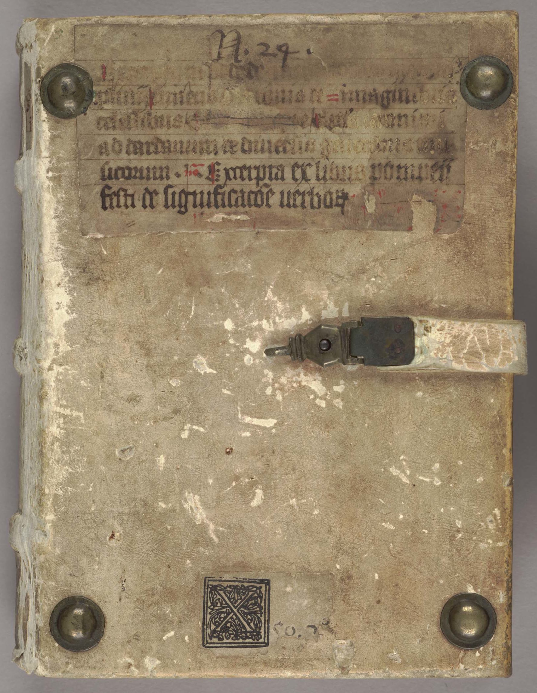
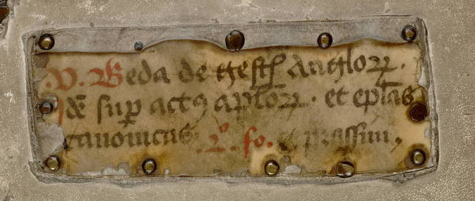
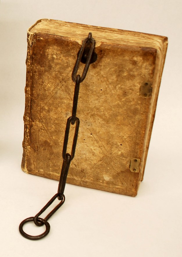
One of the fundamental things in a medieval book is letters – those symbols that fill up page after page and that make up meaning. Each one of us human beings writes differently and considering that medieval books were made before the invention of print, it follows that the scripts they carry show a great variety in execution styles. This is perhaps the most amazing experience of spending a day going through a pile of medieval books in the library: the immense variation in the manner in which the text is written on the parchment pages.

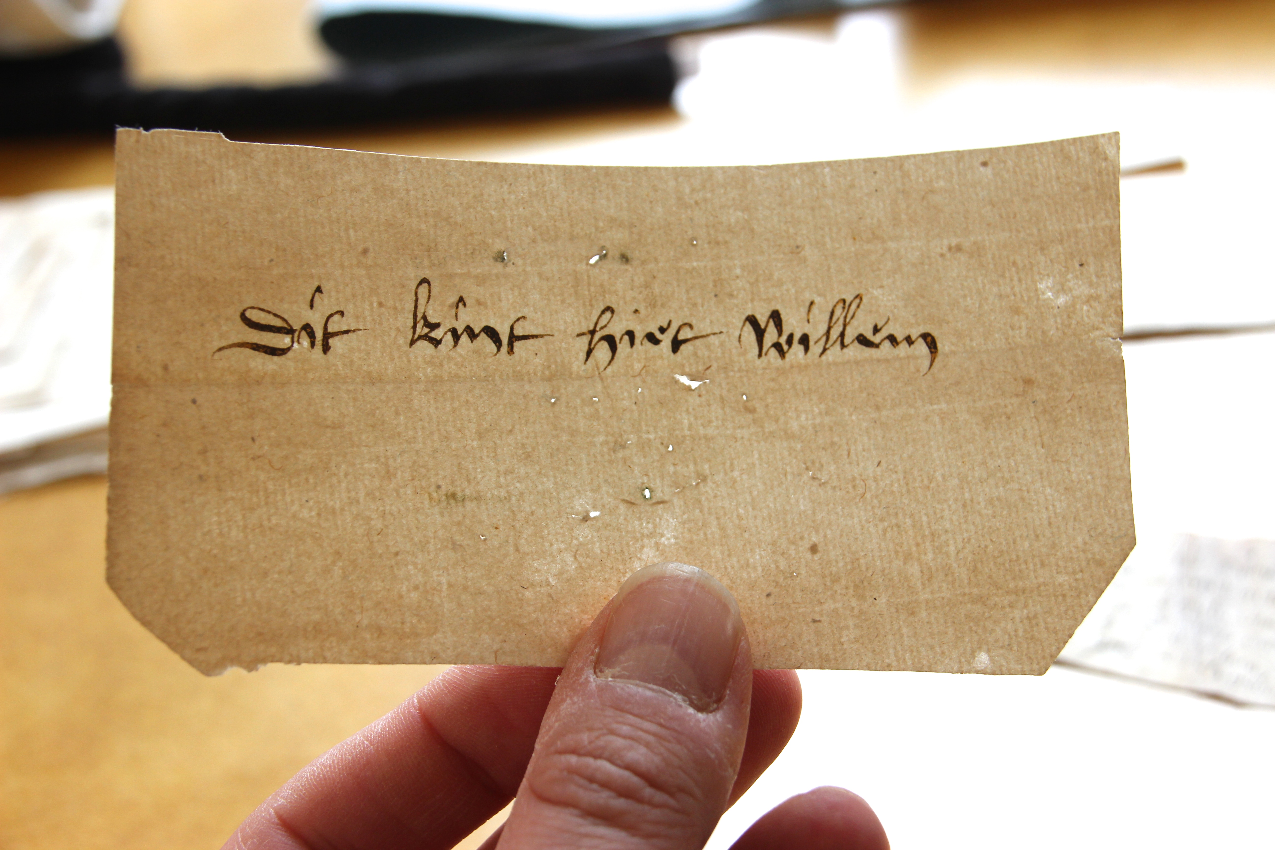
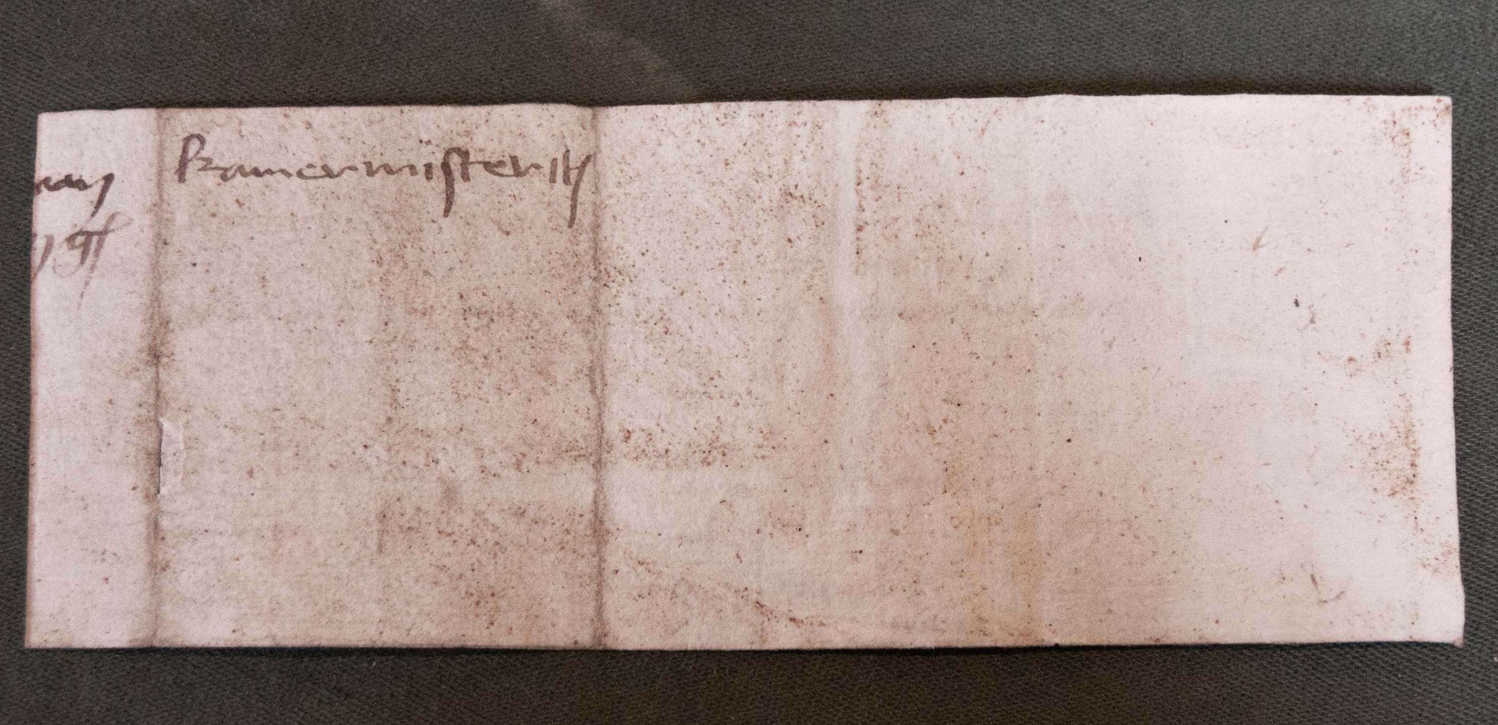
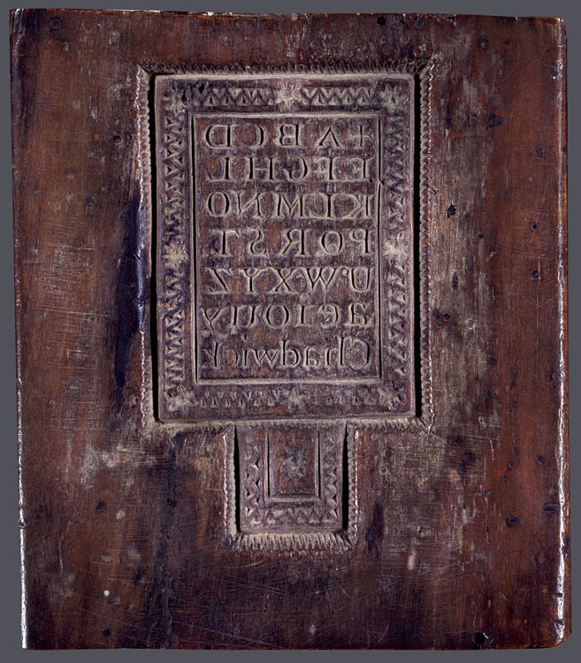
No surviving artefact underscores this point of variation better than advertisement sheets of commercial scribes. The one in Fig. 1 was produced by Herman Strepel and through it he shows off his expertise – and in a sense his merchandise – to customers who visited his shop. The blank back shows that the sheet was hanging on the wall, like a menu in a fast-food restaurant. He even wrote the names of the scripts next to the samples, in appealing golden letters, like a good businessman (more about advertisements from the medieval book world in this post).

Writing Sheet
Fig. 1 – Advertisement sheet for scripts, c. 1450 (The Hague, KB, 76 D 45) – Source

In this wild party of letter shapes roughly two categories of variation can be observed: first, the shape of medieval letters differs because they belong to different script families; and secondly, their precise execution varies because the scribes opted for a particular size, thickness, quality, and pen angle. Remarkably, this variation is still preserved in our modern notions of typefaces, which represent the families, and fonts, which express the variation within these families, for example concerning size (for their meaning, see here).

If we forget, for a moment, that letters themselves convey meaning, these two levels of variation – choice of script and of its execution – comprise perhaps the greatest value: letters show us when a manuscript was made. This information comes in extremely handy considering that the title page was not yet invented. But how do we find it? Welcome to the secretive world of handwritten letters from the Middle Ages.

Tick, tock
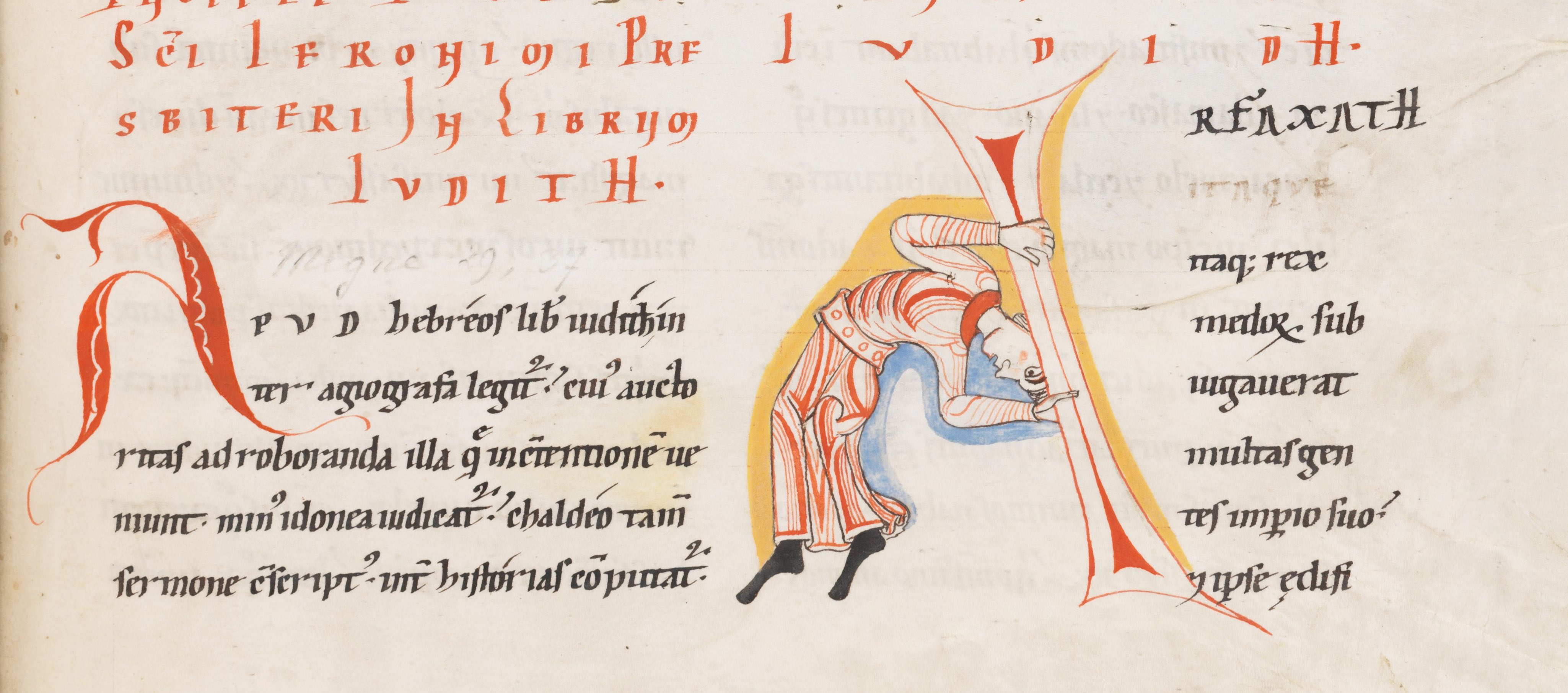
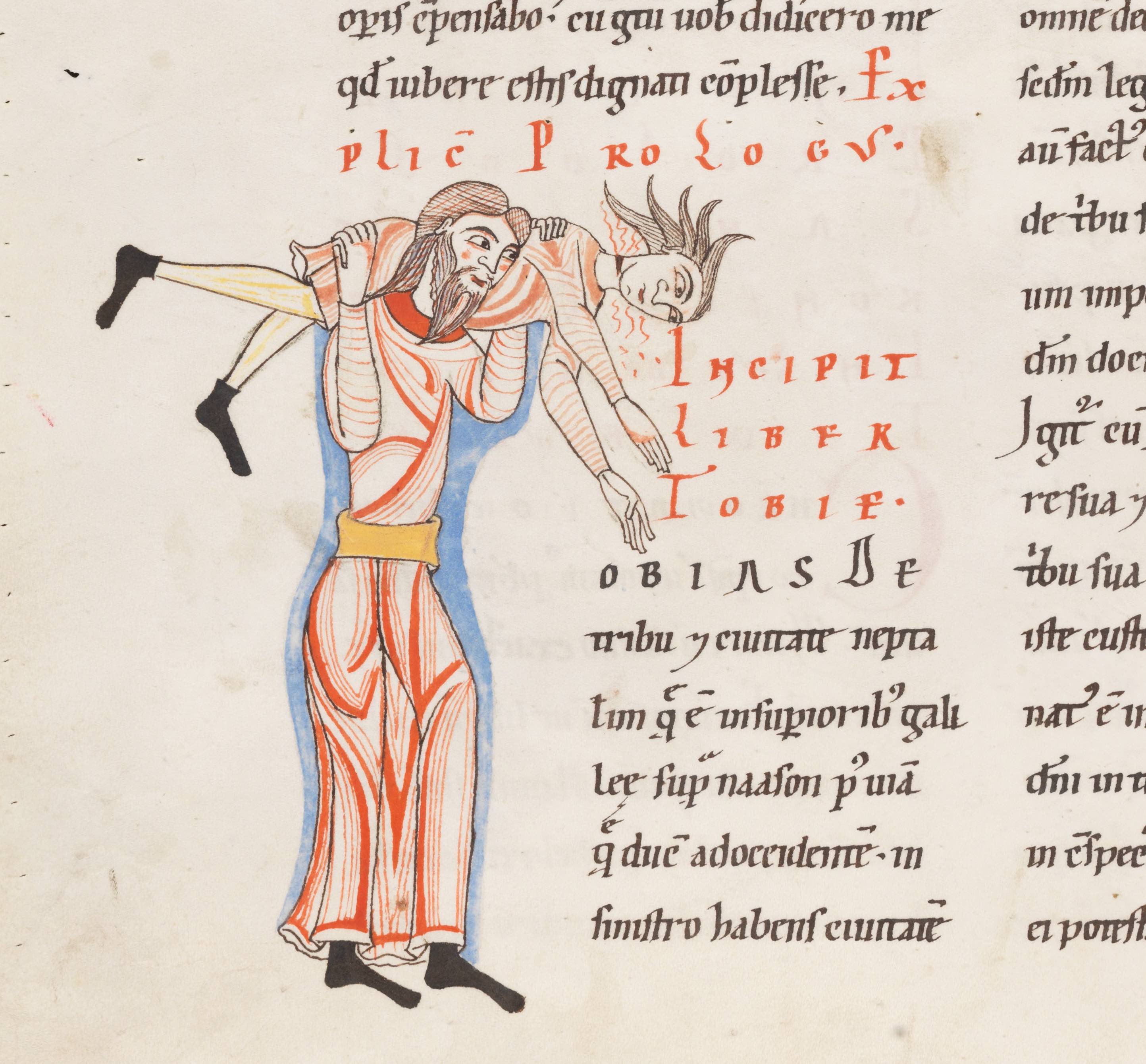
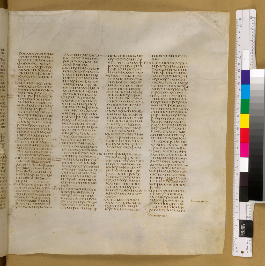
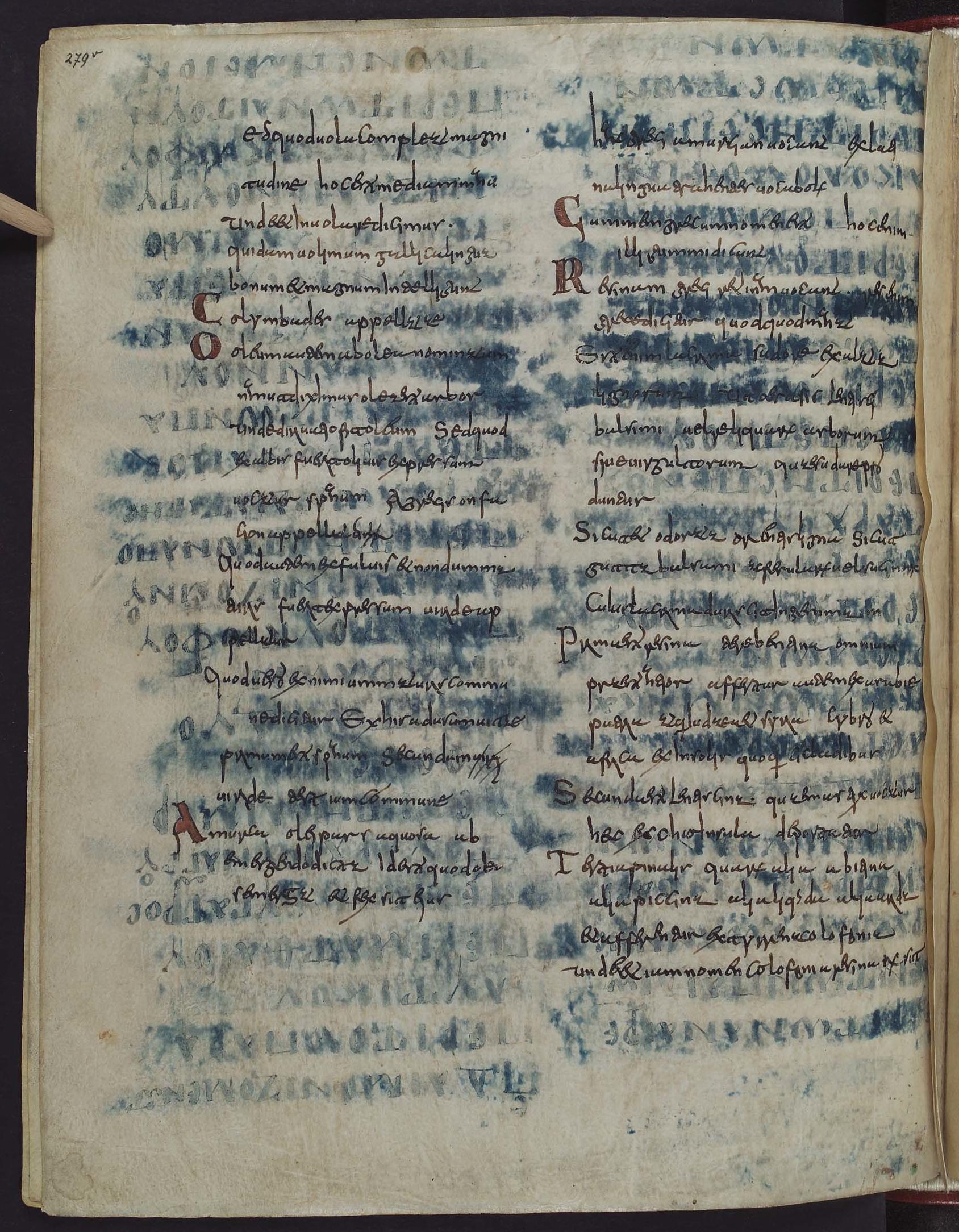
Medieval script tells time, although usually not very precisely. Take for example the three major script families from the medieval period: Caroline minuscule (Fig. 2, sample 1), Pregothic script (Fig. 2, sample 2), and Littera textualis or Gothic script (Fig. 2, sample 3).

script samples
Fig. 2 – Three medieval script families: St Gall, Stiftsbibliothek, 14 (9th century); Leiden, University Library, BPL 196 (12th century); London, British Library, Arundel 28 (13th century)

Despite the fact that these three families are relatively easy to distinguish and identify, they were used for extensive periods of time: Caroline (nr. 1) from c. 800 to c. 1050, Pregothic (nr. 2) from c. 1050 to c. 1250, and Gothic from c. 1250 to c. 1500. In other words, merely identifying the family of handwriting is not enough to pinpoint when precisely a book was made. To get that information one needs to do more – and this is where things start to get a bit more complicated.

Data
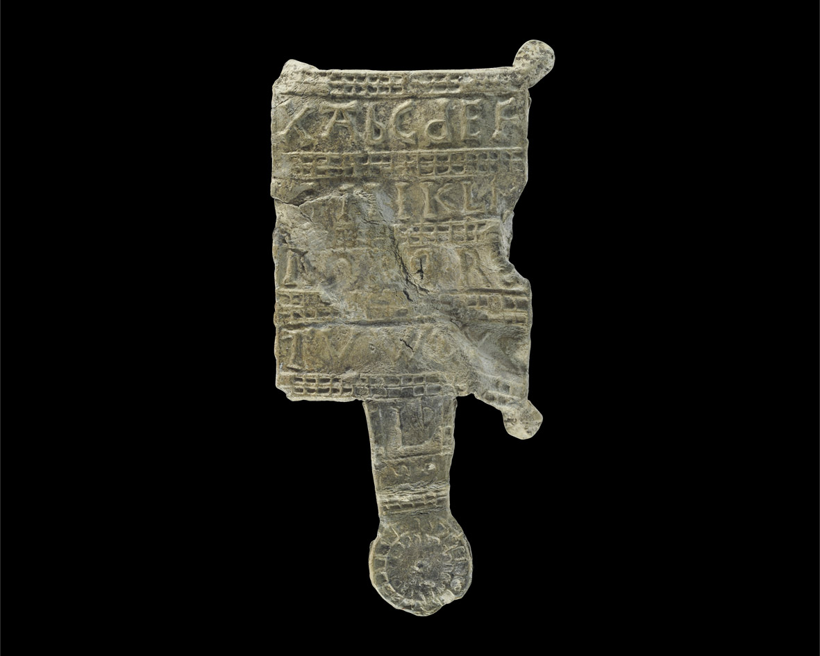
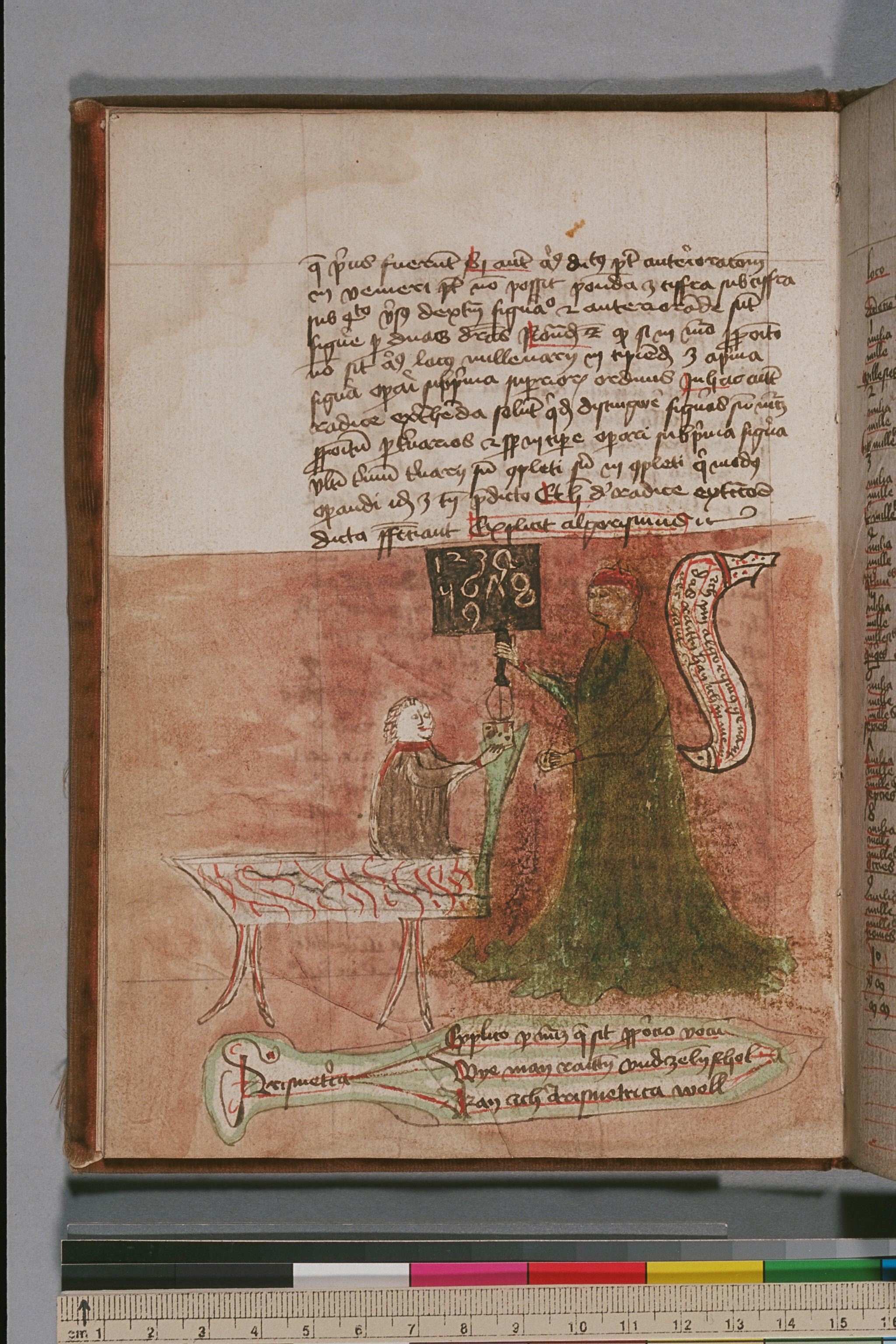
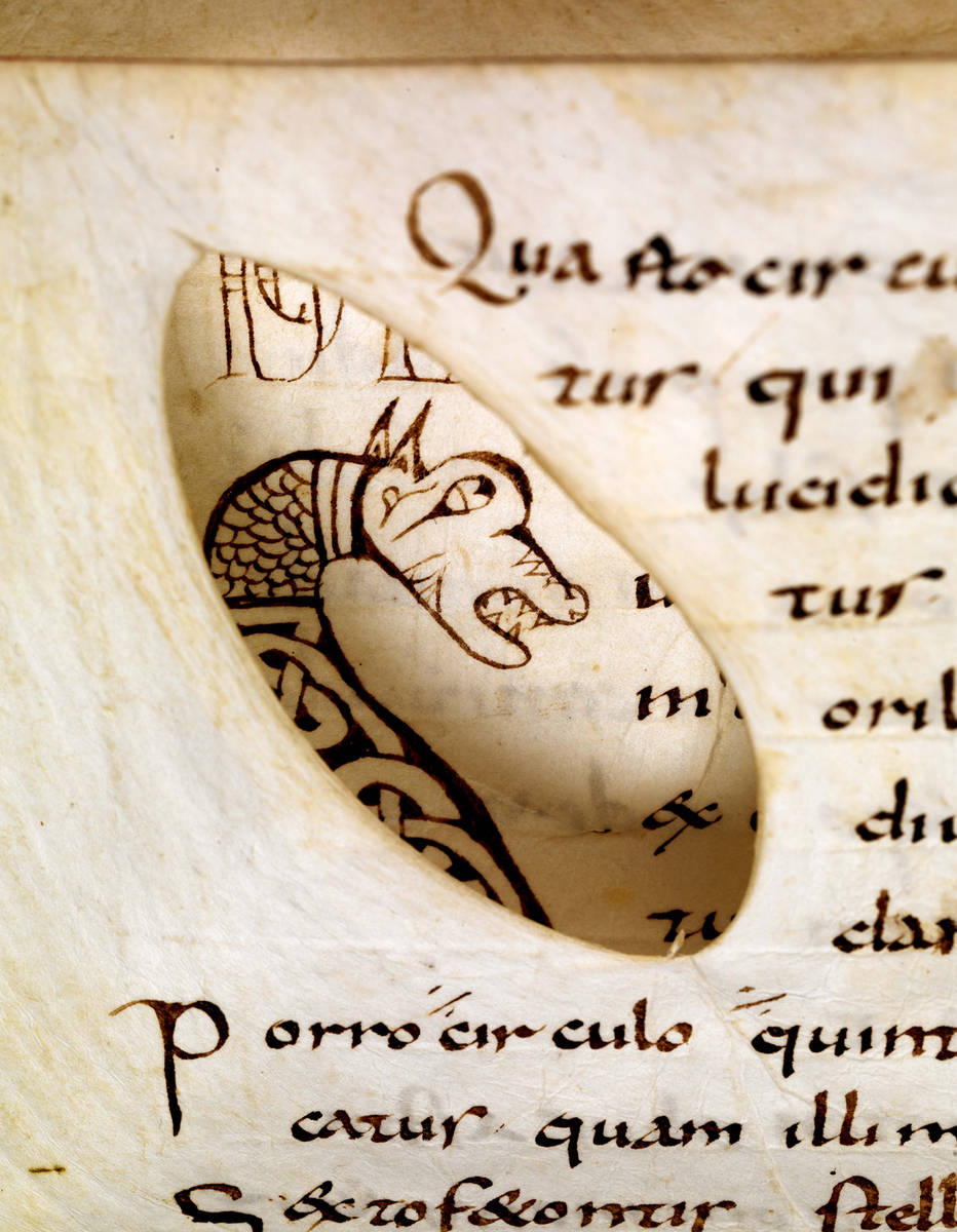
To know when a book was copied, one needs to investigate where in the timespan of a script the sample in question can be placed. Does a style of writing fit better in the early stages of a script, is it representative of the end of its life cycle, or perhaps rather somewhere in the middle age? To be able to answer this question one needs to know how the font in question developed over time. This is the kind of research I have been doing over the last few years, called quantitative paleography because it uses a high volume of verifiable data. Thus it is possible to map how Pregothic evolved by tracking,for example, the letter pair de (Fig. 3, magnifying glass).

1156-57 BM Charleville BM 246 B, f. 138v (detail) (1)
Fig. 3 – Letter pair “de” in Charleville, Bibliothèque municipale, Ms 246 B (dated 1156-1157).

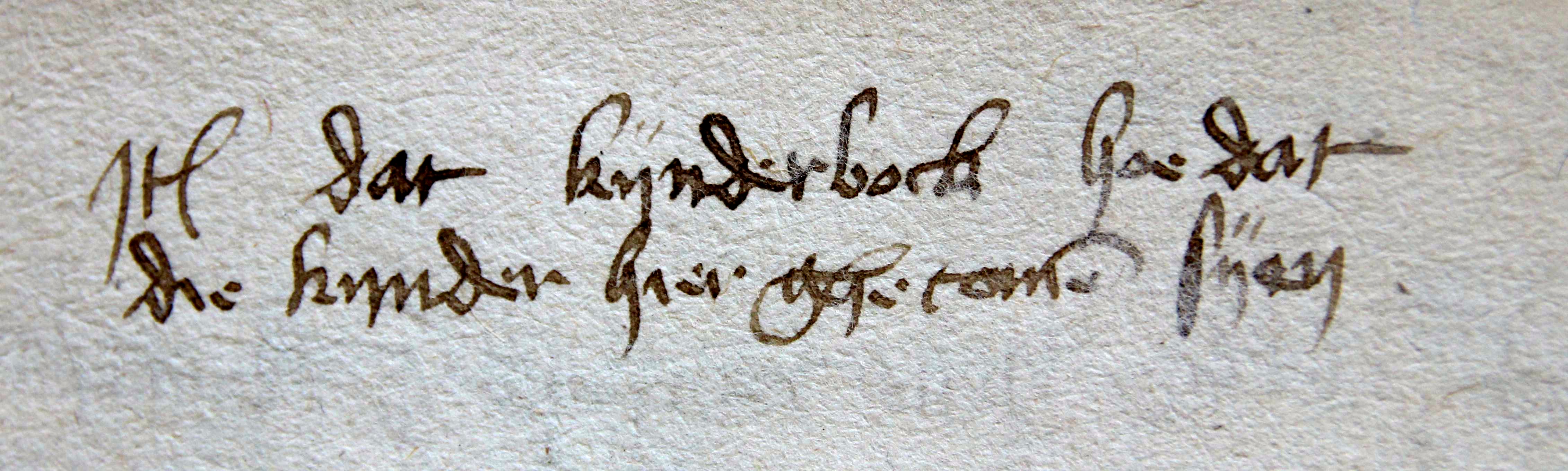
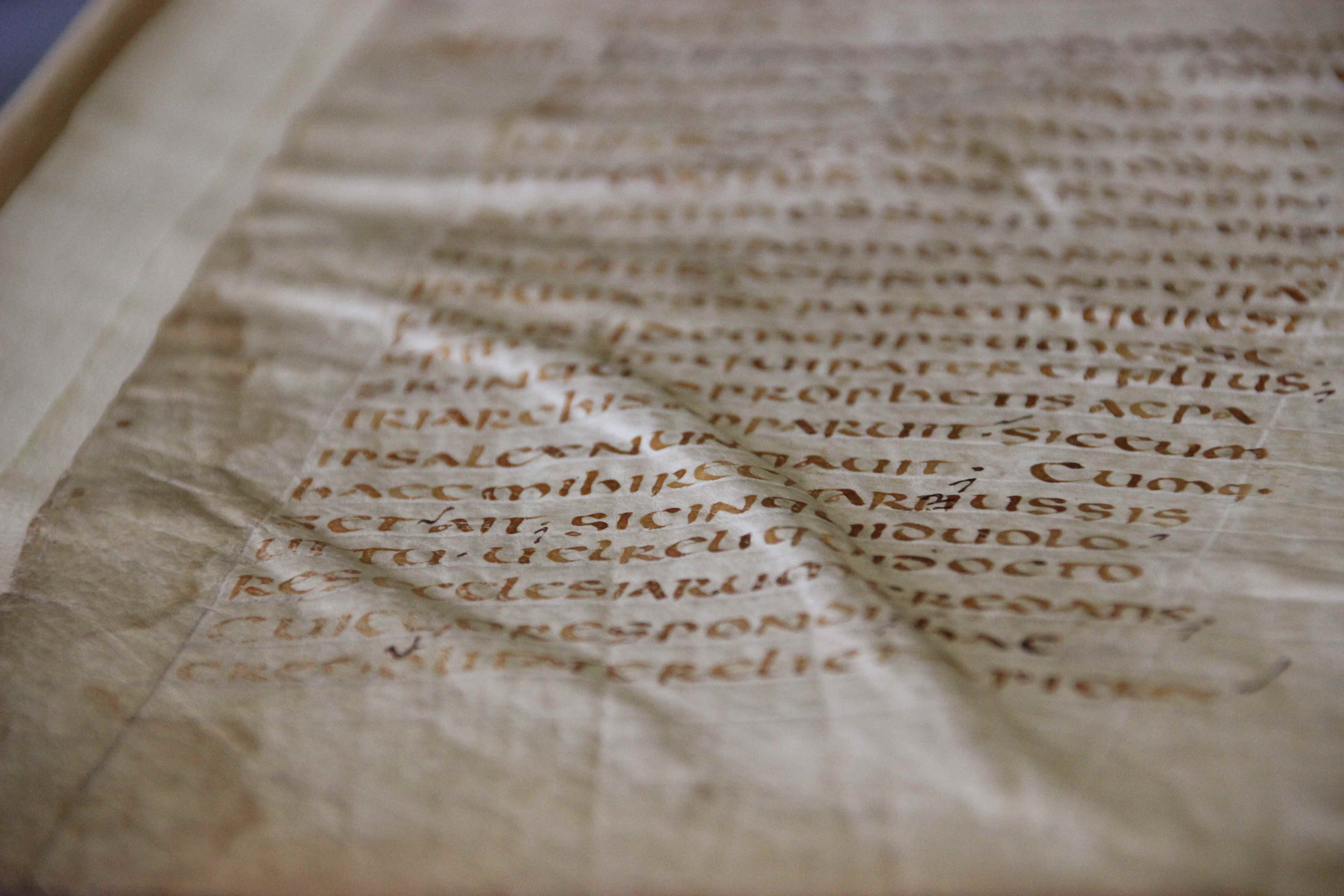
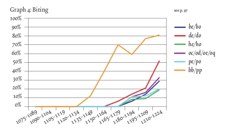
Here the two elements of this letter pair, which was written down in 1156 or 1157, are touching one another, albeit only slightly. Just twenty years earlier these same letters would still have been written fully separated. This becomes clear when we gather data from manuscripts that bear a date (like the one in Fig. 3), which they do every now and then. When this data is gathered one can deduce, with statistical support, when certain features were born or when they died. Thus data shows, for example, that the touching of de is first encountered in the period 1150-1175. The process, which I dubbed “kissing” in this free downloadable book (which also shows how the method works), continues until the two letters fully overlap. This is called “biting” by script experts (Fig. 4, magnifying glass).

BL Arundel 28
Fig. 4 – London, British Library, MS Arundel 28 (1250-1300)

In fact, the pair highlighted in Fig. 4 has moved so close together that they share the central vertical pen stroke: the right side of d is also the left side of e. The two have literally become inseparable, because separating them would leave one of them incomplete. The data – gathered from 342 dated manuscripts written between 1075 and 1225 – shows how biting emerged at different moments in different letter pairs: first in pp, then in de and do, and subsequently in some others. (Fig. 5). It shows how even a single script feature needed time to spread to all corners of the script.

Kwakkel_McKitterick_Thomson_Turning_Over_a_New_Leaf_Page_207
Fig. 5 – Kwakkel, “Biting, Kissing and the Treatment of Feet”, p. 207 – Source

Secret – not
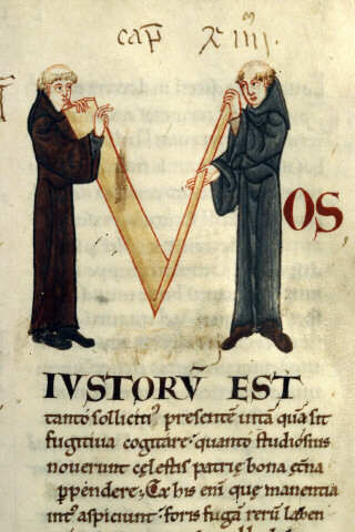
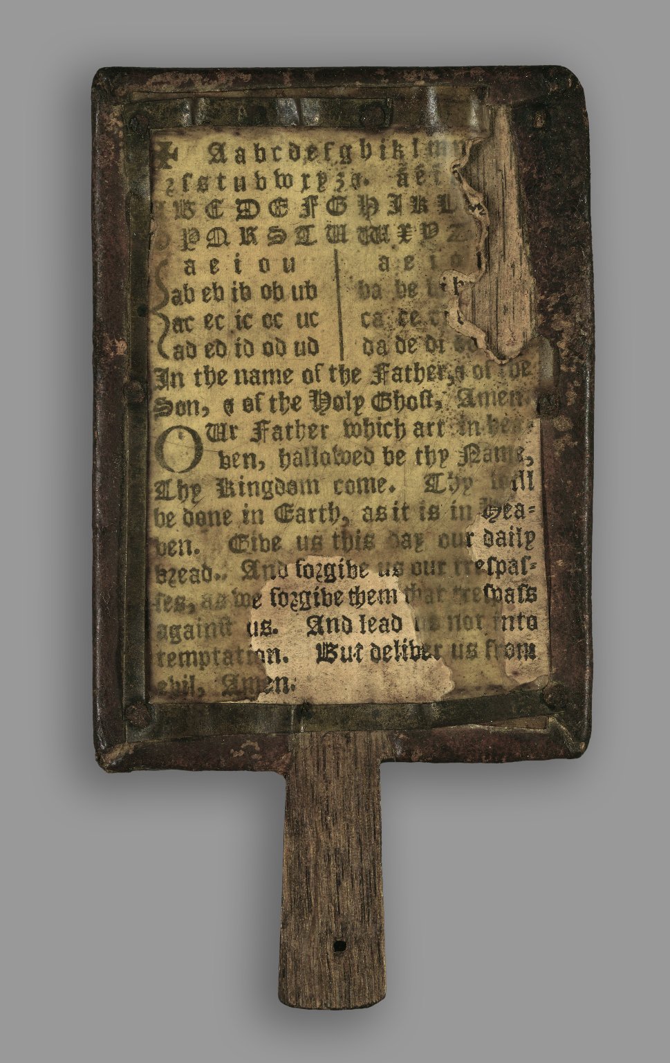
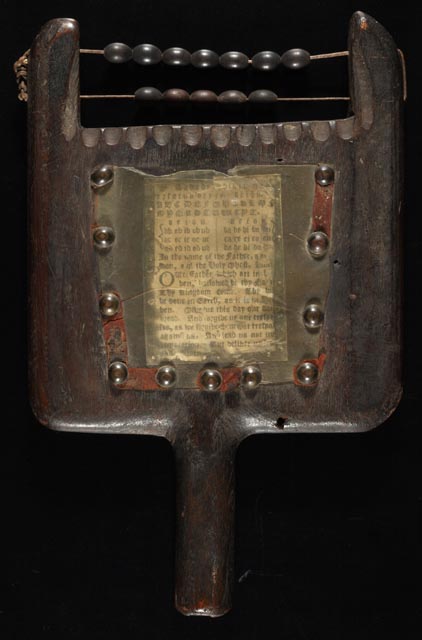
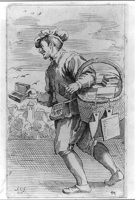
The average medieval scribe knew a number of scripts by heart. Commercial producers of books, discussed at the outset of this post, aimed to please a diverse clientele and will therefore likely have known more fonts than any other type of scribe, including the monk (Fig. 6). The latter was very conservative: he did not often have a broad palette of scripts and he was disinclined to adapt his manner of writing on command. Still, even within single scripts monks show variation in the style of execution. Interestingly, he poured into something from his cultural-historical background in the shape of letters, revealing to the attentive beholder when precisely he wrote a book, even when he did not give this piece of information away explicitly.

British_Library_Royal_4_b_i
Fig. 6 – Scribe at work: London, British Library, MS Royal 4 B.i (Rochester, 1100-1125)

How the letters were formed may also reveal other things about the scribe, for example where he or she lived, or even that it was a hasty book project. Unveiling this hidden information in handwriting is difficult, because letter shapes do not easily give up their secrets. Still, the increasing popularity of Digital Humanities and the tendency of modern script experts to map the development of handwriting with the help of verifiable data makes it increasingly more difficult for scribes to hide their secrets.

Postscriptum – In response to some helpful remarks on Twitter, I am aware, of course, that scripts and fonts – as used in the title – are not the same thing. However, I like the comparison of the two, and used it here, because just like medieval script, a font relates both to the notion of family (Times New Roman) and its execution (e.g. a 12 point letter). More on fonts and typefaces here (via John Mulloy, @MulloyJohn).

Judging a Book by its Cover

What a clever device the book is. It is compact and light, yet contains hundreds of pages that hold an incredible amount of information. Moving forward or backward in the text is as easy as flipping a page, while the book’s square shape and flat bottom facilitates easy shelving. Still, the object is useless if the information it contains cannot be found. And so tools were developed to help the reader do just that, such as page numbers, running titles, and indices. As familiar as these aids may be, they are older than you think. The page number, for example, is encountered in papyrus manuscripts made some two thousand years ago (see this older blog post).

Crucially, to look up information in a book you must have first located the object. And so the shelfmark was invented, the equivalent of our call number. By the end of the medieval period it had become as clever as the book to which it was added: letters, digits, and even colour coding was used to guide the reader to a particular manuscript (see this post on GPS in the medieval library). This post explores the medieval roots of yet another tool for finding a specific book, one that is as popular now as it was in medieval times: title and author information displayed on the spine and dust jacket.  How did the outside of the medieval manuscript communicate what was hidden inside?

1. Text on leather

St Gall, Stiftsbibliothek, MS 292
Fig. 1 – St Gall, Stiftsbibliothek, MS 292 (c. 1100) – Source
St Gall, Stiftsbibliothek, MS 292, front cover (detail)
Fig. 2 – St Gall, Stiftsbibliothek, MS 292, front cover, detail (14th century)

Why make things complicated? The easiest way to identify a manuscript was to simply jot the title on the front cover, straight on the leather of the binding (Figs. 1-2). Although one might imagine that this is how the tradition of our modern cover information began, there are too few original bindings left to know for sure. The manuscript seen in Figs. 1-2 is important as it shows that the practice goes back to at least the fourteenth century.

The manuscript shown in Figs. 1-2 was copied around 1100 and still has its original binding. Interestingly, this tells us that for 200-300 years users were quite content with an “anonymous” book, which did not provide a clue to what information it contained. This is all the more striking when you consider that during these three centuries the library where the object was held, in the abbey of St Gall, harboured several hundred books. How on earth did the monks find their way to the texts contained within this binding?

2. Title labels

St Gall, Stiftsbibliothek, MS 237, front cover
Fig. 3 – St Gall, Stiftsbibliothek, MS 237 (9th century), front cover – Source
St Gall, Stiftsbibliothek, MS 237, paper label
Fig. 4 – St Gall, Stiftsbibliothek, MS 237, paper label (14th century?)

Writing text on a manuscript’s cover, as seen in Fig. 2, was not easy. The structure of the leather could be coarse and the surface uneven, which made it potentially difficult to write the title information legibly. More importantly, when the leather had a dark color, a black title may simply not be visible. In such cases it made more sense to write the information on a parchment or paper slip – a label – that was subsequently pasted on the cover, as is still common practice in libraries today.

The manuscript in Figs. 3-4, which features a parchment label, shows how incredibly effective this practice was: it clearly reads Liber ethymolo[giarum] Isidori, telling the reader that he was about to open Isidore of Seville’s Etymologies. These paste-on labels could be quite extensive (Fig. 5). In fact, some book owners preferred to have the entire contents displayed on the outside, even if the object held ten works (Fig. 6).

Austin, Harry Ransom Humanities Research Center, MS HRC 29
Fig. 5 – Austin, Harry Ransom Humanities Research Center, MS HRC 29 (10th-11th centuries), label 15th century – Source
Schlatt, Eisenbibliothek, MS 20, label on front cover (15th-century)
Fig. 6 – Schlatt, Eisenbibliothek, MS 20 (13th century), label 15th-century – Source

As detailed as these labels are, they exclusively list the titles of the works contained by the manuscript, not the authors’ names. It appears as if the librarian who labeled these manuscripts judged the title (and not the author) to be the best identifier of the object.

3. The fenestra
Paper or parchment title shields were sometimes placed under a thin piece of horn (bone), for protection (Figs. 7-8). The so-called “fenestra” (window in Latin) was secured to the wooden cover with nails: it was clearly going nowhere (Fig. 8). This type of cover information can be seen as the next step in the process of providing efficient book titles: a clear and permanent label, hammered into wooden boards with nails. It is a far cry from the on-the-fly title hastily written directly on leather (here is another example).

San Marino, Huntington Library, MS HM 35300 (15th century)
Fig. 7 – San Marino, Huntington Library, MS HM 35300 (15th century) – Source and more
San Marino, Huntington Library, MS HM 35300, fenestra
Fig. 8 – San Marino, Huntington Library, MS HM 35300, fenestra

The fenestra is often found on manuscripts that were part of a well-organised library. It may therefore contain quite a bit more information than merely the title or the author. The one seen in Fig. 8 is from the library of the Carthusian house of Syon in Middlesex, England. The label is clever and reads:  “V. Beda de gestis Anglorum. Idem super actus apostolorum et epistolas canonicas. 2o fo et prassini”. The main piece of information concerns what is found inside: Bede’s Ecclesiastical History of the English People and Bede’s commentaries on the Acts of the Apostles and on the New Testament’s Canonical Epistles.

However, it also mentions the first words of the second folium: secundum folium [incipit] et prassini, the second folium starts with “et prassini”. These words formed a unique identifier, for no two copies of Bede’s Ecclesiastical History will have had these very words at the start of the second leaf. This technique was commonly used to identify unique copies for inclusion in a monastery’s book inventory or library catalogue. It is probable that this is the reason why the fenestra contains the phrase: to link this specific book to the monastery’s catalogue.

4. Spine titles

Fore-edge decoration by Cesare Vecellio
Fig 9 – Fore-edge decoration by Cesare Vecellio – Source (Source title image)

Not only was a book’s title and name of the author jotted down on the front cover, it would ultimately also feature on the spine, as any modern reader knows. This part of the tradition has its own path of development. It all started on the fore-edge, the long side of the book that shows the paper or parchment pages. From at least the fourteenth century decoration was added to this location. Few books have been so lavishly decorated as Ordorico Pillone’s, who, around 1580, had the artist Cesare Vecellio decorate the fore-edge of 172 books in his library with stunning designs (Fig. 9). The technique would be perfected in the nineteenth century, when the magically disappearing fore-edge decoration was invented (example here).

In medieval times the edges of the book block were not usually decorated, while the design was commonly modest (Fig. 10-11). Although there are exceptions to this rule, as a potentially medieval fore-edge decoration in Durham shows (more here).

London, British Library, Egerton MS 2610 (1
Fig. 10 – London, British Library, Egerton MS 2610 (decoration: 14th century) – Source and more
London, British Library, Burney MS 275 (before 1416)
Fig. 11 – London, British Library, Burney MS 275 (decoration: before 1416) – Source

The manuscript in Fig. 11 shows that medieval fore-edge decoration could serve a functional purpose, because it concerns the coat of arms of Jean, duc de Berry (d. 1416). We may assume the books in his library were positioned with the fore-edge faced outward, as was common practice in many medieval libraries – in fact, this was done until well into the 17th century, as this image shows. How impressive his library must have looked to visitors: dozens of precious books, all evidently owned by the duke.

Given that the fore-edge was facing the reader, this location was also the perfect place to write down the title or author of the work contained by the volume. ‘Quaestiones morales’ (moral questions), a 15th-century hand wrote on the fore edge of an incunable printed in 1489 (Fig. 12). The earliest cases I encountered date from the early fifteenth century, although our view may be skewed because such fore-edge titles disappeared when binders in the early-modern period refitted the books with new bindings.

Washington, Folger Shakespeare Library, INC_M26 (1487)
Fig. 12 – Washington, Folger Shakespeare Library, INC_M26 (1487) – Source

When books finally turned their backs to the reader, the title ended up where it is still found today: on the spine. Based on my own experience, this practice was not common in medieval times, for the simple fact that manuscripts were not usually placed with their backs facing the reader. Cases from the early-modern period are plentiful. In fact, it became so popular that some readers wrote extensive tables of contents on the backs of their books (Fig. 13).

Shelf in the Wolfenbüttel, Herzog August Bibliothek
Fig. 13 – Shelf in the Wolfenbüttel, Herzog August Bibliothek – Photo EK, more

The early history of displaying a book’s title and author on the outside is long and winding: first the information was found on the front or back, then on the fore-edge, and finally on the spine. This order is no coincidence, because it roughly reflects another development, namely how books were stored: first flat (Early and Central Middle Ages), then upright with the fore-edge facing the reader (Later Middle Ages), and finally with the spine facing outward (Early Modern period).

Judging from surviving book bindings, the history of the “dust jacket” with title actually starts surprisingly late. After all, the earliest traceable specimens date from the fourteenth century. Curiously, in the same century the Latin titulus was first used for denoting the title of a book (see here), which may also indicate that titles did not exist before then. If correct, this reconstruction suggests that for much of the Middle Ages readers could not tell what texts were found inside a book. Generations of frustrated monks had to wander through the library opening and closing manuscripts until they had found what they were looking for.

Chain, Chest, Curse: Combating Book Theft in Medieval Times

Do you leave your e-reader or iPad on the table in Starbucks when you are called to pick up your cup of Joe? You’re probably not inclined to do this, because the object in question might be stolen. The medieval reader would nod his head approvingly, because book theft happened in his day too. In medieval times, however, the loss was much greater, given that the average price of a book – when purchased by an individual or community – was much higher. In fact, a more appropriate question would be whether you would leave the keys in the ignition of your car with the engine running when you enter Starbucks to order a coffee. Fortunately, the medieval reader had various strategies to combat book theft. Some of these appear a bit over the top to our modern eyes, while others seem not effective at all.

Chains
The least subtle but most effective way to keep your books safe was to chain them to a bookcase. Walking around in a “chained library” is an unreal experience (Fig. 1). There is nothing like seeing a medieval book in its natural habitat, where the chains produce a “cling-cling” sound when you walk too close to them – a sound that must have been familiar to medieval users of chained libraries.

The chained library of Hereford Cathedral
Fig. 1 – The chained library of Hereford Cathedral – Source
Fig. 2 – Zutphen, “Librije” Chained Library (16th century) – Photo EK (more here)

While there are only a modest number of chained libraries still in existence today (in my own country just one remains, Fig. 2), many of the medieval books we consult in modern libraries were once part of such a collection of “imprisoned” books. Objects that were once chained can be identified with ease, either from the attached chain (Fig. 3) or from the imprint it left in the wood of the book binding (example here, lower edge). The links of the chain are remarkably crude and clunky, although they have a certain charm as well (Fig. 4 and image all the way at the top, taken from this source).

University of Kansas, Spencer Library, MS D84 (15th or 16th-century chain)
Fig. 3 – University of Kansas, Spencer Library, MS D84 (15th or 16th-century chain) – Source
Zutphen, Librije Chained Library - Photo Julie Somers
Fig. 4 – Zutphen, “Librije” Chained Library (16th century) – Photo Julie Somers

The primary reason for chaining a book was, obviously, safekeeping. Just like phones and tablets on display in modern stores are fixed to their display tables with straps, these precious medieval books were bolted to the library that owned them. This feature of stabilitas loci (to allude to the Benedictine ideal of staying in one location your entire life) turns the chain into something interesting beyond the strictly book-historical. It shows, after all, that the text inside the object was available in a public or semi-public place, such as a church or a cathedral. In other words, chains (or traces of them) suggest how information was accessed.

Book chests
Not all chained books were part of a real library – say a room with one or more bookcases. The famous seventeenth-century “Gorton Chest” from Chetham’s Library shows that books were also chained inside a book chest (Fig. 5, more here and here). This particular example was made in 1658 to contain 68 volumes that were purchased from the bequest of Humphrey Chetham. The lot made up the full extent of the parochial library of Gorton Chapel.

Chetham_Library_Book_Chest
Fig. 5 – Manchester, Chetham’s Library, Gorton chest, made in 1655 – Source

While book chests were a common phenomenon in medieval times, most of them did not actually feature chains. Surviving specimens suggest that the majority were merely wooden boxes, often enforced, that were fitted with one or more locks. The one that still survives in Merton College library, dating from the fourteenth-century, is a good example of such an object (Fig. 6). The theft-prevention plan of these chests was simple yet effective: the filled object was too heavy to move or steal, while the locks kept the contents safe from theft. In a sense, the heavy and enforced chest is the equivalent of a modern safe. Similar chests were used for other kinds of precious objects as well (here is one not made for books).

Oxford, Merton College, book chest (14th century)
Fig. 6 – Oxford, Merton College, book chest (14th century) – Photo EK

Cursing
Considering these two practical theft-prevention techniques – chaining your books to something unmovable or putting them into a safe – the third seems kind of odd: to write a curse against book thieves inside the book. Your typical curse (or anathema) simply stated that the thief would be cursed, like this one in a book from an unidentified Church of St Caecilia: “Whoever takes this book or steals it or in some evil way removes it from the Church of St Caecilia, may he be damned and cursed forever, unless he returns it or atones for his act” (source and image). Some of these book curses really rub it in: “If anyone should steal it, let him know that on the Day of Judgement the most sainted martyr himself will be the accuser against him before the face of our Lord Jesus Christ” (source).

Book curses appear both in Latin and the vernacular, including in non-Western traditions, like Arabic (example here). Fig. 7 shows an Anglo-Saxon curse from the second half of the eleventh century, in a manuscript donated to Exeter Cathedral by bishop Leofric. This combination (of curse and donated book) is encountered more often. The inscription at the bottom of the page in Fig. 8 notes that the book was donated to Rochester Priory in Kent by Ralph of Stoke. The notation ends with a short book curse.

Oxford, Bodleian Library, MS Auct. D. 2.16 (12th century)
Fig. 7 – Oxford, Bodleian Library, MS Auct. D. 2.16 (12th century) – Source
British Library, Royal MS 2 C.i (written c. 1220)
Fig. 8 – British Library, Royal MS 2 C.i (written c. 1220) – Source

These two cases suggest that the receivers of the gifts felt compelled to treat the given object with extra care. A similar sentiment is encountered in some books that were copied by individuals who were, for some reason, important to a religious house. In the early twelfth century, one Humphrey was precentor in Rochester Priory, Kent, meaning he lead the congregation in singing during the mass. He is also known as a scribe who copied a number of books for the community in a particularly dazzling script. One of these books he copied bears a curse as well as a note “In memory of Humphrey the precentor” right below it (Fig. 9). The apparent significance to the community may well be the reason why a curse was added.

BL_Royal_5_B.xii
Fig. 9 – British Library, Royal MS 5 B.xii (dated 1115) – Source

Optimism
Book curses raise a lot of interesting questions. Were they indeed favoured for books of special significance? Are we to understand their presence as a sign that librarians and book owners really thought the inscriptions were effective? And if they were, why not place them in all books contained in the library? No matter the answers to these queries, there is a certain optimism embedded in such notations: the writer of the note apparently believed that a gentle reminder would bring potential thieves around and they might consequently not take the object.

Interestingly, the same optimism is echoed by inscriptions that ask the finder or thief of a book to return the object to its rightful owner. A Middle English note reads: “Ho so me fond er ho so me took I am // jon Fosys Boke” (Whoever found me or whoever took me, I am John Foss’s book) (Fig. 10, information taken from this article).

St Petersburg, National Library of Russia, MS Lat. F.v.I. N 70 (14th century)
Fig. 10 – St Petersburg, National Library of Russia, MS Lat. F.v.I. N 70 (14th century) – Source

Notes like this bring us back to Starbucks, where I have seen similar requests stuck to the wall: whoever took my iPad, please return it, or at least return the files on it. Just as in modern times, medieval books were likely also not often returned. In fact, the example of John Foss’s book gives us reason for pessimism: in the inscription the name is written on erasure, meaning that an earlier name, of a previous owner, was erased with a knife. Curiously, this makes John Foss the potential thief of this book. If this is indeed the case, the thief identifies himself by altering the very book curse that was aimed at people like him.

Post-scriptum: more on chained libraries in this post and on the one in Zutphen here. The link to the image of the curse related to the Church of St Caecilia was provided by Elizabeth Archibald (@Elizarchibald).

Medieval Letter-People

The human body is one of the most common objects encountered in art, whether in paintings, sculptures or other objects. Things have not changed much since medieval times, when artists loved to fill their work with human figures – commonly saints or individuals affiliated with biblical stories. Among the great diversity of depictions, there is one type that stands out in that the body is used (or rather, abused) to express something other than itself. These particularly fascinating and often amusing depictions are found on the medieval page. We see people bent and stretched into unnatural shapes in order to change them into something for which the book was created: letters (Fig. 1).

British Library, Add. MS 8887 (15th century)
Fig. 1 – Letter G: British Library, Add. MS 8887 (15th century) – Source

Looking at these unfortunate victims of book decorators – in this case the letter G from the Macclesfield Alphabet Book – may bring a smile to your face, which was probably the aim. At the same time, it is easy to overlook the sophisticated design behind such forced yoga exercises. Moreover, when you look a bit closer at this kind of book decoration, different types of letter-people may be discerned.

1. Inconspicuous letter-people
In the least conspicuous type we simply see one or more individuals hanging about near the text, minding their own business. At least, that is what you would think at first sight. When you start reading it quickly becomes clear that these people and their paraphernalia are actually forming the first letter.

Dijon, Bibliothèque municipale, MS 170 (12th century)
Fig. 2 – Letter M: Dijon, Bibliothèque municipale, MS 170 (12th century)
Dijon_BM_15_3v
Fig. 3 – Letter H: Dijon, Bibliothèque municipale, MS 15 (12th century)

In the first of these two scenes (Fig. 2), two monks hold up a structure made out of planks. When turning to the text (Gregory’s Moralia in Iob) it becomes clear that the monks and the V-shaped structure form the capital letter M (the first line reads “Mos iustorum est”). Fig. 3 is even more subtle: it shows a monk giving a wax tablet to what looks like bishop. In fact, they also form the letter H during the exchange (the start of “Hieronimus”).

2. Bending reality
Subtle as they are, it is hard to believe depictions like these were not meant to entertain. Some letters made up by human figures appear to take the entertainment factor a step further. In the same medieval set of books as the previous decorations this giant letter Q (Fig. 4) can be found.

Dijon_BM_170_59r
Fig. 4 – Letter Q: Dijon, Bibliothèque municipale, MS 170 (12th century)

While the individuals forming the M and H (above) are in a natural pose, this Q is formed by two Cistercian monks (lay brothers, actually) in a most uncomfortable position. The team is chopping wood, with one monk placing an axe on the tree, while the other hits the axe with a hammer. While that must have been a common, real sight for the readers of this book, which was produced for a French Cistercian house, the backs of the  monks are rounded unnaturally in order to form the Q shape. The result is an uncomfortable-looking pose that provokes laughter.

The case of the two monks shows that bending reality can make it difficult to recognise a letter. A similar feeling surrounds a scene in another twelfth-century manuscript, one that shows a man wrestling with a beam (Fig. 5). It looks as if he is trying to lift it on his shoulders, but it appears to be too heavy. The image below it (Fig. 6) plays into the same theme of lifting. In both cases it takes a while before you recognise the letter that is expressed – the medieval reader probably got it much quicker.

Engelberg, Stifsbibliothek, MS 4 (12th century)
Fig. 5 – Letter A: Engelberg, Stifsbibliothek, MS 4 (12th century) – Source
Engelberg, Stifsbibliothek, MS 4 (12th century)
Fig. 6 – Letter T: Engelberg, Stifsbibliothek, MS 4 (12th century) – Source

A closer look reveals an A in the top image (the start of the name “Arfaxath”). It has the same peculiar shape as the A seen to the left of the acrobat and his heavy beam. The unnatural pose reminds us of the two monks chopping wood: reality is somewhat stretched – or rather, bent. Fig. 6, from the same manuscript (a Bible), shows the letter T for “Tobias”, which is produced by two individuals wrestling. It is not hard to imagine that the lifted person is spinning around while making a lot of noise (that is at least how I interpret the red lines coming out of his face).

3. Bending reality further
Near the end of the medieval period manuscripts appeared in which the human body was stretched and bent like never before: model books (see my post Medieval Super Models). These objects presented decorators with ideas and actual models for the large initial letters at the beginning of a text. People (as well as animals) form a common subject matter in these model books. Interestingly, they exchanged real-life, natural scenes with sophisticated constructions that feature multiple people in strange collective acrobatic poses (Fig. 5).

London, British Library, Add. MS 8887 (15th century)
Fig. 5 – Letters A, B, C, D: Oxford, Bodleian Library, Ashmole 1504 (1520-30) – Source

The great thing about this kind of decoration is that they are mini stories. They are much more dynamic than the scenes in Figs. 2-4, which show a single, rather static event. The letter B in Fig. 5, for example, shows a small band of people, who have to work hard for this pose. Still, one is making music, another balances on a dragon, while the old lady is supported by an old man. Readers had a lot to talk about when they saw this letter. Is the old man her husband, who is reduced to a (quite literally) supporting player? Is the man with the green jacket fighting the dragon or merely using it as a chair?

Bergamo, Biblioteca Civica, MS Cassaf. 1.21 (14th century)
Fig. 7 – Letters q, r: Bergamo, Biblioteca Civica, MS Cassaf. 1.21 (14th century) – Source

This theme of a bent reality where the lives of people are played out in unreal stories – while forming a letter – is also seen in other model books, such as the one made by Giovannino de Grassi, who worked at the Visconti court in Italy (Fig. 7). The letter q is made up by two knights on horseback, in an almost postmodern pose, while the letter r that follows shows a cute collection of animals.

With the animal theme the tradition has gone full circle. Animals forming letters are encountered as early as the ninth century (Fig. 8).

Alençon, Bibliothèque municipale, MS 12 (9th century)
Fig. 8 Letter T: Alençon, Bibliothèque municipale, MS 12 (9th century)

This scene shows a dog running away with a fish in his mouth, while forming the letter T (“Tum ego”) – and all this in a dead-serious text by the philosopher Boethius. It shows that entertainment using familiar objects, both humans and animals, is something universal, something that binds decorators from all corners of medieval Europe. It was sure to be a hit with the reader, who was given the chance to have a short “breather” from such heavy texts as Gregory’s Moralia and the complex ideas of Boethius. For a moment an unusual take on reality was allowed to take over and entertain.

Half Full, Half Empty: The Peculiar Medieval Page

Margins are both a universal and remarkable feature of books. From the very earliest specimens produced two millennia ago, to the e-readers we use today, books contain pages that hold both text and a significant amount of blank space. What a strange pair they are: words, the primary reason for the book’s existence; and a vast emptiness present on all sides of the text. A particularly remarkable aspect of marginal space is that there is so much of it in medieval books. My own work on the twelfth century, reflecting broader medieval patterns, shows that pages from that period consist of approximately 50% margin, although in some cases it can be significantly more. This implies, astonishingly, that the majority of medieval books are half empty, despite the fact that parchment was expensive and sometimes even hard to come by. Why is this?

Tradition

London, British Library, Add. MS 43725 (4th century)
Fig. 1 – London, British Library, Add. MS 43725 (4th century) – Source

One answer to this question is a simple one: because this is how books were traditionally made. Medieval scribes took over a great deal of material features first introduced by their counterparts in Antiquity. The book as we know it – i.e. an object produced from quires (bundles of folded sheets) – came into existence in the fourth century, as discussed in my post What is the Oldest Book in the World?  The pages of the famous Codex Sinaiticus, a Greek New Testament copied around the middle of the fourth century, measures 381 x 345 mm (height x width), while the text itself only takes up 250×310 mm (height x width). A simple calculation reveals that the text takes up 58% of the page, while 42% is reserved for the outer margins. In other words, a little under half of this magnificent book is empty.

Michigan, Ann Arbor, P.Mich.Inv.6238 (made 150-250)
Fig. 2 – Michigan, Ann Arbor, P.Mich.Inv.6238 (made 150-250) –  Source

Going back even further, papyrus manuscripts from Antiquity also included a considerable amount of marginal space. This is seen, for example, in Fig. 2, which shows the remains of a copy of Paul’s Epistles written between 150 and 250 CE. While the margins have been reduced post-production through damage (the edges of the papyrus eroded), the upper margin, which is largely intact, shows how the scribe reserved ample marginal space. The extensive medieval margin is, in one way, simply a continuation of an older practice.

Toolbox
The early papyrus book in Fig. 2 highlights that it was also convenient to have an empty space around the text. It meant that you could fill them with tools that may be helpful when consulting the book. A particularly important reading aid is visible at the top of the papyrus page: the capital version of the Greek letter Mu (looking like an M), which represents the Greek number 40 (Fig. 3). In other words, this is a very early page number (folium number), an instrument that is apparently some two thousand years old and predates the printed book by over a millennium.

Detail of Fig. 1
Fig. 3 – Detail of Fig. 2

There are many other kinds of aids encountered in the margins of medieval books, including cross references to other books or locations in the same manuscript, quotation marks, labels that indicate who the quoted author is, and chapter numbers. A particularly prominent aid is the running title placed in the upper margin. The one in Fig. 4 states “Physicorum”, indicating this is Aristotle’s Physics. This particular manuscript contains several Aristotle texts, which were popular in the university classroom. The student or teacher who was browsing through the book for certain information was greatly helped by these sign posts.

London, British Library, Harley MS 3487 (13th century)
Fig. 4 – London, British Library, Harley MS 3487 (13th century) – Source

Notes
While the margin did a good job accommodating the relatively short reading aids, it could be challenging to add large amounts of text to the void surrounding the main text. Fig. 5 shows a schoolbook from c. 1100 that was donated to Egmond Abbey near Amsterdam by one Baldwinus, a teacher in Flanders. The text in the book, Lucan’s Pharsalia, was used in the medieval classroom, and it is therefore no surprise that numerous explanatory notes have been added to the text, probably by Baldwinus himself.

Leiden, University Library, BUR Q 1 (c. 1100)
Fig. 4 – Leiden, University Library, BUR Q 1 (c. 1100) – Photo EK

There is something special about these marginal notes: they are preceded by symbols that are the precursor of our modern footnote (more about this early practice in this post). The symbol links a remark in the margin to a specific location in the main text. The symbol seen in Fig. 5 resembles the number 7 and is perhaps the Tironian note for “et”.

Detail of Fig. 3
Fig. 5 – Detail of Fig. 4

Despite these add-ons, the schoolbook from c. 1100 is not really prepared to hold extensive notes. Baldwinus could have crammed more text in the margins, had he copied in a smaller script or increased the number of lines for the marginal text passages (presently, their number corresponds to the main text). However, this was not yet common practice in his day and age. In the scholastic age, by contrast, when university students needed to add a lot of extra information in the margin, these two tricks were applied, as seen in Fig. 3 – note the tiny script of the marginal notes, as well as the increased number of lines compared to the main text.

Convention
The examples in this post have shown different ways in which the margin, that handy device inherited from Antiquity, was put to good use by scribes and readers. However, it has not discussed why medieval margins were so large. Why keep as much as half of the page blank? Surely a quarter would be sufficient to add notes or tools?  While there are manuscripts that exhibit pages with tiny or no margins, there are not many. Leiden University library owns one of these exceptions: an early-eleventh-century schoolbook made from scrap parchment, the pages of which were filled to the brim (Fig. 6).

Leiden, University Library, VLO 92 (1000-1025)
Fig. 6 – Leiden, University Library, VLO 92 (1000-1025)

Interestingly, the teacher who copied this book diverted from the medieval convention related to page design in that he opted not to add substantial blank spaces. His use of scrap parchment (offcuts that were left over after the regular sheets were cut from the animal skin) indicates this was a low-cost book project. In other words, making maximum use of the available space on the page is likely motivated by cost considerations: it ultimately limited the number sheets necessary to copy this collection of (classical) texts.

While the choice for large margins may have a basis in a shared idea of perfect proportions, something modern book designers would call the “golden ratio” (see herehere and here), the notion of convention is probably the ultimate drive. There are plenty of conventions in medieval book production that don’t have an obvious explanation. The relative dimensions of the page is one of them: the width of medieval books tends to be about 70% of its height (see my Books on a Diet post for some curious exceptions), but why is this so? And why do quires predominantly consist of four folded sheets? Why are page numbers placed in the upper rather than lower margin? The bottom line is that large margins may simply have been something that medieval readers had come to expect from the object in front of them.

Postscriptum – This post was written in celebration of a conference devoted to the medieval margin, which I attended in June 2015 (details and abstracts here). More on the unusual Leiden scrap manuscript in the essay I wrote for this volume. Also make sure to check out this blog by the Marginal Scholarship project. I owe the title of this post to Julie Somers.

Rare Medieval Name Tags

A word of warning: this post may make you want to weep. Last week I blogged about tiny pieces of parchment, paper birch bark, and wood that were filled with short messages from individuals in Antiquity and the Middle Ages (check out Texting in Medieval Times). The snippets – from a soldier’s request for more beer to a duke’s shopping list – were made cheaply and with little care because the messages on them were not meant to be kept long. Although such ephemeral material doesn’t normally survive, it forms an important historical source: it provides a rare glimpse on everyday life in medieval times.

Erfgoed Leiden, HGW, Archiefnummer 519, Inv. nr. 3384 (15th century)
Fig. 1 – Erfgoed Leiden, HGW, Archiefnummer 519, Inv. nr. 3384 (15th century) – Photo EK

More than in any other medieval document I have seen, such an intimate view of medieval life is provided by a type of written object I encountered for the first time this week (Fig. 1). When visiting the restoration lab at the regional archives in Leiden (Erfgoed Leiden en omstreken) my eyes were drawn to a photograph on the wall that showed a tiny strip of paper from the fifteenth century. I returned the next day to order up the slips from the vault and see for myself what they were all about. Here is the powerful story of a collection of medieval name tags, which may be best consumed with a tissue handy by.

Name tags
The fifteenth-century strips are written in Middle Dutch and kept in the archive of the medieval Holy Spirit Orphanage in the city of Leiden (Dutch: Heilige Geest- of Arme Wees- en Kinderhuis). Founded in 1316, the orphanage was connected to the parish of St Peter (more here). The building is still there and is situated less than 100 meters from the massive Church of Hoogland (Hooglandse Kerk), which can be seen towering over the city from miles away. Until the middle of the twentieth century, the charitable organisation was responsible for the care of foundlings and children.

Erfgoed Leiden, HGW, Archiefnr. 519, Inv. nr. 3384, slip 1 (15th century)
Fig. 2 Erfgoed Leiden, HGW, Archiefnr. 519, Inv. nr. 3384, slip 1 (15th century) – Photo EK
Erfgoed Leiden, HGW, Archiefnr. 519, Inv. nr. 3384, slip 2 (15th century)
Fig. 3 – Erfgoed Leiden, HGW, Archiefnr. 519, Inv. nr. 3384, slip 2 (15th century) – Photo EK
Erfgoed Leiden, HGW, Archiefnr. 519, Inv. nr. 3384, slip 3 (15th century)
Fig. 4 – Erfgoed Leiden, HGW, Archiefnr. 519, Inv. nr. 3384, slip 3 (15th century) – Photo EK

The paper slips, some of which are as small as 10×30 mm, add a real-world dimension to what we know about medieval orphanages. The examples above read: “This child is named Bartholomew” (Fig. 2: Item Dit kint heeit bartelmeis), “Job is his name” (Fig. 3: Job ist geheten), and “This child’s name is William” (Fig. 4: Dit kint hiet Willem). Each slip shows a pair of holes as well as the indent of a pin, which explains what we are looking at: name tags pinned on foundlings’ clothing as they entered the orphanage. As far as I know, this is the only surviving collection of medieval name tags, and it is a mystery why they were kept in the orphanage’s archive for five centuries.

Who wrote them?
The tag collection can probably be divided into two categories. Some were probably written by one of the masters of the orphanage. The ones seen in Figs. 2-4, for example, are done by an experienced, professional hand. Others, however, are written in a less experienced hand. These may well have been written by the parents. This is supported by the observation that these tags provide more details about the child (Figs. 5-6).

Erfgoed Leiden, HGW, Archiefnr. 519, Inv. nr. 3384, slip 4 (15th century)
Fig. 5 – Erfgoed Leiden, HGW, Archiefnr. 519, Inv. nr. 3384, slip 4 (15th century) – Photo EK
Erfgoed Leiden, HGW, Archiefnr. 519, Inv. nr. 3384, slip 6 (15th century)
Fig. 6 – Erfgoed Leiden, HGW, Archiefnr. 519, Inv. nr. 3384, slip 6 (15th century) – Photo EK

The one seen in Fig. 5 (again with a clear pin mark) reads: “This child is called Cornelius and belongs to a painter whose wife is a wool comber” (Dit kijnt heet cornelis dit hoet een schilder een schilder toe sijn wijf is een kemster). On the tag in Fig. 6 we read “This child is baptised and her name is Mariken” (Dijt kijnt is ghekorstent ende haerren name is mariken). Both show how some children – whether found in the street or dropped off at the orphanage – entered the orphanage with some family history attached, literally.

The only parchment tag provides a particularly detailed history (Fig. 7).  It reads “My mother gave me an illegal father, which is why I was brought here as a foundling. Keep this note so that they can pick me up again later. I was baptised and born on St Remigius day.” (Mijn moeder min een onrecht vader gaf daer om ben ic voer een vondelinck gebracht, bewaert dit briefken v[…] opdat nae min weder halen sal ic ben gedopt ende op Remigius dach geboren.) As in the case of Fig. 5-6, it is very likely that the information on this note was provided by the parents, probably as they dropped off their child.

Erfgoed Leiden, HGW, Archiefnr. 519, Inv. nr. 3384, slip 5 (15th century)
Fig. 7 – Erfgoed Leiden, HGW, Archiefnr. 519, Inv. nr. 3384, slip 5 (15th century) – Photo EK

Accompanying booklet
The ten or so surviving slips are kept together with a fifteenth-century booklet, in which they may, in fact, have traveled through time. The title on the first page tells us what we are dealing with: “The Child Book: How the Children Came Here” (Fig. 8: Item dat kijnderbock hoe dat die kijnder hier ghecomen sijen).

Erfgoed Leiden, HGW, Archiefnr. 519, Inv. nr. 3384, booklet (15th century)
Fig. 8 – Erfgoed Leiden, HGW, Archiefnr. 519, Inv. nr. 3384, booklet (15th century) – Photo EK

The booklet forms the counterpart to the labels, for it registers the orphans and provides information about the location where they were found. We may presume that the foundlings entered the house, often as babies, were tagged, and then processed. However, the entries in the book also contains brief reports from individuals who found foundlings in public spaces and came by to drop them off at the orphanage. The stories on the fifty-odd pages are truly heartbreaking.

Erfgoed Leiden, HGW, Archiefnr. 519, Inv. nr. 3384, booklet entry 2 (dated 1492)
Fig. 9 – Erfgoed Leiden, HGW, Archiefnr. 519, Inv. nr. 3384, booklet entry 2 (dated 1492) – Photo EK

On page 33 the following entry is found (Fig. 9). “Item, a child came to us without a name on the Thursday before the feast of St Peter in Chains. And we named it Peter, in the year 1502, for he was found in the Church of Our Lady under a bench.” (Item ons is en kijnt an ghekoemen sonder maem des donnersdacx voer sijnte pieters dach ad vynckula [St Peter in Chains] ende vij hietten pieter int jaer [1502] ende vas gheleit in onsser frouwen kerc onder een banck).

On page 7 a story with unhappy ending is penned down, by two scribes under the heading “anonymous” (sonder naem) (Fig. 10).

Erfgoed Leiden, HGW, Archiefnr. 519, Inv. nr. 3384, booklet entry 2 (dated 1491)
Fig. 10 – Erfgoed Leiden, HGW, Archiefnr. 519, Inv. nr. 3384, booklet entry 2 (dated 1491) – Photo EK

The first writes “Item a child was found in the church of St Peter and we named it Luke, on the Sunday before St Luke [= 18 October] in the year 1491. It looked like a newborn child to us, and it had been placed on the altar of St Agnes.” A second hand, in a slightly browner ink, added a short line, sometime later: “Luke died around St Catharine’s day [= 25 November] in the same year.” (Scribe 1: Item een kijnt ende vas ghevonden in sinte pieters kerc ende wij hietent Lucas op die zonnendach voer sinte Lucas anno [1491] ende was een nuo borun kijnt als ons dachten ende lach op sinte aegten altaer. Scribe 2: Lucas starf omtrent sinte katrinen dach actum voerseit.) The second scribe then crossed out the entry in the register.

These narratives form a powerful accompaniment to the paper slips. They report how and where the foundlings were found, and when they came to the orphanage with a paper name tag pinned on their clothes. Handling the paper slips in the archives is a heartbreaking experience: to think that they were made for the sole purpose of providing information about a child whose life was about to change dramatically. The handwriting underscores the emotions that must have been felt by the parents: the text is written in a scruffy manner, often with mistakes in spelling and grammar. For them it must have been a difficult task to write down these mini histories, in more ways than one.

Postscriptum – More on the history of the orphanage in Kees van der Wiel, ‘Dit kint hiet Willem’. De Heilige Geest in Leiden – 700 jaar vondelingen, wezen en jeugdzorg (Leiden: Primavera Pers, 2010), which also features some of the slips. With many thanks to Erfgoed Leiden for letting me photograph the name tags and use them for this post; and to Ed van der Vlist (Royal Library, The Hague) for his help with some readings. Just to emphasise, while I studied and transcribed them, I did not discover the tags, which featured in an exhibition some years ago.

Texting in Medieval Times

We all do it a few times per day: shooting a friend a text message with our phones. Doing so has become routine and we don’t really think about it: just grab your device, hold it up, and type a few words quickly and on the fly. Both the speed and short lifespan of text messages are responsible for its most peculiar features: they are written in a special language of short words and a high volume of abbreviations, and they come with the built-in understanding that there will likely be typos included. Interestingly, this hurried and cursory manner of communicating was quite common in medieval times, while its roots can be traced back to Antiquity. This post shows how people sent each other short messages before the invention of electricity and the phone: hastily, cheaply and with a modest amount of attention. “My soldiers have run out of beer, please send some!”

Antiquity

British Museum, 1986,1001.64, aka Tab. Vindol. II.291 (dated to 97-103 CE)
Fig. 1 – British Museum, 1986,1001.64, aka Tab. Vindol. II.291 (dated to 97-103 CE) – Source

The idea for this post was sparked by an image of a wooden writing tablet that was written almost two thousand years ago (Fig. 1: I encountered it in a news letter from calligrapher Patricia Lovett). The tablet was dug up some time ago in a Roman army camp just south of Hadrian’s wall, in the north of England. Some 400 wood tablets with correspondence were found in the house of the commander, Flavius Cerealis, prefect of the Ninth Cohort. Remarkably, the tablets are only 1-3 mm thick, about the size of a modern postcard (more about the fortress here and about the correspondence here).

The one in Fig. 1 is particularly charming and personal. It invites the commander’s wife, Sulpicia Lepidina, to her sister’s birthday party. The latter writes: “On 11 September, sister, for the day of the celebration of my birthday, I give you a warm invitation to make sure that you come to us, to make the day more enjoyable for me by your arrival. […] Give my greetings to your Cerialis. My Aelius and my little son send him their greetings. I shall expect you sister. Farewell, sister my dearest soul, as I hope to prosper, and hail.” (Source) Astonishingly, with this tiny scrap of no more than 223 mm wide we have in our hands a two-millennium-old text message sent between two sisters, concerning a matter as trivial as a birthday. As scholars have remarked, this is one of the oldest surviving specimens of a woman’s handwriting, which makes the tiny scrap even more memorable.

Wooden shaft with nib excavated at Vindolanda
Fig. 2 – Wooden shaft with nib excavated at Vindolanda (late Antique) – Source

Produced with wooden pens with stuck-on nibs (Fig. 2), the 400 surviving text messages also include correspondence from the field, likely sent by courier.  The sub-commander Masculus writes to Flavius Cerealis, his superior: “Please, my lord, give instructions as to what you want us to have done tomorrow. Are we to return with the standard to the crossroads all together or [only half of us. Also,] my fellow soldiers have no beer. Please order some to be sent.” (Tab. Vindol. III 628, more here). This great (oldest-surviving?) order for beer, no doubt meant to be thrown out, survives because the earth preserved the wood on which it was written.

Middle Ages

Leiden, Bibliotheca Thysiana, Archive found in book binding (15th century)
Fig. 3 – Leiden, Bibliotheca Thysiana, Inv. Nr. 2200 H, Archive found in book binding (15th century) – Photo EK

Similar short logistical messages survive from medieval times, although their manner of survival is different. Fig. 3 shows waste material discovered in a book binding by students of Leiden’s Book and Digital Media Studies MA-program, for which I teach. A total of 132 paper slips were pressed together to form a board made out of “cardboard”. Quite unusual is the origins of the material: the recycling bin of a small court near Heidelberg, belonging to an unknown duke. The material is not your usual archival material – charters, accounts and whatnot – but mostly concerns ephemeral material that is mostly lost from medieval times: “yellow sticky notes” that were sent from one servant to another, such as the one seen in Fig. 4. The scrap was written by the chamberlain (“hofmeister”) and it requests the amount of six guilders from the duke, whose servant is the recipient of the message.

Fig. 4 – Leiden, Bibliotheca Thysiana, Inv. Nr. 2200 H, Chamberlain note from 1461 (front)
Leiden, Bibliotheca Thysiana, Chamberlain note from 1461 (back)
Fig. 5 – Leiden, Bibliotheca Thysiana, Inv. Nr. 2200 H, Chamberlain note from 1461 (back) – Photo Giulio Menna

The back of the message (Fig. 5) also adds to our understanding of this hidden world of medieval text messaging. It shows to whom the note needed to be delivered (“kamermeister”) but also that it was folded into a small package for transportation (note the two folds). Another interesting note is a request to purchase some wild roses in Heidelberg, while making sure “to include some that are still in the bud.” (More about this case in this blog post.) Many of these slips were produced from recycled charters or account books. The messages were either written on their back (verso), or on a strip that was cut from their (blank) margin, as still visible in Fig. 5 (note the half words next to the word “kamermeister”). Why use a good sheet of paper if the message would be deleted immediately after use?

Time Capsule
Both the Vindolanda tablets and the medieval scraps that emerged from an early-modern binding form a time capsule with everyday conversations that do not normally survive from the past. We meet every-day people doing every-day things. Their manner of expressing themselves is untainted in that they do not try to be literary or witty, but merely convey a short message. They are part of a type of writing that was produced for short-term use and, ultimately, destruction. In that sense the messages from Antiquity and medieval times are not unlike the class notes I blogged about in the past, scribbled down by students and young children (Fig. 6) – more about notes and the bark sample in this post.

Birch bark strip used by the student Onfim, dated 1240-1260
Fig. 6 – Birch bark strip used by the student Onfim, dated 1240-1260 – Source, blogmore

The parallel with the birch bark notepad is striking for another reason as well: it confirms that individuals in the past selected cheap materials for items that were meant for short use only. In that sense it makes perfect sense that the “text messages” discussed above were written on things that were just lying around: thin pieces of wood and slips of waste in a recycling bin.

While the caches from Vindolanda and Leiden are remarkable, there are actually plenty of time capsules still out there. The average archive in Europe will contain several boxes filled with medieval waste material, which usually include a wide range of recycled “transitory” material, such as letters and notes (Fig. 7).

Maastricht, Archives, Box 384 (medieval waste)
Fig. 7 – Maastricht, Archives, Box 384 (medieval waste) – Photo EK

If the paper and parchment slips are the medieval equivalent of our modern text messages, written in a cursory fashion and forgotten about almost immediately after receipt, these archival boxes are like the memory chips of our phones. They allow us to read conversations deleted hundreds of years ago, connecting us to real medieval individuals doing real medieval things.

Postscriptum: as pointed out by Sarah Bond (@SarahEBond), similar to the genre discussed in this post is the ostrakon tradition from Antiquity, whereby short texts (quotes, notes and drafts) were written on pieces of broken pottery. Sarah forwarded this specimen with a quote from Homer; other examples are found in this Tumblr post I wrote some time ago.

Book on a Stick

Both medieval manuscripts and their modern counterparts are designed to accommodate human readers. Our two hands can keep an open book under control with ease by applying gentle pressure on the outer margins of the pages. Release the pressure with your right hand and a page lifts up in the air, just enough to conveniently flip it. With a rustling sound it travels from right to left, moved along by an impatient reader that is left in suspense for a second or two. The proportions of the page, too, are designed to accommodate consumption by human beings. Our eyes can handle only a small number of consecutively placed words, no more than eight or so, depending on the size of the letter. As a consequence, medieval page design shifted to presenting a text in two columns rather than one, a transition that occurred over the course of the twelfth century.

This relationship between book design and human anatomy is seen most vividly in a particularly peculiar bookish object that thrived in the sixteenth, seventeenth and eighteenth centuries: the hornbook (Fig. 1).

Washington, Folger Shakespeare Library, STC 13813.6 (dated 1625)
Fig. 1 – Washington, Folger Shakespeare Library, STC 13813.6 (dated 1625) – Source

This charming device is a primer: a text used by children as they were learning to read. It contains the alphabet (naturally), but also a small collection of short texts, such as the Lord’s Prayer and Hail Mary (more here and here). Its design reflects perfectly how the material format of books was customised for use by human beings: its user could easily grab a hornbook with one hand and hold it up at eye height. With his other hand the user could then duplicate the letters before his eyes. Two important things stand out when one observes the tradition: the variety of materials used to produce hornbooks – which were made of such materials as wood, lead and gingerbread – and its time of invention, which predate the proposed origins in current scholarly literature.

Materials
The heart of the hornbook is text, albeit a very small amount of it. In fact, it may well be the shortest read to survive from the early-modern period. Most hornbooks from that time are made out of wood. The pupil’s “required readings” were printed on a sheet of paper that was subsequently covered by a thin piece of horn for protection – hence the object’s name. The result is a remarkably sturdy object, which you can drop without damaging it, a minimum requirement for something used by young kids.

Washington, Library of Congress, 102.3 (18th century)
Fig. 2 – Washington, Library of Congress, 102.3 (18th century) – Source

Several surviving hornbooks show that the device was also used to teach kids to add and subtract. The one seen in Fig. 2, which dates from the eighteenth century, has a nifty add-on: an abacus. This particular specimen shows the end of the hornbook’s development, which appears to have become more sophisticated over time. The one in Fig. 2 contains another novel feature: the sheet of paper can be removed from behind the horn and replaced by another text, which may perhaps even be found on the reverse (here is another example). This late model is rather like an iPad with several apps loaded, one of which can even be updated when needed!

Other hornbooks were made out of even sturdier materials, such as ivory and lead (Fig. 3). The last one must have been particularly cheap and easy to produce, probably with the help of a mould. This specimen shows that the hornbook was subject to mass production, like its cousin, the printed book.

Timeline Acutions, Lot_903 (17th century)
Fig. 3 Timeline Acutions, Lot 903 (17th century) – Source

Quite different is the hornbook seen in Fig. 4. This wooden slab could be used to produce a gingerbread hornbook, handle and all. The tradition of this particularly tasty type of hornbook goes back to the seventeenth century. The English poet Matthew Prior (d. 1721) mentions it in one of his poems: “To Master John the English maid / A horn book gives of ginger-bread / And that the Child may learn the better / As he can name, he eats the letter / Proceeding thus with vast delight / He spells, and gnaws from left to right” (source). Although a peculiar book, the gingerbread version of the hornbook probably wins the prize for best didactical tool: what better reward than to eat the letter you were just able to read out loud?

Columbia University Library, RBML, Plimpton Hornbook 6 (England, 18th century?)
Fig. 4 – Columbia University Library, RBML, Plimpton Hornbook 6 (England, 18th century?) – Source

Medieval origins
While the heyday of the hornbook was no doubt the early-modern period, the scholarly literature will also tell you that this bookish device was in used in the fifteenth century, during the late medieval period. In fact, publications on the topic stress that there are also handwritten – medieval – versions of the device. Peculiarly, I wasn’t able to find one, except for this early-sixteenth-century specimen. Even illustrations showing hornbooks “in the wild” date from the seventeenth century at best, such as the pair hanging from the chapman’s basket in an engraving from 1646 (Fig. 5).

Annibale Carracci, 'Tavolette, e Libri per li putti’ (1646)
Fig. 5 – Annibale Carracci, ‘Tavolette, e Libri per li putti’ (1646) – Source and more

So is the hornbook a post-medieval invention? I was about to draw this conclusion, given the lack of evidence predating the early-modern period, when I coincidentally encountered the following illustration in a 14th-century Italian manuscript with an unidentified devotional text about Mary, the mother of Christ (Fig. 6-7).

Oxford, Bodleian Library, Canon. Misc. 476 (14th century).
Fig. 6 – Oxford, Bodleian Library, Canon. Misc. 476 (14th century) – Source
Detail of Fig. 0.
Fig. 7 – Detail of Fig. 6.

The image shows Christ being brought to school by his mother. He is bringing his “textbook” to class: a hornbook, which dangles from his wrist by a string, just like many of the later specimens did (see the hole in the handle in Fig. 1). Quite intriguingly, we are shown a real medieval snapshot of how children carried their hornbook to and at school. More importantly, it shows that the hornbook was indeed a medieval invention. Some further digging revealed additional visual evidence of hornbooks being used in before the age of print (Fig. 8).

Columbia University, Plimpton MS 184 (15th century)
Fig. 8 – Columbia University, Plimpton MS 184 (15th century) – Source

The manuscript, which was produced in Germany in 1440-1460, shows a teacher holding up a hornbook, using it to show Arabic numerals to a pupil in front of him. The German text bubble next to the scene is very positive about this teaching moment: “With calculus and numbers, I can be a star in arithmetic!” While it was produced somewhat later than the Italian example in Fig. 6, the setting in which the hornbook was used is the same: a context where basic information about letters and digits is conveyed to young pupils. While no actual hornbooks appear to survive from the medieval period, these visual representations show that educating young children was also the driving force behind the production of hornbooks in the age before print.

Destroying Medieval Books – And Why That’s Useful

Old furniture, broken cups, worn-out shoes and stinky mattresses: we don’t think twice about throwing things out that we don’t need anymore. And books? Here things are a bit different. Apart from the fact that you may find it morally abject to throw out a book, that noble carrier of ideas, the object retains its economic value much longer than many other man-made things. Old and worn books will usually have a second – third, fourth or fifth – life in them, for example on the shelves of the secondhand bookstore. Indeed, old age may even increase their value dramatically, as visitors of book auctions will know.

The final curtain call of any book, including medieval ones, is when its content is no longer deemed correct, valid, or useful. Between the end of the Middle Ages and the nineteenth century thousands and thousands of medieval manuscripts were torn apart, ripped to pieces, boiled, burned, and stripped for parts. While these atrocities were undertaken to various ends, the ultimate explanation for this literary genocide is the same: the old-fashioned parchment book had run its course. It was forced to bow and leave the stage, where the printed book was now stealing the show. This post sheds light on a dark chapter of wilful destruction – which came with surprising benefits for the culprits.

Culprit 1: The Bookbinder

15th-century fragment inside bookbinding (Rolduc Abbey library) - Photo EK
Fig. 1 – 15th-century fragment inside bookbinding (Rolduc Abbey library) – Photo EK

If you have followed my blogs – both here and on Tumblr – you known I have a soft spot for so-called manuscript “fragments”. Ranging from small snippets no larger than your pinky to full leaves, they were the product of the knives of bookbinders. When Gutenberg invented moving type, handwritten books became old-fashioned overnight. All over Europe they subsequently became the victims of recycling at the hands of binders, who cut them into pieces and pasted them inside bookbindings, where they often still remain. And so we encounter a little strip from a medieval Dutch Bible glued to the inside of a sixteenth-century binding (Fig. 1); and snippets from a medieval Hebrew text peeping out of a damaged binding (pic at the top). These examples show how medieval books were mutilated and stripped for parts, like cars at a scrap yard. Thousands of them disappeared this way – though fortunately not without a trace.

Culprit 2: The Tailor

Copenhagen, Den Arnamagnæanske Samling AM 666 b 4to (13th century)
Fig. 2 – Copenhagen, Arnamagnæanske Samling AM 666 b 4to (13th century)

The strength and durability of parchment made medieval pages ideal for supporting bookbindings. Tailors loved to recycle the material for the same reason. The pages in Fig. 2 form the lining of a bishop’s mitre, to which a layer of cloth was subsequently pasted. The practice is observed in other mitres as well (two examples are mentioned in the comments at the bottom of this blog). What’s really remarkable about the lining seen above is not so much that the poor bishop had a bunch of hidden medieval pages on his head, but that they were cut from a Norwegian translation of Old French love poetry (so-called lais). Lovers were chasing each other through dark corridors, maidens were frolicking in the fields, knights were butchering each other over nothing. All the while the oblivious bishop was performing the rites of the Holy Mass.

Dress made in Cistercian abbey of Wienhausen, Germany
Fig. 3 – Dress made in Cistercian abbey of Wienhausen, Germany – Source

There are other examples where tailors (I’m putting mitre makers under this label for convenience) used leaves from medieval manuscripts to “stiffen” the cloth. Dr. Lähnemann, chair of German Studies at Newcastle University, has identified several such cloth items with hidden content in her work. An unusual case is seen in Fig. 3: a dress made in the late fifteenth century by Cistercian nuns in Wienhausen, Germany. It was not meant to be worn by people, however, but to be draped around a statue in the convent. It’s not unlike doll’s clothes you pick up in the toy store today, except that the remains of a Latin text are hidden inside.

Culprit 3: The Scribe
And then there were the scribes. Surrounded by used books and with a pen knife in their hand, makers of medieval books were bound to do some damage. There are several ways in which old pages could be put to good use in the monastic scriptorium or library. You can make bookmarks out of them, as I have shown in a recent post (here). A more hidden way of recycling concerns the so-called palimpsest, where the words were scraped off a page after which a new text was copied down on it. In the early Middle Ages entire books were palimpsested. There was a definite upside to this practice from the scribe’s point of view. It gave him, without effort, a pile of parchment to fill with something new: it allowed him to cut corners without having to cut corners, so to speak (Fig. 4).

Wolfenbüttel, Herzog August Bibliothek, Guelf. 64 Weiss. (9th century)
Fig. 4 – Wolfenbüttel, Herzog August Bibliothek, Guelf. 64 Weiss. (9th century) – Source

There was a downside as well. As seen in Fig. 4, the scraped away lower text never fully disappeared from sight: it tended to pop up unexpectedly throughout the new book. While the text at the forefront (the upper text) of this spectacular manuscript dates from the eight century, what’s hidden underneath it is much older. To produce this manuscript a fifth-century copy of Paul to the Romans was palimpsested, as well as parts of a sixth-century Gospel Book in Greek uncial letters (the blue text that is shining through).

The last words: the joys of destruction
While it is a thrill to look for bits and pieces of medieval text inside a bookbinding or below the surface of a page, destroying books – especially medieval ones – is bad. However, the cases of recycling shown here also point out how very useful the second life of the manuscript could be. To medieval scribes and post-medieval binders and tailors it must have been a joy to have piles of recyclable parchment books at their disposal. Moreover, to speak as an optimist, their slicing and dicing is proving most useful. Thanks to the destructive practices in the past we at least have some pages or strips left from given manuscripts – which would otherwise have completely disappeared. Seeing a few lines is often enough to identify a text and determine when and where it was copied. In this way fragments become blips on the radar: they add, often significantly, to the study of medieval literary and scholarly culture. While destroying medieval books is bad, it is most useful to have their sorry remains.

Note – More about fragments in bookbindings in this and this post. Take a closer look at a palimpsest here. More on using manuscripts in textiles here.

The Skinny on Bad Parchment

My favourite activity is to touch, smell, and listen to the crackling sound of cows and sheep that have been dead for a thousand years. That’s right, I am talking about medieval parchment, the standard material for books made between the fifth and thirteenth centuries. Animal skin replaced papyrus (standard up to the fifth century) and would ultimately be challenged by paper, which competed for dominance during the later medieval period. Parchment was resilient, however, and it was even used by early printers, including Gutenberg himself – showing the use of animal skin did not die with the medieval manuscript.

There is a lot you can tell from medieval skin. Like a physician today, the book historian can make a diagnosis by observing it carefully. The best quality, for example, feels just like velvet. It usually has an even, off-white colour, and it makes no sound when you turn the page. Bad skin, by contrast, crackles. It is of uneven thickness, and shows staining and a variety of colours. Unlike what you may have thought, looking at imperfect skin is far more interesting than studying its perfect counterpart. This is because a defect tells a powerful story, shedding light on the book’s production and providing clues about its use and storage post-production. Here’s the skinny on bad medieval parchment.

Production

Bamberg, Staatsbibliothek, Msc.Nat.1 (9th century)
Fig. 1 – Bamberg, Staatsbibliothek, Msc.Nat.1 (9th century) – Source

Scribes were usually not the ones to blame for a manuscript’s bad skin. A fair part of that honor goes to the parchment maker. Preparing parchment was a delicate business. In order to clear the skin of flesh and hair, it was attached to a wooden frame, tight like a drum. If the round knife of the parchment maker (the lunellum) cut too deep during this scraping process, elongated rips or holes would appear. As a result the reader is given an unexpected sneak peek onto the next page – where a dragon may just be introduced into the story (Fig. 1). We encounter such holes frequently in medieval books, which suggests that readers were not too bothered by them. Many scribes will have shared this sentiment, because they usually simply wrote around a hole. Some placed a little line around them, as if to prevent the reader from falling in.

The jabs of parchment makers – and the resulting holes – were sometimes stitched together. Fig. 2 shows a former rip (a long one) snaking across the page: the scribe has stitched it up like a patient in post-op. Repairing holes was sometimes done more eloquently, as seen in Fig. 3, as well as in the image at the top of this post (Engelberg, Stiftsbibliothek, MS 16). In both cases the holes are not made to disappear, as with the stitching in Fig. 2, but they are highlighted by coloured threads. In some monastic communities this must have been common practice, given that they repaired a lot of books with such “embroidery” (some examples in this Tumblr post). The practice turned defect into art: good-looking bad skin.

Leiden, Universiteitsbibliotheek, BPL 25 (9th century)
Fig. 2 Leiden, Universiteitsbibliotheek, BPL 25 (9th century) – Photo EK
Uppsala, University Library, MS C 317 (14th century)
Fig. 3 – Uppsala, University Library, MS C 371 (14th century) – Source

Another skin problem encountered by scribes during a book’s production was the animal’s hair follicle – the skin organ that produces hair. These follicles show as pronounced black dots on the white page. Often parchment makers or scribes were able to sand them away, producing the desired smooth and cream-colored surface. However, if the follicles had been too deep in a calf or sheep, no dermatologist could have removed the imperfection, let alone the blunt instruments of the scribe. The only thing to do was to write around the patch (Fig. 4). The follicles are helpful because they allow us to determine – from the distance between them – whether the animal was a calf, a sheep or a goat. This, in turn, may shed light on where the manuscript was produced: the use of goat, for example, often points to Italy.

Leiden, Universiteitsbibliotheek, BPL 191 A (12th century)
Fig. 4 – Leiden, Universiteitsbibliotheek, BPL 191 A (12th century) – Photo EK

Post-production
Bad skin may also tell us something about the individuals who owned, read and stored manuscripts. The presence of holes and rips may for example indicate the cost of the materials. Studies suggest that parchment was sold in four different grades, which implies that sheets with and without visible deficiencies may have been sold at different rates. If this was indeed the case, an abundance of elongates holes in a manuscript may just point at an attempt to economise on the cost of the writing support. In other words, bad skin may have come at a good price.

Parchment provides other information about readers as well, for example that he or she stored a book in an unsuitable location. Damp places, for one, would leave a mark on the manuscript’s skin, as is clearly seen in a manuscript I sometimes call the “Mouldy Psalter” – for mouldy it is (Fig. 5). On nearly every page the top corner shows a purple rash from the mould that once attacked the skin. It is currently safe and the mould is gone, but the purple stains show just how dangerously close the book came to destruction – some corners have actually been eaten away. Similarly, if a book was stored without the proper pressure produced by a closed binding, for example because the clasp was missing (as explained here), the parchment would buckle and produce endearing “waves” on the page (Fig. 6).

Leiden, Universiteitsbibliotheek, BPL 2896 (12th century)
Fig. 5 – Leiden, Universiteitsbibliotheek, BPL 2896 (12th century) – Photo EK
Leiden, Universiteitsbibliotheek, BPL 21 (9th century)
Fig. 6 – Leiden, Universiteitsbibliotheek, BPL 21 (9th century) – Photo EK

Apart from such attacks by mother nature, a manuscript could also be scarred for life by the hand of men – those evil users of books. Well known are cases where scribes and readers erased text with a knife, either because the reading was wrong or because they disagreed with it. However, in the wrong hands a knife could easily have a more severe impact on the book’s skin. All those shiny letters on the medieval page were too much for some beholders. The individual that gazed at the golden letters in the manuscript shown in Fig. 7 used his knife to remove some of them. Appropriately, it concerns a copy of Seneca’s Tragedies.

Leiden, Universiteitsbibliotheek, BPL 59 (14th century)
Fig. 7 – Leiden, Universiteitsbibliotheek, BPL 59 (14th century) – Photo EK

While the velvety softness of perfect skin can be quite appealing to handle, getting to know imperfect parchment is ultimately more interesting and rewarding. Damage is telling, as this post shows, and it may shed light on such things as the attitude of scribes (who did not necessarily mind holes on the page), the manner in which a book was stored by its owner (with a missing clasp or in a wet environment), and even the state of mind of those looking at it (“Must cut out golden letters!”). As a book historian it feels good to work with bad skin.

Note – A few days after publishing this post I found a great image in which a scribe used three holes in the page to produce the face of a laughing man – turning the flaws into art. More here. Also, since posting this I made a brief YouTube film with the Khan Academy, which shows what good and bad parchment looks like – and sounds (!). Here is the link.