Tag Archives: Scribes

Doodles in Medieval Manuscripts

Doodling is something we all do, from time to time, often without realising. Listening to someone on the phone or perhaps attending a meeting (or class), we scribble, rather haphazardly and spontaneously, squiggly lines, random words, and mini drawings. The practice is quite old. Doodled squiggly lines and mini drawings are encountered frequently in medieval books, mostly in the margins or on flyleaves. The one in Figure 1 was added to the lower margin of a manuscript with Juvenal’s Satires. Its style resembles our modern stick figures and it may just be the artistic creation of a child.

Carpentras_BM_368_f64v
Figure 1. Doodle in the lower margin of a medieval page (Carpentras, Bibliothèque municipale, 368 (15th century). Source

In spite of the parallel with modern times, the rationale behind doodling in manuscripts is usually very different. Exceptions such as the one in Figure 1 aside, the medieval practice of doodling has little to do with boredom or absent-minded pen movements. They are calculated products of the pen, executed with a particular goal in mind.

Why Pen Trials?

The answer to this question lies in the two tools wielded by medieval scribes more than any other instrument. In miniatures scribes are often shown with a pen in one hand and a knife in the other, such as the hermit seen copying text from an exemplar in Figure 2. (Note, incidentally, the handy paraphernalia he has at his disposal, like the slider that helped him keep track of the line he was supposed to copy.) Here we see the scribe using the tip of the knife to keep the parchment in place: using his hands would release oily grease onto the writing surface, which would subsequently prevent the ink from sticking properly.

Royal 14 E III f.6v
Figure 2. Scribe at work, pen and knife in hand (London, British Library, Royal 14 E.iii, 14th century). Source

An equally important use of the knife, however, was to adjust the nib; and it is here that the origins of the pen trial – and the doodle – are found. After some time, a few hours perhaps, the nib became dull and it needed to be cut again in order to produce crisp letters. After trimming the nib, the scribe tested his pen to check that it had the right width and to make sure there would be no streaks of white visible within the strokes of the letters. For this testing process he turned to an empty piece of paper or parchment and scribbled down some squiggly lines or short words. The process was quick and routine among scribes across medieval Europe (Figure 3).

BPL 111 I
Figure 3. Two flyleaves filled with pen trials (Leiden, Universiteitsbibliotheek, BPL 111-I, 13th-15th centuries). Photo by the author

Palette

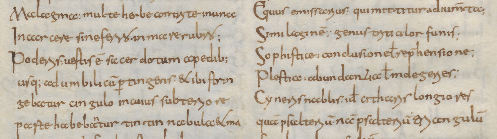
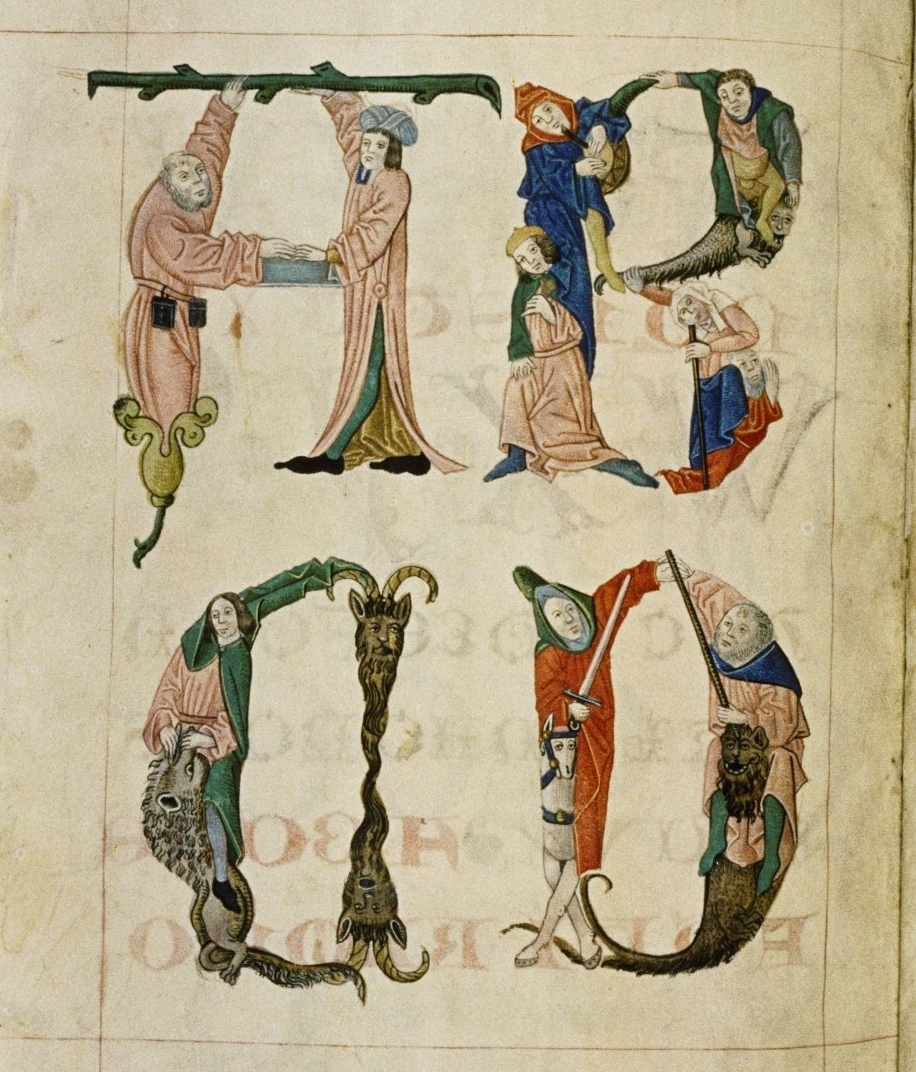
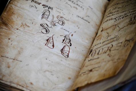
Pen trials, which are most often encountered on flyleaves in the back of manuscripts, can be quite appealing. As it happened, scribes did not just write down squiggly lines or words when testing their pens, but they even produced modest works of art. In Leiden University Library some great “artistic” specimens are encountered. In the back of BPL 111-I, for example, we find a collection of large initial letters with faces inside them (Figure 3). It includes a letter B with two monks (note the tonsures), a D with a stern-looking lady wearing a pointy hat, a bearded person in a letter S, and a duck containing a long-nosed man. This page and the facing one are filled with dozens of pen trials. The shapes of the letters and the ink colour suggests that the doodles on these pages were produced by a limited number of individuals, perhaps two or three, which is in line with what we commonly see on flyleaves that contain pen trials.

The two pages in the back of BPL 111-I are also in line with broader European traditions regarding the kind of tests they contain. We encounter single letters and words, as well as nonsensical phrases (“e,” “egi de e,” “ego panne,” “autem”). Another popular theme is also found in Figure 3: musical notation (somewhat out of focus near the top of the picture). The square notes of the Middle Ages were perfect for testing the nib, because they naturally showed how wide it was, while the short square shape also invited the scribe to execute a series of quick test strokes. Common also are the little specks visible in Figure 3: you can vaguely see them in the white zone below the initial letters. These result from tapping the quill on the parchment, probably in an attempt to adjust the nib by “tapping” it into shape.

Cambridge_Parker_LIbrary_223_p338
Figure 4. Pen trials by a high volume of individuals (Cambridge, Parker Library, MS 223, p. 338, twelfth century). Source

Scriptorium

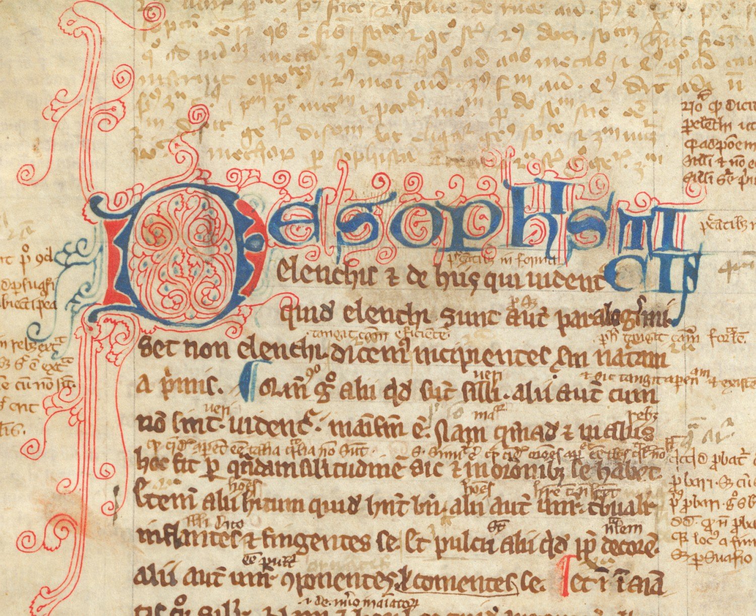
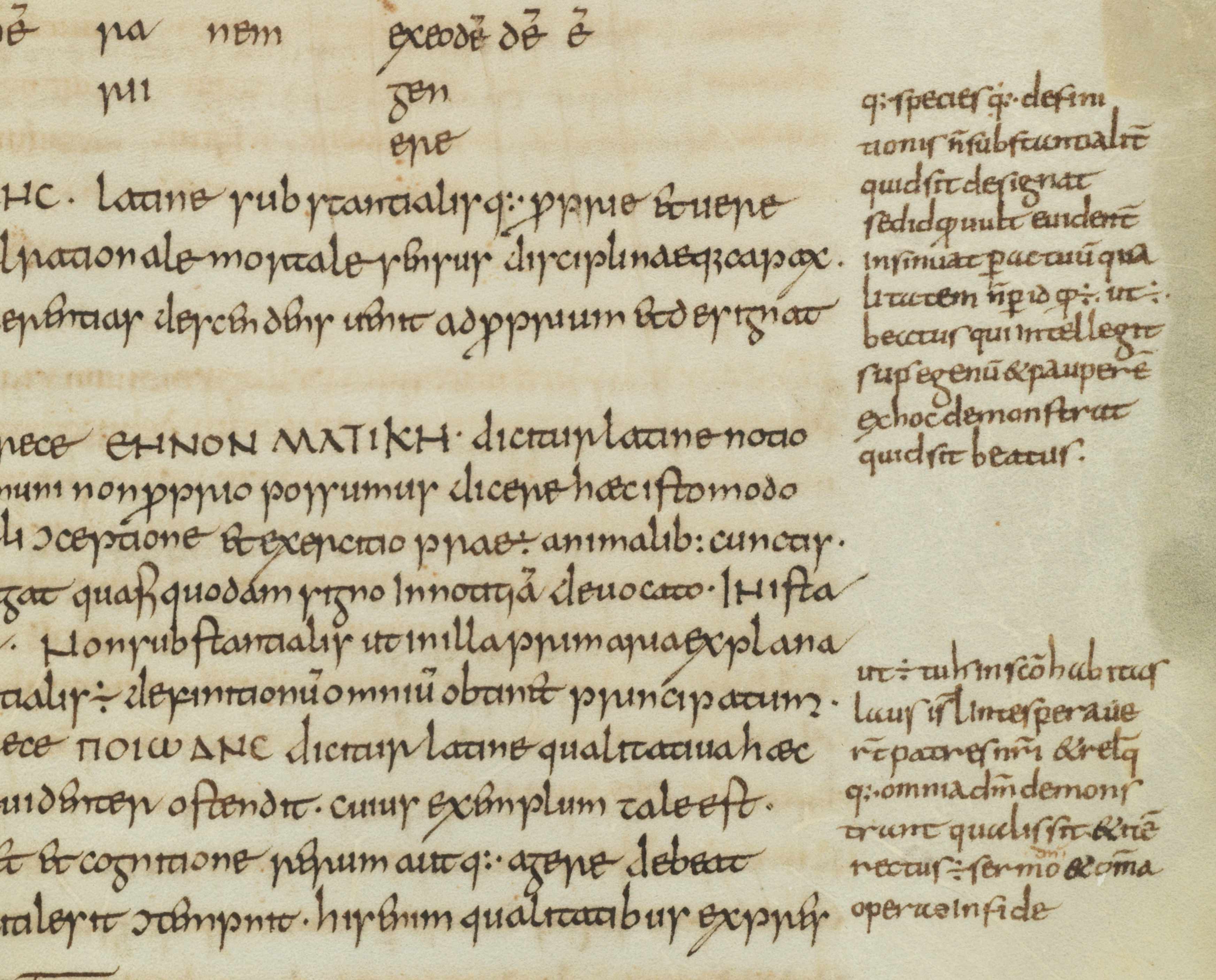
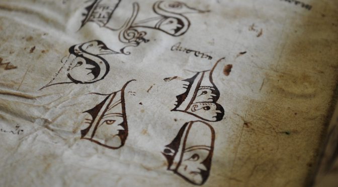
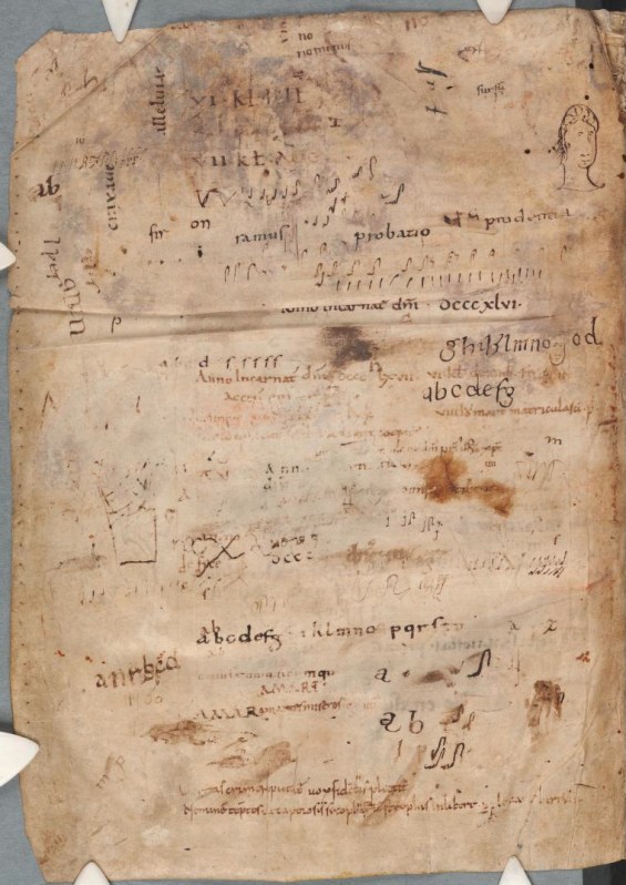
While the pen trials in Figure 3 were executed by perhaps two or three individuals, there could be far more scribes involved. Figure 4 shows a page in a ninth-century manuscript. Present in the back of the last quire, it was left blank because the text had already ended. Some three centuries later, likely in the second half of the twelfth century, the page was filled with pen trials by least fifteen scribes. We are probably looking at a group of individuals in the same scriptorium, who favoured very different “doodles” for testing their pen, from alphabets to a small portrait. And the musical notation appears as well, at various locations. A similar case where a large group of individuals share the same empty page is found in a set of manuscripts from Rochester Priory in Kent, now Oxford, Bodleian Library, MSS Bodley 340 and 342 (Figure 5). Several individuals from the early twelfth-century wrote down short passages on their flyleaves, including – with a peculiar sense of appropriateness – the phrase probatio pennae, “I test my pen” (near the top of the detail shown in Figure 5).

Oxford_Bodley 340
Figure 5. Pen trials by several twelfth-century scribes in Rochester Priory, Kent (Oxford, Bodleian Library, MS Bodley 340, f. 169v, detail).

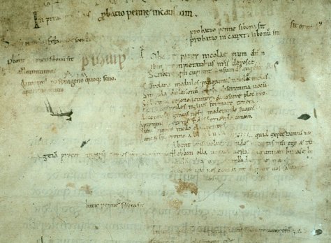
Groups of pen trials from a medieval scriptorium can be important sources of information about scribal practices and the backgrounds of scribes. Those in the back of Bodley 340 and 342, for example, show that the scriptorium of Rochester Abbey was filled with individuals who were trained across the European Continent, including in Germany, Holland and Italy (see Kwakkel, “Hidden in Plain Sight”). This verdict is based on the letter shapes of the pen trials, which reveal where their makers are from: scribes were trained to produce slightly different letter shapes all over Europe, which shows in the pen trials. By proxy, the page in Figure 5 highlights the ethnical diversity of the monks in Rochester Abbey.

Test Sheets

Sometimes one encounters truly special collections of pen trials. Leiden University Library holds a loose double-leaf filled with an unusual amount of them (Figure 6). Its existence adds significantly to our understanding of medieval pen trials. One may be inclined to think that scribes always turned to empty pages in the back of existing manuscripts and filled them pen trials. While this happened, as the previous cases show, there is also another practice at play. The Leiden sheet suggests that scribes also used loose – i.e. unbound – sheets, which likely lay on their desk. Some of these “test sheets” were repurposed and turned into flyleaves, making it look, to somebody observing the pen trials today, as if they were directly written into the book.

Figure_3_BPL_3327_22
Figure 6. Upper half of a flyleaf filled with dozens of pen trials (Leiden, Universiteitsbibliotheek, BPL 3327, 22, 15th century). Photo by the author

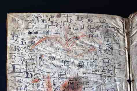
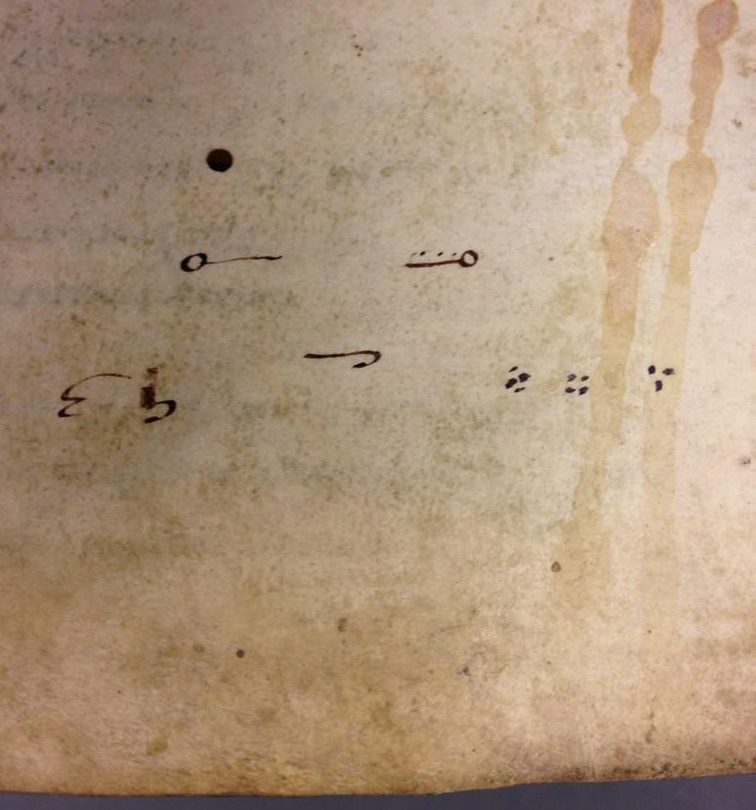
This particular test sheet was filled to the brim with several hundred pen trials: there are more than I have ever seen in one location (note that Figure 6 shows only a detail). When one looks carefully, running themes can be observed across the page, sometimes clustered in the same location. There is the large capital letter H that is frequently drawn, especially near the top of the page; and there are recurring human figures as well, such as a grumpy lady, a man with curly hair, and a few bishops. Another theme is the nota sign, the attention sign that is encountered in the margins of manuscripts: quite a few are observed under the two red arches (they look like “nt” with a curly line over top). There are as many as ten individuals at work on this sheet, which suggests this sheet, too, was used in a scriptorium.

Figure_4_PER_16
Figure 7. Fifteenth-century test sheet used as flyleaf (Leiden, Universiteitsbibliotheek, PER 16). Photo by the author

Another test sheet is seen in Figure 7. It was used by a single scribe, who used the crumbly sheet to write down letters, parts of religious verses, and non-sensicle expressions. Here the earlier purpose is clearly visible through the rough and well-used appearance of the flyleaf. It concerns a piece that was ripped off of a larger paper sheet and subsequently used for testing the pen. At a later stage it was repurposed as a flyleaf. Figures 6 and 7 show us the far ends of the spectrum of medieval test sheets: some were inhabited with words and doodles by a group of individuals, as indicated by the variations in ink color, letter shape, and nib width, while others were tools used by single scribes.

This is an expanded and modified version of a post that first appeared on Leiden Medievalists Blog.

Read more about pen-trials:

Erik Kwakkel, “Hidden in Plain Sight: Continental Scribes in Rochester Cathedral Priory, 1075-1150,” in Writing in Context: Insular Manuscript Culture, 500-1200, ed. Erik Kwakkel, Studies in Medieval and Renaissance Book Culture (Leiden: Leiden University Press, 2013), 231-61.

Me, Myself, and I: The Story of Two Medieval Selfies

Cologny_Bodmer_127_244r_detailSelfies are by no means an exclusively modern phenomenon. As shown in a previous post on medieval selfies, some decorators made self-portraits in manuscripts, showing that the practice predates print – albeit without the use of a camera. They did so to identify themselves as the creator of a miniature or historiated initial, or even to exhibit their accomplishments as businessmen, as the early-sixteenth-century commercial illustrator Nicolaus Bertschy appears to do. Other medieval examples of selfies are those by Matthew Paris, the thirteenth-century monk from St Albans, painted in the lower margin of his Historia Anglorum (see here).

That earlier blog post includes two intriguing selfies made by the same person, a monk who calls himself Rufillus. One is found in a copy of Ambrose’s Hexaemeron kept in the Bibliothèque municipale in Amiens as MS Lescalopier 30 (Figure 1). The text discusses the six days of the Creation and Rufillus displays himself inside a green – and rather confined – initial letter D at the outset of the section on the Third Day. Why he shows himself here, when the Hexaemeron is about to discuss the creation of plants and material forms, is unclear.

Amiens, BM, Lescalopier 30, fol. 29v
Figure 1. Rufillus inhabiting a letter D (Amiens, Bibliothèque municipale, Lescalopier 30, fol. 29v, late 12th century). Source

His other selfie is encountered in Cod. Bodmer 127, a collection of saints’ lives kept in the Fondation Martin Bodmer in the Swiss city of Cologny (The Passionary of Weissenau, Figure 2). Here, Rufillus created a more roomy environment, painting himself inside a very large letter R at the outset of the passion of St Martin of Tours (d. 397). Selfies are not frequently encountered in medieval manuscripts, which makes the Rufillus case quite special, given that it entails not one but two “snapshots” of the same person. This post explores what we can learn from the two self-portraits of a monk who is a bit of a showoff – and who is not shy about using the selfie-stick.

Cologny, Fondation Martin Bodmer, MS 127, fol. 244r
Figure 2. Rufillus inside a letter R (Cologny, Fondation Martin Bodmer, Cod. Bodmer 127, fol. 244r, late 12th century). Source

Rufillus the Illuminator

Helpfully, Rufillus identifies himself by providing his name: in the Cologny manuscript he painted it in white above his brush (accompanied by “Fr.” for frater, monk), while in the crowded Amiens initial the name is written right above the decorative letter with pen and ink. Based on the origins of the two manuscripts, scholars place Rufillus in the late-twelfth century Premonstratensian abbey of Weissenau near Ravensburg in the South of Germany (get up to speed on Rufillus in this article by Solange Michon; a useful enumeration of manuscripts from Weissenau is found here). In secondary literature he is commonly regarded (and explicitly labeled as) an illuminator (see for example here and here). Judging from the decoration in the two manuscripts, which include numerous decorated initials and even some full-page miniatures, he was quite accomplished. In his article Michon shows, by highlighting iconographical – design – parallels, that it is the same person who produced the decoration in both manuscripts.

The Cologny manuscript shows the artisan “in the moment,” hard at work decorating the manuscript (Figure 2). The scene is unusually rich in detail and shows us, among other things, what tools were used by medieval illuminators. In one hand Rufillus is holding a bowl filled with red paint; in the other a brush. Cow horns filled with all kind of paints are placed behind him, while a mortar and pestle are placed nearby for preparing additional pigments. In what is a familiar pose for painters today, his right hand is leaning on his left for stability. That hand is in turn supported by a stick placed on the ground – a selfie-stick! With a healthy dose of irony, Rufillus allows us to observe him as he is painting the initial he is inhabiting. In a rather unusual twist, we witness both the artist at work and the result of his toils. By showing himself applying red paint on the letter R he invites the beholder in his atelier, which is a powerful gesture.

Amiens_Lescalopier_30_detail
Figure 3. Rufillus’ name in Amiens, Bibliothèque municipale, Lescalopier 30, fol. 29v. Source

Rufillus the Scribe

While the common designation given to Rufillus by scholars is illuminator or decorator, the second selfie suggests that he was also a scribe. After all, in as much detail as he presents himself as an illuminator in the Cologny manuscript, he shows himself as a scribe in the Amiens codex (Figure 1). In this depiction, too, the paraphernalia of the trade are clearly identifiable, this time the scribe’s: a sheet of parchment, a reed, and a knife to hold down the parchment as well as to cut the nib of the pen. While Rufillus placed himself on a bench in the Cologny painting, the Amiens scene shows him seated in a scribal chair, one that supports his behind as well as the parchment sheet he is writing on. It seems appropriate, in this light, that Rufillus signed his name with pen rather than brush: he stayed in his role. The key observation to make here, however, is that our monk appears to have been active both as illuminator and scribe in the scriptorium of Weissenau (more about such a combination here).

The name “rufillus” written above the Amiens painting provides additional information. Let’s look at it again, this time from up close (Figure 3). The ink used for his name has a brown colour, deviating from the deep-dark black ink of the main text. In other words, main text and name were copied at different moments. The same is suggested by the observation that the pen used for writing the name was much thinner. Moreover, the nib used for the name reveals an imperfection not seen in the main text: the flawed nib produced a thin white line in the central stroke of the letter l. This is obviously a later cut or even a different pen. These observations make sense. In the production of a manuscript the copying of the text came first, followed by the execution of the decoration.

Evidently, Rufillus signed his name when he completed the painting, not while he was copying. This is telling, I think. Rufillus could have identified himself better and more explicitly through a scribal colophon, which is where copyists provide details about themselves (see this post). By contrast, he is far less traditional and added his presence not with pen but with brush. By doing so he inserted the motif of the scribe into the visual narrative of the book, even though its topic did not call for it. This somewhat inappropriate behaviour is amplified by the fact that he then identified this scribe as himself. Through his action, Rufillus squeezed himself into Ambrose’s text and climbed onto the podium of the Church Father. He purposefully attracted attention to his person.

Rufillus_StGall127_AmiensLescalopier30
Figure 4. The monk Rufillus in two historiated initials (Amiens, Bibliothèque municipale, Lescalopier 30, fol. 29v, left, and Cologny, Fondation Martin Bodmer, Cod. Bodmer 127, fol. 244r, right).

Rufillus the Person

Each of the two manuscripts shows that Rufillus is not lacking in confidence and that he does not mind breaking with the monastic virtue of modesty. It is in the combination of the two selfies, however, that we learn things we otherwise would not have known about him. For example, with Amiens alone we could not be sure that Rufillus produced the decoration in the manuscript as well. After all, the decorator could have produced a portrait of his colleague the scribe, in praise of his activities, or even a generic picture of a scribe at work. Had Cologny been by itself, there would not have been a reason to infer that Rufillus was also involved in scribal activities. Where the two selfies really become quite telling, however, is in the realism they entail. There are striking commonalities that suggest the decorator aimed to provide a realistic depiction of himself, which fits the bill given his pronounced self-promotion.

Striking similarities in his appearance are for example the pronounced eye lids, the shape and colour of his hair (bright red and with recesses), and the sharp lines across the cheeks, starting next to the nose and giving his face a thin appearance (Figure 4). With only one selfie the red hair would have been striking, but the repeated occurrence suggests that Rufillus really was a red-headed monk. This is, of course, why our scribe-illuminator calls himself Rufillus, which is derived from the Latin rūfus, meaning “red-haired” (see also here). In other words, our scribe-illuminator is using a pseudonym, one derived from a pronounced feature in his appearance – his hair. For a person who should strive to be modest and for whom the monastic community ought to be more important than the individual in it, relating one’s identity to a bodily feature seems peculiar. Yet, in light of what we have learned about Rufillus, it is no surprise.

Bloomington_LillyLibrary_Ricketts20
Figure 5. Peter Lombard, bishop of Paris, shown as scribe (Bloomington, Lilly Library, Ricketts 20, fol. 1v, c. 1200-15). Source

Rufillus the Old Man?

A third manuscript exists that was copied and illuminated by our anonymous red-headed monk, although it is not usually mentioned in discussions about Rufillus and his self-portraits. The codex in question is Bloomington, Indiana University, Ricketts 20 (Peter Lombard, Commentary on the Psalms), which is assumed to have been produced in c. 1200-15, a few decades after Amiens and Cologny, and which was part of the library of Weissenau Abbey (Figure 5). In the description of the manuscript in his Gilding the Lilly (p. 60), Christopher de Hamel identified the scribe and illuminator as Rufillus (his assessment is quoted in this manuscript description). One can see from the handwriting that Rufillus was older when he made the Bloomington manuscript: his firm hand, with which he once produced such sharp and disciplined script, appears shaky and weak.

Bloomington_Lilly_Ricketts 20
Figure 6. Bloomington, Lilly Library, Ricketts 20, fol. 45v (c. 1200). Source

Another initial letter in the same manuscript provides a bit of history about its origins (Figure 6). A person is shown holding an open book in which the following is written: “Rodolfus plebanus de Lindaugia. q[ui] nobis dedit hu[n]c libru[m],” “Rudolf, parish priest of Lindau, who gave us this book” (source, with minor correction in the transcription). The painting shows the person who “gave” the manuscript to Weissenau abbey. Because the maker of the book, our Rufillus, is commonly regarded as a monk of Weissenau, this inscription would suggest that Rudolf paid for the materials, which is a bit of stretch but possible. Had our anonymous monk not been so firmly tied to Weissenau abbey in secondary literature, this inscription could indicate that Rufillus and Rudolf were one and the same person: he first made the manuscript, then donated it to the abbey. If this speculative inference were true, it would place our red-headed scribe-illuminator outside the abbey of Weissenau – and turn the letter O in Figure 6 into a third selfie, showing Rufillus as an old man.

Rufillus and the Weissenau scriptorium:

  • Jonathan James Graham Alexander, Medieval Illuminators and Their Methods of Work (New Haven & London: Yale University Press, 1992), pp. 16-17.
  • Walter Berschin, “Rufillus von Weissenau (um 1200) in seiner Buchmalerwerkstatt,” in: Walter Berschin (ed.), Mittelateinische Studien II (Heidelberg: Mattes Verlag, 2010), pp. 353-56.
  • Christopher de Hamel, Gilding the Lilly: A Hundred Medieval and Illuminated Manuscripts in the Lilly Library (Bloomington: The Lilly Library, 2010), p. 60.
  • Solange Michon, “Un moine enluminateur de XIIe siècle: Frère Rufillus de Weissenau,” Zeitschrift für schweizerische Archäologie und Kunstgeschichte 44 (1987), 1-7.
  • Solange Michon, Le Grand Passionnaire enluminé de Weissenau et son scriptorium autour de 1200 (Genève: Slatkine, 1990).
  • Elke Wenzel, Die mittelalterliche Bibliothek der Abtei Weißenau (Frankfurt am Main: Peter Lang, 1998).

Selfies and self-portraits:

Cracking Codes in Medieval Books

Reading a medieval book may not seem so different from reading a  volume from your own bookshelf: just pick it up, flip to the first page, and start reading. However, apart from the fact that you cannot really hold the average medieval book in your hand – a single volume often weighs as much as a whole pile of today’s books – there is also a problem that occurs when you actually start to read. It turns out you need to decode quite a bit. The first round of decoding happens when your eyes meet the page. The letters on it are shaped very differently from what our brains usually process, so the CPU in our head starts to spin like mad, perhaps even encouraging us to give up. See what happens when you read this snippet from the famous Leiden Glossary (Fig. 1). When you’re done with that, try Thomas Aquinas’ autograph, written in what is appropriately called a ‘littera inintelligibilis’ – indecipherable script (Fig. 2).

Leiden, Universiteitsbibliotheek, VLQ MS 69, fol. 24v, detail
Fig. 1 – Leiden, Universiteitsbibliotheek, VLQ MS 69, fol. 24v, detail (late 8th century) – Source: photo UBL
Vatican Library, Vat. Lat. 9850, autograph Aquinas, 1260-1265
Fig. 2 – Vatican Library, Vat. Lat. 9850, autograph Aquinas, 1260-1265 – Source

The paleographer Lowe defined the first of these as a Pre-caroline Allemannic minuscule, which means it dates from before the establishment of Caroline Minuscule, which came around shortly before c. 800. It is relatively easy to decode the latter with our modern brains. This is because early printers in Italy used Caroline as a model for the Roman typefaces, which ultimately became our Times New Roman. Because we read a version of Caroline on our computer screen every day, we can sort of make sense of a medieval page from the ninth century (Fig. 3).

Leiden, Universiteitsbibliotheek, VLF MS 30, fol. 22v (9th century)
Fig. 3 – Leiden, Universiteitsbibliotheek, VLF MS 30, fol. 22v (9th century) – Source: photo UBL

However, even when you are able to read such easy ‘typefaces’ from before the invention of printing, for example because you happen to be a medieval book historian, there is a second coding problem to overcome, which is much trickier: letters and words are frequently abbreviated with symbols. In fact, sometimes the text of a full page or even an entire book is written in code. Like any cypher, you can only read it if you know the key.

Abbreviations
Decoding abbreviated letters and short common words is not rocket science, nor will it have been for medieval readers. Some of these abbreviations are actually still in use today, like the ampersand in the first line of Fig. 3, which starts with ‘Ignibus & ignis’. The ampersand abbreviates the word et (and), from which it, in fact, evolved (more on the genesis here). Less frequent words could also be abbreviated, but this practice was tricky in that the medieval scribe had to judge whether the book’s reader would understand the abbreviations – otherwise the text could not be decoded. Students in the scholastic environment of the emerging universities were masters in coding and decoding words (Fig. 4).

London, British Library, Arundel MS 383 (1250-1300)
Fig. 4 – London, British Library, Arundel MS 383 (1250-1300) – Source

The students who filled this page with notes abbreviated the words like there was no tomorrow. In fact, in the top segment (in the lighter ink) every single word is shortened with the help of lines, half circles, loops, dots and whatnot. It makes sense that students did this: the remarks are for personal use only, so you could do what you wanted. Moreover, shortening text in this fashion saved time and space. Coded words created room for more coded words.

Tironian notes
In the Middle Ages a peculiar abbreviation language existed, which even an experienced reader at the time was not necessarily able to decipher: Tironian notes. This medieval system of shorthand made use of several thousand symbols, which abbreviated entire words. The language is rooted in Antiquity. The poet Plutarch tells us that Cicero had trained scribes to take down notes at a fast pace, including his servant Tiro – hence the name.

Paris, BnF, lat. MS 11553 (9th century)
Fig. 5 – Paris, BnF, lat. MS 11553 (9th century) – Source

In medieval times Tironian notes were used by scholars trained at the highest level (see this excellent blog post). During the ninth century, the heyday of the ‘coding’ symbols, scholars used them to add comments to a text or to criticise them, much like the students in the university textbook in Fig. 4, and for the same reason: to save space and to increase speed. Sometimes such marginal additions are substantial, like those found in a ninth-century Bible kept in Paris (Fig. 5: right margin and in between lines).

Very rarely does one encounter a full text or manuscript copied out in Tironian notes. The ones I know are all filled with the Psalms, such as Paris, Bibliothèque national de France, lat. MS 190 and lat. MS 13160, both from the ninth century (Fig. 6). What is really great about these coded pages is that the first Tironian note of each chapter is executed in the same style as a regular decorated letter would be: enlarged and painted (see also the detail all the way at the top of this post). The result is a big and beautiful nonsensical shape – unless you know what it means.

Paris, BnF, lat. MS 190 (9th century)
Fig. 6 – Paris, BnF, lat. MS 190 (9th century) – Source

At first sight it seems an odd practice to write an entire book out in code, which could only be deciphered by scholars who had enjoyed the same high level of training as the scribe. However, perhaps these peculiar books were used to train individuals in the notation system? Monks knew the Psalms by heart, making them the perfect tool to learn the strange language of Tiro. The Latin titles would prompt a memorised text, after which perhaps the symbols would fall into place. It is striking, in this light, that the Psalms in MS 190 are preceded by a kind of dictionary to look up the meaning of the symbols – as you would want to do when learning a new language. Several of these explanatory texts survive, including in other Paris manuscripts (such as lat. 7493lat. 8777lat. 8778 and lat. 8780).

Leiden, Universiteitsbibliotheek, VLO MS 84 (9th century)
Fig. 7 – Leiden, Universiteitsbibliotheek, VLO MS 84 (9th century) – Photo EK

A similar explanatory text is found in Leiden (Fig. 7). The first entries on this page read liber, libellus and librarius (book, booklet and librarian). The symbol for the first looks like a bent line with a dot, in the second the dot is replaced by a comma, while the third shows both dot and comma – a librarian, after all, looks after both books and booklets. Then follow related words, such as parchment (pergamena and, less common, pitacium), page and sheets (pagina, carta, cartula). As this segment shows, the text is not so much a dictionary as a collection of thematic word lists.

Uncrackable code
While not everybody in medieval times would be able to read Tironian notes, probably many scholars could decipher it. However, there is a famous coded book that no one could read but its producer: the Voynich manuscript, which is written in an unknown alphabet (Fig. 8). There is considerable discussion about many aspects of this manuscript, including its precise date (see here) and the meaning  of the text it holds. The latter is perhaps the most striking aspect of the code in which the text is written: no one has been able to crack it.

Yale, Beinecke Library, MS 408 (15th century)
Fig. 8 – Yale, Beinecke Library, MS 408 (15th century) – Source

The manuscript has fascinated scholars for a long time. Until 2013, when news outlets claimed the book had a genuine message (see here), it was not even clear if there was meaning in the madness. Finally, in February 2014 an English professor decoded ten words through the proper names of plants (see here). As intriguing as the book is, from a book-historical point of view it is far less interesting than Tironian notes. After all, while the Voynich manuscript appears to be coded in a highly personal way, placing the book in a relatively isolated position, Tironian notes provide an in-depth look into the fascinating world of medieval scholars. To hear their voices, all you need to do is crack the code.

The Medieval Origins of the Modern Footnote

Last week I posted a blog on note-taking in medieval times. It showed how individuals who wanted to jot down a note dealt with the absence of notepads and scrap paper. As in our modern day, the urge to write down a note in medieval times often came while reading a book. And so the margins of the page grew into a prime location where the reader could vent his objections or – albeit more rarely – express his or her approval.

The present post deals with the logistics behind this “window dressing”: it shows how a reader with many important things to say kept track of his marginal comments. Particularly, it deals with a serious problem that came with adding notes to the page: how to connect a particular comment, placed among a dozen others, to the specific text passage it refers to. The clever system that was created for this purpose lives on as our modern footnote.

Disconnected

Bern, Burgerbibliothek, MS 234 (10th century)
Fig. 1 – Bern, Burgerbibliothek, MS 234, fol. 11r (9th century) – Source

The crux of our footnote system is the presence of a symbol that connects the note to the relevant location in the text. Curiously, in medieval times it was quite common not to have such connections in place, perhaps especially in the earlier period (Fig. 1). When few remarks were added to the page, a reader could deduce with relative ease to which passage a marginal note referred. It helped if a text was in popular use or known by heart, as many medieval works were. In such cases the note made sense instantly because the reader was familiar with the referenced literary context. Moreover, as long as notes were few and short, a reader could simply insert them – interlinearly – over the relevant word or passage (Fig. 2).

Alençon, Bibliothèque municipale, MS 12, fol. 21v (9th century)
Fig. 2 – Alençon, Bibliothèque municipale, MS 12, fol. 21v (10th century)
Cologny, Fondation Martin Bodmer, Cod. 89, fol. 59v
Fig. 3 – Cologny, Fondation Martin Bodmer, Cod. 89, fol. 59v (Horace, 12th century) – Source

Cleverly, in this system the very position of the remark identified the word to which it referred. However, as the number and size of such comments increased, it became impossible to place them between the lines. The great blank space provided by the margins was now drafted into service. It is here that the absence of a proper reference system was felt. As the marginal body of remarks and critique began to accumulate, the page became a real messy place, a labyrinth in which it became impossible for readers to find specific pieces of information (Fig. 3). In came the footnote.

Dots and lines
Connecting a marginal remark to the relevant passage in the text was usually done with a duplicated symbol, called a signe de renvoi: one was placed in front of the marginal note, the other near the word or passage that the remark commented upon. While it is hard to deduce a clear pattern of development, it appears that in the early stages of using such footnotes scribes and readers resorted to plain symbols rather than letters or numbers. These symbols varied considerably in shape and sophistication. At the high end of the spectrum we encounter complex symbols, such as the reversed letter E seen in Fig. 4 (magnified).

St Gall, Stiftsbibliothek, MS 4, fol. 170r (10th century)
Fig. 4 – St Gall, Stiftsbibliothek, MS 4, p. 170 (820-840) – Source

More popular, however, were less complex symbols, which could be added to the page much quicker. Dots and lines are particularly common ingredients of such footnote symbols. Interestingly, their first appearance (it seems to me) is not as a connector of comment and text, but as an insertion mark that added an omitted line into the text. In Fig. 5 such an omitted line is placed in the margin accompanied by a symbol made up of a line and a dot. It is repeated in the text itself, near the location where the line belonged. This omission mark may well be the origins of the footnote system that would emerge over the course of the Middle Ages – and that we still use today, almost unchanged.

Einsiedeln, Stiftsbibliothek, MS 172, p. 20 (9th century)
Fig. 5 – Einsiedeln, Stiftsbibliothek, MS 172, p. 20 (9th century) – Source

Scribes used different versions of the line-and-dot symbol. In fact, they had to if they were to produce unique ties between comment and text. When dots were used, their number would increase as more notes were added. Alternatively, the position of the dots could be varied, so that they formed different – unique! – patterns.

Leiden, University Library, VLF MS 69, flyleaf (12th century) - Photo EK
Fig. 6 – Leiden, University Library, VLF MS 69, flyleaf (12th century) – Photo EK

Customising the line-type footnote, scribes usually distinguished one from the other by added circles, which were attached at different locations and in varying numbers. In what is a most unusual find, in a Leiden manuscript we see a scribe practicing his dot and line footnote symbols (Fig. 6). It shows variations in the number and pattern of dots, as well as in the treatments of lines.

Letters
Closest to our modern system of footnotes, finally, is the use of letters to tie a marginal remark to its proper location in the text. In some manuscripts we see the entire alphabet running down the margin. Fig. 7 shows a page from a manuscript with works by Horace (left column) to which a high volume of notes were added (right column), all of which are connected to specific passages with the letters A to Z.

Leeuwarden, Tresoar, 45HS, fol. 45r
Fig. 7 – Leeuwarden, Tresoar, 45HS, fol. 45r (c. 1100) – Photo EK

In the eleventh and twelfth centuries such classical texts were most commonly used in a classroom setting. The instructors who used the books, typically in a monastic school, had many things to explain to their students, as the notes show. It made sense to organise such added information in a clear manner, and the alphabet came in handy in this respect. Some pages in this particular book contain more footnotes than there are letters in the alphabet, which challenged the system. In such cases the user added into the mix symbols made from lines and dots.

The last word: numerals
So where are the medieval footnotes that make use of numbers, like we do today? Curiously, I have not been able to find them, which kind of makes sense. Roman numerals would not be suitable for the task. Placed out of context, as a symbol initiating a segment of text (i.e. the marginal comment) they would easily be mistaken for a letter – which they are, graphically speaking. Moreover, a high Roman numeral would quickly take in a lot of space – not what you want in a note symbol. Arabic numerals were far were less popular than Roman numerals, even in the later Middle Ages. Readers may not have felt comfortable enough with these new numbers to use them in the margin. In fact, some scribes in the later Middle Ages are still confused by the zero. The leap from alphabet to numerals – from the medieval to our modern system – appears to have been taken in the age of print.

Medieval Spam: The Oldest Advertisements for Books

Advertisements are all around us. As I am writing this post, waiting in an airport lobby, I can only escape them if I close my eyes and cover my ears. Marketing and advertising are practices dating back to medieval times and we encounter them even in the world of books. While rare, surviving book advertisements are fascinating because they highlight what salesmen thought potential buyers deemed important about their products. Advertisements form, in an unusual way, a unique keyhole view into the hearts and minds of readers that lived a thousand years ago. Fascinatingly, surviving book advertisements come in very recognisable – modern – formats: some are window displays, others are spam in books, and yet others are flyers posted in public places.

Window displays

The Hague, Royal Library, 76 D 45 (advertisement sheet, c. 1450)
Fig. 1 – The Hague, Royal Library, 76 D 45 (advertisement sheet, c. 1450) – Source

While still rare, the most common surviving book advertisement from medieval times is the so-called ‘advertisement sheet’ from medieval writing masters (Fig. 1). Individuals who could write had a valuable gift, both intellectually and financially: they were able to duplicate any piece of writing, from short letters to full books; and they could do so for money. During the last three centuries of the Middle Ages (1200-1500) the demand for books rapidly increased, in part because of their cheaper production and the growing numbers of readers. Increased demand had a major impact on supply: urban professionals took over book production from the abbeys. They started to charge money, make profit, and build the commercial book market we still have today (more about such commercial activities in this blog post).

As more people became involved in commercial book production, competition among artisans increased. Starting in the thirteenth century, the book world became a market place where producers had to show what they had to offer – and more so than their nearby colleagues (Fig. 2). It is in this context that we are to understand the advertisement sheet in Fig. 1, a handful of which survive from the Middle Ages. Encompassing over ten different scripts, each one more fancy than the next, it displays the expertise of the artisan to potential customers. The sheet was made by one Herman Strepel, who worked around the middle of the fifteenth century, perhaps in the German city of Münster.

Paris, BnF, fr. 25526, fol. 77v (1325-1350)
Fig. 2 – Paris, BnF, fr. 25526, fol. 77v (1325-50): commercial shop with scribe and illuminator – Source

The sheet in Fig. 1 is a clever marketing tool in other ways as well. The samples are accompanied by their proper names, written in attractive letters of shiny gold. This vocabulary allowed the clientele to enter into a professional conversation with the scribe – using such term as ‘fracta’, ‘rotunda’ and ‘modus copiistarum’. The back of the advertisement sheet is blank, which means it was probably displayed in clear sight of potential customers, perhaps in a window or against a wall. A specimen from a German scribe says, ‘If you want to learn to write, do come in.’ It not only shows that artisans extended their services well beyond merely producing books (they were professional trainers as well), but it also that such sheets were put on display right outside the door.

Spam in books

Giesen, Universitätsbibliothek, 945 (advertisement in book)
Fig. 3 – Giesen, Universitätsbibliothek, 945 (advertisement at end of book)

The best way to show off one’s abilities as a book producer was through the book itself: every page is an appraisal of the artisan’s qualities. Some scribes directly addressed potential customers on the last page of a book, where they explicitly referred to the fine quality of the manuscript – and by proxy their abilities. An illuminating case concerns a scribe who calls himself Herneis. On the last page of a book he had copied for a client he wrote the following note: ‘If someone else would like such a handsome book, come and look me up in Paris, across the Notre Dame cathedral’ (Fig. 3). The message ‘lured’ the beholder to the book street of medieval Paris, right opposite the cathedral. It’s a great example of medieval spam.

A slightly less blatant case of spam is from fifteenth-century Holland, the most western province of the Low Countries. Six Middle-Dutch manuscripts survive from an anonymous commercial scribe operating there. They all contain the same text, a History Bible, which suggests that the individual specialized in one particular genre. The surviving copies show variation in layout, writing support (paper/parchment), the inclusion of miniatures, and in the quality of the script. These differences most likely reflect the wishes of the patrons that were served. Interestingly, one of the manuscripts (Leiden, University Library, LTK 231) contains an intriguing message: ‘If you like this copy of the Old Testament, I can also produce a book with the New Testament for you.’ This tempting offer has the feel of iTunes’ ‘Complete my album’ or, more appropriately, the suggestions Amazon makes for further reading.

Flyers

Oxford, Bodleian Library, Arch. G. e. 37
Fig. 4 – Oxford, Bodleian Library, Arch. G. e. 37 (c. 1477) – Source

The rarest kind of medieval advertisement is also the smallest. It measures only 80×146 mm, a little bigger than a credit card. As with historical artifacts in general, the smaller a bookish object is, the slimmer the chances that it survived. The small strip of paper seen in Fig. 4 is an advertisement that promoted William Caxton’s Sarum Pie (‘Ordinale ad usum Sarum’), a religious book he printed in his Westminster shop in 1477 (more here and here). It is a very small flyer that was to be posted in the city, given the Latin closing remark ‘Supplico stet cedula’ (please leave this [strip] posted). It is the earliest printed advertisement in English and it has a lot to tell.

The printed strip shows interesting parallels with the previous two items. As with the spam message of Herneis, Caxton tells customers where to go, which is the bare minimum that an advertisement has to do: ‘late hym come to Westmonester in to the Almonesrye at the reed pole’. Moreover, it stresses that the book has no typos (it is ‘well and truly correct’) and can be bought cheaply (‘and he shal have them good chepe’). Just like the advertisement sheet of Herman Strepel, Caxton’s piece of paper comes with a great marketing trick: it states that the new publication is ‘emprynted after the forme of this present lettre’ (is printed in the same typeface as this very note). In other words, the reader can tell with his own eyes that it is worthwhile heading over to Caxton’s shop.

Marketing tricks, sending out spam, and using colourful letters to attract clients: medieval advertisements are as effective today as they were 600 years ago.

Note – Want to know more? Check out this lecture I gave on commercial book production.

Medieval Super Models

This post is devoted to a particularly attractive and rare kind of medieval manuscript: the model book. A feast to the eye, the object is filled with drawings and paintings that were meant to show scribes and illuminators how to decorate letters, paint initials, or add large segments of decoration to the page. Within this tradition, two types of model books can be distinguished. Some functioned as instruction manuals. In such books, the drawings might be accompanied by a narrative or explanation that instructs the artisan how to proceed, usually in a step-by-step process. Other model books appear to have merely functioned  as  a source of inspiration: they present a wide array of shapes and drawings from which the artisan could take his pick.

The level of sophistication among surviving model books varies considerably. On the lower end of the spectrum there are pattern books that merely show how to make enlarged letters with some minor flourishing. On the higher end, by contrast, there are copies with high-quality stand-alone designs and sophisticated historiated initials inhabited by figures and scenes. Evidently the requirements of the artisans varied; and by proxy, so did the taste of medieval readers. It is this variation that makes model books so fascinating, both as physical objects and as cultural artifacts. This blog illuminates the breadth of the genre – and shows off the attractiveness of these medieval super models.

Plainly decorated letters

Yale, Beinecke Library, MS 439, fols. 30v-31r (1510-1517)
Fig. 1 – Yale, Beinecke Library, MS 439, fols. 30v-31r (1510-1517)

To start at the lower end of the spectrum, some model books merely showed scribes how to execute a certain script or how to draw plain enlarged capitals – the most basic kind of decoration. The book opening seen in Fig. 1 is from Gregorius Bock’s Scribal Pattern Book, which provides instruction on both fronts (more about the manuscript here). Produced in 1510-1517, the first part of the small parchment book contains a series of alphabets in different scripts, some of which are clearly influenced by print typefaces. The second part contains decorative initials arranged in alphabetical order. In the introduction to his manual, Gregorius adds a dedication to his cousin Heinrich Lercher Wyss of Stuttgart, who was scribe to the Duke of Württemberg. The arrangement of the material shows how Heinrich likely used the book: he would thumb through its pages until he had reached either an alphabet or capital letter to his liking (more about the context here).

Cambridge, Fitzwilliam Museum, MS 83-1972 (c. 1175)
Fig. 2 – Cambridge, Fitzwilliam Museum, MS 83-1972 (c. 1150-1175)

While Brock’s letters are a pleasure to look at, especially for the book historian, it was not exactly rocket science. More complex – but still relatively plain – are the models provided by a much older pattern book in the Fitzwilliam Museum in Cambridge (Fig. 2; more here). This appears to be the oldest surviving pattern book for initials: it dates from c. 1150 and was produced and used in a Tuscan workshop. The choice is much more limited than in the previous example: the Cambridge copy does not provide multiple alphabets, nor does it present a wide range of initials (in fact, only about twenty are present). Interestingly, some manuscripts survive in which we encounter decorated letters that could well be modelled from this or a similar model book (like British Library, Harley MS 7183).

Elaborately decorated letters

London, British Library, Add. MS 8887 (15th century)
Fig. 3 – Oxford, Bodleian Library, Ashmole 1504 (1520-30) – Source

On the more upscale end of things is the model book known as the Macclesfield Alphabet Book. It was made and used in fifteenth-century England, apparently for the transmission of ideas to decorators or their assistants (full digital copy here, information podcast here). The artisans were offered quite a lot of choice, given that we encounter no less than fourteen different alphabets on its pages. What makes this book so special, however, is their quality and the manner in which the letters are designed: their shapes are produced by human figures. As in other modelbooks that include letters made out of people (Fig. 3), the figures are shown in most uncomfortable positions, as if doing yoga exercises.

A similar subject matter is encountered in the alphabet book of the Italian artist Giovannino de Grassi (Fig. 4 and image at the very top). This book was created at the Visconti court and features both initial letters and stand-alone drawings. The Visconti’s were known as important patrons of the arts and so it makes sense that we see their generosity extend into the world of book production. Giovannino was known for depicting exotic animals in their natural habitat and this book features such images as well. His pages provided models for other artists who wished to replicate his realistic depictions.

Bergamo, Biblioteca Civica, MS Cassaf. 1.21 (14th century)
Fig. 4 – Bergamo, Biblioteca Civica, MS Cassaf. 1.21 (14th century) – source

Marginal decoration
Even more sophisticated are model books that show how to create elaborate decoration that runs in the margin along the length of the page. These border decorations, with their curly leaves and unexpected turns, could be tricky to produce. The so-called Göttingen Model Book, made around 1450 (Fig. 5, left), provides a solution to this problem. Its pages not only show, step by step, how to build a 3D leaf pattern, they also present detailed instructions like the following:

The foliage one shall first draw with a lead or a point. Then one shall outline the foliage with a pen and with very thin ink or with thin black color. Then one shall polish the foliage with a tooth, so that the color can be applied smoothly, but not too firmly. Then one shall paint it with the colors, one side right and the other side left or reversed, with a brush, namely light red and green. […] (Source of transcription)

Göttingen, Universitätsbibliothek, Uffenb. MS 51 (left) and Gutenberg Bible (right)
Fig. 5 – Göttingen, Universitätsbibliothek, Uffenb. MS 51 (left) and the same decoration executed in an actual book, a  Gutenberg Bible (right)

The drawings and narrative clearly complement one another. From time to time the instructions mention something like “as it is shown here” or “as the image shows”. A model book can hardly be clearer than this: while the alphabet books shown above were more or less meant to simply inspire the artist, the Göttingen book really takes the artist by the hand and guides him through each step of the production process. The instructions apparently worked well, as is shown by a surviving Gutenburg Bible that contains these very leafy borders (see Fig. 5, right, and more here).

The final point
Models are crucial in any learning process. Observing how something is done helps you acquire a skill you lack as much as it encourages you to develop further those you already have. Moreover, there is an additional use to these pattern books that has not yet been mentioned: the beautiful letters and shapes could also be browsed by readers looking for a good image for their newly acquired book. Patrons visiting artisans’ shops could well have been given these objects to find out what the book-maker was capable of providing. Given its many uses, it is hardly surprising that the tradition shown in this blog is also encountered in other cultures, including Byzantine and Arabic book production.

One particularly unusual Arabic specimen deserves to make the final point of this post. The fragment shown in Fig. 6 presented Arabic decorators with models of scenes from the New Testament (more here). It figures that the artisans, used to decorating the Quran, needed a little inspiration when it came to the Bible. This specimen is also interesting because it presents a type of instruction not seen in Western copies, as far as I know: some of the figures have been outlined by tiny holes, meaning that the sheet could be used as “tracing paper” (click the image to see this closer). While this ultimate instruction method took all potential flaws and creativity out of the modelling process, it allowed decorators with lesser talents to produce something beautiful.

Yale, Beinecke Library, MS 553 (1400-1700)
Fig. 6 – Yale, Beinecke Library, MS 553 (1400-1700)


Post-scriptum 16 September, 2014 –  I wish to thank Giovanni Scorcioni (@FacsimileFinder) for providing the Hi-Res image in Fig. 4.

Post-scriptum 19 September, 2014 – Mari-Liisa Varila (@mlvarila) alerted me to a 17th-century equivalent to the Arabic “tracing paper” specimen (here you’ll find more information). More about this technique, which is called pouncing, here.

Strange Medieval Books

Written by hand, medieval manuscripts are very different from printed books, which started to appear after Gutenberg’s mid-fifteenth-century invention of moving type. One difference in particular is important for our understanding of manuscripts. While printed books were produced in batches of a thousand or more, handwritten copies were made one at the time. In fact, medieval books, especially those made commercially, came to be after a detailed conversation between scribe and reader, a talk that covered all aspects of the manuscript’s production. This is the only way the scribe could ensure the expensive product he was about to make was in sync with what the reader wanted. Consequently, while printed books were shaped generically and according to the printer’s perception of what the (anonymous) “market” preferred, the medieval scribe designed a book according to the explicit instructions  of its user.

This principle of one-on-one (of scribe-reader and reader-manuscript) explains why we come across some very strange medieval books. Scribes, especially those that were paid for their work, would accommodate any quirky wish – why on earth not? Here is a selection of five striking manuscripts that are literally outstanding as they are shaped unlike the bulk of surviving medieval manuscripts.

1. Fleur-de-Lis

Amiens, Bibliothèque municipale, MS 22 (c. 1555)
Fig. 1 – Amiens, Bibliothèque municipale, Fonds Lescalopier MS 22 (c. 1555)

This Book of Hours has the most peculiar shape (Fig. 1): its pages resemble lily leaves (the yellow background is a paper sheet used for contrast). Such Fleurs-de-Lis were a symbol for French royalty, which puts this special book in a particular setting right away. In fact, we know it was made for king Henry II of France, who used it for private devotion – the Book of Hours contained prayers and other short texts, which were read at set times during the day. Not only does the very shape of the pages testify to the object’s royal patron, so too does the high quality of the decoration (more images here). The manuscript handles extremely well: it measures only 182×80 mm and has a limited number of pages (129 leaves), which means it is light and easy to hold for a long time. Evidently, even during private devotion Henry II was treated like a king.

2. Codex Rotundus

HildesheimDombibliothek728
Fig. 2 – Hildesheim, Dombibliothek, MS 728 (1450-75)

This is one of the most peculiar medieval book formats out there (Fig. 2). While you’d expect to see some corners on a page, the Codex Rotundus lacks any at all. Like the previous item, it concerns a Book of Hours, an instrument used for private devotion. Currently kept in the Dombibliothek at Hildesheim as MS 728 (more here), it was originally made in a Bruges workshop for Adolf of Cleves, whose monogram is engraved on the clasps. Adolf was the nephew of Phillip the Good, Duke of Burgundy, which puts this book in a courtly environment, like the previous item. The pages are only 90 mm in diameter, which means this manuscript was designed as a true portable item, perhaps to be brought to church during journeys away from court. The page design came with its own challenges for the binder, however, who had to add no less than three clasps to keep it closed.

3. Heart-Shaped Book

Kopenhagen, KB, Thott MS 1510 (c. 1550)
Fig. 3 – Copenhagen, KB, Thott MS 1510 (c. 1550)

It kind of makes sense to put love poetry in a heart-shaped book (Fig. 3). Still, very few of them survive. Medieval paintings show actual readers prominently showcasing their heart-shaped books, suggesting it must have been a tradition (an example is found here). Copied in the sixteenth century, this particular one from the Danish National Library is the oldest manuscript with love ballads in Danish vernacular (more information here). It contains 83 of them, all composed at the court of King Christian III. The contents may be royal, the appearance of the manuscript certainly is not. In fact, with its scruffy script and mishmash layout, the heart book is far removed from the high-end manuscripts presented so far. Moreover, judging from this added marginal note, the life of the individual who read the book was far removed from the comforts of court: “May God end and turn my misery into a good and happy ending.” He sounds heartbroken.

4. Narrow Books

St Gall, Stiftsbibliothek, MS 360 (c. 1100)
Fig. 4 – St Gall, Stiftsbibliothek, MS 360 (c. 1100)

This book is unusual in more than one way. It concerns a hymnal, which was carried through the church during processions (Fig. 4). This is why the book is fitted in a box, which was removed when the pages were used to sing from. What is perhaps more striking about this object is its dimensions: the pages are unusually tall and narrow. Medieval scribes were very strict about the relation between a page’s height and width. It more or less resembles our modern standard in that the width is about 0.7 of the page height (which is 1.0). The narrow format made it possible to hold the book with one hand: the pressure of its weight pressed down on the palm of the hand, not on the finger tips. This tall and high “performance” format was also used in early-modern theatres, and some educators favoured it for use in the classroom, as discussed in a previous blog.

5. Miniature Books

London, British Library, Stowe MS 956 (c. 1540)
Fig. 5 – London, British Library, Stowe MS 956 (c. 1540)

And then there are the miniature books. This tiny object holds an English translation of the Psalms and is only 40 mm in height – less than the short side of your credit card (Fig. 5). It was owned by Anne Boleyn, whose life was cut equally short thanks to her husband Henry VIII, recognisably depicted on the opening page. There are several types of movable books (see this blog “Books on the Go”). As the “loops” on the binding show, this book was designed as a girdle book, which means that it likely dangled from Boleyn’s belt. Although some great specimens survive (see this blog post), such small books were infrequently made in medieval times. This was in part because they could not hold much text and it required particular skills to write such small script. In fact, research shows that less than 1% of surviving manuscripts measure less than 150 mm in height.

While these five examples showcase the exceptional in medieval manuscript culture, one ought to keep in mind that the items stand out because the majority of medieval books do not look like this. On an average day (week, month, year) the book historian will not encounter books like the ones seen here. This is important as it underscores just how strictly medieval scribes adhered to very particular – and the same – rules of book production. Remarkably, these rules of book production were not written down but passed on during training, whether in a monastic environment of in the guild system of the late-medieval cities. While the users of the books above may have been keen to own objects that looked different from the pack, their makers knew this is not what a book was supposed to look like – but they penned it anyway.

The Last Page of the Medieval Book

I love the last page of the medieval book. Not because it means that my research of a particular manuscript is almost completed, but because the last page often provides information pertaining to the origins of the object – information not normally found elsewhere in the manuscript. This post, which discusses some of this information, is devoted to the last text page of a manuscript as well as the last physical page of the book – which are, perhaps surprisingly, not usually the same thing.

The Last Page of the Text
The last page of the text was a podium where the scribe could state information about himself and the circumstances of the book’s production. While few scribes seized this opportunity (about one in seven do say something), such added information, collected in what we call a “colophon”, can enrich our knowledge of a manuscript considerably. Some colophons provide a glance into the reality of the scriptorium or urban workshop, where a scribe toils over a piece of parchment. Well known are colophons that state such cries as “Please give me a drink!” or “Let my right hand be free from pain!” (see Fig. 1 and this MedievalFragments post).

Scribal colophon in Leiden, Universiteitsbibliotheek, VLF 5 (pic Giulio Menna)
Fig. 1 – Scribal colophon in Leiden, Universiteitsbibliotheek, VLF 5, 15th century (Photo: Giulio Menna)

More telling are colophons where a scribe lifts the veil and allows us to peek into his or her working space. The Paris artisan Herneis states on the last page of a book he copied: “If someone else would like such a handsome book, come and look me up in Paris, across from the Notre Dame cathedral” (see Fig. 2 and this MedievalFragments post). There are other cases where a commercial scribe advertises his work. One from mid-fifteenth-century Holland copied the same book up to eight times (the historical books of the Old Testament), showing that his labor is a commercial enterprise. At the end of one of these he writes: “If there is somebody who would like a copy of the New Testament, I would be happy to provide it for payment, because it is beautiful” (Utrecht, Universiteitsbibliotheek, MS 1006, fol. 455r).

Advertisement by Herneis le Romanceur, professional scribe in Paris (Giessen, UB, 945, 13th c)
Fig. 2 – Advertisement by Herneis le Romanceur, professional scribe in Paris (Giessen, UB, 945, 13th century)

While Herneis in Paris was spamming a general audience, telling them where to go for a good book, the anonymous scribe in Holland was likely addressing the individual for whom he just copied the Old Testament. When the reader got to the end of the last page, he stumbled into this not-so-subtle recommendation for more good stuff – not unlike what happens when you search for a good read on Amazon: “If you like that book, you will love this one!”

As exciting as these examples are, the really important colophons are those that read like a title page. The colophon in Leiden, Universiteitsbibliotheek, BPL MS 2541 is an example of a particularly rich source of information about how the manuscript came to be. The colophon on the last page states: “Pray for the person who made this book, which was completed in 1484 in the city of Maaseik, where we were taking refuge after our convent had burned down” (Fig. 3). These few lines provide a wealth of information, most importantly when and where the book was made, but even something extra about the life (and suffering) of the scribe, who recently lost her home in a fire.

Leiden, Universiteitsbibliotheek, BPL MS 2541, 15th century
Fig. 3 – Leiden, Universiteitsbibliotheek, BPL MS 2541, 15th century (Photo: Erik Kwakkel)

The Last Page of the Book
The second kind of last page that this post highlights is the actual last page of the book. As you can see in Fig. 3, the end of the last page sometimes coincides with the end of the book, or at least with the original medieval part of it. What also happens, quite frequently, in fact, is that the last text page is followed by one or more medieval flyleaves. These are often the remaining blank leaves of a last quire, which were left in place as an extra layer of protection. Flyleaves could also be added, usually in the form of a bifolium that was fixed in between the last quire and the board, to which half of the bifolium was appended as a pastedown.

The empty flyleaf – the actual last page of the medieval book – is usually a feast to look at. It was the ideal location to test your pen, to doodle on, or to add informal notes. Some librarians favoured putting the title of the book on the last page, as in Fig. 4, where the librarian wrote “Paterius de opusculis sancta Gregorii” in a book filled with excerpts from works by Gregory the Great.

St Gall, Stifsbibliothek, MS 241, p. 180 (note on contents, 13th century)
Fig. 4 – St Gall, Stifsbibliothek, MS 241, p. 180 (note on contents, 13th century)

Far more entertaining (for us) are, of course, the famous doodles that were frequently placed on flyleaves. Testing the pen was a common occurrence, given that the quill had to be cut several times per day. Scribes turned to the last page of a nearby book to jot short sentences of doodle little drawings to see if the nib’s cut was in order. Interestingly, some of these trials seem to combine testing the pen and trying out decorative elements. A good example of this is the page shown in Fig. 5.

Leiden, Universiteitsbibliotheek, BPL MS 111 I (14th-century doodles)
Fig. 5 – Leiden, Universiteitsbibliotheek, BPL MS 111 I, 14th-century doodles (Photo: Erik Kwakkel)

While testing his pen, the scribe of these lovely doodles actually produced shapes that would not be out of place on an actual text page as decoration. It is almost as if he was refining a skill while also dealing with the nib of his pen. After all, a nib could be tested with just a few squiggly lines. Thus the last page of the book becomes a test ground for artistic creations: it makes for an attractive last thing to glance at before closing the book.

Note: This was originally posted as my last contribution to the collaborative research blog MedievalFragments. A companion piece on “The First Page of the Medieval Book” can be read here.

Where Are the Scriptoria?

This blog connects to two earlier entries in medievalfragments: Irene O’Daly’s recent blog on how scribes are depicted in medieval art (here); and Jenneka Janzen’s assessment of how we are to understand the “physical scriptorium” (here). Something struck me when I read both pieces, in particular when I looked at the images accompanying Irene’s blog. The scribes in her story, as well as those in images I had on file myself, are depicted as individual copyists instead of scribes working in groups. Even when multiple scribes are presented in each other’s vicinity, such as the four evangelists in the Aachen Gospels of c. 820 (Fig. 1), we are still looking at multiple individual scribes – after all, they have their backs turned to each other and are separated by rock formations. My point, you ask? Where are the scriptoria, I reply!

Aachen Gospels, Aachen, Cathedral, s.n. (c. 820)
Fig. 1. Aachen Gospels (Aachen, Cathedral, s.n. c. 820).

While the monastic scriptorium is the location where manuscripts were made – at least until c. 1200, when commercial scribes took over the monks’ role as primary book producers – it turns out that medieval images of scriptoria are rare. Very rare. Check this out: while a Google search consisting of the words “medieval” “scribe ” and “manuscript” returns dozens of writing monks, not a single one is shown in a spacey room working side by side with fellow monks – with the exception of images from the nineteenth or twentieth century. Even an intense search through various databases left me nearly empty handed. Here is what I did find.

Lay person and monk making books jointly in a monastery (Wiesbaden, Deutches Museum)
Fig. 2. Lay person and monk jointly making books in a Echternach Abbey (Bremen, Universitätsbibliothek, MS 217, c. 1020).

This first image of multiple book producers at work in a monastic environment is from a richly-decorated Gospel Book produced in Echternach, Luxemburg (Fig. 2). It was made as a mighty gift for Emperor Henry II. The image shows a peculiar blend of two worlds: the individual on the right, a monk, is copying the text; while the person on the left, whose clothes show he is not a monk, produced the decoration. For important books such as this one professionals from the outside world were sometimes hired to decorate the pages. Is the place we see them working in a scriptorium? Perhaps. However, what the image really shows is how this particular book – the object sent to Henry II – came to be, namely with the help of a hired hand. Perhaps this image was added to show the receiver that a professional had decorated the object? (‘Spare no expense!’) In any case, it is unlikely that this illustration was included to show the inside of a scriptorium. This may be underscored by the observation that when lay scribes were asked to enter an abbey for the duration of a book project, they were usually separated from the local monks by order of the abbot.

Scriptorium in tenth-century Spain (Madird, Nat. Hist. Archaeological Museum Ms.Cod., 1097 B, c. 970)
Fig. 3. Scriptorium in tenth-century Spain (Madrid, Nat. Hist. Archaeological Museum, Cod., 1097 B, c. 970).

The second image I found presents a similar scenario (Fig. 3). Shown is the scriptorium of Tábara de León, a monastery in Spain, in what is usually regarded as the oldest known depiction of a scriptorium (c. 970). The image is part of a copy of Beatus’ Commentary on the Apocalypse. The accompanying colophon identifies the monk on the left as “Senior”, while the individual across the table is “Emeterius”, who is dressed as a lay person. Both are working on a book (is Emeterius perhaps drawing images?), while a third, in a room to the right, is cutting sheets (more information on this image here). While you are looking at a band of individuals producing a manuscript, the image likely shows how that very book was produced, as in Fig. 2.

Both images presented so far raise questions rather than answer them. Are we looking at a realistic representation of a scriptorium? Or do they show how a particular book was produced; stressing, in particular, that the monks had help from an outsider? If these two images do show us the real deal, then the scriptorium is a tiny space, not a vast room with rows of desks. Or did the illustrator choose to sacrifice a realistic view of a spacious room in order to show multiple individuals in the small space of a miniature?

Fig. 4. Paris, BnF, Lat. MS 818 (11th century).

The third image I found, which is part of an eleventh century missal (Fig. 4), underscores the issues encountered so far. The two figures appear to be involved in the production of a book. The individual on the left is writing on a wax tablet with a stylus, while the other is perhaps ruling a parchment sheet with a sharp object. (Or is he cutting sheets?) What may appear to be the inside of a scriptorium, could, in fact, also be showing us something else. If we zoom out and observe the full page, we see that the two figures are placed in a cramped space underneath the main character, a saint, who is writing text on a wax tablet with a stylus. It reminds me of the famous tenth-century ivory cutting showing Gregory the Great towering over some ‘dwarf’ scribes copying his works (Fig. 5). Three scribes producing manuscripts in a confined space do not constitute a scriptorium. Or do they?

Fig. 5. Gregory and his scribes (Vienna, Kunsthistorisches Museum, 10th century).

Having searched the web far and wide, I came up with one last image. This scene is hard to trace back to a specific manuscript, but it appears to be kept in Madrid’s Bibliotheca de San Lorenzo de El Escorial – this is where I found it (Fig. 6). At long last, I hear you say, a real scriptorium, fitted with benches that are filled with scribes copying books, while a scriptorium master is looking on.

Spanish scriptorium? (Madrid, Biblioteca de San Lorenzo de El Escorial, 14th century).
Fig. 6. Spanish scriptorium? (Madrid, Biblioteca de San Lorenzo de El Escorial, 14th century).

Perhaps this is so, but there are issues here, too. For one thing, the scribe in the back is not a monk but a lay person. A rich one by the looks of his clothes and hair. The figure in the middle appears to be a monk, but the person on the right is likely not. The image comes close to what we would imagine a scriptorium to look like, judging from such descriptions as “[in the cloister] you might have seen a dozen young monks sitting on chairs in perfect silence, writing at tables carefully and skillfully constructed” (quote taken from Jenneka’s blog, mentioned earlier). However, the lay person in the back would seem out of place, as does perhaps the individual on the right.

In spite of all the obscurity in this blog, my main point stands: where are the scriptoria? After all, a search on the web and in my bookcase did not produce more than a handful of scenes where we see multiple individuals working on books in the same physical space. That none of them convincingly show us the inside of a monastic scriptorium does not matter. The biggest mystery, in my opinion, is why there are so few depictions of multiple scribes working together.

Note: This post was originally written for, and posted on, my project blog MedievalFragments.