Tag Archives: Script

Doodles in Medieval Manuscripts

Doodling is something we all do, from time to time, often without realising. Listening to someone on the phone or perhaps attending a meeting (or class), we scribble, rather haphazardly and spontaneously, squiggly lines, random words, and mini drawings. The practice is quite old. Doodled squiggly lines and mini drawings are encountered frequently in medieval books, mostly in the margins or on flyleaves. The one in Figure 1 was added to the lower margin of a manuscript with Juvenal’s Satires. Its style resembles our modern stick figures and it may just be the artistic creation of a child.

Carpentras_BM_368_f64v
Figure 1. Doodle in the lower margin of a medieval page (Carpentras, Bibliothèque municipale, 368 (15th century). Source

In spite of the parallel with modern times, the rationale behind doodling in manuscripts is usually very different. Exceptions such as the one in Figure 1 aside, the medieval practice of doodling has little to do with boredom or absent-minded pen movements. They are calculated products of the pen, executed with a particular goal in mind.

Why Pen Trials?

The answer to this question lies in the two tools wielded by medieval scribes more than any other instrument. In miniatures scribes are often shown with a pen in one hand and a knife in the other, such as the hermit seen copying text from an exemplar in Figure 2. (Note, incidentally, the handy paraphernalia he has at his disposal, like the slider that helped him keep track of the line he was supposed to copy.) Here we see the scribe using the tip of the knife to keep the parchment in place: using his hands would release oily grease onto the writing surface, which would subsequently prevent the ink from sticking properly.

Royal 14 E III f.6v
Figure 2. Scribe at work, pen and knife in hand (London, British Library, Royal 14 E.iii, 14th century). Source

An equally important use of the knife, however, was to adjust the nib; and it is here that the origins of the pen trial – and the doodle – are found. After some time, a few hours perhaps, the nib became dull and it needed to be cut again in order to produce crisp letters. After trimming the nib, the scribe tested his pen to check that it had the right width and to make sure there would be no streaks of white visible within the strokes of the letters. For this testing process he turned to an empty piece of paper or parchment and scribbled down some squiggly lines or short words. The process was quick and routine among scribes across medieval Europe (Figure 3).
BPL 111 I
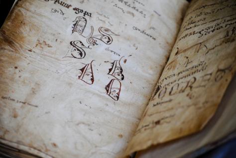
Figure 3. Two flyleaves filled with pen trials (Leiden, Universiteitsbibliotheek, BPL 111-I, 13th-15th centuries). Photo by the author

Palette

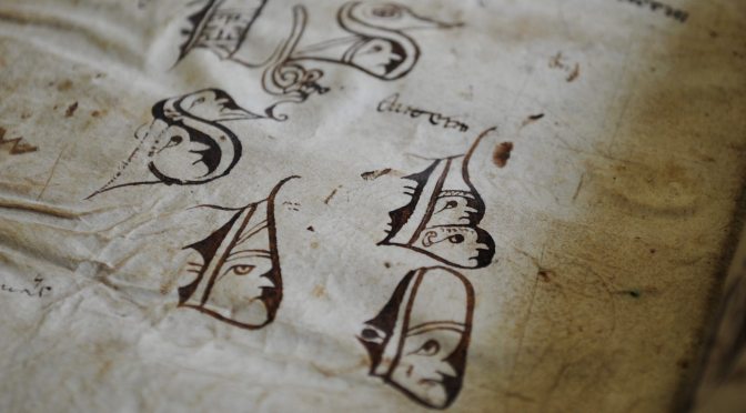
Pen trials, which are most often encountered on flyleaves in the back of manuscripts, can be quite appealing. As it happened, scribes did not just write down squiggly lines or words when testing their pens, but they even produced modest works of art. In Leiden University Library some great “artistic” specimens are encountered. In the back of BPL 111-I, for example, we find a collection of large initial letters with faces inside them (Figure 3). It includes a letter B with two monks (note the tonsures), a D with a stern-looking lady wearing a pointy hat, a bearded person in a letter S, and a duck containing a long-nosed man. This page and the facing one are filled with dozens of pen trials. The shapes of the letters and the ink colour suggests that the doodles on these pages were produced by a limited number of individuals, perhaps two or three, which is in line with what we commonly see on flyleaves that contain pen trials.

The two pages in the back of BPL 111-I are also in line with broader European traditions regarding the kind of tests they contain. We encounter single letters and words, as well as nonsensical phrases (“e,” “egi de e,” “ego panne,” “autem”). Another popular theme is also found in Figure 3: musical notation (somewhat out of focus near the top of the picture). The square notes of the Middle Ages were perfect for testing the nib, because they naturally showed how wide it was, while the short square shape also invited the scribe to execute a series of quick test strokes. Common also are the little specks visible in Figure 3: you can vaguely see them in the white zone below the initial letters. These result from tapping the quill on the parchment, probably in an attempt to adjust the nib by “tapping” it into shape.
Cambridge_Parker_LIbrary_223_p338
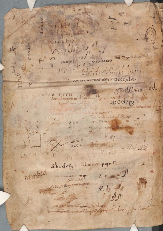
Figure 4. Pen trials by a high volume of individuals (Cambridge, Parker Library, MS 223, p. 338, twelfth century). Source

Scriptorium

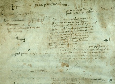
While the pen trials in Figure 3 were executed by perhaps two or three individuals, there could be far more scribes involved. Figure 4 shows a page in a ninth-century manuscript. Present in the back of the last quire, it was left blank because the text had already ended. Some three centuries later, likely in the second half of the twelfth century, the page was filled with pen trials by least fifteen scribes. We are probably looking at a group of individuals in the same scriptorium, who favoured very different “doodles” for testing their pen, from alphabets to a small portrait. And the musical notation appears as well, at various locations. A similar case where a large group of individuals share the same empty page is found in a set of manuscripts from Rochester Priory in Kent, now Oxford, Bodleian Library, MSS Bodley 340 and 342 (Figure 5). Several individuals from the early twelfth-century wrote down short passages on their flyleaves, including – with a peculiar sense of appropriateness – the phrase probatio pennae, “I test my pen” (near the top of the detail shown in Figure 5).
Oxford_Bodley 340
Figure 5. Pen trials by several twelfth-century scribes in Rochester Priory, Kent (Oxford, Bodleian Library, MS Bodley 340, f. 169v, detail).

Groups of pen trials from a medieval scriptorium can be important sources of information about scribal practices and the backgrounds of scribes. Those in the back of Bodley 340 and 342, for example, show that the scriptorium of Rochester Abbey was filled with individuals who were trained across the European Continent, including in Germany, Holland and Italy (see Kwakkel, “Hidden in Plain Sight”). This verdict is based on the letter shapes of the pen trials, which reveal where their makers are from: scribes were trained to produce slightly different letter shapes all over Europe, which shows in the pen trials. By proxy, the page in Figure 5 highlights the ethnical diversity of the monks in Rochester Abbey.

Test Sheets

Sometimes one encounters truly special collections of pen trials. Leiden University Library holds a loose double-leaf filled with an unusual amount of them (Figure 6). Its existence adds significantly to our understanding of medieval pen trials. One may be inclined to think that scribes always turned to empty pages in the back of existing manuscripts and filled them pen trials. While this happened, as the previous cases show, there is also another practice at play. The Leiden sheet suggests that scribes also used loose – i.e. unbound – sheets, which likely lay on their desk. Some of these “test sheets” were repurposed and turned into flyleaves, making it look, to somebody observing the pen trials today, as if they were directly written into the book.
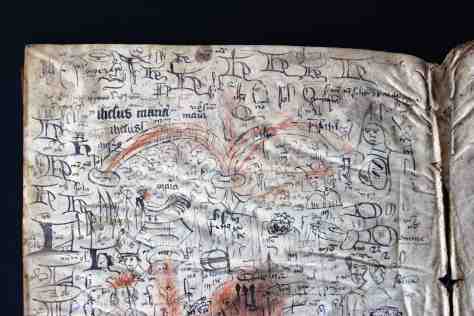
Figure_3_BPL_3327_22
Figure 6. Upper half of a flyleaf filled with dozens of pen trials (Leiden, Universiteitsbibliotheek, BPL 3327, 22, 15th century). Photo by the author

This particular test sheet was filled to the brim with several hundred pen trials: there are more than I have ever seen in one location (note that Figure 6 shows only a detail). When one looks carefully, running themes can be observed across the page, sometimes clustered in the same location. There is the large capital letter H that is frequently drawn, especially near the top of the page; and there are recurring human figures as well, such as a grumpy lady, a man with curly hair, and a few bishops. Another theme is the nota sign, the attention sign that is encountered in the margins of manuscripts: quite a few are observed under the two red arches (they look like “nt” with a curly line over top). There are as many as ten individuals at work on this sheet, which suggests this sheet, too, was used in a scriptorium.

Figure_4_PER_16
Figure 7. Fifteenth-century test sheet used as flyleaf (Leiden, Universiteitsbibliotheek, PER 16). Photo by the author

Another test sheet is seen in Figure 7. It was used by a single scribe, who used the crumbly sheet to write down letters, parts of religious verses, and non-sensicle expressions. Here the earlier purpose is clearly visible through the rough and well-used appearance of the flyleaf. It concerns a piece that was ripped off of a larger paper sheet and subsequently used for testing the pen. At a later stage it was repurposed as a flyleaf. Figures 6 and 7 show us the far ends of the spectrum of medieval test sheets: some were inhabited with words and doodles by a group of individuals, as indicated by the variations in ink color, letter shape, and nib width, while others were tools used by single scribes.

This is an expanded and modified version of a post that first appeared on Leiden Medievalists Blog.

Read more about pen-trials:

Erik Kwakkel, “Hidden in Plain Sight: Continental Scribes in Rochester Cathedral Priory, 1075-1150,” in Writing in Context: Insular Manuscript Culture, 500-1200, ed. Erik Kwakkel, Studies in Medieval and Renaissance Book Culture (Leiden: Leiden University Press, 2013), 231-61.

The Secrets of Medieval Fonts

One of the fundamental things in a medieval book is letters – those symbols that fill up page after page and that make up meaning. Each one of us human beings writes differently and considering that medieval books were made before the invention of print, it follows that the scripts they carry show a great variety in execution styles. This is perhaps the most amazing experience of spending a day going through a pile of medieval books in the library: the immense variation in the manner in which the text is written on the parchment pages.

No surviving artefact underscores this point of variation better than advertisement sheets of commercial scribes. The one in Fig. 1 was produced by Herman Strepel and through it he shows off his expertise – and in a sense his merchandise – to customers who visited his shop. The blank back shows that the sheet was hanging on the wall, like a menu in a fast-food restaurant. He even wrote the names of the scripts next to the samples, in appealing golden letters, like a good businessman (more about advertisements from the medieval book world in this post).

Writing Sheet
Fig. 1 – Advertisement sheet for scripts, c. 1450 (The Hague, KB, 76 D 45) – Source

In this wild party of letter shapes roughly two categories of variation can be observed: first, the shape of medieval letters differs because they belong to different script families; and secondly, their precise execution varies because the scribes opted for a particular size, thickness, quality, and pen angle. Remarkably, this variation is still preserved in our modern notions of typefaces, which represent the families, and fonts, which express the variation within these families, for example concerning size (for their meaning, see here).

If we forget, for a moment, that letters themselves convey meaning, these two levels of variation – choice of script and of its execution – comprise perhaps the greatest value: letters show us when a manuscript was made. This information comes in extremely handy considering that the title page was not yet invented. But how do we find it? Welcome to the secretive world of handwritten letters from the Middle Ages.

Tick, tock
Medieval script tells time, although usually not very precisely. Take for example the three major script families from the medieval period: Caroline minuscule (Fig. 2, sample 1), Pregothic script (Fig. 2, sample 2), and Littera textualis or Gothic script (Fig. 2, sample 3).

script samples
Fig. 2 – Three medieval script families: St Gall, Stiftsbibliothek, 14 (9th century); Leiden, University Library, BPL 196 (12th century); London, British Library, Arundel 28 (13th century)

Despite the fact that these three families are relatively easy to distinguish and identify, they were used for extensive periods of time: Caroline (nr. 1) from c. 800 to c. 1050, Pregothic (nr. 2) from c. 1050 to c. 1250, and Gothic from c. 1250 to c. 1500. In other words, merely identifying the family of handwriting is not enough to pinpoint when precisely a book was made. To get that information one needs to do more – and this is where things start to get a bit more complicated.

Data
To know when a book was copied, one needs to investigate where in the timespan of a script the sample in question can be placed. Does a style of writing fit better in the early stages of a script, is it representative of the end of its life cycle, or perhaps rather somewhere in the middle age? To be able to answer this question one needs to know how the font in question developed over time. This is the kind of research I have been doing over the last few years, called quantitative paleography because it uses a high volume of verifiable data. Thus it is possible to map how Pregothic evolved by tracking,for example, the letter pair de (Fig. 3, magnifying glass).

1156-57 BM Charleville BM 246 B, f. 138v (detail) (1)
Fig. 3 – Letter pair “de” in Charleville, Bibliothèque municipale, Ms 246 B (dated 1156-1157).

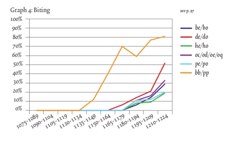
Here the two elements of this letter pair, which was written down in 1156 or 1157, are touching one another, albeit only slightly. Just twenty years earlier these same letters would still have been written fully separated. This becomes clear when we gather data from manuscripts that bear a date (like the one in Fig. 3), which they do every now and then. When this data is gathered one can deduce, with statistical support, when certain features were born or when they died. Thus data shows, for example, that the touching of de is first encountered in the period 1150-1175. The process, which I dubbed “kissing” in this free downloadable book (which also shows how the method works), continues until the two letters fully overlap. This is called “biting” by script experts (Fig. 4, magnifying glass).

BL Arundel 28
Fig. 4 – London, British Library, MS Arundel 28 (1250-1300)

In fact, the pair highlighted in Fig. 4 has moved so close together that they share the central vertical pen stroke: the right side of d is also the left side of e. The two have literally become inseparable, because separating them would leave one of them incomplete. The data – gathered from 342 dated manuscripts written between 1075 and 1225 – shows how biting emerged at different moments in different letter pairs: first in pp, then in de and do, and subsequently in some others. (Fig. 5). It shows how even a single script feature needed time to spread to all corners of the script.

Kwakkel_McKitterick_Thomson_Turning_Over_a_New_Leaf_Page_207
Fig. 5 – Kwakkel, “Biting, Kissing and the Treatment of Feet”, p. 207 – Source

Secret – not
The average medieval scribe knew a number of scripts by heart. Commercial producers of books, discussed at the outset of this post, aimed to please a diverse clientele and will therefore likely have known more fonts than any other type of scribe, including the monk (Fig. 6). The latter was very conservative: he did not often have a broad palette of scripts and he was disinclined to adapt his manner of writing on command. Still, even within single scripts monks show variation in the style of execution. Interestingly, he poured into something from his cultural-historical background in the shape of letters, revealing to the attentive beholder when precisely he wrote a book, even when he did not give this piece of information away explicitly.

British_Library_Royal_4_b_i
Fig. 6 – Scribe at work: London, British Library, MS Royal 4 B.i (Rochester, 1100-1125)

How the letters were formed may also reveal other things about the scribe, for example where he or she lived, or even that it was a hasty book project. Unveiling this hidden information in handwriting is difficult, because letter shapes do not easily give up their secrets. Still, the increasing popularity of Digital Humanities and the tendency of modern script experts to map the development of handwriting with the help of verifiable data makes it increasingly more difficult for scribes to hide their secrets.

Postscriptum – In response to some helpful remarks on Twitter, I am aware, of course, that scripts and fonts – as used in the title – are not the same thing. However, I like the comparison of the two, and used it here, because just like medieval script, a font relates both to the notion of family (Times New Roman) and its execution (e.g. a 12 point letter). More on fonts and typefaces here (via John Mulloy, @MulloyJohn).

The First Page of the Medieval Book

This is the first post of my new blog medievalbooks.nl. Until now I have posted short blogs on my Tumblr and longer ones on the collaborative research blog MedievalFragments. As the latter will be coming to an end, this is a good moment to start a blog with longer posts of my own.

For a reader there are few things more exciting than opening a new book and exposing its first page. How will the story start? Where is it set? Who is the main character? For the historian of the medieval book the thrill is the same, albeit for different reasons. As the squeaky wooden board falls open, various questions arise: In what script will the book be written? What layout did the scribe choose? What will the decoration look like?I love the opening page of the medieval book not just because it embodies the start of a new exploration, but also because it reveals the “whole being” of the book. Unique clues can be found on a manuscript’s first page, clues about the artisans that produced the object and the individuals who owned it over the centuries. Moreover, the opening page often provides the first inkling of the purpose for which the manuscript was made. Here we go!

Fig. 1 - Opening page of British Library, Sloane MS 2424 (fol. 1r)
Fig. 1 – Opening page of British Library, Sloane MS 2424 (fol. 1r), 12th century

Artisans
The most “in your face” clue about the individuals who produced the manuscript is provided by the script – the handwriting of a medieval scribe. As you start reading the first page, certain book-historical data starts to flow. The shape of medieval letters transmits two important pieces of information: the scribe’s whereabouts and “whenabouts”. I have blogged about the peculiar process of “sensing” how old a manuscript is (read it here). A similar feeling produces a sense of the country or region where the scribe was trained – and where he, we presume, produced the book. This copy of William of Conches’ Dragmaticon philosophiae (Fig. 1) was clearly produced by a scribe trained in Southern France. Such is suggested, among other things, by the shape of Tironian “et”, which features a firm and long horizontal top that starts far left from centre (Fig. 2).

Fig. 2 - Tironian abbreviation for 'et' (Sloane 2424)
Fig. 2 – Tironian abbreviation for ‘et’ (detail of Fig. 1)

In fact, according to this British Library record François Avril placed the manuscript in Languedoc, in the very south of France. He did so on the basis of the decoration, which is another bookish feature expressing information about the origins of a manuscript. Both the colours of the initial and the “box” placed around it have a Southern-French feel (Fig. 3), showing that both artisans – scribe and decorator – were likely trained in that region. Decoration is a key element in the pursuit of information about the makers of a manuscript. This, in turn, increases the value of the opening page, because many medieval manuscripts (including the one shown in Fig. 1) contain a decorated initial on their first page only. The start of the book had to be celebrated, as it were, providing us with clues as to where that party took place.

Fig. 3 - BL Sloane 2424, fol. 1r (detail), 12th century
Fig. 3 – Decorated initial (detail of Fig. 1)

Owners
The first page is even more important for establishing who owned the manuscript. We often forget that the average medieval book may have had as many as fifteen owners. A thirteenth-century copy, for example, is currently 800 years old. If the average reading life of an individual was forty years (meaning he started to build a library at, say, twenty years of age), we may assume that the thirteenth-century book in question has had twenty different owners. It is no surprise, then, that we often find multiple names and ex-libris inscriptions written down in medieval books.

The first page was a prime location for such details, in part because medieval librarians knew that ownership inscriptions placed on cover- and flyleaves would disappear when the book was rebound. British Library, Sloane MS 2424 features a wide array of  ownership inscriptions on its opening page, both from medieval and modern times. The oldest one is found at the very top: an ex-libris inscription in thirteenth-century cursive script (Fig. 4). It is partly erased (as one does with second-hand books), meaning the identity of the institution who owned the manuscript remains anonymous.

Fig. 4 - British Library, Sloane MS 2424 fol. 1r (ownership inscription, 13th century)
Fig. 4 – Ownership inscription, 13th century (detail of Fig. 1)

The page in question also holds more modern shelfmarks. The number “2424”, written down in an eighteen-century hand, refers to the book’s place in the library of Sir Hans Sloane (d. 1753), who owned the manuscript prior to the British Library (Fig. 5). An earlier shelfmark, “B.27”, scratched out by Sloane, was likely from one of the previous owners – which included Louis Malet and Sir Robert Cotton, as the Schoenberg Database of provenances tells us. A nineteenth-century stamp from the British Library points to the present owner.

British Library, Sloane MS 2424, fol. 1r, 17th century.
Fig. 5 Ownership inscriptions, 18th and 19th centuries (detail of Fig. 1)


Purpose
The hardest thing to read from the first page of the medieval manuscript is the purpose for which the object was made. For this kind of information one may turn to dimensions and layout. The pretty manuscript in Fig. 6, for example, has margins that are slightly wider than normal. Originally the margins would have been even larger, considering that the book was bound at least twice, meaning that its width was reduced twice by the binder’s knife. Such broad margins suggest that this twelfth-century book filled with patristic excerpts was designed to be glossed. In fact, a later user did use the provided space for his (illegible) personal notes.

Opening page of British Library, Arundel MS 173 (fol. 1r)
Fig. 6 – Opening page of British Library, Arundel MS 173 (fol. 1r)

As with layout, a page’s dimensions may also provide information about the purpose for which a medieval book was created. Take the peculiar copy of Virgil’s Aeneis in Fig.  7. The book breaks with the norm of medieval book production in that the page is extremely high and narrow. We know that this format was favoured by individuals who used books in a setting of performance, such as soloists in the church and actors on the stage. Similarly, teachers in monastic schools enjoyed the narrow format, which accommodated their walking through the classroom as Virgil’s text was used to teach novices Latin grammar – a common use for classical manuscripts in this age. In sum, the likely function of Harley 2777 already jumps off its first page.

British Library, Harley MS 2777, fol. 1r, 12th century
Fig. 7 – Opening page of British Library, Harley MS 2777, fol. 1r, 12th century


For the impatient scholar who cannot wait to see the first page, narrow books like the Harley Virgil are perfect. After all, its unusual dimensions, which are so very telling for the manuscript’s purpose, are already evident when the manuscript is still sitting in its box, unopened. Even before the first page is consulted, the manuscript has already transmitted some of its secrets.

Note – You may want to check out the accompanying post devoted to the manuscript’s ‘last’ page, which was published on my project’s collaborative research blog MedievalFragments. It is reposted below (or click here).


My Week of Lecturing in Oxford

It is the evening of Thursday 27 February, 2014, and at the moment I am sitting in The White Horse being stared at by Inspector Morse, who frequented this pub back in the day – and who seems to have left a portrait behind every time he did. When I look out the window I can see the Bodleian Library, that treasure trove of medieval books. For the past week this is where I have been: Oxford, more precisely Corpus Christi College. Invited to be the 2014 E.A. Lowe Lecturer in Palaeography, I came to the college for a week to give lectures on medieval script. I learned a lot over the past week, both from the audience’s responses and through discussions with colleagues, both inside and outside Corpus Christi College – a most welcoming and hospitable community. This blog has everything to do with medieval manuscripts, but it is more personal than usual, if you forgive me: I thought I’d give a sense of what it entails, doing lectures in a historical place like this. So here is my week of being part of a stimulating academic world.

Corpus Christi College, Oxford (pic: my own)

I arrived in Oxford last Thursday afternoon, just in time to hear @WillNoel do the annual McKenzie Lecture in bibliography in St Cross College, titled “Bibliography in Bits”. Will, Twitter celebrity par excellence, is a well-known proponent of Open Access and making digital data available for all to download and use. (“For free!” he would add to that in a loud voice.) He talked about digital surrogates of medieval books: how a manuscript’s digital representation is its own entity, how it exists – is – in its own right. He showed how a digital manuscript is a resource that teaches us things the material object itself may not reveal. His lecture (and the dinner that followed) formed a great start of my week here. It would also be the last thing I would do – until now, sitting in this pub – without a certain amount of pressure.

That pressure was not just generated by the venue, but also by the fact that the data at the heart of my lectures had just been harvested – with the indispensable help of my Research Assistant, RV. The paint of my lectures still wet, much of my free time was filled with going through my data and deducing how to expand the scope of my papers with their help. My three lectures aimed to show how the major book script of the Early Middle Ages (Caroline Minuscule, in use from c. 800 to c. 1100) morphed into the major book script of the Later Middle Ages (Littera Textualis, or Gothic script, used from c. 1200 to c. 1600). It’s a great topic because the century in between the two is filled with experimentation by scribes, of mixing older and newer features, and of fights for dominance between opposing letter shapes. My approach was threefold. First, finding a way to describe in objective terms what the actual difference is between the letter shapes in the two scripts. Second, registering in a database whether scribes in different ages and geographical areas preferred the Caroline or Gothic presentation of a letter. Third, translating this data into graphs that provide insight into the transformation from the one script into the other. Each step of my research came with challenges and limitations, but also with opportunities to advance our knowledge.

Title slide of my first lecture

So, here we are, on the Friday: my first lecture. It focuses on how the transitional script from the Long Twelfth Century evolved over time. The theater is filling up nicely (about 75 people have come) and I start to do my thing. I discuss the method for about twenty minutes and then dive into the paleographical depths of the complex hybrid script. Highlighting differences between letter shapes I begin to carve out an objectified description of the road between Caroline and Gothic, focusing not on the overall impression but on hard, measurable features. I challenge the traditional temporal boundaries of the two scripts and feel brave enough to query, at the end of the lecture, whether we ought to perhaps abolish our notion of Caroline and Gothic being different scripts. Would it not be better to regard them as different expressions of the same writing system? My data certainly backed up this provocative idea. After the lecture a dinner was organized in the founder’s room of Corpus Christi Corpus: a great end of my first performance.

Then came the weekend, which I spent with family just outside Oxford – walks, pubs, and a newspaper on Sunday. On Monday I did an extra-curricular masterclass for the Centre for the Study of the Book, which runs under auspices of The Bodleian Libraries (here). It had been arranged only a few weeks earlier, within half an hour, and entirely through Twitter messages between me and @DanielWakelin1 – medieval books are so modern! In a seminar room filled with graduate students, faculty and nine medieval manuscripts I talked about two unusual book types: the elegantly tall and narrow holsterbook, and the off-cut manuscript, which is made from recycled strips of parchment. The students had picked out a selection of specimens from the Bodleian Library, adding to the class’s hands-on character. In the afternoon the Fellow Librarian of Merton College gave me a private tour through their medieval library, which is Britain’s oldest surviving library designed for use by scholars (I blogged about it here).

Medieval Library at Merton College (pic: my own)

Then came Tuesday and my second Lowe Lecture. Having done temporal development last Friday, it made sense to focus on the enormous regional variation in the transformation from Caroline to Gothic. When you place a manuscript from Germany next to one from France you can sense that they are not equally advanced, but with a new tool I developed I could support such intuitive verdicts with a number. I introduced the notion of Gothic Weight, which measures the “Gothicness” of a script written between 1075 and 1225. It gives a value to each of the thirty or so features I track in my database: 2 points for Gothic, 0 points for Caroline and 1 point if the script trait in question is presented in a mixed form – meaning that the scribe uses both Caroline and Gothic on the same page. When the points are added up, you end up with one number representing how advanced or behind an individual scribe was with respect to his handwriting. It means you can compare a German and a French manuscript objectively, as well as comparing Germany and France as a whole (by taking the average Gothic Weight), or even map the increase of Gothiness over time within European regions.

Sculpture of a scholar, Bodleian Library (Pic: my own)

Wednesday and Thursday were filled with working hard on the third paper, in which I aimed to show how Gothic script evolved not over time or in different regions, but as a novelty that was passed on to new generations of scribes. How did idiosyncrasy turn into new norm? My database did not provide an answer to this question, but using my data in combination with broader questions I could explore the very difficult question of a script’s dissemination – albeit without providing a definitive answer. The paper mainly focused on training, as I figured this was the moment when a new script feature had the chance to jump to a new user – a novice in a monastery being trained to write for the first time. In fact, such transmission would depend on the person in charge of training novices: if he was modern and advanced, then likely so would his pupils be. The main part of the paper therefore examined two cases where teacher and pupil were found on the same page: the first prompting the latter, monitoring progress, and correcting mistakes. It is exciting research given that you study, in a sense, the “homework” of a medieval scribe.

After the lecture I was invited for dinner in St Edmunds Hall and after that I retreated to the White Horse, where I am currently writing this blog. The bell for the last round has just rung, so I must be off – away from this pub and, tomorrow, from Oxford. One last time I will open the medieval gate of Corpus Christi College with my electronic key chain – a contrast that strikes me as a suitable parallel for my week of studying digitally the handwriting of medieval scribes.

More information – The full abstracts of my Lowe Lectures are found here. More about my approach to medieval script in this blog about kissing letters. Download this free book if you want to read an article I wrote on mapping script objectively.

Note: This post was originally written for, and posted on, my project blog MedievalFragments.