In the beginning there were animals and they were deemed suitable for writing on. Before paper was introduced in medieval Europe, the book’s origins walked in the meadow as calf, goat, and sheep. Little did they know that their skin would become parchment and filled with poetry, songs, and stern theological lessons. From beast to book: each page in a medieval codex represents an end and a beginning.
We owe a lot to medieval flocks. Jointly, uncountable animals secured the survival of classical and medieval texts in their afterlives, transporting them to the safety of the printing age, and our own bookcases. The manner of transportation varied. Some rides were luxurious and pampered readers with velvety pages; others were third class. Parchment makers sold different grades of sheets, from cheap to expensive, and visual perfection drove up the price. As did size: large books with perfect skin were the SUVs among manuscripts.
Did medieval readers give any thought to holding a beast for a book? Parchment made with care hid its beginnings well. Properly de-haired, trimmed and sanded, a page was just a page. Except when the knife of the parchment maker slipped and produced a tiny cut, which showed up as an oval hole on the page (as seen here). Because it was harder to clean the area around it, stubborn hair tended to stay in place. It made the animal come out of hiding, put it back into full view: this story of Lucan was evidently copied on the skin of a calf with white hair.
Images: Leiden, University Library, BUR Q 1: Lucan, De bello civili (digitized here, find the page here). Larger photo my own, the other is taken from the digitized object.
The chances of a medieval book making it to the safety of a modern library are dazzlingly small. Relatively few did. Imagine the challenging journey across centuries of wear and tear, fire and water, and perhaps worst of all, fickle readers. Why keep a book from the past that is handwritten on yellowish animal skin if the printer around the corner offered a perfectly white vegan option on paper?
It is an utterly unbalanced fight, book survival. What is to survive must be kept one hundred percent of the time, while a single discarding gesture made the book disappear forever. A medieval codex easily had ten or more owners and for this survival thing to work, each one had to care as much as their predecessor. A weak link in the provenance chain may undo a rare book’s existence. Not that we would necessarily know, because books that vanish, usually vanish without a trace. We think.
I find myself pondering all this when I open a battered manuscript in the library and observe its attention-seeking imperfection: bright purple mould stains mark the tough journey the book is recovering from. Made it, crossed the finish line! This is probably why I like imperfections in rare books so much. It feels as if an old book in perfect condition has missed the chance to grow a personality: it sneaked through history without absorbing any of it—it is not perfect yet.
Image: Leiden, University Library, BPL 2896 (Glossed Psalter, Italy, 12th century), digitized here. Large photo my own.
When readers in Western Europe turned their eyes to printed books, around the middle of the 15th century, handwritten books became old-fashioned, unwanted, and ultimately obsolete. Bookbinders began to disassemble medieval manuscripts and recycle their strong parchment leaves as binding materials. Thousands were systematically destroyed over the next two centuries, which is why one often encounters medieval leaves inside hidden 16th and 17th-century bindings (see image at the top, showing Leiden, UBL, 583 E 24). Elsewhere on this blog I have written about this systematic destruction (here), how to peek into the binding with MA-XRF (here), and how even today manuscripts are disassembled for profit (here). The following discusses a specific way of storing fragments and how that benefits teaching with these charming bits and pieces.
Snippets of joy
Fig. 1 Selection of fragments from personal collection of author (13th-16th centuries. Photo EK
There are several reasons why fragments are perfect for teaching. Compared to the alternative – using full manuscripts – fragment leaves, and especially snippets of leaves, are less bulky and much easier to handle (Fig. 1). Fragments can withstand the curiosity of students better, especially when they are inexperienced with delicate medieval materials. A manuscript fitted in an original or early-modern binding can be awkward to handle: there is a certain tension between seeing the material details discussed in class, while ensuring the manuscript remains undamaged. Opening manuscripts fully flat is not recommended and Special Collections librarians go through great lengths to make sure that the book is supported properly during class. All this is easier with fragments, which usually comprise just a single sheet. All the while, they still show the essence of a manuscript, facilitating almost the same range of class discussion – though minus the thumbing through an actual book.
Another advantage resulting from their small size is that multiple fragments can be handled with ease at the same time, which is unpractical with full manuscripts. I often work with groups of four students positioned at a single table and with two manuscripts that table is usually full – considering other clutter, from laptops and rulers to notebooks. Having five or even ten fragments on the table is no problem and it provides each student the chance to handle a medieval “book”. Usually, such a spread of objects provides a more profound connection to the topic of discussion that day, simply because there are more examples available to show the variety of choices scribes made for each stage of production. This makes fragments ideal to discuss medieval book design principles (parchment, page layout, dimensions) and styles of handwriting (script styles, execution levels, individual style differences).
Framing the fragment
Fig. 2 Leiden, UBL, BPL 2454 (13): Fragments of a Middle Dutch Apocalypse fitted in melinex. Photo EK
Success in the classroom depends, however, on a key factor: how they are prepared for use. Do they still need to be removed from an envelop? This is unhandy and asking for trouble, especially when putting them back in at the end of the class. Are they flattened or still curly and buckled (Fig. 1)? Flat objects show their full contents, while those with folds hide certain information. Each library has its own ways of preparing fragments for consultation. It is not uncommon to fit them in plastic, including Melinex (Fig. 2). While this provides protection, it also makes it hard to see certain details because the fragments are covered by a “mist”. Moreover, taking images can be challenging because of the reflective surface.
New solution at UBC
In 2022 I spent some time with the conservation specialist and her student assistant at the university library of The University of British Columbia, where I work, to figure out how to store the medieval fragment collection and how to prepare individual fragments for use in the classroom. The aim was to do so in a way that would safeguard the objects from damage (you can’t just stick them in a sturdy box, like you would with a full manuscript), while at the same time providing an optimal pedagogical experience. After initial discussions during the summer, on a snowy day in November 2022 I went down to the conservation lab to provide input on a prototype the two experts built. The solution was both simple and elegant – and also very cool-looking (Fig. 3).
Fig. 3 Prototype: small snippet from an incunabulum fitted in cardboard frame. Photo EKFig. 4 Detail of previous image, showing Japanese paper used to attach fragment to frame. Photo EK
Fitted in a cardboard frame with a thin insert of Japanese paper (Fig. 4), the fragment becomes a well-protected object that students can easily handle and even hold up to their eyes. There is no need to touch the actual fragment any more, or remove it from an envelop, preventing further wear and tear. At the same time, the surface is still clearly visible (much more so than in Fig. 2). For storage, this design is ideal too. One box can fit a variety of fragments, all fitted in the same size frame (the idea is to have two or three standard cardboard sizes, matching the boxes they will end up in). The framed fragment is subsequently fitted in a firm plastic folder for added protection; these folders will have an insert in which a description of the item can be fitted, which some of my students are doing as Directed Studies projects.
While UBC may not the first to frame its fragments in this way, it is the first time I have worked with this elegant solution. It makes teaching with the often unwieldy materials even more of a delight, also knowing that the delicate materials are safe. Moreover, it makes life easier for librarians too, as they can simply take a box into the seminar room and put the folders of fragments I requested on the tables. Students, in turn, have everything they need at their finger tips. Not just the actual fragment, but also a description and other materials that relate to the fragment in question, such as older storage envelops with notes. Framed fragments enable us to conveniently observe destroyed books from up close, while it improves their use in the classroom and chances for long-term survival.
It reads like a horror story. In 1964, the New York rare book dealer Philip Duschnes (d. 1970) bought and subsequently broke a splendid medieval Bible produced in early-fourteenth-century Paris (Figure 1). Every page is adorned with exuberant decoration, usually with gold leaf. The manuscript also contains numerous historiated initials, like the letter S above. With so much beauty on each page, to Duschnes the manuscript must have seemed ideal for breaking and selling by the leaf. In 1965, he began offering individual leaves for sale in his catalogue 169, stating that others from the same manuscript were available. Cut to order.
Duschnes had done the same with other manuscripts, such as the Beauvais Missal (read the full story here; watch this lecture by Lisa Fagin Davis). In 1942 he sold the half-gutted missal to Otto Ege (d. 1951), another infamous manuscript cutter, who added the remains to his “Fifty Original Manuscript Leaves” portfolios, which he put together and sold in the 1940s (more in Gwara 2013 and here). The business of selling freshly-cut leaves from medieval manuscripts proved incredibly lucrative. Today, leaves can be purchased from a variety of sources, including Ebay. This post introduces a newly identified leaf of Duschnes’s bible at the University of British Columbia and it explores what can be known about the original manuscript to which it belonged.
Fig. 1 Leaf from the St Albans Bible auctioned at Christie’s on 10 July 2019 (now part of the McCarthy Collection, see Kidd 2019). Source
Breaking a book
Duschnes bought his bible at the Sotheby’s auction of 6 July 1964 for £1,500 (approximately $12,000 today). At the time of purchase, the manuscript contained two flyleaves taken from a register from St Albans Abbey, which suggests a St Albans provenance. The abbey’s chronicle, moreover, detailed that abbot Michael de Mentmore (1335-1349) gifted two beautiful bibles to the community (“duas bonas biblias, quarum unam dedit Conventus, alteram suo studio assignavit,” cf. De Hamel 1981, p. 12). Duschnes’s bible was believed to have been one of these two books. Following this assumption, auction catalogues have come to refer to the broken parent manuscript acquired by Duschnes as the “St Albans Bible,” despite the uncertainty surrounding its earliest provenance.
As a result of Duschnes’s dark deed, leaves from “the” St Albans Bible flooded the market and often found new homes in private collections (very few are held in university libraries). Even today, the book’s eye-catching leaves are frequently auctioned at Sotheby’s (2015, 2016), Christie’s (2015, 2019), Bonham’s (2012), and Dreweatts (2017). Auction houses do not usually identify new owners and, while leaves purchased by libraries may in time appear on the radar, especially when they are digitized, those in private collections may not be seen for many decades. The practice of breaking rare books extends to incunabula. This 1928 edition, which appeared in 100 copies, contains no less than 60 original leaves from early printed books; and this one, published in 1964 in 40 copies, holds an original leaf from the 1486 printing of Ovid’s Metamorphoses. Even modern rare books are at times cut up. Duschnes dismembered a copy of the famous Kelmscott Chaucer and sold it by the leaf in this 1941 publication.
Leaf in a box
Although the St Albans Bible is rather well-known, I had never seen any of its leaves myself. That changed during a recent visit to The University of British Columbia’s Rare Books and Special Collections. In preparation for my manuscript course at the iSchool, I had a box pulled that was described as “Fragments of medieval manuscripts”. Leafing through the box’s contents, I encountered several attractive, colourful leaves. They all had a sharp inner edge, indicating they were carefully cut out of existing manuscripts. Two fragments in the box were from a liturgical manuscript, one from a breviary, and three from bibles. Unfortunately, there is no documentation available regarding the previous ownership of these fragments.
Fig. 2 St Albans Bible fragment at UBC, 2 Samuel, Chapters 22-23 (Vancouver, UBC Library, Z114 M424, recto). Source and zoom here
My eye was drawn to one of the bible fragments, because it was older than the others (Fig. 2). A modern pencilled note (now removed) identified it as “The Book of Samuel”. It measured 297×199 mm, was copied in two columns with 46 lines to the column, and judging from the script it appeared to have been made in the early fourteenth century. The other thing that made the leaf stand out was its decoration, which was of very high quality and of French origins. What especially jumped off the page was the elaborate penwork flourishing at the running title (Fig. 3), which is quite unusual. The original manuscript was evidently made by professional artisans, likely in France and presumably in Paris. But who could these individuals be?
Fig. 3 St Albans Bible fragment at UBC, detail showing running title (Regu[m]). Source and zoom hereThinking of Otto Ege and his Fifty Original Manuscript Leaves portfolios, I googled ‘“ege” manuscript bible “46 lines”,’ then clicked the image tab, thinking that the leaf may have been from a manuscript cut-up in the 1940s. The eleventh image in my Google result indeed looked much like it belonged to the parent manuscript of the UBC leaf, although it was not one of Ege’s victims. It concerned an item in a collection of twenty medieval bible specimens, yet more victims of dismemberment. Offered for sale by King Alfred’s Notebook (here), the leaf was identified as belonging to the “St Albans Bible”. Upon closer inspection of the script and decoration, it became clear to me that the UBC fragment indeed originate from the same host manuscript. It is presently one of the few leaves available for study in institutional libraries (see the list and the plea below this post).
The origins of the St Albans Bible
A thorough study of the St Albans Bible has yet to be conducted. This is likely due to the fact that the book was cut into pieces and scattered across multiple institutions and private owners. In parallel to other Parisian products of this age, there are probably three artists at work in the manuscript. One executed the historiated initials, a second the illumination (border decoration, chapter numbers, both made with gold leaf), while a third did the penwork flourishing. A forth individual copied the text. The individuals involved in its production were affiliated to the famous Parisian illuminator and libraire (bookseller) Jean Pucelle. The first to point this out was Christopher de Hamel, who stated that the historiated initials were “in the style of the Parisian illuminator Jean Pucelle” (De Hamel 1981, p. 12).
In recent years more information has come to light about the illumination in the St Albans Bible. Mie Kuroiwa attributed the illumination to the Saint Louis Master, a known associate of Pucelle (Kuroiwa 2013, p. 129, no. 35). According to Francois Avril, the Saint Louis Master is the same person as an artist known as “Mahiet” (Keane 2013, p. 133, esp. note 15). Mahiet’s name is written in the famous Belleville Breviary, one of three manuscripts known to have been illuminated by Pucelle (Paris, BnF, latin 10484, digitized here). At fol. 33r Pucelle, who probably supervised the manuscript’s production, wrote down a kind of invoice “Mahiet – J. Pucelle a baillie XX et IIIs – VId,” indicating he needed to pay 23 shilling and 6 denier to the decorator Mahiet (Fig. 4). Other folia mention payments from Pucelle to the illuminator Ancelet, who is probably Anseau de Sens (fol. 62r), and to J. Chevrier (fols. 268r and 300r) (all of these cases were first discussed in Delisle 1884, p. 284).
Fig. 4 Note for payment by Pucelle to the illuminator Mahiet (Paris, BnF, latin 10484, fol. 33r, lower margin). Source
Teamwork
The networks brought together by libraire Pucelle consisted of different artisans each time, although research shows that booksellers preferred to work with the same group of colleagues (for libraires and their teams, see Rouse and Rouse 2000). Another combination of artisans is encountered in the Bible of Robert of Billyng (Paris, BnF, Latin 11935, digitized here). The team introduces itself in the colophon at fol. 642r (Fig. 5). Written in brown ink, the text first states: “Here ends the text of the bible. Robert of Billyng made me. Amen”. Another individual, perhaps Pucelle himself, adds in smaller red script: “Jean Pucelle, Anseau de Sens and Jacques Maci illuminated this book. This vermilion line that you see was written in the year of our Lord 1327, on a Thursday, the last day of April on the eve of May – this I tell you.” (Translation Patrick Moran, UBC; transcription of the colophon in Colophons de manuscrits occidentaux, Vol. 5 (1979), p. 244, nr. 16674.) While it is unclear which decorator did precisely what, again we see Pucelle collaborating with the illuminator Anseau de Sens.
Fig. 5 Colophon from 1327 identifying the scribe (“Robertus de Billyng me fecit”) and the three illuminators who worked on the book (Paris, BnF, latin 11935, fol. 642r). Source
The St Albans Bible was the product of a closely-knit community of artisans at the heart of the Parisian book trade. Those involved in the book’s creation lived and worked in the same street, which made it easy to get teams together (Rouse and Rouse 2000). Pucelle and Jacques Maci, who both worked on the Bible of Robert of Billys, were even neighbours (Rouse and Rouse 2010, Vol. 2, p. 57). Four artisans were brought together to produce the St Albans Bible, although only one of these has been identified by name: the illuminator Mahiet, who had also worked on the Belleville Breviary, the best-known product to come out of the business of Pucelle the libraire. It remains to be determined who produced the historiated initials and the penwork flourishing. The scribe also has to be identified. Behind this team stood, somewhat invisible, a fifth person: the libraire, who had the manuscript produced for a client and who subcontracted the various tasks to artisans in his network (see for this process Kwakkel 2011). Whether this person was Jean Pucelle is not clear. There were plenty of other booksellers around in the Paris book trade, and Mahiet did not exclusively work for Pucelle. While the St Albans Bible can be placed in an important center of book production, in many respects its history remains as incomplete as the book itself.
Post scriptum: In between writing and publishing this post, UBC’s Rare Books and Special Collections purchased a second leaf from the St Albans Bible, which has been digitized together with the leaf that sparked this post (here are direct links to recto and verso). I wish to thank Jan Van Acker (Abdijmuseum Ten Duinen) for correcting my interpretation of the quoted payment to Mahiet by Pucelle.
References and useful sources
Colophons de manuscrits occidentaux des origines au XVIe siècle. 6 vols. Fribourg: Éditions universitaires, 1965-1982).
Delisle, Léopold. “Les livres d’Heures du duc de Berry.” Gazette des Beaux-Arts 29 (1884): 97–110, 281–292, and 391–405.
Delisle, Léopold. La Bible de Robert de Billyng et de Jean Pucelle. Paris: H. Champion, 1910.
Deuchler, Florens. “Jean Pucelle: Facts and Fictions.” The Metropolitan Museum of Art Bulletin 29 (1971): 253-256 (download it here).
Gwara, Scott. Otto Ege’s Manuscripts: A Study of Ege’s Manuscript Collections, Portfolios, and Retail Trade, with a Comprehensive Handlist of Manuscripts Collected or Sold. Cayce, SC: De Brailes, 2013.
de Hamel, Christopher. “Leaf of a Bible Manuscript.” In Fine Books and Book Collecting, edited by Christopher de Hamel and Richard A. Linenthal, 10-12. Leamington Spa: James Hall, 1981.
Keane, Marguerite A. “Collaboration in the Hours of Jeanne de Navarra.” In Jean Pucelle: Innovation and Collaboration in Manuscript Painting, edited by Kyunghee Pyon and Anna D. Russakoff, 131-148. Turnhout: Brepols, 2013.
Kidd, Peter. The McCarthy Collection: French Miniatures (London: Ad Ilissum, 2020, forthcoming).
Kuroiwa, Mie. “Working with Jean Pucelle and His Successors: The Case of the Saint Louis Master (Mahiet?).” In Jean Pucelle: Innovation and Collaboration in Manuscript Painting, edited by Kyunghee Pyon and Anna D. Russakoff, 111-129. Turnhout: Brepols, 2013.
Kwakkel, Erik. “Commercial Organisation and Economic Innovation.” In The Production of Books in England, 1350-1530, edited by Alexandra Gillespie and Daniel Wakelin, 173-191. Cambridge: Cambridge University Press, 2011.
Rouse, Richard H., and Mary A. Rouse. Manuscripts and Their Makers: Commercial Book Producers in Medieval Paris, 1200–1500. 2 vols. Studies in Medieval and Early Renaissance Art History 25. Turnhout: Harvey Miller, 2000.
Addendum: known St Albans Bible leaves (institutional libraries only)
I aim to create a student project about this bible based on the surviving leaves. Please contact me at erik.kwakkel [at] ubc.ca if you know where other specimens are kept. The list below includes items with a stable location and is therefore limited to institutional libraries. There are many leaves in private ownership (this publication by Peter Kidd, for example, identifies twenty specimens), but it is hard to trace them and to keep track of their current location (they are more likely to change ownership than those kept in library).
Cambridge, MA, Houghton Library, MS Lat. 471: 1 Samuel, 1 leaf (catalogue entry here).
M712.141: 2 Corinthians, 1 leaf (catalogue record here).
Poughkeepsie, Vassar College Archives & Special Collections Library, Scheetz MS 27: Interpretation of Hebrew Names. Alert by Ronald Patkus, head of Special Collections.
Reading, University of Reading Library, MS 90: 1 Chronicles (part image here).
Stanford, Stanford University Library, M1768: Interpretation of Hebrew Names, 1 leaf (digitized here).
St Albans, The Cathedral and Abbey Church of St Alban, Inv. nos. 17.0 and 17.1: Esdras/Nehemiah, 1 leaf; Philippians/Colossians, 1 leaf, with drolleries. Alert by archives team, St Alban Cathedral. More about these two leaves, as well as digital images, in this blog post.
St John’s, Memorial University of Newfoundland, Queen Elizabeth II Library, BS1274 .L3 1325: Deuteronomy, 1 leaf (catalogue entry here, one side digitized here). Alert by Pat Warner, Special Collections Librarian.
Toronto, University of Toronto, Massey College, Gurney Pam 0004: Jeremiah, 1 leaf (catalogue entry here, digitized here).
Tokyo, Museum of Western Art: Psalms, 2 leaves (low-res images here). Alert by Peter Kidd
Vancouver, University of British Columbia Library, Z114 M424: Genesis, 2 Samuel, 2 leaves total (digitized here).
Over the years I have developed a passion for the ways in which medieval scribes and booksellers (i.e. stationer, libraire) promoted their products. Commercial book artisans had a variety of tools available to attract clients to their shops, from spam scribbled in the back of manuscripts (“If you like this, I can make you one too!”) to unsubtle advertisement posters hung outside the shop door (“Pick a pretty letter and I’ll make you a book!”). One of the smallest advertisements surviving from before the close of the Middle Ages dates from 1476/1477 and was produced by William Caxton, Britain’s first printer (Figure 1). This piece of paper, of which two copies survive, is regarded as the earliest surviving printed advertisement in the English language (claim here). It promotes Caxton’s Sarum Pie, or the Ordinale ad usum Sarum, a handbook for priests. Only a handful pages of this text survive today, including one recently rediscovered in Reading University Library (more here; hi-res image of that page here). This post focuses on the 1477 advertisement: how did Caxton advertise his new publication? And what can we learn from a comparison of the two surviving copies?
Figure 1. Advertisement for William Caxton’s Ordinale ad usum Sarum (Oxford, Bodleian Library, Arch. G e.37, datable to 1476-77). Source
Marketing
I briefly discussed the paper slip in Figure 1 in this earlier post, because it is one of the few advertisements to survive from the early days of printing. Caxton produced a really clever marketing tool (see the full transcription here, at p. 378). The slip states, for example, that the 1477 handbook for priests is printed in the same letter type as the advertisement (“enpryntid after the forme of this present lettre,” line 3). Even without having seen the new book, its key feature, the type, can thus already be assessed. The advertisement also reassures potential clients that the text of the handbook is “truly correct” (line 4) and that it can be acquired cheaply (“he shal have them good chepe,” lines 5-6). Both features will have been welcomed by priests, the target audience, who needed their textual tools to be flawless and did not have much money to spend on them. In further acts of persuasion, the client is provided with the precise location of Caxton’s shop (“late hym come to Westmo|nester in to the almonesrye at the reed pale,” lines 4-5). The Almonry was a row of houses off Tothill Street in Westminster and the printing shop was set up in a house called the Reed Pale.
The text on the small slip concludes with a fascinating warning in Latin: “Supplico stet cedula,” Please do not remove this notice, showing that it was put on display somewhere. It has been suggested (at p. 378 of this publication) that it was perhaps pinned up in a church porch. Given the modest dimensions of the slip, which measures only 80×146 mm, about the size of a deck of cards, this is clearly a very different beast than the large parchment advertisement sheets that survive from the same period (see my blog post on such medieval posters, here). Rather than a full-page advertisement, the slip is a modest notice, inconspicuously displayed in a location where potential clients passed by. In that sense, a church porch – instead of, say, a busy street – seems a probable location. Additional support for this inference is the observation that the warning at the end is put in Latin, the language used by priests and other church officials.
A Second Copy
While the Incunabula Short Title Catalogue mentions a second surviving copy of the advertisement, kept in the John Rylands Library in Manchester, the Oxford copy in Figure 1 has traditionally been the focal point of scholarly literature. The fact that a digital facsimile was available encouraged this uneven attention. So when I recently happened upon the digital facsimile of the Manchester copy, put online in October 2017, I was quite excited to see if it would add to our understanding of the advertisement. Looking at it, it does not disappoint, for the second copy does show us something new (Figure 2).
Figure 2. Manchester, John Rylands Library, JRL 1409136 (different copy of the advertisement in Figure 1). Source
The most notable difference between the two copies is the handwritten note at the very bottom of the Manchester copy. It reads: “Pray, do not pull down the Advertisement,” and thus provides an English translation of the Latin rider at the bottom. A tiny cross connects the translation to that Latin line. Being a script expert of the medieval period, I am unable to say much with certainty about the style of handwriting, or the date, but it is clearly not a contemporary hand. It has been suggested to me that the translation was put there by the Cambridge book collector Richard Farmer (d. 1797). One of the surviving notes by Farmer indeed shows striking parallels in the handwriting. As it happens, he actually owned both existing copies of the advertisement. (See for this identication and additional information on the provenance of both the Oxford and Manchester slip the postscript at the bottom of this post.)
Caxton Type 3
Returning to Caxton’s remark that the letter shape of the advertisement is the same as that of the 1477 publication it promotes, there is much truth to this. Comparing the type of the advertisement to the leaf that recently resurfaced in Reading University, one can only marvel at the strong resemblance (Figure 3). Notably, in both, the letter shapes lack “sharpness:” frequently “blobs” and small hairlines appear at letters, while an individual letter usually has a variety of appearances when looked at in detail. See for example the different shapes of the letter e in “reed pale” (Figure 4). The three presentations vary in the shape of their top and bottom (smooth vs. pointy), the space in the “eye” of the letter e, and even in their height. It is not impossible that the printer deliberately produced this effect, which gave the printed book a more “genuine” – i.e. traditional, “manuscript” – look. In Gutenberg’s B-42 bible the same effect is observed, perhaps for the same reason.
Figure 3. Composite image of the Oxford advertisement from Figure 1 (left) and Sarum Pie in Reading, University Library, John and Griselda Lewis Coll–JGL 1/12/4 (right). Sources: Oxford and Reading.
Figure 4. Detail from Figure 1, line 5 (Oxford copy).
Both the advertisement and the handbook it promotes are printed in what is called Caxton “Type 3,” which is essentially a Gothic bookhand, modelled, by the looks of it, on continental littera textualis, the standard bookhand for manuscripts. It is the formata or high-quality variant that is imitated here, considering the inclusion (or at least attempts to do so) of so-called “diamond feet,” whereby the feet of minims (e.g. in the letters i, m, n) are given a pointy – diamond – appearance. The script features a letter a in two compartments, typical for book script, and lacks the cursive traits of Caxton’s other types, as used in for example the 1491/1492 Canterbury Tales. That particular type, and also those of other English publications by Caxton, features loops at ascenders and a letter a in a single compartment (see one of the Manchester copies here).
William Blades attributes this specific type to two additional Caxton publications (The Life and Typography of William Caxton, England’s First Printer, 1863, pp. 235-42): Horae: ad usum Sarum (Blades nr. 37, datable to 1477-79) and the Psalterium cum cantocis (Blades 38, datable to 1481, image). Judging from the list of Type 3 publications, Caxton reserved his Gothic type, reflective of medieval Gothic book script, for his Latin publications. The audience for these was probably very different from readers who purchased his English works, including the Canterbury Tales. That is: priests and other members of the church will have been used to Gothic script.
Comparing the Two Copies
Comparing the two copies of the advertisement produces interesting observations, for example that the pressure of the press was not always evenly distributed. The two specimens show minor differences in the shape of letters, which possibly result from variation in pressure. If you look carefully at the contours of individual letters, you notice numerous small differences (Figure 5). The top part of the double hyphen at the end is thinner in Manchester, the feet of the letter m are more pointy in that copy, and in general the letters look a bit sharper as well.
Figure 5. Details from Figures 1-2, showing how the letter shapes in Manchester (left) and Oxford (right) have minor differences.
Figure 6. Details from Figures 1-2, emphasizing the shape of the leter y in Manchester (left) and Oxford (right).
Considering these many minute differences, one stable imperfection, found in both copies, stands out. Note how the dotted letter y in “ony” (line 1) uses an inverted comma as a period, as does “pyes” in line 2 (Figure 6, white circles). However, when observing the same letter in the word “enprynted” (line 3), only the lower rim of the inverted comma is visible (Figure 6, blue circles). Both advertisements have this flaw, prompting the hypothesis that the individual lead letter used here was damaged. After all, it seems unlikely that pressure was unevenly executed twice – i.e. in two print runs – in precisely the same location. Given that all other letters y in the document are in perfect order, this particular damaged letter excludes the possibility that the matrix, the hollow form of the letter into which lead was pored, was damaged. The incomplete letter y reveals, interestingly, how Caxton operated when printing these advertisements: it appears he produced one at a time, rather than printing multiple in one go. After all, a damaged letter can only appear once in a single pressing.
Advertising in the Age of Print
For early printers, advertising was an important part of doing business, as it had been for medieval scribes and stationers before them (see this blog post). However, scribes kept on advertising in the age of the printed book. By then, they possessed a skill that had become rare, but which was still in demand. A number of surviving advertisement sheets with script specimens survive from the print era. Some of these even invite clients to come in and learn the trade of writing. This can be seen in one of the most appealing advertisements that survive from around 1500: a signpost painted in 1516 by Hans and Ambrosius Holbein, luring customers (and their children) into the shop to learn to read and write (Figure 7). With its lengthy commercial message and flashy presentation, the sign shows that some 40 years after Caxton’s 1477 advertisement, advertising had evolved into a much more conspicuous affair.
One side of an advertisement sign from 1516 (Basel, Öffentliche Kunstsammlung). Source (pic and info)
Further reading
Erik Kwakkel, Books Before Print (Leeds: Arc Humanities Press, 2018), Chap. 25 (“Medieval Posters”) discusses advertisement posters, and Chap. 29 (“Second-hand Books Before Print”) the second-hand sales of manuscripts. For the latter, see also see Erik Kwakkel, “Medieval Bargain Books,” Medievalbooks.nl (blog post publioshed May 22, 2015). Various examples of medieval book advertising are discussed in Erik Kwakkel, “Medieval Spam: The Oldest Advertisements for Books,” Medievalbooks.nl (blog post published December 5, 2014). On the broader context of medieval commercial book production, see Erik Kwakkel, “Commercial Organisation and Economic Innovation,” in The Production of Books in England, 1350-1530, ed. Alexandra Gillespie and Daniel Wakelin, Cambridge Studies in Palaeography and Codicology, 14 (Cambridge: Cambridge University Press, 2011), pp. 173-91. On book advertising in the age of incunabula, see Lotte Hellinga, “Advertising and Selling Books in the Fifteenth Century,” in -, Incunabula in Transition: People and Trade (Leiden: Brill, 2018), pp. 20-39.
Postscript
In one of the comments to this post, Arnold Hunt pointed out that the translation note on the Manchester copy was written by Dr. Richard Farmer (1735-1797), a Cambridge book collector. This blog post by The University of Cambridge Special Collections discusses a book that contains a note by Farmer. This image in that post, showing a note by Farmer at the very bottom of the right-hand page, confirms the identity of the person who wrote the translation on the Manchester advertisement. Note, for example, the shape of the ascender at the letter d and the direction of the loop, from right to left, at the h in Cambridge (“hand,” line 2) and t (“Advertisement”) in Manchester.
In another comment to this post, Julianne Simpson at the John Rylands Library provides additional details about the provenance of the Manchester and Oxford advertisement slips. She writes: “Both were part of lot 6017 in the sale of Richard Farmer’s library in 1798 – ‘Scraps of early printed Books, by Caxton, etc.’ This lot was purchased by Francis Douce who then records how he exchanged one copy with Lord Spencer:
‘I had most fortunately acquired two of the very curious slips of Caxton’s book advertisement stuck up by him in the printing office at the Almonry. I shewed this to Edwards who told Lord S[pencer]. of them & he delegated the artful Yorkshireman to negotiate an exchange. Now as there is no third specimen of the kind existing one of these was at least equal in value to one of the books printed by Caxton, & so Edwards admitted. A copy of the Virgil & an old dotted printed were proposed in exchange to which I consented & delivered one of the above slips. When I examined the Virgil I found it wanted the prologue. Notwithstanding this I afterwards heard that the Lord was not satisfied with the exchange, when I voluntarily gave him a very fine & perfect copy of a Lyndwood by W. de Worde, when he somewhat indecorously said to me, ‘Aye this is something’. I was almost tempted to remonstrate on the imperfection of his Virgil, but was not certain that he was aware of it, though I think his Yorkshire agent must have been’. (Francis Douce in MS. Douce e.75, p.15.)”
Medieval readers, especially studious ones, must have cursed their desks from time to time. It is not easy to manage desk space when working with often large and clunky medieval books. Scribes and translators developed work-arounds for these space issues, as I have shown in a blog post on medieval desktops. Scribes would place two desk surfaces stacked vertically, one for the book that was copied from, the other for the copy (image here). In contrast, translators would sometimes position two surfaces next to one another, one presumably for the original text, the other for the translation (see the striking images here and here). Readers, however, faced bigger challenges, since many needed more than two books open at the same time, which produced clutter and frantic searches for particular information. Figure 1 shows the French author Christine de Pisan, who is often shown while working in her study (here is an interesting article on the iconography), sitting behind a desk cluttered by books.
Figure 1. The author Christine de Pisan shown as a reader, book clutter in fronts of her (Brussels, Koninklijke Bibliotheek, 9009-11, 15th century). Source
Near the end of the Middle Ages a device came into service that helped avid readers like Christine: the book carousel or book wheel. When precisely this device became available to medieval readers is hard to deduce, but the oldest specimens I was able to find date from the fourteenth century. While being careful of the fact that medieval images may not necessarily be a truthful depiction of reality, it appears that during this early period there are two clearly distinguishable designs available. The difference lies in the number of shelves the device was fitted with, and thus in the carousel’s capacity.
Plain design
The book carousel enabled readers to have multiple books at hand, including copies that were opened to a relevant page. Among the earliest depictions are carousels shown with a single deck, providing room for no more than four to six tomes (although those with room for only two books also existed, as seen here). Early depictions of this “plain” model are seen in Figure 2 (from 1383) and Figure 3 (from c. 1400). These book wheels share some striking features. One is that the carousel stands on top of the desk, usually at the far end, where it is out of the way. This is most clearly observed in the depiction of a writing Cicero in the Bodleian Library manuscript (Figure 2). Here the carousel is placed in arm’s reach and contains various open books: the author merely has to turn the platform – carefully! – to consult them. Additional books are present in a book cupboard nearby. These would presumably be placed on the wheel when they were needed.
Figure 2. Cicero composing a work sitting at this desk (Oxford, Bodleian Library, Canon. Class. Lat. 257, dated 1383). Source
A similar scene is observed in Figure 3, which is found in a copy of Petrarch’s De viris illustribus kept in the University Library in Darmstadt. Here, too, an author is seen at work with a book wheel nearby. This carousel is placed on the desk, although the image shows this less clearly. Here the author is reading, not writing: Petrarch uses both hands to thumb through the book as if looking for certain information. More sources are nearby, placed on the book wheel, which can be consulted simply by reaching over. As in Figure 2, an open book is present on the platform; additionally, a red copy with the clasps unhooked lies at the ready. However, the platform also holds a roll, by the looks of it, as well as loose pieces of paper. This carousel is clearly in heavy use!
Figure 3. Petrarch sitting at a desk with a book carousel placed nearby (Darmstadt, Universität- und Landesbibliothek, MS 101, datable to c. 1400). Source
The images shown so far share two striking features: the book carousel appears to consist of a single platform and the device was small enough to place on top of one’s desk. (Curiously, some carousels were designed with an arm, enabling the user to “swing” the platform closer, as this example shows.) This relatively plain design continued until the end of the medieval period, and even beyond. Figure 4 shows a woodcut from a late-fifteenth-century incunabulum (an early printed book) containing a bible with commentary (here is another example from an incunabulum). Jerome, that revered bible translator, is shown sitting behind a single-platform book wheel consulting various source texts. While this scene is very appropriate given that the Church Father is known to have consulted a great deal of sources for the production of his Vulgate Bible, including Hebrew manuscripts, it clearly concerns medievalization of an ancient scene.
Figure 4. St Jerome shown as bible translator, while consulting sources on book wheel (Paris, Bibliothèque Mazarine, 1339, A f. 014, late 15th century). Source
More sophisticated designs
There were also more sophisticated carousels available to the medieval reader: some book wheels were fitted with two rotating platforms. This seems a sensible step-up given the limited capacity that came with a single platform – note that the individuals in Figures 2-4 all have books nearby that do not fit on their carousel. Among the surviving depictions of this “double-decker” design are two from the fourteenth century (Figures 5-6). It shows that the one and two-deck designs were in use in the same century, which indicates that readers likely preferred one or the other. In other words, we do not seem to be dealing with a chronological development.
Figure 5. Scribe (likely the author Johannes Andreae) at work, surrounded by books (Cambrai, Bibliothèque municipale, 620 (572)), c. 1320-1340. Source
Figure 6. One of the authors of Le Roman de la Rose, Guillaume de Lorris or Jean de Meun, shown with book wheel (Oxford, Bodleian Library, MS e Mus. 65, datable to c. 1390). Source
Both individuals seen in Figures 5-6 are scribes. The first in particular is very engaged with books, which are shown all around him. Not only is his desk fitted with a two-tiered book carousel, there is also a book case present behind him (note the handy fold-away doors), as well as a wooden bench that doubles as book storage. This “book bench” is fitted with locks, so that its precious contents were hidden from thieves.
Even more sophisticated designs appeared just beyond the Middle Ages. Surviving from the sixteenth and seventeenth centuries are both depictions and actual specimens of book carousels that were not fitted with a horizontally turning platform, but that moved vertically. Carousels with this orientation can be fitted with a relatively high number of shelves, perhaps as many as eight or ten. In order for the books to not fall off, it was crucial that the shelves remained level as they were turning. The most famous of these is the book wheel shown in The Diverse and Artifactitious Machines of Captain Agostino Ramelli from 1588 (Figure 7). The engraving includes the complex mechanism that held the books level.
Figure 7. A scholar behind a vertical book wheel, as shown in Le diverse et artificiose machine del Capitano Agostino Ramelli, 1588, fig. CLXXXVIII (Beinecke Rare Book and Manuscript Library, Yale University, Eliz+47). Source
Figure 8. Book wheel in Bibliotheca Thysiana, Leiden (mid 17th century). Source: photo by the author
Early-modern readers also could opt to purchase (have built, presumably) a less elaborate carousel with a vertical orientation, one with a modest number of shelves, each of which fitting one or two books. The one in the Bibliotheca Thysiana in Leiden contains only four shelves (Figure 8). Its user, Johannes Thysius (d. 1653), could consult up to eight books at the same time while sitting or standing behind the machine. The mechanism that held the books level is hidden inside the sides of the carousel. Even though you’d expect the books to remain on the shelves, it is quite a sensation to see the shelves remain dead level as you turn the carousel:
Larger carousels than the ones shown here do not seem to have been around in the medieval or early-modern period. There were ways to expand the device’s capacity, however, for example by adding a stationary shelf at the foot of the carousel, or even placing the book wheel on top of a small book cupboard (here is an example). Cases like this show that book carousels may have doubled as book cases. After all, private individuals in the medieval period did not usually own a large library. The modest number of books they owned would normally fit on a book wheel with a horizontal orientation. In other words, in addition to being a handy device for studying or reading multiple books at the same time, book carousels were also most useful storage devices, keeping books safe and off the ground.
Doodling is something we all do, from time to time, often without realising. Listening to someone on the phone or perhaps attending a meeting (or class), we scribble, rather haphazardly and spontaneously, squiggly lines, random words, and mini drawings. The practice is quite old. Doodled squiggly lines and mini drawings are encountered frequently in medieval books, mostly in the margins or on flyleaves. The one in Figure 1 was added to the lower margin of a manuscript with Juvenal’s Satires. Its style resembles our modern stick figures and it may just be the artistic creation of a child.
Figure 1. Doodle in the lower margin of a medieval page (Carpentras, Bibliothèque municipale, 368 (15th century). Source
In spite of the parallel with modern times, the rationale behind doodling in manuscripts is usually very different. Exceptions such as the one in Figure 1 aside, the medieval practice of doodling has little to do with boredom or absent-minded pen movements. They are calculated products of the pen, executed with a particular goal in mind.
Why Pen Trials?
The answer to this question lies in the two tools wielded by medieval scribes more than any other instrument. In miniatures scribes are often shown with a pen in one hand and a knife in the other, such as the hermit seen copying text from an exemplar in Figure 2. (Note, incidentally, the handy paraphernalia he has at his disposal, like the slider that helped him keep track of the line he was supposed to copy.) Here we see the scribe using the tip of the knife to keep the parchment in place: using his hands would release oily grease onto the writing surface, which would subsequently prevent the ink from sticking properly.
Figure 2. Scribe at work, pen and knife in hand (London, British Library, Royal 14 E.iii, 14th century). Source
An equally important use of the knife, however, was to adjust the nib; and it is here that the origins of the pen trial – and the doodle – are found. After some time, a few hours perhaps, the nib became dull and it needed to be cut again in order to produce crisp letters. After trimming the nib, the scribe tested his pen to check that it had the right width and to make sure there would be no streaks of white visible within the strokes of the letters. For this testing process he turned to an empty piece of paper or parchment and scribbled down some squiggly lines or short words. The process was quick and routine among scribes across medieval Europe (Figure 3).
Figure 3. Two flyleaves filled with pen trials (Leiden, Universiteitsbibliotheek, BPL 111-I, 13th-15th centuries). Photo by the author
Palette
Pen trials, which are most often encountered on flyleaves in the back of manuscripts, can be quite appealing. As it happened, scribes did not just write down squiggly lines or words when testing their pens, but they even produced modest works of art. In Leiden University Library some great “artistic” specimens are encountered. In the back of BPL 111-I, for example, we find a collection of large initial letters with faces inside them (Figure 3). It includes a letter B with two monks (note the tonsures), a D with a stern-looking lady wearing a pointy hat, a bearded person in a letter S, and a duck containing a long-nosed man. This page and the facing one are filled with dozens of pen trials. The shapes of the letters and the ink colour suggests that the doodles on these pages were produced by a limited number of individuals, perhaps two or three, which is in line with what we commonly see on flyleaves that contain pen trials.
The two pages in the back of BPL 111-I are also in line with broader European traditions regarding the kind of tests they contain. We encounter single letters and words, as well as nonsensical phrases (“e,” “egi de e,” “ego panne,” “autem”). Another popular theme is also found in Figure 3: musical notation (somewhat out of focus near the top of the picture). The square notes of the Middle Ages were perfect for testing the nib, because they naturally showed how wide it was, while the short square shape also invited the scribe to execute a series of quick test strokes. Common also are the little specks visible in Figure 3: you can vaguely see them in the white zone below the initial letters. These result from tapping the quill on the parchment, probably in an attempt to adjust the nib by “tapping” it into shape.
Figure 4. Pen trials by a high volume of individuals (Cambridge, Parker Library, MS 223, p. 338, twelfth century). Source
Scriptorium
While the pen trials in Figure 3 were executed by perhaps two or three individuals, there could be far more scribes involved. Figure 4 shows a page in a ninth-century manuscript. Present in the back of the last quire, it was left blank because the text had already ended. Some three centuries later, likely in the second half of the twelfth century, the page was filled with pen trials by least fifteen scribes. We are probably looking at a group of individuals in the same scriptorium, who favoured very different “doodles” for testing their pen, from alphabets to a small portrait. And the musical notation appears as well, at various locations. A similar case where a large group of individuals share the same empty page is found in a set of manuscripts from Rochester Priory in Kent, now Oxford, Bodleian Library, MSS Bodley 340 and 342 (Figure 5). Several individuals from the early twelfth-century wrote down short passages on their flyleaves, including – with a peculiar sense of appropriateness – the phrase probatio pennae, “I test my pen” (near the top of the detail shown in Figure 5).
Figure 5. Pen trials by several twelfth-century scribes in Rochester Priory, Kent (Oxford, Bodleian Library, MS Bodley 340, f. 169v, detail).
Groups of pen trials from a medieval scriptorium can be important sources of information about scribal practices and the backgrounds of scribes. Those in the back of Bodley 340 and 342, for example, show that the scriptorium of Rochester Abbey was filled with individuals who were trained across the European Continent, including in Germany, Holland and Italy (see Kwakkel, “Hidden in Plain Sight”). This verdict is based on the letter shapes of the pen trials, which reveal where their makers are from: scribes were trained to produce slightly different letter shapes all over Europe, which shows in the pen trials. By proxy, the page in Figure 5 highlights the ethnical diversity of the monks in Rochester Abbey.
Test Sheets
Sometimes one encounters truly special collections of pen trials. Leiden University Library holds a loose double-leaf filled with an unusual amount of them (Figure 6). Its existence adds significantly to our understanding of medieval pen trials. One may be inclined to think that scribes always turned to empty pages in the back of existing manuscripts and filled them pen trials. While this happened, as the previous cases show, there is also another practice at play. The Leiden sheet suggests that scribes also used loose – i.e. unbound – sheets, which likely lay on their desk. Some of these “test sheets” were repurposed and turned into flyleaves, making it look, to somebody observing the pen trials today, as if they were directly written into the book.
Figure 6. Upper half of a flyleaf filled with dozens of pen trials (Leiden, Universiteitsbibliotheek, BPL 3327, 22, 15th century). Photo by the author
This particular test sheet was filled to the brim with several hundred pen trials: there are more than I have ever seen in one location (note that Figure 6 shows only a detail). When one looks carefully, running themes can be observed across the page, sometimes clustered in the same location. There is the large capital letter H that is frequently drawn, especially near the top of the page; and there are recurring human figures as well, such as a grumpy lady, a man with curly hair, and a few bishops. Another theme is the nota sign, the attention sign that is encountered in the margins of manuscripts: quite a few are observed under the two red arches (they look like “nt” with a curly line over top). There are as many as ten individuals at work on this sheet, which suggests this sheet, too, was used in a scriptorium.
Figure 7. Fifteenth-century test sheet used as flyleaf (Leiden, Universiteitsbibliotheek, PER 16). Photo by the author
Another test sheet is seen in Figure 7. It was used by a single scribe, who used the crumbly sheet to write down letters, parts of religious verses, and non-sensicle expressions. Here the earlier purpose is clearly visible through the rough and well-used appearance of the flyleaf. It concerns a piece that was ripped off of a larger paper sheet and subsequently used for testing the pen. At a later stage it was repurposed as a flyleaf. Figures 6 and 7 show us the far ends of the spectrum of medieval test sheets: some were inhabited with words and doodles by a group of individuals, as indicated by the variations in ink color, letter shape, and nib width, while others were tools used by single scribes.
This is an expanded and modified version of a post that first appeared on Leiden Medievalists Blog.
Read more about pen-trials:
Erik Kwakkel, “Hidden in Plain Sight: Continental Scribes in Rochester Cathedral Priory, 1075-1150,” in Writing in Context: Insular Manuscript Culture, 500-1200, ed. Erik Kwakkel, Studies in Medieval and Renaissance Book Culture (Leiden: Leiden University Press, 2013), 231-61.
Selfies are by no means an exclusively modern phenomenon. As shown in a previous post on medieval selfies, some decorators made self-portraits in manuscripts, showing that the practice predates print – albeit without the use of a camera. They did so to identify themselves as the creator of a miniature or historiated initial, or even to exhibit their accomplishments as businessmen, as the early-sixteenth-century commercial illustrator Nicolaus Bertschy appears to do. Other medieval examples of selfies are those by Matthew Paris, the thirteenth-century monk from St Albans, painted in the lower margin of his Historia Anglorum (see here).
That earlier blog post includes two intriguing selfies made by the same person, a monk who calls himself Rufillus. One is found in a copy of Ambrose’s Hexaemeron kept in the Bibliothèque municipale in Amiens as MS Lescalopier 30 (Figure 1). The text discusses the six days of the Creation and Rufillus displays himself inside a green – and rather confined – initial letter D at the outset of the section on the Third Day. Why he shows himself here, when the Hexaemeron is about to discuss the creation of plants and material forms, is unclear.
Figure 1. Rufillus inhabiting a letter D (Amiens, Bibliothèque municipale, Lescalopier 30, fol. 29v, late 12th century). Source
His other selfie is encountered in Cod. Bodmer 127, a collection of saints’ lives kept in the Fondation Martin Bodmer in the Swiss city of Cologny (The Passionary of Weissenau, Figure 2). Here, Rufillus created a more roomy environment, painting himself inside a very large letter R at the outset of the passion of St Martin of Tours (d. 397). Selfies are not frequently encountered in medieval manuscripts, which makes the Rufillus case quite special, given that it entails not one but two “snapshots” of the same person. This post explores what we can learn from the two self-portraits of a monk who is a bit of a showoff – and who is not shy about using the selfie-stick.
Figure 2. Rufillus inside a letter R (Cologny, Fondation Martin Bodmer, Cod. Bodmer 127, fol. 244r, late 12th century). Source
Rufillus the Illuminator
Helpfully, Rufillus identifies himself by providing his name: in the Cologny manuscript he painted it in white above his brush (accompanied by “Fr.” for frater, monk), while in the crowded Amiens initial the name is written right above the decorative letter with pen and ink. Based on the origins of the two manuscripts, scholars place Rufillus in the late-twelfth century Premonstratensian abbey of Weissenau near Ravensburg in the South of Germany (get up to speed on Rufillus in this article by Solange Michon; a useful enumeration of manuscripts from Weissenau is found here). In secondary literature he is commonly regarded (and explicitly labeled as) an illuminator (see for example here and here). Judging from the decoration in the two manuscripts, which include numerous decorated initials and even some full-page miniatures, he was quite accomplished. In his article Michon shows, by highlighting iconographical – design – parallels, that it is the same person who produced the decoration in both manuscripts.
The Cologny manuscript shows the artisan “in the moment,” hard at work decorating the manuscript (Figure 2). The scene is unusually rich in detail and shows us, among other things, what tools were used by medieval illuminators. In one hand Rufillus is holding a bowl filled with red paint; in the other a brush. Cow horns filled with all kind of paints are placed behind him, while a mortar and pestle are placed nearby for preparing additional pigments. In what is a familiar pose for painters today, his right hand is leaning on his left for stability. That hand is in turn supported by a stick placed on the ground – a selfie-stick! With a healthy dose of irony, Rufillus allows us to observe him as he is painting the initial he is inhabiting. In a rather unusual twist, we witness both the artist at work and the result of his toils. By showing himself applying red paint on the letter R he invites the beholder in his atelier, which is a powerful gesture.
Figure 3. Rufillus’ name in Amiens, Bibliothèque municipale, Lescalopier 30, fol. 29v. Source
Rufillus the Scribe
While the common designation given to Rufillus by scholars is illuminator or decorator, the second selfie suggests that he was also a scribe. After all, in as much detail as he presents himself as an illuminator in the Cologny manuscript, he shows himself as a scribe in the Amiens codex (Figure 1). In this depiction, too, the paraphernalia of the trade are clearly identifiable, this time the scribe’s: a sheet of parchment, a reed, and a knife to hold down the parchment as well as to cut the nib of the pen. While Rufillus placed himself on a bench in the Cologny painting, the Amiens scene shows him seated in a scribal chair, one that supports his behind as well as the parchment sheet he is writing on. It seems appropriate, in this light, that Rufillus signed his name with pen rather than brush: he stayed in his role. The key observation to make here, however, is that our monk appears to have been active both as illuminator and scribe in the scriptorium of Weissenau (more about such a combination here).
The name “rufillus” written above the Amiens painting provides additional information. Let’s look at it again, this time from up close (Figure 3). The ink used for his name has a brown colour, deviating from the deep-dark black ink of the main text. In other words, main text and name were copied at different moments. The same is suggested by the observation that the pen used for writing the name was much thinner. Moreover, the nib used for the name reveals an imperfection not seen in the main text: the flawed nib produced a thin white line in the central stroke of the letter l. This is obviously a later cut or even a different pen. These observations make sense. In the production of a manuscript the copying of the text came first, followed by the execution of the decoration.
Evidently, Rufillus signed his name when he completed the painting, not while he was copying. This is telling, I think. Rufillus could have identified himself better and more explicitly through a scribal colophon, which is where copyists provide details about themselves (see this post). By contrast, he is far less traditional and added his presence not with pen but with brush. By doing so he inserted the motif of the scribe into the visual narrative of the book, even though its topic did not call for it. This somewhat inappropriate behaviour is amplified by the fact that he then identified this scribe as himself. Through his action, Rufillus squeezed himself into Ambrose’s text and climbed onto the podium of the Church Father. He purposefully attracted attention to his person.
Figure 4. The monk Rufillus in two historiated initials (Amiens, Bibliothèque municipale, Lescalopier 30, fol. 29v, left, and Cologny, Fondation Martin Bodmer, Cod. Bodmer 127, fol. 244r, right).
Rufillus the Person
Each of the two manuscripts shows that Rufillus is not lacking in confidence and that he does not mind breaking with the monastic virtue of modesty. It is in the combination of the two selfies, however, that we learn things we otherwise would not have known about him. For example, with Amiens alone we could not be sure that Rufillus produced the decoration in the manuscript as well. After all, the decorator could have produced a portrait of his colleague the scribe, in praise of his activities, or even a generic picture of a scribe at work. Had Cologny been by itself, there would not have been a reason to infer that Rufillus was also involved in scribal activities. Where the two selfies really become quite telling, however, is in the realism they entail. There are striking commonalities that suggest the decorator aimed to provide a realistic depiction of himself, which fits the bill given his pronounced self-promotion.
Striking similarities in his appearance are for example the pronounced eye lids, the shape and colour of his hair (bright red and with recesses), and the sharp lines across the cheeks, starting next to the nose and giving his face a thin appearance (Figure 4). With only one selfie the red hair would have been striking, but the repeated occurrence suggests that Rufillus really was a red-headed monk. This is, of course, why our scribe-illuminator calls himself Rufillus, which is derived from the Latin rūfus, meaning “red-haired” (see also here). In other words, our scribe-illuminator is using a pseudonym, one derived from a pronounced feature in his appearance – his hair. For a person who should strive to be modest and for whom the monastic community ought to be more important than the individual in it, relating one’s identity to a bodily feature seems peculiar. Yet, in light of what we have learned about Rufillus, it is no surprise.
Figure 5. Peter Lombard, bishop of Paris, shown as scribe (Bloomington, Lilly Library, Ricketts 20, fol. 1v, c. 1200-15). Source
Rufillus the Old Man?
A third manuscript exists that was copied and illuminated by our anonymous red-headed monk, although it is not usually mentioned in discussions about Rufillus and his self-portraits. The codex in question is Bloomington, Indiana University, Ricketts 20 (Peter Lombard, Commentary on the Psalms), which is assumed to have been produced in c. 1200-15, a few decades after Amiens and Cologny, and which was part of the library of Weissenau Abbey (Figure 5). In the description of the manuscript in his Gilding the Lilly (p. 60), Christopher de Hamel identified the scribe and illuminator as Rufillus (his assessment is quoted in this manuscript description). One can see from the handwriting that Rufillus was older when he made the Bloomington manuscript: his firm hand, with which he once produced such sharp and disciplined script, appears shaky and weak.
Another initial letter in the same manuscript provides a bit of history about its origins (Figure 6). A person is shown holding an open book in which the following is written: “Rodolfus plebanus de Lindaugia. q[ui] nobis dedit hu[n]c libru[m],” “Rudolf, parish priest of Lindau, who gave us this book” (source, with minor correction in the transcription). The painting shows the person who “gave” the manuscript to Weissenau abbey. Because the maker of the book, our Rufillus, is commonly regarded as a monk of Weissenau, this inscription would suggest that Rudolf paid for the materials, which is a bit of stretch but possible. Had our anonymous monk not been so firmly tied to Weissenau abbey in secondary literature, this inscription could indicate that Rufillus and Rudolf were one and the same person: he first made the manuscript, then donated it to the abbey. If this speculative inference were true, it would place our red-headed scribe-illuminator outside the abbey of Weissenau – and turn the letter O in Figure 6 into a third selfie, showing Rufillus as an old man.
Rufillus and the Weissenau scriptorium:
Jonathan James Graham Alexander, Medieval Illuminators and Their Methods of Work (New Haven & London: Yale University Press, 1992), pp. 16-17.
Walter Berschin, “Rufillus von Weissenau (um 1200) in seiner Buchmalerwerkstatt,” in: Walter Berschin (ed.), Mittelateinische Studien II (Heidelberg: Mattes Verlag, 2010), pp. 353-56.
Christopher de Hamel, Gilding the Lilly: A Hundred Medieval and Illuminated Manuscripts in the Lilly Library (Bloomington: The Lilly Library, 2010), p. 60.
Solange Michon, “Un moine enluminateur de XIIe siècle: Frère Rufillus de Weissenau,” Zeitschrift für schweizerische Archäologie und Kunstgeschichte 44 (1987), 1-7.
Solange Michon, Le Grand Passionnaire enluminé de Weissenau et son scriptorium autour de 1200 (Genève: Slatkine, 1990).
Elke Wenzel, Die mittelalterliche Bibliothek der Abtei Weißenau (Frankfurt am Main: Peter Lang, 1998).
Selfies and self-portraits:
James Hall, The Selfportrait: A Cultural History (New York: Thames & Hudson, 2014).
Adi Kuntsman, Selfie Citizenship (Cham: Palgrave, 2017).
It may seem a stretch to compare page design with architecture, but the comparison really works, I think. Looking at the medieval page, it is not difficult to regard it as an engineered construction: a convoluted space defined by columns and corridors, with rooms inhabited by thoughts and ideas (Figure 1). Nothing encountered on the medieval page is a coincidence. Everything is there for a reason and serves a specific purpose; and so, too, is the manner in which the text was spread out over the page. Like other material features of the manuscript, page design is usually reflective of how the book would be used, but in their choices scribes also responded to the preferences – demands, even – of the individuals who would ultimately use the manuscript.
Readers, in turn, preferred their books – and the pages in them – to be formatted in certain ways because they planned to use them for performing particular tasks: to educate or be educated (teachers and students), to entertain or to be entertained (minstrels and courtiers), or to gather a body of information and consult it (scholars, preachers, physicians, lawyers). How and where words were placed on the page – their size and script, and their location – were important considerations in this process of turning the book into a tool that was up to the task. Indeed, it can be argued that a page’s design was (and is) key to a book’s success. What are some of the variables in play? And how did the choice for a certain design affect, positively and negatively, the manner in which the medieval book could be used effectively?
Figure 1. Oxford, Bodleian Library, Laud lat. 9, fol. 16r (Commentary to the Bible, 1220-30). Source
Blueprint
If the page is a building, its foundation was laid in an early stage of a manuscript’s production. After the scribe had figured out how to tackle a particular book – he knew how it would be used, having had input from the patron or the monastery’s librarian – he would start designing the page by grabbing two tools that were fundamental for what the page would ultimately look like. The first was a pointy device that allowed him to punch holes in the parchment or paper leaves, which appear like dots along the long edges of the book. The second was a tool with which he could add ruling to the page. Up to c. 1150, a sharp object was used to produce gutters – indentations in the parchment – which created pathways for the lines of text flowing out of the pen. After that date a piece of lead or a pen and ink produced the ruling (this miniature shows a scribe using a ruler to produce the ruling; at the top of this post is another).
Connecting the dots in this fashion, the scribe placed a web of lines on the page (Figure 2). The resulting grid formed the outline of the future text: it defined – and confined – the number and location of the columns, the number of lines they would hold, as well as the dimensions and positioning of the four margins. Even the ultimate presence of reading aids was construed during this early production stage. An extra line was added in the upper margin to guide the running title, if one was planned, while in preparation for marginal commentaries extra ruling was added to the marginal space (both not present in Figure 2). In a way this grid of horizontal and vertical lines functioned as the blueprint of the manuscript: it defined the ultimate page even before a single letter was written down on it. The still empty lines, yet to be complemented with words, determined what the book would look like and how it could be used later.
Figure 2. Ruling pattern, showing two pages with horizontal and vertical ruling, and marginal prickings. Source
Rooms and Corridors
The quill would bring this blueprint to life: it placed words onto the ruling, thus producing text and meaning. The main text of the book could be flanked by commentaries, which in turn formed additional columns. When several commentaries were present, the design of the page can be quite daunting – and must have been a nightmare to produce (see for example Figure 1). However, this complexity is relative. The example in Figure 3 shows a central text column, written in a large letter and deep-dark black ink, which contains the biblical text (the page shows St Paul’s Letter to the Galatians). Around it, in equally dark ink, Peter Lombard’s commentary to St Paul’s letter is encountered. This part was produced in Paris during the second half of the 13th century and illuminated in the Du Prat workshop (source).
The margins around this text and commentary remained empty until 1412, when an additional commentary by Peter Tarentasia was added to the page in a smaller script. The result is a complex page, but also a remarkably organised one. After all, the information was placed in relatively isolated text compartments – “rooms,” as it were – which were separated by blank corridors. In other words, it was crystal clear to the reader what was what: the larger size of the letter identified the main text, while the smaller script of the commentaries as well as their positioning on the page, identified the occupants of the other rooms. Complex manuscripts like these, which present a textus inclusus or “square-bracket” glossing pattern, contain pages inhabited by a maze of corridors, which “snake” between the columns and sometimes even underneath or above them.
Figure 3. The Hague, Koninklijke Bibliotheek, 71 A 22, fol. 180r (Lombard, Glossa in epistolas Pauli, 1250-1300). Source
Pillars
The manuscripts in Figures 1 and 3 are so complex that it is difficult to say how many text columns they consist of. Evidently, however, in both cases the main text is copied out in a single column, a firm pillar written in a bold letter. Most medieval manuscripts hold either one or two columns of main text. Three or four are occasionally encountered. Usually it concerns a dictionary or encyclopedia (read about an example of four columns here). A page with more than four columns is extremely rare. In fact, I only know of one such manuscript (Figure 4). It is kept in Amiens and holds a concordance of the Bible, a tool that enabled readers to identify where in the Bible certain concepts and figures were mentioned.
The entries in this manuscript – often a name followed by a bible book and a chapter number – are short, which is why the scribe decided to place five of them on a single page. The book measures 310×208 mm and is thus not even unusually large, which tells you just how small the script is. Equally remarkable, the page has room for a sixth column, which is crammed into the outer margin. Here the reader could add remarks; one was added on the spread seen in Figure 4, all the way in the top left corner. In the lower margins, too, there is room planned for comments. A grid of square boxes is seen here, produced by pencil lines. This is a popular design for university textbooks, which contain many such penciled squares, sometimes over forty of them on one page. They act as comment boxes in which the student could jot down his notes (this is an example of such a manuscript; more about this practice in this blog post).
Figure 4. Amiens, Bibliothèque municipale, 95 (Concordance, c. 1300). Source
The page as a house, the scribe as its architect: they are attractive comparisons, which highlight just how much an effective page depended on crafty design, careful planning, and meticulous calculations. Like an architect, the scribe made sure to create a comfortable home for future inhabitants.
More on medieval page design:
Raymond Clemens & Timothy Graham, Introduction to Manuscript Studies (Ithaca/London: Cornell University Press, 2007), pp. 14-17 (“Preparations prior to writing”). Discusses layout and the preparation of the sheets.
Erik Kwakkel, “Decoding the Material Book: Cultural Residue in Medieval Manuscripts,” in The Medieval Manuscript Book: Cultural Approaches, ed. Michael Van Dussen and Michael Johnson (Cambridge: Cambridge University Press, 2015), 60-76. Discusses the rationale behind the choice of a manuscript’s materials features.
Erik Kwakkel, Books Before Print (Leeds: Arc Humanities Press, 2018), pp. 30-70 (“Filling the Page: Script, Writing, and Page Design”). Overview of page design through case-studies.
Elaine Treharne, “The Architextual Editing of Early English,” in A. G. Edwards and T. Takako (eds.), Poetica 71 (2009), 1-13. Architectural context used as a metaphor in the editing of medieval texts.
One of the fundamental things in a medieval book is letters – those symbols that fill up page after page and that make up meaning. Each one of us human beings writes differently and considering that medieval books were made before the invention of print, it follows that the scripts they carry show a great variety in execution styles. This is perhaps the most amazing experience of spending a day going through a pile of medieval books in the library: the immense variation in the manner in which the text is written on the parchment pages.
No surviving artefact underscores this point of variation better than advertisement sheets of commercial scribes. The one in Fig. 1 was produced by Herman Strepel and through it he shows off his expertise – and in a sense his merchandise – to customers who visited his shop. The blank back shows that the sheet was hanging on the wall, like a menu in a fast-food restaurant. He even wrote the names of the scripts next to the samples, in appealing golden letters, like a good businessman (more about advertisements from the medieval book world in this post).
Fig. 1 – Advertisement sheet for scripts, c. 1450 (The Hague, KB, 76 D 45) – Source
In this wild party of letter shapes roughly two categories of variation can be observed: first, the shape of medieval letters differs because they belong to different script families; and secondly, their precise execution varies because the scribes opted for a particular size, thickness, quality, and pen angle. Remarkably, this variation is still preserved in our modern notions of typefaces, which represent the families, and fonts, which express the variation within these families, for example concerning size (for their meaning, see here).
If we forget, for a moment, that letters themselves convey meaning, these two levels of variation – choice of script and of its execution – comprise perhaps the greatest value: letters show us when a manuscript was made. This information comes in extremely handy considering that the title page was not yet invented. But how do we find it? Welcome to the secretive world of handwritten letters from the Middle Ages.
Tick, tock
Medieval script tells time, although usually not very precisely. Take for example the three major script families from the medieval period: Caroline minuscule (Fig. 2, sample 1), Pregothic script (Fig. 2, sample 2), and Littera textualis or Gothic script (Fig. 2, sample 3).
Fig. 2 – Three medieval script families: St Gall, Stiftsbibliothek, 14 (9th century); Leiden, University Library, BPL 196 (12th century); London, British Library, Arundel 28 (13th century)
Despite the fact that these three families are relatively easy to distinguish and identify, they were used for extensive periods of time: Caroline (nr. 1) from c. 800 to c. 1050, Pregothic (nr. 2) from c. 1050 to c. 1250, and Gothic from c. 1250 to c. 1500. In other words, merely identifying the family of handwriting is not enough to pinpoint when precisely a book was made. To get that information one needs to do more – and this is where things start to get a bit more complicated.
Data
To know when a book was copied, one needs to investigate where in the timespan of a script the sample in question can be placed. Does a style of writing fit better in the early stages of a script, is it representative of the end of its life cycle, or perhaps rather somewhere in the middle age? To be able to answer this question one needs to know how the font in question developed over time. This is the kind of research I have been doing over the last few years, called quantitative paleography because it uses a high volume of verifiable data. Thus it is possible to map how Pregothic evolved by tracking,for example, the letter pair de (Fig. 3, magnifying glass).
Fig. 3 – Letter pair “de” in Charleville, Bibliothèque municipale, Ms 246 B (dated 1156-1157).
Here the two elements of this letter pair, which was written down in 1156 or 1157, are touching one another, albeit only slightly. Just twenty years earlier these same letters would still have been written fully separated. This becomes clear when we gather data from manuscripts that bear a date (like the one in Fig. 3), which they do every now and then. When this data is gathered one can deduce, with statistical support, when certain features were born or when they died. Thus data shows, for example, that the touching of de is first encountered in the period 1150-1175. The process, which I dubbed “kissing” in this free downloadable book (which also shows how the method works), continues until the two letters fully overlap. This is called “biting” by script experts (Fig. 4, magnifying glass).
Fig. 4 – London, British Library, MS Arundel 28 (1250-1300)
In fact, the pair highlighted in Fig. 4 has moved so close together that they share the central vertical pen stroke: the right side of d is also the left side of e. The two have literally become inseparable, because separating them would leave one of them incomplete. The data – gathered from 342 dated manuscripts written between 1075 and 1225 – shows how biting emerged at different moments in different letter pairs: first in pp, then in de and do, and subsequently in some others. (Fig. 5). It shows how even a single script feature needed time to spread to all corners of the script.
Fig. 5 – Kwakkel, “Biting, Kissing and the Treatment of Feet”, p. 207 – Source
Secret – not
The average medieval scribe knew a number of scripts by heart. Commercial producers of books, discussed at the outset of this post, aimed to please a diverse clientele and will therefore likely have known more fonts than any other type of scribe, including the monk (Fig. 6). The latter was very conservative: he did not often have a broad palette of scripts and he was disinclined to adapt his manner of writing on command. Still, even within single scripts monks show variation in the style of execution. Interestingly, he poured into something from his cultural-historical background in the shape of letters, revealing to the attentive beholder when precisely he wrote a book, even when he did not give this piece of information away explicitly.
Fig. 6 – Scribe at work: London, British Library, MS Royal 4 B.i (Rochester, 1100-1125)
How the letters were formed may also reveal other things about the scribe, for example where he or she lived, or even that it was a hasty book project. Unveiling this hidden information in handwriting is difficult, because letter shapes do not easily give up their secrets. Still, the increasing popularity of Digital Humanities and the tendency of modern script experts to map the development of handwriting with the help of verifiable data makes it increasingly more difficult for scribes to hide their secrets.
Postscriptum – In response to some helpful remarks on Twitter, I am aware, of course, that scripts and fonts – as used in the title – are not the same thing. However, I like the comparison of the two, and used it here, because just like medieval script, a font relates both to the notion of family (Times New Roman) and its execution (e.g. a 12 point letter). More on fonts and typefaces here (via John Mulloy, @MulloyJohn).


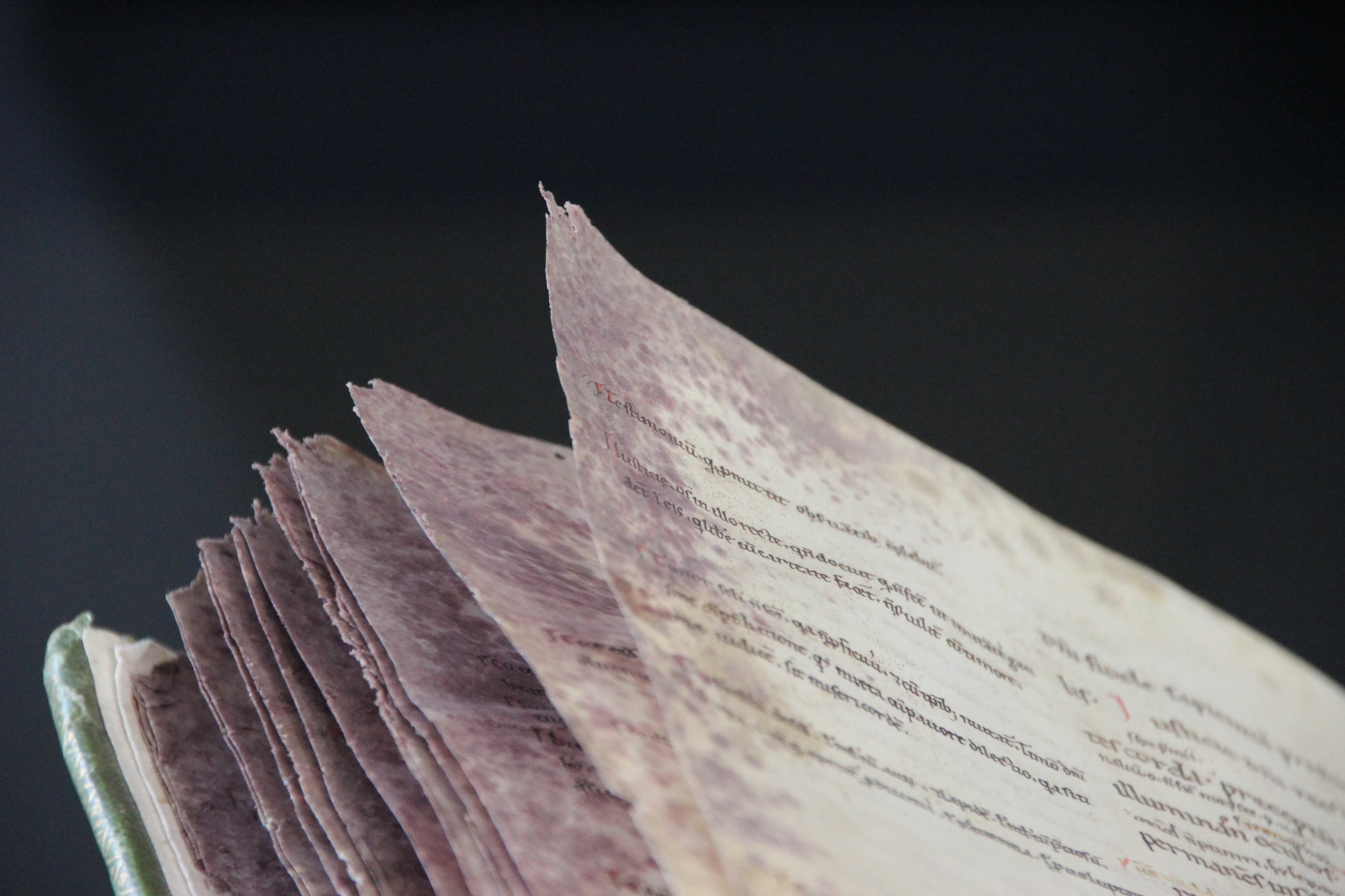
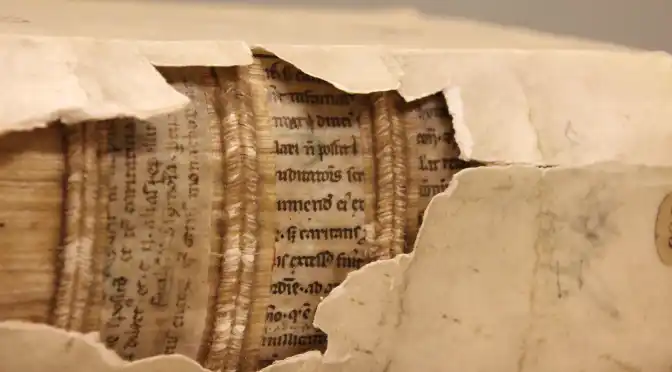


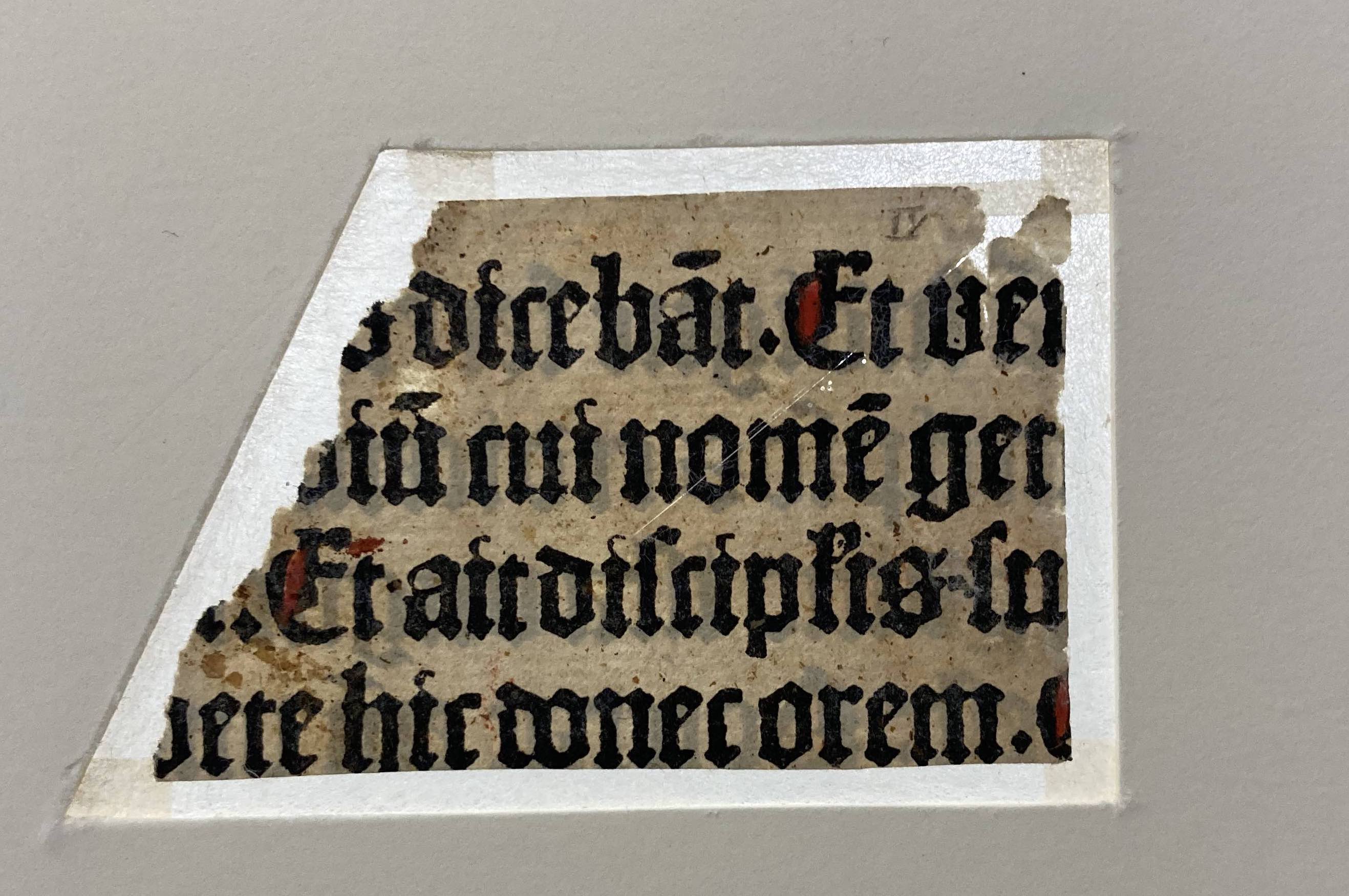
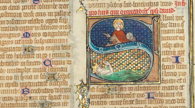
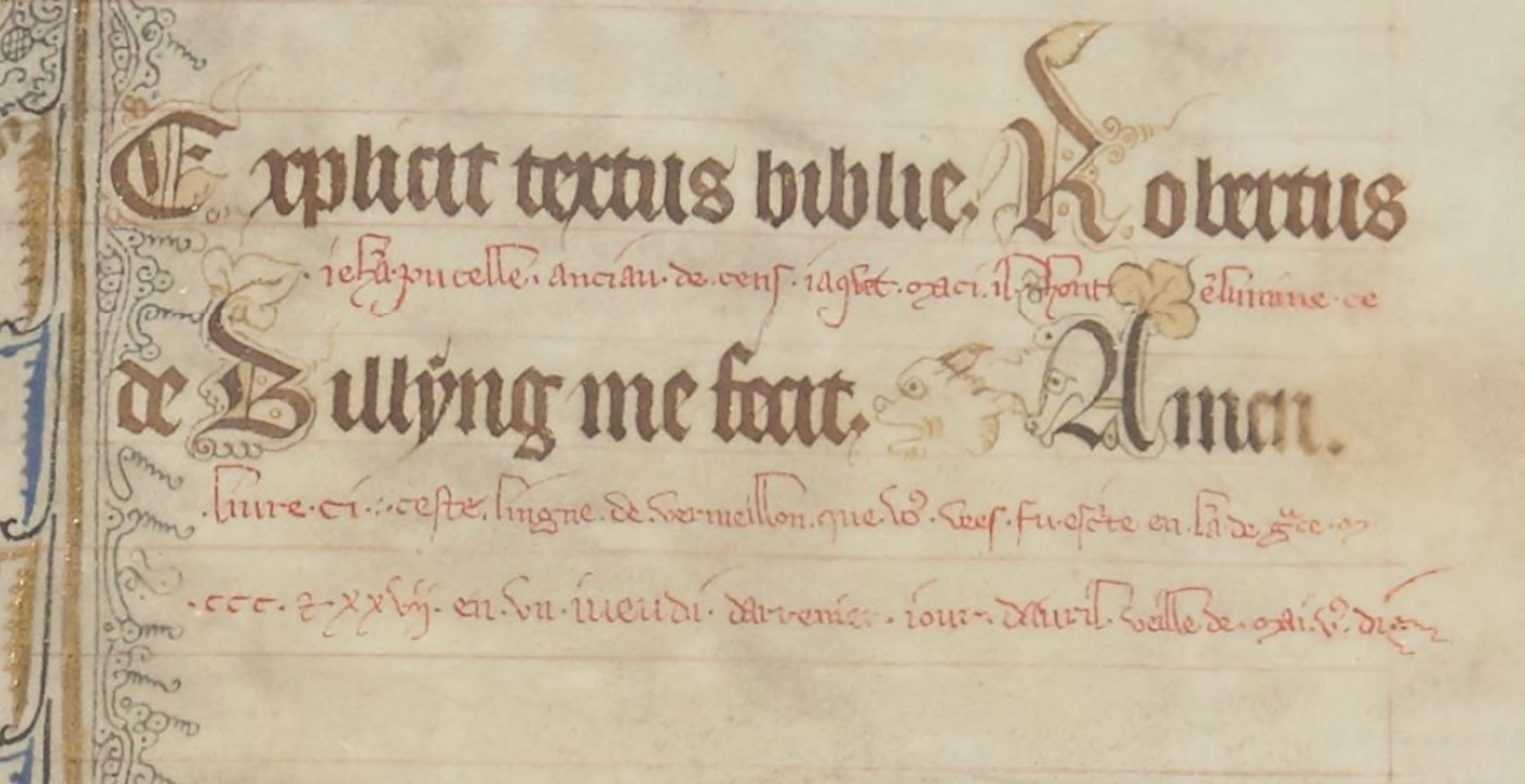
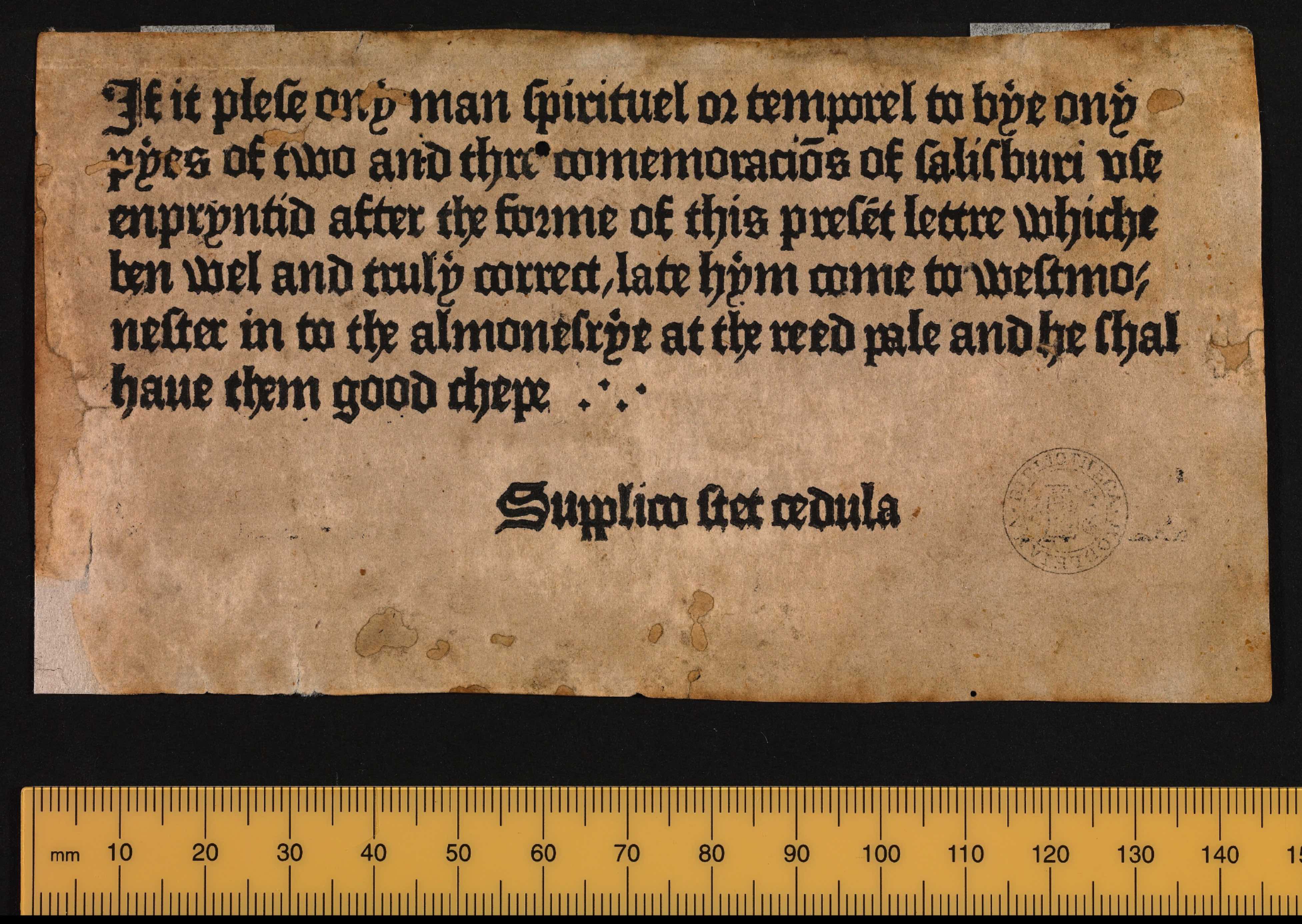
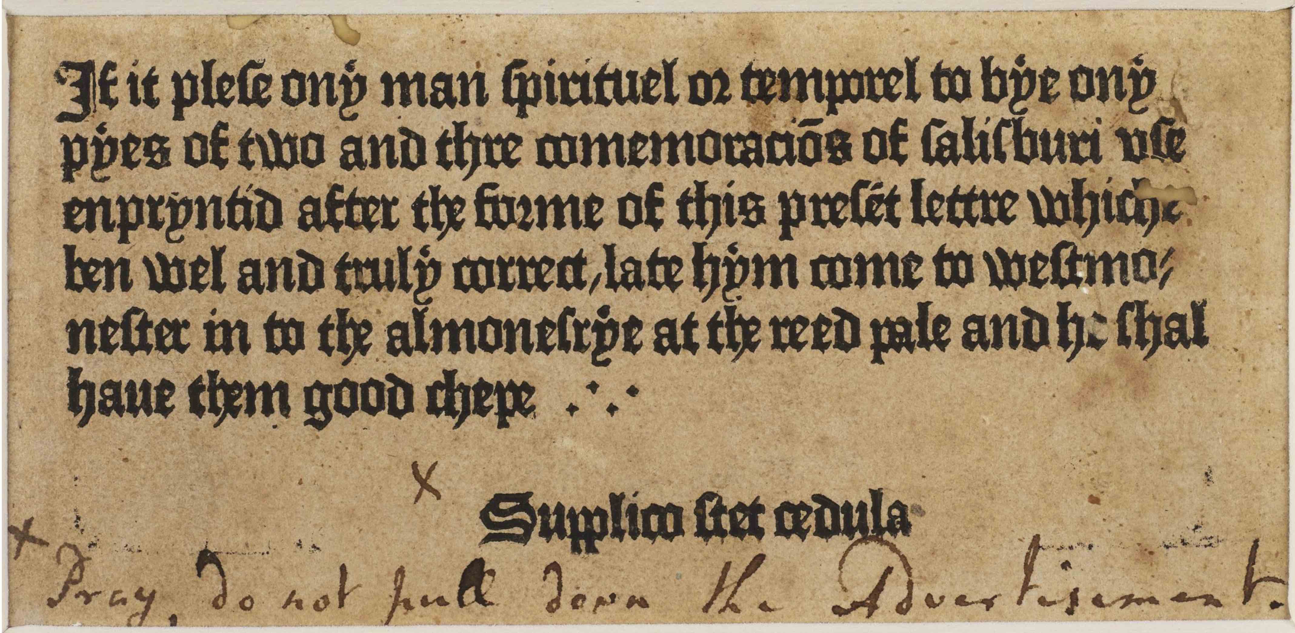
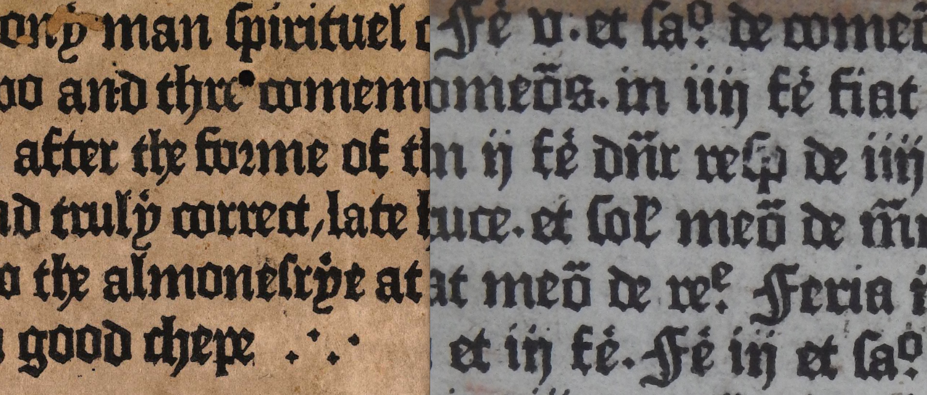
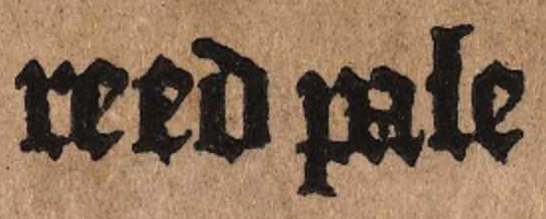

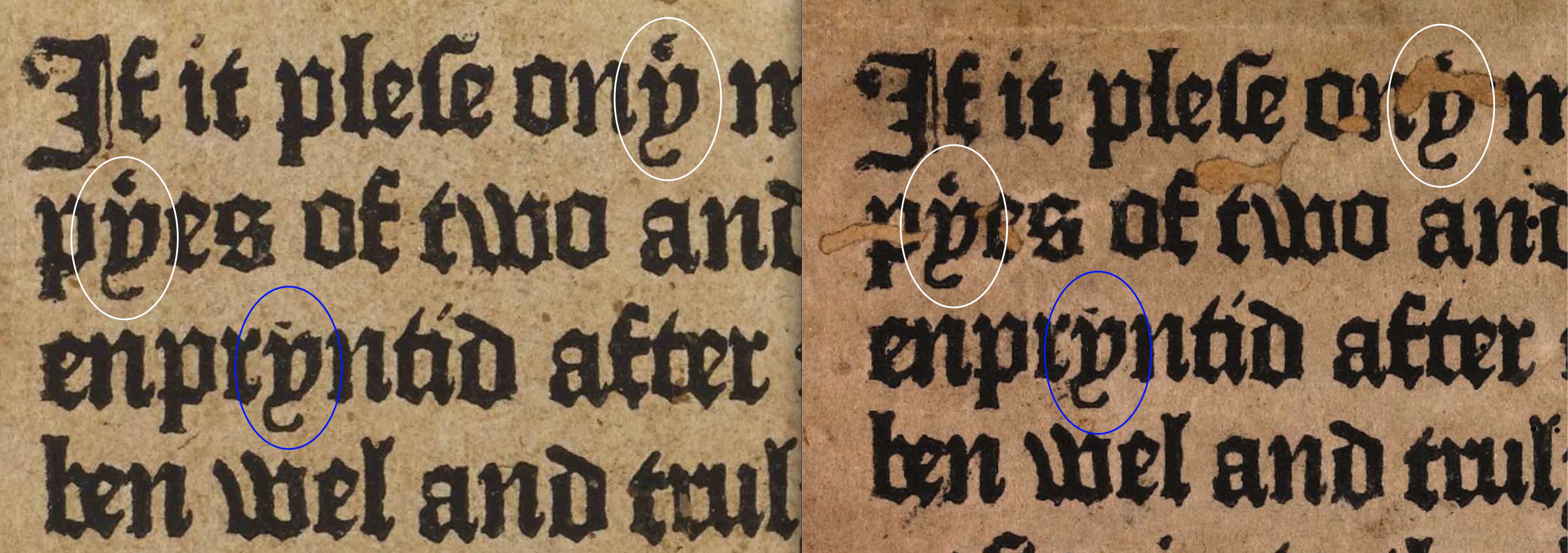
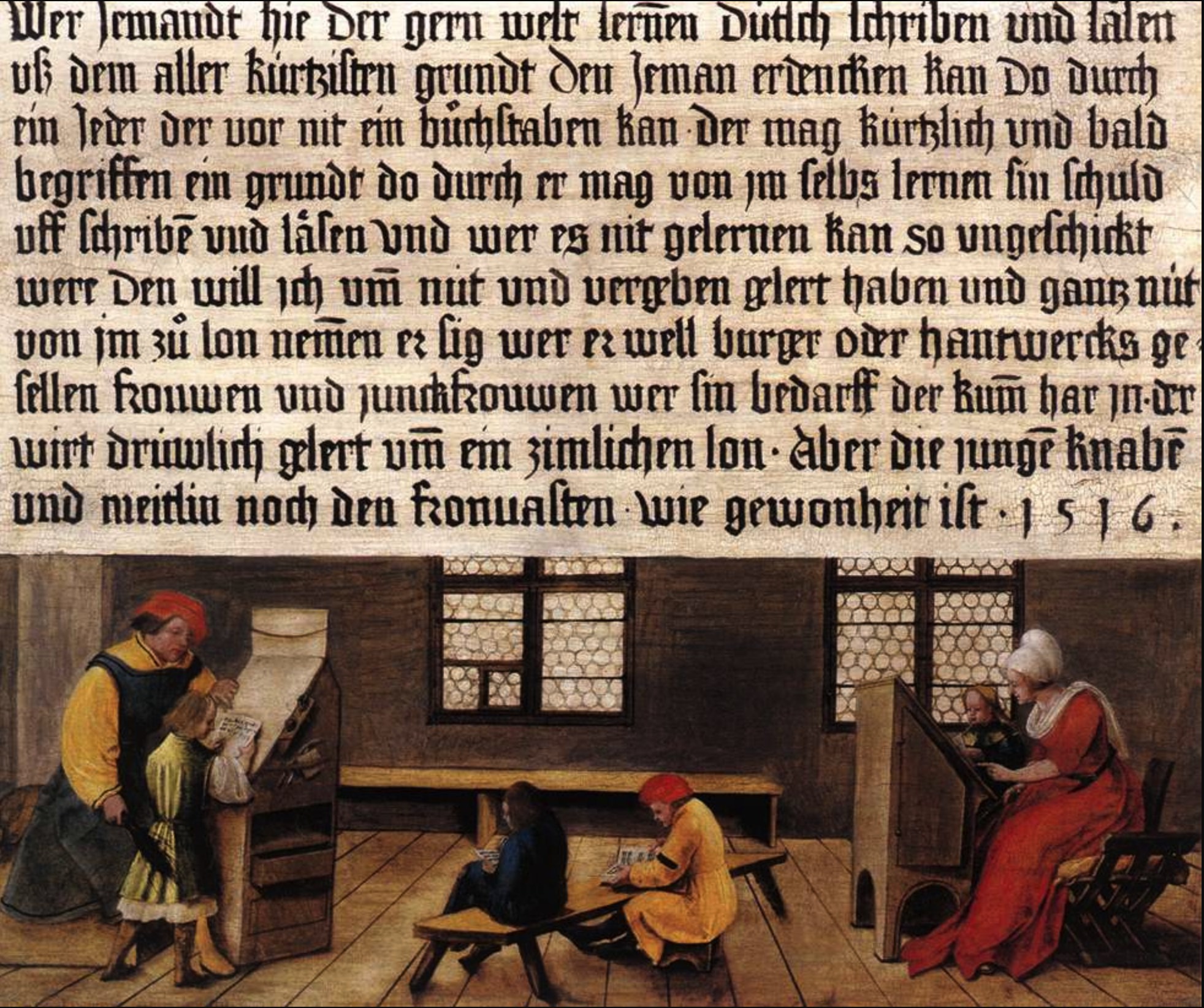
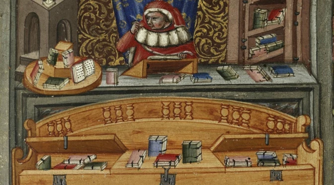
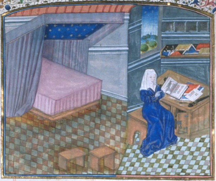
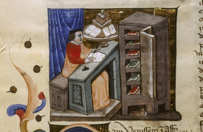
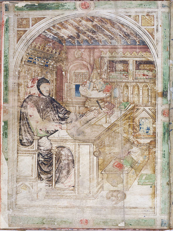
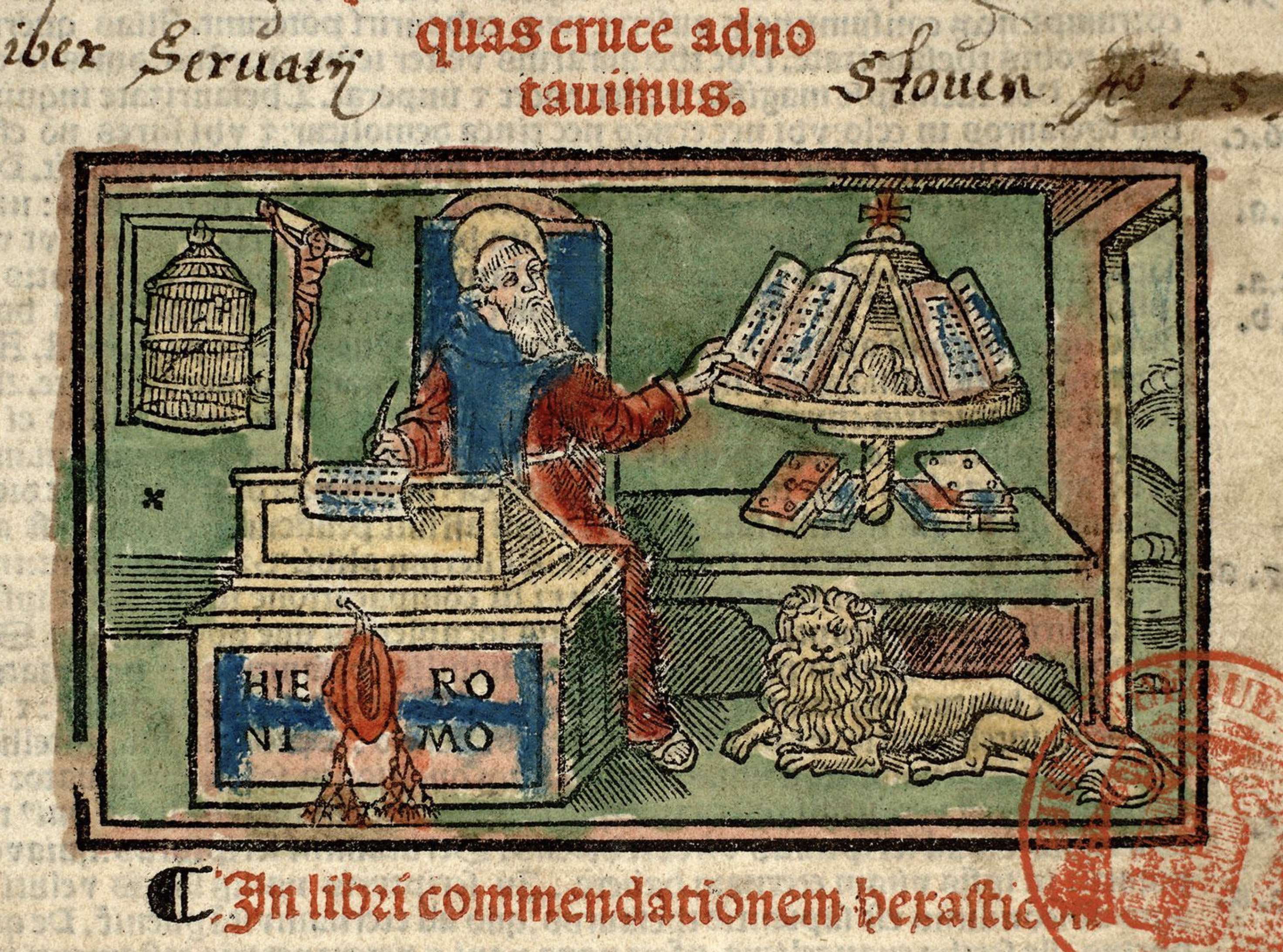
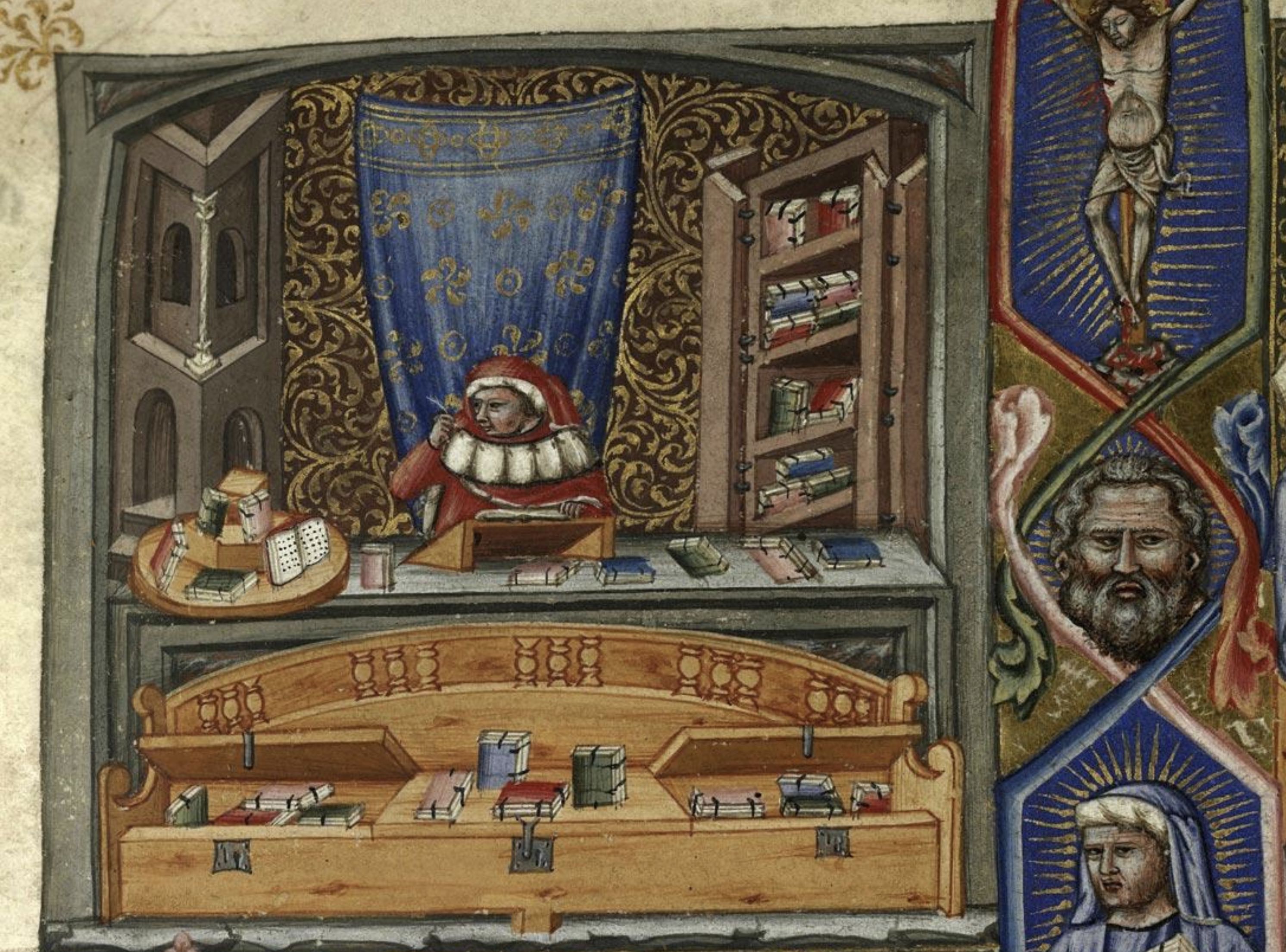
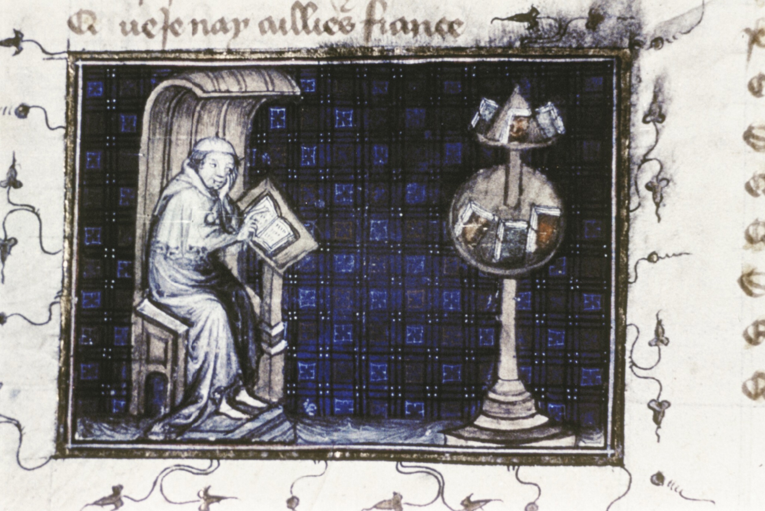
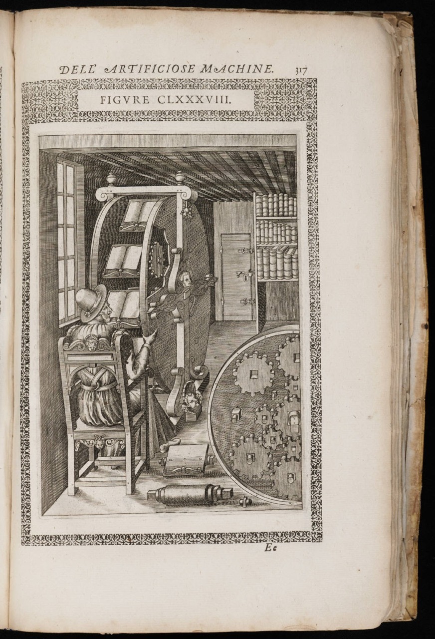
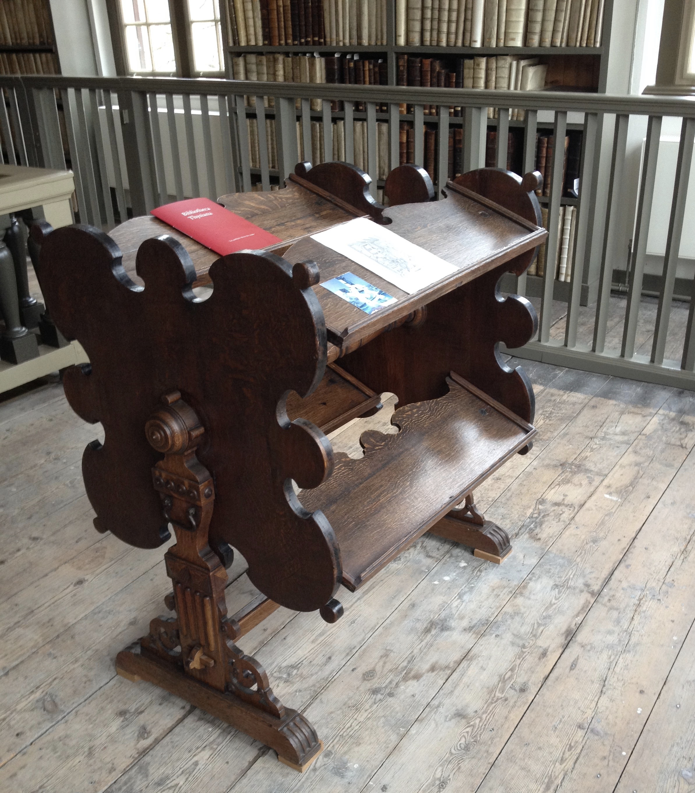
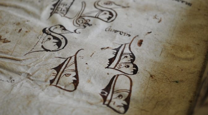
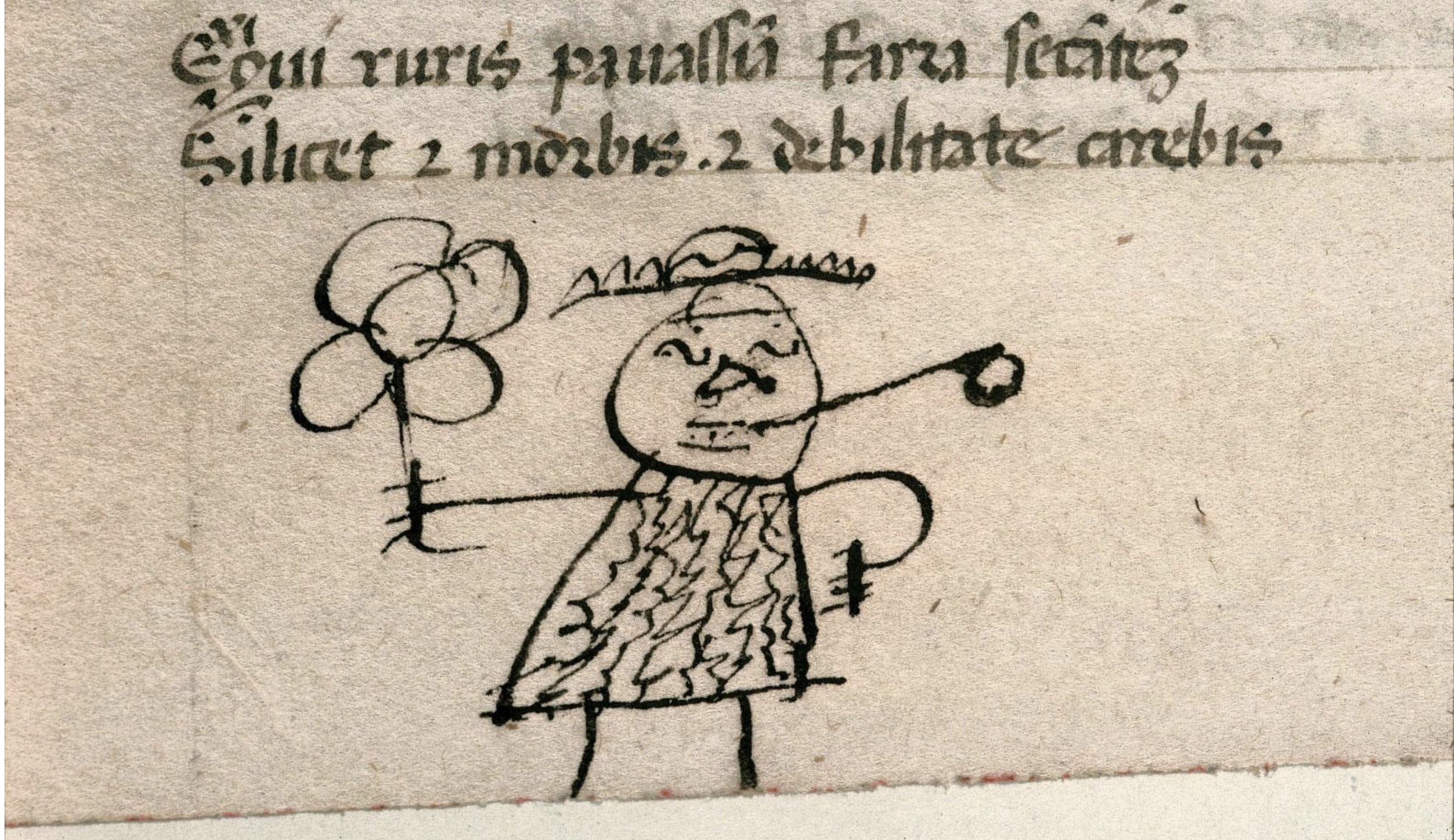
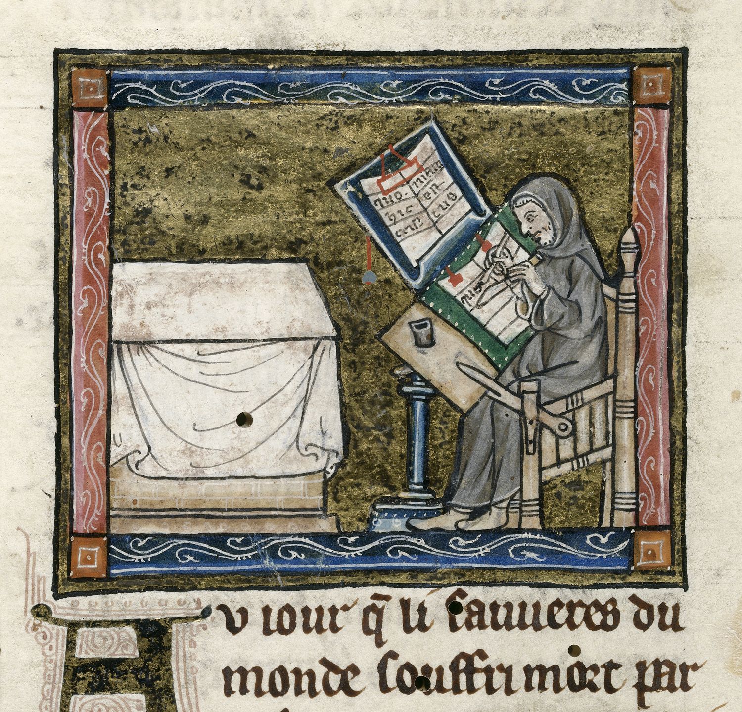
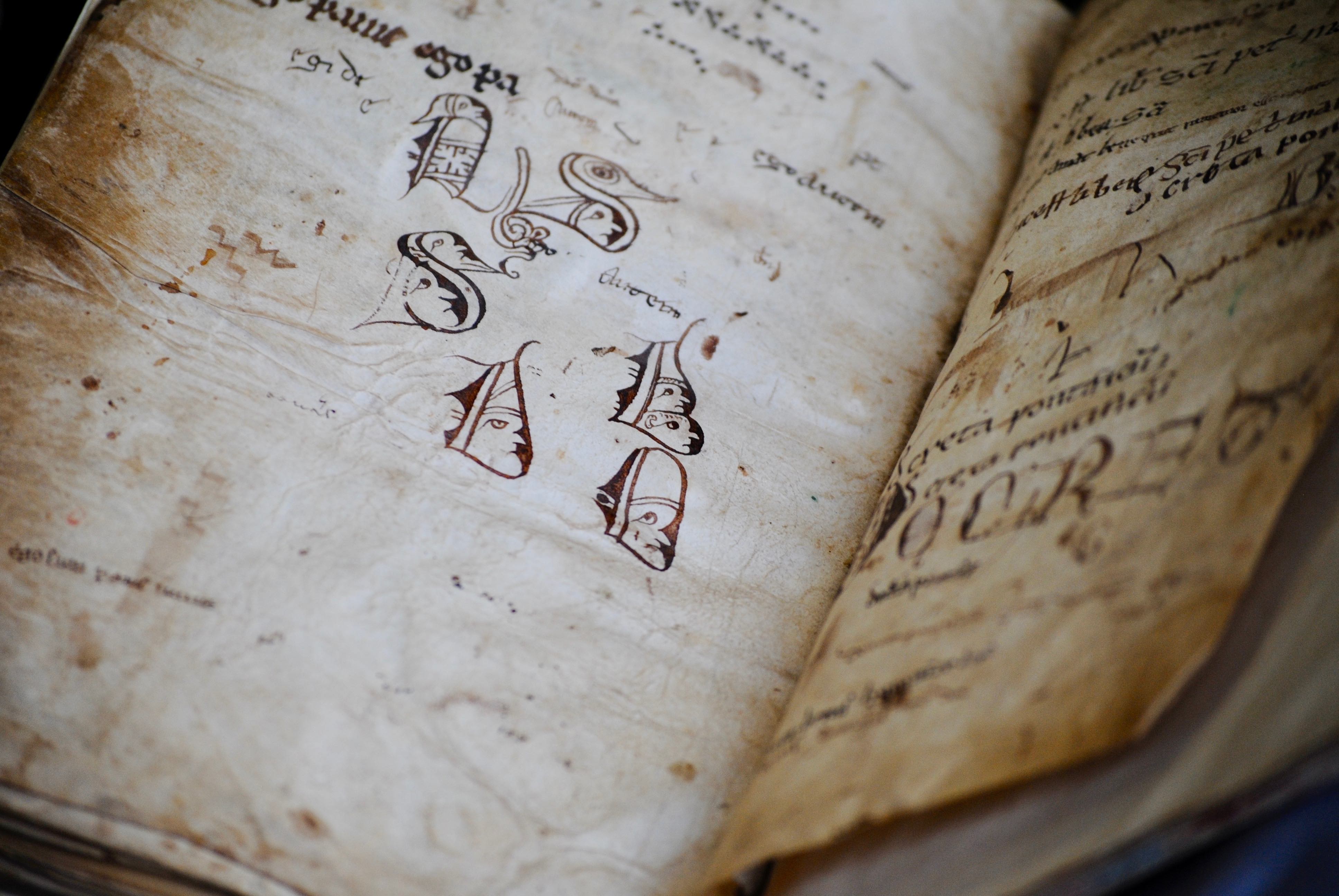
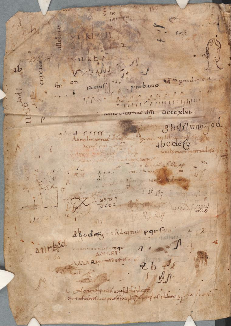
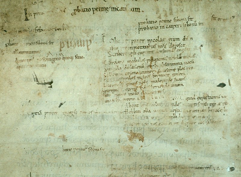
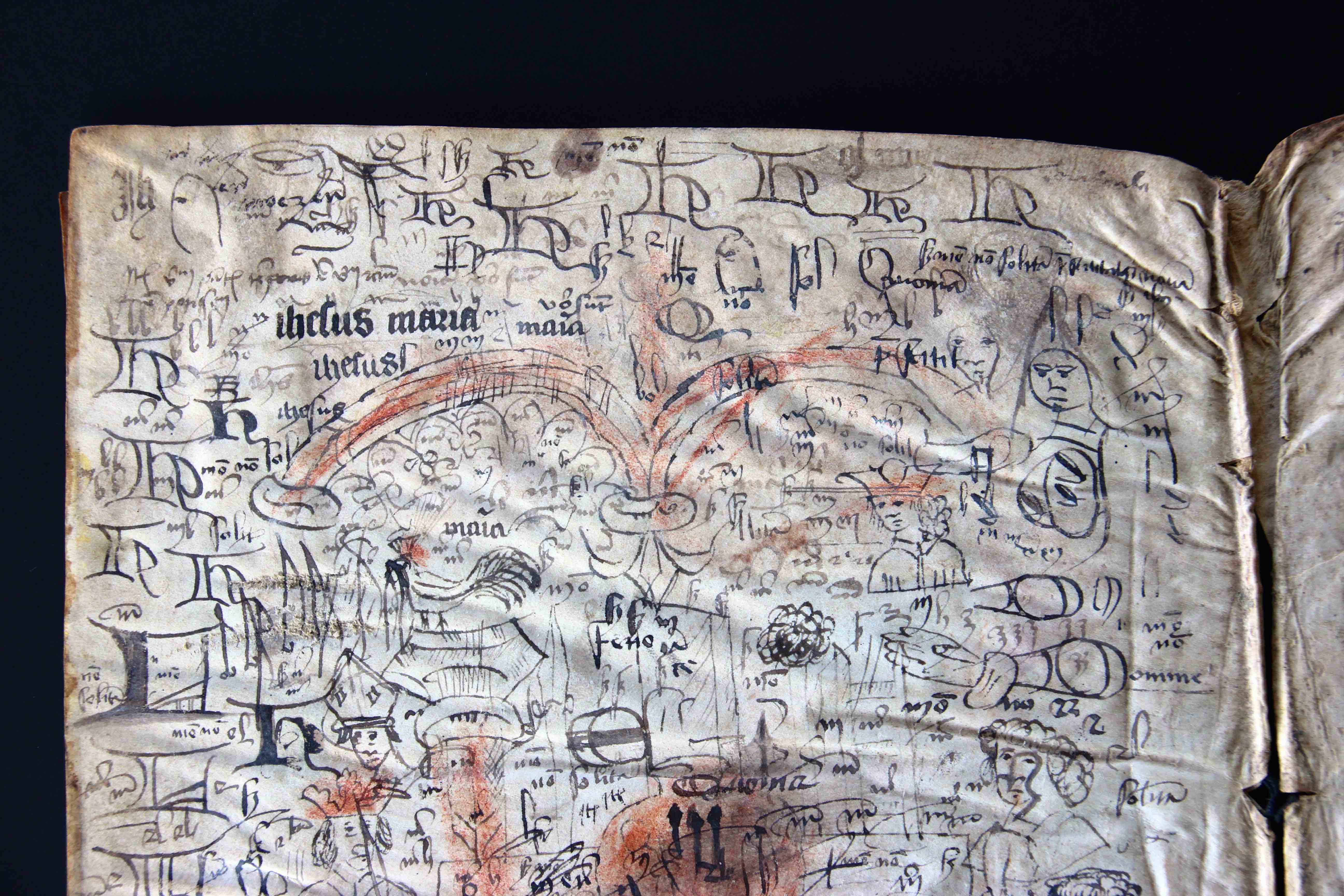
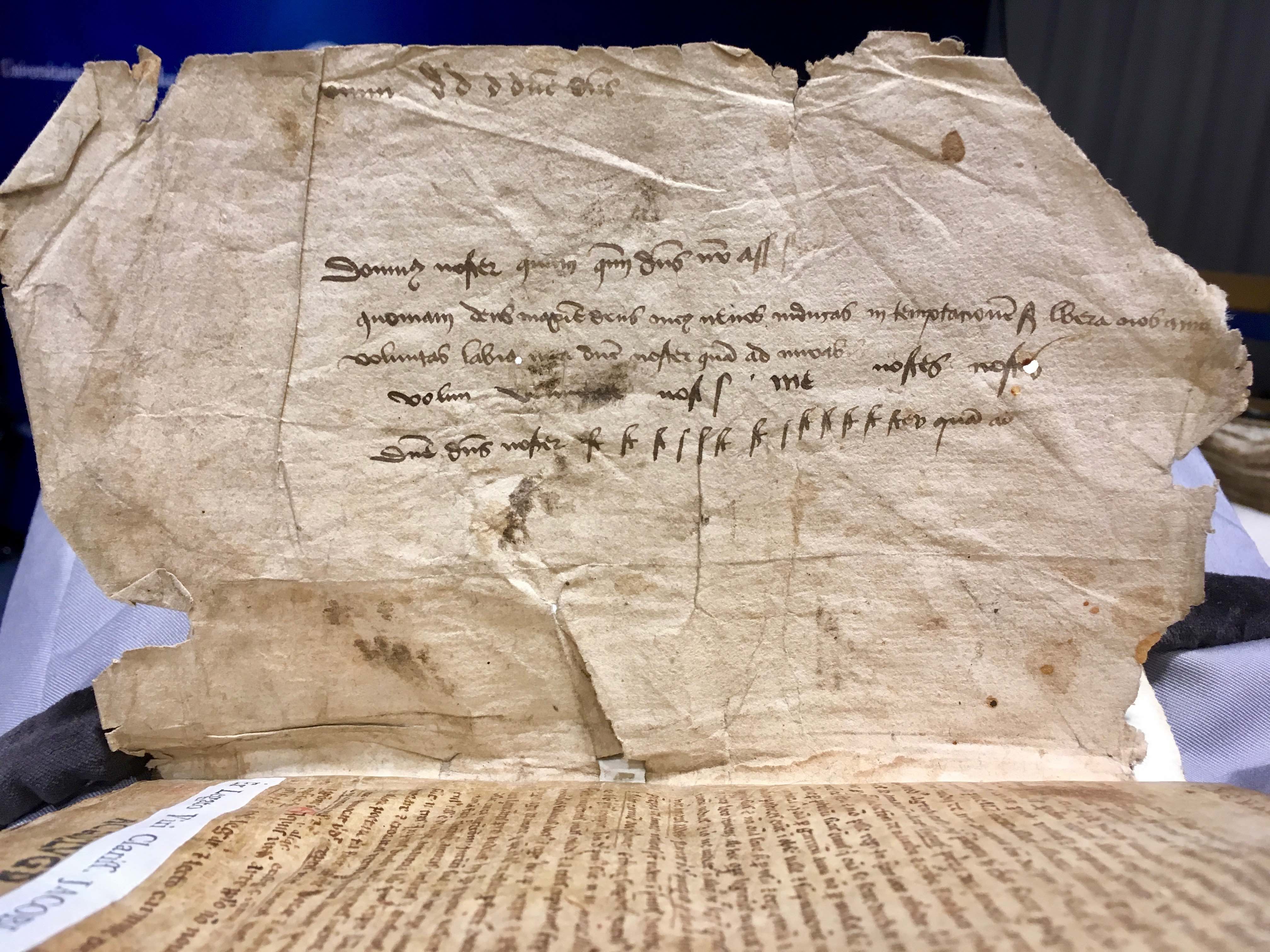
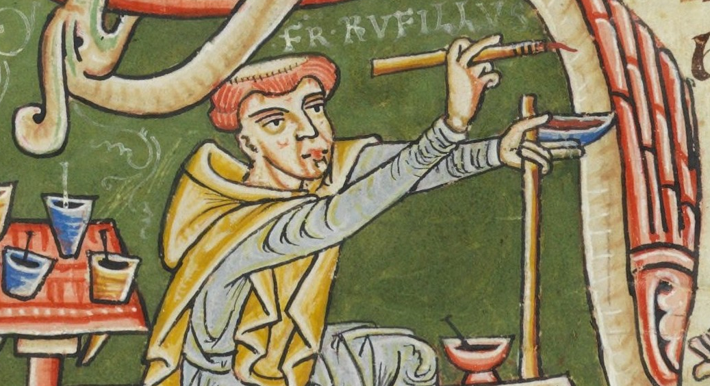 Selfies are by no means an exclusively modern phenomenon. As shown in a previous post on
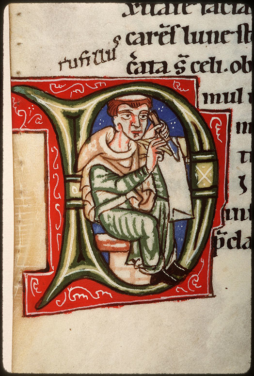

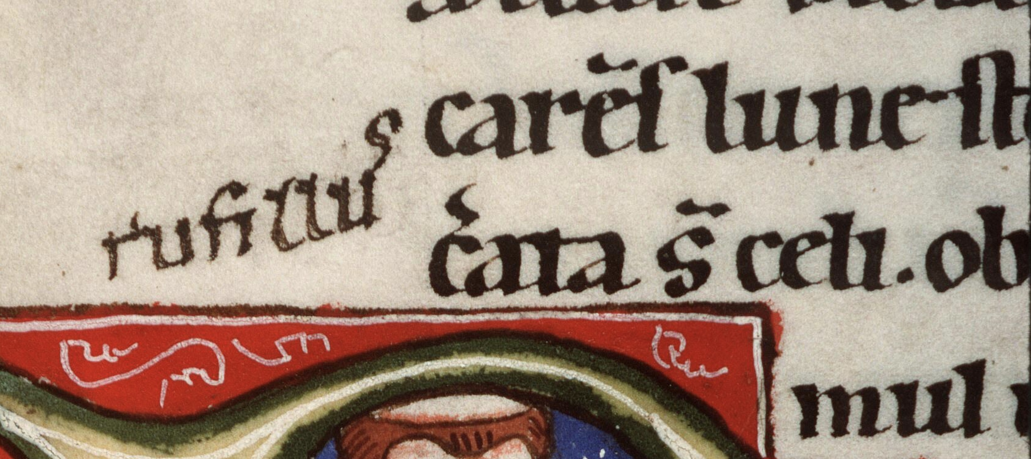
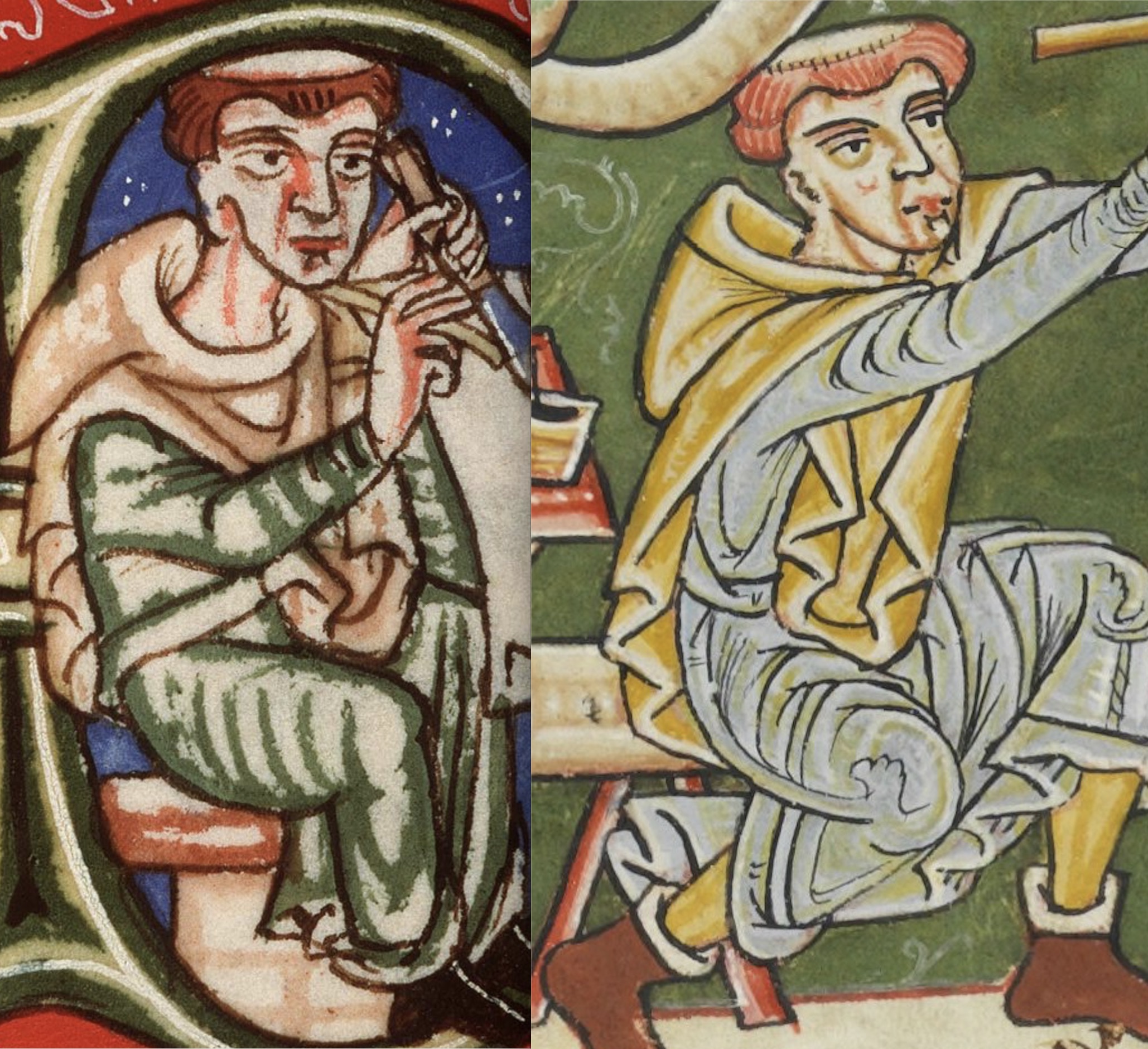
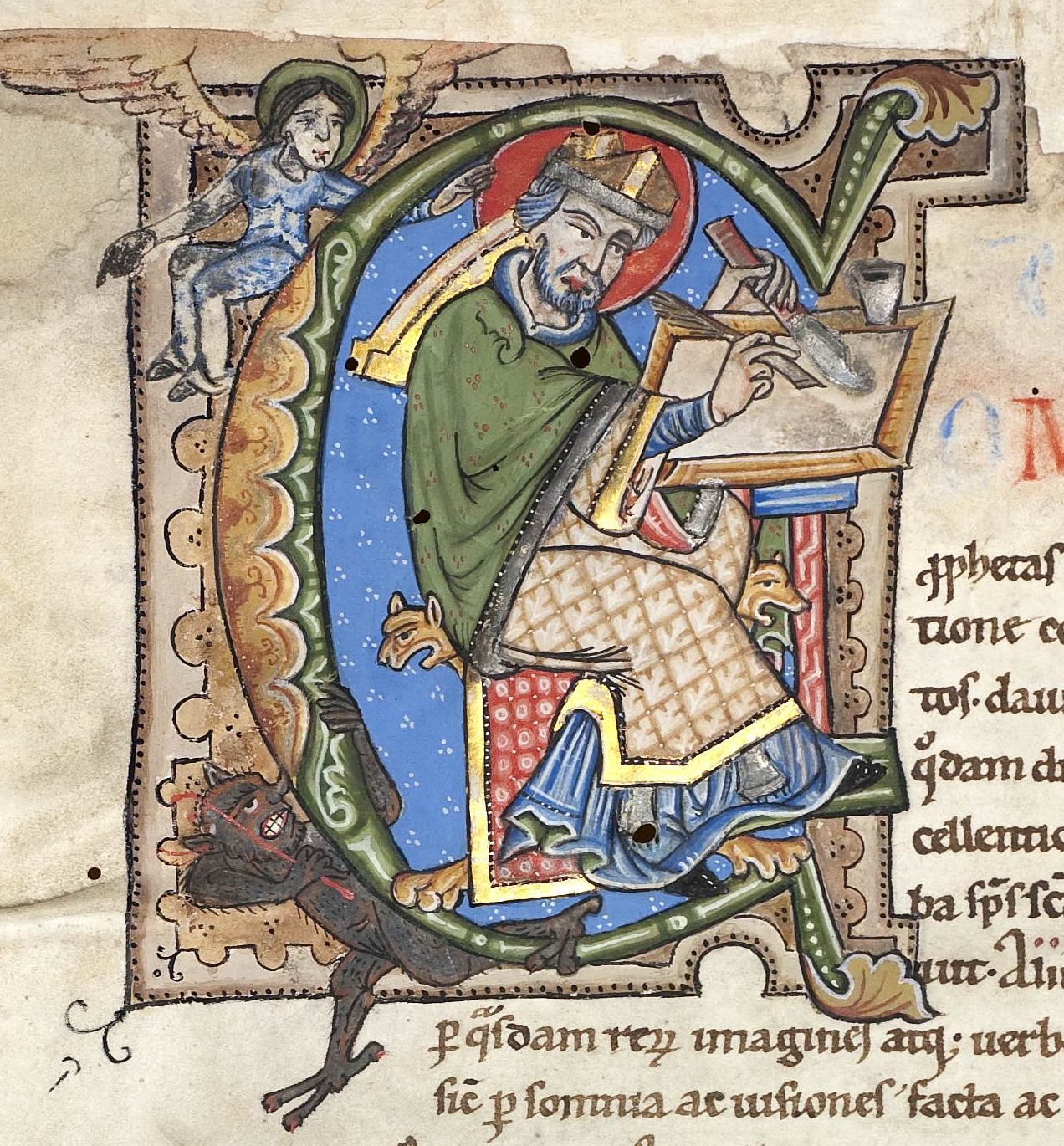
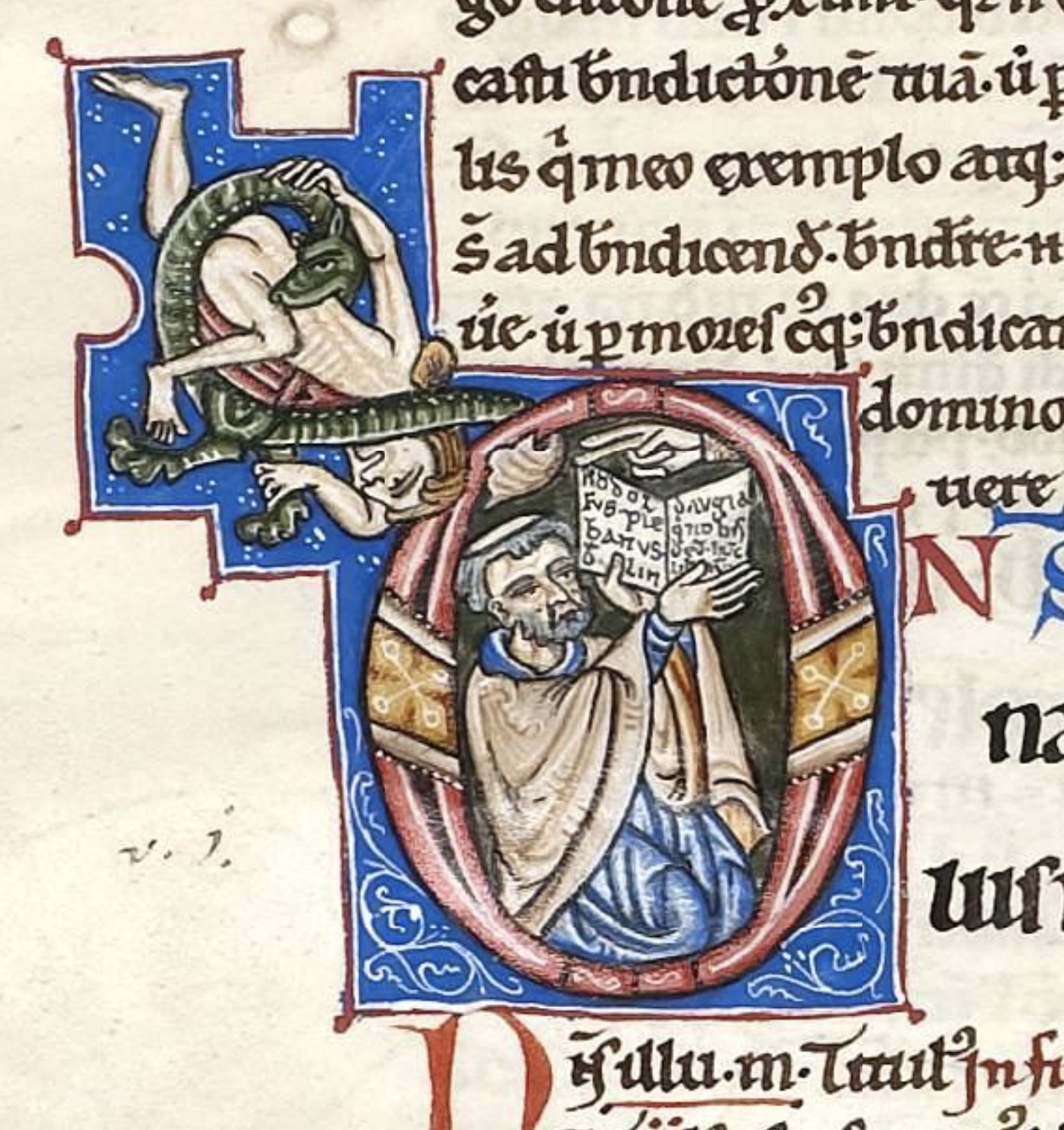
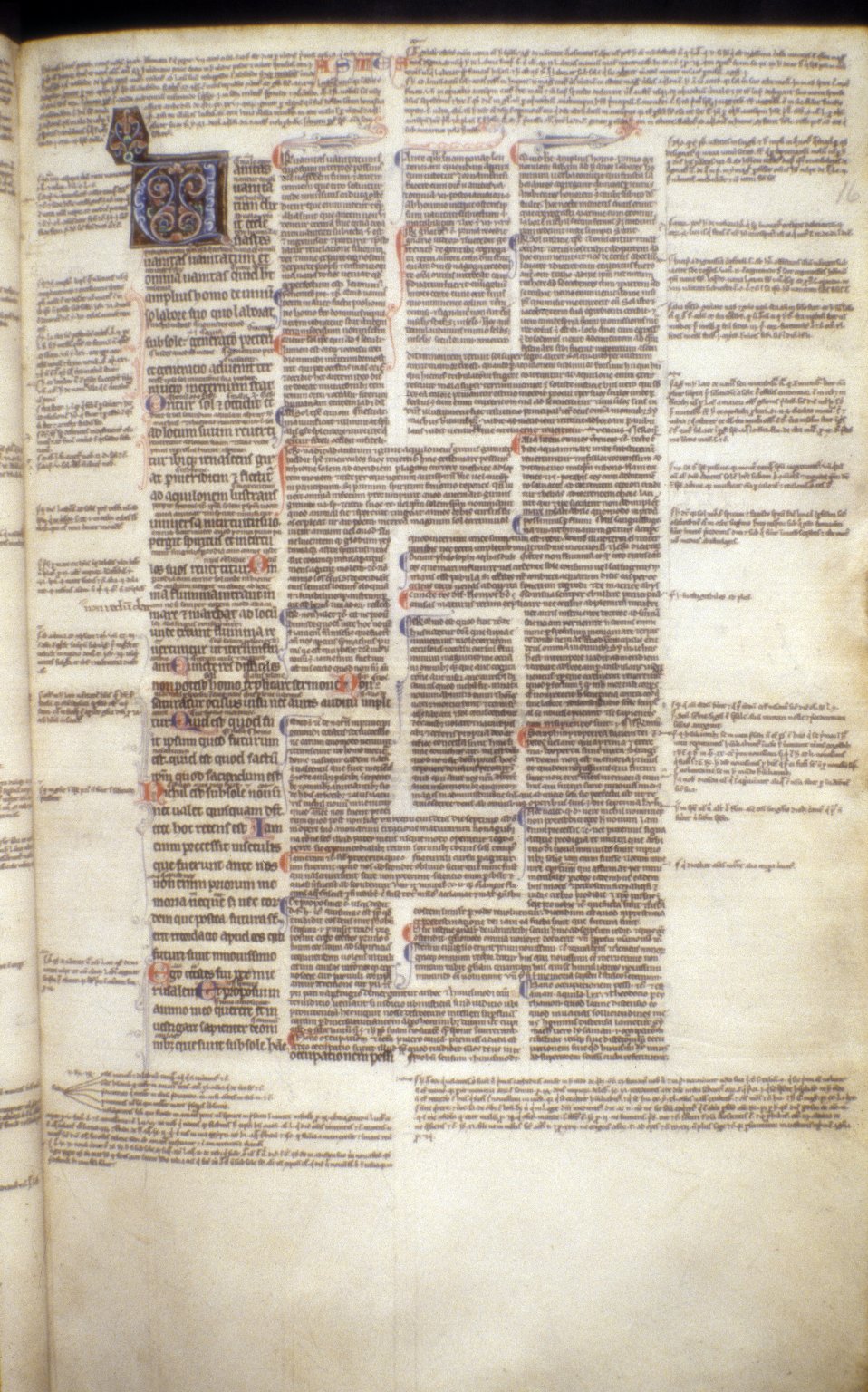

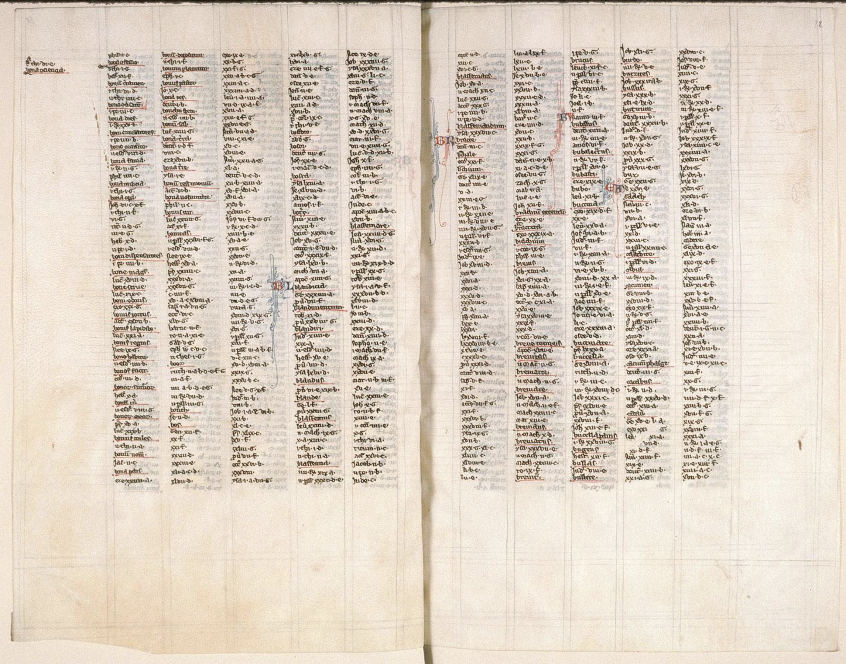
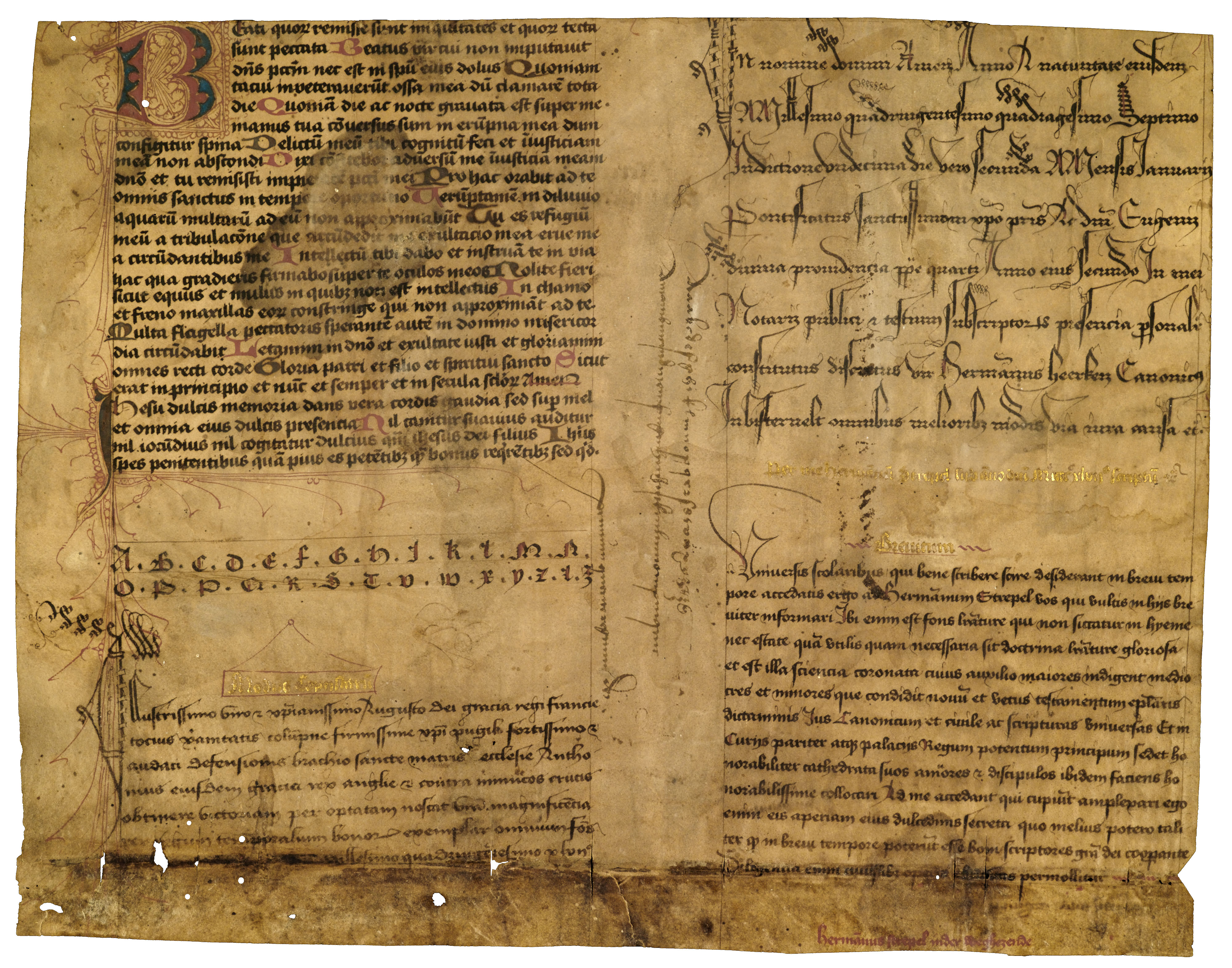

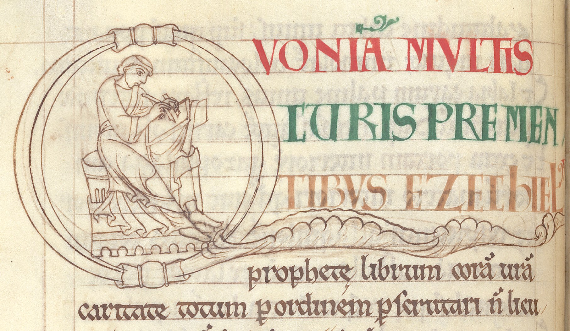

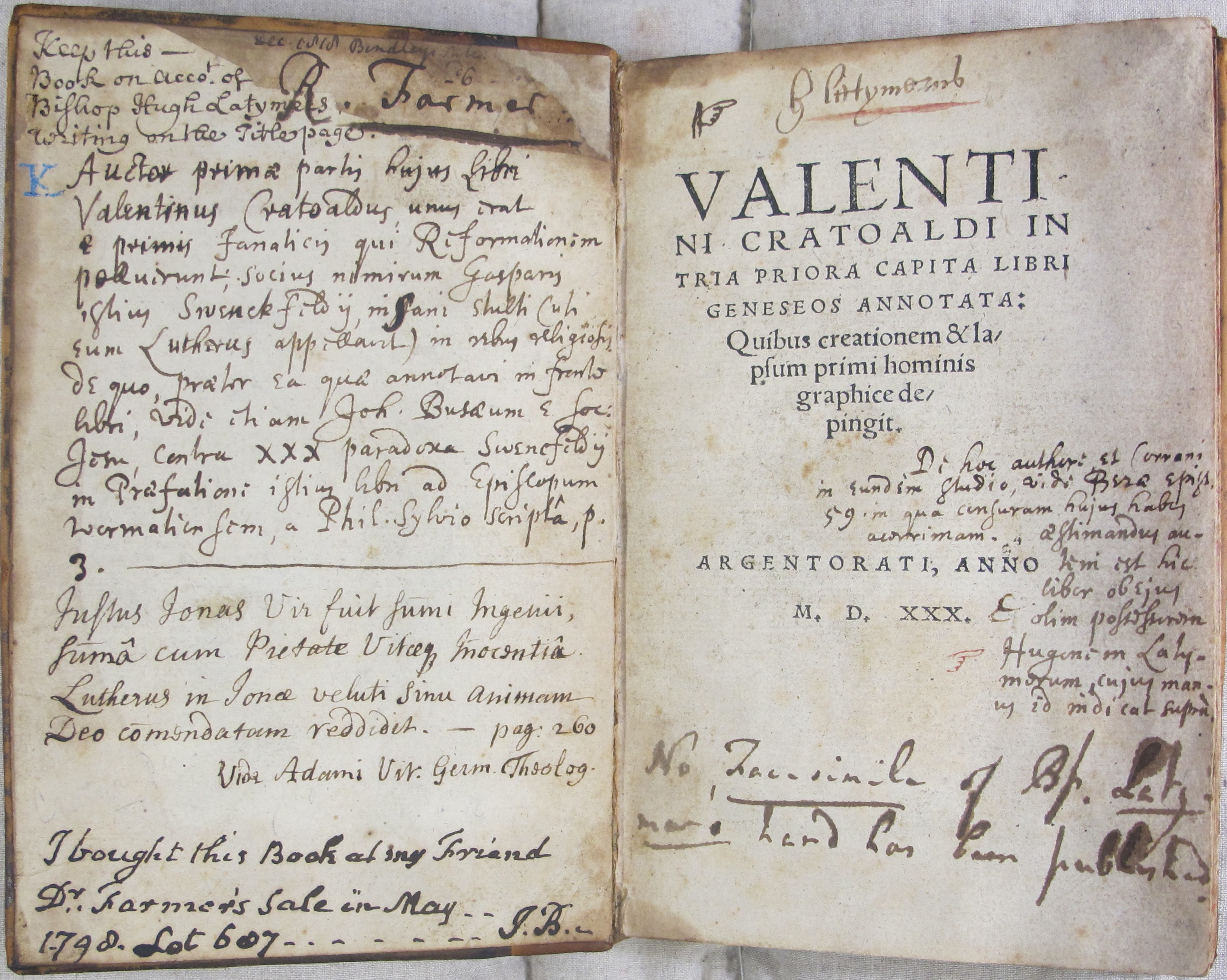