Tag Archives: Reading

Medieval Book Carousels

Medieval readers, especially studious ones, must have cursed their desks from time to time. It is not easy to manage desk space when working with often large and clunky medieval books. Scribes and translators developed work-arounds for these space issues, as I have shown in a blog post on medieval desktops. Scribes would place two desk surfaces stacked vertically, one for the book that was copied from, the other for the copy (image here). In contrast, translators would sometimes position two surfaces next to one another, one presumably for the original text, the other for the translation (see the striking images here and here). Readers, however, faced bigger challenges, since many needed more than two books open at the same time, which produced clutter and frantic searches for particular information. Figure 1 shows the French author Christine de Pisan, who is often shown while working in her study (here is an interesting article on the iconography), sitting behind a desk cluttered by books.

Brussels, Bibliothèque royale, Ms. 9009-11
Figure 1. The author Christine de Pisan shown as a reader, book clutter in fronts of her (Brussels, Koninklijke Bibliotheek, 9009-11, 15th century). Source

Near the end of the Middle Ages a device came into service that helped avid readers like Christine: the book carousel or book wheel. When precisely this device became available to medieval readers is hard to deduce, but the oldest specimens I was able to find date from the fourteenth century. While being careful of the fact that medieval images may not necessarily be a truthful depiction of reality, it appears that during this early period there are two clearly distinguishable designs available. The difference lies in the number of shelves the device was fitted with, and thus in the carousel’s capacity.

Plain design

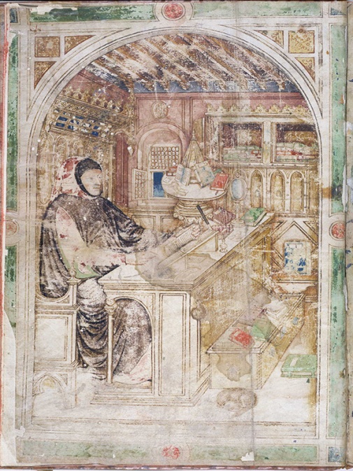
The book carousel enabled readers to have multiple books at hand, including copies that were opened to a relevant page. Among the earliest depictions are carousels shown with a single deck, providing room for no more than four to six tomes (although those with room for only two books also existed, as seen here). Early depictions of this “plain” model are seen in Figure 2 (from 1383) and Figure 3 (from c. 1400). These book wheels share some striking features. One is that the carousel stands on top of the desk, usually at the far end, where it is out of the way. This is most clearly observed in the depiction of a writing Cicero in the Bodleian Library manuscript (Figure 2). Here the carousel is placed in arm’s reach and contains various open books: the author merely has to turn the platform – carefully! – to consult them. Additional books are present in a book cupboard nearby. These would presumably be placed on the wheel when they were needed.

Oxford_Bodleian_Canon._Class. _Lat257
Figure 2. Cicero composing a work sitting at this desk (Oxford, Bodleian Library, Canon. Class. Lat. 257, dated 1383). Source

A similar scene is observed in Figure 3, which is found in a copy of Petrarch’s De viris illustribus kept in the University Library in Darmstadt. Here, too, an author is seen at work with a book wheel nearby. This carousel is placed on the desk, although the image shows this less clearly. Here the author is reading, not writing: Petrarch uses both hands to thumb through the book as if looking for certain information. More sources are nearby, placed on the book wheel, which can be consulted simply by reaching over. As in Figure 2, an open book is present on the platform; additionally, a red copy with the clasps unhooked lies at the ready. However, the platform also holds a roll, by the looks of it, as well as loose pieces of paper. This carousel is clearly in heavy use!

Darmstadt_UB_101
Figure 3. Petrarch sitting at a desk with a book carousel placed nearby (Darmstadt, Universität- und Landesbibliothek, MS 101, datable to c. 1400). Source

The images shown so far share two striking features: the book carousel appears to consist of a single platform and the device was small enough to place on top of one’s desk. (Curiously, some carousels were designed with an arm, enabling the user to “swing” the platform closer, as this example shows.) This relatively plain design continued until the end of the medieval period, and even beyond. Figure 4 shows a woodcut from a late-fifteenth-century incunabulum (an early printed book) containing a bible with commentary (here is another example from an incunabulum). Jerome, that revered bible translator, is shown sitting behind a single-platform book wheel consulting various source texts. While this scene is very appropriate given that the Church Father is known to have consulted a great deal of sources for the production of his Vulgate Bible, including Hebrew manuscripts, it clearly concerns medievalization of an ancient scene.

Paris_Mazarine_1339_A_f._014
Figure 4. St Jerome shown as bible translator, while consulting sources on book wheel (Paris, Bibliothèque Mazarine, 1339, A f. 014, late 15th century). Source

More sophisticated designs

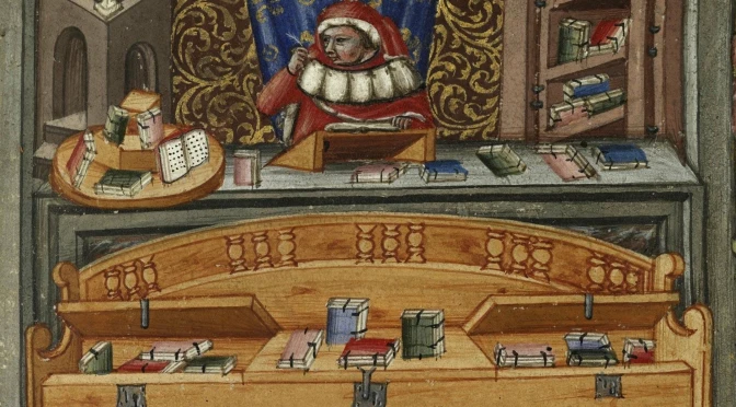
There were also more sophisticated carousels available to the medieval reader: some book wheels were fitted with two rotating platforms. This seems a sensible step-up given the limited capacity that came with a single platform – note that the individuals in Figures 2-4 all have books nearby that do not fit on their carousel. Among the surviving depictions of this “double-decker” design are two from the fourteenth century (Figures 5-6). It shows that the one and two-deck designs were in use in the same century, which indicates that readers likely preferred one or the other. In other words, we do not seem to be dealing with a chronological development.

Cambrai_BM_620
Figure 5. Scribe (likely the author Johannes Andreae) at work, surrounded by books (Cambrai, Bibliothèque municipale, 620 (572)), c. 1320-1340. Source
Oxford_Bodleian_E_Mus._65
Figure 6. One of the authors of Le Roman de la Rose, Guillaume de Lorris or Jean de Meun, shown with book wheel (Oxford, Bodleian Library, MS e Mus. 65, datable to c. 1390). Source

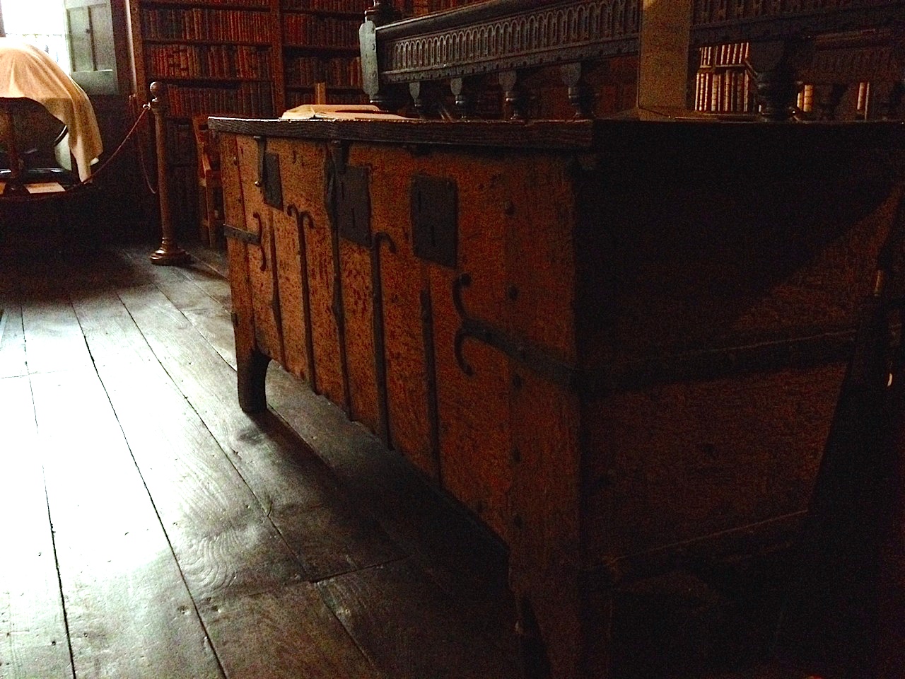
Both individuals seen in Figures 5-6 are scribes. The first in particular is very engaged with books, which are shown all around him. Not only is his desk fitted with a two-tiered book carousel, there is also a book case present behind him (note the handy fold-away doors), as well as a wooden bench that doubles as book storage. This “book bench” is fitted with locks, so that its precious contents were hidden from thieves.

Even more sophisticated designs appeared just beyond the Middle Ages. Surviving from the sixteenth and seventeenth centuries are both depictions and actual specimens of book carousels that were not fitted with a horizontally turning platform, but that moved vertically. Carousels with this orientation can be fitted with a relatively high number of shelves, perhaps as many as eight or ten. In order for the books to not fall off, it was crucial that the shelves remained level as they were turning. The most famous of these is the book wheel shown in The Diverse and Artifactitious Machines of Captain Agostino Ramelli from 1588 (Figure 7). The engraving includes the complex mechanism that held the books level.

The Diverse and Artifactitious Machines of Captain Agostino Ramelli”, 1588.
Figure 7. A scholar behind a vertical book wheel, as shown in Le diverse et artificiose machine del Capitano Agostino Ramelli, 1588, fig. CLXXXVIII (Beinecke Rare Book and Manuscript Library, Yale University, Eliz+47). Source
Leiden_Bibliotheca_Thysiana
Figure 8. Book wheel in Bibliotheca Thysiana, Leiden (mid 17th century). Source: photo by the author

Early-modern readers also could opt to purchase (have built, presumably) a less elaborate carousel with a vertical orientation, one with a modest number of shelves, each of which fitting one or two books. The one in the Bibliotheca Thysiana in Leiden contains only four shelves (Figure 8). Its user, Johannes Thysius (d. 1653), could consult up to eight books at the same time while sitting or standing behind the machine. The mechanism that held the books level is hidden inside the sides of the carousel. Even though you’d expect the books to remain on the shelves, it is quite a sensation to see the shelves remain dead level as you turn the carousel:


Larger carousels than the ones shown here do not seem to have been around in the medieval or early-modern period. There were ways to expand the device’s capacity, however, for example by adding a stationary shelf at the foot of the carousel, or even placing the book wheel on top of a small book cupboard (here is an example). Cases like this show that book carousels may have doubled as book cases. After all, private individuals in the medieval period did not usually own a large library. The modest number of books they owned would normally fit on a book wheel with a horizontal orientation. In other words, in addition to being a handy device for studying or reading multiple books at the same time, book carousels were also most useful storage devices, keeping books safe and off the ground.

The Architecture of the Medieval Page

It may seem a stretch to compare page design with architecture, but the comparison really works, I think. Looking at the medieval page, it is not difficult to regard it as an engineered construction: a convoluted space defined by columns and corridors, with rooms inhabited by thoughts and ideas (Figure 1). Nothing encountered on the medieval page is a coincidence. Everything is there for a reason and serves a specific purpose; and so, too, is the manner in which the text was spread out over the page. Like other material features of the manuscript, page design is usually reflective of how the book would be used, but in their choices scribes also responded to the preferences – demands, even – of the individuals who would ultimately use the manuscript.

Readers, in turn, preferred their books – and the pages in them – to be formatted in certain ways because they planned to use them for performing particular tasks: to educate or be educated (teachers and students), to entertain or to be entertained (minstrels and courtiers), or to gather a body of information and consult it (scholars, preachers, physicians, lawyers). How and where words were placed on the page – their size and script, and their location – were important considerations in this process of turning the book into a tool that was up to the task. Indeed, it can be argued that a page’s design was (and is) key to a book’s success. What are some of the variables in play? And how did the choice for a certain design affect, positively and negatively, the manner in which the medieval book could be used effectively?

OXford_Bodleian_LaudLat.9_16r
Figure 1. Oxford, Bodleian Library, Laud lat. 9, fol. 16r (Commentary to the Bible, 1220-30). Source

Blueprint

If the page is a building, its foundation was laid in an early stage of a manuscript’s production. After the scribe had figured out how to tackle a particular book – he knew how it would be used, having had input from the patron or the monastery’s librarian – he would start designing the page by grabbing two tools that were fundamental for what the page would ultimately look like. The first was a pointy device that allowed him to punch holes in the parchment or paper leaves, which appear like dots along the long edges of the book. The second was a tool with which he could add ruling to the page. Up to c. 1150, a sharp object was used to produce gutters – indentations in the parchment – which created pathways for the lines of text flowing out of the pen. After that date a piece of lead or a pen and ink produced the ruling (this miniature shows a scribe using a ruler to produce the ruling; at the top of this post is another).

Connecting the dots in this fashion, the scribe placed a web of lines on the page (Figure 2). The resulting grid formed the outline of the future text: it defined – and confined – the number and location of the columns, the number of lines they would hold, as well as the dimensions and positioning of the four margins. Even the ultimate presence of reading aids was construed during this early production stage. An extra line was added in the upper margin to guide the running title, if one was planned, while in preparation for marginal commentaries extra ruling was added to the marginal space (both not present in Figure 2). In a way this grid of horizontal and vertical lines functioned as the blueprint of the manuscript: it defined the ultimate page even before a single letter was written down on it. The still empty lines, yet to be complemented with words, determined what the book would look like and how it could be used later.

ruling_pattern
Figure 2. Ruling pattern, showing two pages with horizontal and vertical ruling, and marginal prickings. Source

Rooms and Corridors

The quill would bring this blueprint to life: it placed words onto the ruling, thus producing text and meaning. The main text of the book could be flanked by commentaries, which in turn formed additional columns. When several commentaries were present, the design of the page can be quite daunting – and must have been a nightmare to produce (see for example Figure 1). However, this complexity is relative. The example in Figure 3 shows a central text column, written in a large letter and deep-dark black ink, which contains the biblical text (the page shows St Paul’s Letter to the Galatians). Around it, in equally dark ink, Peter Lombard’s commentary to St Paul’s letter is encountered. This part was produced in Paris during the second half of the 13th century and illuminated in the Du Prat workshop (source).

The margins around this text and commentary remained empty until 1412, when an additional commentary by Peter Tarentasia was added to the page in a smaller script. The result is a complex page, but also a remarkably organised one. After all, the information was placed in relatively isolated text compartments – “rooms,” as it were – which were separated by blank corridors. In other words, it was crystal clear to the reader what was what: the larger size of the letter identified the main text, while the smaller script of the commentaries as well as their positioning on the page, identified the occupants of the other rooms. Complex manuscripts like these, which present a textus inclusus or “square-bracket” glossing pattern, contain pages inhabited by a maze of corridors, which “snake” between the columns and sometimes even underneath or above them.

Figure_1_KBH_71A22_180r_low-res
Figure 3. The Hague, Koninklijke Bibliotheek, 71 A 22, fol. 180r (Lombard, Glossa in epistolas Pauli, 1250-1300). Source

Pillars

The manuscripts in Figures 1 and 3 are so complex that it is difficult to say how many text columns they consist of. Evidently, however, in both cases the main text is copied out in a single column, a firm pillar written in a bold letter. Most medieval manuscripts hold either one or two columns of main text. Three or four are occasionally encountered. Usually it concerns a dictionary or encyclopedia (read about an example of four columns here). A page with more than four columns is extremely rare. In fact, I only know of one such manuscript (Figure 4). It is kept in Amiens and holds a concordance of the Bible, a tool that enabled readers to identify where in the Bible certain concepts and figures were mentioned.

The entries in this manuscript – often a name followed by a bible book and a chapter number – are short, which is why the scribe decided to place five of them on a single page. The book measures 310×208 mm and is thus not even unusually large, which tells you just how small the script is. Equally remarkable, the page has room for a sixth column, which is crammed into the outer margin. Here the reader could add remarks; one was added on the spread seen in Figure 4, all the way in the top left corner. In the lower margins, too, there is room planned for comments. A grid of square boxes is seen here, produced by pencil lines. This is a popular design for university textbooks, which contain many such penciled squares, sometimes over forty of them on one page. They act as comment boxes in which the student could jot down his notes (this is an example of such a manuscript; more about this practice in this blog post).

Figure_2_Amiens_BM_95_31v-32r_low-res
Figure 4. Amiens, Bibliothèque municipale, 95 (Concordance, c. 1300). Source

The page as a house, the scribe as its architect: they are attractive comparisons, which highlight just how much an effective page depended on crafty design, careful planning, and meticulous calculations. Like an architect, the scribe made sure to create a comfortable home for future inhabitants.

More on medieval page design:

Raymond Clemens & Timothy Graham, Introduction to Manuscript Studies (Ithaca/London: Cornell University Press, 2007), pp. 14-17 (“Preparations prior to writing”). Discusses layout and the preparation of the sheets.

Erik Kwakkel, “Decoding the Material Book: Cultural Residue in Medieval Manuscripts,” in The Medieval Manuscript Book: Cultural Approaches, ed. Michael Van Dussen and Michael Johnson (Cambridge: Cambridge University Press, 2015), 60-76. Discusses the rationale behind the choice of a manuscript’s materials features.

Erik Kwakkel, Books Before Print (Leeds: Arc Humanities Press, 2018), pp. 30-70 (“Filling the Page: Script, Writing, and Page Design”). Overview of page design through case-studies.

Elaine Treharne, “The Architextual Editing of Early English,” in A. G. Edwards and T. Takako (eds.), Poetica 71 (2009), 1-13. Architectural context used as a metaphor in the editing of medieval texts.

Chain, Chest, Curse: Combating Book Theft in Medieval Times

Do you leave your e-reader or iPad on the table in Starbucks when you are called to pick up your cup of Joe? You’re probably not inclined to do this, because the object in question might be stolen. The medieval reader would nod his head approvingly, because book theft happened in his day too. In medieval times, however, the loss was much greater, given that the average price of a book – when purchased by an individual or community – was much higher. In fact, a more appropriate question would be whether you would leave the keys in the ignition of your car with the engine running when you enter Starbucks to order a coffee. Fortunately, the medieval reader had various strategies to combat book theft. Some of these appear a bit over the top to our modern eyes, while others seem not effective at all.

Chains
The least subtle but most effective way to keep your books safe was to chain them to a bookcase. Walking around in a “chained library” is an unreal experience (Fig. 1). There is nothing like seeing a medieval book in its natural habitat, where the chains produce a “cling-cling” sound when you walk too close to them – a sound that must have been familiar to medieval users of chained libraries.

The chained library of Hereford Cathedral
Fig. 1 – The chained library of Hereford Cathedral – Source
Fig. 2 – Zutphen, “Librije” Chained Library (16th century) – Photo EK (more here)

While there are only a modest number of chained libraries still in existence today (in my own country just one remains, Fig. 2), many of the medieval books we consult in modern libraries were once part of such a collection of “imprisoned” books. Objects that were once chained can be identified with ease, either from the attached chain (Fig. 3) or from the imprint it left in the wood of the book binding (example here, lower edge). The links of the chain are remarkably crude and clunky, although they have a certain charm as well (Fig. 4 and image all the way at the top, taken from this source).

University of Kansas, Spencer Library, MS D84 (15th or 16th-century chain)
Fig. 3 – University of Kansas, Spencer Library, MS D84 (15th or 16th-century chain) – Source
Zutphen, Librije Chained Library - Photo Julie Somers
Fig. 4 – Zutphen, “Librije” Chained Library (16th century) – Photo Julie Somers

The primary reason for chaining a book was, obviously, safekeeping. Just like phones and tablets on display in modern stores are fixed to their display tables with straps, these precious medieval books were bolted to the library that owned them. This feature of stabilitas loci (to allude to the Benedictine ideal of staying in one location your entire life) turns the chain into something interesting beyond the strictly book-historical. It shows, after all, that the text inside the object was available in a public or semi-public place, such as a church or a cathedral. In other words, chains (or traces of them) suggest how information was accessed.

Book chests
Not all chained books were part of a real library – say a room with one or more bookcases. The famous seventeenth-century “Gorton Chest” from Chetham’s Library shows that books were also chained inside a book chest (Fig. 5, more here and here). This particular example was made in 1658 to contain 68 volumes that were purchased from the bequest of Humphrey Chetham. The lot made up the full extent of the parochial library of Gorton Chapel.

Chetham_Library_Book_Chest
Fig. 5 – Manchester, Chetham’s Library, Gorton chest, made in 1655 – Source

While book chests were a common phenomenon in medieval times, most of them did not actually feature chains. Surviving specimens suggest that the majority were merely wooden boxes, often enforced, that were fitted with one or more locks. The one that still survives in Merton College library, dating from the fourteenth-century, is a good example of such an object (Fig. 6). The theft-prevention plan of these chests was simple yet effective: the filled object was too heavy to move or steal, while the locks kept the contents safe from theft. In a sense, the heavy and enforced chest is the equivalent of a modern safe. Similar chests were used for other kinds of precious objects as well (here is one not made for books).

Oxford, Merton College, book chest (14th century)
Fig. 6 – Oxford, Merton College, book chest (14th century) – Photo EK

Cursing
Considering these two practical theft-prevention techniques – chaining your books to something unmovable or putting them into a safe – the third seems kind of odd: to write a curse against book thieves inside the book. Your typical curse (or anathema) simply stated that the thief would be cursed, like this one in a book from an unidentified Church of St Caecilia: “Whoever takes this book or steals it or in some evil way removes it from the Church of St Caecilia, may he be damned and cursed forever, unless he returns it or atones for his act” (source and image). Some of these book curses really rub it in: “If anyone should steal it, let him know that on the Day of Judgement the most sainted martyr himself will be the accuser against him before the face of our Lord Jesus Christ” (source).

Book curses appear both in Latin and the vernacular, including in non-Western traditions, like Arabic (example here). Fig. 7 shows an Anglo-Saxon curse from the second half of the eleventh century, in a manuscript donated to Exeter Cathedral by bishop Leofric. This combination (of curse and donated book) is encountered more often. The inscription at the bottom of the page in Fig. 8 notes that the book was donated to Rochester Priory in Kent by Ralph of Stoke. The notation ends with a short book curse.

Oxford, Bodleian Library, MS Auct. D. 2.16 (12th century)
Fig. 7 – Oxford, Bodleian Library, MS Auct. D. 2.16 (12th century) – Source
British Library, Royal MS 2 C.i (written c. 1220)
Fig. 8 – British Library, Royal MS 2 C.i (written c. 1220) – Source

These two cases suggest that the receivers of the gifts felt compelled to treat the given object with extra care. A similar sentiment is encountered in some books that were copied by individuals who were, for some reason, important to a religious house. In the early twelfth century, one Humphrey was precentor in Rochester Priory, Kent, meaning he lead the congregation in singing during the mass. He is also known as a scribe who copied a number of books for the community in a particularly dazzling script. One of these books he copied bears a curse as well as a note “In memory of Humphrey the precentor” right below it (Fig. 9). The apparent significance to the community may well be the reason why a curse was added.

BL_Royal_5_B.xii
Fig. 9 – British Library, Royal MS 5 B.xii (dated 1115) – Source

Optimism
Book curses raise a lot of interesting questions. Were they indeed favoured for books of special significance? Are we to understand their presence as a sign that librarians and book owners really thought the inscriptions were effective? And if they were, why not place them in all books contained in the library? No matter the answers to these queries, there is a certain optimism embedded in such notations: the writer of the note apparently believed that a gentle reminder would bring potential thieves around and they might consequently not take the object.

Interestingly, the same optimism is echoed by inscriptions that ask the finder or thief of a book to return the object to its rightful owner. A Middle English note reads: “Ho so me fond er ho so me took I am // jon Fosys Boke” (Whoever found me or whoever took me, I am John Foss’s book) (Fig. 10, information taken from this article).

St Petersburg, National Library of Russia, MS Lat. F.v.I. N 70 (14th century)
Fig. 10 – St Petersburg, National Library of Russia, MS Lat. F.v.I. N 70 (14th century) – Source

Notes like this bring us back to Starbucks, where I have seen similar requests stuck to the wall: whoever took my iPad, please return it, or at least return the files on it. Just as in modern times, medieval books were likely also not often returned. In fact, the example of John Foss’s book gives us reason for pessimism: in the inscription the name is written on erasure, meaning that an earlier name, of a previous owner, was erased with a knife. Curiously, this makes John Foss the potential thief of this book. If this is indeed the case, the thief identifies himself by altering the very book curse that was aimed at people like him.

Post-scriptum: more on chained libraries in this post and on the one in Zutphen here. The link to the image of the curse related to the Church of St Caecilia was provided by Elizabeth Archibald (@Elizarchibald).

Half Full, Half Empty: The Peculiar Medieval Page

Margins are both a universal and remarkable feature of books. From the very earliest specimens produced two millennia ago, to the e-readers we use today, books contain pages that hold both text and a significant amount of blank space. What a strange pair they are: words, the primary reason for the book’s existence; and a vast emptiness present on all sides of the text. A particularly remarkable aspect of marginal space is that there is so much of it in medieval books. My own work on the twelfth century, reflecting broader medieval patterns, shows that pages from that period consist of approximately 50% margin, although in some cases it can be significantly more. This implies, astonishingly, that the majority of medieval books are half empty, despite the fact that parchment was expensive and sometimes even hard to come by. Why is this?

Tradition

London, British Library, Add. MS 43725 (4th century)
Fig. 1 – London, British Library, Add. MS 43725 (4th century) – Source

One answer to this question is a simple one: because this is how books were traditionally made. Medieval scribes took over a great deal of material features first introduced by their counterparts in Antiquity. The book as we know it – i.e. an object produced from quires (bundles of folded sheets) – came into existence in the fourth century, as discussed in my post What is the Oldest Book in the World?  The pages of the famous Codex Sinaiticus, a Greek New Testament copied around the middle of the fourth century, measures 381 x 345 mm (height x width), while the text itself only takes up 250×310 mm (height x width). A simple calculation reveals that the text takes up 58% of the page, while 42% is reserved for the outer margins. In other words, a little under half of this magnificent book is empty.

Michigan, Ann Arbor, P.Mich.Inv.6238 (made 150-250)
Fig. 2 – Michigan, Ann Arbor, P.Mich.Inv.6238 (made 150-250) –  Source

Going back even further, papyrus manuscripts from Antiquity also included a considerable amount of marginal space. This is seen, for example, in Fig. 2, which shows the remains of a copy of Paul’s Epistles written between 150 and 250 CE. While the margins have been reduced post-production through damage (the edges of the papyrus eroded), the upper margin, which is largely intact, shows how the scribe reserved ample marginal space. The extensive medieval margin is, in one way, simply a continuation of an older practice.

Toolbox
The early papyrus book in Fig. 2 highlights that it was also convenient to have an empty space around the text. It meant that you could fill them with tools that may be helpful when consulting the book. A particularly important reading aid is visible at the top of the papyrus page: the capital version of the Greek letter Mu (looking like an M), which represents the Greek number 40 (Fig. 3). In other words, this is a very early page number (folium number), an instrument that is apparently some two thousand years old and predates the printed book by over a millennium.

Detail of Fig. 1
Fig. 3 – Detail of Fig. 2

There are many other kinds of aids encountered in the margins of medieval books, including cross references to other books or locations in the same manuscript, quotation marks, labels that indicate who the quoted author is, and chapter numbers. A particularly prominent aid is the running title placed in the upper margin. The one in Fig. 4 states “Physicorum”, indicating this is Aristotle’s Physics. This particular manuscript contains several Aristotle texts, which were popular in the university classroom. The student or teacher who was browsing through the book for certain information was greatly helped by these sign posts.

London, British Library, Harley MS 3487 (13th century)
Fig. 4 – London, British Library, Harley MS 3487 (13th century) – Source

Notes
While the margin did a good job accommodating the relatively short reading aids, it could be challenging to add large amounts of text to the void surrounding the main text. Fig. 5 shows a schoolbook from c. 1100 that was donated to Egmond Abbey near Amsterdam by one Baldwinus, a teacher in Flanders. The text in the book, Lucan’s Pharsalia, was used in the medieval classroom, and it is therefore no surprise that numerous explanatory notes have been added to the text, probably by Baldwinus himself.

Leiden, University Library, BUR Q 1 (c. 1100)
Fig. 4 – Leiden, University Library, BUR Q 1 (c. 1100) – Photo EK

There is something special about these marginal notes: they are preceded by symbols that are the precursor of our modern footnote (more about this early practice in this post). The symbol links a remark in the margin to a specific location in the main text. The symbol seen in Fig. 5 resembles the number 7 and is perhaps the Tironian note for “et”.

Detail of Fig. 3
Fig. 5 – Detail of Fig. 4

Despite these add-ons, the schoolbook from c. 1100 is not really prepared to hold extensive notes. Baldwinus could have crammed more text in the margins, had he copied in a smaller script or increased the number of lines for the marginal text passages (presently, their number corresponds to the main text). However, this was not yet common practice in his day and age. In the scholastic age, by contrast, when university students needed to add a lot of extra information in the margin, these two tricks were applied, as seen in Fig. 3 – note the tiny script of the marginal notes, as well as the increased number of lines compared to the main text.

Convention
The examples in this post have shown different ways in which the margin, that handy device inherited from Antiquity, was put to good use by scribes and readers. However, it has not discussed why medieval margins were so large. Why keep as much as half of the page blank? Surely a quarter would be sufficient to add notes or tools?  While there are manuscripts that exhibit pages with tiny or no margins, there are not many. Leiden University library owns one of these exceptions: an early-eleventh-century schoolbook made from scrap parchment, the pages of which were filled to the brim (Fig. 6).

Leiden, University Library, VLO 92 (1000-1025)
Fig. 6 – Leiden, University Library, VLO 92 (1000-1025)

Interestingly, the teacher who copied this book diverted from the medieval convention related to page design in that he opted not to add substantial blank spaces. His use of scrap parchment (offcuts that were left over after the regular sheets were cut from the animal skin) indicates this was a low-cost book project. In other words, making maximum use of the available space on the page is likely motivated by cost considerations: it ultimately limited the number sheets necessary to copy this collection of (classical) texts.

While the choice for large margins may have a basis in a shared idea of perfect proportions, something modern book designers would call the “golden ratio” (see herehere and here), the notion of convention is probably the ultimate drive. There are plenty of conventions in medieval book production that don’t have an obvious explanation. The relative dimensions of the page is one of them: the width of medieval books tends to be about 70% of its height (see my Books on a Diet post for some curious exceptions), but why is this so? And why do quires predominantly consist of four folded sheets? Why are page numbers placed in the upper rather than lower margin? The bottom line is that large margins may simply have been something that medieval readers had come to expect from the object in front of them.

Postscriptum – This post was written in celebration of a conference devoted to the medieval margin, which I attended in June 2015 (details and abstracts here). More on the unusual Leiden scrap manuscript in the essay I wrote for this volume. Also make sure to check out this blog by the Marginal Scholarship project. I owe the title of this post to Julie Somers.

Book on a Stick

Both medieval manuscripts and their modern counterparts are designed to accommodate human readers. Our two hands can keep an open book under control with ease by applying gentle pressure on the outer margins of the pages. Release the pressure with your right hand and a page lifts up in the air, just enough to conveniently flip it. With a rustling sound it travels from right to left, moved along by an impatient reader that is left in suspense for a second or two. The proportions of the page, too, are designed to accommodate consumption by human beings. Our eyes can handle only a small number of consecutively placed words, no more than eight or so, depending on the size of the letter. As a consequence, medieval page design shifted to presenting a text in two columns rather than one, a transition that occurred over the course of the twelfth century.

This relationship between book design and human anatomy is seen most vividly in a particularly peculiar bookish object that thrived in the sixteenth, seventeenth and eighteenth centuries: the hornbook (Fig. 1).

Washington, Folger Shakespeare Library, STC 13813.6 (dated 1625)
Fig. 1 – Washington, Folger Shakespeare Library, STC 13813.6 (dated 1625) – Source

This charming device is a primer: a text used by children as they were learning to read. It contains the alphabet (naturally), but also a small collection of short texts, such as the Lord’s Prayer and Hail Mary (more here and here). Its design reflects perfectly how the material format of books was customised for use by human beings: its user could easily grab a hornbook with one hand and hold it up at eye height. With his other hand the user could then duplicate the letters before his eyes. Two important things stand out when one observes the tradition: the variety of materials used to produce hornbooks – which were made of such materials as wood, lead and gingerbread – and its time of invention, which predate the proposed origins in current scholarly literature.

Materials
The heart of the hornbook is text, albeit a very small amount of it. In fact, it may well be the shortest read to survive from the early-modern period. Most hornbooks from that time are made out of wood. The pupil’s “required readings” were printed on a sheet of paper that was subsequently covered by a thin piece of horn for protection – hence the object’s name. The result is a remarkably sturdy object, which you can drop without damaging it, a minimum requirement for something used by young kids.

Washington, Library of Congress, 102.3 (18th century)
Fig. 2 – Washington, Library of Congress, 102.3 (18th century) – Source

Several surviving hornbooks show that the device was also used to teach kids to add and subtract. The one seen in Fig. 2, which dates from the eighteenth century, has a nifty add-on: an abacus. This particular specimen shows the end of the hornbook’s development, which appears to have become more sophisticated over time. The one in Fig. 2 contains another novel feature: the sheet of paper can be removed from behind the horn and replaced by another text, which may perhaps even be found on the reverse (here is another example). This late model is rather like an iPad with several apps loaded, one of which can even be updated when needed!

Other hornbooks were made out of even sturdier materials, such as ivory and lead (Fig. 3). The last one must have been particularly cheap and easy to produce, probably with the help of a mould. This specimen shows that the hornbook was subject to mass production, like its cousin, the printed book.

Timeline Acutions, Lot_903 (17th century)
Fig. 3 Timeline Acutions, Lot 903 (17th century) – Source

Quite different is the hornbook seen in Fig. 4. This wooden slab could be used to produce a gingerbread hornbook, handle and all. The tradition of this particularly tasty type of hornbook goes back to the seventeenth century. The English poet Matthew Prior (d. 1721) mentions it in one of his poems: “To Master John the English maid / A horn book gives of ginger-bread / And that the Child may learn the better / As he can name, he eats the letter / Proceeding thus with vast delight / He spells, and gnaws from left to right” (source). Although a peculiar book, the gingerbread version of the hornbook probably wins the prize for best didactical tool: what better reward than to eat the letter you were just able to read out loud?

Columbia University Library, RBML, Plimpton Hornbook 6 (England, 18th century?)
Fig. 4 – Columbia University Library, RBML, Plimpton Hornbook 6 (England, 18th century?) – Source

Medieval origins
While the heyday of the hornbook was no doubt the early-modern period, the scholarly literature will also tell you that this bookish device was in used in the fifteenth century, during the late medieval period. In fact, publications on the topic stress that there are also handwritten – medieval – versions of the device. Peculiarly, I wasn’t able to find one, except for this early-sixteenth-century specimen. Even illustrations showing hornbooks “in the wild” date from the seventeenth century at best, such as the pair hanging from the chapman’s basket in an engraving from 1646 (Fig. 5).

Annibale Carracci, 'Tavolette, e Libri per li putti’ (1646)
Fig. 5 – Annibale Carracci, ‘Tavolette, e Libri per li putti’ (1646) – Source and more

So is the hornbook a post-medieval invention? I was about to draw this conclusion, given the lack of evidence predating the early-modern period, when I coincidentally encountered the following illustration in a 14th-century Italian manuscript with an unidentified devotional text about Mary, the mother of Christ (Fig. 6-7).

Oxford, Bodleian Library, Canon. Misc. 476 (14th century).
Fig. 6 – Oxford, Bodleian Library, Canon. Misc. 476 (14th century) – Source
Detail of Fig. 0.
Fig. 7 – Detail of Fig. 6.

The image shows Christ being brought to school by his mother. He is bringing his “textbook” to class: a hornbook, which dangles from his wrist by a string, just like many of the later specimens did (see the hole in the handle in Fig. 1). Quite intriguingly, we are shown a real medieval snapshot of how children carried their hornbook to and at school. More importantly, it shows that the hornbook was indeed a medieval invention. Some further digging revealed additional visual evidence of hornbooks being used in before the age of print (Fig. 8).

Columbia University, Plimpton MS 184 (15th century)
Fig. 8 – Columbia University, Plimpton MS 184 (15th century) – Source

The manuscript, which was produced in Germany in 1440-1460, shows a teacher holding up a hornbook, using it to show Arabic numerals to a pupil in front of him. The German text bubble next to the scene is very positive about this teaching moment: “With calculus and numbers, I can be a star in arithmetic!” While it was produced somewhat later than the Italian example in Fig. 6, the setting in which the hornbook was used is the same: a context where basic information about letters and digits is conveyed to young pupils. While no actual hornbooks appear to survive from the medieval period, these visual representations show that educating young children was also the driving force behind the production of hornbooks in the age before print.

Helping Hands on the Medieval Page

We are taught not to point. Pointing with your finger is rude, even though it is often extremely convenient and efficient. Medieval readers do not seem to have been hindered by this convention: in the margins of books before print one frequently encounters a manicula or “little hand”. While the purpose of these “helping hands” was the same (they were usually put there to highlight an important passage), their appearance varies considerably. This is due to the fact that there was no standard format for the hand – beyond the point that it had to resemble one (Fig. 1).

Leiden, Universiteitsbibliotheek, VLQ MS 99 (13th century)
Fig. 1 – Leiden, Universiteitsbibliotheek, VLQ MS 99 (13th century) – Photo EK

Since the reader was able to shape hand and finger as he or she saw fit, we can sometimes recognise a particular reader within a single manuscript, or even within the books of a library. The charming hands function as a kind of fingerprint of a particular reader, allowing us to assess what he or she found important about a book or a collection of books. This post celebrates the variety encountered in these personal and permanent pointers, from the plain hand to the exotic octopus.

Plain hands
The term “manicula” is somewhat deceptive. Pointing hands are almost never just pointing hands. Usually there are arms attached, which may even be fitted in sleeves. Sometimes these sleeves are elaborate and realistic, with folds and all (Fig. 2). It is an exciting thought that the medieval reader who added this tiny drawing in the margin may simply have looked down and replicated his own arm. If this is true, we may potentially be able to tell something about his status, for example whether he is a monk (wearing a habit) or a private individual. This inference potentially prompts an exciting kind of study, which has never been undertaken. It also makes you wonder what to think of a full figure as seen in Fig. 3. It is tempting to think that we are looking at the reader here – although, realistically, this would probably be pushing it too far.

St Andrews, University Library, Typ NL A85 JT (Antwerp, 1487-1490)
Fig. 2 – St Andrews, University Library, Typ NL A85 JT (Antwerp, 1487-1490) – Source
Bodleian Library, Add. A 15 (14th century)
Fig. 3 – Oxford, Bodleian Library, Add. A 15 (15th century) – Source

Looking at surviving maniculae in medieval books sparks yet another correction: tiny hands are often not really tiny. The one seen in Fig. 1 takes up much of the marginal space. It is a very natural looking hand, with the digits in just the right shape and angle. There is even a nail attached to the finger – the first I have encountered. As you would expect, pointing fingers are attached to both left and right hands. Without having done any conclusive research on this, it appears right hands are more common than left ones.

Elaborate hands
Not all pointing hands look realistic. The one seen in Fig. 2 is representative of a phenomenon that is frequently encountered: the pointing finger is stretched well beyond human proportions. The reason, of course, is that the tip of the finger needs to point out one particular line – otherwise the system would fail. The fingers of a pointing hand can easily be more elaborate. The hand in Fig. 4 is not only unusual in the size of the sleeve and the notes written on it, what really jumps out is the size of the fingers and the way in which they are fanning out. The reader no doubt meant to point out an extensive passage and so more fingers were drafted into service. He did the same thing elsewhere in the manuscript, this time using an octopus with spread-out tentacles (Fig. 5). Another way to point out more than one line is seen in Fig. 6: just use two hands!

Berkeley, Bancroft Library,  BANC MS UCB 085 (14th century)
Fig. 4 – Berkeley, Bancroft Library, BANC MS UCB 085 (14th century) – Source
Berkeley, Bancroft Library,  BANC MS UCB 085 (14th century)
Fig. 5 – Berkeley, Bancroft Library, BANC MS UCB 085 (14th century) – Source
Paris, Bibliothèque nationale de France, lat. MS 4935 (15th century)
Fig. 6 – Paris, BnF, lat. MS 4935 (15th century) – Source

Exotic hands
Then there are the really exotic hands, which are turned into a visual feast. Fig. 7 shows and an arm that was turned into the body of a dragon, while the hands in Fig. 8 (which look like ladies’ gloves) are attached to the wrong location on the human body. These hands are not just meant to point out an important passage, they must also have been intended to bring a smile on the reader’s face.

British Library, Royal MS 12 E.xxv (c. 1300)
Fig. 7 – British Library, Royal MS 12 E.xxv (c. 1300): dragon with hand – Source, via
Paris, Bibliothèque nationale de France, Fr. MS 12584 (13th century)
Fig. 8 – Paris, BnF, Fr. MS 12584 (13th century) – Source

Interestingly, while the dragon could easily have been doodled by the reader himself, the depictions seen in Fig. 8 are carefully designed and painted. These pointing hands – the manuscript contains many of them – were probably done professionally. If this inference is correct, it suggests that the reader asked the artisan to insert them during production. This is interesting because it means that the reader already knew what passages he would wanted to have highlighted. It appears he already knew the text well before he owned a copy.

The range of helping hands is remarkable. There were other, easier ways to mark important passages, such as lines and crosses placed in the margin. However, in some cases readers preferred to have a more pronounced signpost. While a tiny line could be overlooked, the hands – particularly if executed with color – really pulled your attention to the thing that mattered. That particular sentiment lives on in modern times, I recently noticed when stopping at a traffic light for bikers in Leiden, The Netherlands, where I live (Fig. 8). “Dear biker”, the modern (sleeveless) manicula expresses, “push the button if you don’t want to stand here all day.” Now that is helpful.

Traffic light in city of Leiden, The Netherlands - Photo EK
Fig. 8 – Traffic light in city of Leiden, The Netherlands – Photo EK

Location, Location: GPS in the Medieval Library

Books love to hide from us. While you were sure you put your current read on the kitchen table, it turns up next to your comfortable chair in the living room. As you handle more books at the same time, it becomes increasingly challenging to keep track of their location. In the Middle Ages it was even more difficult to locate a specific book. Unlike today, medieval books lacked a standard size, so you couldn’t really make neat piles – which sort of brings order to chaos. Finding a book was also made difficult by the fact that the spine title had not yet been invented.

So how did medieval readers locate books, especially when they owned a lot of them? The answer lies in a neat trick that resembles our modern GPS : a book was tagged with a unique identifier (a shelfmark) that was entered into a searchable database (a library catalogue), which could subsequently be consulted with a handheld device (a portable version of the catalogue). Here is how to plot the route to a specific book in the medieval library.

Shelfmark
The most effective tool for retrieving a book in medieval times was to give it a number and placing it in the correct sequential order on the shelf. It is still common practice in modern libraries, for good reason: as long as the shelver puts the object back in the right spot, you will be able to find it again quickly. Such book numbers – shelfmarks – come in various forms. The more books a library owned, the more complex the shelfmarks became (had to become, actually). The most simple type merely stated that the book in question was the “twelfth volume” in the cupboard, as seen in the image at the top of this post (British Library, Royal 10 A.xi).

Ghent, Universiteitsbibliotheek, 941 (14th century), flyleaf
Fig. 1 – Ghent, Universiteitsbibliotheek, 941 (14th century), flyleaf with title and faint shelfmark “A” (15th century) – Source

Similarly, in small collections books were marked with single letters. In Bethlehem Priory near Brussels each item in the small library of Middle Dutch (i.e. non-Latin) books was given a letter, which was placed on an empty page in front of the manuscript together with a short title. The first volume in this mini library was a late-fourteenth-century copy of works by the mystic Hadewijch (now Ghent, Universiteitsbibliotheek, MS 941). On a flyleaf we can still faintly read “Visiones haywigis. A”, showing it was the first book on the shelf (Fig. 1).

Larger libraries – exceeding 26 books – needed a more sophisticated shelfmark system. A particularly clever one is found in manuscripts that were placed on lecterns, like those used in chained libraries  (Fig. 2). The shelfmarks had two components: a letter pointed to the appropriate lectern, while a number indicated the book’s position on the shelf. Because manuscripts were placed on both sides of the lectern, a bit of color was added – literally – to distinguish between the sides. Red numbers referred to books placed on the right side, black ones to those on the left.

Chained library "De Librije" in Zutphen, The Netherlands
Fig. 2 – Chained library “De Librije” in Zutphen, The Netherlands – Photo EK
Leiden, Universiteitsbibliotheek, BUR Q 1 (c. 1100), binding 15th century
Fig. 3 – Leiden, Universiteitsbibliotheek, BUR Q 1 (c. 1100, binding 15th century) – Photo EK

The shelfmark tag on the front cover of Lucan’s Pharsalia in Fig. 3 (“Q 2”) is a variation on this theme. Here the letter was made red so as to indicate on what side of the lectern the book was to be placed. It shows that the fifteenth-century owner of the book, the Benedictine Abbey of Egmond, near Amsterdam, owned a lectern library. Much like a modern GPS, the tag “(red) Q 2” ties the manuscript to a unique location: it is the third book on the right side of the sixteenth lectern.

Catalogues
Having a location tag is only useful, of course, if there is a searchable database from which the book’s location may be retrieved. How would you otherwise get to Lucan’s Pharsalia in the library, or even know it is present there? The library catalogue is such a database. Up to 1200 the contents list of a monastic library was usually merely an inventory: it marked the presence of a book, but not its location. The later Middle Ages saw a surge of real catalogues, listing books and their location. Some of these catalogues were written out in books (as we will see in a moment), while others were pasted to the wall in the library.

Leiden, Regionaal Archief, Kloosters 885 Inv. Nr. 208A (15th century)
Fig. 4 – Leiden, Regionaal Archief, Kloosters 885 Inv. Nr. 208A (wall catalogue, 15th century) – Source

A particularly big wall catalogue survives from Lopsen Abbey near Leiden: it originally measured 800×590 mm (Fig. 4). The books in this list are numbered sequentially (1, 2, 3, etc.) within categories such as “libri refectoriales” (books read during the meals) and “libri devoti et utiles” (books for personal, spiritual development). However, there is no clear indication as to where the object may be found (the same in this wall catalogue). Readers had to wander through the library to find the right section and then start counting to find the book they were looking for. Not very efficient.

By contrast, other late-medieval catalogues are very clear about the location of a book. From several monastic libraries in the Forest of Soignes just outside of Brussels, catalogues survive that actually refer to the sophisticated type of shelfmark seen in Fig. 3. The ones from Zevenborren Priory (now Brussels, Koninklijke Bibliotheek, MSS II 1038 and 7602, both early 16th century) refer to books on both the “black side” and the “red side” of the lectern.

Book cupboards in Hereford Chained Library
Fig. 5 – Bookcases in Hereford Chained Library

Handheld device
The catalogue of the lectern library in another abbey in the forest, nearby Rooklooster Priory, is the cleverest of the lot. It comes in the form of a book with a peculiar shape (now Brussels, Koninklijke Bibliotheek, MS II 152). It is long and narrow, a format that indicates it was made for handheld use, as research has shown. Curiously, the shape of the pages resembles the long inventory slips on the side of book cupboards in chained libraries (see the wooden frames clearly visible in Fig. 5). The hand-held Rooklooster catalogue must have been copied directly from such slips on the side of the lecterns.

What a clever tool the user ended up with. The open catalogue in his hand presented two columns, one for books on the “black” (left-hand side) side of the lectern, another for books on the “red” (right-hand) side. Moreover, each column is divided into two halves. The top half lists books placed on the upper shelf of the lectern, the lower half those on the lower shelf (these shelves were placed under the lectern, as seen  in Fig. 6).

Cesena, Bibliotheca Malastestiana
Fig. 6 – Cesena, Bibliotheca Malastestiana: lectern with shelf – Source

Standing in front of a lectern with his handheld device, the reader knew precisely which of the volumes in front of him was the one he was looking for: he could identify it without even opening it. This particular medieval catalogue is not unlike a modern navigation system, with “GPS coordinates” directing readers to such works as Ambrose on the Psalms (Black A 1) and Augustine’s Civitate Dei (Red A 5). The only difference is that it never ran out of batteries.

Medieval Desktops

We are used to having multiple books open at the same time when looking things up at home or writing an essay for class. Whether PDFs, e-books or old-fashioned paper volumes, switching between books in a smooth movement is something we don’t often think about. This was very different in medieval times. In those days, books tended to resist when you tried to move them: they were heavy as a brick and easily twice that size. A related problem was one of space. The average medieval book has a wingspan of at least half a meter wide when open. Consequently, comfortably placing two books in front of you was a stretch, let alone multiple volumes. In an early-sixteenth-century depiction of Erasmus, the scholar cannot even place a single book on his desk as he is writing a letter (Fig. 1).

Albrecht Dürer's portrait of Erasmus, 1526 (detail)
Fig. 1 – Albrecht Dürer’s portrait of Erasmus, 1526 (detail) – source

Interestingly, the challenges of medieval book consultation stands in stark contrast with what we know about reading and studying in the period. Readers browsed through a great number of volumes at the same time, interested as they were in learning different points of view with respect to their topic of inquiry. Sparked by this contradiction, this post explores medieval desktops. How many books are being consulted at the same time in medieval depictions of reading? How are the objects laid out across the available space? In short, how are we to understand the logistics behind the devouring of knowledge in the last four centuries of the Middle Ages? As will become clear, the answers to these questions vary greatly depending on why an individual handled multiple books at the same time.

Scribes
The first group of individuals who had to manage multiple books were scribes. By definition, a scribe had to have at least two books on his desk: the one he was making (a growing pile of quires, which remained unbound until the very end) and the one he was copying from (called the “exemplar”). While keeping track of the loose quires may have been challenging, of the groups discussed here scribes had it the easiest. After all, the individual was only technically reading one book – the one he was copying from. This explains why their deskspace was of limited size, at least judging from surviving depictions.

Brussels, KB, 9278 (15th century)
Fig. 2 – Brussels, KB, 9278 (15th century) – source

In most cases their working space was erect rather than flat (Fig. 1). This famous image of Jean Miélot at work shows how the desktop of the scribe had a 45-degree angle, resulting in an almost erect surface. Clearly visible is also a vertical orientation in the line-up of the books: one was placed above the other. In fact, the desktop in this image is split in half, with the lower half containing the book under production, as well as the scribe’s tools (ink pots and pens), while the upper half holds the exemplar. Miélot obviously needed to go shopping for a larger desk, because we see books laying around on the ground and on a bench.

London, British Library, Royal 18 E.iii (15th century)
Fig. 3 – London, British Library, Royal 18 E.iii (15th century) – source

Interestingly, there are also desks with a horizontal orientation. Fig. 3 shows the translator Simon de Hesdin at work. Although the books are out of sight, the desk clearly provides room for two books. However, they placed next to one another. This may be specially done for the task of a translator, who needed to carefully read the source text and subsequently scribbling down the translation in loose quires or on loose sheets. This way, both books would be right before him: there was no need to look up at a high book platform. (See in this respect also the note added post-publication, below.)

Readers
While it is easy to find images of scribes with a desk full of books,  it is less common to encounter readers in similar situations. That is to say: there are very few medieval scenes in which someone is reading but not writing – where books are present but pens are not. In part, this has to do with medieval study practices. Readers would usually have a pen nearby even when they were just reading. After all, remarks and critiques needed to be added to the margin at the spur of the moment. “Penless” images, while rare, often show a crowded desktop. The scene presented in Fig. 4 shows Christine de Pisan browsing multiple books at a big desk (more about Christine in her study in this article).

Brussels, Bibliothèque, Royale, MS 9009-11
Fig. 4 – Brussels, Bibliothèque, Royale, MS 9009-11

The absence of the pen may result from an urge to depict Christine as an avid reader. This is emphasized, I think, by the various volumes that lay open – note how some open books are facing down, the way we still do today! From the late medieval period a special tool was available for readers who did not like the clutter shown on Christine’s desk: the book carousel (Figs. 5 and 6).

Leiden, Universiteitsbibliotheek, BPL Collection
Fig. 5 – Leiden, Universiteitsbibliotheek, BPL Collection – Photo EK
Oxford, Bodleian Library, Douce 195 (15th century).
Fig. 6 – Oxford, Bodleian Library, Douce 195 (15th century).

These carousels allowed readers to consult multiple manuscripts in a very convenient fashion, by spinning (slowly!) the top part, which moved. The oldest one I could find dates from the fourteenth century (here), but it is possible they were in use even earlier. It is striking that these two scenes show readers – scholars – without pens, even though the second seems to hold an invisible one.

Book hipster
Cleverly, the medieval “spinning wheels” in Figs. 5-6 circumvented the constrictions of the limited space a regular desktop provided. However, what if you need even more real estate than the turning desktop could offer? The answer to this question is perhaps one of the most intriguing and cool pieces of book furniture that survive from the past: the book wheel (Fig. 7).

From "The Diverse and Artifactitious Machines of Captain Agostino Ramelli", 1588.
Fig. 7 – From “The Diverse and Artifactitious Machines of Captain Agostino Ramelli”, 1588.

The image from 1588 shows the bookwheel invented by the Renaissance engineer Agostino Ramelli, whose concept was based on medieval designs. The upside to the carousel is obvious: there was space for a lot of books. This practice is not unlike deciding to hook up a second monitor to your computer, except that the individual is actually watching twelve monitors at the same time – like a trader on Wall Street. I have sat behind one from the 17th century myself and it is truly a majestic feeling to spin the wheel. The click-click sound of the gears hidden inside the device is simply mesmerising.

The last word: laptop
While desktops (in their great variety) are representative of how most scribes and readers handled their books, there is also a surface space that is more exceptional – and that can only be addressed as a “laptop”. The use of such portable desks, which sat on the scribe’s lap, is well documented for the early-modern period (here is one from sixteenth-century Spain; here are a few others). They were used, for example, by noblemen or secretaries drafting documents and letters whilst on the road. It concerns a box with a slightly angled surface, inside which the writing materials were stored, including sheets, ink and pens. Interestingly, this practice – and tool – go back to at least the twelfth century, as Fig. 8 shows. The device contains a hole for the ink pot and inside may well have been blank sheets, in parallel to the portable kits from the Renaissance.

Chartres Cathedral, West Portal (c. 1150)
Fig. 8 – Chartres Cathedral, West Portal (c. 1150) – Source

Apart from the fact that the actual desk space was more limited than what we are used to, the medieval desktop was not so different from ours, including how messy it was. They contained books, both open and closed, as well as writing tools. However, more so than in our present time, desktops were a necessary tool, whether they were packed (as in Christine’s case) or with only one or two books in place (as with most scribes). The medieval quill, after all, needed a stable and even surface. While desktops may seem trivial objects to us, they were crucially important to both medieval scribes and readers.

Note added 22 Dec, 2014: this image of the translator Jean Wauquelin at work (Valenciennes, BM, 772) also shows the translator sitting at two desks with a horizontal rather than a vertical orientation. It raises two questions: was this unusual set-up favoured by translators; and if so, could the reason be that it allowed them to point at the line they were translating, as seen in the Wauquelin image – after all, this would impossible to do with a vertical orientation.

Smart Medieval Bookmarks

Marking pages for future reading predates browsers and the web. In fact, the practice is much older even than printed books. This post introduces various ways in which monks and other medieval readers kept track of the page at which they had stopped reading – and from which they planned to continue in the near future. What tools were available for this purpose? And how did these differ from one another? Apart from addressing these two queries, this post also reports on a genuine discovery: a new specimen of a rare but particularly smart type of bookmark, which I found in my own University Library here in Leiden. Cleverly, and unlike our modern equivalent, the bookmark in question showed medieval readers not only at what page they had stopped reading, but also in which text column and line they had left off.

Static bookmarks

 Leiden, Universiteitsbibliotheek, BPL MS 2001 (12th century) - Pic my own
Fig. 1 – Leiden, Universiteitsbibliotheek, BPL MS 2001 (12th century) – Photo EK

But let’s start at the beginning. If certain bookmarks can be called “smart”, it follows that others were, well, dumb. In bookmark terms that qualifier must go to types that are fixed to one specific page rather than being able to freely move throughout the book. Fig. 1 shows such a static bookmark, perhaps as old as the twelfth century. It was produced by making a small cut in the corner of the page, after which the emerging strip was guided through a small incision, and then folded outwards, so as to stick out of the book. The result (which you will recognize as the banner image of this blog) was as unmovable as it was destructive to the page – adding to its unflattering qualifier “dumb”.

A slightly less invasive version, no doubt preferred by medieval librarians, didn’t involved cutting but glueing a tiny strip of parchment on the long side of the page (Fig. 2). These so-called “fore-edge” bookmarks could even be filled with extra information, for example what section started at the marked location (“B” for “Baptism” in Fig. 2).

Utrecht, UB, MS 146, fol. 17r (detail)
Fig. 2 – Glued-on parchment strip with letter B (Utrecht, UB, MS 146, fol. 17r)  – source

Dynamic bookmarks
Far more interesting from a book-historical point of view are the more dynamic bookmarks, which could be used at any page of the manuscript because they were movable. An unusual example is seen in Fig. 3, which shows heart-shaped bookmarks that could be clipped onto a page. Interestingly, they were cut out of a thirteenth-century manuscript with a Middle Dutch saint’s life. The culprits were nuns in the 20th century, who clearly did not appreciate old books. Only a small number of pages of this very important manuscript have survived undamaged. When you study the book  in the University Library of Amsterdam, as I did a few years back, a curious collection of full leaves and heart-shaped fragments ends up on your desk.

Amsterdam, Universiteitsbibliotheek, MSS I G 56-57 (13th century)
Fig. 3 – Amsterdam, Universiteitsbibliotheek, MSS I G 56-57 (13th century)

The downside of such clip-on bookmarks is that time tended not to be very kind to them. Since they could be separated from the page, many actually were: they fell out or were never re-inserted by the reader. The solution to the vanishing bookmark came in the form of what is called a “register bookmark”, seen in Fig. 4 (I took the composite image from this blog post). This type, which looks like a spider with its legs trapped, was securely fastened to the top of the binding (as visible in Fig. 4, left), so it couldn’t get lost. Additionally, the bookmark allowed the reader to mark multiple locations in the book.

Auckland Libraries, Sir George Grey Special Collections, Med. MS S.1588
Fig. 4 – Auckland Libraries, Sir George Grey Special Collections, Med. MS S.1588

Evidently, these two groups of bookmarks – static and dynamic – provided very different approaches to marking information – and thus to a book’s use. Readers who added clip-on or “spider” bookmarks anticipated they would need to retrieve information not from one single page but from a changing number of pages. In other words, movable bookmarks served an audience with a shifting knowledge “appetite”, while the static ones encouraged a more “ritual” use of a book. In other words, both types are telling, in their own way, about medieval reading culture.

Multi-dynamic bookmarks
And then there is, finally, the multi-dynamic bookmark – and the story of how a new specimen of this type was discovered. The qualifier “multi-dynamic”, which is my own, refers to the fact that this bookmark is of the moving type, while at the same time it is able to do much more than simply marking a page. The bookmark’s use is as simple as it is clever. This becomes clear when we look at the bookmark in action, for example in this twelfth-century Bible in the Houghton Library (Fig. 5).

Harvard, Houghton Library, MS 277 (12th century)
Fig. 5 – Harvard, Houghton Library, MS 277 (12th century) – source

As you can see, the bookmark consists of two components. As with the spider bookmark, it features a string attached to the top of the binding (in this case the string is a strip from a recycled manuscript page). This allowed the reader to mark a certain page. Nothing new here. The second component, however, is what makes this a smart bookmark: a disk with the numbers 1-4 written on it, fitted in a tiny sleeve. The reader would pull down the marker along the string until the flat top hit the line where he had stopped reading. The disk could subsequently be turned to the appropriate column – an open medieval book usually showed four columns of text – meaning the device marked page, column and line.

Discovery
Although such rotating bookmarks were used until well into the age of print (see an example here), only about thirty-five have survived according to an inventory published in the Transactions of the Cambridge Bibliographical Society (2001). It figures that when in 2005 a tiny specimen of 41×22 mm (the size of two thumbnails) was sold off at Sotheby’s, it went for a stunning $ 11,000 (see pic at the top; more here). Just to illustrate that new specimen still emerge, I recently discovered one in the University Library in Leiden, where it was filed in an early-twentieth-century filing cabinet of the Bibliotheca Manuscript Neerlandica – since moved to a fragment collection with shelfmark BPL 3327 (Fig. 6).

Leiden, Universiteitsbibliotheek, BPL MS 3327 (14th century)
Fig. 6 – Leiden, Universiteitsbibliotheek, BPL MS 3327 (14th century?) – Photo EK

The Leiden artifact shows all the characteristics of a rotating bookmark: a small parchment disk with four numbers and a tiny hole in the middle. Interestingly, it is only the second specimen identified in Dutch collections, although the one in Leiden is clearly the oldest of the two (here is the other). While it is hard to date the red roman numbers with precision, it appears they were put on the parchment in the fourteenth century. The striking difference with the Houghton specimen in Fig. 5 is that the new find comes without its sleeve, which does not survive. It is astonishing still that the tiny disk made it to our day and age. It must have been hidden in the darkness of a manuscript  for several hundreds of years until it got separated and became an orphan – sleeveless and without a home.

Getting Personal in the Margin

At its very heart the medieval book is a vehicle of information. It was an expensive receptacle for text, which was poured onto the page by the scribe, and retrieved by the reader. As strange as this may sound, as a book historian I have limited interest in the actual text found on the medieval page. My job is to look at books, not to read them: knowing author, genre and purpose often suffices for what I do. Very different, however, is my attitude towards words found in the margins, placed there “extra-textually” by scribes and readers. Here we may find information about the production circumstances of a given manuscript and the attitude of scribes or readers towards a text. In most books, there was ample room  to add such details, because on average a stunning fifty percent of the medieval page was left blank. It is in this vast emptiness, so often overlooked in editions of texts, that we may pick up key information about the long life of the book.

Pointing a Finger

Kansas University, Kenneth Spencer Library,  MS C54 (15th century)
Fig. 1 – Kansas University, Kenneth Spencer Library, MS C54 (15th century)

We are taught not to point, but in the margin of the page it is okay. Readers frequently felt the need to mark a certain passage, for example for future reference or to debate its meaning (Fig. 1; more here). To do so, they added manicula (Latin for “little hand”) those highly entertaining pointing fingers. This is good news for us, because they facilitate a look into the mind of a medieval reader. It is not uncommon that a person’s interest shines through the collection of marginal hands in a manuscript. While most individuals simply marked spots with an X, the pointing hand provided a much clearer – and more expressive – signpost. A particularly entertaining pair is found in Berkeley’s Bancroft Library. To mark a particularly long passage we encounter a hand where all five fingers have been drafted into service, while in another case the hand is replaced by an octopus with five tentacles (Fig. 2-3).

Berkeley, Bancroft Library,  BANC MS UCB 085 (14th century)
Fig. 2 – Berkeley, Bancroft Library, MS 85 (14th century)
Berkeley, Bancroft Library,  BANC MS UCB 085 (14th century)
Fig. 3 – Berkeley, Bancroft Library, MS 85 (14th century)

From time to time a debatable passage is highlighted by a pointing device that is part of the book’s decoration, like Augustine taking a stance while aiming his spear at a gloss in the text, seen at the top of this post (source).

Critiquing Authorities

Vienna, ÖNB, S.n. 12.857 (14th century)
Fig. 4 – Vienna, ÖNB, S.n. 12.857, fol. 95v (14th century)

There is nothing more inviting to a critical mind than the empty space of the margin. Medieval readers frequently felt the need to vent in that location, for different reasons. Like Augustine and his spear, they would express their dismay about something. There is the Carthusian monk from Herne, for example, who could not handle the poor Latin-Dutch Bible translation he was reading. With a pen shaking from frustration he wrote: “Whoever translated these Gospels, did a very poor job!” (Fig. 4) The same person is encountered in the margins of a different manuscript, where he corrected yet another flawed translation (Brussels, Bibliothèque Royale, MS 2849-51). Providing improved readings in the margins he added the following personal touch: “This is how I would have translated it.” Take that, translator!

While such explicit remarks are exceptional, critiquing the text in the margin was a normal thing to do as a medieval reader. In most cases he or she would jot down a gloss next to the actual text and connect the two with so-called tie marks – the precursor of our footnote (Fig. 5). This practice became particularly popular in the university classroom of the thirteenth century. The De disciplina scholarum, a student guidebook from Paris, stipulated that wax tablets or tiny slips of parchment were taken into the classroom for note-taking. These notes were later added to the margins of students’ textbooks. Aristotle manuscripts, the main textbook for the Arts Faculty, even provided a clever “zoning” system to accommodate criticism: the margins were broken up into vertical columns where the opinions of master and student would settle (visible in Fig. 5).

London, British Library, Harley MS 3487 (13th century)
Fig. 5 – London, British Library, Harley MS 3487 (13th century): marginal notes preceded by tiemarks

Scribes Getting Personal
The examples so far show how marginal additions allow us to peek into the world of those who read manuscripts. Similarly, marginalia bring us closer to those who made the books. Well known are the logistical remarks. From time to time we encounter cross references (“For more on this theme, see this and this page”), remarks about a manuscript’s contents (“Something seems missing here”), or indicators expressing that something is missing (“Vacat”, this is empty). While these statements suggest that book makers put their heart into their scribal work, they can hardly be called “personal”.

That label is appropriate for a rarer type of scribal remark. From the same Charterhouse as the nitty-gritty reader who disliked the Gospel translation comes the following marginal notation: “I put this text here because it also contains work by [the author] Jacob van Maerlant” (Ghent, Universiteitsbibliotheek, MS 1374, fol. 129r). Says the same scribe in another manuscript: “I copied this here because it analyses faith” (Vienna, ÖNB, Cod. 13.708, fol. 218r). With these remarks the scribe appears to deliver a personal message to the reader, sharing his rationale for compiling the collections.

London, British Library, Add. MS 30024, fol. 1v (Mechanical arts)
Fig. 6 – Depiction of the mechanical art “escriture” (writing), showing a commercial scribe, front (London, British Library, Add. 30024, fol. 1v, detail)

Other personal statements come from the world of commercial book production. Here it was all about making a profit out of producing and selling books (Fig. 6). Some artisans wrote their name and location in the margin, like a medieval form of spam (I wrote about it here). Not every paid scribe was equally happy with what he received and from time to time we encounter complaints. On 15 May 1444, at nine o’clock in the evening, the scribe Henry of Damme finished a copy of a chronicle about the city of Brussels, which he had copied for the municipal government. In a corner of a flyleaf he tallies his expenses: “11 golden letters, 8 shilling each; 700 (initial) letters with double shafts, 7 shilling for each hundred; and 35 quires of text, each 16 leaves, at 3 shilling each” (source, in Dutch). Unsatisfied as he was, he wrote the following underneath the last text line: Pro tali precio nunquam plus scriber volo: “For such a (small) amount I won’t write again!” (Brussels, Bibliothèque Royale, MS 19607, fol. CCLXXVr).

The breakdown of these numbers show that Henry had little reason for complaining: he earned 1.4 shilling a day, which is about the same as his fellow scribes working in the chancery. While the Carthusian scribe who explained the reasons for putting a collection together made a positive and personable connection to the readers of his books, Henry’s remarks, by contrast, expose him as a bit of a greedy whiner.