Category Archives: Social Media

Facebook Before Facebook: Tagging in Antiquity

This is a guest blog by Sarah E. Bond, ancient historian in the Classics Department at the University of Iowa. The post highlights the link between media in the past and in our own digital world, a theme that is frequently addressed here. Sarah maintains a blog devoted to classical culture. EK


In the digital world, tags are ubiquitous. When we digitally tag items, we are essentially applying metadata (information about your information) to an object. We practice this all the time: when we write a blog post and want to increase viewership, when we upload an image onto Flickr, or when we identify individuals or places in Facebook posts. At Facebook’s Desktop Help center, they attempt to explain the reasons for tagging: “When you tag someone, you create a link to their profile…Your status update may also show up on that friend’s Timeline.” In antiquity, tags functioned in a similar manner to today. Though on stone, ceramics, mosaics, and other media rather than the screen, they still broadcast literary and social networks while also providing context for the viewer.

Fig. 1 - Monticello
Fig. 1 – Monticello Archeological Field School, 2005 – Source: Facebook Sarah Bond

In the book Evolution and Ethics (1893), biologist T.H. Huxley wrote that, “One of the unpardonable sins, in the eyes of most people, is for a man to go about unlabeled. The world regards such a person as the police do an unmuzzled dog, not under proper control.” What Huxley meant was that there is a human proclivity toward labeling individuals, objects, places, and concepts. In short? Our minds prefer to organize knowledge.

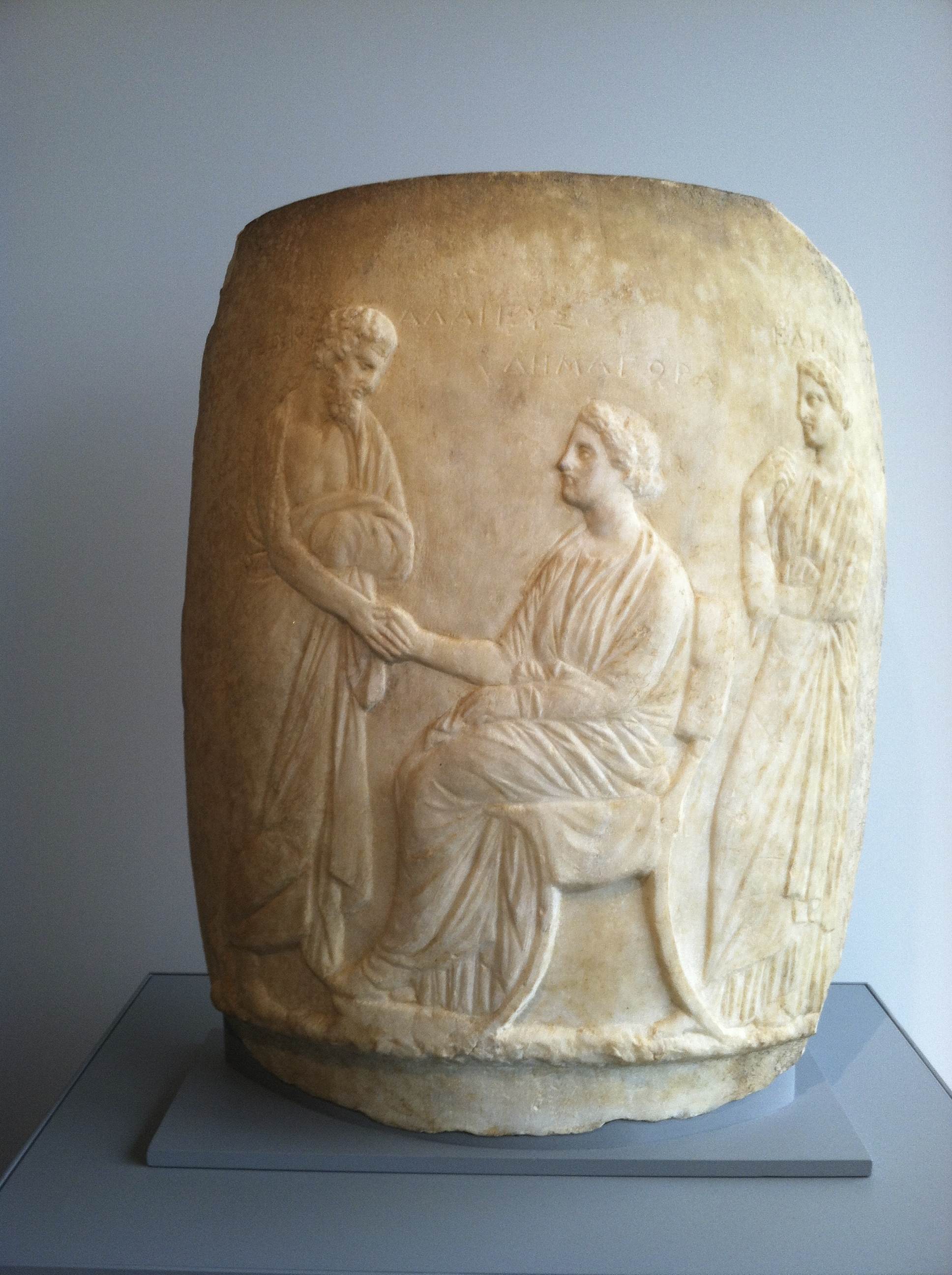
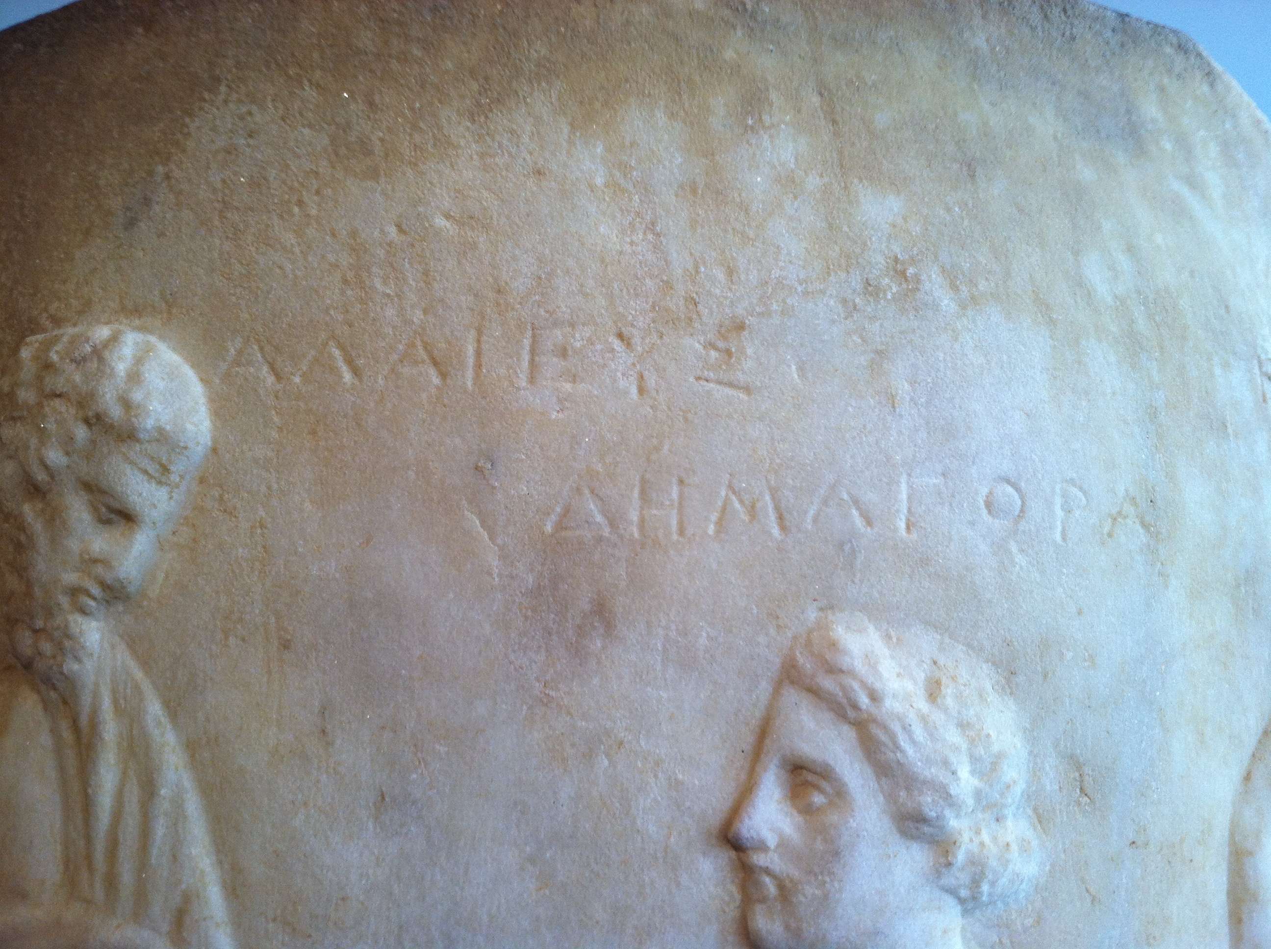
I couldn’t help but recall this quote not long ago, while recording an inscription at the Art Institute of Chicago for the U.S. Epigraphy Project (Fig. 1). On display in the newly reopened Greek, Roman, and Byzantine galleries of the ArtIC is a funeral monument from the 4th century BCE shaped like a Greek lekythos, an oil jar (Fig. 2). The marble marker didn’t just imitate a ceramic vessel in regard to its shape; it also replicated the tags that often identify figures on Greek pottery. Interestingly, with steady precision, the stonecutter labeled the three figures: Leon Alaieus, Demagora, and Helike (Fig. 3).

Fig. 2 - Leon
Fig. 2 – Funerary Lekythos, 4th century BCE. Katherine K. Adler Memorial Fund, Mr. and Mrs. Walter Alexander Classical Endowment Fund, Costa A. Pandaleon Greek Art Memorial Fund, and David P. Earle III Fund, 2009.76 – Photo SB
Fig. 3 – Funerary Lekythos, 4th century BCE  (detail of Fig. 2)

One of my jobs—along with the other contributors to the USEP—is to visit museums and record the inscriptions on various objects. Many of these epigraphic notations receive little attention from viewers, not only because most visitors can no longer read Latin or Greek (O tempora!), but also because the modern focus tends to champion the figures rather than the texts. However, we must ask ourselves whether this is a modern bias. By all accounts, there was a strong interplay between texts and images in antiquity that cannot be ignored. Moreover, the inclination toward the organization of information through labeling went beyond simple identification. Much like today, labels functioned in a myriad of ways: to articulate space, to exhibit notions of proper paideia (education) and legitimacy, to trigger collective memory, and to provide deeper engagement with an object.

Fig. 4 - Jerusalem portion of the Madaba Map
Fig. 4 – Jerusalem portion of the Madaba Map, 6th century CE – Source

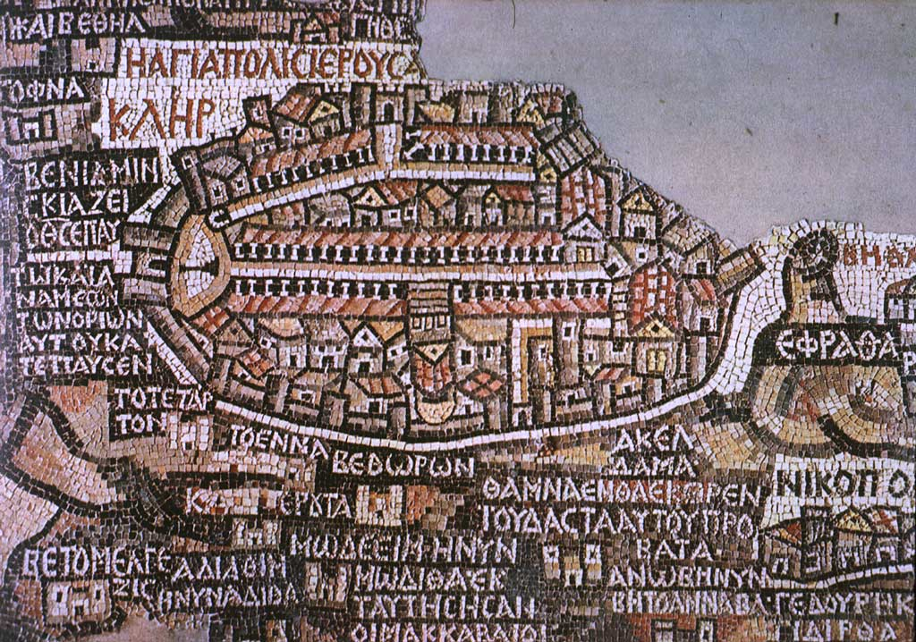
Moving away from classical antiquity and into the late antique period, the interplay between texts and images became more pronounced, particularly through mosaics. Perhaps the most well known example of this is the Madaba Map, a mid 6th century CE mosaic from Jordan depicting the Holy Land (Fig. 4, interactive version here). Discovered in 1884, the map has a mix of topographical tags and buildings in order to project a worldview of the Christian Near East. The buildings are not to scale, areas are highly distorted, and it would be of little use to a traveller, but then again, the objective of the map is not functionality. To my mind, the incredibly clustered tags are visually advertising the abundance of Christian sites in general. Here the tags and the architecture work together to claim dominion.

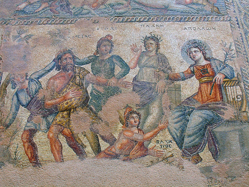
It is important to remember that just as there are trends in writing materials or in fonts, there were fashions in tagging based on period, place, and medium. During the later Roman empire, it appears to have become vogue in the East in particular to label mosaics. Mosaics from Cyprus, Syria, and modern day Turkey often have labels overtop figures identifying classical figures such as Dionysus or Theseus. Rather than simply assuming these tags were provided due to the ignorance of the viewer in regard to Greek mythology, we should perhaps think about it as a shift in the landscape of writing. In terms of literacy levels and who could read these captions, labels on mosaics likely required a minimal amount of “recognition vocabulary” (as Greg Woolf calls it) in order to read. They functioned to prompt conversation between dinner guests staring at the floor or perhaps congregants within a basilica, and lured viewers into interaction while perhaps serving to display the education of the patron.

Fig. 5 Apollo Paphos
Fig. 5 Apollo Paphos mosaic, 4th century CE (Apollo enthroned) – Source
Fig. 6 - Theseus Paphos
Fig. 6 – Theseus Paphos, 2nd century CE (Struggle of Theseus and Minotaur) – Source

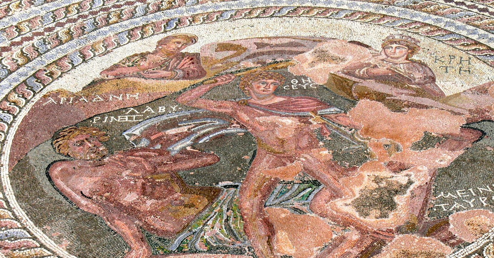
What are we to make of this apparent increase in the use of labels on mosaics in the late Roman East? One could perhaps argue that it was the expression of the import of writing and literacy within early Christian communities, but as we can see at Paphos, this trend predated the rise of Christianity. More likely is that labels at various times came into vogue as a means of provoking literary or perhaps geographic discussions that could then be tied spatially (or in later memories) back to the owner of house. As they had previously done in funerary or symposium contexts, mosaic labels also worked in tandem with the space and the image to heighten the viewer’s overall engagement. Just like the Facebook tagging of today, these labels helped the ancient viewer to access and to organize information more thoroughly, often while enhancing the prestige of the tagger.

Fig. 7 - Atropos
Fig. 7 –  Wikipedia screen shot showing mosaic with tagged name – Source

Although the digital tags of today link to databases, both ancient and modern tags similarly function to create a network that individuals are visibly situated within. Wikipedia, for example, allows users to translate tags into their own language (Fig. 7). In antiquity, even if the patron or the deceased was not tagged in a vase or a mosaic, there was an implied association. Just think about your friend who constantly tags people to view New York Times articles or posts Kierkegaard quotes on their walls. What are they really telling you? The walls may have changed, but the coded purposes behind curated images and tagging remain ever the same. Viewers of your posts visit your digital home to view tagged images, even if they have no knowledge of the people within them. Tagging still functions to create networks and to elevate the poster in terms of social capital—the principal coinage in the Facebook marketplace.

Meet the Medieval Manuscript

By Erik Kwakkel and Giulio Menna (@SexyCodicology)

While this and other blogs introduce you to particular aspects of medieval book production, there are few places on the web that provide a full overview of how handwritten books – or “manuscripts” – were made, especially for those new to the topic. To fill this gap, we (Erik and Giulio) have produced a website called Quill: Books Before Print, through generous support of various institutions (below). The site is now live and available for free to anyone who wants to know more about the handwritten book in the medieval period.

Navigating through Quill shows you what made the manuscript “tick”, and how it ticks. Each of the fifty-odd segments contains an artistic photograph (made by Giulio, who is a professional photographer) and some 150 words of light reading (written by Erik, who is a professional book historian). This post introduces our work, explains how and why we made it, and what we like best about it.

Leiden, Universiteitsbibliotheek, BPL 14 D (13th century)
Fig. 1 – Leiden, Universiteitsbibliotheek, BPL 14 D (13th century) – Photo GM (Quill source)

Writing about manuscripts (by Erik Kwakkel)
I love writing about manuscripts. Not only do I do so frequently in academic publications (find a list here), but also for an audience beyond the university, for example through social media (this blog, Tumblr) and magazines (I have a regular column in Quest Historie). Writing for non-specialists is fun in that you can just tell a story. However, it also requires a certain approach and tone. The texts I wrote for Quill are first and foremost meant to be entertaining – learning something is a close second. The entries are therefore written in a “light” tone and use “speaking” comparisons. Thus I discuss fragments hidden in bindings as “stowaway“, bookmarks become the “fossilized taste” of medieval readers, and parchment sheets are seen as “dead cows“.

To get this tone right, images are crucial. To write an inspired post about a manuscript, an image needs to “grab” me. Moreover, the trick (both for Quill and my blog posts) is to find a single guiding principle that can carry the text. My blog post on Medieval Selfies is a good example of this, but the same is seen in the entries for Quill. Each of the clickable segments are built around a single observation or angle, which is usually reflected in the title: “Add-on” for the segment on marginal glosses, “One, two, three” for page numbers,  and “Mind the gap!” for blank spots on the page.

Leiden, Universiteitsbibliotheek, BPL 304 (15th century)
Fig. 2 – Leiden, Universiteitsbibliotheek, BPL 304 (15th century) – Photo GM (Quill source)

My favourite sections to write are those related to medieval handwriting – script. It is notoriously difficult to do so in clear terms, even in academic papers, when everybody knows precisely what you are talking about. I liked the challenge of providing clear information about such a complex matter as the development from one manner of handwriting to another. Playing with verbal imagery I discuss early-medieval script under the label “The unifier“, while script it develops into is seen as “The divider“. As far as my favourite images are concerned, I’m attached to all of them. Particularly pretty, however, are those that show things you normally don’t see, like a the palimpsest (scratches-away text, vaguely visible) or the backs of the quires, as in Fig. 3.

Leiden, Universiteitsbibliotheek, SCA 28
Fig. 3 – Leiden, Universiteitsbibliotheek, SCA 28 – Photo GM  (Quill source)

Photographing manuscripts (by Giulio Menna)
When I was asked to take pictures of medieval manuscripts for this project I was thrilled; when I was told I would essentially have unlimited access to the manuscripts from the exquisite collection in the Leiden University Library, I was as excited as the proverbial child in the candy store. What an opportunity! But then it dawned on me: How do you take photos of manuscripts? How do I make photos that will interest someone who has never seen a manuscript before?

Thanks to Erik’s MA course in manuscript studies I knew exactly what had to be photographed and where to find it in the books. I spent most of the time browsing through manuscript catalogs and manuscripts’ descriptions, searching for the right book to use for the shots. Once the desired detail was found, the actual photography began. First things first: respect the manuscript! I might find a detail that could make a perfect picture, but to get the photo right I would  have had to mishandle the manuscript in some way: those pictures did not get taken.

Leiden, Universiteitsbibliotheek, VLQ 4 (15th century)
Fig. 4 – Leiden, Universiteitsbibliotheek, VLQ 4 (15th century) – Photo GM (Quill source)

Once an ideal manuscript was found, I used the oldest trick in the book for directing viewer’s attention towards the detail described: depth of field. This would ensure that only the detail in question would be in focus in the picture, and the surroundings would be blurred (Fig. 5 is a good example). I have a very good lens (f/2.8) that allows me to do just that. The lighting was a bit of a problem. Since I was shooting in the Special Collections room I had no direct control over the light. Most of the time I had to wander around the table and find the right angle at which there would be no shadows or reflections.

Leiden, Universiteitsbibliotheek, VLQ 38 (12th century)
Fig. 5 – Leiden, Universiteitsbibliotheek, VLQ 38 (12th century) – Photo GM (Quill source)

There are two photos I am particularly fond of. One is the initial P (for Plinius) seen in Fig. 5. It is the opening page of the manuscript, and the letter is welcoming us to the book. I like to believe that this photo captures the moment when you open a manuscript you have never seen before, and you are captivated by unexpected decoration. The initial is very pleasing to the eye: I particularly enjoy the contrast between the old parchment on the right and the white modern paper on the left.

Leiden, Universiteitsbibliotheek, BPL 304 (15th century)
Fig. 6 – Leiden, Universiteitsbibliotheek, BPL 304 (15th century) – Photo GM (Quill source)

The second image I like very much is of a watermark (Fig. 6). Taking a picture of a watermark was technically challenging: the manuscript’s pages are made of paper, and although paper made in 1600s is more resilient than the contemporary counterpart, it is still delicate and has to be handled with extra care. I had no control over light sources, but I knew that in order to show the watermark I needed a strong light from the back of a page. The plan then became to wait for the sun to go down in the late afternoon, and let some of the light shine through the Special Collections’ windows onto the manuscript. All I had to do then was kneel before the book and take the picture of the naturally bending page.

The last word: enjoy
We hope you will enjoy browsing our website – which was two years in the making – and learn from it at the same time. The site is designed to work optimally with tablets: it’s a true pleasure to swipe the image carousel at the top. We think it provides a sound introduction to making books before print and we hope that the website will be picked up by the broadest possible audience, including instructors at schools and universities. Enjoy!

Leiden, Universiteitsbibliotheek, SCA 38 B
Fig. 7 – Leiden, Universiteitsbibliotheek, SCA 38 B – Photo GM (Quill source)


Credits – Quill: Books Before Print was produced through a grant of De Jonge Akademie (The Young Academy), an offshoot of the Royal Dutch Academy of Arts and Sciences, and with logistical support of Leiden University Centre for the Arts in Society (LUCAS). The website would not have been possible without the invaluable support of Leiden University Library and its Special Collections department.

Medieval Selfies

Self-portraits of medieval book artisans are as exciting as they are rare. In the age before the modern camera there were limited means to show others what you looked like. In the very late medieval period, when the Renaissance spirit was already felt in the air, some painters made self-portraits or included themselves in paintings commissioned by others. Stunningly, the medieval painter Jan van Eyck showed himself in the portrait of Giovanni Arnolfini and his fiance: he is staring at you from the mirror that is hanging behind the couple. For those who still didn’t get it, he painted above it Johannes de eyck fuit hic, Jan van Eyck was here” (Fig. 1, more here). He added the date 1434 to the picture, making it a particularly early selfie.

Jan van Eyck, Giovanni Arnolfini and his fiance, 1434 (right) and mirror detail (left)
Fig. 1 – Jan van Eyck, Giovanni Arnolfini and fiance (right)  and mirror detail (left)

As far as producers of books is concerned, there were only two kinds of artisans who handled a tool with which a selfie could potentially be produced, if the individual was so inclined. Scribes could doodle themselves using ink and pen; and decorators could do the same with brush and paint. In practice, however, we almost exclusively encounter self-portraits made by decorators, perhaps because scribes lacked the skills and equipment to produce something meaningful. Even so, decorators rarely put themselves in the picture. The exceptions to this rule are real treats, as this post aims to show: they provide sneak peeks into the workshops of medieval artists.

Monastic decorators
When a decorator is seen on the page, we must assume that a conscious choice was made to become part of the book’s decoration program. This is particularly evident when the decorator added his or her name and designation (“decorator”). This is precisely what the nun Guda did: she depicted herself inside an initial letter D with a banderole (title banner) that reads “Guda, sinner, copied and decorated this book” (Fig. 2). It seems out of sync with the modest life style of nuns to identify oneself with name and title. Pride was a vice so there must have been another reason behind Guda’s self-identification. Perhaps she did so with a sense of history: she is raising her right hand as if to greet future readers.

Frankfurt, Staatsbibliothek Ms. barth. 42
Fig. 2 – Frankfurt, Staatsbibliothek, MS Barth. 42 (late 12th century)

In spite of this very expressive scene, Guda’s selfie does not give away too much about the medieval artist’s workshop. In fact, if it wasn’t for the words on the banner, we would not have guessed that she was a decorator. Where are the paraphernalia of the trade? Fortunately, there is another example that provides more detail about the working environment of monastic artists (Fig. 3). This image was produced by Rufillus, monk in Weissenau Abbey in Ravensburg, Germany, near the end of the 12th century. In the selfie we catch Rufillus putting the finishing touches on a giant letter R. He wrote his name above his tool: there is no avoiding that we get to know him. Remarkably, in another manuscript we encounter Rufillus again. This time he depicts himself as the scribe of the book – he scribbled, oh vanity, his name above himself (Fig. 4).

Cologny, Fondation Martin Bodmer, MS 127, fol. 244r (late 12th century)
Fig. 3 – Cologny, Fondation Martin Bodmer, MS 127, fol. 244r (late 12th century) – source
Amiens, BM, Lescalopier 30, fol. 29v (late 12th century)
Fig. 4 – Amiens, BM, Lescalopier 30, fol. 29v (late 12th century) – source

Rufillus the decorator places himself in a rich setting: in Fig. 3 we see him surrounded by pots of pigment and various instruments. He provides us, in other words, with a much wanted glimpse into his monastic workshop. Moreover, like the nun Guda, Rufillus was apparently active as a decorator and a scribe, which is another important detail that can be derived from the selfie. What is most striking in light of this post, however, is the similarity of the two portraits: in both, Rufillus shows himself as having bright red hair, big eyes and pronounced wrinkles on his cheeks. The similarity strongly suggests that this is what our decorator really looked like, which is a fascinating thought.

Commercial decorators
Such detail-rich selfies are also encountered in books that were made commercially. A particularly telling self-portrait was made in 1512 by the German book decorator Nicolaus Bertschy (Fig. 5, more information here). In this portrait, which is included in the Lorcher Graduale, he shows himself in the company of his wife, who appears to be drinking from a large mug with her arm around his neck. It is not the scenario you would expect, this rather down to earth setting where drinks and female distraction replace both decorum and concentration.

Stuttgart, Württembergische Landesbibliothek, Cod. mus. I 2 65, fol. 236v (detail)
Fig. 5 – Stuttgart, Württembergische Landesbibliothek, Cod. mus. I 2 65, fol. 236v (detail)

Nicolaus introduces himself in a note beneath the image: in spite of the scene, he clearly saw no need to hide his identity. Next to him we see the scribe Leonhard Wagner (note the “LW” on the white shield), who is said to have known a hundred different kinds of handwriting (more here). The illustration shows the two artisans producing the very choirbook in which it appears, making this a selfie with a fascinating double layer.

Remarkably, a manuscript from fourteenth-century Paris also presents a selfie of a decorator and his wife (Fig. 6). It shows Richard and Jeanne de Montbaston, who worked in the second quarter of the century. In this great image Richard appears to copy the text while Jeanne is busy decorating the pages. Given this division of labour it was likely Jeanne who produced this selfie. There are many more details that prove insightful for artists’ workshops. Parchment sheets that were finished are hanging to dry on clothes lines, for example.

Paris, BnF, fr. 25526, fol. 77v (1325-1350)
Fig. 6 – Paris, BnF, fr. 25526, fol. 77v (1325-1350) – source and full manuscript source

Interestingly, in a commercial setting such selfies can be regarded a kind of advertisement, especially when a name was added. It identified, after all, who had produced the decoration – as if to say, “If you like this, you know who to contact!” It is somewhat perplexing, however, that patrons allowed artists to add put such spam in their newly purchased books – especially when showing a decorator and his wife drinking on the job.

The last word
And what about selfies of scribes? Here things are less clear. Occasionally we encounter a plain pen drawing of an individual copying. However, they are (to my knowledge) never accompanied by name and designation (“scriptor”), meaning we cannot know for sure if the scribe meant to show himself or simply drew a generic “scribe”. The drawing in Fig. 7 is an example of such unclarity: it may be a selfie, or it may not be.

Oxford, Bodleian Library, Douce 104, fol. 52v (dated 1427)
Fig. 7 – Oxford, Bodleian Library, Douce 104, fol. 52v (dated 1427) – source

Studies have shown that the writing figure is a clerk, a copyist affiliated to an institution where documents were made. As it turns out, this particular manuscript containing the text Piers Plowman was produced by a clerk. This is evident, among other things, from the way in which the dated colophon in the back of the manuscript was worded. Moreover, the marginal notation above the clerk’s head, which appears to be in the same hand as the main text, writes over the top of the drawing. This suggests it was  the scribe himself who drew it. A writing clerk drawing a writing clerk: is it enough to call this image a selfie? It’s a great conundrum that shows the limits of taking the modern notion of “selfie” to an age when cameras didn’t exist.

My First Year on Twitter: How I Became @erik_kwakkel

By Erik Kwakkel (@erik_kwakkel)

I signed up for Twitter almost a year ago to the day. I had heard of Twitter, of course, but I connected the medium to such messages as “I am so bored of this life!” and “I just drank an entire six-pack in five minutes.” Mind you, life can be boring at times (although Twitter is a fine antidote, I find) and I am known throughout the world for my firm handling of the six-pack. There was little, however, that could tempt me to join the league of “two-thumb typers”. Then I became elected to The Young Academy, the “junior” branch of the Royal Dutch Academy of Arts and Sciences, and saw how Twitter can be a marvelous tool to present your research interests to a broader audience, both inside and outside academia. I decided to give it a try for a year and then evaluate. As I started to write such an evaluation for this blog, another dynamic appeared, which I will give voice as well: how did I become “@erik_kwakkel”?

0-250 Followers – What I love most about Twitter is how it connects you to like-minded individuals, kindred spirits if you want. I enjoy reading what others have to share, and I love it when followers express that they enjoyed something I posted, for example through their replies or retweets – the latter being the perfect litmus test for assessing how well you are “in touch” with your followers. Mind you, when I started tweeting there was little feedback. Not just because I had few followers (on Twitter everybody is forced to talk to himself for a little while upon start-up), but also because I had not found my niche yet. I felt like an echo because I was merely retweeting others, including Calls for Papers, blogs about medieval manuscripts, new findings in my field of research – the study of the medieval book.

Remarkable image, but not a funny tweet
Remarkable image, familiar scene

250-500 Followers – During the first weeks that I merely echoed others I remaining very indifferent about Twitter. That changed in March 2012, when my students and I discovered dozens of medieval fragments while staying in a monastery (more on this event here, here and here). Over the course of three days I live-tweeted our findings. Mind you, I did not decide to live-tweet, because I had never even heard of it. I merely aimed to show others what we discovered. Since we found something new every 15 minutes, the event started to attract attention among the 250 followers I then had. Many things happened: their number increased quickly; I started to receive responses from others about our findings, including identifications; the newspaper called; and I began to enjoy tweeting. These three days were important because it gave me a sense of Twitter’s potential, but also that it was possible to have a dialogue with others interested in old books. I realized, in sum, that one can make a real contribution to a virtual community.

500-1000 Followers – It is kind of ironic that I learned to make sense of Twitter while staying in a medieval monastery. It also shows that being secluded from the world has no impact on your contribution to Twitter, which is another thing I have grown to like about the medium. A second boost caught me equally by surprise. The afternoon before I went on holiday, early July 2012, I had an hour to kill. I thought I would send out a bunch of images because I did not know when I would be able to tweet again. By this time I tweeted a few images per week, mostly of manuscripts I encountered in libraries, both virtual and real. That hour I sent out ten manuscript pages with doodles that I had found. However, I changed one thing, although not purposefully so. Whereas my captions normally merely stated the shelfmark and the age of the manuscript, I found myself typing funny, even bizarre and over-the-top things to accompany the image (here is one of those ten). Blame it on the lure of the holiday, which was around the corner, but I’d never had so much fun as a twitterer. The responses were very unexpected: I received dozens of retweets within half an hour; people were asking for more; and others responded by sending doodles they had discovered themselves.

Popular image
Particularly popular image (sent to me by @EmirOFilipovic)

1000-1500 Followers – That one hour in July changed everything for me. The ten medieval doodles showed me a way to combine three important things: what I love as a researcher (medieval books); the means to reach a broad audience (images); and something that is dear to me personally, which is to bring a light touch, humor if appropriate, to all things I do. In effect, the ten images helped me to decide who I wanted to be as @erik_kwakkel: an expert who shows off the wonderful world of the medieval book through images with vivid, funny where possible, captions. During my summer holiday I remained “in the zone” and experimented with various types of captions and images, leaning in particular on the responses from some of the new followers I had gained (such as @PaulaSKirby). Did they retweet, then it worked. If not, I had gone too far. I learned that four images per day saturates the market. Also that early in the day over-the-top tweets have less impact than the more factual ones. And so I crafted a schedule that starts with a factual tweet (Noon, my time); followed by a funny one (4 pm); then a tweet that is a mix of these two (8 pm); and finally a neutral one (Midnight).

Early trial of funny caption
Early tweet with funny caption, which hit the right spot

1668 Followers – So here I am: @erik_kwakkel, tweeting four images per day to 1668 (correction, now 1670) followers, interspersed with announcements, links to remarkable blogs, or manuscript news. From time to time I post material sent to me by others, such as the cat paw image above. My network has grown exponentially, not just virtually, but also tangibly: I received tweets with invitations to speak; some of my own tweets led to articles in national newspapers; and at conferences I often know a few delegates already, through Twitter. The “fun” dynamic of my tweets has even sparked a well thought-through analysis from @burnablebooks, from which I learned new things about my image stream (find it here). There are many seemingly appealing reasons not to be on Twitter as an academic (I blogged about them here), but none have persuaded me to leave the medium be. I will stick around, as I hope my followers will too.

Note: This post was originally written for, and posted on, my project blog MedievalFragments.

A Window Display of 140 Characters: Why and How Twitter Works for Me as an Academic

By Erik Kwakkel (@erik_kwakkel)

Earlier this year I was invited to join the Young Academy of the Royal Dutch Academy of Arts and Sciences. All of a sudden I found myself in the company of researchers who were relatively young, yet advanced in terms of publications, acquired funding and public outreach. During a lunch leading up to the installation ceremony I noticed how my peers frequently checked and updated their Twitter accounts. Having resisted opening one myself, mainly because I thought it would be time-consuming and useless for academic purposes, I curiously inquired about the upsides. There were plenty, it turned out, and the next day I was on Twitter myself, with my spouse as sole follower. And so I started to tweet to her about medieval manuscripts, handwritten books that form my main area of expertise and investigation, and she pretended she hadn’t heard it all before. Now, six months later, with the 400th follower fast approaching, I thought I’d give a brief account of my experiences. The main purpose is to show other hesitant academics out there that Twitter can be a great platform for showing others what you are passionate about and why your research object matters. Here are three replies to my former hesitant and critical self.

1. Twitter is time-consuming

The most commonly heard negative verdict is that Twitter is time-consuming. This is simply not true. I carefully pick moments that I actively browse my feed and send tweets myself. As opposed to “personal” tweets (“I just bought a loaf of white bread and it smells soooo good!”), research-related tweets do generally not tap into the immediate present. My subject of study is anywhere between 1600 and 600 years old, so if I notice something interesting in a manuscript that is worthwhile sharing, it can wait until my lunch break or until after dinner – my main go-twitter moments. Also, I usually don’t shoot off more than one or two tweets per day – although a few more in the holidays, it turns out. Even though I craft them with care, it usually does not take me more then two minutes to find a suitable manuscript picture (I am tapping from my very large image database as well as the web) and write a caption – which is a format I am trying out at the moment. I find that I do not have to check my feed very often because it rarely contains time-sensitive information. (Mind you, I do not use Twitter to communicate with colleagues and friends due to the biggest downside of the medium, namely the virtual absence of the means to archive.)

2. I have nothing to say

While I have never met a colleague at a conference who did not talk passionately about his or her research, often unprompted, another reason why academics are hesitant to join, it seems, is the idea that you have to say something special, new, or original. I find that how I use Twitter – I want to show the largest and broadest possible audience how marvelous the world of the medieval manuscript is – even the most common observations (from my professional point of view) are worthwhile sharing. After all, as an academic you do not tweet for yourself but for others: as the title of this blog indicates, I see my tweets as mini window displays in which my object of study shines for a brief moment. “Sharing is nice,” to quote the sign at my table here in this busy Vancouver coffee shop. Popular tweets (in terms of the number of retweets and replies) are those that state simple facts, accompanied by a vivid image, such as this one:

Image

3. Who on earth would be in interested in this?

I hear colleagues remark that nobody out there is interested in their thoughts. While this may be true in the real world, the Twitter community is so crowded that there is bound to be a significant number of individuals interested in the information you provide via tweets. The most important thing, I think, is to find a niche that you are comfortable with – a certain subject, tone, and manner of presentation – and stick to that format. If you build it, they will come. I am having great fun putting out tweets, especially those that present an image and a captivating description. People who do not like this will not follow my feed. Consequently, my way of putting information out there (i.e. information I find worth sharing, presented in my own way) will automatically become part of a network of individuals with the same interest and who like my way of dealing with the subject matter. With Twitter, it seems, you always have the right audience. That said, it is not easy to find a balance between providing factual information (building blocks of a tweet) and entertainment (an equally crucial component). I try to be witty, but not all the time. I provide factual details, but not always. Mixing up different ways in which you put your research out there seems to be key – to increase the number of followers with whom you share information, that is. And so after a few serious tweets I send one that is totally over the top, whose sole purpose is exclusively to entertain, as for example my most popular tweet to date (57 retweets):

Image

Note: This post was originally written for, and posted on, my project blog MedievalFragments.

Strangers at a Party

Talking about medieval manuscripts in front of a camera is really tough. This verdict shot through my head as I was taping podcasts in the Palaeography Room at the University of London’s School of Advanced Studies recently. The activity seems no different than demonstrating the beauty of the handwritten book to a group of students or an audience of lay people, something I can do with my eyes closed. You lift a manuscript out of the storage box and explain the significance of its features, as passionately as possible, while flipping pages. In actuality, however, the rolling camera brings unusual pressure to the event.

Not only is a continuous flow of clear and clearly projected observations needed – hesitation is deadly as it would mean having to repeat the ordeal – but while speaking one has to also identify and formulate the next thing to say. These two simultaneous mental processes are accompanied by a third, I quickly found out. Soon after I had started, an evaluative voice in my head began to ask questions: from ‘Did I say this correctly?’ and ‘Will the viewer be able to make out the detail I just pointed out?’ to the more worrisome ‘What will you say next, Erik?’ and ‘Did I just scratch my nose?’

It did not help that I had not seen the material in front of me before: the manuscripts and fragments had introduced themselves briefly to me only an hour before, while climbing out of their boxes and shaking off their envelopes in the curator’s office, relieved to be out in the open again. Yet while the items and I had had a pleasant conversation, I did not really know them. In fact, presenting them in front of a camera to a potentially very large online audience felt like introducing a complete stranger to a busy party. Who were they? Where did they come from? What made them tick? And why again had I invited them?

As is often the case with public speaking, it is exactly this intellectual challenge of thinking on your feet and not exactly knowing what you will say next or how you will tie an observation to your train of thoughts, that makes it so much fun to do. And so I pressed on and taped 5-minute podcasts on the Paris Bible (‘Written in a letter of only 2 mm high, comparable to a modern newspaper!’), a student textbook (‘Not a single unabbreviated word on this page!’), manuscript fragments (‘Behold, hidden treasure in a bookbinding…’), layout (‘This scribe really knew what he was doing.’) and the transition from Caroline minuscule to Gothic script (‘Look at these two letters biting each other.’).

What I have learned from the experience? You’ll be alright if you are able to forget the camera. You do better without judging what you say as you say it. And it helps to pick items that have pronounced features and that relate to the theme of a podcast in a clear manner. But most of all, that introducing strangers at a party can be a lot of fun.

Added 9 May, 2012:

History SPOT published a blog entry describing the filming of these movies from the perspective of the camera man.

Note: This post was originally written for, and posted on, my project blog MedievalFragments.