Category Archives: Decoration

Breaking Bad: The Incomplete History of the St Albans Bible

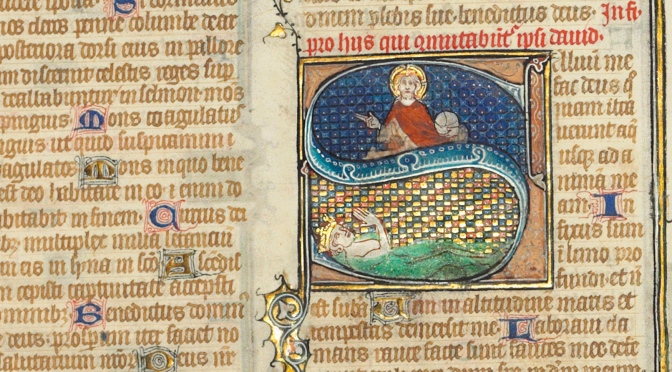
It reads like a horror story. In 1964, the New York rare book dealer Philip Duschnes (d. 1970) bought and subsequently broke a splendid medieval Bible produced in early-fourteenth-century Paris (Figure 1). Every page is adorned with exuberant decoration, usually with gold leaf. The manuscript also contains numerous historiated initials, like the letter S above. With so much beauty on each page, to Duschnes the manuscript must have seemed ideal for breaking and selling by the leaf. In 1965, he began offering individual leaves for sale in his catalogue 169, stating that others from the same manuscript were available. Cut to order.

Duschnes had done the same with other manuscripts, such as the Beauvais Missal (read the full story here; watch this lecture by Lisa Fagin Davis). In 1942 he sold the half-gutted missal to Otto Ege (d. 1951), another infamous manuscript cutter, who added the remains to his “Fifty Original Manuscript Leaves” portfolios, which he put together and sold in the 1940s (more in Gwara 2013 and here). The business of selling freshly-cut leaves from medieval manuscripts proved incredibly lucrative. Today, leaves can be purchased from a variety of sources, including Ebay. This post introduces a newly identified leaf of Duschnes’s bible at the University of British Columbia and it explores what can be known about the original manuscript to which it belonged.

Christie_s_Leaf_St_Albans_Bible
Fig. 1 Leaf from the St Albans Bible auctioned at Christie’s on 10 July 2019 (now part of the McCarthy Collection, see Kidd 2019). Source

Breaking a book

Duschnes bought his bible at the Sotheby’s auction of 6 July 1964 for £1,500 (approximately $12,000 today). At the time of purchase, the manuscript contained two flyleaves taken from a register from St Albans Abbey, which suggests a St Albans provenance. The abbey’s chronicle, moreover, detailed that abbot Michael de Mentmore (1335-1349) gifted two beautiful bibles to the community (“duas bonas biblias, quarum unam dedit Conventus, alteram suo studio assignavit,” cf. De Hamel 1981, p. 12). Duschnes’s bible was believed to have been one of these two books. Following this assumption, auction catalogues have come to refer to the broken parent manuscript acquired by Duschnes as the “St Albans Bible,” despite the uncertainty surrounding its earliest provenance.

As a result of Duschnes’s dark deed, leaves from “the” St Albans Bible flooded the market and often found new homes in private collections (very few are held in university libraries). Even today, the book’s eye-catching leaves are frequently auctioned at Sotheby’s (2015, 2016), Christie’s (2015, 2019), Bonham’s (2012), and Dreweatts (2017). Auction houses do not usually identify new owners and, while leaves purchased by libraries may in time appear on the radar, especially when they are digitized, those in private collections may not be seen for many decades. The practice of breaking rare books extends to incunabula. This 1928 edition, which appeared in 100 copies, contains no less than 60 original leaves from early printed books; and this one, published in 1964 in 40 copies, holds an original leaf from the 1486 printing of Ovid’s Metamorphoses. Even modern rare books are at times cut up. Duschnes dismembered a copy of the famous Kelmscott Chaucer and sold it by the leaf in this 1941 publication.

Leaf in a box

Although the St Albans Bible is rather well-known, I had never seen any of its leaves myself. That changed during a recent visit to The University of British Columbia’s Rare Books and Special Collections. In preparation for my manuscript course at the iSchool, I had a box pulled that was described as “Fragments of medieval manuscripts”. Leafing through the box’s contents, I encountered several attractive, colourful leaves. They all had a sharp inner edge, indicating they were carefully cut out of existing manuscripts. Two fragments in the box were from a liturgical manuscript, one from a breviary, and three from bibles. Unfortunately, there is no documentation available regarding the previous ownership of these fragments.

UBC_Z114M424_recto
Fig. 2 St Albans Bible fragment at UBC, 2 Samuel, Chapters 22-23 (Vancouver, UBC Library, Z114 M424, recto). Source and zoom here

My eye was drawn to one of the bible fragments, because it was older than the others (Fig. 2). A modern pencilled note (now removed) identified it as “The Book of Samuel”. It measured 297×199 mm, was copied in two columns with 46 lines to the column, and judging from the script it appeared to have been made in the early fourteenth century. The other thing that made the leaf stand out was its decoration, which was of very high quality and of French origins. What especially jumped off the page was the elaborate penwork flourishing at the running title (Fig. 3), which is quite unusual. The original manuscript was evidently made by professional artisans, likely in France and presumably in Paris. But who could these individuals be?

Vancouver_UBC_Library_Z114_M424,
Fig. 3 St Albans Bible fragment at UBC, detail showing running title (Regu[m]). Source and zoom here
Thinking of Otto Ege and his Fifty Original Manuscript Leaves portfolios, I googled ‘“ege” manuscript bible “46 lines”,’ then clicked the image tab, thinking that the leaf may have been from a manuscript cut-up in the 1940s. The eleventh image in my Google result indeed looked much like it belonged to the parent manuscript of the UBC leaf, although it was not one of Ege’s victims. It concerned an item in a collection of twenty medieval bible specimens, yet more victims of dismemberment. Offered for sale by King Alfred’s Notebook (here), the leaf was identified as belonging to the “St Albans Bible”. Upon closer inspection of the script and decoration, it became clear to me that the UBC fragment indeed originate from the same host manuscript. It is presently one of the few leaves available for study in institutional libraries (see the list and the plea below this post).

The origins of the St Albans Bible

A thorough study of the St Albans Bible has yet to be conducted. This is likely due to the fact that the book was cut into pieces and scattered across multiple institutions and private owners. In parallel to other Parisian products of this age, there are probably three artists at work in the manuscript. One executed the historiated initials, a second the illumination (border decoration, chapter numbers, both made with gold leaf), while a third did the penwork flourishing. A forth individual copied the text. The individuals involved in its production were affiliated to the famous Parisian illuminator and libraire (bookseller) Jean Pucelle. The first to point this out was Christopher de Hamel, who stated that the historiated initials were “in the style of the Parisian illuminator Jean Pucelle” (De Hamel 1981, p. 12).

In recent years more information has come to light about the illumination in the St Albans Bible. Mie Kuroiwa attributed the illumination to the Saint Louis Master, a known associate of Pucelle (Kuroiwa 2013, p. 129, no. 35). According to Francois Avril, the Saint Louis Master is the same person as an artist known as “Mahiet” (Keane 2013, p. 133, esp. note 15). Mahiet’s name is written in the famous Belleville Breviary, one of three manuscripts known to have been illuminated by Pucelle (Paris, BnF, latin 10484, digitized here). At fol. 33r Pucelle, who probably supervised the manuscript’s production, wrote down a kind of invoice “Mahiet – J. Pucelle a baillie XX et IIIs – VId,” indicating he needed to pay 23 shilling and 6 denier to the decorator Mahiet (Fig. 4). Other folia mention payments from Pucelle to the illuminator Ancelet, who is probably Anseau de Sens (fol. 62r), and to J. Chevrier (fols. 268r and 300r) (all of these cases were first discussed in Delisle 1884, p. 284).

BnF_latin_10484_fol_33r_lower_margin_enlarged
Fig. 4 Note for payment by Pucelle to the illuminator Mahiet (Paris, BnF, latin 10484, fol. 33r, lower margin). Source

Teamwork

The networks brought together by libraire Pucelle consisted of different artisans each time, although research shows that booksellers preferred to work with the same group of colleagues (for libraires and their teams, see Rouse and Rouse 2000). Another combination of artisans is encountered in the Bible of Robert of Billyng (Paris, BnF, Latin 11935, digitized here). The team introduces itself in the colophon at fol. 642r (Fig. 5). Written in brown ink, the text first states: “Here ends the text of the bible. Robert of Billyng made me. Amen”. Another individual, perhaps Pucelle himself, adds in smaller red script: “Jean Pucelle, Anseau de Sens and Jacques Maci illuminated this book. This vermilion line that you see was written in the year of our Lord 1327, on a Thursday, the last day of April on the eve of May –  this I tell you.” (Translation Patrick Moran, UBC; transcription of the colophon in Colophons de manuscrits occidentaux, Vol. 5 (1979), p. 244, nr. 16674.) While it is unclear which decorator did precisely what, again we see Pucelle collaborating with the illuminator Anseau de Sens.

BnF_Latin_11935_fol_642r
Fig. 5 Colophon from 1327 identifying the scribe (“Robertus de Billyng me fecit”) and the three illuminators who worked on the book (Paris, BnF, latin 11935, fol. 642r). Source

The St Albans Bible was the product of a closely-knit community of artisans at the heart of the Parisian book trade. Those involved in the book’s creation lived and worked in the same street, which made it easy to get teams together (Rouse and Rouse 2000). Pucelle and Jacques Maci, who both worked on the Bible of Robert of Billys, were even neighbours (Rouse and Rouse 2010, Vol. 2, p. 57). Four artisans were brought together to produce the St Albans Bible, although only one of these has been identified by name: the illuminator Mahiet, who had also worked on the Belleville Breviary, the best-known product to come out of the business of Pucelle the libraire. It remains to be determined who produced the historiated initials and the penwork flourishing. The scribe also has to be identified. Behind this team stood, somewhat invisible, a fifth person: the libraire, who had the manuscript produced for a client and who subcontracted the various tasks to artisans in his network (see for this process Kwakkel 2011). Whether this person was Jean Pucelle is not clear. There were plenty of other booksellers around in the Paris book trade, and Mahiet did not exclusively work for Pucelle. While the St Albans Bible can be placed in an important center of book production, in many respects its history remains as incomplete as the book itself.

Post scriptum: In between writing and publishing this post, UBC’s Rare Books and Special Collections purchased a second leaf from the St Albans Bible, which has been digitized together with the leaf that sparked this post (here are direct links to recto and verso). I wish to thank Jan Van Acker (Abdijmuseum Ten Duinen) for correcting my interpretation of the quoted payment to Mahiet by Pucelle.

References and useful sources

Colophons de manuscrits occidentaux des origines au XVIe siècle. 6 vols. Fribourg: Éditions universitaires, 1965-1982).

Delisle, Léopold. “Les livres d’Heures du duc de Berry.” Gazette des Beaux-Arts 29 (1884): 97–110, 281–292, and 391–405.

Delisle, Léopold. La Bible de Robert de Billyng et de Jean Pucelle. Paris: H. Champion, 1910.

Deuchler, Florens. “Jean Pucelle: Facts and Fictions.” The Metropolitan Museum of Art Bulletin 29 (1971): 253-256 (download it here).

Gwara, Scott. Otto Ege’s Manuscripts: A Study of Ege’s Manuscript Collections, Portfolios, and Retail Trade, with a Comprehensive Handlist of Manuscripts Collected or Sold. Cayce, SC: De Brailes, 2013.

de Hamel, Christopher. “Leaf of a Bible Manuscript.” In Fine Books and Book Collecting, edited by Christopher de Hamel and Richard A. Linenthal, 10-12. Leamington Spa: James Hall, 1981.

Keane, Marguerite A. “Collaboration in the Hours of Jeanne de Navarra.” In Jean Pucelle: Innovation and Collaboration in Manuscript Painting, edited by Kyunghee Pyon and Anna D. Russakoff, 131-148. Turnhout: Brepols, 2013.

Kidd, Peter. The McCarthy Collection: French Miniatures (London: Ad Ilissum, 2020, forthcoming).

Kuroiwa, Mie. “Working with Jean Pucelle and His Successors: The Case of the Saint Louis Master (Mahiet?).” In Jean Pucelle: Innovation and Collaboration in Manuscript Painting, edited by Kyunghee Pyon and Anna D. Russakoff, 111-129. Turnhout: Brepols, 2013.

Kwakkel, Erik. “Commercial Organisation and Economic Innovation.” In The Production of Books in England, 1350-1530, edited by Alexandra Gillespie and Daniel Wakelin, 173-191. Cambridge: Cambridge University Press, 2011.

Rouse, Richard H., and Mary A. Rouse. Manuscripts and Their Makers: Commercial Book Producers in Medieval Paris, 1200–1500. 2 vols. Studies in Medieval and Early Renaissance Art History 25. Turnhout: Harvey Miller, 2000.

Addendum: known St Albans Bible leaves (institutional libraries only)

I aim to create a student project about this bible based on the surviving leaves. Please contact me at erik.kwakkel [at] ubc.ca if you know where other specimens are kept. The list below includes items with a stable location and is therefore limited to institutional libraries. There are many leaves in private ownership (this publication by Peter Kidd, for example, identifies twenty specimens), but it is hard to trace them and to keep track of their current location (they are more likely to change ownership than those kept in library).

Cambridge, MA, Houghton Library, MS Lat. 471: 1 Samuel, 1 leaf (catalogue entry here).

Dallas, Southern Methodist University, Bridwell Library, MS 64 (low-res image here).

Mānoa, University of Hawaii, Hamilton Library [shelfmark not known to me]: Jeremiah, Job, Matthew, 3 leaves total. Alert by Scott Gwara, USC.

New Haven, Beinecke Library,

Takamiya 87: Ecclesiasticus, 1 leaf (digitized here).

M712.141: 2 Corinthians, 1 leaf (catalogue record here).

Poughkeepsie, Vassar College Archives & Special Collections Library, Scheetz MS 27: Interpretation of Hebrew Names. Alert by Ronald Patkus, head of Special Collections.

Reading, University of Reading Library, MS 90: 1 Chronicles (part image here).

Stanford, Stanford University Library, M1768: Interpretation of Hebrew Names, 1 leaf (digitized here).

St Albans, The Cathedral and Abbey Church of St Alban, Inv. nos. 17.0 and 17.1: Esdras/Nehemiah, 1 leaf; Philippians/Colossians, 1 leaf, with drolleries. Alert by archives team, St Alban Cathedral. More about these two leaves, as well as digital images, in this blog post.

St John’s, Memorial University of Newfoundland, Queen Elizabeth II Library, BS1274 .L3 1325: Deuteronomy, 1 leaf (catalogue entry here, one side digitized here). Alert by Pat Warner, Special Collections Librarian.

Toronto, University of Toronto, Massey College, Gurney Pam 0004: Jeremiah, 1 leaf (catalogue entry here, digitized here).

Tokyo, Museum of Western Art: Psalms, 2 leaves (low-res images here). Alert by Peter Kidd

Vancouver, University of British Columbia Library, Z114 M424: Genesis, 2 Samuel, 2 leaves total (digitized here).

Me, Myself, and I: The Story of Two Medieval Selfies

Cologny_Bodmer_127_244r_detailSelfies are by no means an exclusively modern phenomenon. As shown in a previous post on medieval selfies, some decorators made self-portraits in manuscripts, showing that the practice predates print – albeit without the use of a camera. They did so to identify themselves as the creator of a miniature or historiated initial, or even to exhibit their accomplishments as businessmen, as the early-sixteenth-century commercial illustrator Nicolaus Bertschy appears to do. Other medieval examples of selfies are those by Matthew Paris, the thirteenth-century monk from St Albans, painted in the lower margin of his Historia Anglorum (see here).

That earlier blog post includes two intriguing selfies made by the same person, a monk who calls himself Rufillus. One is found in a copy of Ambrose’s Hexaemeron kept in the Bibliothèque municipale in Amiens as MS Lescalopier 30 (Figure 1). The text discusses the six days of the Creation and Rufillus displays himself inside a green – and rather confined – initial letter D at the outset of the section on the Third Day. Why he shows himself here, when the Hexaemeron is about to discuss the creation of plants and material forms, is unclear.

Amiens, BM, Lescalopier 30, fol. 29v
Figure 1. Rufillus inhabiting a letter D (Amiens, Bibliothèque municipale, Lescalopier 30, fol. 29v, late 12th century). Source

His other selfie is encountered in Cod. Bodmer 127, a collection of saints’ lives kept in the Fondation Martin Bodmer in the Swiss city of Cologny (The Passionary of Weissenau, Figure 2). Here, Rufillus created a more roomy environment, painting himself inside a very large letter R at the outset of the passion of St Martin of Tours (d. 397). Selfies are not frequently encountered in medieval manuscripts, which makes the Rufillus case quite special, given that it entails not one but two “snapshots” of the same person. This post explores what we can learn from the two self-portraits of a monk who is a bit of a showoff – and who is not shy about using the selfie-stick.

Cologny, Fondation Martin Bodmer, MS 127, fol. 244r
Figure 2. Rufillus inside a letter R (Cologny, Fondation Martin Bodmer, Cod. Bodmer 127, fol. 244r, late 12th century). Source

Rufillus the Illuminator

Helpfully, Rufillus identifies himself by providing his name: in the Cologny manuscript he painted it in white above his brush (accompanied by “Fr.” for frater, monk), while in the crowded Amiens initial the name is written right above the decorative letter with pen and ink. Based on the origins of the two manuscripts, scholars place Rufillus in the late-twelfth century Premonstratensian abbey of Weissenau near Ravensburg in the South of Germany (get up to speed on Rufillus in this article by Solange Michon; a useful enumeration of manuscripts from Weissenau is found here). In secondary literature he is commonly regarded (and explicitly labeled as) an illuminator (see for example here and here). Judging from the decoration in the two manuscripts, which include numerous decorated initials and even some full-page miniatures, he was quite accomplished. In his article Michon shows, by highlighting iconographical – design – parallels, that it is the same person who produced the decoration in both manuscripts.

The Cologny manuscript shows the artisan “in the moment,” hard at work decorating the manuscript (Figure 2). The scene is unusually rich in detail and shows us, among other things, what tools were used by medieval illuminators. In one hand Rufillus is holding a bowl filled with red paint; in the other a brush. Cow horns filled with all kind of paints are placed behind him, while a mortar and pestle are placed nearby for preparing additional pigments. In what is a familiar pose for painters today, his right hand is leaning on his left for stability. That hand is in turn supported by a stick placed on the ground – a selfie-stick! With a healthy dose of irony, Rufillus allows us to observe him as he is painting the initial he is inhabiting. In a rather unusual twist, we witness both the artist at work and the result of his toils. By showing himself applying red paint on the letter R he invites the beholder in his atelier, which is a powerful gesture.

Amiens_Lescalopier_30_detail
Figure 3. Rufillus’ name in Amiens, Bibliothèque municipale, Lescalopier 30, fol. 29v. Source

Rufillus the Scribe

While the common designation given to Rufillus by scholars is illuminator or decorator, the second selfie suggests that he was also a scribe. After all, in as much detail as he presents himself as an illuminator in the Cologny manuscript, he shows himself as a scribe in the Amiens codex (Figure 1). In this depiction, too, the paraphernalia of the trade are clearly identifiable, this time the scribe’s: a sheet of parchment, a reed, and a knife to hold down the parchment as well as to cut the nib of the pen. While Rufillus placed himself on a bench in the Cologny painting, the Amiens scene shows him seated in a scribal chair, one that supports his behind as well as the parchment sheet he is writing on. It seems appropriate, in this light, that Rufillus signed his name with pen rather than brush: he stayed in his role. The key observation to make here, however, is that our monk appears to have been active both as illuminator and scribe in the scriptorium of Weissenau (more about such a combination here).

The name “rufillus” written above the Amiens painting provides additional information. Let’s look at it again, this time from up close (Figure 3). The ink used for his name has a brown colour, deviating from the deep-dark black ink of the main text. In other words, main text and name were copied at different moments. The same is suggested by the observation that the pen used for writing the name was much thinner. Moreover, the nib used for the name reveals an imperfection not seen in the main text: the flawed nib produced a thin white line in the central stroke of the letter l. This is obviously a later cut or even a different pen. These observations make sense. In the production of a manuscript the copying of the text came first, followed by the execution of the decoration.

Evidently, Rufillus signed his name when he completed the painting, not while he was copying. This is telling, I think. Rufillus could have identified himself better and more explicitly through a scribal colophon, which is where copyists provide details about themselves (see this post). By contrast, he is far less traditional and added his presence not with pen but with brush. By doing so he inserted the motif of the scribe into the visual narrative of the book, even though its topic did not call for it. This somewhat inappropriate behaviour is amplified by the fact that he then identified this scribe as himself. Through his action, Rufillus squeezed himself into Ambrose’s text and climbed onto the podium of the Church Father. He purposefully attracted attention to his person.

Rufillus_StGall127_AmiensLescalopier30
Figure 4. The monk Rufillus in two historiated initials (Amiens, Bibliothèque municipale, Lescalopier 30, fol. 29v, left, and Cologny, Fondation Martin Bodmer, Cod. Bodmer 127, fol. 244r, right).

Rufillus the Person

Each of the two manuscripts shows that Rufillus is not lacking in confidence and that he does not mind breaking with the monastic virtue of modesty. It is in the combination of the two selfies, however, that we learn things we otherwise would not have known about him. For example, with Amiens alone we could not be sure that Rufillus produced the decoration in the manuscript as well. After all, the decorator could have produced a portrait of his colleague the scribe, in praise of his activities, or even a generic picture of a scribe at work. Had Cologny been by itself, there would not have been a reason to infer that Rufillus was also involved in scribal activities. Where the two selfies really become quite telling, however, is in the realism they entail. There are striking commonalities that suggest the decorator aimed to provide a realistic depiction of himself, which fits the bill given his pronounced self-promotion.

Striking similarities in his appearance are for example the pronounced eye lids, the shape and colour of his hair (bright red and with recesses), and the sharp lines across the cheeks, starting next to the nose and giving his face a thin appearance (Figure 4). With only one selfie the red hair would have been striking, but the repeated occurrence suggests that Rufillus really was a red-headed monk. This is, of course, why our scribe-illuminator calls himself Rufillus, which is derived from the Latin rūfus, meaning “red-haired” (see also here). In other words, our scribe-illuminator is using a pseudonym, one derived from a pronounced feature in his appearance – his hair. For a person who should strive to be modest and for whom the monastic community ought to be more important than the individual in it, relating one’s identity to a bodily feature seems peculiar. Yet, in light of what we have learned about Rufillus, it is no surprise.

Bloomington_LillyLibrary_Ricketts20
Figure 5. Peter Lombard, bishop of Paris, shown as scribe (Bloomington, Lilly Library, Ricketts 20, fol. 1v, c. 1200-15). Source

Rufillus the Old Man?

A third manuscript exists that was copied and illuminated by our anonymous red-headed monk, although it is not usually mentioned in discussions about Rufillus and his self-portraits. The codex in question is Bloomington, Indiana University, Ricketts 20 (Peter Lombard, Commentary on the Psalms), which is assumed to have been produced in c. 1200-15, a few decades after Amiens and Cologny, and which was part of the library of Weissenau Abbey (Figure 5). In the description of the manuscript in his Gilding the Lilly (p. 60), Christopher de Hamel identified the scribe and illuminator as Rufillus (his assessment is quoted in this manuscript description). One can see from the handwriting that Rufillus was older when he made the Bloomington manuscript: his firm hand, with which he once produced such sharp and disciplined script, appears shaky and weak.

Bloomington_Lilly_Ricketts 20
Figure 6. Bloomington, Lilly Library, Ricketts 20, fol. 45v (c. 1200). Source

Another initial letter in the same manuscript provides a bit of history about its origins (Figure 6). A person is shown holding an open book in which the following is written: “Rodolfus plebanus de Lindaugia. q[ui] nobis dedit hu[n]c libru[m],” “Rudolf, parish priest of Lindau, who gave us this book” (source, with minor correction in the transcription). The painting shows the person who “gave” the manuscript to Weissenau abbey. Because the maker of the book, our Rufillus, is commonly regarded as a monk of Weissenau, this inscription would suggest that Rudolf paid for the materials, which is a bit of stretch but possible. Had our anonymous monk not been so firmly tied to Weissenau abbey in secondary literature, this inscription could indicate that Rufillus and Rudolf were one and the same person: he first made the manuscript, then donated it to the abbey. If this speculative inference were true, it would place our red-headed scribe-illuminator outside the abbey of Weissenau – and turn the letter O in Figure 6 into a third selfie, showing Rufillus as an old man.

Rufillus and the Weissenau scriptorium:

  • Jonathan James Graham Alexander, Medieval Illuminators and Their Methods of Work (New Haven & London: Yale University Press, 1992), pp. 16-17.
  • Walter Berschin, “Rufillus von Weissenau (um 1200) in seiner Buchmalerwerkstatt,” in: Walter Berschin (ed.), Mittelateinische Studien II (Heidelberg: Mattes Verlag, 2010), pp. 353-56.
  • Christopher de Hamel, Gilding the Lilly: A Hundred Medieval and Illuminated Manuscripts in the Lilly Library (Bloomington: The Lilly Library, 2010), p. 60.
  • Solange Michon, “Un moine enluminateur de XIIe siècle: Frère Rufillus de Weissenau,” Zeitschrift für schweizerische Archäologie und Kunstgeschichte 44 (1987), 1-7.
  • Solange Michon, Le Grand Passionnaire enluminé de Weissenau et son scriptorium autour de 1200 (Genève: Slatkine, 1990).
  • Elke Wenzel, Die mittelalterliche Bibliothek der Abtei Weißenau (Frankfurt am Main: Peter Lang, 1998).

Selfies and self-portraits:

Medieval Letter-People

The human body is one of the most common objects encountered in art, whether in paintings, sculptures or other objects. Things have not changed much since medieval times, when artists loved to fill their work with human figures – commonly saints or individuals affiliated with biblical stories. Among the great diversity of depictions, there is one type that stands out in that the body is used (or rather, abused) to express something other than itself. These particularly fascinating and often amusing depictions are found on the medieval page. We see people bent and stretched into unnatural shapes in order to change them into something for which the book was created: letters (Fig. 1).

British Library, Add. MS 8887 (15th century)
Fig. 1 – Letter G: British Library, Add. MS 8887 (15th century) – Source

Looking at these unfortunate victims of book decorators – in this case the letter G from the Macclesfield Alphabet Book – may bring a smile to your face, which was probably the aim. At the same time, it is easy to overlook the sophisticated design behind such forced yoga exercises. Moreover, when you look a bit closer at this kind of book decoration, different types of letter-people may be discerned.

1. Inconspicuous letter-people
In the least conspicuous type we simply see one or more individuals hanging about near the text, minding their own business. At least, that is what you would think at first sight. When you start reading it quickly becomes clear that these people and their paraphernalia are actually forming the first letter.

Dijon, Bibliothèque municipale, MS 170 (12th century)
Fig. 2 – Letter M: Dijon, Bibliothèque municipale, MS 170 (12th century)
Dijon_BM_15_3v
Fig. 3 – Letter H: Dijon, Bibliothèque municipale, MS 15 (12th century)

In the first of these two scenes (Fig. 2), two monks hold up a structure made out of planks. When turning to the text (Gregory’s Moralia in Iob) it becomes clear that the monks and the V-shaped structure form the capital letter M (the first line reads “Mos iustorum est”). Fig. 3 is even more subtle: it shows a monk giving a wax tablet to what looks like bishop. In fact, they also form the letter H during the exchange (the start of “Hieronimus”).

2. Bending reality
Subtle as they are, it is hard to believe depictions like these were not meant to entertain. Some letters made up by human figures appear to take the entertainment factor a step further. In the same medieval set of books as the previous decorations this giant letter Q (Fig. 4) can be found.

Dijon_BM_170_59r
Fig. 4 – Letter Q: Dijon, Bibliothèque municipale, MS 170 (12th century)

While the individuals forming the M and H (above) are in a natural pose, this Q is formed by two Cistercian monks (lay brothers, actually) in a most uncomfortable position. The team is chopping wood, with one monk placing an axe on the tree, while the other hits the axe with a hammer. While that must have been a common, real sight for the readers of this book, which was produced for a French Cistercian house, the backs of the  monks are rounded unnaturally in order to form the Q shape. The result is an uncomfortable-looking pose that provokes laughter.

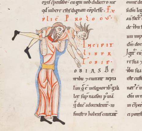
The case of the two monks shows that bending reality can make it difficult to recognise a letter. A similar feeling surrounds a scene in another twelfth-century manuscript, one that shows a man wrestling with a beam (Fig. 5). It looks as if he is trying to lift it on his shoulders, but it appears to be too heavy. The image below it (Fig. 6) plays into the same theme of lifting. In both cases it takes a while before you recognise the letter that is expressed – the medieval reader probably got it much quicker.

Engelberg, Stifsbibliothek, MS 4 (12th century)
Fig. 5 – Letter A: Engelberg, Stifsbibliothek, MS 4 (12th century) – Source
Engelberg, Stifsbibliothek, MS 4 (12th century)
Fig. 6 – Letter T: Engelberg, Stifsbibliothek, MS 4 (12th century) – Source

A closer look reveals an A in the top image (the start of the name “Arfaxath”). It has the same peculiar shape as the A seen to the left of the acrobat and his heavy beam. The unnatural pose reminds us of the two monks chopping wood: reality is somewhat stretched – or rather, bent. Fig. 6, from the same manuscript (a Bible), shows the letter T for “Tobias”, which is produced by two individuals wrestling. It is not hard to imagine that the lifted person is spinning around while making a lot of noise (that is at least how I interpret the red lines coming out of his face).

3. Bending reality further
Near the end of the medieval period manuscripts appeared in which the human body was stretched and bent like never before: model books (see my post Medieval Super Models). These objects presented decorators with ideas and actual models for the large initial letters at the beginning of a text. People (as well as animals) form a common subject matter in these model books. Interestingly, they exchanged real-life, natural scenes with sophisticated constructions that feature multiple people in strange collective acrobatic poses (Fig. 5).

London, British Library, Add. MS 8887 (15th century)
Fig. 5 – Letters A, B, C, D: Oxford, Bodleian Library, Ashmole 1504 (1520-30) – Source

The great thing about this kind of decoration is that they are mini stories. They are much more dynamic than the scenes in Figs. 2-4, which show a single, rather static event. The letter B in Fig. 5, for example, shows a small band of people, who have to work hard for this pose. Still, one is making music, another balances on a dragon, while the old lady is supported by an old man. Readers had a lot to talk about when they saw this letter. Is the old man her husband, who is reduced to a (quite literally) supporting player? Is the man with the green jacket fighting the dragon or merely using it as a chair?

Bergamo, Biblioteca Civica, MS Cassaf. 1.21 (14th century)
Fig. 7 – Letters q, r: Bergamo, Biblioteca Civica, MS Cassaf. 1.21 (14th century) – Source

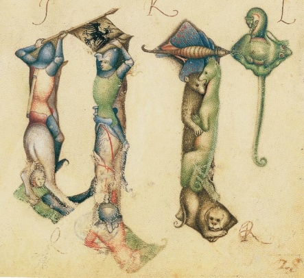
This theme of a bent reality where the lives of people are played out in unreal stories – while forming a letter – is also seen in other model books, such as the one made by Giovannino de Grassi, who worked at the Visconti court in Italy (Fig. 7). The letter q is made up by two knights on horseback, in an almost postmodern pose, while the letter r that follows shows a cute collection of animals.

With the animal theme the tradition has gone full circle. Animals forming letters are encountered as early as the ninth century (Fig. 8).

Alençon, Bibliothèque municipale, MS 12 (9th century)
Fig. 8 Letter T: Alençon, Bibliothèque municipale, MS 12 (9th century)

This scene shows a dog running away with a fish in his mouth, while forming the letter T (“Tum ego”) – and all this in a dead-serious text by the philosopher Boethius. It shows that entertainment using familiar objects, both humans and animals, is something universal, something that binds decorators from all corners of medieval Europe. It was sure to be a hit with the reader, who was given the chance to have a short “breather” from such heavy texts as Gregory’s Moralia and the complex ideas of Boethius. For a moment an unusual take on reality was allowed to take over and entertain.

Helping Hands on the Medieval Page

We are taught not to point. Pointing with your finger is rude, even though it is often extremely convenient and efficient. Medieval readers do not seem to have been hindered by this convention: in the margins of books before print one frequently encounters a manicula or “little hand”. While the purpose of these “helping hands” was the same (they were usually put there to highlight an important passage), their appearance varies considerably. This is due to the fact that there was no standard format for the hand – beyond the point that it had to resemble one (Fig. 1).

Leiden, Universiteitsbibliotheek, VLQ MS 99 (13th century)
Fig. 1 – Leiden, Universiteitsbibliotheek, VLQ MS 99 (13th century) – Photo EK

Since the reader was able to shape hand and finger as he or she saw fit, we can sometimes recognise a particular reader within a single manuscript, or even within the books of a library. The charming hands function as a kind of fingerprint of a particular reader, allowing us to assess what he or she found important about a book or a collection of books. This post celebrates the variety encountered in these personal and permanent pointers, from the plain hand to the exotic octopus.

Plain hands
The term “manicula” is somewhat deceptive. Pointing hands are almost never just pointing hands. Usually there are arms attached, which may even be fitted in sleeves. Sometimes these sleeves are elaborate and realistic, with folds and all (Fig. 2). It is an exciting thought that the medieval reader who added this tiny drawing in the margin may simply have looked down and replicated his own arm. If this is true, we may potentially be able to tell something about his status, for example whether he is a monk (wearing a habit) or a private individual. This inference potentially prompts an exciting kind of study, which has never been undertaken. It also makes you wonder what to think of a full figure as seen in Fig. 3. It is tempting to think that we are looking at the reader here – although, realistically, this would probably be pushing it too far.

St Andrews, University Library, Typ NL A85 JT (Antwerp, 1487-1490)
Fig. 2 – St Andrews, University Library, Typ NL A85 JT (Antwerp, 1487-1490) – Source
Bodleian Library, Add. A 15 (14th century)
Fig. 3 – Oxford, Bodleian Library, Add. A 15 (15th century) – Source

Looking at surviving maniculae in medieval books sparks yet another correction: tiny hands are often not really tiny. The one seen in Fig. 1 takes up much of the marginal space. It is a very natural looking hand, with the digits in just the right shape and angle. There is even a nail attached to the finger – the first I have encountered. As you would expect, pointing fingers are attached to both left and right hands. Without having done any conclusive research on this, it appears right hands are more common than left ones.

Elaborate hands
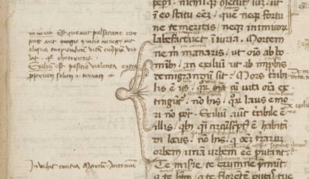
Not all pointing hands look realistic. The one seen in Fig. 2 is representative of a phenomenon that is frequently encountered: the pointing finger is stretched well beyond human proportions. The reason, of course, is that the tip of the finger needs to point out one particular line – otherwise the system would fail. The fingers of a pointing hand can easily be more elaborate. The hand in Fig. 4 is not only unusual in the size of the sleeve and the notes written on it, what really jumps out is the size of the fingers and the way in which they are fanning out. The reader no doubt meant to point out an extensive passage and so more fingers were drafted into service. He did the same thing elsewhere in the manuscript, this time using an octopus with spread-out tentacles (Fig. 5). Another way to point out more than one line is seen in Fig. 6: just use two hands!

Berkeley, Bancroft Library,  BANC MS UCB 085 (14th century)
Fig. 4 – Berkeley, Bancroft Library, BANC MS UCB 085 (14th century) – Source
Berkeley, Bancroft Library,  BANC MS UCB 085 (14th century)
Fig. 5 – Berkeley, Bancroft Library, BANC MS UCB 085 (14th century) – Source
Paris, Bibliothèque nationale de France, lat. MS 4935 (15th century)
Fig. 6 – Paris, BnF, lat. MS 4935 (15th century) – Source

Exotic hands
Then there are the really exotic hands, which are turned into a visual feast. Fig. 7 shows and an arm that was turned into the body of a dragon, while the hands in Fig. 8 (which look like ladies’ gloves) are attached to the wrong location on the human body. These hands are not just meant to point out an important passage, they must also have been intended to bring a smile on the reader’s face.

British Library, Royal MS 12 E.xxv (c. 1300)
Fig. 7 – British Library, Royal MS 12 E.xxv (c. 1300): dragon with hand – Source, via
Paris, Bibliothèque nationale de France, Fr. MS 12584 (13th century)
Fig. 8 – Paris, BnF, Fr. MS 12584 (13th century) – Source

Interestingly, while the dragon could easily have been doodled by the reader himself, the depictions seen in Fig. 8 are carefully designed and painted. These pointing hands – the manuscript contains many of them – were probably done professionally. If this inference is correct, it suggests that the reader asked the artisan to insert them during production. This is interesting because it means that the reader already knew what passages he would wanted to have highlighted. It appears he already knew the text well before he owned a copy.

The range of helping hands is remarkable. There were other, easier ways to mark important passages, such as lines and crosses placed in the margin. However, in some cases readers preferred to have a more pronounced signpost. While a tiny line could be overlooked, the hands – particularly if executed with color – really pulled your attention to the thing that mattered. That particular sentiment lives on in modern times, I recently noticed when stopping at a traffic light for bikers in Leiden, The Netherlands, where I live (Fig. 8). “Dear biker”, the modern (sleeveless) manicula expresses, “push the button if you don’t want to stand here all day.” Now that is helpful.

Traffic light in city of Leiden, The Netherlands - Photo EK
Fig. 8 – Traffic light in city of Leiden, The Netherlands – Photo EK

Books on a Diet

We’re all familiar with that most popular of New Year’s resolutions – and the one that is broken most frequently afterwards. While many oversized medieval books look like they enjoyed life to the max, this post is devoted to a relatively rare kind of manuscript that is much slimmer than what you would expect (Fig. 1). “Expect”, because the relative proportions of manuscripts – the width in relation to the height – form a surprisingly stable feature in medieval book production. In fact, the vast majority of surviving manuscripts have the same relative proportions as our modern paper: their width is around 70% of their height.

British Library, Harley MS 5431 (10th century)
Fig. 1 – British Library, Harley MS 5431, 230×85 mm  (10th century) – Source

This stability ought to surprise you. While readers of printed books had little choice as to the physical appearance of the object they read, owners of manuscripts handled a book that was made especially for them. Consequently, they would commonly have specified what it should look like. You would think that medieval readers might go overboard and abuse this freedom of choice, ordering polka-dotted books with pink letters written upside down on triangle-shaped pages. The opposite turns out to be true. Book owners before print are predictable in that they mostly opted for regular features: their choices are typical, as if they conform to unwritten rules.

This striking act of conformation results from what is a main driving force behind the chosen physical features: the anticipated use of the object. For example, if you anticipated that you would scribble an excessive amount of notes in your book, you would specify to the scribe to extend the size of the margins. And if you knew that you would take a book with you when you left the house, it would make sense to have that copy produced in a suitably small format. This strong link between form and function is good news for us: we may infer that narrow books– sometimes called “holsterbooks” – were put on their diet for good reason.

Ivory Decoration

Frankfurt am Main, Goethe Universität, Barth MS 181 (14th century)
Fig. 2 – Frankfurt, Goethe Universität, Barth MS 181, 402×250 mm (14th century) – Source

One reason to slim books down had to do with their binding; or more precisely, with its decoration. The most prestigious decorative element of a medieval binding was ivory plaques, slabs of tusk on to which elaborate scenes were cut (Fig. 2). They were attached to both the front and back of the manuscript, usually embedded in the wood of the boards. Book projects that involved this costly decoration commonly produced manuscripts that were much narrower (or taller) than the norm. The plaques themselves had to be narrow given the limited width of the tusk. Interestingly, however, manuscript makers appear to have preferred the book to be equally narrow. This was probably done for visual reasons: it looks better when the relative proportions of book and decoration are in sync. Moreover, keeping the book slim meant that more visible space was covered with ivory.

St Gall, Stiftsbibliothek, MS 53 (c. 895)
Fig. 3 – St Gall, Stiftsbibliothek, MS 53, 395×323 mm (c. 895) – Source

This tendency to keep a book narrow when ivory decoration was added is mentioned in a remarkable account by the historian Ekkehart of St Gall (d. 1022). Referring to what is now St Gall, Stiftsbibliothek, MS 53 (Fig. 3) he states that this manuscript was made tall and narrow for good reason. Among the abbey’s treasures, he reports in his chronicle, were two ivory plaques. They once belonged to emperor Charlemagne (d. 814), who used them as a wax tablet, which he kept next to his bed. When it was decided in St Gall that the plaques would be used to decorate the bookbinding of a newly produced Gospel Book, the scribe was asked to design the book in such a way “that it matched the shape of the ivory”. Interestingly, Ekkehart noticed that it was narrower than usual, because he addresses MS 53 as “our tall Gospel Book”.

Books for soloists

St Gall, Stiftsbibliothek, MS 360 (11th century)
Fig. 4 – St Gall, Stiftsbibliothek, MS 360, 255×80 mm (12th century) – Source

A second reason to produce a slim book in medieval times is pragmatic rather than artistic. When one examines what these oddly tall manuscripts contain, as I did in a journal article published in 2012 (details here), it turns out that a fair number consist of texts that were sung by soloists during the church service. Take the Cantatorium and the Troper, two frequently-used musical books. When one limits the view to the period before 1200, as I usually do in my scholarly work, it turns out that all surviving copies are formatted in the slim format discussed here. Another example is the famous St Gall Hymnal, which is not just very narrow, but also very thin (Fig. 4). It is not given a proper binding, but it is stored in a book box, not many of which survive from medieval times.

The reason for these musical books to be designed so awkwardly (in that they break with the norms of medieval book production) is related to how they were used: handheld – literally, as in “while held in one hand”. As I proposed in the article previously mentioned, the effect of the narrow shape was that the weight of the book rested on the palm when it lay open in your hand. This meant that the soloist could easily hold it up for a long period of time. Regularly shaped books, by contrast, executed considerable pressure on the fingertips and the thumb when you held them in one hand. This is not surprising, of course, because they were not designed for holding: they were supposed to rest on a desk or podium while in use. The thinness of the musical books was helpful in this respect, because it greatly reduced their weight, as did leaving off a binding (think St Gall Hymnal). As with the shift in the pressure points, the weight loss helped the reader holding up the book for a long time.

A long tradition

Oxford, Bodleian Library, Douce MS 228 (15th century)
Fig. 5 – Oxford, Bodleian Library, Douce MS 228 (15th century) – Source

While the examples so far focused on the period before 1200, the practice of making slim books is thriving in the later medieval period as well. In the fifteenth century, for example, we see municipal clerks make narrow literary manuscripts, probably conforming to chancery practices. Moreover, there appears to be a real tradition of slender paper books in Middle English literary culture. The Romance of Richard Coeur de Lion in Douce 228, for example, is the slimmest manuscript I know (Fig. 5). It has been argued (here) that this particular manuscript was made for minstrels, in other words that the object was used hand-held. Having read this post, you now know that this makes perfect sense.
Across the board, ivory decoration and handheld use are two significant factors in this long tradition of making “slim” books. When faced with a slender book, we can therefore speculate: was its binding perhaps originally fitted with ivory decoration? Or, if this seems unlikely because the parchment and handwriting suggests a cheap production, perhaps it was made for handheld use? As in modern times, diets and weight loss relating to the medieval book speak to deeper motivations.

Drawing with Words

The pages of medieval books are generally filled with two things: words and decoration – and a lot of nothingness, the margins. The divide between the two is evident and clear. Words make up the text and are executed with pen and ink, while illustrations, produced with brush and paint, decorate the text. There are manuscripts, however, in which this self-evident truth is turned upside-down: sometimes decoration is created by words, which were meant to be read. This intriguing scenario blurs the divide between text and illustration: it challenges how we define both.

Decoration forming words

British Library, Arundel 155 (10th century)
Fig. 1 – British Library, Arundel 155 (11th century) – Source

Decorative elements forming readable text  are fairly common in medieval times. High-quality manuscripts often open with words – or even a full sentence – that are painted with a brush rather than copied with a pen. The artist who produced the eleventh-century page in Fig. 1, for example, used his brush to paint the entire first line of Psalm 1: “Beatus vir qui non abiit in consilio impirum” (Blessed is the man who has not followed the advice of the impious). Particularly impressive is the first letter, the B, which is decorated lavishly with gold.

Even more elaborate are some of the pages of the Lindisfarne Gospels, which is perhaps the most impressive manuscript that survives from the early Middle Ages (it was made at Lindisfarne at the coast of Northumberland around 700). The page in Fig. 2 shows the incipit (the opening line) of the Gospel of Matthew. While there is a lot to read on this page, the words are actually executed with brush and paint, apart from a few lines at the top. This decorative page – and the others in the book – are commonly discussed in an art-historical context (they are prime examples of Hiberno-Saxon art) and not as expressions of writing (more about Lindisfarne Gospels in relation to this issue in this article).

London, British Library, Cotton Nero D.IV (c. 700)
Fig. 2 – London, British Library, Cotton Nero D.IV (c. 700) – Source

These magnificent pages blur the boundary between text and image: they present something to read, but nothing has actually been written down – at least not in the traditional sense of the word, with a pen. Curiously, the words on these pages form the start of a text and were meant to be read, not just looked at. In other words, the intriguing hybridity of these pages forced the user to read a painting.

Words forming decoration
Much more unusual is a different mix of text and image: instances where a meaningful scene is made out of words. Delightful examples from manuscript production in the West are Figs. 3 and 4, taken from a ninth-century copy of Cicero’s Aratea, a work of astronomy. The text shows animals that represent constellations (the firm red dots are stars). Curiously, these animal illustrations consist, for the most part, of words written out with a pen.

British Library, Harley 647, fols. 9r (9th century)
Fig. 3 – British Library, Harley 647, fols. 9r (9th century) – Source
British Library, Harley 647, fols. 9r (9th century)
Fig. 4 – British Library, Harley 647, fols. 9r (9th century) – Source

The text in the hare and the swan is not actually the Aratea itself, which is found lower on the page, out of sight in the images above. The animals are actually formed by an explanatory text by Hyginus, called the Astronomica. Segments of this text are used for graphic representations of constellations: Orion (the hunter) is shown as a hare, the hunter’s favourite prey, while the lovely blue bird is the constellation Cygnus (swan). Word and image are engaged in a peculiar symbiotic relationship wherein one would become meaningless without the other.

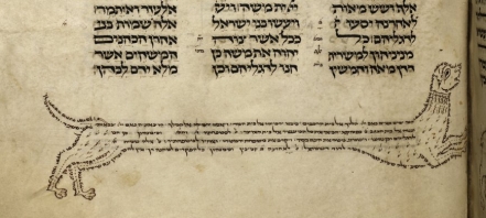
A similar tradition is witnesses in Hebrew Torah culture of the tenth century. It introduced a phenomenon called “micrography“, the art of decorating the page with meaningful text written in tiny letters. By the thirteenth century Hebrew manuscripts contained elaborate depictions of individuals, animals and objects (Fig. 5). Hebrew religious leaders protested against this practice of drawing with words, as they figured it distracted from taking in their meaning.

British Library, Add. 21160-31 (13th century)
Fig. 5 – British Library, Add. 21160-31 (13th century) – Source
British Library, Add. 21160 (13th century)
Fig. 6 – British Library, Add. 21160 (13th century) – Source

The last word: music
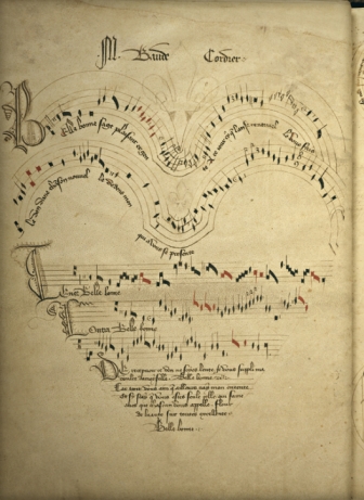
The notion of drawing an image with words was taken a step further in the later Middle Ages. In the thirteenth century, for example, we encounter marginal glosses in the shape of objects and people. A particularly elaborate late-medieval example is a variation on this theme: it presents a drawing in the shape of a heart, except the heart is made out both words and musical notes (Fig. 7).

Chantilly, Musée Condé 564 (14th century)
Fig. 7 – Chantilly, Musée Condé 564 (14th century)

It concerns the so-called “Chantilly Codex”, which contains over a hundred polyphonic songs by French composers. The one seen here is by Baude Cordier and is called “Belle, Bonne, Sage” (listen to it here). As the Renaissance was nearing, word play became a favoured occupation of poets, including in a visual sense. Cordier borrowed the word “Cor” (coeur, heart) from his name and used it for the visual presentation of this song. Cutting-edge design? Hardly. Little did Cordier know that the practice of drawing and writing at the same time was old-school.

Medieval Super Models

This post is devoted to a particularly attractive and rare kind of medieval manuscript: the model book. A feast to the eye, the object is filled with drawings and paintings that were meant to show scribes and illuminators how to decorate letters, paint initials, or add large segments of decoration to the page. Within this tradition, two types of model books can be distinguished. Some functioned as instruction manuals. In such books, the drawings might be accompanied by a narrative or explanation that instructs the artisan how to proceed, usually in a step-by-step process. Other model books appear to have merely functioned  as  a source of inspiration: they present a wide array of shapes and drawings from which the artisan could take his pick.

The level of sophistication among surviving model books varies considerably. On the lower end of the spectrum there are pattern books that merely show how to make enlarged letters with some minor flourishing. On the higher end, by contrast, there are copies with high-quality stand-alone designs and sophisticated historiated initials inhabited by figures and scenes. Evidently the requirements of the artisans varied; and by proxy, so did the taste of medieval readers. It is this variation that makes model books so fascinating, both as physical objects and as cultural artifacts. This blog illuminates the breadth of the genre – and shows off the attractiveness of these medieval super models.

Plainly decorated letters

Yale, Beinecke Library, MS 439, fols. 30v-31r (1510-1517)
Fig. 1 – Yale, Beinecke Library, MS 439, fols. 30v-31r (1510-1517)

To start at the lower end of the spectrum, some model books merely showed scribes how to execute a certain script or how to draw plain enlarged capitals – the most basic kind of decoration. The book opening seen in Fig. 1 is from Gregorius Bock’s Scribal Pattern Book, which provides instruction on both fronts (more about the manuscript here). Produced in 1510-1517, the first part of the small parchment book contains a series of alphabets in different scripts, some of which are clearly influenced by print typefaces. The second part contains decorative initials arranged in alphabetical order. In the introduction to his manual, Gregorius adds a dedication to his cousin Heinrich Lercher Wyss of Stuttgart, who was scribe to the Duke of Württemberg. The arrangement of the material shows how Heinrich likely used the book: he would thumb through its pages until he had reached either an alphabet or capital letter to his liking (more about the context here).

Cambridge, Fitzwilliam Museum, MS 83-1972 (c. 1175)
Fig. 2 – Cambridge, Fitzwilliam Museum, MS 83-1972 (c. 1150-1175)

While Brock’s letters are a pleasure to look at, especially for the book historian, it was not exactly rocket science. More complex – but still relatively plain – are the models provided by a much older pattern book in the Fitzwilliam Museum in Cambridge (Fig. 2; more here). This appears to be the oldest surviving pattern book for initials: it dates from c. 1150 and was produced and used in a Tuscan workshop. The choice is much more limited than in the previous example: the Cambridge copy does not provide multiple alphabets, nor does it present a wide range of initials (in fact, only about twenty are present). Interestingly, some manuscripts survive in which we encounter decorated letters that could well be modelled from this or a similar model book (like British Library, Harley MS 7183).

Elaborately decorated letters

London, British Library, Add. MS 8887 (15th century)
Fig. 3 – Oxford, Bodleian Library, Ashmole 1504 (1520-30) – Source

On the more upscale end of things is the model book known as the Macclesfield Alphabet Book. It was made and used in fifteenth-century England, apparently for the transmission of ideas to decorators or their assistants (full digital copy here, information podcast here). The artisans were offered quite a lot of choice, given that we encounter no less than fourteen different alphabets on its pages. What makes this book so special, however, is their quality and the manner in which the letters are designed: their shapes are produced by human figures. As in other modelbooks that include letters made out of people (Fig. 3), the figures are shown in most uncomfortable positions, as if doing yoga exercises.

A similar subject matter is encountered in the alphabet book of the Italian artist Giovannino de Grassi (Fig. 4 and image at the very top). This book was created at the Visconti court and features both initial letters and stand-alone drawings. The Visconti’s were known as important patrons of the arts and so it makes sense that we see their generosity extend into the world of book production. Giovannino was known for depicting exotic animals in their natural habitat and this book features such images as well. His pages provided models for other artists who wished to replicate his realistic depictions.

Bergamo, Biblioteca Civica, MS Cassaf. 1.21 (14th century)
Fig. 4 – Bergamo, Biblioteca Civica, MS Cassaf. 1.21 (14th century) – source

Marginal decoration
Even more sophisticated are model books that show how to create elaborate decoration that runs in the margin along the length of the page. These border decorations, with their curly leaves and unexpected turns, could be tricky to produce. The so-called Göttingen Model Book, made around 1450 (Fig. 5, left), provides a solution to this problem. Its pages not only show, step by step, how to build a 3D leaf pattern, they also present detailed instructions like the following:

The foliage one shall first draw with a lead or a point. Then one shall outline the foliage with a pen and with very thin ink or with thin black color. Then one shall polish the foliage with a tooth, so that the color can be applied smoothly, but not too firmly. Then one shall paint it with the colors, one side right and the other side left or reversed, with a brush, namely light red and green. […] (Source of transcription)

Göttingen, Universitätsbibliothek, Uffenb. MS 51 (left) and Gutenberg Bible (right)
Fig. 5 – Göttingen, Universitätsbibliothek, Uffenb. MS 51 (left) and the same decoration executed in an actual book, a  Gutenberg Bible (right)

The drawings and narrative clearly complement one another. From time to time the instructions mention something like “as it is shown here” or “as the image shows”. A model book can hardly be clearer than this: while the alphabet books shown above were more or less meant to simply inspire the artist, the Göttingen book really takes the artist by the hand and guides him through each step of the production process. The instructions apparently worked well, as is shown by a surviving Gutenburg Bible that contains these very leafy borders (see Fig. 5, right, and more here).

The final point
Models are crucial in any learning process. Observing how something is done helps you acquire a skill you lack as much as it encourages you to develop further those you already have. Moreover, there is an additional use to these pattern books that has not yet been mentioned: the beautiful letters and shapes could also be browsed by readers looking for a good image for their newly acquired book. Patrons visiting artisans’ shops could well have been given these objects to find out what the book-maker was capable of providing. Given its many uses, it is hardly surprising that the tradition shown in this blog is also encountered in other cultures, including Byzantine and Arabic book production.

One particularly unusual Arabic specimen deserves to make the final point of this post. The fragment shown in Fig. 6 presented Arabic decorators with models of scenes from the New Testament (more here). It figures that the artisans, used to decorating the Quran, needed a little inspiration when it came to the Bible. This specimen is also interesting because it presents a type of instruction not seen in Western copies, as far as I know: some of the figures have been outlined by tiny holes, meaning that the sheet could be used as “tracing paper” (click the image to see this closer). While this ultimate instruction method took all potential flaws and creativity out of the modelling process, it allowed decorators with lesser talents to produce something beautiful.

Yale, Beinecke Library, MS 553 (1400-1700)
Fig. 6 – Yale, Beinecke Library, MS 553 (1400-1700)


Post-scriptum 16 September, 2014 –  I wish to thank Giovanni Scorcioni (@FacsimileFinder) for providing the Hi-Res image in Fig. 4.

Post-scriptum 19 September, 2014 – Mari-Liisa Varila (@mlvarila) alerted me to a 17th-century equivalent to the Arabic “tracing paper” specimen (here you’ll find more information). More about this technique, which is called pouncing, here.