Category Archives: Modern Medieval

Medieval Speech Bubbles

This blog frequently highlights parallels between medieval and modern technology and media. My recent posts on SpamGPS and Selfies in medieval times are good examples of that. As odd as this may sound, as a medieval book historian I see such parallels with modern concepts all the time: all you need is a pair of eyes and a little imagination. A few days ago, however, I encountered (and tweeted) a parallel I had never seen before: a drawing with the appearance of a page from a modern comic book (Fig. 1, tweet here).

British Library, Stowe 49 (14th century)
Fig. 1 – British Library, Stowe MS 49, fol. 122r (c. 1300) – Source

The drawing from c. 1300 shows a group of people walking, some of them with a walking stick in their hand. You can almost hear the sing-songs in the background. As it turns out, this merry scene bears more than one parallel to a modern comic book story.

Speech bubbles
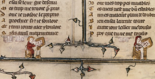
According to the description of the British Library we are looking at a group of travellers conversing in English. What the description does not mention, however, is something that is rarely seen in medieval drawings: the different parts of conversation are given the appearance of speech bubbles. That is to say, just like in modern comic books, sentences are visually connected to the individual who utters them, by means of a tiny line (Fig. 2).

British Library, Stowe 49, fol. 122r, detail
Fig. 2 – British Library, Stowe MS 49, fol. 122r, detail

Also in parallel to modern comic books, the story that unfolds is funny and familiar. The art historian Lucy Freeman Sandler has devoted considerable attention to this scene (a transcription and literal translation is found in this publication). Using her work, while rewording her literal translation, the following conversation may be overheard:

The figure on the left starts, with a strange mantra: “They die because of heat, they die because of heat.” Then the two young people on his right speak, probably addressing their father [according to Sandler], who is walking behind them: “Sir, we die of cold!” The father, carrying a heavy toddler, orders them to stop whining: “Behold your little brother in front of us, he is only wearing a hood.” (He is right, because he is otherwise naked.) Then the toddler speaks, uttering universal toddler sounds: “Wa we”. Finally the two children in the back come into play (Fig. 2). “Sir, I am carrying too much weight,” says the one on the left.  The one on the right closes the conversation by comparing his own misery to that of his brother and father, stating “It is not they who carry the heaviest burden.”

The Middle English scene is familiar to many of us. We are shown a family en route to an unknown location (as if it were an alternative version of the Canterbury Tales). The young ones are verbally poking at each other, and complain about the temperature and the weight of their suitcases. It is the medieval version of a modern parent’s nightmare: being on the road with a crying toddler and whiny kids that egg each other on.  “Are we there yet?”

Banderole

Lons Angeles, Getty Museum, MS 66 (
Fig. 3 – Los Angeles, Getty Museum, MS 66 – Source

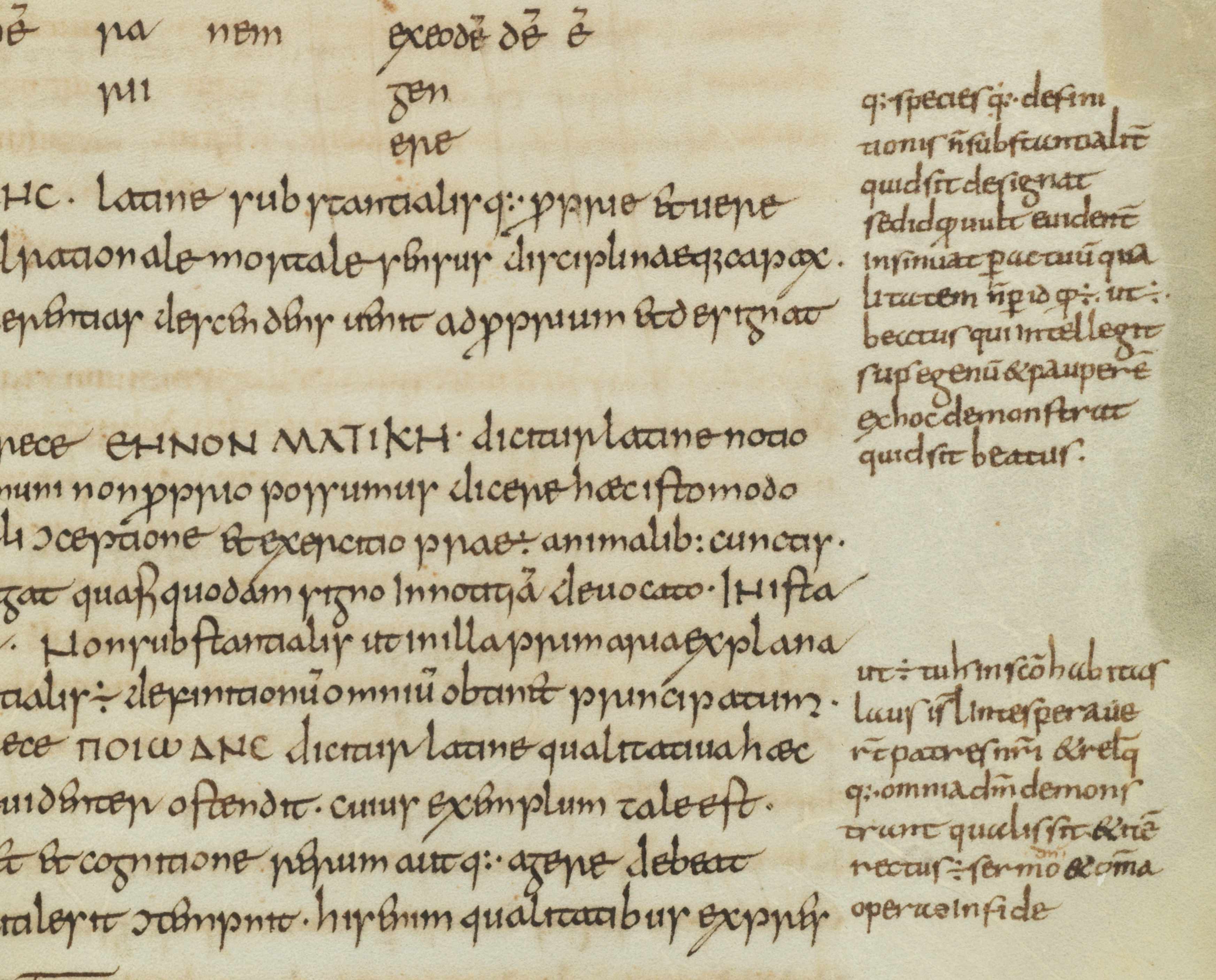
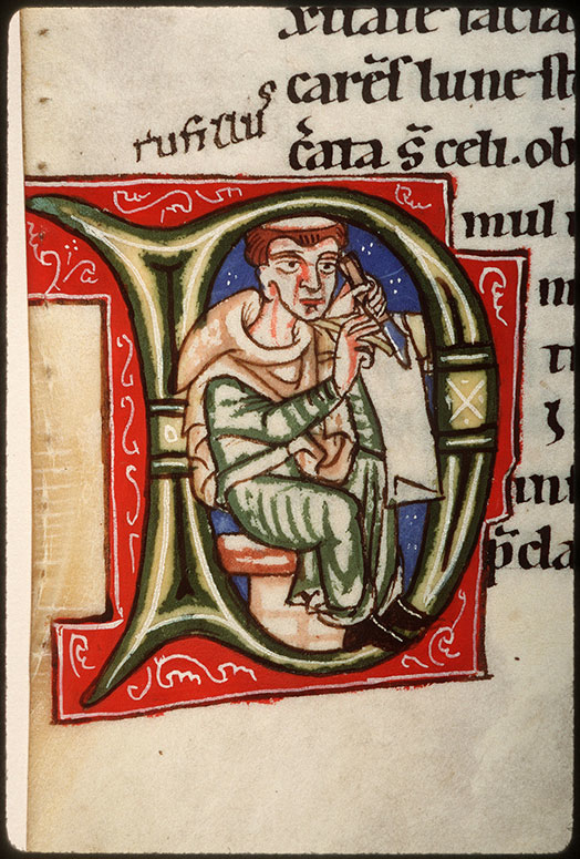
Books before print had another way to make a silent figure on the page speak: the banderole. This clever device gave the decorator the ability to make someone deliver a short statement. Short, because it had to fit on a tiny scroll (see a collection of them here and in this blog post). In Fig. 3, for example, we see a fool repeat the words whispered in his ear by the devil: “There is no God” (Non est deus). The speaker holds the tip of the scroll in his hand, so as to claim the words as his own. It also happened that the speaker was pointing at the banderol, often touching it with his finger.

Schøyen Collection MS 33 (14th century)
Fig. 4 – Schoyen Collection MS 33 (14th century) – Source

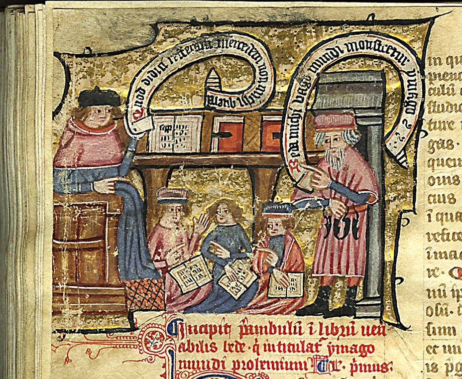
Such points of contact (holding the scroll or touching it) were particularly important when an image presented more than one speaking person. It allowed the viewer to identify who was saying what. Fig. 4 shows a classroom where two teachers appear to be in a lively debate. One is holding the scroll, the other is pointing at it, each firmly securing the text to their own person.

Interesting in light of the comic book parallel is that the banderole was not always held in or close to the speaker’s hand: it could also flow from his or her mouth. While such cases are less common, they have a strikingly modern appearance because of the banderole’s white background, which creates the illusion of a real text bubble (Fig. 5).

Paris, BnF, lat. 11978 (15th century)
Fig. 5 – Paris, BnF, lat. 11978 (15th century) – Source, found via
Frankfurt, Staatsbibliothek Ms. barth. 42
Fig. 6 – Frankfurt, Staatsbibliothek, Ms. barth. 42 (12th century)

Not all banderoles present such a “live” text. Some label a scene, while others clarify the identity of a person. For example, the banderole in Fig. 6 introduces the twelfth-century illuminator Guda, who decorated the book in question, but it does not present direct speech (more about the image in this post). Instead, it is the medieval equivalent of tagging a person in an image.

No bubbles
Then there are, finally, manuscripts where direct speech is written in mid air, unsupported by a banderole or a bubble. In order to relate the uttered text to a given person, the scribe wrote the lines in such a way that they appeared to flow from the speaker’s mouth. The result are wavy lines of text that dance across the page. A great example is seen in Fig. 7. This miniature is part of a cycle on the life and work of the scholar Raymond Lull (d. 1316). Here he is shown discussing with Thomas Méysier, his student and disciple. The images in the cycle were made under personal supervision of Thomas, who also compiled the contents of the manuscript, which presents a compilation of Lull’s work called the Electorium parvum sue breviculum (more here).

Karlsruhe, Badische LandesBibliothek, St Peter Perg. 92 (14th century)
Fig. 7 – Karlsruhe, Badische LandesBibliothek, St Peter Perg. 92 (14th century) – Source

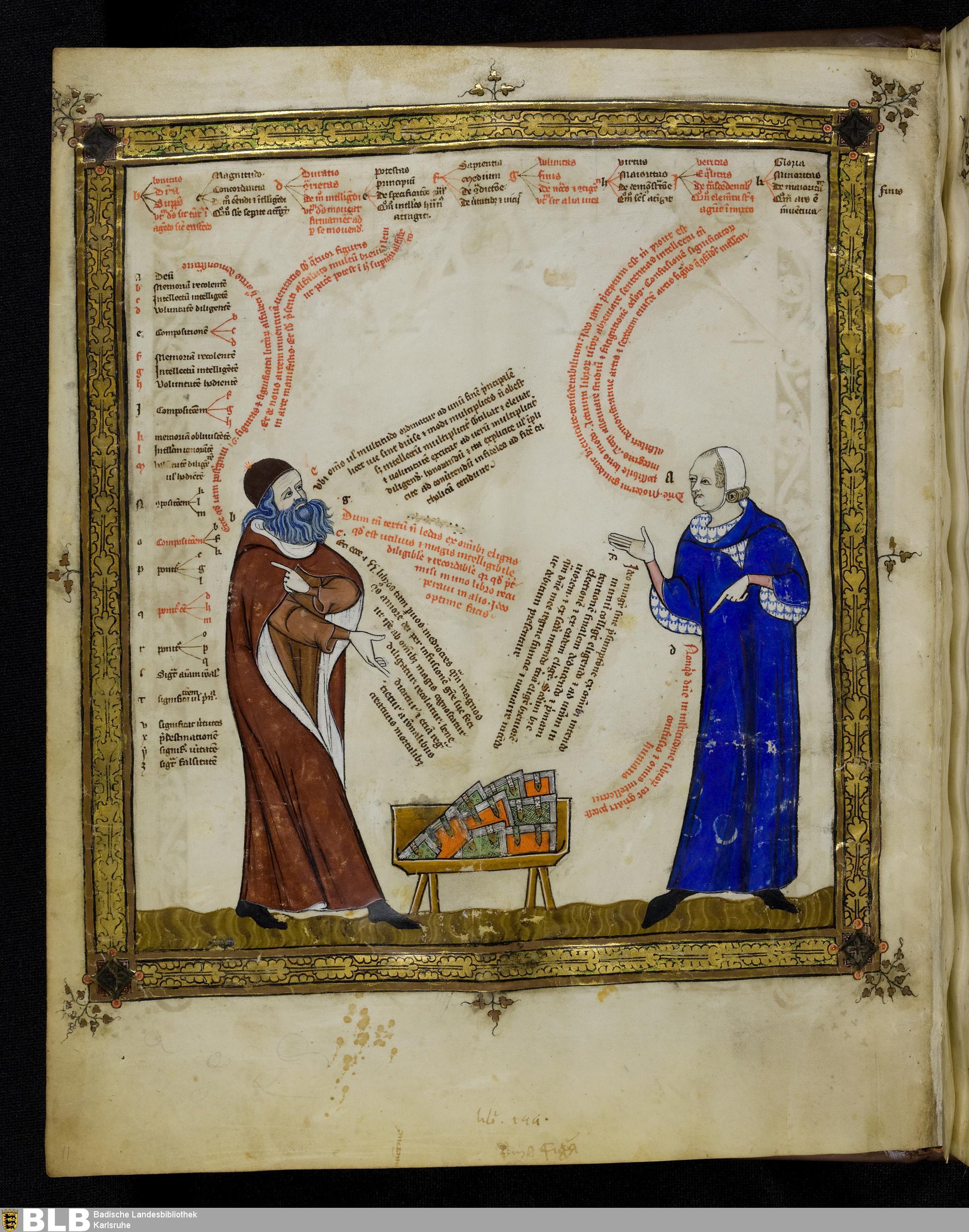
Although serious in subject matter, the conversation between the master and the student has a funny, almost grotesque appearance. Over a big and authoritative pile of books we see the scholars engaged in a lively discussion. Arguments fly across the page. It looks like the scribe is trying to help the viewer keep track of the discussion through the use of different colours (red and black). Also, the scribe presents the conversation in such a way that each component begins with a line that sticks out slightly. Cleverly, the extended tip is found next to the speaker’s mouth, leaving no doubt as to who is saying what. No bubble required.

Acknowledgments – I wish to thank Thijs Porck (Leiden) for his help with the Middle English translation of the scene in Fig. 1. My PhD student Jenneka Janzen (Leiden) introduced me to the Karlsruhe manuscript in Fig. 7.

Medieval Apps

How about this for a truism: a book is a book, and something that is not a book is not a book. This post will knock your socks off if you are inclined to affirm this statement, because in medieval times a book could be so much more than that. As it turns out, tools were sometimes attached to manuscripts, such as a disk, dial or knob, or even a complete scientific instrument. Such ‘add-ons’ were usually mounted onto the page, extending the book’s primary function as an object that one reads, turning it into a piece of hardware.

Adding such tools was an invasive procedure that involved hacking into the wooden binding or cutting holes in pages. In spite of this, they were quite popular in the later Middle Ages, especially during the 15th century. This shows that they served a real purpose, adding value to the book’s contents: some clarified the text’s meaning, while others functioned as a calculator or, astonishingly, allowed the reader to tell time. These fascinating add-ons  – which are really not that different from the apps on our smartphones – turned a static handwritten book into an interactive object.

The Volvelle

British Library, Egerton MS 848 (15th century)
Fig. 1 – British Library, Egerton MS 848 (15th century) – Source

A volvelle is an instrument that consists of one or more rotating disks mounted on the page. Volvelles allowed the reader to make a variety of complex calculations, such as the position of the sun and the moon, or the precise date of Easter – which was, like the volvelle, a moving feast. The one seen in Fig. 1 contains no less than three revolving disks, which are pinned to the page in a central point: two show the cycle of sun and moon (note the charming depictions at their pointers), while a third presents the Zodiac.

In spite of its simplicity, the device provides a surprising wealth of data, which could be read if one knew how to interpret the dials. However, volvelles were not always crude instruments providing dry data. Some are actually a pleasure to look at (Fig. 2). Others added an entertaining touch to the moving parts. The one in Fig. 3, for example, calculates the date of Easter, a popular application of the volvelle, but in this case the answer is pointed out by a spinning lady.

Heidelberg, Universitätsbibliothek, Cod. Pal .833 Ger. (early 16th century)
Fig. 2 – Heidelberg, Universitätsbibliothek, Cod. Pal .833 Ger. (early 16th century) – Source, more here
British Library, Harley MS 941 (15th century)
Fig.3 – British Library, Harley MS 941 (15th century) – Source

The oldest volvelles are connected to the scientific explorations of Raymond Lull, a thirteenth-century scholar, who introduced the clever device from Arabic scholarly culture. It explains why the earliest volvelles date from the 13th century (there are no older manuscripts that hold them, as far as I am aware), but also why the oldest ones are found in books holding works by Raymond Lull. These oldest specimens are less sophisticated: they have a limited number of disks and present less data on and around the dials (see a Lull specimen from the early 14th century here).

Maastricht, Regionaal Historisch Centrum Limburg (15th century)
Fig. 4 – Maastricht, Regionaal Historisch Centrum Limburg (15th century) – Photo EK, source

Such crude medieval computers could make a page very bulky. It is surprising, however, how much volume a volvelle could take up without compromising how well the book could be handled.The one I encountered in an archive some time ago even makes use of pieces of wood, giving it the appearance of a real instrument, but also adding a certain clunkiness (Fig. 4).

Cogwheel

Oxford, Bodleian Library, Digby MS 46 (14th century)
Fig. 5 – Oxford, Bodleian Library, Digby MS 46 (14th century) – Source

Volvelles are not the only instruments mounted onto the medieval book. Fig. 5 shows a page from a manuscript containing various texts about fortune telling. The page holds a text on Geomancy, which is a method of divination that allowed someone to calculate one’s ‘key number’. Random rows of numbers were drawn up  and marked down (as seen on the page), after which they were connected by lines. The number you ultimately ended up with was then looked up in a table with lunar and solar information, which was also included in the manuscript (image here).

Oxford, Bodleian Library, Digby MS 46 (15th century)
Fig. 6 – Oxford, Bodleian Library, Digby MS 46 (14th century) – Source

There was another method to calculate this number: by turning a wheel (information here). It is here that the Oxford manuscript becomes relevant for us. Remarkably, the user of the book carved a hollow space into the wooden front board of the binding and fitted a pair of cogwheels into it (Fig. 6). Turning these produced the number that could subsequently be looked up in the table.

The last word: sundial

Oxford, Bodleian Library, Brox._46.10 (17th century)
Fig. 7 – Oxford, Bodleian Library, Brox._46.10 (17th century) – Source

The last example of an instrument that was added to a book also has to do with the sun. Like an iPad, the book in Fig. 7 has a smart cover. The front of the sheepskin bookbinding is not filled with blind-stamped decoration, as was often the case, but rather a sundial was pasted on it. The reader could put the book in the sun and place a stylus on the cover, which would reveal what time it was. While it may not have been a very practical clock, the cover reveals that it was likely used to this end: the ‘footprints’ of the stylus are still visible (note the small circle and the black stain near the letters IHS, at the bottom). Moreover, the severity of the stain suggests the book was frequently used to tell time.

Just like our modern smartphones, the medieval book could be a versatile tool that combined contents with an untold number of applications – giving the scriptorium the feel of an App Store.

The Medieval Origins of the Modern Footnote

Last week I posted a blog on note-taking in medieval times. It showed how individuals who wanted to jot down a note dealt with the absence of notepads and scrap paper. As in our modern day, the urge to write down a note in medieval times often came while reading a book. And so the margins of the page grew into a prime location where the reader could vent his objections or – albeit more rarely – express his or her approval.

The present post deals with the logistics behind this “window dressing”: it shows how a reader with many important things to say kept track of his marginal comments. Particularly, it deals with a serious problem that came with adding notes to the page: how to connect a particular comment, placed among a dozen others, to the specific text passage it refers to. The clever system that was created for this purpose lives on as our modern footnote.

Disconnected

Bern, Burgerbibliothek, MS 234 (10th century)
Fig. 1 – Bern, Burgerbibliothek, MS 234, fol. 11r (9th century) – Source

The crux of our footnote system is the presence of a symbol that connects the note to the relevant location in the text. Curiously, in medieval times it was quite common not to have such connections in place, perhaps especially in the earlier period (Fig. 1). When few remarks were added to the page, a reader could deduce with relative ease to which passage a marginal note referred. It helped if a text was in popular use or known by heart, as many medieval works were. In such cases the note made sense instantly because the reader was familiar with the referenced literary context. Moreover, as long as notes were few and short, a reader could simply insert them – interlinearly – over the relevant word or passage (Fig. 2).

Alençon, Bibliothèque municipale, MS 12, fol. 21v (9th century)
Fig. 2 – Alençon, Bibliothèque municipale, MS 12, fol. 21v (10th century)
Cologny, Fondation Martin Bodmer, Cod. 89, fol. 59v
Fig. 3 – Cologny, Fondation Martin Bodmer, Cod. 89, fol. 59v (Horace, 12th century) – Source

Cleverly, in this system the very position of the remark identified the word to which it referred. However, as the number and size of such comments increased, it became impossible to place them between the lines. The great blank space provided by the margins was now drafted into service. It is here that the absence of a proper reference system was felt. As the marginal body of remarks and critique began to accumulate, the page became a real messy place, a labyrinth in which it became impossible for readers to find specific pieces of information (Fig. 3). In came the footnote.

Dots and lines
Connecting a marginal remark to the relevant passage in the text was usually done with a duplicated symbol, called a signe de renvoi: one was placed in front of the marginal note, the other near the word or passage that the remark commented upon. While it is hard to deduce a clear pattern of development, it appears that in the early stages of using such footnotes scribes and readers resorted to plain symbols rather than letters or numbers. These symbols varied considerably in shape and sophistication. At the high end of the spectrum we encounter complex symbols, such as the reversed letter E seen in Fig. 4 (magnified).

St Gall, Stiftsbibliothek, MS 4, fol. 170r (10th century)
Fig. 4 – St Gall, Stiftsbibliothek, MS 4, p. 170 (820-840) – Source

More popular, however, were less complex symbols, which could be added to the page much quicker. Dots and lines are particularly common ingredients of such footnote symbols. Interestingly, their first appearance (it seems to me) is not as a connector of comment and text, but as an insertion mark that added an omitted line into the text. In Fig. 5 such an omitted line is placed in the margin accompanied by a symbol made up of a line and a dot. It is repeated in the text itself, near the location where the line belonged. This omission mark may well be the origins of the footnote system that would emerge over the course of the Middle Ages – and that we still use today, almost unchanged.

Einsiedeln, Stiftsbibliothek, MS 172, p. 20 (9th century)
Fig. 5 – Einsiedeln, Stiftsbibliothek, MS 172, p. 20 (9th century) – Source

Scribes used different versions of the line-and-dot symbol. In fact, they had to if they were to produce unique ties between comment and text. When dots were used, their number would increase as more notes were added. Alternatively, the position of the dots could be varied, so that they formed different – unique! – patterns.

Leiden, University Library, VLF MS 69, flyleaf (12th century) - Photo EK
Fig. 6 – Leiden, University Library, VLF MS 69, flyleaf (12th century) – Photo EK

Customising the line-type footnote, scribes usually distinguished one from the other by added circles, which were attached at different locations and in varying numbers. In what is a most unusual find, in a Leiden manuscript we see a scribe practicing his dot and line footnote symbols (Fig. 6). It shows variations in the number and pattern of dots, as well as in the treatments of lines.

Letters
Closest to our modern system of footnotes, finally, is the use of letters to tie a marginal remark to its proper location in the text. In some manuscripts we see the entire alphabet running down the margin. Fig. 7 shows a page from a manuscript with works by Horace (left column) to which a high volume of notes were added (right column), all of which are connected to specific passages with the letters A to Z.

Leeuwarden, Tresoar, 45HS, fol. 45r
Fig. 7 – Leeuwarden, Tresoar, 45HS, fol. 45r (c. 1100) – Photo EK

In the eleventh and twelfth centuries such classical texts were most commonly used in a classroom setting. The instructors who used the books, typically in a monastic school, had many things to explain to their students, as the notes show. It made sense to organise such added information in a clear manner, and the alphabet came in handy in this respect. Some pages in this particular book contain more footnotes than there are letters in the alphabet, which challenged the system. In such cases the user added into the mix symbols made from lines and dots.

The last word: numerals
So where are the medieval footnotes that make use of numbers, like we do today? Curiously, I have not been able to find them, which kind of makes sense. Roman numerals would not be suitable for the task. Placed out of context, as a symbol initiating a segment of text (i.e. the marginal comment) they would easily be mistaken for a letter – which they are, graphically speaking. Moreover, a high Roman numeral would quickly take in a lot of space – not what you want in a note symbol. Arabic numerals were far were less popular than Roman numerals, even in the later Middle Ages. Readers may not have felt comfortable enough with these new numbers to use them in the margin. In fact, some scribes in the later Middle Ages are still confused by the zero. The leap from alphabet to numerals – from the medieval to our modern system – appears to have been taken in the age of print.

Medieval Notepads

We are surrounded by pieces of scrap paper. We chuck tons of them in the waste bin each year, leave them lying on our desks, use them as bookmarks, stuff them in our pockets, and toss them on the street. And so we usually do not have to look hard or long when we need a piece of paper for our shopping list or for writing down a thought. This was very different in medieval times. Writing material – of any kind – was very expensive back then, which meant that scribes used a paper or parchment sheet to the max: everything was used. As a result, there was nothing obvious lying around on one’s desk that was suitable for scrap material. So how did the medieval person make notes?

In the margin

Leiden, University Library, BPL 2888 (Italy, 13th century)
Fig. 1 – Leiden, University Library, BPL 2888 (Italy, 13th century), Photo Julie Somers – Source

The most common and sensible location for putting down thoughts, critique or notes was the margin of the medieval book. Consider this: you wouldn’t think so looking at a medieval page, but on average only half of it was filled with the actual text. A shocking fifty to sixty percent was designed to be margin. As inefficient as this may seem, the space came in handy for the reader. As the Middle Ages progressed it became more and more common to resort to the margin for note-taking. Notably, the thirteenth century gave birth to two particularly smart book designs that accommodated such use. Both types are connected to the emerging university, which makes sense as this was a note-taking environment par excellence – then and now.

The first of these is seen in Fig. 1, which shows a page of a law manuscript that actually contains two kinds of texts. Found in the two central columns is the Digest of Justianian, written in a slightly larger letter. Draped around it, in a smaller letter, is the commentary to this work: these are the notes of smart teachers from the past, put there collectively to help the reader make sense of the law. This specific style of presenting two works on the one page, where the glosses (commentary) are presented as “square brackets”, is called textus inclusus. An Italian reader in the thirteenth century added his own two-cents to these “prefab” opinions that came with the book: in Fig. 1 we see them scribbled between the two central columns.

London, British Library, Harley 3487 (13th century)
Fig. 2 – London, British Library, Harley 3487 (13th century) – Source

The second thirteenth-century book layout that was specially designed to accommodate note-taking is as clever as the text on its pages. We encounter it first and foremost in manuscripts with works by Aristotle, although the design would spread to other domains, including law and medicine. As seen in Fig. 2, the margins surrounding the Aristotle text (which form the two central columns) were left completely blank by the scribe. The tiny writing that is seen there now is from a student in the Arts Faculty, where the works of Aristotle formed the main textbook, called the Corpus vetustius (the old corpus).

If you look carefully you see five vertical commentary columns marked by thin pencil lines, which allowed for five “pillars” of notes. Cleverly, in this page design the start of the note could be placed at the same height as the Aristotle line on which it commented, not just one time, but five times over! Larger comments were placed in the larger blank areas in the lower margin. Some of these Aristotle textbooks contained up to twenty “zones” for notes, which would ultimately be connected to the main text with the help of symbols resembling our current footnotes.

Yellow sticky notes 

Sens CT Library, J 36 (Chartaire 156), 9th century, photo Genevra Kornbluth
Fig. 3 – Sens CT Library, J 36 (Chartaire 156), 9th century, photo Genevra Kornbluth – Source

As stated, paper and parchment sheets were commonly used to the max, meaning no redundant material was left that could be used for scraps. However, when the animal skin was turned into parchment sheets such redundant material was left over. In the process the outer rim of the dried skin was removed, because these “offcuts” were deemed unsuitable for writing on. The material was too thick for a regular page and its surface was slippery and translucent, not to mention that most offcuts were too small for normal pages. They consequently ended up in the recycling bin of the parchment maker.

Interestingly, these small, scrappy slips of parchment were sometimes sold to clients. Offcuts were used for text with a short lifespan, such as letters and drafts. In addition, it was used when a text was “utilitarian” and did not need to be produced from regular – more expensive – parchment. An example is seen in Fig. 3, which shows a short description strapped to a bone that belonged to a saint. Such “relic labels” were important because of course nobody wanted to mistake the big toe of St Peter for that of St Paul. Such information was scribbled on the parchment strip, usually in low-quality (fast) handwriting.

Leiden, University Library, BPL 191 D, fragment (France, 13th century) - Photo Giulio Menna
Fig. 4 – Leiden, University Library, BPL 191 D, fragment (13th century) – Photo Giulio Menna
Birch bark strip used by the student Onfim, dated 1240-1260
Fig. 5 – Novgorod, Museum of History, birch bark strip 202, from pupil Onfim, dated 1240-1260 – Source, blogmore

Offcuts were also frequently used by students and scholars, for example for taking notes in the classroom (Fig. 4, more here). In fact, in De discipline scholarum, a guidebook made in the 1230s for students and teachers at the University of Paris, it is explained how a student should bring such slips of parchment to class for taking notes. Interestingly, some of these slips have survived because they were pasted in a student’s textbook, like the one seen in Fig. 4. These are truly the medieval equivalent of our “yellow sticky notes”. The practice of bringing scrap material into the classroom was a much broader medieval phenomenon, as is shown by the famous birch bark notes that survive from 13th-century Russia. Fig. 5 shows funny “stick figure” doodles drawn by the student Onfim as he was sitting, bored no doubt, in class.

The last word: notepad
There is evidence that multiple parchment offcuts were sometimes bound together, by pricking a hole in them and pulling a cord through. These bundles, which essentially form a true notepad in the modern sense of the word, could be of considerable size. A specimen in the Universitätsbibliothek Würzburg consists of thirty slips. A type of notepad that was even more popular in medieval times was the wax tablet (here is a collection of them). These, too, were often tied together into a bundle, forming a notepad of perhaps six or so “pages” (Fig. 6, note the holes for the cords on the left side). Smart pages, that is, because the contents could be erased from the soft wax (with the flat back of the stylus), presenting vacant space for fresh thoughts.

Michigan, University Library, Papyrology Collection, Inv. 768
Fig. 6 – Michigan, University Library, Papyrology Collection, Inv. 768 (4th-6th century) – Source

Facebook Before Facebook: Tagging in Antiquity

This is a guest blog by Sarah E. Bond, ancient historian in the Classics Department at the University of Iowa. The post highlights the link between media in the past and in our own digital world, a theme that is frequently addressed here. Sarah maintains a blog devoted to classical culture. EK


In the digital world, tags are ubiquitous. When we digitally tag items, we are essentially applying metadata (information about your information) to an object. We practice this all the time: when we write a blog post and want to increase viewership, when we upload an image onto Flickr, or when we identify individuals or places in Facebook posts. At Facebook’s Desktop Help center, they attempt to explain the reasons for tagging: “When you tag someone, you create a link to their profile…Your status update may also show up on that friend’s Timeline.” In antiquity, tags functioned in a similar manner to today. Though on stone, ceramics, mosaics, and other media rather than the screen, they still broadcast literary and social networks while also providing context for the viewer.

Fig. 1 - Monticello
Fig. 1 – Monticello Archeological Field School, 2005 – Source: Facebook Sarah Bond

In the book Evolution and Ethics (1893), biologist T.H. Huxley wrote that, “One of the unpardonable sins, in the eyes of most people, is for a man to go about unlabeled. The world regards such a person as the police do an unmuzzled dog, not under proper control.” What Huxley meant was that there is a human proclivity toward labeling individuals, objects, places, and concepts. In short? Our minds prefer to organize knowledge.

I couldn’t help but recall this quote not long ago, while recording an inscription at the Art Institute of Chicago for the U.S. Epigraphy Project (Fig. 1). On display in the newly reopened Greek, Roman, and Byzantine galleries of the ArtIC is a funeral monument from the 4th century BCE shaped like a Greek lekythos, an oil jar (Fig. 2). The marble marker didn’t just imitate a ceramic vessel in regard to its shape; it also replicated the tags that often identify figures on Greek pottery. Interestingly, with steady precision, the stonecutter labeled the three figures: Leon Alaieus, Demagora, and Helike (Fig. 3).

Fig. 2 - Leon
Fig. 2 – Funerary Lekythos, 4th century BCE. Katherine K. Adler Memorial Fund, Mr. and Mrs. Walter Alexander Classical Endowment Fund, Costa A. Pandaleon Greek Art Memorial Fund, and David P. Earle III Fund, 2009.76 – Photo SB
Fig. 3 – Funerary Lekythos, 4th century BCE  (detail of Fig. 2)

One of my jobs—along with the other contributors to the USEP—is to visit museums and record the inscriptions on various objects. Many of these epigraphic notations receive little attention from viewers, not only because most visitors can no longer read Latin or Greek (O tempora!), but also because the modern focus tends to champion the figures rather than the texts. However, we must ask ourselves whether this is a modern bias. By all accounts, there was a strong interplay between texts and images in antiquity that cannot be ignored. Moreover, the inclination toward the organization of information through labeling went beyond simple identification. Much like today, labels functioned in a myriad of ways: to articulate space, to exhibit notions of proper paideia (education) and legitimacy, to trigger collective memory, and to provide deeper engagement with an object.

Fig. 4 - Jerusalem portion of the Madaba Map
Fig. 4 – Jerusalem portion of the Madaba Map, 6th century CE – Source

Moving away from classical antiquity and into the late antique period, the interplay between texts and images became more pronounced, particularly through mosaics. Perhaps the most well known example of this is the Madaba Map, a mid 6th century CE mosaic from Jordan depicting the Holy Land (Fig. 4, interactive version here). Discovered in 1884, the map has a mix of topographical tags and buildings in order to project a worldview of the Christian Near East. The buildings are not to scale, areas are highly distorted, and it would be of little use to a traveller, but then again, the objective of the map is not functionality. To my mind, the incredibly clustered tags are visually advertising the abundance of Christian sites in general. Here the tags and the architecture work together to claim dominion.

It is important to remember that just as there are trends in writing materials or in fonts, there were fashions in tagging based on period, place, and medium. During the later Roman empire, it appears to have become vogue in the East in particular to label mosaics. Mosaics from Cyprus, Syria, and modern day Turkey often have labels overtop figures identifying classical figures such as Dionysus or Theseus. Rather than simply assuming these tags were provided due to the ignorance of the viewer in regard to Greek mythology, we should perhaps think about it as a shift in the landscape of writing. In terms of literacy levels and who could read these captions, labels on mosaics likely required a minimal amount of “recognition vocabulary” (as Greg Woolf calls it) in order to read. They functioned to prompt conversation between dinner guests staring at the floor or perhaps congregants within a basilica, and lured viewers into interaction while perhaps serving to display the education of the patron.

Fig. 5 Apollo Paphos
Fig. 5 Apollo Paphos mosaic, 4th century CE (Apollo enthroned) – Source
Fig. 6 - Theseus Paphos
Fig. 6 – Theseus Paphos, 2nd century CE (Struggle of Theseus and Minotaur) – Source

What are we to make of this apparent increase in the use of labels on mosaics in the late Roman East? One could perhaps argue that it was the expression of the import of writing and literacy within early Christian communities, but as we can see at Paphos, this trend predated the rise of Christianity. More likely is that labels at various times came into vogue as a means of provoking literary or perhaps geographic discussions that could then be tied spatially (or in later memories) back to the owner of house. As they had previously done in funerary or symposium contexts, mosaic labels also worked in tandem with the space and the image to heighten the viewer’s overall engagement. Just like the Facebook tagging of today, these labels helped the ancient viewer to access and to organize information more thoroughly, often while enhancing the prestige of the tagger.

Fig. 7 - Atropos
Fig. 7 –  Wikipedia screen shot showing mosaic with tagged name – Source

Although the digital tags of today link to databases, both ancient and modern tags similarly function to create a network that individuals are visibly situated within. Wikipedia, for example, allows users to translate tags into their own language (Fig. 7). In antiquity, even if the patron or the deceased was not tagged in a vase or a mosaic, there was an implied association. Just think about your friend who constantly tags people to view New York Times articles or posts Kierkegaard quotes on their walls. What are they really telling you? The walls may have changed, but the coded purposes behind curated images and tagging remain ever the same. Viewers of your posts visit your digital home to view tagged images, even if they have no knowledge of the people within them. Tagging still functions to create networks and to elevate the poster in terms of social capital—the principal coinage in the Facebook marketplace.

Medieval Desktops

We are used to having multiple books open at the same time when looking things up at home or writing an essay for class. Whether PDFs, e-books or old-fashioned paper volumes, switching between books in a smooth movement is something we don’t often think about. This was very different in medieval times. In those days, books tended to resist when you tried to move them: they were heavy as a brick and easily twice that size. A related problem was one of space. The average medieval book has a wingspan of at least half a meter wide when open. Consequently, comfortably placing two books in front of you was a stretch, let alone multiple volumes. In an early-sixteenth-century depiction of Erasmus, the scholar cannot even place a single book on his desk as he is writing a letter (Fig. 1).

Albrecht Dürer's portrait of Erasmus, 1526 (detail)
Fig. 1 – Albrecht Dürer’s portrait of Erasmus, 1526 (detail) – source

Interestingly, the challenges of medieval book consultation stands in stark contrast with what we know about reading and studying in the period. Readers browsed through a great number of volumes at the same time, interested as they were in learning different points of view with respect to their topic of inquiry. Sparked by this contradiction, this post explores medieval desktops. How many books are being consulted at the same time in medieval depictions of reading? How are the objects laid out across the available space? In short, how are we to understand the logistics behind the devouring of knowledge in the last four centuries of the Middle Ages? As will become clear, the answers to these questions vary greatly depending on why an individual handled multiple books at the same time.

Scribes
The first group of individuals who had to manage multiple books were scribes. By definition, a scribe had to have at least two books on his desk: the one he was making (a growing pile of quires, which remained unbound until the very end) and the one he was copying from (called the “exemplar”). While keeping track of the loose quires may have been challenging, of the groups discussed here scribes had it the easiest. After all, the individual was only technically reading one book – the one he was copying from. This explains why their deskspace was of limited size, at least judging from surviving depictions.

Brussels, KB, 9278 (15th century)
Fig. 2 – Brussels, KB, 9278 (15th century) – source

In most cases their working space was erect rather than flat (Fig. 1). This famous image of Jean Miélot at work shows how the desktop of the scribe had a 45-degree angle, resulting in an almost erect surface. Clearly visible is also a vertical orientation in the line-up of the books: one was placed above the other. In fact, the desktop in this image is split in half, with the lower half containing the book under production, as well as the scribe’s tools (ink pots and pens), while the upper half holds the exemplar. Miélot obviously needed to go shopping for a larger desk, because we see books laying around on the ground and on a bench.

London, British Library, Royal 18 E.iii (15th century)
Fig. 3 – London, British Library, Royal 18 E.iii (15th century) – source

Interestingly, there are also desks with a horizontal orientation. Fig. 3 shows the translator Simon de Hesdin at work. Although the books are out of sight, the desk clearly provides room for two books. However, they placed next to one another. This may be specially done for the task of a translator, who needed to carefully read the source text and subsequently scribbling down the translation in loose quires or on loose sheets. This way, both books would be right before him: there was no need to look up at a high book platform. (See in this respect also the note added post-publication, below.)

Readers
While it is easy to find images of scribes with a desk full of books,  it is less common to encounter readers in similar situations. That is to say: there are very few medieval scenes in which someone is reading but not writing – where books are present but pens are not. In part, this has to do with medieval study practices. Readers would usually have a pen nearby even when they were just reading. After all, remarks and critiques needed to be added to the margin at the spur of the moment. “Penless” images, while rare, often show a crowded desktop. The scene presented in Fig. 4 shows Christine de Pisan browsing multiple books at a big desk (more about Christine in her study in this article).

Brussels, Bibliothèque, Royale, MS 9009-11
Fig. 4 – Brussels, Bibliothèque, Royale, MS 9009-11

The absence of the pen may result from an urge to depict Christine as an avid reader. This is emphasized, I think, by the various volumes that lay open – note how some open books are facing down, the way we still do today! From the late medieval period a special tool was available for readers who did not like the clutter shown on Christine’s desk: the book carousel (Figs. 5 and 6).

Leiden, Universiteitsbibliotheek, BPL Collection
Fig. 5 – Leiden, Universiteitsbibliotheek, BPL Collection – Photo EK
Oxford, Bodleian Library, Douce 195 (15th century).
Fig. 6 – Oxford, Bodleian Library, Douce 195 (15th century).

These carousels allowed readers to consult multiple manuscripts in a very convenient fashion, by spinning (slowly!) the top part, which moved. The oldest one I could find dates from the fourteenth century (here), but it is possible they were in use even earlier. It is striking that these two scenes show readers – scholars – without pens, even though the second seems to hold an invisible one.

Book hipster
Cleverly, the medieval “spinning wheels” in Figs. 5-6 circumvented the constrictions of the limited space a regular desktop provided. However, what if you need even more real estate than the turning desktop could offer? The answer to this question is perhaps one of the most intriguing and cool pieces of book furniture that survive from the past: the book wheel (Fig. 7).

From "The Diverse and Artifactitious Machines of Captain Agostino Ramelli", 1588.
Fig. 7 – From “The Diverse and Artifactitious Machines of Captain Agostino Ramelli”, 1588.

The image from 1588 shows the bookwheel invented by the Renaissance engineer Agostino Ramelli, whose concept was based on medieval designs. The upside to the carousel is obvious: there was space for a lot of books. This practice is not unlike deciding to hook up a second monitor to your computer, except that the individual is actually watching twelve monitors at the same time – like a trader on Wall Street. I have sat behind one from the 17th century myself and it is truly a majestic feeling to spin the wheel. The click-click sound of the gears hidden inside the device is simply mesmerising.

The last word: laptop
While desktops (in their great variety) are representative of how most scribes and readers handled their books, there is also a surface space that is more exceptional – and that can only be addressed as a “laptop”. The use of such portable desks, which sat on the scribe’s lap, is well documented for the early-modern period (here is one from sixteenth-century Spain; here are a few others). They were used, for example, by noblemen or secretaries drafting documents and letters whilst on the road. It concerns a box with a slightly angled surface, inside which the writing materials were stored, including sheets, ink and pens. Interestingly, this practice – and tool – go back to at least the twelfth century, as Fig. 8 shows. The device contains a hole for the ink pot and inside may well have been blank sheets, in parallel to the portable kits from the Renaissance.

Chartres Cathedral, West Portal (c. 1150)
Fig. 8 – Chartres Cathedral, West Portal (c. 1150) – Source

Apart from the fact that the actual desk space was more limited than what we are used to, the medieval desktop was not so different from ours, including how messy it was. They contained books, both open and closed, as well as writing tools. However, more so than in our present time, desktops were a necessary tool, whether they were packed (as in Christine’s case) or with only one or two books in place (as with most scribes). The medieval quill, after all, needed a stable and even surface. While desktops may seem trivial objects to us, they were crucially important to both medieval scribes and readers.

Note added 22 Dec, 2014: this image of the translator Jean Wauquelin at work (Valenciennes, BM, 772) also shows the translator sitting at two desks with a horizontal rather than a vertical orientation. It raises two questions: was this unusual set-up favoured by translators; and if so, could the reason be that it allowed them to point at the line they were translating, as seen in the Wauquelin image – after all, this would impossible to do with a vertical orientation.

Medieval Selfies

Self-portraits of medieval book artisans are as exciting as they are rare. In the age before the modern camera there were limited means to show others what you looked like. In the very late medieval period, when the Renaissance spirit was already felt in the air, some painters made self-portraits or included themselves in paintings commissioned by others. Stunningly, the medieval painter Jan van Eyck showed himself in the portrait of Giovanni Arnolfini and his fiance: he is staring at you from the mirror that is hanging behind the couple. For those who still didn’t get it, he painted above it Johannes de eyck fuit hic, Jan van Eyck was here” (Fig. 1, more here). He added the date 1434 to the picture, making it a particularly early selfie.

Jan van Eyck, Giovanni Arnolfini and his fiance, 1434 (right) and mirror detail (left)
Fig. 1 – Jan van Eyck, Giovanni Arnolfini and fiance (right)  and mirror detail (left)

As far as producers of books is concerned, there were only two kinds of artisans who handled a tool with which a selfie could potentially be produced, if the individual was so inclined. Scribes could doodle themselves using ink and pen; and decorators could do the same with brush and paint. In practice, however, we almost exclusively encounter self-portraits made by decorators, perhaps because scribes lacked the skills and equipment to produce something meaningful. Even so, decorators rarely put themselves in the picture. The exceptions to this rule are real treats, as this post aims to show: they provide sneak peeks into the workshops of medieval artists.

Monastic decorators
When a decorator is seen on the page, we must assume that a conscious choice was made to become part of the book’s decoration program. This is particularly evident when the decorator added his or her name and designation (“decorator”). This is precisely what the nun Guda did: she depicted herself inside an initial letter D with a banderole (title banner) that reads “Guda, sinner, copied and decorated this book” (Fig. 2). It seems out of sync with the modest life style of nuns to identify oneself with name and title. Pride was a vice so there must have been another reason behind Guda’s self-identification. Perhaps she did so with a sense of history: she is raising her right hand as if to greet future readers.

Frankfurt, Staatsbibliothek Ms. barth. 42
Fig. 2 – Frankfurt, Staatsbibliothek, MS Barth. 42 (late 12th century)

In spite of this very expressive scene, Guda’s selfie does not give away too much about the medieval artist’s workshop. In fact, if it wasn’t for the words on the banner, we would not have guessed that she was a decorator. Where are the paraphernalia of the trade? Fortunately, there is another example that provides more detail about the working environment of monastic artists (Fig. 3). This image was produced by Rufillus, monk in Weissenau Abbey in Ravensburg, Germany, near the end of the 12th century. In the selfie we catch Rufillus putting the finishing touches on a giant letter R. He wrote his name above his tool: there is no avoiding that we get to know him. Remarkably, in another manuscript we encounter Rufillus again. This time he depicts himself as the scribe of the book – he scribbled, oh vanity, his name above himself (Fig. 4).

Cologny, Fondation Martin Bodmer, MS 127, fol. 244r (late 12th century)
Fig. 3 – Cologny, Fondation Martin Bodmer, MS 127, fol. 244r (late 12th century) – source
Amiens, BM, Lescalopier 30, fol. 29v (late 12th century)
Fig. 4 – Amiens, BM, Lescalopier 30, fol. 29v (late 12th century) – source

Rufillus the decorator places himself in a rich setting: in Fig. 3 we see him surrounded by pots of pigment and various instruments. He provides us, in other words, with a much wanted glimpse into his monastic workshop. Moreover, like the nun Guda, Rufillus was apparently active as a decorator and a scribe, which is another important detail that can be derived from the selfie. What is most striking in light of this post, however, is the similarity of the two portraits: in both, Rufillus shows himself as having bright red hair, big eyes and pronounced wrinkles on his cheeks. The similarity strongly suggests that this is what our decorator really looked like, which is a fascinating thought.

Commercial decorators
Such detail-rich selfies are also encountered in books that were made commercially. A particularly telling self-portrait was made in 1512 by the German book decorator Nicolaus Bertschy (Fig. 5, more information here). In this portrait, which is included in the Lorcher Graduale, he shows himself in the company of his wife, who appears to be drinking from a large mug with her arm around his neck. It is not the scenario you would expect, this rather down to earth setting where drinks and female distraction replace both decorum and concentration.

Stuttgart, Württembergische Landesbibliothek, Cod. mus. I 2 65, fol. 236v (detail)
Fig. 5 – Stuttgart, Württembergische Landesbibliothek, Cod. mus. I 2 65, fol. 236v (detail)

Nicolaus introduces himself in a note beneath the image: in spite of the scene, he clearly saw no need to hide his identity. Next to him we see the scribe Leonhard Wagner (note the “LW” on the white shield), who is said to have known a hundred different kinds of handwriting (more here). The illustration shows the two artisans producing the very choirbook in which it appears, making this a selfie with a fascinating double layer.

Remarkably, a manuscript from fourteenth-century Paris also presents a selfie of a decorator and his wife (Fig. 6). It shows Richard and Jeanne de Montbaston, who worked in the second quarter of the century. In this great image Richard appears to copy the text while Jeanne is busy decorating the pages. Given this division of labour it was likely Jeanne who produced this selfie. There are many more details that prove insightful for artists’ workshops. Parchment sheets that were finished are hanging to dry on clothes lines, for example.

Paris, BnF, fr. 25526, fol. 77v (1325-1350)
Fig. 6 – Paris, BnF, fr. 25526, fol. 77v (1325-1350) – source and full manuscript source

Interestingly, in a commercial setting such selfies can be regarded a kind of advertisement, especially when a name was added. It identified, after all, who had produced the decoration – as if to say, “If you like this, you know who to contact!” It is somewhat perplexing, however, that patrons allowed artists to add put such spam in their newly purchased books – especially when showing a decorator and his wife drinking on the job.

The last word
And what about selfies of scribes? Here things are less clear. Occasionally we encounter a plain pen drawing of an individual copying. However, they are (to my knowledge) never accompanied by name and designation (“scriptor”), meaning we cannot know for sure if the scribe meant to show himself or simply drew a generic “scribe”. The drawing in Fig. 7 is an example of such unclarity: it may be a selfie, or it may not be.

Oxford, Bodleian Library, Douce 104, fol. 52v (dated 1427)
Fig. 7 – Oxford, Bodleian Library, Douce 104, fol. 52v (dated 1427) – source

Studies have shown that the writing figure is a clerk, a copyist affiliated to an institution where documents were made. As it turns out, this particular manuscript containing the text Piers Plowman was produced by a clerk. This is evident, among other things, from the way in which the dated colophon in the back of the manuscript was worded. Moreover, the marginal notation above the clerk’s head, which appears to be in the same hand as the main text, writes over the top of the drawing. This suggests it was  the scribe himself who drew it. A writing clerk drawing a writing clerk: is it enough to call this image a selfie? It’s a great conundrum that shows the limits of taking the modern notion of “selfie” to an age when cameras didn’t exist.