Tag Archives: art

Medieval Apps

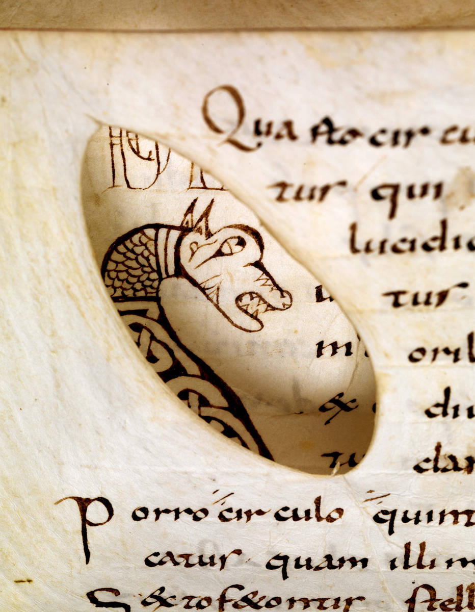
How about this for a truism: a book is a book, and something that is not a book is not a book. This post will knock your socks off if you are inclined to affirm this statement, because in medieval times a book could be so much more than that. As it turns out, tools were sometimes attached to manuscripts, such as a disk, dial or knob, or even a complete scientific instrument. Such ‘add-ons’ were usually mounted onto the page, extending the book’s primary function as an object that one reads, turning it into a piece of hardware.

Adding such tools was an invasive procedure that involved hacking into the wooden binding or cutting holes in pages. In spite of this, they were quite popular in the later Middle Ages, especially during the 15th century. This shows that they served a real purpose, adding value to the book’s contents: some clarified the text’s meaning, while others functioned as a calculator or, astonishingly, allowed the reader to tell time. These fascinating add-ons  – which are really not that different from the apps on our smartphones – turned a static handwritten book into an interactive object.

The Volvelle

British Library, Egerton MS 848 (15th century)
Fig. 1 – British Library, Egerton MS 848 (15th century) – Source

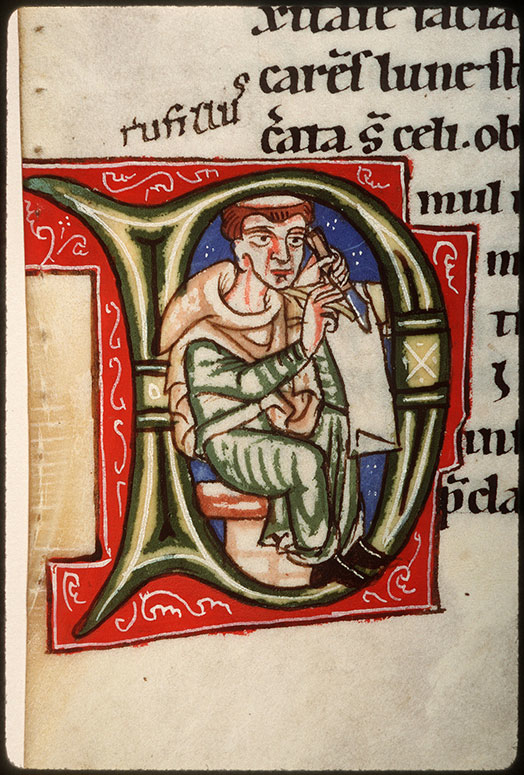
A volvelle is an instrument that consists of one or more rotating disks mounted on the page. Volvelles allowed the reader to make a variety of complex calculations, such as the position of the sun and the moon, or the precise date of Easter – which was, like the volvelle, a moving feast. The one seen in Fig. 1 contains no less than three revolving disks, which are pinned to the page in a central point: two show the cycle of sun and moon (note the charming depictions at their pointers), while a third presents the Zodiac.

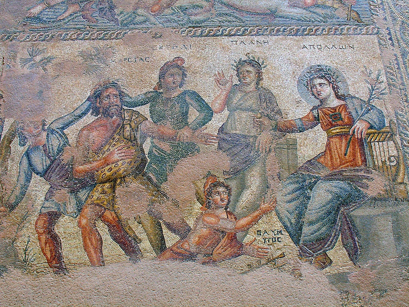
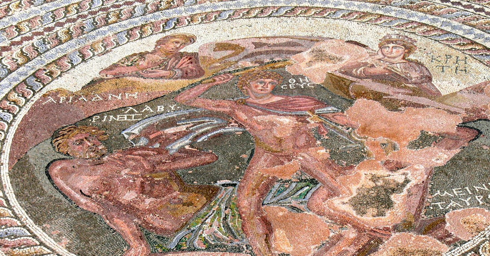
In spite of its simplicity, the device provides a surprising wealth of data, which could be read if one knew how to interpret the dials. However, volvelles were not always crude instruments providing dry data. Some are actually a pleasure to look at (Fig. 2). Others added an entertaining touch to the moving parts. The one in Fig. 3, for example, calculates the date of Easter, a popular application of the volvelle, but in this case the answer is pointed out by a spinning lady.

Heidelberg, Universitätsbibliothek, Cod. Pal .833 Ger. (early 16th century)
Fig. 2 – Heidelberg, Universitätsbibliothek, Cod. Pal .833 Ger. (early 16th century) – Source, more here
British Library, Harley MS 941 (15th century)
Fig.3 – British Library, Harley MS 941 (15th century) – Source

The oldest volvelles are connected to the scientific explorations of Raymond Lull, a thirteenth-century scholar, who introduced the clever device from Arabic scholarly culture. It explains why the earliest volvelles date from the 13th century (there are no older manuscripts that hold them, as far as I am aware), but also why the oldest ones are found in books holding works by Raymond Lull. These oldest specimens are less sophisticated: they have a limited number of disks and present less data on and around the dials (see a Lull specimen from the early 14th century here).

Maastricht, Regionaal Historisch Centrum Limburg (15th century)
Fig. 4 – Maastricht, Regionaal Historisch Centrum Limburg (15th century) – Photo EK, source

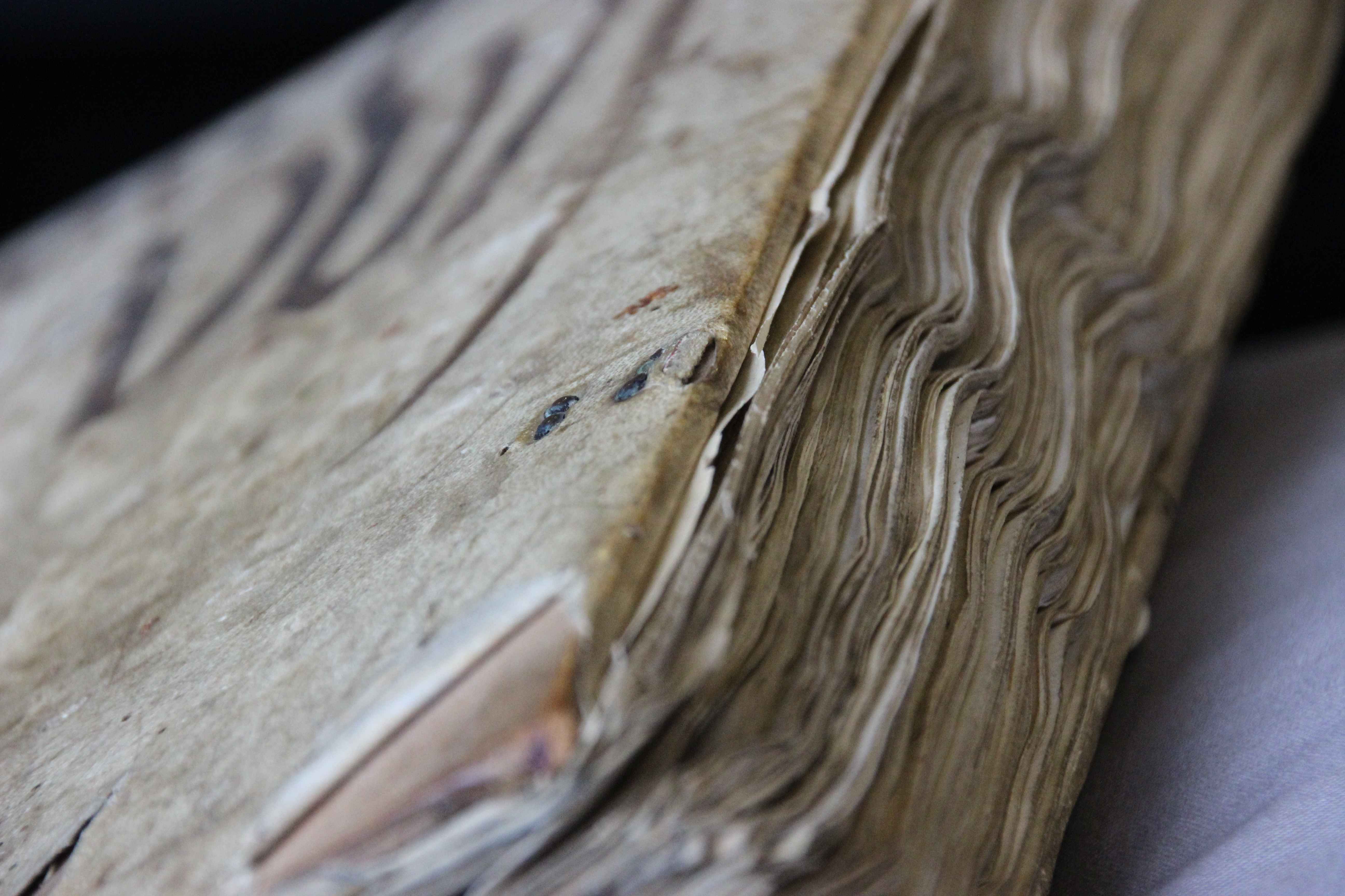
Such crude medieval computers could make a page very bulky. It is surprising, however, how much volume a volvelle could take up without compromising how well the book could be handled.The one I encountered in an archive some time ago even makes use of pieces of wood, giving it the appearance of a real instrument, but also adding a certain clunkiness (Fig. 4).

Cogwheel

Oxford, Bodleian Library, Digby MS 46 (14th century)
Fig. 5 – Oxford, Bodleian Library, Digby MS 46 (14th century) – Source

Volvelles are not the only instruments mounted onto the medieval book. Fig. 5 shows a page from a manuscript containing various texts about fortune telling. The page holds a text on Geomancy, which is a method of divination that allowed someone to calculate one’s ‘key number’. Random rows of numbers were drawn up  and marked down (as seen on the page), after which they were connected by lines. The number you ultimately ended up with was then looked up in a table with lunar and solar information, which was also included in the manuscript (image here).

Oxford, Bodleian Library, Digby MS 46 (15th century)
Fig. 6 – Oxford, Bodleian Library, Digby MS 46 (14th century) – Source

There was another method to calculate this number: by turning a wheel (information here). It is here that the Oxford manuscript becomes relevant for us. Remarkably, the user of the book carved a hollow space into the wooden front board of the binding and fitted a pair of cogwheels into it (Fig. 6). Turning these produced the number that could subsequently be looked up in the table.

The last word: sundial

Oxford, Bodleian Library, Brox._46.10 (17th century)
Fig. 7 – Oxford, Bodleian Library, Brox._46.10 (17th century) – Source

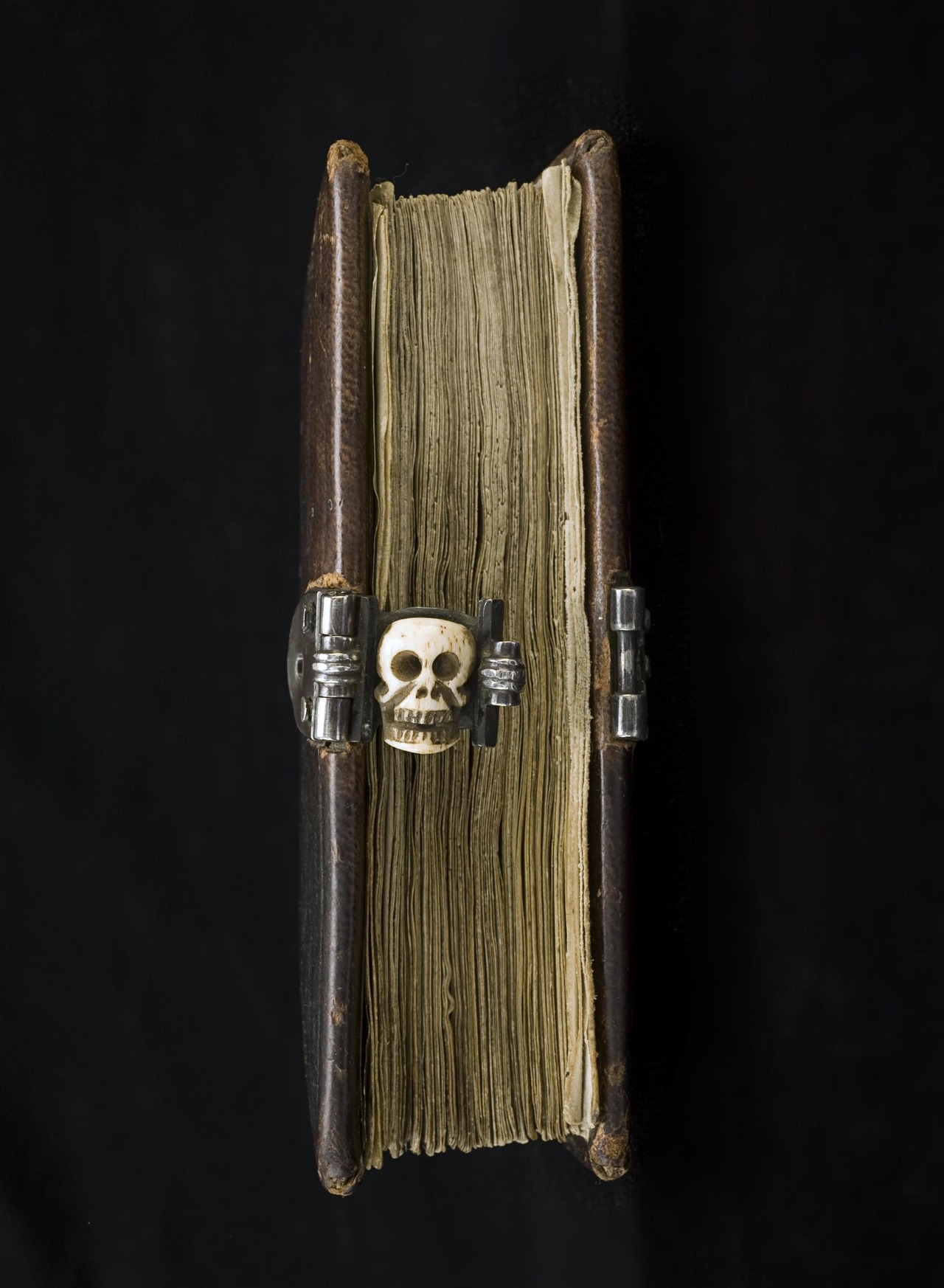
The last example of an instrument that was added to a book also has to do with the sun. Like an iPad, the book in Fig. 7 has a smart cover. The front of the sheepskin bookbinding is not filled with blind-stamped decoration, as was often the case, but rather a sundial was pasted on it. The reader could put the book in the sun and place a stylus on the cover, which would reveal what time it was. While it may not have been a very practical clock, the cover reveals that it was likely used to this end: the ‘footprints’ of the stylus are still visible (note the small circle and the black stain near the letters IHS, at the bottom). Moreover, the severity of the stain suggests the book was frequently used to tell time.

Just like our modern smartphones, the medieval book could be a versatile tool that combined contents with an untold number of applications – giving the scriptorium the feel of an App Store.

Mary Had a Little Book

For the book historian Christmas is a great season. It means that a lot of so-called “Annunciation” scenes make their rounds on social media, the biblical story in which the angel Gabriel announces to Mary that she will give birth to God’s son, Christ. There is something very attractive about these scenes for lovers of medieval books. Especially in the later Middle Ages, Mary is shown to be reading when Gabriel breaks the news. The idea was to show her in a holy place engaged in prayer, studies explain (here and here), and to make this connection to the beholder, she was shown with a book.

While this alone tells you a lot about the role of the book in medieval times, the Annunciation scenes have an even more interesting story to tell. They invited medieval decorators to depict a book and a reader engaged with it, life-like and to the best of their abilities. This implies that we get, by proxy, an unusual visual glimpse into the practice of medieval reading: how is the book held, what does the object look like, and what can we tell about its binding? While not every Annunciation scene contains a book, the seasonal images are like spycams intruding into the intimate world of medieval reading.

The tradition

Aix-en-Provence, Bibliothèque municipale, MS 15 (13th century)
Fig. 1 – Aix-en-Provence, Bibliothèque municipale, MS 15 (13th century) – Source

A quick search in public online databases results in hundreds of Annunciation scenes: the British Library Catalogue of Illuminated Manuscripts returns 160 manuscripts (search here), the French Inititale database no less than 274 (check the result here). This group of 400+ manuscripts provides much information about the tradition of a reading Mary. It is striking, for example, just how many Annunciation scenes depict her with a book. Especially after 1300 there are few without it.

Interestingly, the image databases allow us to gauge in what kind of manuscript the scenes are predominantly found. By far the majority are Book of Hours, but there is also a fair share of Psalters and Bibles, as well as some liturgical books such as Missals. The most popular vehicle of this scene, the Book of Hours, is connected to private devotion, as are many Psalters and some Bibles and Missals. After 1300 private devotion is one of the most common settings for using a book. In other words, the readers of these manuscripts were engaged in precisely the same thing as Mary: praying with a book in their hand.

Paris, Bibliothèque Mazarine, MS 469 (15th century)
Fig. 2 – Paris, Bibliothèque Mazarine, MS 469 (15th century) – Source

It is significant that both Mary and the medieval reader are engaging with the book as an object during one of the most important scenes from Christian devotional culture: the birth announcement of Christ. The object had obviously become an important religious tool. What is also striking is that Mary is shown interacting with the book in different ways. She is often caught reading, with the book placed either in her hand or on a table or podium in front of her (Figs. 2-3 and top pic, Angers, BM, 2048). In other cases she is simply holding the object in her hand, either open or closed (Fig. 1). In most cases Mary is depicted in a room or a building with arches (Figs. 1 & 3), providing the illusion of a church or a holy place in general. She is often raising her hands in surprise – although to our modern eyes she seems to gesture “No, thank you!” (Fig. 2).

London, British Library, Add. MS 49598 (Benedictional of Aethelwold, 936-984)
Fig. 3 – London, British Library, Add. MS 49598 (936-984) –  Source

While it is really easy to find bookish Annunciation scenes from the later medieval period, when the tradition of a reading Mary was well established, examples from before 1100 are rare. The earliest I have been able to find date from the late tenth century. The oldest is the magnificent St Aethelwold Benedictional (Fig. 3), which was made in 963-984 for Aethelwold the Bishop of Winchester (this is a digitised version). Another late-tenth-century example is the so-called Corvey Gospels in Wolfenbüttel, in which Mary is shown with a very thin book in her hand (image here).

Older examples of a reading Mary do exist, but not in books – at least not to such an extent that I was able to easily find them. A scene dating to the ninth century, for example, is found on an ivory situla, a bucket for the holy water used in the Mass (Fig. 4). It shows Mary looking up from her book to see the angel Gabriel making a gesture of blessing with his hand. The arch above her suggests she is in a room, a holy space, as seen in so many manuscript depictions.

New York, Metropolitan Museum, Accession  Nr. 17.190.45 (860-880)
Fig. 4 – Metropolitan Museum, Accession Nr. 17.190.45 (860-880) – Source

Mary had a little book
Apart from providing a peek into rooms where readers are interacting with books, these seasonal images also show us what manuscripts in medieval times looked like. Granted, most objects are shown rather generically, but in some cases the decorator shows us realistic details. It is striking, for example, that many images in which Mary is holding her book show her with a surprisingly small object in her hand (Fig. 1). These are likely meant to represent a portable book, a type of manuscript designed to be carried around.

New York, Metropolitan Museum, Cloisters Collection 56.70 (1427-1432)
Fig. 5 – Metropolitan Museum, Cloisters Collection 56.70 (1427-1432) – Source
The Hague, Royal Library, MS 135 J 55 (c. 1460)
Fig. 6 – The Hague, Royal Library, MS 135 J 55 (c. 1460) – Source

If we expand our scope and include medieval paintings, we are shown more details of the medieval book as a physical object. Notably, the famous Merode Altarpiece from the early fifteenth century shows Mary holding a book fitted in what is called a chemise binding (Fig. 5). This type of binding allowed the reader to fold the book into a piece of cloth or leather extended from the binding. Only a handful survive, so it is a great coincidence that one of them actually covers up an Annunciation scene – albeit that Mary is bookless in this one (Fig. 6).

Curiously, Fig. 5 shows a second book on the table, with a green bag underneath it. This bag is another medieval artifact that survives in very small numbers: the book pouch, which was also used for carrying a book around. The same velvet pouch is seen in the Annunciation scene by Gerard David (c. 1500) – see it here. Both bookbindings in the Merode Altarpiece indicate that the manuscripts Mary is using are portable. More importantly, the beholder would have recognised them as such. By the later Middle Ages, devotional practices had become a “movable feast” and so books used to that end needed to be shown as ambulant. In that sense too the manuscripts depicted here are very realistic.

Metropolitan Museum, Cloister Collections, 54.1.1 (1405-1408)
Fig. 7 – Metropolitan Museum, Cloisters Collections, 54.1.1 (1405-1408) – Source

It is interesting that the Merode Altarpiece shows Mary with two books. It appears that this increase started in the fifteenth century and continued into the age of print. The famous “Belles Heures” of Duc du Berry, produced by the Limbourg Brothers in the early fifteenth century, shows Mary in the vicinity of three books as well as a scroll (Fig. 7). In a sixteenth-century woodcut by the famous Albrecht Dürer there are also three books present (here). Both examples give the traditional church environment the feeling of a modest library. Considering that she would soon be with child, to the modern viewer it makes sense that Mary tries to get as much quality time with her books as possible.

Facebook Before Facebook: Tagging in Antiquity

This is a guest blog by Sarah E. Bond, ancient historian in the Classics Department at the University of Iowa. The post highlights the link between media in the past and in our own digital world, a theme that is frequently addressed here. Sarah maintains a blog devoted to classical culture. EK


In the digital world, tags are ubiquitous. When we digitally tag items, we are essentially applying metadata (information about your information) to an object. We practice this all the time: when we write a blog post and want to increase viewership, when we upload an image onto Flickr, or when we identify individuals or places in Facebook posts. At Facebook’s Desktop Help center, they attempt to explain the reasons for tagging: “When you tag someone, you create a link to their profile…Your status update may also show up on that friend’s Timeline.” In antiquity, tags functioned in a similar manner to today. Though on stone, ceramics, mosaics, and other media rather than the screen, they still broadcast literary and social networks while also providing context for the viewer.

Fig. 1 - Monticello
Fig. 1 – Monticello Archeological Field School, 2005 – Source: Facebook Sarah Bond

In the book Evolution and Ethics (1893), biologist T.H. Huxley wrote that, “One of the unpardonable sins, in the eyes of most people, is for a man to go about unlabeled. The world regards such a person as the police do an unmuzzled dog, not under proper control.” What Huxley meant was that there is a human proclivity toward labeling individuals, objects, places, and concepts. In short? Our minds prefer to organize knowledge.

I couldn’t help but recall this quote not long ago, while recording an inscription at the Art Institute of Chicago for the U.S. Epigraphy Project (Fig. 1). On display in the newly reopened Greek, Roman, and Byzantine galleries of the ArtIC is a funeral monument from the 4th century BCE shaped like a Greek lekythos, an oil jar (Fig. 2). The marble marker didn’t just imitate a ceramic vessel in regard to its shape; it also replicated the tags that often identify figures on Greek pottery. Interestingly, with steady precision, the stonecutter labeled the three figures: Leon Alaieus, Demagora, and Helike (Fig. 3).

Fig. 2 - Leon
Fig. 2 – Funerary Lekythos, 4th century BCE. Katherine K. Adler Memorial Fund, Mr. and Mrs. Walter Alexander Classical Endowment Fund, Costa A. Pandaleon Greek Art Memorial Fund, and David P. Earle III Fund, 2009.76 – Photo SB
Fig. 3 – Funerary Lekythos, 4th century BCE  (detail of Fig. 2)

One of my jobs—along with the other contributors to the USEP—is to visit museums and record the inscriptions on various objects. Many of these epigraphic notations receive little attention from viewers, not only because most visitors can no longer read Latin or Greek (O tempora!), but also because the modern focus tends to champion the figures rather than the texts. However, we must ask ourselves whether this is a modern bias. By all accounts, there was a strong interplay between texts and images in antiquity that cannot be ignored. Moreover, the inclination toward the organization of information through labeling went beyond simple identification. Much like today, labels functioned in a myriad of ways: to articulate space, to exhibit notions of proper paideia (education) and legitimacy, to trigger collective memory, and to provide deeper engagement with an object.

Fig. 4 - Jerusalem portion of the Madaba Map
Fig. 4 – Jerusalem portion of the Madaba Map, 6th century CE – Source

Moving away from classical antiquity and into the late antique period, the interplay between texts and images became more pronounced, particularly through mosaics. Perhaps the most well known example of this is the Madaba Map, a mid 6th century CE mosaic from Jordan depicting the Holy Land (Fig. 4, interactive version here). Discovered in 1884, the map has a mix of topographical tags and buildings in order to project a worldview of the Christian Near East. The buildings are not to scale, areas are highly distorted, and it would be of little use to a traveller, but then again, the objective of the map is not functionality. To my mind, the incredibly clustered tags are visually advertising the abundance of Christian sites in general. Here the tags and the architecture work together to claim dominion.

It is important to remember that just as there are trends in writing materials or in fonts, there were fashions in tagging based on period, place, and medium. During the later Roman empire, it appears to have become vogue in the East in particular to label mosaics. Mosaics from Cyprus, Syria, and modern day Turkey often have labels overtop figures identifying classical figures such as Dionysus or Theseus. Rather than simply assuming these tags were provided due to the ignorance of the viewer in regard to Greek mythology, we should perhaps think about it as a shift in the landscape of writing. In terms of literacy levels and who could read these captions, labels on mosaics likely required a minimal amount of “recognition vocabulary” (as Greg Woolf calls it) in order to read. They functioned to prompt conversation between dinner guests staring at the floor or perhaps congregants within a basilica, and lured viewers into interaction while perhaps serving to display the education of the patron.

Fig. 5 Apollo Paphos
Fig. 5 Apollo Paphos mosaic, 4th century CE (Apollo enthroned) – Source
Fig. 6 - Theseus Paphos
Fig. 6 – Theseus Paphos, 2nd century CE (Struggle of Theseus and Minotaur) – Source

What are we to make of this apparent increase in the use of labels on mosaics in the late Roman East? One could perhaps argue that it was the expression of the import of writing and literacy within early Christian communities, but as we can see at Paphos, this trend predated the rise of Christianity. More likely is that labels at various times came into vogue as a means of provoking literary or perhaps geographic discussions that could then be tied spatially (or in later memories) back to the owner of house. As they had previously done in funerary or symposium contexts, mosaic labels also worked in tandem with the space and the image to heighten the viewer’s overall engagement. Just like the Facebook tagging of today, these labels helped the ancient viewer to access and to organize information more thoroughly, often while enhancing the prestige of the tagger.

Fig. 7 - Atropos
Fig. 7 –  Wikipedia screen shot showing mosaic with tagged name – Source

Although the digital tags of today link to databases, both ancient and modern tags similarly function to create a network that individuals are visibly situated within. Wikipedia, for example, allows users to translate tags into their own language (Fig. 7). In antiquity, even if the patron or the deceased was not tagged in a vase or a mosaic, there was an implied association. Just think about your friend who constantly tags people to view New York Times articles or posts Kierkegaard quotes on their walls. What are they really telling you? The walls may have changed, but the coded purposes behind curated images and tagging remain ever the same. Viewers of your posts visit your digital home to view tagged images, even if they have no knowledge of the people within them. Tagging still functions to create networks and to elevate the poster in terms of social capital—the principal coinage in the Facebook marketplace.

Dressing Up: Medieval Books Wearing Leather

Every book needs a coat, a protective layer. Without it, after all, the pages would be exposed to the elements and the dirty hands of readers. And so from the very early days of the book the object was given a binding. Medieval bindings mostly consist of two components: boards, commonly made out of wood (but in the later Middle Ages also from compressed paper), and something to cover the boards with. While in medieval times the most common covering material was leather, there is great variation observed in the kind that was used, as well as how it was decorated. Readers and reading communities had their own preferences in this regard. As a result one can “read” as much from the outside of the book as from its pages: they both transmit important cultural-historical information. Here is a post with an exotic twist, which includes bindings made from seal and human skin.

Wearing leather

British Library, Add 89000 (7th century)
Fig. 1 – British Library, Add 89000 (7th century) – Source

Most medieval bindings were made out of animal skin: usually it was a calf or pig who involuntarily ended up protecting the manuscript. Leather proved an ideal material for binding books. The material is stiff, which means it does an excellent job protecting the precious cargo inside, while at the same time adding to the desired “firmness” of the book. The material also repels water quite well. This benefit may seem odd, but it’s not. While monks may not have been reading books in the bath tub, they did consult them in the cloister, which was often a damp environment – given that the hallways were in the open air.

An added bonus of leather was that it accommodated blind-tooled decoration, which was applied in mesmerising shapes and patterns. The oldest book to survive with its original binding still in place is the seventh-century St Cuthbert Gospel (which is a Gospel of John, in fact). It shows just how utterly charming early-medieval leather bindings were; and how beautifully they were decorated (Fig. 1). The manuscript in question was placed in the coffin of St Cuthbert shortly after his death in 687. It was discovered when the grave was opened in the early twelfth century. Because by then a cult had grown around St Cuthbert, the book – and its original binding – was well taken care of. In fact, the binding looks like it was made yesterday.

British Library, Papyrus 1442 (dating 716-717)
Fig. 2 – British Library, Papyrus Codex 1442, binding  (716-717) – Source

The use of leather bindings predates books made out of parchment – like the book of St Cuthbert. Before parchment became common, books were made from plants – papyrus. Such papyrus codices were extremely fragile and they needed the protective qualities of leather, which may ultimately be the origins of the tradition of using skin for bindings (Fig. 2). Given that papyrus became in disuse after the fifth century (with some exceptions), very few original bindings of papyrus books survive. The oldest specimens we have are those in the so-called Nag Hammadi Archive, which date back to the third and fourth centuries (look at some images here). As you can see from Fig. 2, these covers of papyrus books were also decorated handsomely.

Exotic leather

National Library of Sweden (c. 1200)
Fig. 3 – National Library of Sweden (c. 1200) – Source

What to do if you need a leather binding, but there are no cows or pigs to slaughter for this purpose? The answer is seen in Fig. 3, which shows a book that was copied and bound in Iceland. Naturally the binder turned to creatures that were available there. This is how a poor seal ended up covering this Old Icelandic book with sermons, which was made around 1200. If you look carefully you can still see a significant amount of hair on the outside. As with other cases where animal hair is found on book covers, the hairs have turned green over time – or perhaps from the liquids involved in processing animal skin into leather.

The story gets even more graphic. The skin used for bookbindings is not limited to animals. Under the name anthropdermic bibliopegy goes the practice of using human skin for binding books. Perhaps surprisingly, it turns out to be a post-medieval practice, particularly popular in the 17th and 18th centuries. The cover seen in Fig. 4 dates from the early 17th century and the skin was taken from the priest Father Henry Garnet. He was executed in 1606 for his role in the Gunpowder Plot, the attempt to ignite 36 barrels of gunpowder under the British Parliament. The book in question actually outlines the story of the plot and the evidence of Garnet’s guilt (more on this book here and here). The origins of the binding must have given the reader significant satisfaction.

Book bound in human skin (early 17th century)
Fig. 4 – Book bound in human skin (early 17th century) – Source

The last word: cloth
Not all medieval books were dressed up in leather. Less commonly used, perhaps because it is more fragile, is cloth. This material handled the frequent use of a book far less well than leather. The real-world use of a medieval book was such that the object would be pushed back and forth over a wooden desk, which did not exactly contribute to a long life. The cloth binding seen in Fig. 5 dates from the middle of the fifteenth century and it covers a monastic rule.

Stockholm, National Library of Sweden (c. 1450)
Fig. 5 – Stockholm, National Library of Sweden (c. 1450) – Source

The manuscript has a particularly pretty button to close the volume up (see image at top of blog), adding further to the charm of this beautiful bookbinding. In the age of the printed book such cloth bindings (and embroidered ones) became more common, perhaps because increasingly more books became owned privately. This meant, of course, that the objects were not consulted on the hard surface of a wooden desk, but on the soft lap of the reader. As with embroidered bindings, which also increased in popularity in post-medieval times, cloth may have been regarded as a more suitable material for private reading. In tune with the dressing code for medieval books, the objects knew when to slip into something more comfortable.

Note – This blog post tells you more about leather bindings; it includes some great images as well.

The Skinny on Bad Parchment

My favourite activity is to touch, smell, and listen to the crackling sound of cows and sheep that have been dead for a thousand years. That’s right, I am talking about medieval parchment, the standard material for books made between the fifth and thirteenth centuries. Animal skin replaced papyrus (standard up to the fifth century) and would ultimately be challenged by paper, which competed for dominance during the later medieval period. Parchment was resilient, however, and it was even used by early printers, including Gutenberg himself – showing the use of animal skin did not die with the medieval manuscript.

There is a lot you can tell from medieval skin. Like a physician today, the book historian can make a diagnosis by observing it carefully. The best quality, for example, feels just like velvet. It usually has an even, off-white colour, and it makes no sound when you turn the page. Bad skin, by contrast, crackles. It is of uneven thickness, and shows staining and a variety of colours. Unlike what you may have thought, looking at imperfect skin is far more interesting than studying its perfect counterpart. This is because a defect tells a powerful story, shedding light on the book’s production and providing clues about its use and storage post-production. Here’s the skinny on bad medieval parchment.

Production

Bamberg, Staatsbibliothek, Msc.Nat.1 (9th century)
Fig. 1 – Bamberg, Staatsbibliothek, Msc.Nat.1 (9th century) – Source

Scribes were usually not the ones to blame for a manuscript’s bad skin. A fair part of that honor goes to the parchment maker. Preparing parchment was a delicate business. In order to clear the skin of flesh and hair, it was attached to a wooden frame, tight like a drum. If the round knife of the parchment maker (the lunellum) cut too deep during this scraping process, elongated rips or holes would appear. As a result the reader is given an unexpected sneak peek onto the next page – where a dragon may just be introduced into the story (Fig. 1). We encounter such holes frequently in medieval books, which suggests that readers were not too bothered by them. Many scribes will have shared this sentiment, because they usually simply wrote around a hole. Some placed a little line around them, as if to prevent the reader from falling in.

The jabs of parchment makers – and the resulting holes – were sometimes stitched together. Fig. 2 shows a former rip (a long one) snaking across the page: the scribe has stitched it up like a patient in post-op. Repairing holes was sometimes done more eloquently, as seen in Fig. 3, as well as in the image at the top of this post (Engelberg, Stiftsbibliothek, MS 16). In both cases the holes are not made to disappear, as with the stitching in Fig. 2, but they are highlighted by coloured threads. In some monastic communities this must have been common practice, given that they repaired a lot of books with such “embroidery” (some examples in this Tumblr post). The practice turned defect into art: good-looking bad skin.

Leiden, Universiteitsbibliotheek, BPL 25 (9th century)
Fig. 2 Leiden, Universiteitsbibliotheek, BPL 25 (9th century) – Photo EK
Uppsala, University Library, MS C 317 (14th century)
Fig. 3 – Uppsala, University Library, MS C 371 (14th century) – Source

Another skin problem encountered by scribes during a book’s production was the animal’s hair follicle – the skin organ that produces hair. These follicles show as pronounced black dots on the white page. Often parchment makers or scribes were able to sand them away, producing the desired smooth and cream-colored surface. However, if the follicles had been too deep in a calf or sheep, no dermatologist could have removed the imperfection, let alone the blunt instruments of the scribe. The only thing to do was to write around the patch (Fig. 4). The follicles are helpful because they allow us to determine – from the distance between them – whether the animal was a calf, a sheep or a goat. This, in turn, may shed light on where the manuscript was produced: the use of goat, for example, often points to Italy.

Leiden, Universiteitsbibliotheek, BPL 191 A (12th century)
Fig. 4 – Leiden, Universiteitsbibliotheek, BPL 191 A (12th century) – Photo EK

Post-production
Bad skin may also tell us something about the individuals who owned, read and stored manuscripts. The presence of holes and rips may for example indicate the cost of the materials. Studies suggest that parchment was sold in four different grades, which implies that sheets with and without visible deficiencies may have been sold at different rates. If this was indeed the case, an abundance of elongates holes in a manuscript may just point at an attempt to economise on the cost of the writing support. In other words, bad skin may have come at a good price.

Parchment provides other information about readers as well, for example that he or she stored a book in an unsuitable location. Damp places, for one, would leave a mark on the manuscript’s skin, as is clearly seen in a manuscript I sometimes call the “Mouldy Psalter” – for mouldy it is (Fig. 5). On nearly every page the top corner shows a purple rash from the mould that once attacked the skin. It is currently safe and the mould is gone, but the purple stains show just how dangerously close the book came to destruction – some corners have actually been eaten away. Similarly, if a book was stored without the proper pressure produced by a closed binding, for example because the clasp was missing (as explained here), the parchment would buckle and produce endearing “waves” on the page (Fig. 6).

Leiden, Universiteitsbibliotheek, BPL 2896 (12th century)
Fig. 5 – Leiden, Universiteitsbibliotheek, BPL 2896 (12th century) – Photo EK
Leiden, Universiteitsbibliotheek, BPL 21 (9th century)
Fig. 6 – Leiden, Universiteitsbibliotheek, BPL 21 (9th century) – Photo EK

Apart from such attacks by mother nature, a manuscript could also be scarred for life by the hand of men – those evil users of books. Well known are cases where scribes and readers erased text with a knife, either because the reading was wrong or because they disagreed with it. However, in the wrong hands a knife could easily have a more severe impact on the book’s skin. All those shiny letters on the medieval page were too much for some beholders. The individual that gazed at the golden letters in the manuscript shown in Fig. 7 used his knife to remove some of them. Appropriately, it concerns a copy of Seneca’s Tragedies.

Leiden, Universiteitsbibliotheek, BPL 59 (14th century)
Fig. 7 – Leiden, Universiteitsbibliotheek, BPL 59 (14th century) – Photo EK

While the velvety softness of perfect skin can be quite appealing to handle, getting to know imperfect parchment is ultimately more interesting and rewarding. Damage is telling, as this post shows, and it may shed light on such things as the attitude of scribes (who did not necessarily mind holes on the page), the manner in which a book was stored by its owner (with a missing clasp or in a wet environment), and even the state of mind of those looking at it (“Must cut out golden letters!”). As a book historian it feels good to work with bad skin.

Note – A few days after publishing this post I found a great image in which a scribe used three holes in the page to produce the face of a laughing man – turning the flaws into art. More here. Also, since posting this I made a brief YouTube film with the Khan Academy, which shows what good and bad parchment looks like – and sounds (!). Here is the link.

Meet the Medieval Manuscript

By Erik Kwakkel and Giulio Menna (@SexyCodicology)

While this and other blogs introduce you to particular aspects of medieval book production, there are few places on the web that provide a full overview of how handwritten books – or “manuscripts” – were made, especially for those new to the topic. To fill this gap, we (Erik and Giulio) have produced a website called Quill: Books Before Print, through generous support of various institutions (below). The site is now live and available for free to anyone who wants to know more about the handwritten book in the medieval period.

Navigating through Quill shows you what made the manuscript “tick”, and how it ticks. Each of the fifty-odd segments contains an artistic photograph (made by Giulio, who is a professional photographer) and some 150 words of light reading (written by Erik, who is a professional book historian). This post introduces our work, explains how and why we made it, and what we like best about it.

Leiden, Universiteitsbibliotheek, BPL 14 D (13th century)
Fig. 1 – Leiden, Universiteitsbibliotheek, BPL 14 D (13th century) – Photo GM (Quill source)

Writing about manuscripts (by Erik Kwakkel)
I love writing about manuscripts. Not only do I do so frequently in academic publications (find a list here), but also for an audience beyond the university, for example through social media (this blog, Tumblr) and magazines (I have a regular column in Quest Historie). Writing for non-specialists is fun in that you can just tell a story. However, it also requires a certain approach and tone. The texts I wrote for Quill are first and foremost meant to be entertaining – learning something is a close second. The entries are therefore written in a “light” tone and use “speaking” comparisons. Thus I discuss fragments hidden in bindings as “stowaway“, bookmarks become the “fossilized taste” of medieval readers, and parchment sheets are seen as “dead cows“.

To get this tone right, images are crucial. To write an inspired post about a manuscript, an image needs to “grab” me. Moreover, the trick (both for Quill and my blog posts) is to find a single guiding principle that can carry the text. My blog post on Medieval Selfies is a good example of this, but the same is seen in the entries for Quill. Each of the clickable segments are built around a single observation or angle, which is usually reflected in the title: “Add-on” for the segment on marginal glosses, “One, two, three” for page numbers,  and “Mind the gap!” for blank spots on the page.

Leiden, Universiteitsbibliotheek, BPL 304 (15th century)
Fig. 2 – Leiden, Universiteitsbibliotheek, BPL 304 (15th century) – Photo GM (Quill source)

My favourite sections to write are those related to medieval handwriting – script. It is notoriously difficult to do so in clear terms, even in academic papers, when everybody knows precisely what you are talking about. I liked the challenge of providing clear information about such a complex matter as the development from one manner of handwriting to another. Playing with verbal imagery I discuss early-medieval script under the label “The unifier“, while script it develops into is seen as “The divider“. As far as my favourite images are concerned, I’m attached to all of them. Particularly pretty, however, are those that show things you normally don’t see, like a the palimpsest (scratches-away text, vaguely visible) or the backs of the quires, as in Fig. 3.

Leiden, Universiteitsbibliotheek, SCA 28
Fig. 3 – Leiden, Universiteitsbibliotheek, SCA 28 – Photo GM  (Quill source)

Photographing manuscripts (by Giulio Menna)
When I was asked to take pictures of medieval manuscripts for this project I was thrilled; when I was told I would essentially have unlimited access to the manuscripts from the exquisite collection in the Leiden University Library, I was as excited as the proverbial child in the candy store. What an opportunity! But then it dawned on me: How do you take photos of manuscripts? How do I make photos that will interest someone who has never seen a manuscript before?

Thanks to Erik’s MA course in manuscript studies I knew exactly what had to be photographed and where to find it in the books. I spent most of the time browsing through manuscript catalogs and manuscripts’ descriptions, searching for the right book to use for the shots. Once the desired detail was found, the actual photography began. First things first: respect the manuscript! I might find a detail that could make a perfect picture, but to get the photo right I would  have had to mishandle the manuscript in some way: those pictures did not get taken.

Leiden, Universiteitsbibliotheek, VLQ 4 (15th century)
Fig. 4 – Leiden, Universiteitsbibliotheek, VLQ 4 (15th century) – Photo GM (Quill source)

Once an ideal manuscript was found, I used the oldest trick in the book for directing viewer’s attention towards the detail described: depth of field. This would ensure that only the detail in question would be in focus in the picture, and the surroundings would be blurred (Fig. 5 is a good example). I have a very good lens (f/2.8) that allows me to do just that. The lighting was a bit of a problem. Since I was shooting in the Special Collections room I had no direct control over the light. Most of the time I had to wander around the table and find the right angle at which there would be no shadows or reflections.

Leiden, Universiteitsbibliotheek, VLQ 38 (12th century)
Fig. 5 – Leiden, Universiteitsbibliotheek, VLQ 38 (12th century) – Photo GM (Quill source)

There are two photos I am particularly fond of. One is the initial P (for Plinius) seen in Fig. 5. It is the opening page of the manuscript, and the letter is welcoming us to the book. I like to believe that this photo captures the moment when you open a manuscript you have never seen before, and you are captivated by unexpected decoration. The initial is very pleasing to the eye: I particularly enjoy the contrast between the old parchment on the right and the white modern paper on the left.

Leiden, Universiteitsbibliotheek, BPL 304 (15th century)
Fig. 6 – Leiden, Universiteitsbibliotheek, BPL 304 (15th century) – Photo GM (Quill source)

The second image I like very much is of a watermark (Fig. 6). Taking a picture of a watermark was technically challenging: the manuscript’s pages are made of paper, and although paper made in 1600s is more resilient than the contemporary counterpart, it is still delicate and has to be handled with extra care. I had no control over light sources, but I knew that in order to show the watermark I needed a strong light from the back of a page. The plan then became to wait for the sun to go down in the late afternoon, and let some of the light shine through the Special Collections’ windows onto the manuscript. All I had to do then was kneel before the book and take the picture of the naturally bending page.

The last word: enjoy
We hope you will enjoy browsing our website – which was two years in the making – and learn from it at the same time. The site is designed to work optimally with tablets: it’s a true pleasure to swipe the image carousel at the top. We think it provides a sound introduction to making books before print and we hope that the website will be picked up by the broadest possible audience, including instructors at schools and universities. Enjoy!

Leiden, Universiteitsbibliotheek, SCA 38 B
Fig. 7 – Leiden, Universiteitsbibliotheek, SCA 38 B – Photo GM (Quill source)


Credits – Quill: Books Before Print was produced through a grant of De Jonge Akademie (The Young Academy), an offshoot of the Royal Dutch Academy of Arts and Sciences, and with logistical support of Leiden University Centre for the Arts in Society (LUCAS). The website would not have been possible without the invaluable support of Leiden University Library and its Special Collections department.

Medieval Desktops

We are used to having multiple books open at the same time when looking things up at home or writing an essay for class. Whether PDFs, e-books or old-fashioned paper volumes, switching between books in a smooth movement is something we don’t often think about. This was very different in medieval times. In those days, books tended to resist when you tried to move them: they were heavy as a brick and easily twice that size. A related problem was one of space. The average medieval book has a wingspan of at least half a meter wide when open. Consequently, comfortably placing two books in front of you was a stretch, let alone multiple volumes. In an early-sixteenth-century depiction of Erasmus, the scholar cannot even place a single book on his desk as he is writing a letter (Fig. 1).

Albrecht Dürer's portrait of Erasmus, 1526 (detail)
Fig. 1 – Albrecht Dürer’s portrait of Erasmus, 1526 (detail) – source

Interestingly, the challenges of medieval book consultation stands in stark contrast with what we know about reading and studying in the period. Readers browsed through a great number of volumes at the same time, interested as they were in learning different points of view with respect to their topic of inquiry. Sparked by this contradiction, this post explores medieval desktops. How many books are being consulted at the same time in medieval depictions of reading? How are the objects laid out across the available space? In short, how are we to understand the logistics behind the devouring of knowledge in the last four centuries of the Middle Ages? As will become clear, the answers to these questions vary greatly depending on why an individual handled multiple books at the same time.

Scribes
The first group of individuals who had to manage multiple books were scribes. By definition, a scribe had to have at least two books on his desk: the one he was making (a growing pile of quires, which remained unbound until the very end) and the one he was copying from (called the “exemplar”). While keeping track of the loose quires may have been challenging, of the groups discussed here scribes had it the easiest. After all, the individual was only technically reading one book – the one he was copying from. This explains why their deskspace was of limited size, at least judging from surviving depictions.

Brussels, KB, 9278 (15th century)
Fig. 2 – Brussels, KB, 9278 (15th century) – source

In most cases their working space was erect rather than flat (Fig. 1). This famous image of Jean Miélot at work shows how the desktop of the scribe had a 45-degree angle, resulting in an almost erect surface. Clearly visible is also a vertical orientation in the line-up of the books: one was placed above the other. In fact, the desktop in this image is split in half, with the lower half containing the book under production, as well as the scribe’s tools (ink pots and pens), while the upper half holds the exemplar. Miélot obviously needed to go shopping for a larger desk, because we see books laying around on the ground and on a bench.

London, British Library, Royal 18 E.iii (15th century)
Fig. 3 – London, British Library, Royal 18 E.iii (15th century) – source

Interestingly, there are also desks with a horizontal orientation. Fig. 3 shows the translator Simon de Hesdin at work. Although the books are out of sight, the desk clearly provides room for two books. However, they placed next to one another. This may be specially done for the task of a translator, who needed to carefully read the source text and subsequently scribbling down the translation in loose quires or on loose sheets. This way, both books would be right before him: there was no need to look up at a high book platform. (See in this respect also the note added post-publication, below.)

Readers
While it is easy to find images of scribes with a desk full of books,  it is less common to encounter readers in similar situations. That is to say: there are very few medieval scenes in which someone is reading but not writing – where books are present but pens are not. In part, this has to do with medieval study practices. Readers would usually have a pen nearby even when they were just reading. After all, remarks and critiques needed to be added to the margin at the spur of the moment. “Penless” images, while rare, often show a crowded desktop. The scene presented in Fig. 4 shows Christine de Pisan browsing multiple books at a big desk (more about Christine in her study in this article).

Brussels, Bibliothèque, Royale, MS 9009-11
Fig. 4 – Brussels, Bibliothèque, Royale, MS 9009-11

The absence of the pen may result from an urge to depict Christine as an avid reader. This is emphasized, I think, by the various volumes that lay open – note how some open books are facing down, the way we still do today! From the late medieval period a special tool was available for readers who did not like the clutter shown on Christine’s desk: the book carousel (Figs. 5 and 6).

Leiden, Universiteitsbibliotheek, BPL Collection
Fig. 5 – Leiden, Universiteitsbibliotheek, BPL Collection – Photo EK
Oxford, Bodleian Library, Douce 195 (15th century).
Fig. 6 – Oxford, Bodleian Library, Douce 195 (15th century).

These carousels allowed readers to consult multiple manuscripts in a very convenient fashion, by spinning (slowly!) the top part, which moved. The oldest one I could find dates from the fourteenth century (here), but it is possible they were in use even earlier. It is striking that these two scenes show readers – scholars – without pens, even though the second seems to hold an invisible one.

Book hipster
Cleverly, the medieval “spinning wheels” in Figs. 5-6 circumvented the constrictions of the limited space a regular desktop provided. However, what if you need even more real estate than the turning desktop could offer? The answer to this question is perhaps one of the most intriguing and cool pieces of book furniture that survive from the past: the book wheel (Fig. 7).

From "The Diverse and Artifactitious Machines of Captain Agostino Ramelli", 1588.
Fig. 7 – From “The Diverse and Artifactitious Machines of Captain Agostino Ramelli”, 1588.

The image from 1588 shows the bookwheel invented by the Renaissance engineer Agostino Ramelli, whose concept was based on medieval designs. The upside to the carousel is obvious: there was space for a lot of books. This practice is not unlike deciding to hook up a second monitor to your computer, except that the individual is actually watching twelve monitors at the same time – like a trader on Wall Street. I have sat behind one from the 17th century myself and it is truly a majestic feeling to spin the wheel. The click-click sound of the gears hidden inside the device is simply mesmerising.

The last word: laptop
While desktops (in their great variety) are representative of how most scribes and readers handled their books, there is also a surface space that is more exceptional – and that can only be addressed as a “laptop”. The use of such portable desks, which sat on the scribe’s lap, is well documented for the early-modern period (here is one from sixteenth-century Spain; here are a few others). They were used, for example, by noblemen or secretaries drafting documents and letters whilst on the road. It concerns a box with a slightly angled surface, inside which the writing materials were stored, including sheets, ink and pens. Interestingly, this practice – and tool – go back to at least the twelfth century, as Fig. 8 shows. The device contains a hole for the ink pot and inside may well have been blank sheets, in parallel to the portable kits from the Renaissance.

Chartres Cathedral, West Portal (c. 1150)
Fig. 8 – Chartres Cathedral, West Portal (c. 1150) – Source

Apart from the fact that the actual desk space was more limited than what we are used to, the medieval desktop was not so different from ours, including how messy it was. They contained books, both open and closed, as well as writing tools. However, more so than in our present time, desktops were a necessary tool, whether they were packed (as in Christine’s case) or with only one or two books in place (as with most scribes). The medieval quill, after all, needed a stable and even surface. While desktops may seem trivial objects to us, they were crucially important to both medieval scribes and readers.

Note added 22 Dec, 2014: this image of the translator Jean Wauquelin at work (Valenciennes, BM, 772) also shows the translator sitting at two desks with a horizontal rather than a vertical orientation. It raises two questions: was this unusual set-up favoured by translators; and if so, could the reason be that it allowed them to point at the line they were translating, as seen in the Wauquelin image – after all, this would impossible to do with a vertical orientation.

Hugging a Medieval Book

Book historians tend to compare features of the medieval book to body parts. Thus the manuscript’s “head” (top edge) is connected to its “spine” (the back) via the “shoulder” (the area where board meets spine). There are even terms that compare a medieval book’s physical features to human activities or conditions. A large letter with a lively figure inside is called a “gymnastic initial”, while line ruling that is nearly invisible is “blind”. I could go on and explain how other, seemingly unrelated, objects have been used in bookish terminology (the “diaper pattern” is my favourite), but you get my drift. This post takes this projection phenomenon a step further. It shows how one particular feature of the medieval binding eerily resembles a body part, not just in appearance but even in function: the clasp (Fig. 1).

Arm and hand

Leiden, Universiteitsbibliotheek, BPL MS 2579 (15th century)
Fig. 1 – Leiden, Universiteitsbibliotheek, BPL MS 2579 (15th century) – Photo EK

Medieval makers of manuscripts paid just as much attention to closing the book as they did to opening it. In order to preserve the organic pages, which were often made of parchment, it was necessary to keep the volume tightly closed when it was not used. Not only did this keep moisture out, but parchment also has a natural tendency to buckle, especially when handled at room temperature. In fact, parchment pages curl up with so much force that the wooden boards would be pushed open were it not for a smart device designed to keep the lid on: the clasp.

The clasp is like an arm that extends from the one wooden board to the other. Indeed, I find it hard not think of clasps as hugging arms that embrace the leaves, safeguarding them from the harsh reality of medieval book use. Appropriately, the primary purpose of the clasp was to protect the pages. They generated the pressure needed to keep the pages flat, while producing a firm object that could withstand every-day use in a medieval library – like falling off a desk or a shelf. At the end of the arm a tiny “hand” locks into an extension – we could call it a “handle bar” – as clearly visible in Fig. 1. How great that some book binders played with the image of a hand grabbing onto the opposite clasp, as this eighteenth century example shows (Fig. 2).

Book clasp, 18th century (?) -
Fig. 2 – Book clasp in shape of hand, 18th century (?) – Source Daniel Crouch Rare Books

Generally, two clasps were able to contain the force issued by the buckling parchment of a book. However, it was important to get it right as a bookbinder. When the distance between the one end of the arm (the “arm pit”) and the handle bar was too large, there was insufficient pressure. By contrast, if the distance was too little, the book did not close. Medieval manuscripts that have lost their clasps (by far the majority) show what happens to the bookblock when the pressure was too low: unhappy pages with a wavy pattern appeared (Fig. 3).

Leiden, Universiteitsbibliotheek, BPL MS 96 (14th century)
Fig. 3 – Leiden, Universiteitsbibliotheek, BPL MS 96 (14th century) – Photo EK


Exotic arms
Some readers preferred exotic clasps. A particularly remarkable specimen is seen in Fig. 4. The book it helps to close is tiny, no larger than an iPhone. Made c. 1500, it was designed for the road: it concerns a portable Book of Hours (or prayer book) that was carried around by a pilgrim on his religious pilgrimage. The clasp holding it closed is a skull carved out of bone. The theme is fitting for a pilgrim seeking redemption, finding his way along the dusty roads of medieval Europe. Every time he sat down to open his book he was confronted with his future, which looked rather grim: Memento mori, remember that you will die one day. Better smarten up and keep on going!

Stockholm, National Library, MS A 233 (c. 1500)
Fig. 4 – Stockholm, National Library, MS A 233 (c. 1500) – Source

The exoticness of clasps can also be connected to their number in stead of their shape. Clasps are a must for a peculiar binding known as dos-à-dos (or “back-to-back”). While such bindings usually hold two books bound together at their backs (hence the name), the National Library of Sweden owns a unique variant that contains no less than six books (Fig. 5). They are all devotional texts printed in Germany during the 1550s and 1570s (including Martin Luther, Der kleine Catechismus) and each one is closed with its own tiny clasp. A book with six arms and hands: it is quite the display of craftsmanship.

Stockholm, National Library
Fig. 5 – Stockholm, National Library – Source of photos, GIF by EK (source)

The last word: feet
If clasps can be compared to arms, another feature of the bookbinding must be called “feet”. During the later Middle Ages it became customary to store manuscripts on lecterns. In lectern libraries, which were found in monastic houses and churches, readers consulted books on uncomfortable benches. The libraries often had a semi-public function, with outsiders walking in and out to consult books. To facilitate such use – and to make sure no books were unlawfully removed –  the objects were usually chained to the lecterns (Fig. 7).

The chained library in Zutphen, the Netherlands (De Librije)
Fig. 7 – The chained library in Zutphen, the Netherlands (De Librije) – Photo EK

Books in lectern libraries were not read on a flat surface (such as a desk), but erect – the objects were resting, after all, on nearly vertical stands. This kind of use came with a challenge: the shuffling that inevitably happened when the book was read, wore out the lower edge of the binding. More importantly, since the medieval book block was flush with the binding, the constant contact with the lectern as the reader flipped through the book could easily damage the page. A simple tool was invented to prevent such damage: “feet” – tiny pieces of brass that hoisted the book up and made it hover, as it were (Fig. 8). The feet that are attached to bindings are often shiny. It shows just how much the book was used – and how much damage was prevented by the attached feet (Fig. 9).

Leiden, Universiteitsbibliotheek, BUR MS Q 1 (11th century)
Fig. 8 – Leiden, Universiteitsbibliotheek, BUR MS Q 1 (11th century) – Photo EK
Leiden_UB_BPL_67
Fig. 9 – Leiden, Universiteitsbibliotheek, BPL MS 67 (9th century) – Photo EK

There is something very attractive about these body parts. They show just how much bookbinders and readers were in tune with the needs of the book as an object. They packaged them so that they could withstand rough consultation, while their designs also left room for a certain amount of fun – as the hand-clasp and perhaps even the skull-clasp shows. The hug given by these strong arms protected the book’s most precious cargo, the text, both from accidents in the medieval library and, as much as possible, from the inevitable decay of time.

Medieval Selfies

Self-portraits of medieval book artisans are as exciting as they are rare. In the age before the modern camera there were limited means to show others what you looked like. In the very late medieval period, when the Renaissance spirit was already felt in the air, some painters made self-portraits or included themselves in paintings commissioned by others. Stunningly, the medieval painter Jan van Eyck showed himself in the portrait of Giovanni Arnolfini and his fiance: he is staring at you from the mirror that is hanging behind the couple. For those who still didn’t get it, he painted above it Johannes de eyck fuit hic, Jan van Eyck was here” (Fig. 1, more here). He added the date 1434 to the picture, making it a particularly early selfie.

Jan van Eyck, Giovanni Arnolfini and his fiance, 1434 (right) and mirror detail (left)
Fig. 1 – Jan van Eyck, Giovanni Arnolfini and fiance (right)  and mirror detail (left)

As far as producers of books is concerned, there were only two kinds of artisans who handled a tool with which a selfie could potentially be produced, if the individual was so inclined. Scribes could doodle themselves using ink and pen; and decorators could do the same with brush and paint. In practice, however, we almost exclusively encounter self-portraits made by decorators, perhaps because scribes lacked the skills and equipment to produce something meaningful. Even so, decorators rarely put themselves in the picture. The exceptions to this rule are real treats, as this post aims to show: they provide sneak peeks into the workshops of medieval artists.

Monastic decorators
When a decorator is seen on the page, we must assume that a conscious choice was made to become part of the book’s decoration program. This is particularly evident when the decorator added his or her name and designation (“decorator”). This is precisely what the nun Guda did: she depicted herself inside an initial letter D with a banderole (title banner) that reads “Guda, sinner, copied and decorated this book” (Fig. 2). It seems out of sync with the modest life style of nuns to identify oneself with name and title. Pride was a vice so there must have been another reason behind Guda’s self-identification. Perhaps she did so with a sense of history: she is raising her right hand as if to greet future readers.

Frankfurt, Staatsbibliothek Ms. barth. 42
Fig. 2 – Frankfurt, Staatsbibliothek, MS Barth. 42 (late 12th century)

In spite of this very expressive scene, Guda’s selfie does not give away too much about the medieval artist’s workshop. In fact, if it wasn’t for the words on the banner, we would not have guessed that she was a decorator. Where are the paraphernalia of the trade? Fortunately, there is another example that provides more detail about the working environment of monastic artists (Fig. 3). This image was produced by Rufillus, monk in Weissenau Abbey in Ravensburg, Germany, near the end of the 12th century. In the selfie we catch Rufillus putting the finishing touches on a giant letter R. He wrote his name above his tool: there is no avoiding that we get to know him. Remarkably, in another manuscript we encounter Rufillus again. This time he depicts himself as the scribe of the book – he scribbled, oh vanity, his name above himself (Fig. 4).

Cologny, Fondation Martin Bodmer, MS 127, fol. 244r (late 12th century)
Fig. 3 – Cologny, Fondation Martin Bodmer, MS 127, fol. 244r (late 12th century) – source
Amiens, BM, Lescalopier 30, fol. 29v (late 12th century)
Fig. 4 – Amiens, BM, Lescalopier 30, fol. 29v (late 12th century) – source

Rufillus the decorator places himself in a rich setting: in Fig. 3 we see him surrounded by pots of pigment and various instruments. He provides us, in other words, with a much wanted glimpse into his monastic workshop. Moreover, like the nun Guda, Rufillus was apparently active as a decorator and a scribe, which is another important detail that can be derived from the selfie. What is most striking in light of this post, however, is the similarity of the two portraits: in both, Rufillus shows himself as having bright red hair, big eyes and pronounced wrinkles on his cheeks. The similarity strongly suggests that this is what our decorator really looked like, which is a fascinating thought.

Commercial decorators
Such detail-rich selfies are also encountered in books that were made commercially. A particularly telling self-portrait was made in 1512 by the German book decorator Nicolaus Bertschy (Fig. 5, more information here). In this portrait, which is included in the Lorcher Graduale, he shows himself in the company of his wife, who appears to be drinking from a large mug with her arm around his neck. It is not the scenario you would expect, this rather down to earth setting where drinks and female distraction replace both decorum and concentration.

Stuttgart, Württembergische Landesbibliothek, Cod. mus. I 2 65, fol. 236v (detail)
Fig. 5 – Stuttgart, Württembergische Landesbibliothek, Cod. mus. I 2 65, fol. 236v (detail)

Nicolaus introduces himself in a note beneath the image: in spite of the scene, he clearly saw no need to hide his identity. Next to him we see the scribe Leonhard Wagner (note the “LW” on the white shield), who is said to have known a hundred different kinds of handwriting (more here). The illustration shows the two artisans producing the very choirbook in which it appears, making this a selfie with a fascinating double layer.

Remarkably, a manuscript from fourteenth-century Paris also presents a selfie of a decorator and his wife (Fig. 6). It shows Richard and Jeanne de Montbaston, who worked in the second quarter of the century. In this great image Richard appears to copy the text while Jeanne is busy decorating the pages. Given this division of labour it was likely Jeanne who produced this selfie. There are many more details that prove insightful for artists’ workshops. Parchment sheets that were finished are hanging to dry on clothes lines, for example.

Paris, BnF, fr. 25526, fol. 77v (1325-1350)
Fig. 6 – Paris, BnF, fr. 25526, fol. 77v (1325-1350) – source and full manuscript source

Interestingly, in a commercial setting such selfies can be regarded a kind of advertisement, especially when a name was added. It identified, after all, who had produced the decoration – as if to say, “If you like this, you know who to contact!” It is somewhat perplexing, however, that patrons allowed artists to add put such spam in their newly purchased books – especially when showing a decorator and his wife drinking on the job.

The last word
And what about selfies of scribes? Here things are less clear. Occasionally we encounter a plain pen drawing of an individual copying. However, they are (to my knowledge) never accompanied by name and designation (“scriptor”), meaning we cannot know for sure if the scribe meant to show himself or simply drew a generic “scribe”. The drawing in Fig. 7 is an example of such unclarity: it may be a selfie, or it may not be.

Oxford, Bodleian Library, Douce 104, fol. 52v (dated 1427)
Fig. 7 – Oxford, Bodleian Library, Douce 104, fol. 52v (dated 1427) – source

Studies have shown that the writing figure is a clerk, a copyist affiliated to an institution where documents were made. As it turns out, this particular manuscript containing the text Piers Plowman was produced by a clerk. This is evident, among other things, from the way in which the dated colophon in the back of the manuscript was worded. Moreover, the marginal notation above the clerk’s head, which appears to be in the same hand as the main text, writes over the top of the drawing. This suggests it was  the scribe himself who drew it. A writing clerk drawing a writing clerk: is it enough to call this image a selfie? It’s a great conundrum that shows the limits of taking the modern notion of “selfie” to an age when cameras didn’t exist.

Medieval Super Models

This post is devoted to a particularly attractive and rare kind of medieval manuscript: the model book. A feast to the eye, the object is filled with drawings and paintings that were meant to show scribes and illuminators how to decorate letters, paint initials, or add large segments of decoration to the page. Within this tradition, two types of model books can be distinguished. Some functioned as instruction manuals. In such books, the drawings might be accompanied by a narrative or explanation that instructs the artisan how to proceed, usually in a step-by-step process. Other model books appear to have merely functioned  as  a source of inspiration: they present a wide array of shapes and drawings from which the artisan could take his pick.

The level of sophistication among surviving model books varies considerably. On the lower end of the spectrum there are pattern books that merely show how to make enlarged letters with some minor flourishing. On the higher end, by contrast, there are copies with high-quality stand-alone designs and sophisticated historiated initials inhabited by figures and scenes. Evidently the requirements of the artisans varied; and by proxy, so did the taste of medieval readers. It is this variation that makes model books so fascinating, both as physical objects and as cultural artifacts. This blog illuminates the breadth of the genre – and shows off the attractiveness of these medieval super models.

Plainly decorated letters

Yale, Beinecke Library, MS 439, fols. 30v-31r (1510-1517)
Fig. 1 – Yale, Beinecke Library, MS 439, fols. 30v-31r (1510-1517)

To start at the lower end of the spectrum, some model books merely showed scribes how to execute a certain script or how to draw plain enlarged capitals – the most basic kind of decoration. The book opening seen in Fig. 1 is from Gregorius Bock’s Scribal Pattern Book, which provides instruction on both fronts (more about the manuscript here). Produced in 1510-1517, the first part of the small parchment book contains a series of alphabets in different scripts, some of which are clearly influenced by print typefaces. The second part contains decorative initials arranged in alphabetical order. In the introduction to his manual, Gregorius adds a dedication to his cousin Heinrich Lercher Wyss of Stuttgart, who was scribe to the Duke of Württemberg. The arrangement of the material shows how Heinrich likely used the book: he would thumb through its pages until he had reached either an alphabet or capital letter to his liking (more about the context here).

Cambridge, Fitzwilliam Museum, MS 83-1972 (c. 1175)
Fig. 2 – Cambridge, Fitzwilliam Museum, MS 83-1972 (c. 1150-1175)

While Brock’s letters are a pleasure to look at, especially for the book historian, it was not exactly rocket science. More complex – but still relatively plain – are the models provided by a much older pattern book in the Fitzwilliam Museum in Cambridge (Fig. 2; more here). This appears to be the oldest surviving pattern book for initials: it dates from c. 1150 and was produced and used in a Tuscan workshop. The choice is much more limited than in the previous example: the Cambridge copy does not provide multiple alphabets, nor does it present a wide range of initials (in fact, only about twenty are present). Interestingly, some manuscripts survive in which we encounter decorated letters that could well be modelled from this or a similar model book (like British Library, Harley MS 7183).

Elaborately decorated letters

London, British Library, Add. MS 8887 (15th century)
Fig. 3 – Oxford, Bodleian Library, Ashmole 1504 (1520-30) – Source

On the more upscale end of things is the model book known as the Macclesfield Alphabet Book. It was made and used in fifteenth-century England, apparently for the transmission of ideas to decorators or their assistants (full digital copy here, information podcast here). The artisans were offered quite a lot of choice, given that we encounter no less than fourteen different alphabets on its pages. What makes this book so special, however, is their quality and the manner in which the letters are designed: their shapes are produced by human figures. As in other modelbooks that include letters made out of people (Fig. 3), the figures are shown in most uncomfortable positions, as if doing yoga exercises.

A similar subject matter is encountered in the alphabet book of the Italian artist Giovannino de Grassi (Fig. 4 and image at the very top). This book was created at the Visconti court and features both initial letters and stand-alone drawings. The Visconti’s were known as important patrons of the arts and so it makes sense that we see their generosity extend into the world of book production. Giovannino was known for depicting exotic animals in their natural habitat and this book features such images as well. His pages provided models for other artists who wished to replicate his realistic depictions.

Bergamo, Biblioteca Civica, MS Cassaf. 1.21 (14th century)
Fig. 4 – Bergamo, Biblioteca Civica, MS Cassaf. 1.21 (14th century) – source

Marginal decoration
Even more sophisticated are model books that show how to create elaborate decoration that runs in the margin along the length of the page. These border decorations, with their curly leaves and unexpected turns, could be tricky to produce. The so-called Göttingen Model Book, made around 1450 (Fig. 5, left), provides a solution to this problem. Its pages not only show, step by step, how to build a 3D leaf pattern, they also present detailed instructions like the following:

The foliage one shall first draw with a lead or a point. Then one shall outline the foliage with a pen and with very thin ink or with thin black color. Then one shall polish the foliage with a tooth, so that the color can be applied smoothly, but not too firmly. Then one shall paint it with the colors, one side right and the other side left or reversed, with a brush, namely light red and green. […] (Source of transcription)

Göttingen, Universitätsbibliothek, Uffenb. MS 51 (left) and Gutenberg Bible (right)
Fig. 5 – Göttingen, Universitätsbibliothek, Uffenb. MS 51 (left) and the same decoration executed in an actual book, a  Gutenberg Bible (right)

The drawings and narrative clearly complement one another. From time to time the instructions mention something like “as it is shown here” or “as the image shows”. A model book can hardly be clearer than this: while the alphabet books shown above were more or less meant to simply inspire the artist, the Göttingen book really takes the artist by the hand and guides him through each step of the production process. The instructions apparently worked well, as is shown by a surviving Gutenburg Bible that contains these very leafy borders (see Fig. 5, right, and more here).

The final point
Models are crucial in any learning process. Observing how something is done helps you acquire a skill you lack as much as it encourages you to develop further those you already have. Moreover, there is an additional use to these pattern books that has not yet been mentioned: the beautiful letters and shapes could also be browsed by readers looking for a good image for their newly acquired book. Patrons visiting artisans’ shops could well have been given these objects to find out what the book-maker was capable of providing. Given its many uses, it is hardly surprising that the tradition shown in this blog is also encountered in other cultures, including Byzantine and Arabic book production.

One particularly unusual Arabic specimen deserves to make the final point of this post. The fragment shown in Fig. 6 presented Arabic decorators with models of scenes from the New Testament (more here). It figures that the artisans, used to decorating the Quran, needed a little inspiration when it came to the Bible. This specimen is also interesting because it presents a type of instruction not seen in Western copies, as far as I know: some of the figures have been outlined by tiny holes, meaning that the sheet could be used as “tracing paper” (click the image to see this closer). While this ultimate instruction method took all potential flaws and creativity out of the modelling process, it allowed decorators with lesser talents to produce something beautiful.

Yale, Beinecke Library, MS 553 (1400-1700)
Fig. 6 – Yale, Beinecke Library, MS 553 (1400-1700)


Post-scriptum 16 September, 2014 –  I wish to thank Giovanni Scorcioni (@FacsimileFinder) for providing the Hi-Res image in Fig. 4.

Post-scriptum 19 September, 2014 – Mari-Liisa Varila (@mlvarila) alerted me to a 17th-century equivalent to the Arabic “tracing paper” specimen (here you’ll find more information). More about this technique, which is called pouncing, here.