Tag Archives: bookbinding

“To conserve or not to conserve, that is the question”

From time to time this blog shows damaged manuscripts. One may be inclined to think that books are better off in pristine condition. However, Karin Scheper, conservator at the University Library Leiden, explains why it is sometimes better to leave a book be. Here is an intriguing guest post about useful disrepair and the upsides of damage. Enjoy! Erik Kwakkel

Custodians and owners of old books will sometimes have to make tough decisions. They want their books to be used – why else would they have them? – yet they also want them to be preserved for the future as well. In the case of manuscripts and early printed books, the materials themselves are old and often fragile, and part of the textblock or binding may have come apart. While in most cases it would technically be possible to repair the damage, this is not always the best option for the book or the user. Instead, a conservation specialist may advise to simply box a book and not treat it at all, or propose minor treatment and consolidation only of the fragile state. Is that a result of sparse conservation budgets, or can there be other reasons?

A conservator evaluates the severity of the damage. Not all deterioration processes are progressive, and some damage may have occurred centuries ago without causing problems. Other conditions, such as deformations or splits in flexing materials may cause severe threats and further loss of material. The book’s current use, its historical value, and its relation to a collection are of course factors of importance when making conservation decisions.

The book as a physical object contains much more information than its contents alone; this blog demonstrates that in every posting. In spite of the fact that an increasing number of manuscripts and old prints are available online, the material object remains valuable – and may even become more valuable. One of the unique values of the physical book is that it contains historical evidence that is not accessible in a digital format. With a damaged object this information may be more easily accessible than in a well-preserved or restored book. The damage itself may reveal historical circumstances or shed light on former use, and in addition, damage may provide access to the interior of the structure. This can teach us what materials were used and what decisions the original bookbinder made, and it may connect the book to a certain region or time frame. Damage can be beneficial for book historians, and repairing damage may deprive them of valuable information. One way to safeguard such evidence is extensive documentation of the object prior to conservation treatment. However, if the condition of the book allows it, minimal intervention is an attractive option that respects the book’s integrity, and sometimes doing nothing may even be the best decision for the moment.

Three cases from the Leiden university collections illustrate such preservation issues and address the question whether the benefit of a conservation treatment outweighs the benefit of not treating a book.

A slotted spine

Leiden_UB_690F16_spine
Fig. 1 – De historica facultate disputatio by Fra. Robortellus, Florence 1544 (Leiden, University Library, 690 F 16) – Photo KS

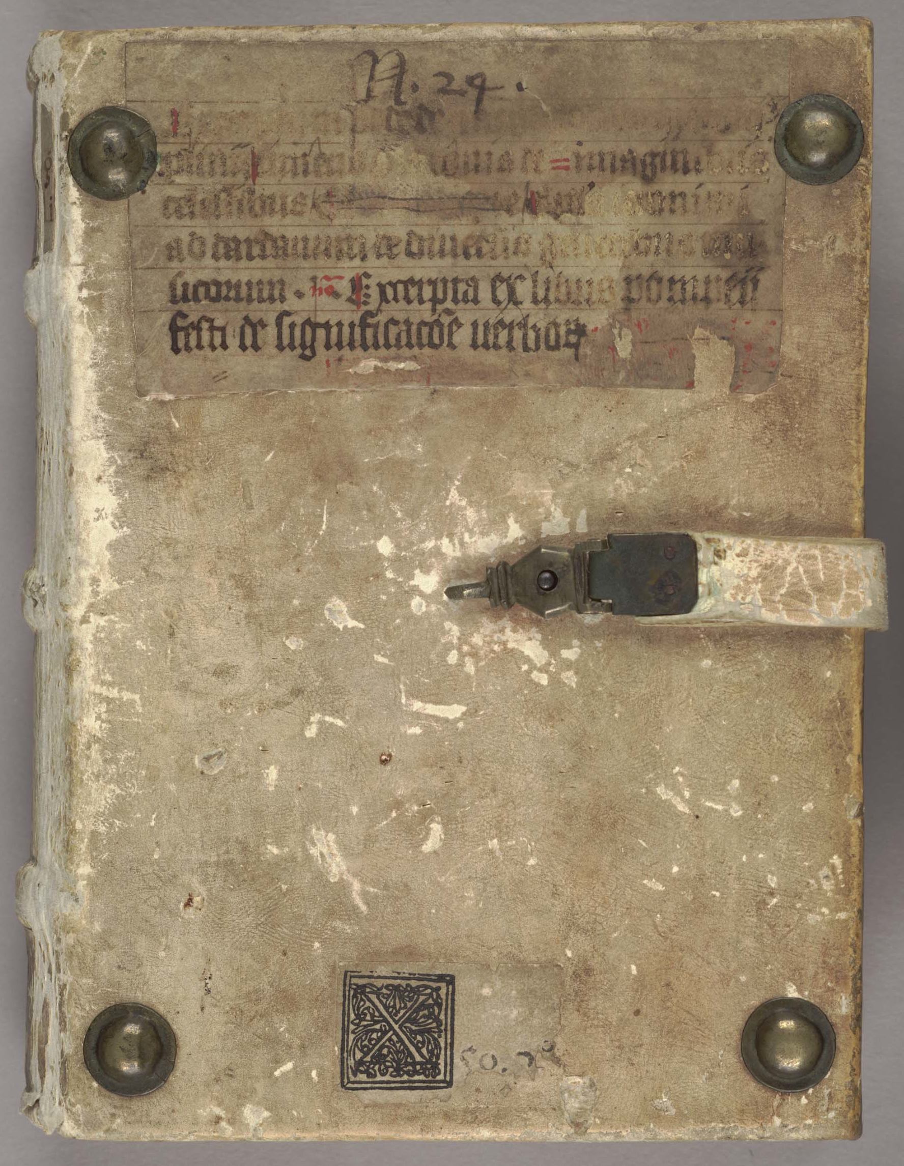
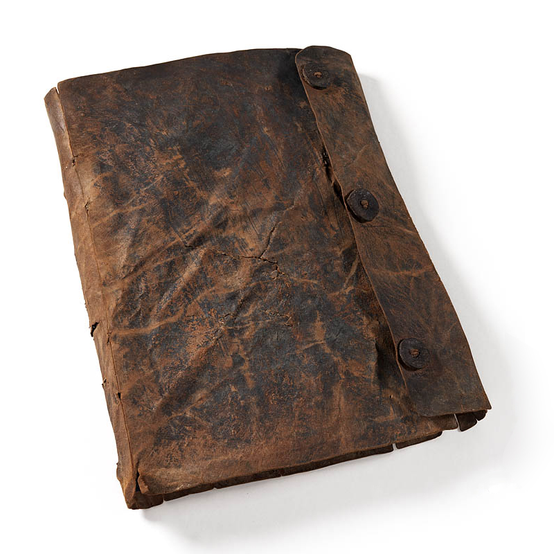
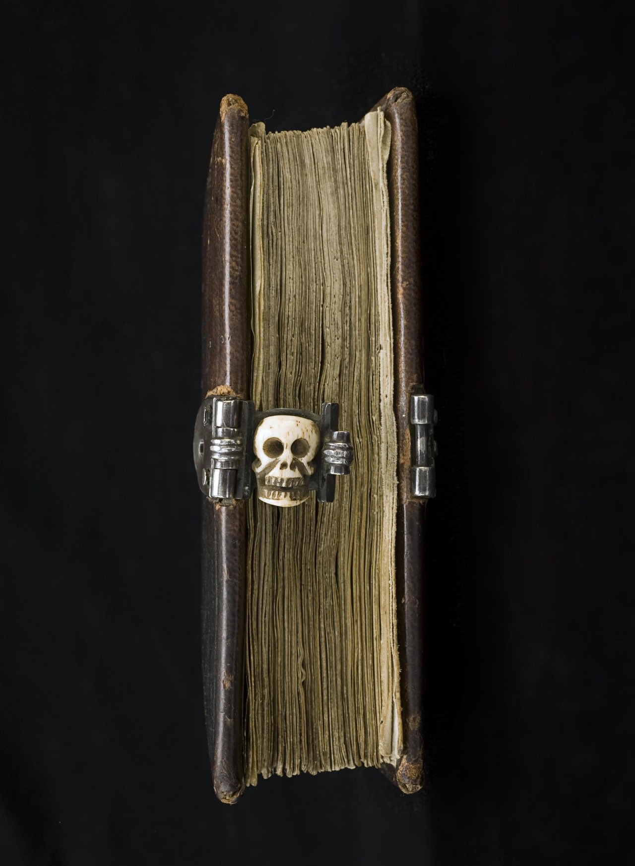
In the early sixteenth century a novel method of binding books in parchment was developed in Italy. Books with raised bands always seemed to function more naturally in leather than in parchment; the three-dimensional shape of the spine with its raised sewing supports and the stiffness of the parchment were not a winning combination. Italian bookbinders solved the problem by cutting slots in the parchment at the positions of the raised bands, and they use white tawed leather at these positions instead (Fig. 1). This technique was used in the sixteenth and seventeenth centuries and appears to be confined to Italy. (See here for more details about how such bindings were made.)

Both parchment and leather discolour over time, after which it becomes difficult to distinguish between the two materials. In addition, the ‘slotted spine’ as a technique is relatively unknown, and it is usually not easy to discern something one is not familiar with. With this particular technique, the characteristics may become more indistinct when the damaged spine of such a book is treated, and as a result an untrained eye may just be under the impression that the repaired binding is meddled with, instead of recognising the distinctive slotted method and thus the provenance. By contrast, the damaged spine of the binding in Fig. 1 invites the user to examine the different materials that are visible. Its construction is sound enough to support the textblock and allows careful use in the reading room; a box protects the binding in the stacks.

Broken but not unstable
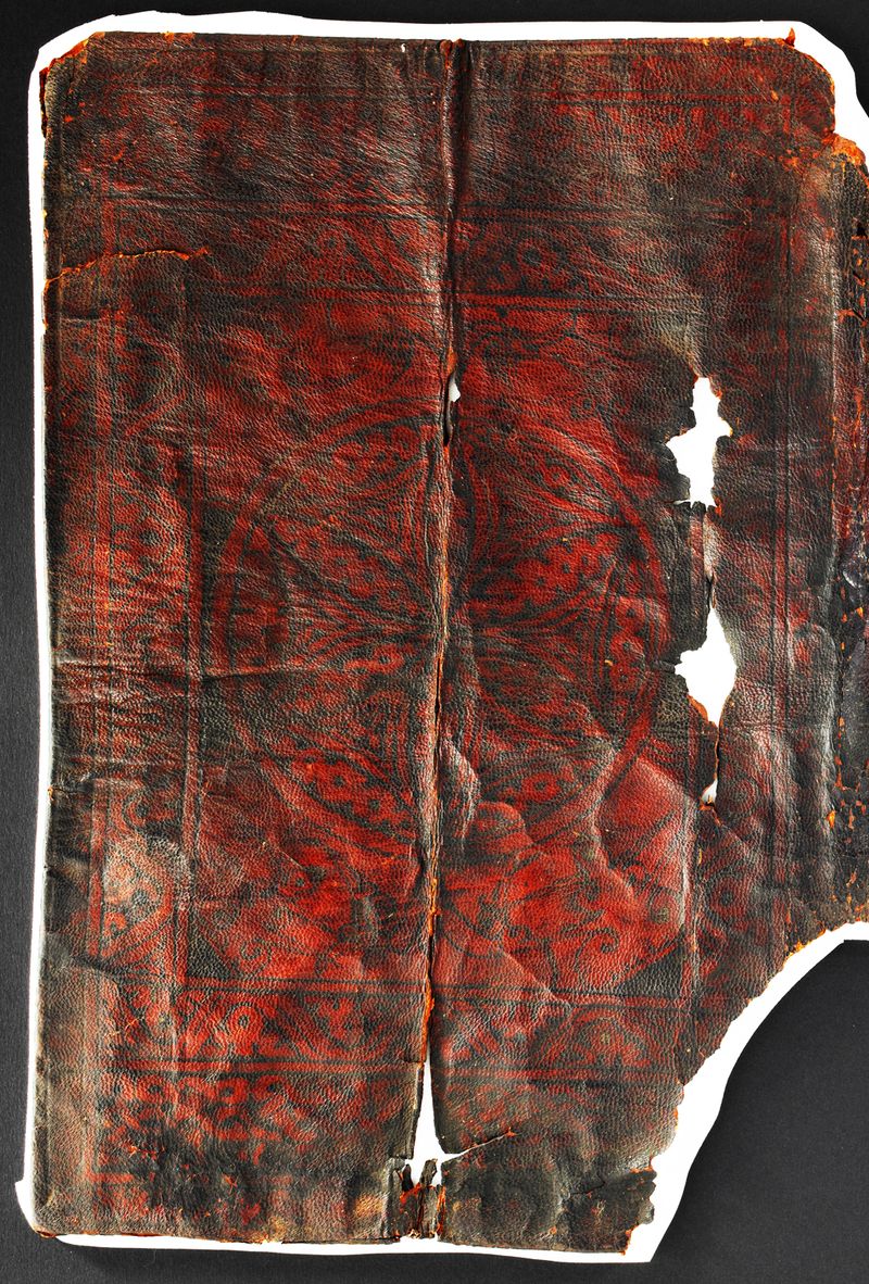
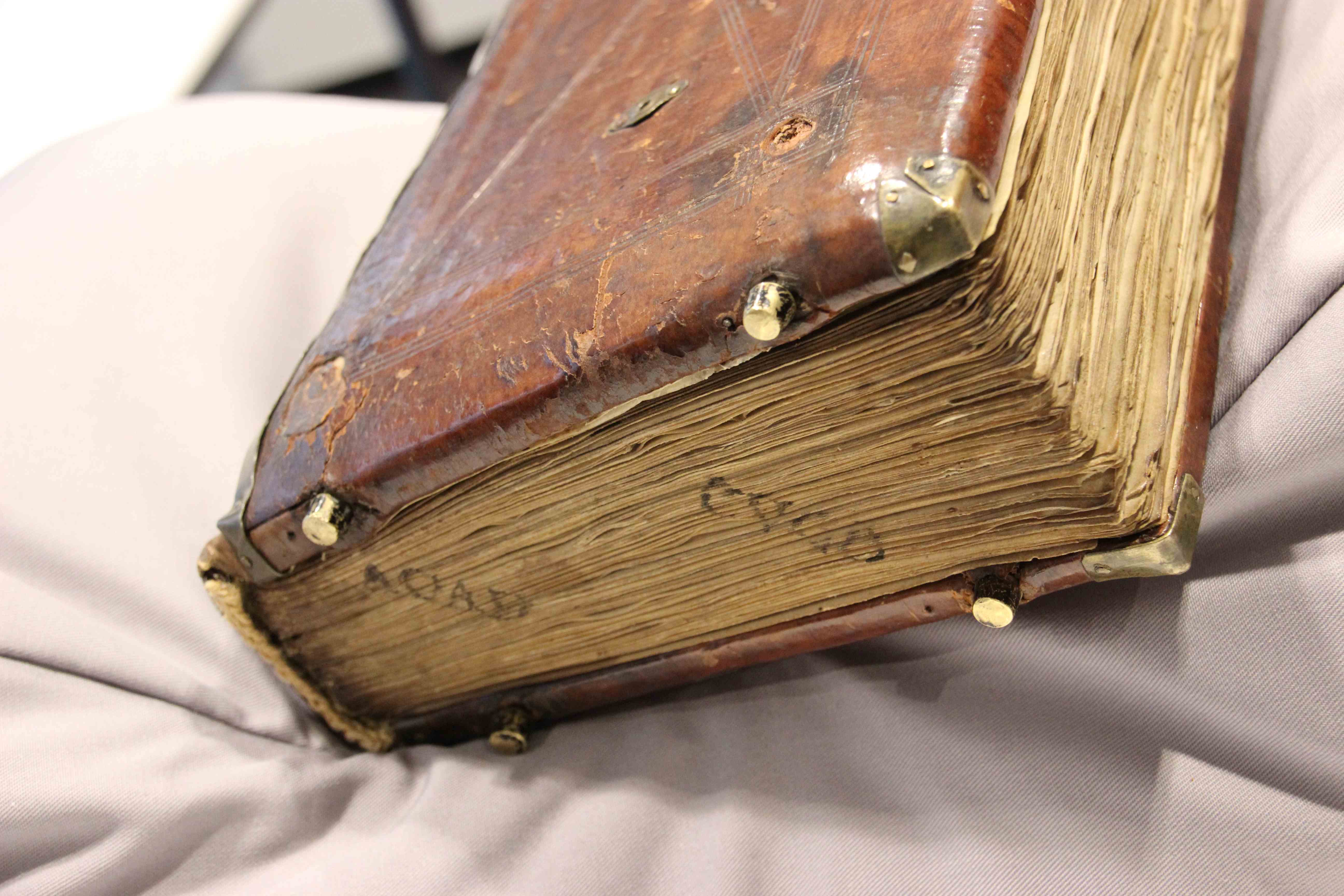
In some cases the damage may appear quite severe when in fact the structure is sound and the covering material is not at risk of further loss. The parchment-bound books in fig. 2 are an example of that. The damage is typical of bindings that suffered from too much UV-light on the spine, which caused the material to deteriorate rapidly while the similar materials in the joint and over the front and back covers were not affected.

Leiden_UB_513E19_523D17_615F18_615F19_663E16
Fig. 2 – Leiden, University Library, 513 E 19, 523 D 17, 615 F 18 and F 19, 663 E 16: The turn-ins (the part of the cover folded over the edge onto the inner surface of the board) of the parchment spines are still in place. These turn-ins did not suffer from the same amount of light and pollution as the spines themselves did – Photo KS

From a book-historical point of view, a new spine would not add anything: it is clear that the original binding was a laced-on full parchment cover. Instead, a new spine would cover up all the information now visible on the spine of the bookblock. Zooming in, we can see the sewing structure and the different materials that are used as spine-linings. For the book on the left, parchment fragments with musical notation were used. For the one next to it, strips of block-printed textile were applied between each sewing support to strengthen the structure. The two volumes on its right side also show the use of block-printed cloth. However, in this case the bookbinder economised – these books are only small, after all – and applied only one lining strip to each volume.

What we can also see in Fig. 2 is that the binder pasted these strips, apparently arbitrarily, between the first and second sewing support in one instance, and between the second and third in the other. This is all the more interesting because the book on the far right displays a very intentional application of materials. Here we see two kinds of materials, cloth and paper. The blue striped cloth is used at head and tail, where strength of material is important to support the endband sewing, and in the middle. The paper strips with their reddish blockstamped decoration are used above and below the central cloth strip, where strength is a little less important. Thus, the structure is well balanced, not unimportant for a book of this size and weight.

This case shows how it is sometimes better to do nothing, or to simply consolidate the condition (e.g. stabilising the damage, making sure that it cannot become worse) without actually repairing the damage. In the case of these parchment bindings, leaving the damage benefits the user and the book itself. Without the rather rigid parchment spine of the binding the book opens more easily and thus its readability improves. This means that the user will not have to put any pressure on the joints when reading, and therefore the book’s structure will hold. A new spine would change the balance and might cause damage to the weaker areas such as the joints, which are currently unbroken. As a by-product of the decision to do nothing, the conservator saves time, which can be invested in those books that are at risk of progressive damage, or are damaged in such a way that their broken structures currently do not allow for use.

Leiden_UB_663E163
Fig.3 – Leiden, University Library, 663 E 16: Parchment binding without a cover spine but with board attachment intact. When the book is opened, the opposite motions of bookblock spine and binding spine are visible. If the book was opened further, a lot of tension would stress the parchment spine (now missing, though the turn-ins are still there) and joints – Photo KS

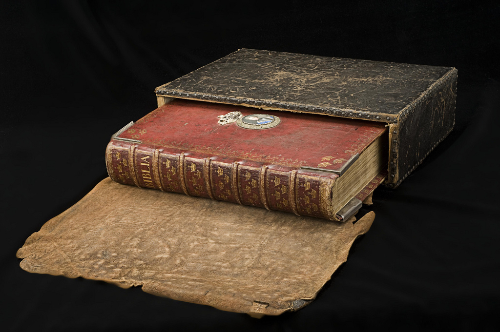
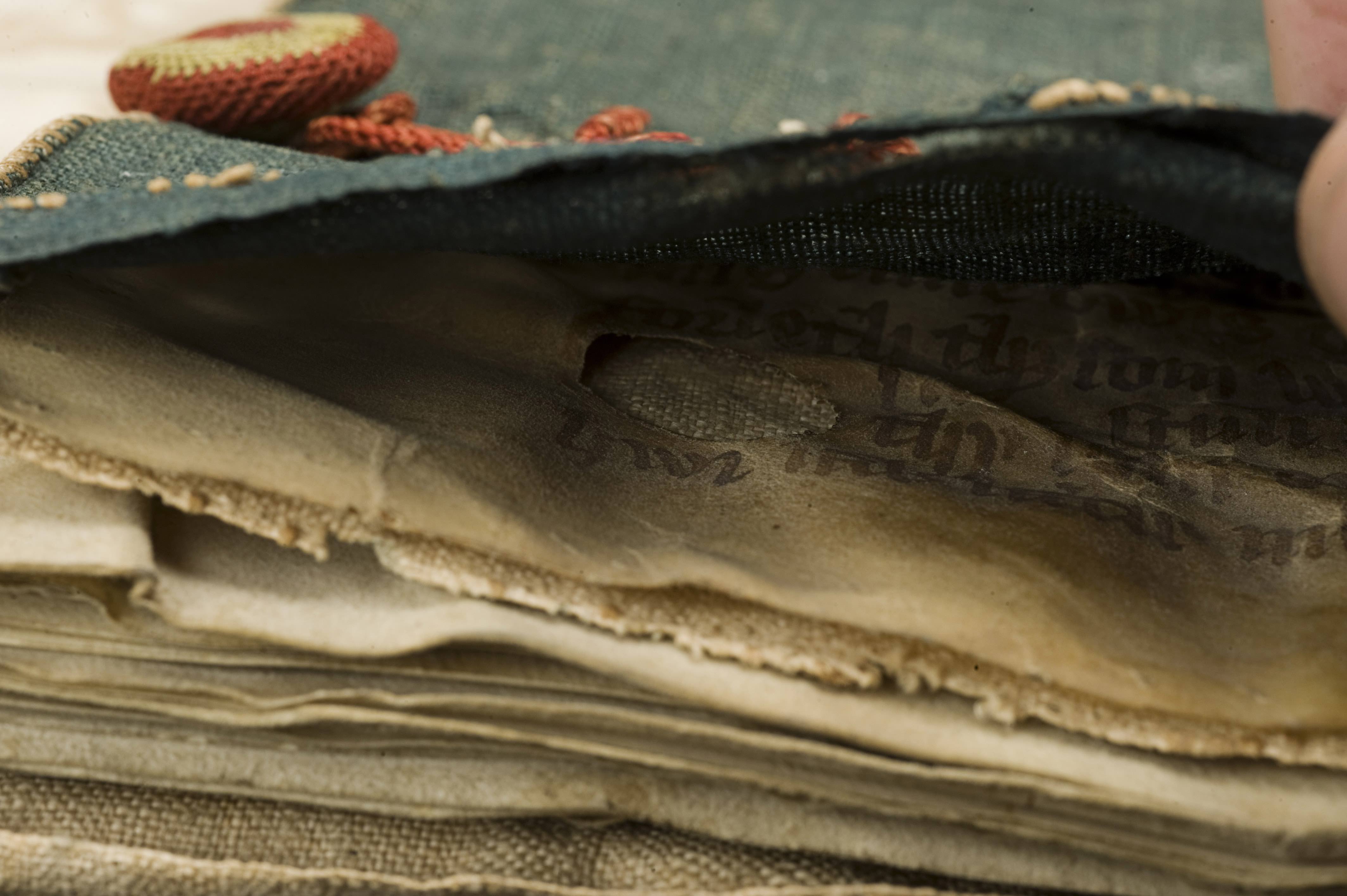
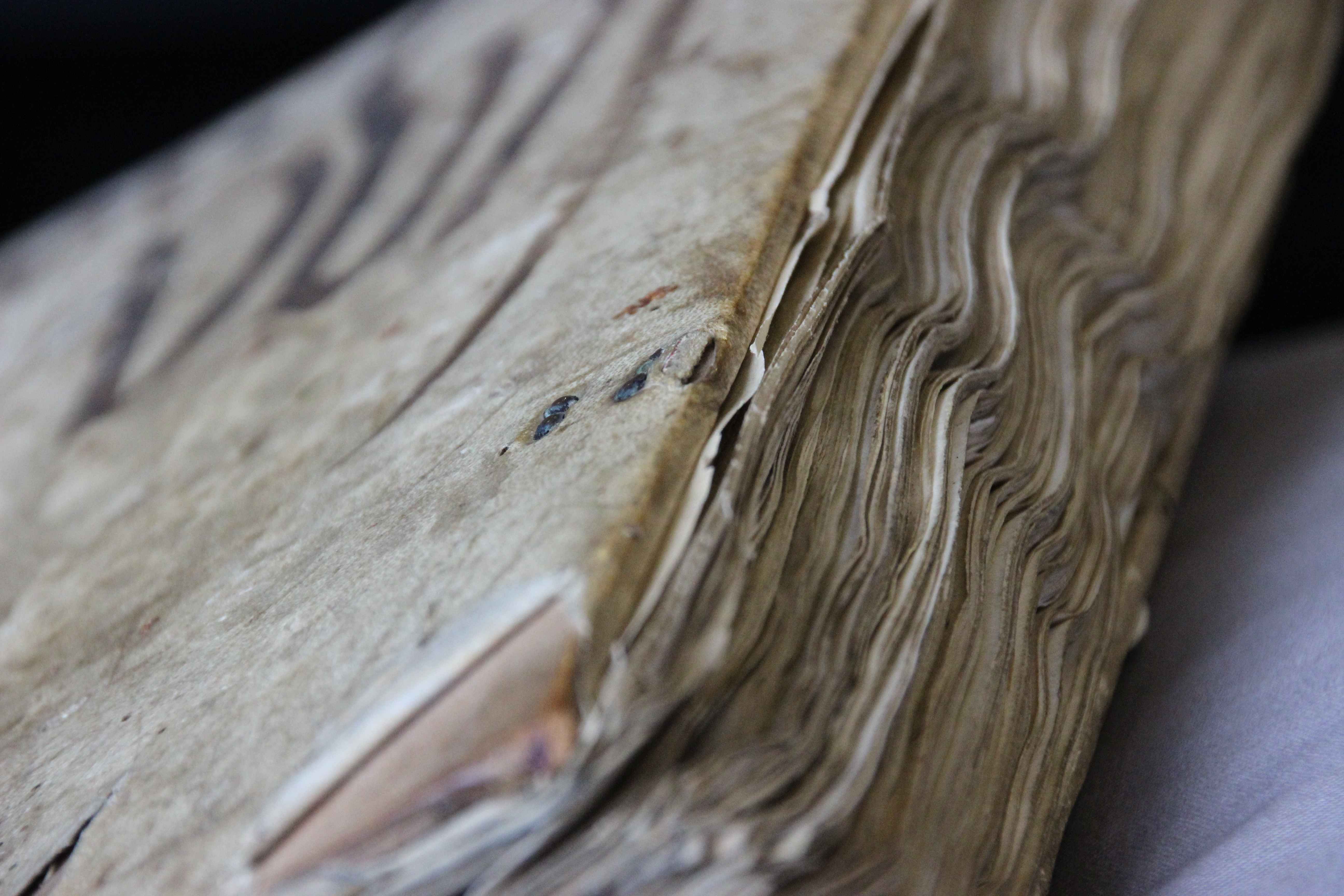
Too thick to function well
Different binding types have different characteristics, and the materials and techniques used to construct the book influence the objects’ physical properties and its ‘mechanism’. A leather covering, for example, pasted onto the spine of a manuscript, supports the textblock spine when the book is used. A parchment binding that is laced on to the textblock with the binding supports, but is not actually connected to the spine itself, moves away from the textblock spine when the book is opened (visible in Fig. 3) When, in addition, the spine of the binding is stiff and the textblock spine is flexible, a tension occurs which strains the joints. The Greek manuscript in Figs. 4-6 is an example of such an unfortunate combination. One of the joints gave way: the book’s solution to the problem. A conservation treatment aiming to restore the broken joint would only inflict further tension on the other joint and eventually lead to more damage and a repeated intervention. It was therefore decided to leave the damage as it is. The manuscript is accessible and safe to handle, though its uncommon condition may raise some questions at first encounter.

Leiden, University Library, BPG 50 (early modern), Commentaries by Procopius of Gaza.
Fig. 4 – Leiden, University Library, BPG 50 (early modern), Commentaries by Procopius of Gaza – Photo KS
Leiden_UB_BPG50_opening
Fig. 5 -Same as Fig. 4, open  – Photo KS
Fig. 6 - Same as Fig. 4, view on the spine
Fig. 6 – Same as Fig. 4, view on the spine – Photo KS

These examples show that damage is not always a problem that needs to be solved. They do not, of course, represent all conservation issues, or every reason for choosing not to treat damage. However, if they inspire the reader to think about physical characteristics and the sensitive condition of an old volume, these objects already serve a purpose that a completely restored volume would not.

Judging a Book by its Cover

What a clever device the book is. It is compact and light, yet contains hundreds of pages that hold an incredible amount of information. Moving forward or backward in the text is as easy as flipping a page, while the book’s square shape and flat bottom facilitates easy shelving. Still, the object is useless if the information it contains cannot be found. And so tools were developed to help the reader do just that, such as page numbers, running titles, and indices. As familiar as these aids may be, they are older than you think. The page number, for example, is encountered in papyrus manuscripts made some two thousand years ago (see this older blog post).

Crucially, to look up information in a book you must have first located the object. And so the shelfmark was invented, the equivalent of our call number. By the end of the medieval period it had become as clever as the book to which it was added: letters, digits, and even colour coding was used to guide the reader to a particular manuscript (see this post on GPS in the medieval library). This post explores the medieval roots of yet another tool for finding a specific book, one that is as popular now as it was in medieval times: title and author information displayed on the spine and dust jacket.  How did the outside of the medieval manuscript communicate what was hidden inside?

1. Text on leather

St Gall, Stiftsbibliothek, MS 292
Fig. 1 – St Gall, Stiftsbibliothek, MS 292 (c. 1100) – Source
St Gall, Stiftsbibliothek, MS 292, front cover (detail)
Fig. 2 – St Gall, Stiftsbibliothek, MS 292, front cover, detail (14th century)

Why make things complicated? The easiest way to identify a manuscript was to simply jot the title on the front cover, straight on the leather of the binding (Figs. 1-2). Although one might imagine that this is how the tradition of our modern cover information began, there are too few original bindings left to know for sure. The manuscript seen in Figs. 1-2 is important as it shows that the practice goes back to at least the fourteenth century.

The manuscript shown in Figs. 1-2 was copied around 1100 and still has its original binding. Interestingly, this tells us that for 200-300 years users were quite content with an “anonymous” book, which did not provide a clue to what information it contained. This is all the more striking when you consider that during these three centuries the library where the object was held, in the abbey of St Gall, harboured several hundred books. How on earth did the monks find their way to the texts contained within this binding?

2. Title labels

St Gall, Stiftsbibliothek, MS 237, front cover
Fig. 3 – St Gall, Stiftsbibliothek, MS 237 (9th century), front cover – Source
St Gall, Stiftsbibliothek, MS 237, paper label
Fig. 4 – St Gall, Stiftsbibliothek, MS 237, paper label (14th century?)

Writing text on a manuscript’s cover, as seen in Fig. 2, was not easy. The structure of the leather could be coarse and the surface uneven, which made it potentially difficult to write the title information legibly. More importantly, when the leather had a dark color, a black title may simply not be visible. In such cases it made more sense to write the information on a parchment or paper slip – a label – that was subsequently pasted on the cover, as is still common practice in libraries today.

The manuscript in Figs. 3-4, which features a parchment label, shows how incredibly effective this practice was: it clearly reads Liber ethymolo[giarum] Isidori, telling the reader that he was about to open Isidore of Seville’s Etymologies. These paste-on labels could be quite extensive (Fig. 5). In fact, some book owners preferred to have the entire contents displayed on the outside, even if the object held ten works (Fig. 6).

Austin, Harry Ransom Humanities Research Center, MS HRC 29
Fig. 5 – Austin, Harry Ransom Humanities Research Center, MS HRC 29 (10th-11th centuries), label 15th century – Source
Schlatt, Eisenbibliothek, MS 20, label on front cover (15th-century)
Fig. 6 – Schlatt, Eisenbibliothek, MS 20 (13th century), label 15th-century – Source

As detailed as these labels are, they exclusively list the titles of the works contained by the manuscript, not the authors’ names. It appears as if the librarian who labeled these manuscripts judged the title (and not the author) to be the best identifier of the object.

3. The fenestra
Paper or parchment title shields were sometimes placed under a thin piece of horn (bone), for protection (Figs. 7-8). The so-called “fenestra” (window in Latin) was secured to the wooden cover with nails: it was clearly going nowhere (Fig. 8). This type of cover information can be seen as the next step in the process of providing efficient book titles: a clear and permanent label, hammered into wooden boards with nails. It is a far cry from the on-the-fly title hastily written directly on leather (here is another example).

San Marino, Huntington Library, MS HM 35300 (15th century)
Fig. 7 – San Marino, Huntington Library, MS HM 35300 (15th century) – Source and more
San Marino, Huntington Library, MS HM 35300, fenestra
Fig. 8 – San Marino, Huntington Library, MS HM 35300, fenestra

The fenestra is often found on manuscripts that were part of a well-organised library. It may therefore contain quite a bit more information than merely the title or the author. The one seen in Fig. 8 is from the library of the Carthusian house of Syon in Middlesex, England. The label is clever and reads:  “V. Beda de gestis Anglorum. Idem super actus apostolorum et epistolas canonicas. 2o fo et prassini”. The main piece of information concerns what is found inside: Bede’s Ecclesiastical History of the English People and Bede’s commentaries on the Acts of the Apostles and on the New Testament’s Canonical Epistles.

However, it also mentions the first words of the second folium: secundum folium [incipit] et prassini, the second folium starts with “et prassini”. These words formed a unique identifier, for no two copies of Bede’s Ecclesiastical History will have had these very words at the start of the second leaf. This technique was commonly used to identify unique copies for inclusion in a monastery’s book inventory or library catalogue. It is probable that this is the reason why the fenestra contains the phrase: to link this specific book to the monastery’s catalogue.

4. Spine titles

Fore-edge decoration by Cesare Vecellio
Fig 9 – Fore-edge decoration by Cesare Vecellio – Source (Source title image)

Not only was a book’s title and name of the author jotted down on the front cover, it would ultimately also feature on the spine, as any modern reader knows. This part of the tradition has its own path of development. It all started on the fore-edge, the long side of the book that shows the paper or parchment pages. From at least the fourteenth century decoration was added to this location. Few books have been so lavishly decorated as Ordorico Pillone’s, who, around 1580, had the artist Cesare Vecellio decorate the fore-edge of 172 books in his library with stunning designs (Fig. 9). The technique would be perfected in the nineteenth century, when the magically disappearing fore-edge decoration was invented (example here).

In medieval times the edges of the book block were not usually decorated, while the design was commonly modest (Fig. 10-11). Although there are exceptions to this rule, as a potentially medieval fore-edge decoration in Durham shows (more here).

London, British Library, Egerton MS 2610 (1
Fig. 10 – London, British Library, Egerton MS 2610 (decoration: 14th century) – Source and more
London, British Library, Burney MS 275 (before 1416)
Fig. 11 – London, British Library, Burney MS 275 (decoration: before 1416) – Source

The manuscript in Fig. 11 shows that medieval fore-edge decoration could serve a functional purpose, because it concerns the coat of arms of Jean, duc de Berry (d. 1416). We may assume the books in his library were positioned with the fore-edge faced outward, as was common practice in many medieval libraries – in fact, this was done until well into the 17th century, as this image shows. How impressive his library must have looked to visitors: dozens of precious books, all evidently owned by the duke.

Given that the fore-edge was facing the reader, this location was also the perfect place to write down the title or author of the work contained by the volume. ‘Quaestiones morales’ (moral questions), a 15th-century hand wrote on the fore edge of an incunable printed in 1489 (Fig. 12). The earliest cases I encountered date from the early fifteenth century, although our view may be skewed because such fore-edge titles disappeared when binders in the early-modern period refitted the books with new bindings.

Washington, Folger Shakespeare Library, INC_M26 (1487)
Fig. 12 – Washington, Folger Shakespeare Library, INC_M26 (1487) – Source

When books finally turned their backs to the reader, the title ended up where it is still found today: on the spine. Based on my own experience, this practice was not common in medieval times, for the simple fact that manuscripts were not usually placed with their backs facing the reader. Cases from the early-modern period are plentiful. In fact, it became so popular that some readers wrote extensive tables of contents on the backs of their books (Fig. 13).

Shelf in the Wolfenbüttel, Herzog August Bibliothek
Fig. 13 – Shelf in the Wolfenbüttel, Herzog August Bibliothek – Photo EK, more

The early history of displaying a book’s title and author on the outside is long and winding: first the information was found on the front or back, then on the fore-edge, and finally on the spine. This order is no coincidence, because it roughly reflects another development, namely how books were stored: first flat (Early and Central Middle Ages), then upright with the fore-edge facing the reader (Later Middle Ages), and finally with the spine facing outward (Early Modern period).

Judging from surviving book bindings, the history of the “dust jacket” with title actually starts surprisingly late. After all, the earliest traceable specimens date from the fourteenth century. Curiously, in the same century the Latin titulus was first used for denoting the title of a book (see here), which may also indicate that titles did not exist before then. If correct, this reconstruction suggests that for much of the Middle Ages readers could not tell what texts were found inside a book. Generations of frustrated monks had to wander through the library opening and closing manuscripts until they had found what they were looking for.

The Incredible Expandable Book

Like most objects, books are confined to the space they occupy, obedient as they are to the laws of nature. That is to say, unlike the Incredible Hulk, they do not normally expand beyond the limits of their own physicality. This post will challenge your beliefs if you agree with this statement. It draws attention to types of medieval books that do expand beyond their physical limits: with a flick of the finger or a gesture of the hand the dimensions of these special objects increased dramatically, up to ten times their original size. As if defying the laws of nature, this miraculous expansion increased the available writing space in objects that were principally designed to be small and portable. The examples in this post suggest that this given of “doing more with less” was an important drive behind the clever design of expandable books.

1. The folding almanac

London, Wellcome Library, MS 8932 (15th century)
Fig. 1a – London, Wellcome Library, MS 8932 (15th century) – Source
London, Wellcome Library, MS 8932 (15th century)
Fig. 1b – London, Wellcome Library, MS 8932 (15th century) – Source

If you are a frequent reader of this blog, you are no stranger to small books made for portability. The same goes for the almanac seen in Fig. 1. Produced in England in 1415-1420, it contains a calendar as well as astrological tables and diagrams. The information was used by physicians to diagnose and prognosticate, while the calendar provided information about feasts. Most of these almanacs, some thirty of which survive, look more scruffy than the pretty specimen in the Wellcome Library, which may not have seen much practical use (more here).

London, Royal Society, MS 45 (c. 1400)
Fig. 2 – London, Royal Society, MS 45 (c. 1400) – Source

Folding almanacs were especially popular in late-medieval England, assuming surviving specimens form an accurate representation. The objects are particularly interesting from a material point of view. During production the folding almanacs looked very much like a regular book: the scribe filled regular pages with text. However, in a completed state, when the binding was added, the pages were folded in a very clever way, giving the object an “unbookish” look. The precise manner of folding differed, as Figs. 1-2 show. Both fold in three steps, but the folding sequence is different. The leaves ‘sit’ different too. The specimen in Fig. 2 seems more prone to damage than the other almanac, because the expanding part (the four zones that are slightly lighter) are attached to the actual book by means of a delicate hinge.

2. The accordion book

Copenhagen, Royal Library, MS NKS_901 (dated 1513)
Fig. 3 – Copenhagen, Royal Library, MS NKS_901 (dated 1513) – Source

Both almanacs above provide six times more writing/reading space in their expanded form, which is quite amazing. However, this is still considerably less than another type of expandable manuscript: the accordion book. Fig. 3 shows illustrated specimen (a calendar) made in Denmark in 1513. While in its folded state the object is as small as a matchbox, it expands to a full page of considerable proportions, comparable to a regular-sized medieval book (more information here, facsimile here). Curiously, the calendar has a most unusual way of unfolding: sections of the sheet expand independently, like little flaps from a pop-up book (note the “incisions” on the right half of the object, as seen in Fig. 4 – full image here).

Copenhagen, Royal Library, NKS 901
Fig. 4 – Copenhagen, Royal Library, NKS 901, detail – Source

The Copenhagen accordion book is a very small portable object. Even though in its expanded state it became much larger, due to the limited size of the object in its folded state, the expansion produced a relatively small writing/reading surface. The remarkable thing about accordion books, however, is that their surface space could be considerable, even when the actual object (in its folded state) was still of modest proportions. My own Leiden University Library owns a copy from fourteenth-century Russia which is only 120 mm in height. The whole thing resembles the dimensions of an iPhone (Fig. 5). In expanded state, however, the book becomes no less than 3750 mm wide, meaning that the surface actually increases by an astonishing factor of ten.

Leiden, University Library, SCA 38 B (14th century)
Fig. 5 – Leiden, University Library, SCA 38 B (14th century) – Photo Giulio Menna

It is hard to say what the upside is of this book format. After all, if the same pages had been bound in a regular (non-accordion) fashion, it would accommodate the same amount of text. Perhaps the format was favoured because of a certain ease of use? It is easier, for example, to access the information in the book without using one’s hands. Also, without flipping any pages, the reader had access to a great deal more than the usual two pages of a book opening, which may perhaps have been handy in certain modes of use.

3. Rolls

Manchester, Chetham's Library, Armburgh 02 1024 (1430-1450)
Fig. 6 – Manchester, Chetham’s Library, Armburgh 02 1024 (1430-1450) – Source

What looks like a cigar, is actually the most common and oldest expandable bookish object: the roll (Fig. 6). This object probably held the most information in relation to its dimensions. Rolls had been in use for a long time when the book finally came around in the fourth century (see my post What is the Oldest Book in the World? and more information on rolls here). During the Middle Ages the roll format remained in use longest in administration. It was not until the late thirteenth century, for example, that cities in North-West Europe switched to the book form to write down their income and expenses – the city of Bruges still used rolls for this purpose in the 1280s.

Rolls can be quite long. One of the longest that survives from the medieval period is a mortuary roll that was carried to 253 monasteries, nunneries and cathedrals across England and France during the 1110s (source). Mortuary rolls were produced to commemorate the death of a prominent person, in this case Abbess Mathilda of Holy Trinity Abbey in Caen. Like writing a joint birthday card today, clerics in France would add their say to the roll, which grew and grew, until it finally reached a length of 22 meters (72 feet). Genealogical rolls could also be quite long (Fig. 7), though not as exceptionally long as the mortuary roll made for Abbess Mathilda.

Christchurch, University of Canterbury, MS 1 (15th century)
Fig. 7 – Christchurch, University of Canterbury, MS 1 (15th century) – Source

From time to time unusual rolls are encountered, like the one seen in Fig. 8. This one is special because the fourteenth-century object comes rolling out of a book (of slightly later date), which functions as its sleeve. The end of the roll (again holding a calendar) is simply pasted onto the book. The full roll measures an astonishing 130 cm (a little over 4 feet). One wonders whether the owner created this remarkable hybrid because it allowed for easy storage on the book shelf. A book placed among its peers, albeit with an unusual content.

The Hague, Royal Library, 130 E 26 (late 14th century)
Fig. 8 – The Hague, Royal Library, 130 E 26 (late 14th century) – Photo EK

What the Incredible Expandable Books in this post share is an effort to hold a lot of text in an object that occupies a modest amount of space, usually in one’s pocket. When there is a dire need to take information with you on the go, medieval readers were quite inventive, as my post Bag it, Box it, Wrap it shows. Interestingly, the expandable information carrier lives on in our own day. Not only are there still book designers who produce accordion books in the medieval fashion (like Peter Thomas, whose recent email correspondence inspired this post), but the expandable almanac at the outset of this post has actually become ubiquitous in the form of pocket maps, displaying such things as the layout of cities and underground stations.

R. Sutton, Petroleum Pocket Map (1886)
Fig. 9 – R. Sutton, Petroleum Pocket Map (1886) – Source

Echoing the roll hidden in a book, some of these maps hide in (and take on the form of) an actual book, like the 1886 edition that shows the location of oil wells (Fig. 9). As with their medieval peers, ease of use and portability are the driving forces behind getting a lot of information in an object with a tiny footprint. “Doing more with less” is clearly a universal urge.

Box It, Bag It, Wrap It: Medieval Books on the Go

Books in use generally reside in our hands or on our desks. This was not very different in medieval times. However, medieval and modern reading culture take different paths when it comes to books that are not in use. While both then and now the objects are commonly shelved after use, medieval readers had additional storing options: slipping the book into a box, bag or wrapper. Unfortunately, few of these exotic – and fascinating – storage devices survive today. However, the ones that do indicate that many were made with a specific purpose in mind, namely transportation. Here are some popular means of packing up your book to go in medieval times, including the precursor of our modern tablet sleeve.

Box it

StGall_360
Fig. 1 – St Gall, Stiftsbibliothek, MS 360 (11th century) – Source

The book box is probably the sturdiest and most effective means to protect your book against the elements and other hostilities on the medieval road. Such boxes were usually made out of wood, to which ornaments, gems and even ivory cuttings were attached, commonly with nails. A particularly well preserved example is seen in Fig. 1. The box contains a famous book of hymns from St Gall, which was designed to be carried in processions both within the monastery and through the nearby city of St Gall. My recent post on “slim” books showed the actual book found inside this box, a narrow object designed to be held in one hand (post here, image here).

Decoration on the outside of the book box not only made the object look pretty, it also gave it prestige. In fact, ivory cuttings and shiny gems reflected the importance the book had within a monastic community or a church. Book boxes actually bear a striking resemblance to medieval reliquaries, shrines or containers made for holding a relic such as the arm of a saint (example here) or a splinter of the holy cross (here). One type of book box in particular matches this profile very well: the Irish cumdach or ‘book shrine’ (Figs. 2-3).

Dublin, Royal, Irish Academy,  D ii 3 (8th/9th century)
Fig. 2- Dublin, Royal, Irish Academy, D ii 3 (8th/9th century) – Source (collections > RIA)
Dublin, Royal, Irish Academy, D ii 3 (8th/9th century)
Fig. 3 – As Fig. 2 but showing the inside, with Stowe Missal visible

The cumdach often held a small manuscript. The Stowe Missal for which the cumdach in Fig. 2 was made, measures only 150×120 mm, which is a little higher than the iPhone 6 (and a little smaller than the iPhone 6 Plus). The book is very snug inside the box (Fig. 3). The small size matches the object’s anticipated use. The Irish cumdachs were often carried around the neck of a monk who would run up and down in front of the troops right before battle. The book became a charm of sorts, which was to bring fortune in battle. It made good sense to store this ‘secret weapon’ in a sturdy box that could withstand all that bouncing around and even a potential blow of a sword.

Stockholm, Royal LIbrary, Karl XII's "fältbibel" (c. 1700)
Fig. 4 – Stockholm, Royal LIbrary, Karl XII’s “fältbibel” (c. 1700) – Source

The most famous of these is the sixth-century Cathach of  St Columba, which holds a Psalter from the sixth or seventh century. Curiously, while this cathach (‘battler’) is commonly regarded as an object meant for carrying into battle to ensure victory (source here), it is obviously too big to carry around one’s neck: it measures 270×190 mm and weighs quite a bit. Its user probably ran up and down the battlefield with the book under his arm. Taking your book to battle in a protective box remained popular throughout early-modern history, as shown by the “field Bible” of c. 1700 , which was taken on war campaigns by king Charles II of Sweden (Fig. 4).

Bag it
The satchel was another means to carry your book around in the medieval outdoors. They were made of leather and commonly decorated in the manner seen in the famous 9th-century Book of Armagh – which, curiously, has a modern lock (Figs. 5-6).

Dublin, Trinity College, MS 52 (Book of Armagh, 9th century)
Fig. 5 – Dublin, Trinity College, MS 52 (Book of Armagh, satchel, 9th century) – Source
Dublin, Trinity, College, MS 52, satchel side (9th century)
Fig. 6 – Dublin, Trinity, College, MS 52 (Book of Armagh, satchel, 9th century) – Source

Very few such satchels survive but we get an inkling of their use and popularity through medieval texts. A seventh-century tract instructs monks to “Hang your white booksacks on the wall, set your lovely satchels in a straight line” (source). It suggests that each member of this particular community owned a satchel. The same text also explains from what animal the leather came (sheep) and how the skin was turned into a bag: take a square piece of leather, sew it closed except for a single opening, which should be closed by a cover fitted with knobs.

Faddan More Psalter, satchel (9th century)
Fig. 7 – Dublin, National Museum, Faddan More Psalter, satchel (9th century) – Source

In 2006 a particularly old specimen was found in a bog, where it had been resting for 1200 years. Around 800 someone had a portable Psalter made, which came with a leather satchel. Somehow the book fell into the remote bog at Faddan More in north Tipperary, Ireland. Restoration revealed a plain but charming example of an early-medieval book bag (Fig. 7). Because it does not feature a strap, this type of satchel bears a striking resemblance to our modern tablet sleeve: unbutton the flap, slide in your reading device, and be on your merry way.

Like book boxes, satchels had a life far beyond the Middle ages. Fig. 8 shows a 17th-century specimen made of cloth that holds an Arabic devotional book. It belonged to a Turkish soldier captured by Venetian forces in 1668. Like the book box, this charming piece of ‘apparel’ carried a religious text into battle, although in this case the book was likely meant for private reading rather than as an aid to victory.

Stockholm, National Library (17th century)
Fig. 8 – Stockholm, National Library (17th century) – Source

Wrap it
If you wanted to carry your book on your body instead of in a box or bag, for example because you needed to consult the text frequently, the girdle book was your device of choice. The binding of these books came with a wrapper, which kind of flows from the leather of the binding itself. It allowed the user to wrap the manuscript into the leather, which produced a watertight package. A knot was attached to the end of the wrapper. The carrier of the book slipped it under his belt so he could carry the book on his body. Many of these girdle books are small and light objects, which made it easy to dangle the package from your belt. A particularly well preserved specimen in Yale’s Beinecke library shows how well such wrappers protected the book (Figs. 9-10).

Yale, Beinecke Library, MS 84 (15th century)
Fig. 9 – Yale, Beinecke Library, MS 84 (15th century) – Source
Yale, Beinecke Library, MS 84 (15th century)
Fig. 10 – Yale, Beinecke Library, MS 84 (15th century) – Source

This particular book was written in England during the fifteenth century, though the binding may be continental. It measures only 100×80 mm (a little bigger than a credit card) and contains Boethius’ Consolation of Philosophy, a sixth-century text discussing such topics as free will, virtue, and justice. These may not be the usual topics to have ready at hand while walking the streets of a late-medieval city, but someone found such use important enough to have it made portable – and at the ready at all times.

Stockholm, Royal Library
Fig. 11 – Stockholm, Royal Library (16th century) – Source

Other girdle books were objects that could be attached to the owner’s belt with a knot, but their wrappers were not meant to protect the book. The wrapper seen in Fig. 11 leaves much of the book exposed to the elements. This book was made in the very late sixteenth century, when the production of girdle books was in decline. By then its protective function may have have been replaced by fashion: exposure – being seen with a book – may well have been what the owner was after. There was a price to pay, however, as the book is too large and heavy to carry around with convenience. In fact, attaching this object to your belt may have cause unwanted exposure as well: there was a good chance the book’s weight brought down your pants.

Postscript: this older post shows how medieval texts moved through Europe and how you can tell from barely-visible marginal notes.

Books on a Diet

We’re all familiar with that most popular of New Year’s resolutions – and the one that is broken most frequently afterwards. While many oversized medieval books look like they enjoyed life to the max, this post is devoted to a relatively rare kind of manuscript that is much slimmer than what you would expect (Fig. 1). “Expect”, because the relative proportions of manuscripts – the width in relation to the height – form a surprisingly stable feature in medieval book production. In fact, the vast majority of surviving manuscripts have the same relative proportions as our modern paper: their width is around 70% of their height.

British Library, Harley MS 5431 (10th century)
Fig. 1 – British Library, Harley MS 5431, 230×85 mm  (10th century) – Source

This stability ought to surprise you. While readers of printed books had little choice as to the physical appearance of the object they read, owners of manuscripts handled a book that was made especially for them. Consequently, they would commonly have specified what it should look like. You would think that medieval readers might go overboard and abuse this freedom of choice, ordering polka-dotted books with pink letters written upside down on triangle-shaped pages. The opposite turns out to be true. Book owners before print are predictable in that they mostly opted for regular features: their choices are typical, as if they conform to unwritten rules.

This striking act of conformation results from what is a main driving force behind the chosen physical features: the anticipated use of the object. For example, if you anticipated that you would scribble an excessive amount of notes in your book, you would specify to the scribe to extend the size of the margins. And if you knew that you would take a book with you when you left the house, it would make sense to have that copy produced in a suitably small format. This strong link between form and function is good news for us: we may infer that narrow books– sometimes called “holsterbooks” – were put on their diet for good reason.

Ivory Decoration

Frankfurt am Main, Goethe Universität, Barth MS 181 (14th century)
Fig. 2 – Frankfurt, Goethe Universität, Barth MS 181, 402×250 mm (14th century) – Source

One reason to slim books down had to do with their binding; or more precisely, with its decoration. The most prestigious decorative element of a medieval binding was ivory plaques, slabs of tusk on to which elaborate scenes were cut (Fig. 2). They were attached to both the front and back of the manuscript, usually embedded in the wood of the boards. Book projects that involved this costly decoration commonly produced manuscripts that were much narrower (or taller) than the norm. The plaques themselves had to be narrow given the limited width of the tusk. Interestingly, however, manuscript makers appear to have preferred the book to be equally narrow. This was probably done for visual reasons: it looks better when the relative proportions of book and decoration are in sync. Moreover, keeping the book slim meant that more visible space was covered with ivory.

St Gall, Stiftsbibliothek, MS 53 (c. 895)
Fig. 3 – St Gall, Stiftsbibliothek, MS 53, 395×323 mm (c. 895) – Source

This tendency to keep a book narrow when ivory decoration was added is mentioned in a remarkable account by the historian Ekkehart of St Gall (d. 1022). Referring to what is now St Gall, Stiftsbibliothek, MS 53 (Fig. 3) he states that this manuscript was made tall and narrow for good reason. Among the abbey’s treasures, he reports in his chronicle, were two ivory plaques. They once belonged to emperor Charlemagne (d. 814), who used them as a wax tablet, which he kept next to his bed. When it was decided in St Gall that the plaques would be used to decorate the bookbinding of a newly produced Gospel Book, the scribe was asked to design the book in such a way “that it matched the shape of the ivory”. Interestingly, Ekkehart noticed that it was narrower than usual, because he addresses MS 53 as “our tall Gospel Book”.

Books for soloists

St Gall, Stiftsbibliothek, MS 360 (11th century)
Fig. 4 – St Gall, Stiftsbibliothek, MS 360, 255×80 mm (12th century) – Source

A second reason to produce a slim book in medieval times is pragmatic rather than artistic. When one examines what these oddly tall manuscripts contain, as I did in a journal article published in 2012 (details here), it turns out that a fair number consist of texts that were sung by soloists during the church service. Take the Cantatorium and the Troper, two frequently-used musical books. When one limits the view to the period before 1200, as I usually do in my scholarly work, it turns out that all surviving copies are formatted in the slim format discussed here. Another example is the famous St Gall Hymnal, which is not just very narrow, but also very thin (Fig. 4). It is not given a proper binding, but it is stored in a book box, not many of which survive from medieval times.

The reason for these musical books to be designed so awkwardly (in that they break with the norms of medieval book production) is related to how they were used: handheld – literally, as in “while held in one hand”. As I proposed in the article previously mentioned, the effect of the narrow shape was that the weight of the book rested on the palm when it lay open in your hand. This meant that the soloist could easily hold it up for a long period of time. Regularly shaped books, by contrast, executed considerable pressure on the fingertips and the thumb when you held them in one hand. This is not surprising, of course, because they were not designed for holding: they were supposed to rest on a desk or podium while in use. The thinness of the musical books was helpful in this respect, because it greatly reduced their weight, as did leaving off a binding (think St Gall Hymnal). As with the shift in the pressure points, the weight loss helped the reader holding up the book for a long time.

A long tradition

Oxford, Bodleian Library, Douce MS 228 (15th century)
Fig. 5 – Oxford, Bodleian Library, Douce MS 228 (15th century) – Source

While the examples so far focused on the period before 1200, the practice of making slim books is thriving in the later medieval period as well. In the fifteenth century, for example, we see municipal clerks make narrow literary manuscripts, probably conforming to chancery practices. Moreover, there appears to be a real tradition of slender paper books in Middle English literary culture. The Romance of Richard Coeur de Lion in Douce 228, for example, is the slimmest manuscript I know (Fig. 5). It has been argued (here) that this particular manuscript was made for minstrels, in other words that the object was used hand-held. Having read this post, you now know that this makes perfect sense.

Across the board, ivory decoration and handheld use are two significant factors in this long tradition of making “slim” books. When faced with a slender book, we can therefore speculate: was its binding perhaps originally fitted with ivory decoration? Or, if this seems unlikely because the parchment and handwriting suggests a cheap production, perhaps it was made for handheld use? As in modern times, diets and weight loss relating to the medieval book speak to deeper motivations.

Dressing Up: Medieval Books Wearing Leather

Every book needs a coat, a protective layer. Without it, after all, the pages would be exposed to the elements and the dirty hands of readers. And so from the very early days of the book the object was given a binding. Medieval bindings mostly consist of two components: boards, commonly made out of wood (but in the later Middle Ages also from compressed paper), and something to cover the boards with. While in medieval times the most common covering material was leather, there is great variation observed in the kind that was used, as well as how it was decorated. Readers and reading communities had their own preferences in this regard. As a result one can “read” as much from the outside of the book as from its pages: they both transmit important cultural-historical information. Here is a post with an exotic twist, which includes bindings made from seal and human skin.

Wearing leather

British Library, Add 89000 (7th century)
Fig. 1 – British Library, Add 89000 (7th century) – Source

Most medieval bindings were made out of animal skin: usually it was a calf or pig who involuntarily ended up protecting the manuscript. Leather proved an ideal material for binding books. The material is stiff, which means it does an excellent job protecting the precious cargo inside, while at the same time adding to the desired “firmness” of the book. The material also repels water quite well. This benefit may seem odd, but it’s not. While monks may not have been reading books in the bath tub, they did consult them in the cloister, which was often a damp environment – given that the hallways were in the open air.

An added bonus of leather was that it accommodated blind-tooled decoration, which was applied in mesmerising shapes and patterns. The oldest book to survive with its original binding still in place is the seventh-century St Cuthbert Gospel (which is a Gospel of John, in fact). It shows just how utterly charming early-medieval leather bindings were; and how beautifully they were decorated (Fig. 1). The manuscript in question was placed in the coffin of St Cuthbert shortly after his death in 687. It was discovered when the grave was opened in the early twelfth century. Because by then a cult had grown around St Cuthbert, the book – and its original binding – was well taken care of. In fact, the binding looks like it was made yesterday.

British Library, Papyrus 1442 (dating 716-717)
Fig. 2 – British Library, Papyrus Codex 1442, binding  (716-717) – Source

The use of leather bindings predates books made out of parchment – like the book of St Cuthbert. Before parchment became common, books were made from plants – papyrus. Such papyrus codices were extremely fragile and they needed the protective qualities of leather, which may ultimately be the origins of the tradition of using skin for bindings (Fig. 2). Given that papyrus became in disuse after the fifth century (with some exceptions), very few original bindings of papyrus books survive. The oldest specimens we have are those in the so-called Nag Hammadi Archive, which date back to the third and fourth centuries (look at some images here). As you can see from Fig. 2, these covers of papyrus books were also decorated handsomely.

Exotic leather

National Library of Sweden (c. 1200)
Fig. 3 – National Library of Sweden (c. 1200) – Source

What to do if you need a leather binding, but there are no cows or pigs to slaughter for this purpose? The answer is seen in Fig. 3, which shows a book that was copied and bound in Iceland. Naturally the binder turned to creatures that were available there. This is how a poor seal ended up covering this Old Icelandic book with sermons, which was made around 1200. If you look carefully you can still see a significant amount of hair on the outside. As with other cases where animal hair is found on book covers, the hairs have turned green over time – or perhaps from the liquids involved in processing animal skin into leather.

The story gets even more graphic. The skin used for bookbindings is not limited to animals. Under the name anthropdermic bibliopegy goes the practice of using human skin for binding books. Perhaps surprisingly, it turns out to be a post-medieval practice, particularly popular in the 17th and 18th centuries. The cover seen in Fig. 4 dates from the early 17th century and the skin was taken from the priest Father Henry Garnet. He was executed in 1606 for his role in the Gunpowder Plot, the attempt to ignite 36 barrels of gunpowder under the British Parliament. The book in question actually outlines the story of the plot and the evidence of Garnet’s guilt (more on this book here and here). The origins of the binding must have given the reader significant satisfaction.

Book bound in human skin (early 17th century)
Fig. 4 – Book bound in human skin (early 17th century) – Source

The last word: cloth
Not all medieval books were dressed up in leather. Less commonly used, perhaps because it is more fragile, is cloth. This material handled the frequent use of a book far less well than leather. The real-world use of a medieval book was such that the object would be pushed back and forth over a wooden desk, which did not exactly contribute to a long life. The cloth binding seen in Fig. 5 dates from the middle of the fifteenth century and it covers a monastic rule.

Stockholm, National Library of Sweden (c. 1450)
Fig. 5 – Stockholm, National Library of Sweden (c. 1450) – Source

The manuscript has a particularly pretty button to close the volume up (see image at top of blog), adding further to the charm of this beautiful bookbinding. In the age of the printed book such cloth bindings (and embroidered ones) became more common, perhaps because increasingly more books became owned privately. This meant, of course, that the objects were not consulted on the hard surface of a wooden desk, but on the soft lap of the reader. As with embroidered bindings, which also increased in popularity in post-medieval times, cloth may have been regarded as a more suitable material for private reading. In tune with the dressing code for medieval books, the objects knew when to slip into something more comfortable.

Note – This blog post tells you more about leather bindings; it includes some great images as well.

Hugging a Medieval Book

Book historians tend to compare features of the medieval book to body parts. Thus the manuscript’s “head” (top edge) is connected to its “spine” (the back) via the “shoulder” (the area where board meets spine). There are even terms that compare a medieval book’s physical features to human activities or conditions. A large letter with a lively figure inside is called a “gymnastic initial”, while line ruling that is nearly invisible is “blind”. I could go on and explain how other, seemingly unrelated, objects have been used in bookish terminology (the “diaper pattern” is my favourite), but you get my drift. This post takes this projection phenomenon a step further. It shows how one particular feature of the medieval binding eerily resembles a body part, not just in appearance but even in function: the clasp (Fig. 1).

Arm and hand

Leiden, Universiteitsbibliotheek, BPL MS 2579 (15th century)
Fig. 1 – Leiden, Universiteitsbibliotheek, BPL MS 2579 (15th century) – Photo EK

Medieval makers of manuscripts paid just as much attention to closing the book as they did to opening it. In order to preserve the organic pages, which were often made of parchment, it was necessary to keep the volume tightly closed when it was not used. Not only did this keep moisture out, but parchment also has a natural tendency to buckle, especially when handled at room temperature. In fact, parchment pages curl up with so much force that the wooden boards would be pushed open were it not for a smart device designed to keep the lid on: the clasp.

The clasp is like an arm that extends from the one wooden board to the other. Indeed, I find it hard not think of clasps as hugging arms that embrace the leaves, safeguarding them from the harsh reality of medieval book use. Appropriately, the primary purpose of the clasp was to protect the pages. They generated the pressure needed to keep the pages flat, while producing a firm object that could withstand every-day use in a medieval library – like falling off a desk or a shelf. At the end of the arm a tiny “hand” locks into an extension – we could call it a “handle bar” – as clearly visible in Fig. 1. How great that some book binders played with the image of a hand grabbing onto the opposite clasp, as this eighteenth century example shows (Fig. 2).

Book clasp, 18th century (?) -
Fig. 2 – Book clasp in shape of hand, 18th century (?) – Source Daniel Crouch Rare Books

Generally, two clasps were able to contain the force issued by the buckling parchment of a book. However, it was important to get it right as a bookbinder. When the distance between the one end of the arm (the “arm pit”) and the handle bar was too large, there was insufficient pressure. By contrast, if the distance was too little, the book did not close. Medieval manuscripts that have lost their clasps (by far the majority) show what happens to the bookblock when the pressure was too low: unhappy pages with a wavy pattern appeared (Fig. 3).

Leiden, Universiteitsbibliotheek, BPL MS 96 (14th century)
Fig. 3 – Leiden, Universiteitsbibliotheek, BPL MS 96 (14th century) – Photo EK


Exotic arms
Some readers preferred exotic clasps. A particularly remarkable specimen is seen in Fig. 4. The book it helps to close is tiny, no larger than an iPhone. Made c. 1500, it was designed for the road: it concerns a portable Book of Hours (or prayer book) that was carried around by a pilgrim on his religious pilgrimage. The clasp holding it closed is a skull carved out of bone. The theme is fitting for a pilgrim seeking redemption, finding his way along the dusty roads of medieval Europe. Every time he sat down to open his book he was confronted with his future, which looked rather grim: Memento mori, remember that you will die one day. Better smarten up and keep on going!

Stockholm, National Library, MS A 233 (c. 1500)
Fig. 4 – Stockholm, National Library, MS A 233 (c. 1500) – Source

The exoticness of clasps can also be connected to their number in stead of their shape. Clasps are a must for a peculiar binding known as dos-à-dos (or “back-to-back”). While such bindings usually hold two books bound together at their backs (hence the name), the National Library of Sweden owns a unique variant that contains no less than six books (Fig. 5). They are all devotional texts printed in Germany during the 1550s and 1570s (including Martin Luther, Der kleine Catechismus) and each one is closed with its own tiny clasp. A book with six arms and hands: it is quite the display of craftsmanship.

Stockholm, National Library
Fig. 5 – Stockholm, National Library – Source of photos, GIF by EK (source)

The last word: feet
If clasps can be compared to arms, another feature of the bookbinding must be called “feet”. During the later Middle Ages it became customary to store manuscripts on lecterns. In lectern libraries, which were found in monastic houses and churches, readers consulted books on uncomfortable benches. The libraries often had a semi-public function, with outsiders walking in and out to consult books. To facilitate such use – and to make sure no books were unlawfully removed –  the objects were usually chained to the lecterns (Fig. 7).

The chained library in Zutphen, the Netherlands (De Librije)
Fig. 7 – The chained library in Zutphen, the Netherlands (De Librije) – Photo EK

Books in lectern libraries were not read on a flat surface (such as a desk), but erect – the objects were resting, after all, on nearly vertical stands. This kind of use came with a challenge: the shuffling that inevitably happened when the book was read, wore out the lower edge of the binding. More importantly, since the medieval book block was flush with the binding, the constant contact with the lectern as the reader flipped through the book could easily damage the page. A simple tool was invented to prevent such damage: “feet” – tiny pieces of brass that hoisted the book up and made it hover, as it were (Fig. 8). The feet that are attached to bindings are often shiny. It shows just how much the book was used – and how much damage was prevented by the attached feet (Fig. 9).

Leiden, Universiteitsbibliotheek, BUR MS Q 1 (11th century)
Fig. 8 – Leiden, Universiteitsbibliotheek, BUR MS Q 1 (11th century) – Photo EK
Leiden_UB_BPL_67
Fig. 9 – Leiden, Universiteitsbibliotheek, BPL MS 67 (9th century) – Photo EK

There is something very attractive about these body parts. They show just how much bookbinders and readers were in tune with the needs of the book as an object. They packaged them so that they could withstand rough consultation, while their designs also left room for a certain amount of fun – as the hand-clasp and perhaps even the skull-clasp shows. The hug given by these strong arms protected the book’s most precious cargo, the text, both from accidents in the medieval library and, as much as possible, from the inevitable decay of time.