Tag Archives: letters

The Secrets of Medieval Fonts

One of the fundamental things in a medieval book is letters – those symbols that fill up page after page and that make up meaning. Each one of us human beings writes differently and considering that medieval books were made before the invention of print, it follows that the scripts they carry show a great variety in execution styles. This is perhaps the most amazing experience of spending a day going through a pile of medieval books in the library: the immense variation in the manner in which the text is written on the parchment pages.

No surviving artefact underscores this point of variation better than advertisement sheets of commercial scribes. The one in Fig. 1 was produced by Herman Strepel and through it he shows off his expertise – and in a sense his merchandise – to customers who visited his shop. The blank back shows that the sheet was hanging on the wall, like a menu in a fast-food restaurant. He even wrote the names of the scripts next to the samples, in appealing golden letters, like a good businessman (more about advertisements from the medieval book world in this post).

Writing Sheet
Fig. 1 – Advertisement sheet for scripts, c. 1450 (The Hague, KB, 76 D 45) – Source

In this wild party of letter shapes roughly two categories of variation can be observed: first, the shape of medieval letters differs because they belong to different script families; and secondly, their precise execution varies because the scribes opted for a particular size, thickness, quality, and pen angle. Remarkably, this variation is still preserved in our modern notions of typefaces, which represent the families, and fonts, which express the variation within these families, for example concerning size (for their meaning, see here).

If we forget, for a moment, that letters themselves convey meaning, these two levels of variation – choice of script and of its execution – comprise perhaps the greatest value: letters show us when a manuscript was made. This information comes in extremely handy considering that the title page was not yet invented. But how do we find it? Welcome to the secretive world of handwritten letters from the Middle Ages.

Tick, tock
Medieval script tells time, although usually not very precisely. Take for example the three major script families from the medieval period: Caroline minuscule (Fig. 2, sample 1), Pregothic script (Fig. 2, sample 2), and Littera textualis or Gothic script (Fig. 2, sample 3).

script samples
Fig. 2 – Three medieval script families: St Gall, Stiftsbibliothek, 14 (9th century); Leiden, University Library, BPL 196 (12th century); London, British Library, Arundel 28 (13th century)

Despite the fact that these three families are relatively easy to distinguish and identify, they were used for extensive periods of time: Caroline (nr. 1) from c. 800 to c. 1050, Pregothic (nr. 2) from c. 1050 to c. 1250, and Gothic from c. 1250 to c. 1500. In other words, merely identifying the family of handwriting is not enough to pinpoint when precisely a book was made. To get that information one needs to do more – and this is where things start to get a bit more complicated.

Data
To know when a book was copied, one needs to investigate where in the timespan of a script the sample in question can be placed. Does a style of writing fit better in the early stages of a script, is it representative of the end of its life cycle, or perhaps rather somewhere in the middle age? To be able to answer this question one needs to know how the font in question developed over time. This is the kind of research I have been doing over the last few years, called quantitative paleography because it uses a high volume of verifiable data. Thus it is possible to map how Pregothic evolved by tracking,for example, the letter pair de (Fig. 3, magnifying glass).

1156-57 BM Charleville BM 246 B, f. 138v (detail) (1)
Fig. 3 – Letter pair “de” in Charleville, Bibliothèque municipale, Ms 246 B (dated 1156-1157).

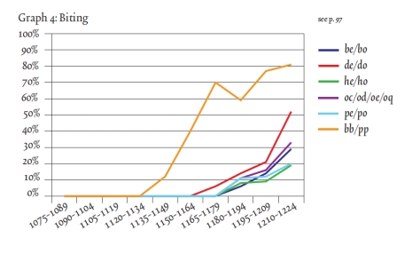
Here the two elements of this letter pair, which was written down in 1156 or 1157, are touching one another, albeit only slightly. Just twenty years earlier these same letters would still have been written fully separated. This becomes clear when we gather data from manuscripts that bear a date (like the one in Fig. 3), which they do every now and then. When this data is gathered one can deduce, with statistical support, when certain features were born or when they died. Thus data shows, for example, that the touching of de is first encountered in the period 1150-1175. The process, which I dubbed “kissing” in this free downloadable book (which also shows how the method works), continues until the two letters fully overlap. This is called “biting” by script experts (Fig. 4, magnifying glass).

BL Arundel 28
Fig. 4 – London, British Library, MS Arundel 28 (1250-1300)

In fact, the pair highlighted in Fig. 4 has moved so close together that they share the central vertical pen stroke: the right side of d is also the left side of e. The two have literally become inseparable, because separating them would leave one of them incomplete. The data – gathered from 342 dated manuscripts written between 1075 and 1225 – shows how biting emerged at different moments in different letter pairs: first in pp, then in de and do, and subsequently in some others. (Fig. 5). It shows how even a single script feature needed time to spread to all corners of the script.
Kwakkel_McKitterick_Thomson_Turning_Over_a_New_Leaf_Page_207
Fig. 5 – Kwakkel, “Biting, Kissing and the Treatment of Feet”, p. 207 – Source

Secret – not
The average medieval scribe knew a number of scripts by heart. Commercial producers of books, discussed at the outset of this post, aimed to please a diverse clientele and will therefore likely have known more fonts than any other type of scribe, including the monk (Fig. 6). The latter was very conservative: he did not often have a broad palette of scripts and he was disinclined to adapt his manner of writing on command. Still, even within single scripts monks show variation in the style of execution. Interestingly, he poured into something from his cultural-historical background in the shape of letters, revealing to the attentive beholder when precisely he wrote a book, even when he did not give this piece of information away explicitly.

British_Library_Royal_4_b_i
Fig. 6 – Scribe at work: London, British Library, MS Royal 4 B.i (Rochester, 1100-1125)

How the letters were formed may also reveal other things about the scribe, for example where he or she lived, or even that it was a hasty book project. Unveiling this hidden information in handwriting is difficult, because letter shapes do not easily give up their secrets. Still, the increasing popularity of Digital Humanities and the tendency of modern script experts to map the development of handwriting with the help of verifiable data makes it increasingly more difficult for scribes to hide their secrets.

Postscriptum – In response to some helpful remarks on Twitter, I am aware, of course, that scripts and fonts – as used in the title – are not the same thing. However, I like the comparison of the two, and used it here, because just like medieval script, a font relates both to the notion of family (Times New Roman) and its execution (e.g. a 12 point letter). More on fonts and typefaces here (via John Mulloy, @MulloyJohn).

Medieval Letter-People

The human body is one of the most common objects encountered in art, whether in paintings, sculptures or other objects. Things have not changed much since medieval times, when artists loved to fill their work with human figures – commonly saints or individuals affiliated with biblical stories. Among the great diversity of depictions, there is one type that stands out in that the body is used (or rather, abused) to express something other than itself. These particularly fascinating and often amusing depictions are found on the medieval page. We see people bent and stretched into unnatural shapes in order to change them into something for which the book was created: letters (Fig. 1).

British Library, Add. MS 8887 (15th century)
Fig. 1 – Letter G: British Library, Add. MS 8887 (15th century) – Source

Looking at these unfortunate victims of book decorators – in this case the letter G from the Macclesfield Alphabet Book – may bring a smile to your face, which was probably the aim. At the same time, it is easy to overlook the sophisticated design behind such forced yoga exercises. Moreover, when you look a bit closer at this kind of book decoration, different types of letter-people may be discerned.

1. Inconspicuous letter-people
In the least conspicuous type we simply see one or more individuals hanging about near the text, minding their own business. At least, that is what you would think at first sight. When you start reading it quickly becomes clear that these people and their paraphernalia are actually forming the first letter.

Dijon, Bibliothèque municipale, MS 170 (12th century)
Fig. 2 – Letter M: Dijon, Bibliothèque municipale, MS 170 (12th century)
Dijon_BM_15_3v
Fig. 3 – Letter H: Dijon, Bibliothèque municipale, MS 15 (12th century)

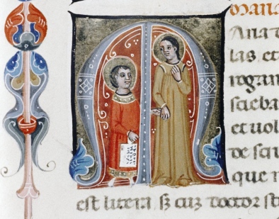
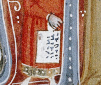
In the first of these two scenes (Fig. 2), two monks hold up a structure made out of planks. When turning to the text (Gregory’s Moralia in Iob) it becomes clear that the monks and the V-shaped structure form the capital letter M (the first line reads “Mos iustorum est”). Fig. 3 is even more subtle: it shows a monk giving a wax tablet to what looks like bishop. In fact, they also form the letter H during the exchange (the start of “Hieronimus”).

2. Bending reality
Subtle as they are, it is hard to believe depictions like these were not meant to entertain. Some letters made up by human figures appear to take the entertainment factor a step further. In the same medieval set of books as the previous decorations this giant letter Q (Fig. 4) can be found.

Dijon_BM_170_59r
Fig. 4 – Letter Q: Dijon, Bibliothèque municipale, MS 170 (12th century)

While the individuals forming the M and H (above) are in a natural pose, this Q is formed by two Cistercian monks (lay brothers, actually) in a most uncomfortable position. The team is chopping wood, with one monk placing an axe on the tree, while the other hits the axe with a hammer. While that must have been a common, real sight for the readers of this book, which was produced for a French Cistercian house, the backs of the  monks are rounded unnaturally in order to form the Q shape. The result is an uncomfortable-looking pose that provokes laughter.

The case of the two monks shows that bending reality can make it difficult to recognise a letter. A similar feeling surrounds a scene in another twelfth-century manuscript, one that shows a man wrestling with a beam (Fig. 5). It looks as if he is trying to lift it on his shoulders, but it appears to be too heavy. The image below it (Fig. 6) plays into the same theme of lifting. In both cases it takes a while before you recognise the letter that is expressed – the medieval reader probably got it much quicker.

Engelberg, Stifsbibliothek, MS 4 (12th century)
Fig. 5 – Letter A: Engelberg, Stifsbibliothek, MS 4 (12th century) – Source
Engelberg, Stifsbibliothek, MS 4 (12th century)
Fig. 6 – Letter T: Engelberg, Stifsbibliothek, MS 4 (12th century) – Source

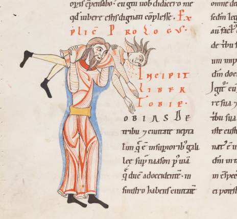
A closer look reveals an A in the top image (the start of the name “Arfaxath”). It has the same peculiar shape as the A seen to the left of the acrobat and his heavy beam. The unnatural pose reminds us of the two monks chopping wood: reality is somewhat stretched – or rather, bent. Fig. 6, from the same manuscript (a Bible), shows the letter T for “Tobias”, which is produced by two individuals wrestling. It is not hard to imagine that the lifted person is spinning around while making a lot of noise (that is at least how I interpret the red lines coming out of his face).

3. Bending reality further
Near the end of the medieval period manuscripts appeared in which the human body was stretched and bent like never before: model books (see my post Medieval Super Models). These objects presented decorators with ideas and actual models for the large initial letters at the beginning of a text. People (as well as animals) form a common subject matter in these model books. Interestingly, they exchanged real-life, natural scenes with sophisticated constructions that feature multiple people in strange collective acrobatic poses (Fig. 5).

London, British Library, Add. MS 8887 (15th century)
Fig. 5 – Letters A, B, C, D: Oxford, Bodleian Library, Ashmole 1504 (1520-30) – Source

The great thing about this kind of decoration is that they are mini stories. They are much more dynamic than the scenes in Figs. 2-4, which show a single, rather static event. The letter B in Fig. 5, for example, shows a small band of people, who have to work hard for this pose. Still, one is making music, another balances on a dragon, while the old lady is supported by an old man. Readers had a lot to talk about when they saw this letter. Is the old man her husband, who is reduced to a (quite literally) supporting player? Is the man with the green jacket fighting the dragon or merely using it as a chair?

Bergamo, Biblioteca Civica, MS Cassaf. 1.21 (14th century)
Fig. 7 – Letters q, r: Bergamo, Biblioteca Civica, MS Cassaf. 1.21 (14th century) – Source

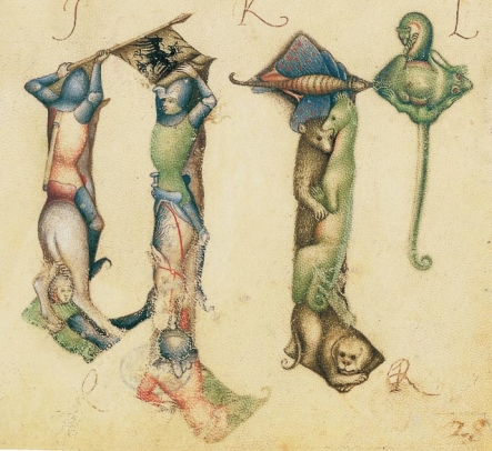
This theme of a bent reality where the lives of people are played out in unreal stories – while forming a letter – is also seen in other model books, such as the one made by Giovannino de Grassi, who worked at the Visconti court in Italy (Fig. 7). The letter q is made up by two knights on horseback, in an almost postmodern pose, while the letter r that follows shows a cute collection of animals.

With the animal theme the tradition has gone full circle. Animals forming letters are encountered as early as the ninth century (Fig. 8).

Alençon, Bibliothèque municipale, MS 12 (9th century)
Fig. 8 Letter T: Alençon, Bibliothèque municipale, MS 12 (9th century)

This scene shows a dog running away with a fish in his mouth, while forming the letter T (“Tum ego”) – and all this in a dead-serious text by the philosopher Boethius. It shows that entertainment using familiar objects, both humans and animals, is something universal, something that binds decorators from all corners of medieval Europe. It was sure to be a hit with the reader, who was given the chance to have a short “breather” from such heavy texts as Gregory’s Moralia and the complex ideas of Boethius. For a moment an unusual take on reality was allowed to take over and entertain.

Texting in Medieval Times

We all do it a few times per day: shooting a friend a text message with our phones. Doing so has become routine and we don’t really think about it: just grab your device, hold it up, and type a few words quickly and on the fly. Both the speed and short lifespan of text messages are responsible for its most peculiar features: they are written in a special language of short words and a high volume of abbreviations, and they come with the built-in understanding that there will likely be typos included. Interestingly, this hurried and cursory manner of communicating was quite common in medieval times, while its roots can be traced back to Antiquity. This post shows how people sent each other short messages before the invention of electricity and the phone: hastily, cheaply and with a modest amount of attention. “My soldiers have run out of beer, please send some!”

Antiquity

British Museum, 1986,1001.64, aka Tab. Vindol. II.291 (dated to 97-103 CE)
Fig. 1 – British Museum, 1986,1001.64, aka Tab. Vindol. II.291 (dated to 97-103 CE) – Source

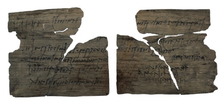
The idea for this post was sparked by an image of a wooden writing tablet that was written almost two thousand years ago (Fig. 1: I encountered it in a news letter from calligrapher Patricia Lovett). The tablet was dug up some time ago in a Roman army camp just south of Hadrian’s wall, in the north of England. Some 400 wood tablets with correspondence were found in the house of the commander, Flavius Cerealis, prefect of the Ninth Cohort. Remarkably, the tablets are only 1-3 mm thick, about the size of a modern postcard (more about the fortress here and about the correspondence here).

The one in Fig. 1 is particularly charming and personal. It invites the commander’s wife, Sulpicia Lepidina, to her sister’s birthday party. The latter writes: “On 11 September, sister, for the day of the celebration of my birthday, I give you a warm invitation to make sure that you come to us, to make the day more enjoyable for me by your arrival. […] Give my greetings to your Cerialis. My Aelius and my little son send him their greetings. I shall expect you sister. Farewell, sister my dearest soul, as I hope to prosper, and hail.” (Source) Astonishingly, with this tiny scrap of no more than 223 mm wide we have in our hands a two-millennium-old text message sent between two sisters, concerning a matter as trivial as a birthday. As scholars have remarked, this is one of the oldest surviving specimens of a woman’s handwriting, which makes the tiny scrap even more memorable.

Wooden shaft with nib excavated at Vindolanda
Fig. 2 – Wooden shaft with nib excavated at Vindolanda (late Antique) – Source

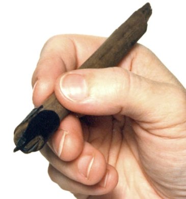
Produced with wooden pens with stuck-on nibs (Fig. 2), the 400 surviving text messages also include correspondence from the field, likely sent by courier.  The sub-commander Masculus writes to Flavius Cerealis, his superior: “Please, my lord, give instructions as to what you want us to have done tomorrow. Are we to return with the standard to the crossroads all together or [only half of us. Also,] my fellow soldiers have no beer. Please order some to be sent.” (Tab. Vindol. III 628, more here). This great (oldest-surviving?) order for beer, no doubt meant to be thrown out, survives because the earth preserved the wood on which it was written.

Middle Ages

Leiden, Bibliotheca Thysiana, Archive found in book binding (15th century)
Fig. 3 – Leiden, Bibliotheca Thysiana, Inv. Nr. 2200 H, Archive found in book binding (15th century) – Photo EK

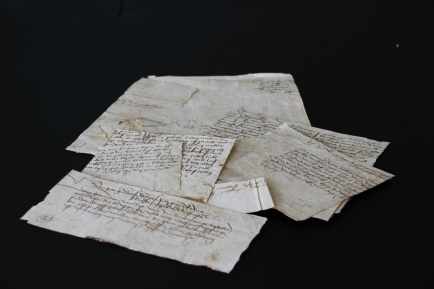
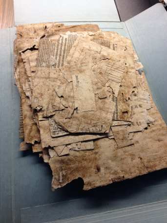
Similar short logistical messages survive from medieval times, although their manner of survival is different. Fig. 3 shows waste material discovered in a book binding by students of Leiden’s Book and Digital Media Studies MA-program, for which I teach. A total of 132 paper slips were pressed together to form a board made out of “cardboard”. Quite unusual is the origins of the material: the recycling bin of a small court near Heidelberg, belonging to an unknown duke. The material is not your usual archival material – charters, accounts and whatnot – but mostly concerns ephemeral material that is mostly lost from medieval times: “yellow sticky notes” that were sent from one servant to another, such as the one seen in Fig. 4. The scrap was written by the chamberlain (“hofmeister”) and it requests the amount of six guilders from the duke, whose servant is the recipient of the message.

Fig. 4 – Leiden, Bibliotheca Thysiana, Inv. Nr. 2200 H, Chamberlain note from 1461 (front)
Leiden, Bibliotheca Thysiana, Chamberlain note from 1461 (back)
Fig. 5 – Leiden, Bibliotheca Thysiana, Inv. Nr. 2200 H, Chamberlain note from 1461 (back) – Photo Giulio Menna

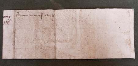
The back of the message (Fig. 5) also adds to our understanding of this hidden world of medieval text messaging. It shows to whom the note needed to be delivered (“kamermeister”) but also that it was folded into a small package for transportation (note the two folds). Another interesting note is a request to purchase some wild roses in Heidelberg, while making sure “to include some that are still in the bud.” (More about this case in this blog post.) Many of these slips were produced from recycled charters or account books. The messages were either written on their back (verso), or on a strip that was cut from their (blank) margin, as still visible in Fig. 5 (note the half words next to the word “kamermeister”). Why use a good sheet of paper if the message would be deleted immediately after use?

Time Capsule
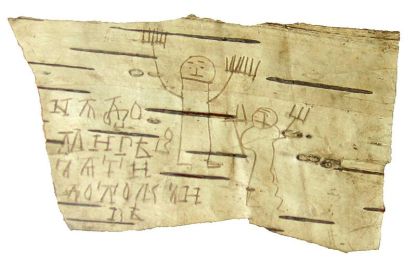
Both the Vindolanda tablets and the medieval scraps that emerged from an early-modern binding form a time capsule with everyday conversations that do not normally survive from the past. We meet every-day people doing every-day things. Their manner of expressing themselves is untainted in that they do not try to be literary or witty, but merely convey a short message. They are part of a type of writing that was produced for short-term use and, ultimately, destruction. In that sense the messages from Antiquity and medieval times are not unlike the class notes I blogged about in the past, scribbled down by students and young children (Fig. 6) – more about notes and the bark sample in this post.

Birch bark strip used by the student Onfim, dated 1240-1260
Fig. 6 – Birch bark strip used by the student Onfim, dated 1240-1260 – Source, blogmore

The parallel with the birch bark notepad is striking for another reason as well: it confirms that individuals in the past selected cheap materials for items that were meant for short use only. In that sense it makes perfect sense that the “text messages” discussed above were written on things that were just lying around: thin pieces of wood and slips of waste in a recycling bin.

While the caches from Vindolanda and Leiden are remarkable, there are actually plenty of time capsules still out there. The average archive in Europe will contain several boxes filled with medieval waste material, which usually include a wide range of recycled “transitory” material, such as letters and notes (Fig. 7).

Maastricht, Archives, Box 384 (medieval waste)
Fig. 7 – Maastricht, Archives, Box 384 (medieval waste) – Photo EK

If the paper and parchment slips are the medieval equivalent of our modern text messages, written in a cursory fashion and forgotten about almost immediately after receipt, these archival boxes are like the memory chips of our phones. They allow us to read conversations deleted hundreds of years ago, connecting us to real medieval individuals doing real medieval things.

Postscriptum: as pointed out by Sarah Bond (@SarahEBond), similar to the genre discussed in this post is the ostrakon tradition from Antiquity, whereby short texts (quotes, notes and drafts) were written on pieces of broken pottery. Sarah forwarded this specimen with a quote from Homer; other examples are found in this Tumblr post I wrote some time ago.

Book on a Stick

Both medieval manuscripts and their modern counterparts are designed to accommodate human readers. Our two hands can keep an open book under control with ease by applying gentle pressure on the outer margins of the pages. Release the pressure with your right hand and a page lifts up in the air, just enough to conveniently flip it. With a rustling sound it travels from right to left, moved along by an impatient reader that is left in suspense for a second or two. The proportions of the page, too, are designed to accommodate consumption by human beings. Our eyes can handle only a small number of consecutively placed words, no more than eight or so, depending on the size of the letter. As a consequence, medieval page design shifted to presenting a text in two columns rather than one, a transition that occurred over the course of the twelfth century.

This relationship between book design and human anatomy is seen most vividly in a particularly peculiar bookish object that thrived in the sixteenth, seventeenth and eighteenth centuries: the hornbook (Fig. 1).

Washington, Folger Shakespeare Library, STC 13813.6 (dated 1625)
Fig. 1 – Washington, Folger Shakespeare Library, STC 13813.6 (dated 1625) – Source

This charming device is a primer: a text used by children as they were learning to read. It contains the alphabet (naturally), but also a small collection of short texts, such as the Lord’s Prayer and Hail Mary (more here and here). Its design reflects perfectly how the material format of books was customised for use by human beings: its user could easily grab a hornbook with one hand and hold it up at eye height. With his other hand the user could then duplicate the letters before his eyes. Two important things stand out when one observes the tradition: the variety of materials used to produce hornbooks – which were made of such materials as wood, lead and gingerbread – and its time of invention, which predate the proposed origins in current scholarly literature.

Materials
The heart of the hornbook is text, albeit a very small amount of it. In fact, it may well be the shortest read to survive from the early-modern period. Most hornbooks from that time are made out of wood. The pupil’s “required readings” were printed on a sheet of paper that was subsequently covered by a thin piece of horn for protection – hence the object’s name. The result is a remarkably sturdy object, which you can drop without damaging it, a minimum requirement for something used by young kids.

Washington, Library of Congress, 102.3 (18th century)
Fig. 2 – Washington, Library of Congress, 102.3 (18th century) – Source

Several surviving hornbooks show that the device was also used to teach kids to add and subtract. The one seen in Fig. 2, which dates from the eighteenth century, has a nifty add-on: an abacus. This particular specimen shows the end of the hornbook’s development, which appears to have become more sophisticated over time. The one in Fig. 2 contains another novel feature: the sheet of paper can be removed from behind the horn and replaced by another text, which may perhaps even be found on the reverse (here is another example). This late model is rather like an iPad with several apps loaded, one of which can even be updated when needed!

Other hornbooks were made out of even sturdier materials, such as ivory and lead (Fig. 3). The last one must have been particularly cheap and easy to produce, probably with the help of a mould. This specimen shows that the hornbook was subject to mass production, like its cousin, the printed book.

Timeline Acutions, Lot_903 (17th century)
Fig. 3 Timeline Acutions, Lot 903 (17th century) – Source

Quite different is the hornbook seen in Fig. 4. This wooden slab could be used to produce a gingerbread hornbook, handle and all. The tradition of this particularly tasty type of hornbook goes back to the seventeenth century. The English poet Matthew Prior (d. 1721) mentions it in one of his poems: “To Master John the English maid / A horn book gives of ginger-bread / And that the Child may learn the better / As he can name, he eats the letter / Proceeding thus with vast delight / He spells, and gnaws from left to right” (source). Although a peculiar book, the gingerbread version of the hornbook probably wins the prize for best didactical tool: what better reward than to eat the letter you were just able to read out loud?

Columbia University Library, RBML, Plimpton Hornbook 6 (England, 18th century?)
Fig. 4 – Columbia University Library, RBML, Plimpton Hornbook 6 (England, 18th century?) – Source

Medieval origins
While the heyday of the hornbook was no doubt the early-modern period, the scholarly literature will also tell you that this bookish device was in used in the fifteenth century, during the late medieval period. In fact, publications on the topic stress that there are also handwritten – medieval – versions of the device. Peculiarly, I wasn’t able to find one, except for this early-sixteenth-century specimen. Even illustrations showing hornbooks “in the wild” date from the seventeenth century at best, such as the pair hanging from the chapman’s basket in an engraving from 1646 (Fig. 5).

Annibale Carracci, 'Tavolette, e Libri per li putti’ (1646)
Fig. 5 – Annibale Carracci, ‘Tavolette, e Libri per li putti’ (1646) – Source and more

So is the hornbook a post-medieval invention? I was about to draw this conclusion, given the lack of evidence predating the early-modern period, when I coincidentally encountered the following illustration in a 14th-century Italian manuscript with an unidentified devotional text about Mary, the mother of Christ (Fig. 6-7).

Oxford, Bodleian Library, Canon. Misc. 476 (14th century).
Fig. 6 – Oxford, Bodleian Library, Canon. Misc. 476 (14th century) – Source
Detail of Fig. 0.
Fig. 7 – Detail of Fig. 6.

The image shows Christ being brought to school by his mother. He is bringing his “textbook” to class: a hornbook, which dangles from his wrist by a string, just like many of the later specimens did (see the hole in the handle in Fig. 1). Quite intriguingly, we are shown a real medieval snapshot of how children carried their hornbook to and at school. More importantly, it shows that the hornbook was indeed a medieval invention. Some further digging revealed additional visual evidence of hornbooks being used in before the age of print (Fig. 8).

Columbia University, Plimpton MS 184 (15th century)
Fig. 8 – Columbia University, Plimpton MS 184 (15th century) – Source

The manuscript, which was produced in Germany in 1440-1460, shows a teacher holding up a hornbook, using it to show Arabic numerals to a pupil in front of him. The German text bubble next to the scene is very positive about this teaching moment: “With calculus and numbers, I can be a star in arithmetic!” While it was produced somewhat later than the Italian example in Fig. 6, the setting in which the hornbook was used is the same: a context where basic information about letters and digits is conveyed to young pupils. While no actual hornbooks appear to survive from the medieval period, these visual representations show that educating young children was also the driving force behind the production of hornbooks in the age before print.

Drawing with Words

The pages of medieval books are generally filled with two things: words and decoration – and a lot of nothingness, the margins. The divide between the two is evident and clear. Words make up the text and are executed with pen and ink, while illustrations, produced with brush and paint, decorate the text. There are manuscripts, however, in which this self-evident truth is turned upside-down: sometimes decoration is created by words, which were meant to be read. This intriguing scenario blurs the divide between text and illustration: it challenges how we define both.

Decoration forming words

British Library, Arundel 155 (10th century)
Fig. 1 – British Library, Arundel 155 (11th century) – Source

Decorative elements forming readable text  are fairly common in medieval times. High-quality manuscripts often open with words – or even a full sentence – that are painted with a brush rather than copied with a pen. The artist who produced the eleventh-century page in Fig. 1, for example, used his brush to paint the entire first line of Psalm 1: “Beatus vir qui non abiit in consilio impirum” (Blessed is the man who has not followed the advice of the impious). Particularly impressive is the first letter, the B, which is decorated lavishly with gold.

Even more elaborate are some of the pages of the Lindisfarne Gospels, which is perhaps the most impressive manuscript that survives from the early Middle Ages (it was made at Lindisfarne at the coast of Northumberland around 700). The page in Fig. 2 shows the incipit (the opening line) of the Gospel of Matthew. While there is a lot to read on this page, the words are actually executed with brush and paint, apart from a few lines at the top. This decorative page – and the others in the book – are commonly discussed in an art-historical context (they are prime examples of Hiberno-Saxon art) and not as expressions of writing (more about Lindisfarne Gospels in relation to this issue in this article).

London, British Library, Cotton Nero D.IV (c. 700)
Fig. 2 – London, British Library, Cotton Nero D.IV (c. 700) – Source

These magnificent pages blur the boundary between text and image: they present something to read, but nothing has actually been written down – at least not in the traditional sense of the word, with a pen. Curiously, the words on these pages form the start of a text and were meant to be read, not just looked at. In other words, the intriguing hybridity of these pages forced the user to read a painting.

Words forming decoration
Much more unusual is a different mix of text and image: instances where a meaningful scene is made out of words. Delightful examples from manuscript production in the West are Figs. 3 and 4, taken from a ninth-century copy of Cicero’s Aratea, a work of astronomy. The text shows animals that represent constellations (the firm red dots are stars). Curiously, these animal illustrations consist, for the most part, of words written out with a pen.

British Library, Harley 647, fols. 9r (9th century)
Fig. 3 – British Library, Harley 647, fols. 9r (9th century) – Source
British Library, Harley 647, fols. 9r (9th century)
Fig. 4 – British Library, Harley 647, fols. 9r (9th century) – Source

The text in the hare and the swan is not actually the Aratea itself, which is found lower on the page, out of sight in the images above. The animals are actually formed by an explanatory text by Hyginus, called the Astronomica. Segments of this text are used for graphic representations of constellations: Orion (the hunter) is shown as a hare, the hunter’s favourite prey, while the lovely blue bird is the constellation Cygnus (swan). Word and image are engaged in a peculiar symbiotic relationship wherein one would become meaningless without the other.
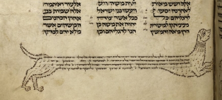
A similar tradition is witnesses in Hebrew Torah culture of the tenth century. It introduced a phenomenon called “micrography“, the art of decorating the page with meaningful text written in tiny letters. By the thirteenth century Hebrew manuscripts contained elaborate depictions of individuals, animals and objects (Fig. 5). Hebrew religious leaders protested against this practice of drawing with words, as they figured it distracted from taking in their meaning.

British Library, Add. 21160-31 (13th century)
Fig. 5 – British Library, Add. 21160-31 (13th century) – Source
British Library, Add. 21160 (13th century)
Fig. 6 – British Library, Add. 21160 (13th century) – Source

The last word: music
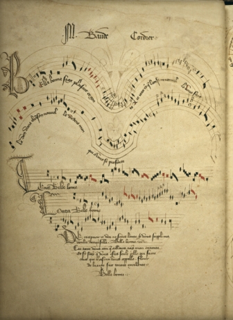
The notion of drawing an image with words was taken a step further in the later Middle Ages. In the thirteenth century, for example, we encounter marginal glosses in the shape of objects and people. A particularly elaborate late-medieval example is a variation on this theme: it presents a drawing in the shape of a heart, except the heart is made out both words and musical notes (Fig. 7).

Chantilly, Musée Condé 564 (14th century)
Fig. 7 – Chantilly, Musée Condé 564 (14th century)

It concerns the so-called “Chantilly Codex”, which contains over a hundred polyphonic songs by French composers. The one seen here is by Baude Cordier and is called “Belle, Bonne, Sage” (listen to it here). As the Renaissance was nearing, word play became a favoured occupation of poets, including in a visual sense. Cordier borrowed the word “Cor” (coeur, heart) from his name and used it for the visual presentation of this song. Cutting-edge design? Hardly. Little did Cordier know that the practice of drawing and writing at the same time was old-school.

Medieval Super Models

This post is devoted to a particularly attractive and rare kind of medieval manuscript: the model book. A feast to the eye, the object is filled with drawings and paintings that were meant to show scribes and illuminators how to decorate letters, paint initials, or add large segments of decoration to the page. Within this tradition, two types of model books can be distinguished. Some functioned as instruction manuals. In such books, the drawings might be accompanied by a narrative or explanation that instructs the artisan how to proceed, usually in a step-by-step process. Other model books appear to have merely functioned  as  a source of inspiration: they present a wide array of shapes and drawings from which the artisan could take his pick.

The level of sophistication among surviving model books varies considerably. On the lower end of the spectrum there are pattern books that merely show how to make enlarged letters with some minor flourishing. On the higher end, by contrast, there are copies with high-quality stand-alone designs and sophisticated historiated initials inhabited by figures and scenes. Evidently the requirements of the artisans varied; and by proxy, so did the taste of medieval readers. It is this variation that makes model books so fascinating, both as physical objects and as cultural artifacts. This blog illuminates the breadth of the genre – and shows off the attractiveness of these medieval super models.

Plainly decorated letters

Yale, Beinecke Library, MS 439, fols. 30v-31r (1510-1517)
Fig. 1 – Yale, Beinecke Library, MS 439, fols. 30v-31r (1510-1517)

To start at the lower end of the spectrum, some model books merely showed scribes how to execute a certain script or how to draw plain enlarged capitals – the most basic kind of decoration. The book opening seen in Fig. 1 is from Gregorius Bock’s Scribal Pattern Book, which provides instruction on both fronts (more about the manuscript here). Produced in 1510-1517, the first part of the small parchment book contains a series of alphabets in different scripts, some of which are clearly influenced by print typefaces. The second part contains decorative initials arranged in alphabetical order. In the introduction to his manual, Gregorius adds a dedication to his cousin Heinrich Lercher Wyss of Stuttgart, who was scribe to the Duke of Württemberg. The arrangement of the material shows how Heinrich likely used the book: he would thumb through its pages until he had reached either an alphabet or capital letter to his liking (more about the context here).

Cambridge, Fitzwilliam Museum, MS 83-1972 (c. 1175)
Fig. 2 – Cambridge, Fitzwilliam Museum, MS 83-1972 (c. 1150-1175)

While Brock’s letters are a pleasure to look at, especially for the book historian, it was not exactly rocket science. More complex – but still relatively plain – are the models provided by a much older pattern book in the Fitzwilliam Museum in Cambridge (Fig. 2; more here). This appears to be the oldest surviving pattern book for initials: it dates from c. 1150 and was produced and used in a Tuscan workshop. The choice is much more limited than in the previous example: the Cambridge copy does not provide multiple alphabets, nor does it present a wide range of initials (in fact, only about twenty are present). Interestingly, some manuscripts survive in which we encounter decorated letters that could well be modelled from this or a similar model book (like British Library, Harley MS 7183).

Elaborately decorated letters

London, British Library, Add. MS 8887 (15th century)
Fig. 3 – Oxford, Bodleian Library, Ashmole 1504 (1520-30) – Source

On the more upscale end of things is the model book known as the Macclesfield Alphabet Book. It was made and used in fifteenth-century England, apparently for the transmission of ideas to decorators or their assistants (full digital copy here, information podcast here). The artisans were offered quite a lot of choice, given that we encounter no less than fourteen different alphabets on its pages. What makes this book so special, however, is their quality and the manner in which the letters are designed: their shapes are produced by human figures. As in other modelbooks that include letters made out of people (Fig. 3), the figures are shown in most uncomfortable positions, as if doing yoga exercises.

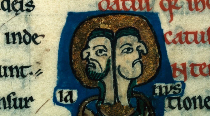
A similar subject matter is encountered in the alphabet book of the Italian artist Giovannino de Grassi (Fig. 4 and image at the very top). This book was created at the Visconti court and features both initial letters and stand-alone drawings. The Visconti’s were known as important patrons of the arts and so it makes sense that we see their generosity extend into the world of book production. Giovannino was known for depicting exotic animals in their natural habitat and this book features such images as well. His pages provided models for other artists who wished to replicate his realistic depictions.

Bergamo, Biblioteca Civica, MS Cassaf. 1.21 (14th century)
Fig. 4 – Bergamo, Biblioteca Civica, MS Cassaf. 1.21 (14th century) – source

Marginal decoration
Even more sophisticated are model books that show how to create elaborate decoration that runs in the margin along the length of the page. These border decorations, with their curly leaves and unexpected turns, could be tricky to produce. The so-called Göttingen Model Book, made around 1450 (Fig. 5, left), provides a solution to this problem. Its pages not only show, step by step, how to build a 3D leaf pattern, they also present detailed instructions like the following:

The foliage one shall first draw with a lead or a point. Then one shall outline the foliage with a pen and with very thin ink or with thin black color. Then one shall polish the foliage with a tooth, so that the color can be applied smoothly, but not too firmly. Then one shall paint it with the colors, one side right and the other side left or reversed, with a brush, namely light red and green. […] (Source of transcription)

Göttingen, Universitätsbibliothek, Uffenb. MS 51 (left) and Gutenberg Bible (right)
Fig. 5 – Göttingen, Universitätsbibliothek, Uffenb. MS 51 (left) and the same decoration executed in an actual book, a  Gutenberg Bible (right)

The drawings and narrative clearly complement one another. From time to time the instructions mention something like “as it is shown here” or “as the image shows”. A model book can hardly be clearer than this: while the alphabet books shown above were more or less meant to simply inspire the artist, the Göttingen book really takes the artist by the hand and guides him through each step of the production process. The instructions apparently worked well, as is shown by a surviving Gutenburg Bible that contains these very leafy borders (see Fig. 5, right, and more here).

The final point
Models are crucial in any learning process. Observing how something is done helps you acquire a skill you lack as much as it encourages you to develop further those you already have. Moreover, there is an additional use to these pattern books that has not yet been mentioned: the beautiful letters and shapes could also be browsed by readers looking for a good image for their newly acquired book. Patrons visiting artisans’ shops could well have been given these objects to find out what the book-maker was capable of providing. Given its many uses, it is hardly surprising that the tradition shown in this blog is also encountered in other cultures, including Byzantine and Arabic book production.

One particularly unusual Arabic specimen deserves to make the final point of this post. The fragment shown in Fig. 6 presented Arabic decorators with models of scenes from the New Testament (more here). It figures that the artisans, used to decorating the Quran, needed a little inspiration when it came to the Bible. This specimen is also interesting because it presents a type of instruction not seen in Western copies, as far as I know: some of the figures have been outlined by tiny holes, meaning that the sheet could be used as “tracing paper” (click the image to see this closer). While this ultimate instruction method took all potential flaws and creativity out of the modelling process, it allowed decorators with lesser talents to produce something beautiful.

Yale, Beinecke Library, MS 553 (1400-1700)
Fig. 6 – Yale, Beinecke Library, MS 553 (1400-1700)


Post-scriptum 16 September, 2014 –  I wish to thank Giovanni Scorcioni (@FacsimileFinder) for providing the Hi-Res image in Fig. 4.

Post-scriptum 19 September, 2014 – Mari-Liisa Varila (@mlvarila) alerted me to a 17th-century equivalent to the Arabic “tracing paper” specimen (here you’ll find more information). More about this technique, which is called pouncing, here.