Tag Archives: Typography

Medieval Letter-People

The human body is one of the most common objects encountered in art, whether in paintings, sculptures or other objects. Things have not changed much since medieval times, when artists loved to fill their work with human figures – commonly saints or individuals affiliated with biblical stories. Among the great diversity of depictions, there is one type that stands out in that the body is used (or rather, abused) to express something other than itself. These particularly fascinating and often amusing depictions are found on the medieval page. We see people bent and stretched into unnatural shapes in order to change them into something for which the book was created: letters (Fig. 1).

British Library, Add. MS 8887 (15th century)
Fig. 1 – Letter G: British Library, Add. MS 8887 (15th century) – Source

Looking at these unfortunate victims of book decorators – in this case the letter G from the Macclesfield Alphabet Book – may bring a smile to your face, which was probably the aim. At the same time, it is easy to overlook the sophisticated design behind such forced yoga exercises. Moreover, when you look a bit closer at this kind of book decoration, different types of letter-people may be discerned.

1. Inconspicuous letter-people
In the least conspicuous type we simply see one or more individuals hanging about near the text, minding their own business. At least, that is what you would think at first sight. When you start reading it quickly becomes clear that these people and their paraphernalia are actually forming the first letter.

Dijon, Bibliothèque municipale, MS 170 (12th century)
Fig. 2 – Letter M: Dijon, Bibliothèque municipale, MS 170 (12th century)
Dijon_BM_15_3v
Fig. 3 – Letter H: Dijon, Bibliothèque municipale, MS 15 (12th century)

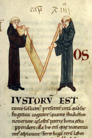
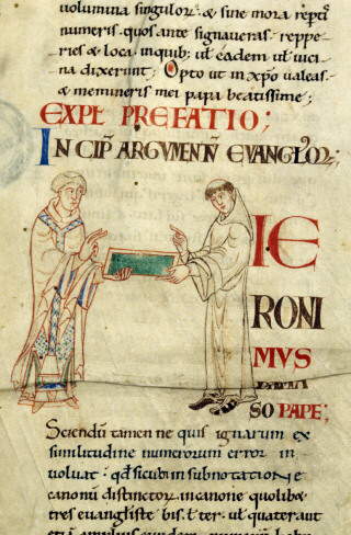
In the first of these two scenes (Fig. 2), two monks hold up a structure made out of planks. When turning to the text (Gregory’s Moralia in Iob) it becomes clear that the monks and the V-shaped structure form the capital letter M (the first line reads “Mos iustorum est”). Fig. 3 is even more subtle: it shows a monk giving a wax tablet to what looks like bishop. In fact, they also form the letter H during the exchange (the start of “Hieronimus”).

2. Bending reality
Subtle as they are, it is hard to believe depictions like these were not meant to entertain. Some letters made up by human figures appear to take the entertainment factor a step further. In the same medieval set of books as the previous decorations this giant letter Q (Fig. 4) can be found.

Dijon_BM_170_59r
Fig. 4 – Letter Q: Dijon, Bibliothèque municipale, MS 170 (12th century)

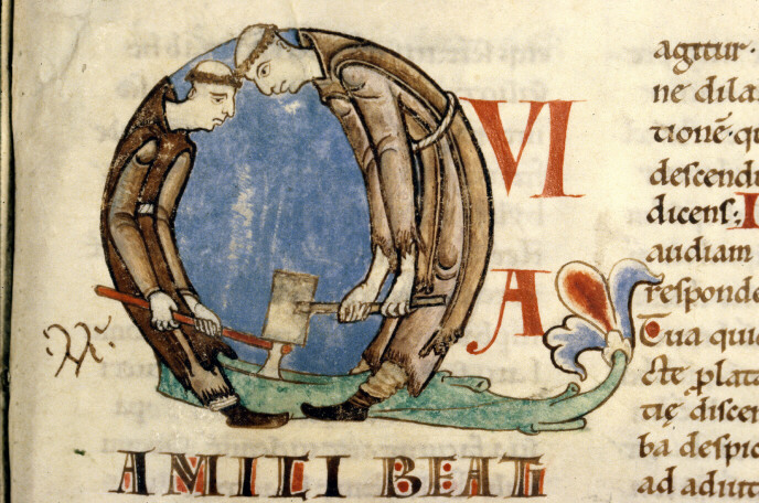
While the individuals forming the M and H (above) are in a natural pose, this Q is formed by two Cistercian monks (lay brothers, actually) in a most uncomfortable position. The team is chopping wood, with one monk placing an axe on the tree, while the other hits the axe with a hammer. While that must have been a common, real sight for the readers of this book, which was produced for a French Cistercian house, the backs of the  monks are rounded unnaturally in order to form the Q shape. The result is an uncomfortable-looking pose that provokes laughter.

The case of the two monks shows that bending reality can make it difficult to recognise a letter. A similar feeling surrounds a scene in another twelfth-century manuscript, one that shows a man wrestling with a beam (Fig. 5). It looks as if he is trying to lift it on his shoulders, but it appears to be too heavy. The image below it (Fig. 6) plays into the same theme of lifting. In both cases it takes a while before you recognise the letter that is expressed – the medieval reader probably got it much quicker.

Engelberg, Stifsbibliothek, MS 4 (12th century)
Fig. 5 – Letter A: Engelberg, Stifsbibliothek, MS 4 (12th century) – Source
Engelberg, Stifsbibliothek, MS 4 (12th century)
Fig. 6 – Letter T: Engelberg, Stifsbibliothek, MS 4 (12th century) – Source

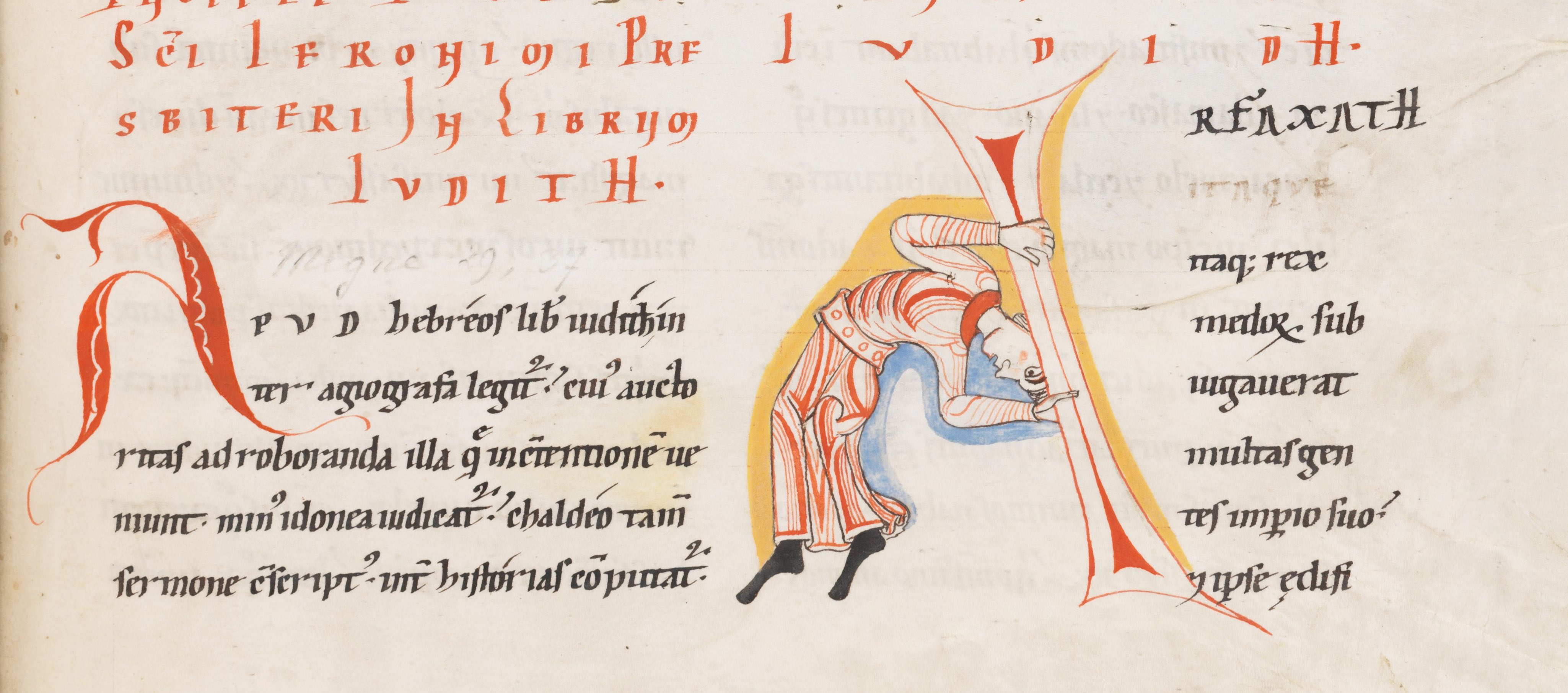
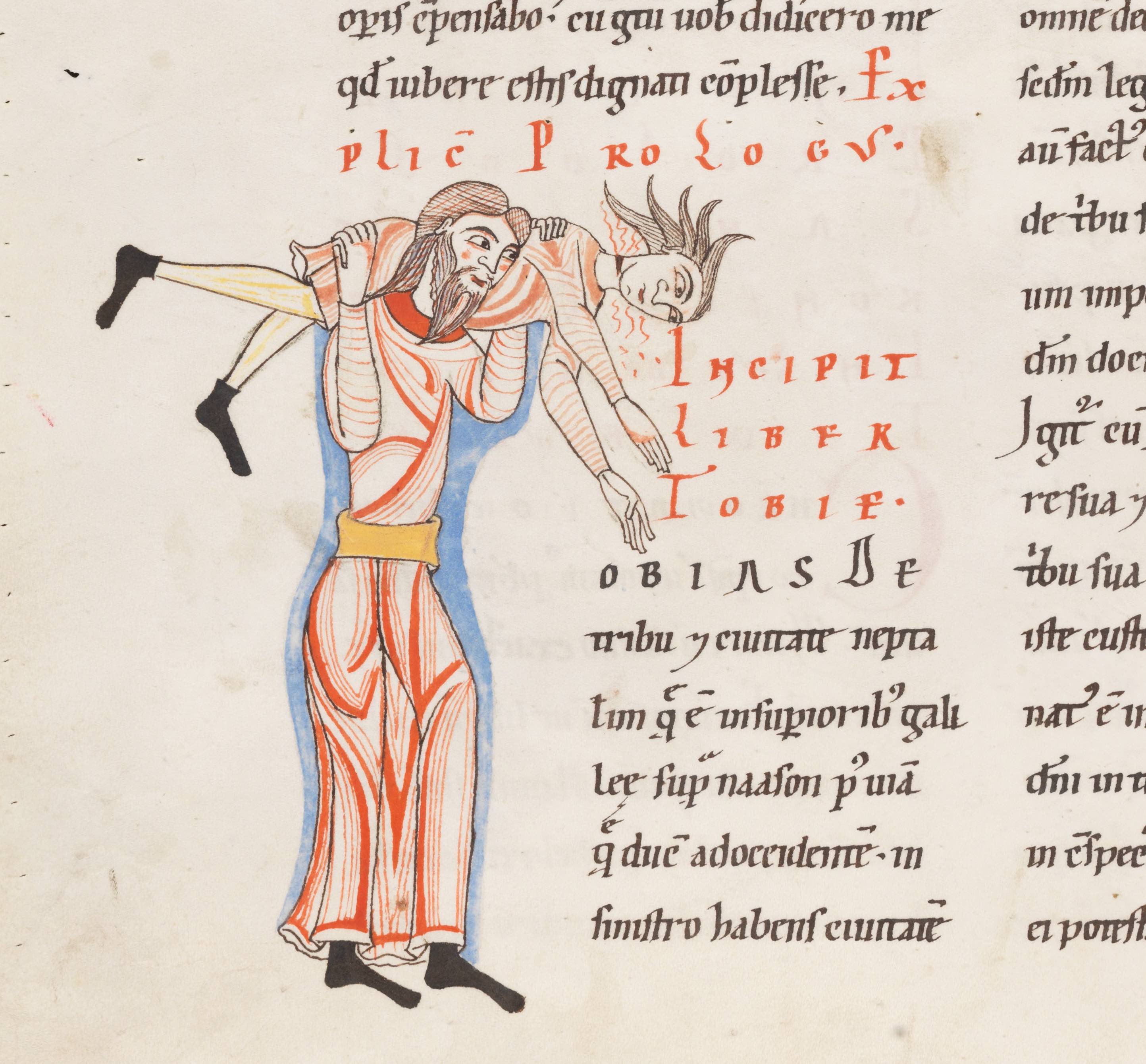
A closer look reveals an A in the top image (the start of the name “Arfaxath”). It has the same peculiar shape as the A seen to the left of the acrobat and his heavy beam. The unnatural pose reminds us of the two monks chopping wood: reality is somewhat stretched – or rather, bent. Fig. 6, from the same manuscript (a Bible), shows the letter T for “Tobias”, which is produced by two individuals wrestling. It is not hard to imagine that the lifted person is spinning around while making a lot of noise (that is at least how I interpret the red lines coming out of his face).

3. Bending reality further
Near the end of the medieval period manuscripts appeared in which the human body was stretched and bent like never before: model books (see my post Medieval Super Models). These objects presented decorators with ideas and actual models for the large initial letters at the beginning of a text. People (as well as animals) form a common subject matter in these model books. Interestingly, they exchanged real-life, natural scenes with sophisticated constructions that feature multiple people in strange collective acrobatic poses (Fig. 5).

London, British Library, Add. MS 8887 (15th century)
Fig. 5 – Letters A, B, C, D: Oxford, Bodleian Library, Ashmole 1504 (1520-30) – Source

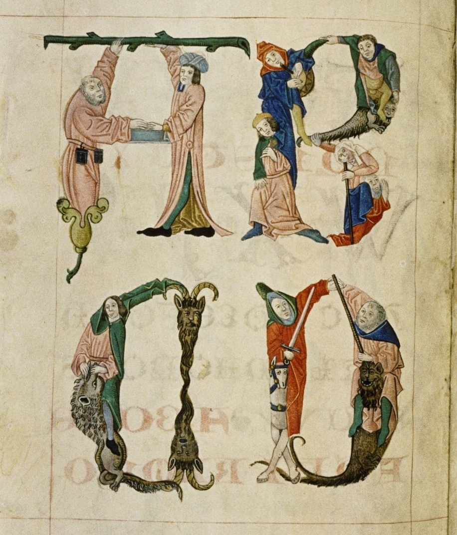
The great thing about this kind of decoration is that they are mini stories. They are much more dynamic than the scenes in Figs. 2-4, which show a single, rather static event. The letter B in Fig. 5, for example, shows a small band of people, who have to work hard for this pose. Still, one is making music, another balances on a dragon, while the old lady is supported by an old man. Readers had a lot to talk about when they saw this letter. Is the old man her husband, who is reduced to a (quite literally) supporting player? Is the man with the green jacket fighting the dragon or merely using it as a chair?

Bergamo, Biblioteca Civica, MS Cassaf. 1.21 (14th century)
Fig. 7 – Letters q, r: Bergamo, Biblioteca Civica, MS Cassaf. 1.21 (14th century) – Source

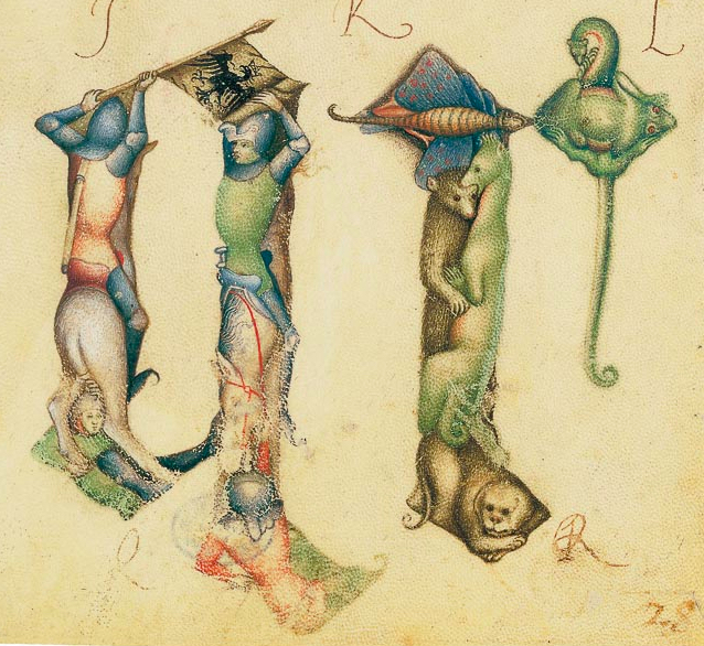
This theme of a bent reality where the lives of people are played out in unreal stories – while forming a letter – is also seen in other model books, such as the one made by Giovannino de Grassi, who worked at the Visconti court in Italy (Fig. 7). The letter q is made up by two knights on horseback, in an almost postmodern pose, while the letter r that follows shows a cute collection of animals.

With the animal theme the tradition has gone full circle. Animals forming letters are encountered as early as the ninth century (Fig. 8).

Alençon, Bibliothèque municipale, MS 12 (9th century)
Fig. 8 Letter T: Alençon, Bibliothèque municipale, MS 12 (9th century)

This scene shows a dog running away with a fish in his mouth, while forming the letter T (“Tum ego”) – and all this in a dead-serious text by the philosopher Boethius. It shows that entertainment using familiar objects, both humans and animals, is something universal, something that binds decorators from all corners of medieval Europe. It was sure to be a hit with the reader, who was given the chance to have a short “breather” from such heavy texts as Gregory’s Moralia and the complex ideas of Boethius. For a moment an unusual take on reality was allowed to take over and entertain.

Half Full, Half Empty: The Peculiar Medieval Page

Margins are both a universal and remarkable feature of books. From the very earliest specimens produced two millennia ago, to the e-readers we use today, books contain pages that hold both text and a significant amount of blank space. What a strange pair they are: words, the primary reason for the book’s existence; and a vast emptiness present on all sides of the text. A particularly remarkable aspect of marginal space is that there is so much of it in medieval books. My own work on the twelfth century, reflecting broader medieval patterns, shows that pages from that period consist of approximately 50% margin, although in some cases it can be significantly more. This implies, astonishingly, that the majority of medieval books are half empty, despite the fact that parchment was expensive and sometimes even hard to come by. Why is this?

Tradition

London, British Library, Add. MS 43725 (4th century)
Fig. 1 – London, British Library, Add. MS 43725 (4th century) – Source

One answer to this question is a simple one: because this is how books were traditionally made. Medieval scribes took over a great deal of material features first introduced by their counterparts in Antiquity. The book as we know it – i.e. an object produced from quires (bundles of folded sheets) – came into existence in the fourth century, as discussed in my post What is the Oldest Book in the World?  The pages of the famous Codex Sinaiticus, a Greek New Testament copied around the middle of the fourth century, measures 381 x 345 mm (height x width), while the text itself only takes up 250×310 mm (height x width). A simple calculation reveals that the text takes up 58% of the page, while 42% is reserved for the outer margins. In other words, a little under half of this magnificent book is empty.

Michigan, Ann Arbor, P.Mich.Inv.6238 (made 150-250)
Fig. 2 – Michigan, Ann Arbor, P.Mich.Inv.6238 (made 150-250) –  Source

Going back even further, papyrus manuscripts from Antiquity also included a considerable amount of marginal space. This is seen, for example, in Fig. 2, which shows the remains of a copy of Paul’s Epistles written between 150 and 250 CE. While the margins have been reduced post-production through damage (the edges of the papyrus eroded), the upper margin, which is largely intact, shows how the scribe reserved ample marginal space. The extensive medieval margin is, in one way, simply a continuation of an older practice.

Toolbox
The early papyrus book in Fig. 2 highlights that it was also convenient to have an empty space around the text. It meant that you could fill them with tools that may be helpful when consulting the book. A particularly important reading aid is visible at the top of the papyrus page: the capital version of the Greek letter Mu (looking like an M), which represents the Greek number 40 (Fig. 3). In other words, this is a very early page number (folium number), an instrument that is apparently some two thousand years old and predates the printed book by over a millennium.

Detail of Fig. 1
Fig. 3 – Detail of Fig. 2

There are many other kinds of aids encountered in the margins of medieval books, including cross references to other books or locations in the same manuscript, quotation marks, labels that indicate who the quoted author is, and chapter numbers. A particularly prominent aid is the running title placed in the upper margin. The one in Fig. 4 states “Physicorum”, indicating this is Aristotle’s Physics. This particular manuscript contains several Aristotle texts, which were popular in the university classroom. The student or teacher who was browsing through the book for certain information was greatly helped by these sign posts.

London, British Library, Harley MS 3487 (13th century)
Fig. 4 – London, British Library, Harley MS 3487 (13th century) – Source

Notes
While the margin did a good job accommodating the relatively short reading aids, it could be challenging to add large amounts of text to the void surrounding the main text. Fig. 5 shows a schoolbook from c. 1100 that was donated to Egmond Abbey near Amsterdam by one Baldwinus, a teacher in Flanders. The text in the book, Lucan’s Pharsalia, was used in the medieval classroom, and it is therefore no surprise that numerous explanatory notes have been added to the text, probably by Baldwinus himself.

Leiden, University Library, BUR Q 1 (c. 1100)
Fig. 4 – Leiden, University Library, BUR Q 1 (c. 1100) – Photo EK

There is something special about these marginal notes: they are preceded by symbols that are the precursor of our modern footnote (more about this early practice in this post). The symbol links a remark in the margin to a specific location in the main text. The symbol seen in Fig. 5 resembles the number 7 and is perhaps the Tironian note for “et”.

Detail of Fig. 3
Fig. 5 – Detail of Fig. 4

Despite these add-ons, the schoolbook from c. 1100 is not really prepared to hold extensive notes. Baldwinus could have crammed more text in the margins, had he copied in a smaller script or increased the number of lines for the marginal text passages (presently, their number corresponds to the main text). However, this was not yet common practice in his day and age. In the scholastic age, by contrast, when university students needed to add a lot of extra information in the margin, these two tricks were applied, as seen in Fig. 3 – note the tiny script of the marginal notes, as well as the increased number of lines compared to the main text.

Convention
The examples in this post have shown different ways in which the margin, that handy device inherited from Antiquity, was put to good use by scribes and readers. However, it has not discussed why medieval margins were so large. Why keep as much as half of the page blank? Surely a quarter would be sufficient to add notes or tools?  While there are manuscripts that exhibit pages with tiny or no margins, there are not many. Leiden University library owns one of these exceptions: an early-eleventh-century schoolbook made from scrap parchment, the pages of which were filled to the brim (Fig. 6).

Leiden, University Library, VLO 92 (1000-1025)
Fig. 6 – Leiden, University Library, VLO 92 (1000-1025)

Interestingly, the teacher who copied this book diverted from the medieval convention related to page design in that he opted not to add substantial blank spaces. His use of scrap parchment (offcuts that were left over after the regular sheets were cut from the animal skin) indicates this was a low-cost book project. In other words, making maximum use of the available space on the page is likely motivated by cost considerations: it ultimately limited the number sheets necessary to copy this collection of (classical) texts.

While the choice for large margins may have a basis in a shared idea of perfect proportions, something modern book designers would call the “golden ratio” (see herehere and here), the notion of convention is probably the ultimate drive. There are plenty of conventions in medieval book production that don’t have an obvious explanation. The relative dimensions of the page is one of them: the width of medieval books tends to be about 70% of its height (see my Books on a Diet post for some curious exceptions), but why is this so? And why do quires predominantly consist of four folded sheets? Why are page numbers placed in the upper rather than lower margin? The bottom line is that large margins may simply have been something that medieval readers had come to expect from the object in front of them.

Postscriptum – This post was written in celebration of a conference devoted to the medieval margin, which I attended in June 2015 (details and abstracts here). More on the unusual Leiden scrap manuscript in the essay I wrote for this volume. Also make sure to check out this blog by the Marginal Scholarship project. I owe the title of this post to Julie Somers.