

This post is devoted to a particularly attractive and rare kind of medieval manuscript: the model book. A feast to the eye, the object is filled with drawings and paintings that were meant to show scribes and illuminators how to decorate letters, paint initials, or add large segments of decoration to the page. Within this tradition, two types of model books can be distinguished. Some functioned as instruction manuals. In such books, the drawings might be accompanied by a narrative or explanation that instructs the artisan how to proceed, usually in a step-by-step process. Other model books appear to have merely functioned as a source of inspiration: they present a wide array of shapes and drawings from which the artisan could take his pick.
The level of sophistication among surviving model books varies considerably. On the lower end of the spectrum there are pattern books that merely show how to make enlarged letters with some minor flourishing. On the higher end, by contrast, there are copies with high-quality stand-alone designs and sophisticated historiated initials inhabited by figures and scenes. Evidently the requirements of the artisans varied; and by proxy, so did the taste of medieval readers. It is this variation that makes model books so fascinating, both as physical objects and as cultural artifacts. This blog illuminates the breadth of the genre – and shows off the attractiveness of these medieval super models.
Plainly decorated letters

To start at the lower end of the spectrum, some model books merely showed scribes how to execute a certain script or how to draw plain enlarged capitals – the most basic kind of decoration. The book opening seen in Fig. 1 is from Gregorius Bock’s Scribal Pattern Book, which provides instruction on both fronts (more about the manuscript here). Produced in 1510-1517, the first part of the small parchment book contains a series of alphabets in different scripts, some of which are clearly influenced by print typefaces. The second part contains decorative initials arranged in alphabetical order. In the introduction to his manual, Gregorius adds a dedication to his cousin Heinrich Lercher Wyss of Stuttgart, who was scribe to the Duke of Württemberg. The arrangement of the material shows how Heinrich likely used the book: he would thumb through its pages until he had reached either an alphabet or capital letter to his liking (more about the context here).

While Brock’s letters are a pleasure to look at, especially for the book historian, it was not exactly rocket science. More complex – but still relatively plain – are the models provided by a much older pattern book in the Fitzwilliam Museum in Cambridge (Fig. 2; more here). This appears to be the oldest surviving pattern book for initials: it dates from c. 1150 and was produced and used in a Tuscan workshop. The choice is much more limited than in the previous example: the Cambridge copy does not provide multiple alphabets, nor does it present a wide range of initials (in fact, only about twenty are present). Interestingly, some manuscripts survive in which we encounter decorated letters that could well be modelled from this or a similar model book (like British Library, Harley MS 7183).
Elaborately decorated letters
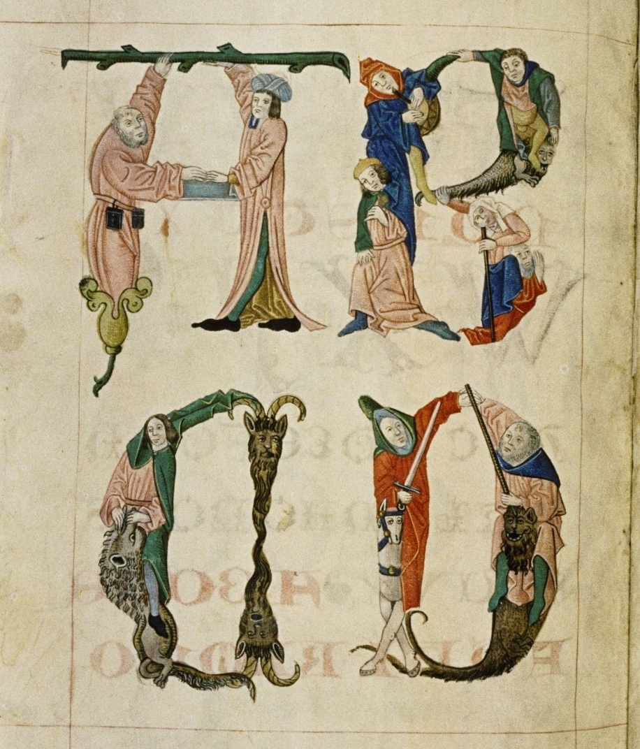
On the more upscale end of things is the model book known as the Macclesfield Alphabet Book. It was made and used in fifteenth-century England, apparently for the transmission of ideas to decorators or their assistants (full digital copy here, information podcast here). The artisans were offered quite a lot of choice, given that we encounter no less than fourteen different alphabets on its pages. What makes this book so special, however, is their quality and the manner in which the letters are designed: their shapes are produced by human figures. As in other modelbooks that include letters made out of people (Fig. 3), the figures are shown in most uncomfortable positions, as if doing yoga exercises.
A similar subject matter is encountered in the alphabet book of the Italian artist Giovannino de Grassi (Fig. 4 and image at the very top). This book was created at the Visconti court and features both initial letters and stand-alone drawings. The Visconti’s were known as important patrons of the arts and so it makes sense that we see their generosity extend into the world of book production. Giovannino was known for depicting exotic animals in their natural habitat and this book features such images as well. His pages provided models for other artists who wished to replicate his realistic depictions.

Marginal decoration
Even more sophisticated are model books that show how to create elaborate decoration that runs in the margin along the length of the page. These border decorations, with their curly leaves and unexpected turns, could be tricky to produce. The so-called Göttingen Model Book, made around 1450 (Fig. 5, left), provides a solution to this problem. Its pages not only show, step by step, how to build a 3D leaf pattern, they also present detailed instructions like the following:
The foliage one shall first draw with a lead or a point. Then one shall outline the foliage with a pen and with very thin ink or with thin black color. Then one shall polish the foliage with a tooth, so that the color can be applied smoothly, but not too firmly. Then one shall paint it with the colors, one side right and the other side left or reversed, with a brush, namely light red and green. […] (Source of transcription)

The drawings and narrative clearly complement one another. From time to time the instructions mention something like “as it is shown here” or “as the image shows”. A model book can hardly be clearer than this: while the alphabet books shown above were more or less meant to simply inspire the artist, the Göttingen book really takes the artist by the hand and guides him through each step of the production process. The instructions apparently worked well, as is shown by a surviving Gutenburg Bible that contains these very leafy borders (see Fig. 5, right, and more here).
The final point
Models are crucial in any learning process. Observing how something is done helps you acquire a skill you lack as much as it encourages you to develop further those you already have. Moreover, there is an additional use to these pattern books that has not yet been mentioned: the beautiful letters and shapes could also be browsed by readers looking for a good image for their newly acquired book. Patrons visiting artisans’ shops could well have been given these objects to find out what the book-maker was capable of providing. Given its many uses, it is hardly surprising that the tradition shown in this blog is also encountered in other cultures, including Byzantine and Arabic book production.
One particularly unusual Arabic specimen deserves to make the final point of this post. The fragment shown in Fig. 6 presented Arabic decorators with models of scenes from the New Testament (more here). It figures that the artisans, used to decorating the Quran, needed a little inspiration when it came to the Bible. This specimen is also interesting because it presents a type of instruction not seen in Western copies, as far as I know: some of the figures have been outlined by tiny holes, meaning that the sheet could be used as “tracing paper” (click the image to see this closer). While this ultimate instruction method took all potential flaws and creativity out of the modelling process, it allowed decorators with lesser talents to produce something beautiful.

Post-scriptum 16 September, 2014 – I wish to thank Giovanni Scorcioni (@FacsimileFinder) for providing the Hi-Res image in Fig. 4.
Post-scriptum 19 September, 2014 – Mari-Liisa Varila (@mlvarila) alerted me to a 17th-century equivalent to the Arabic “tracing paper” specimen (here you’ll find more information). More about this technique, which is called pouncing, here.

I was looking for a way medieval illuminators would ‘copy’ images on manuscripts, when I stumbled across your wonderful blog. Apart for being a treat to read I found in de post scriptums exactly what I was looking for. So thank you for pointing me in the right direction!
LikeLike
In art we call these wholes ‘spolveri’ or ‘spolverezzi’.
On this subject read: Ari Wallert & & Gwen Tauber, Over herhalingen in de schilderkunst: het probleem van reproduktie, in: Bulletin van het Rijksmuseum 52, no.3/4 (2004) 317-327.
LikeLike
Regarding the fragnment shown in Fig. 6:
this methode of outlining the figure with holes is also use when transfering a picture on to cloth prior to starting an embroidery. The fargment could also have been used to transfer the picture onto a ground before starting a small painting (icon). The fact that the fargment has arabic writing on it doesn’t mean that it would have been used to decorate the Quran (in Islam it is forbidden to depict people, plants a scrolls/geometric figures are allowed). It coul be that the fargment belonged to a arabic spaking christian .
LikeLike
Reblogged this on The Chronicles of Pick and commented:
I learned some of these for a few of my commissions. Well, reproductions are what I learned from. Love this…
LikeLike
Nice! Have a look for Master E.S. and Master of the Housebook for early engraved alphabet examples.
LikeLike