Meet the Medieval Manuscript

By Erik Kwakkel and Giulio Menna (@SexyCodicology)

While this and other blogs introduce you to particular aspects of medieval book production, there are few places on the web that provide a full overview of how handwritten books – or “manuscripts” – were made, especially for those new to the topic. To fill this gap, we (Erik and Giulio) have produced a website called Quill: Books Before Print, through generous support of various institutions (below). The site is now live and available for free to anyone who wants to know more about the handwritten book in the medieval period.

Navigating through Quill shows you what made the manuscript “tick”, and how it ticks. Each of the fifty-odd segments contains an artistic photograph (made by Giulio, who is a professional photographer) and some 150 words of light reading (written by Erik, who is a professional book historian). This post introduces our work, explains how and why we made it, and what we like best about it.

Leiden, Universiteitsbibliotheek, BPL 14 D (13th century)
Fig. 1 – Leiden, Universiteitsbibliotheek, BPL 14 D (13th century) – Photo GM (Quill source)

Writing about manuscripts (by Erik Kwakkel)
I love writing about manuscripts. Not only do I do so frequently in academic publications (find a list here), but also for an audience beyond the university, for example through social media (this blog, Tumblr) and magazines (I have a regular column in Quest Historie). Writing for non-specialists is fun in that you can just tell a story. However, it also requires a certain approach and tone. The texts I wrote for Quill are first and foremost meant to be entertaining – learning something is a close second. The entries are therefore written in a “light” tone and use “speaking” comparisons. Thus I discuss fragments hidden in bindings as “stowaway“, bookmarks become the “fossilized taste” of medieval readers, and parchment sheets are seen as “dead cows“.

To get this tone right, images are crucial. To write an inspired post about a manuscript, an image needs to “grab” me. Moreover, the trick (both for Quill and my blog posts) is to find a single guiding principle that can carry the text. My blog post on Medieval Selfies is a good example of this, but the same is seen in the entries for Quill. Each of the clickable segments are built around a single observation or angle, which is usually reflected in the title: “Add-on” for the segment on marginal glosses, “One, two, three” for page numbers,  and “Mind the gap!” for blank spots on the page.

Leiden, Universiteitsbibliotheek, BPL 304 (15th century)
Fig. 2 – Leiden, Universiteitsbibliotheek, BPL 304 (15th century) – Photo GM (Quill source)

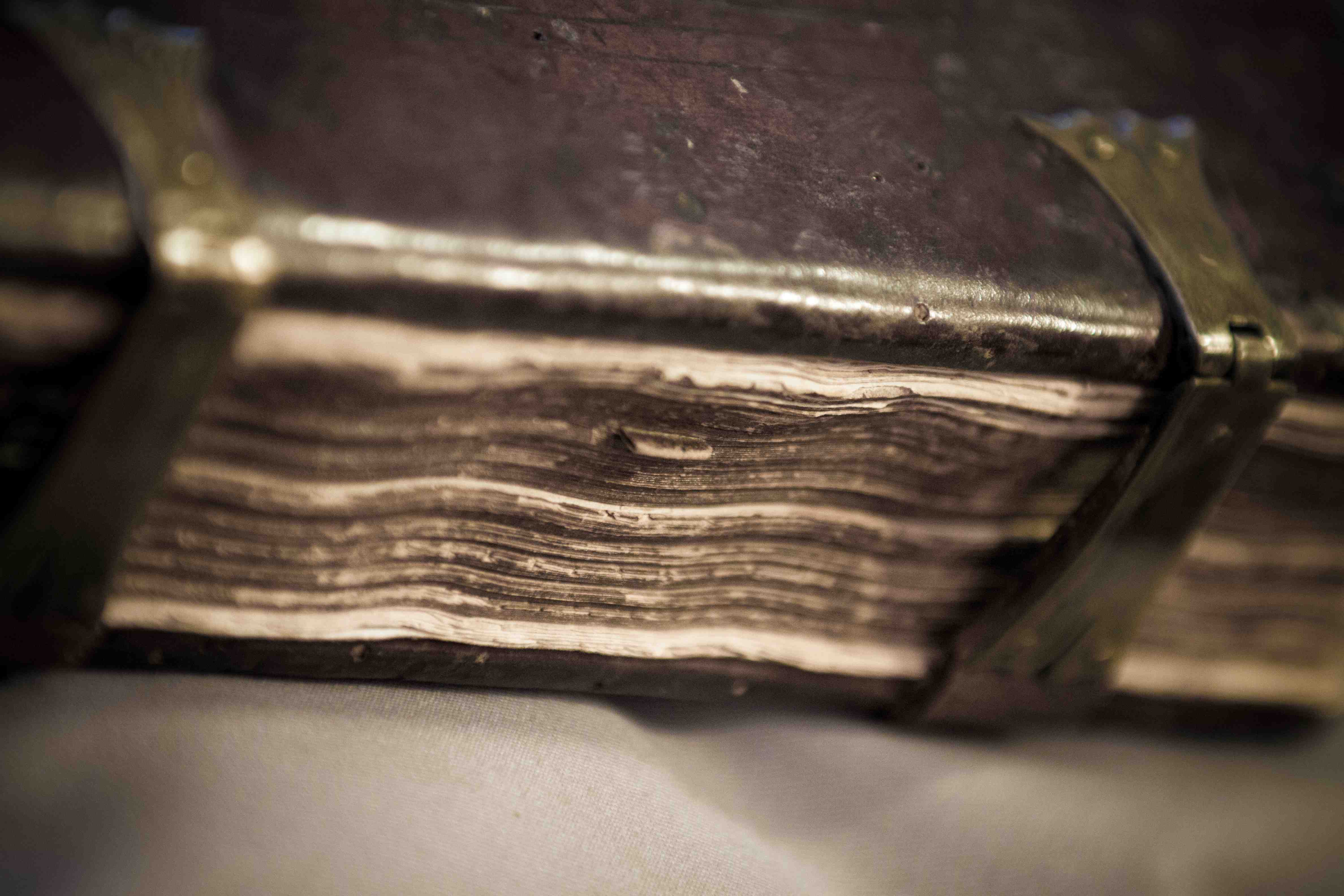
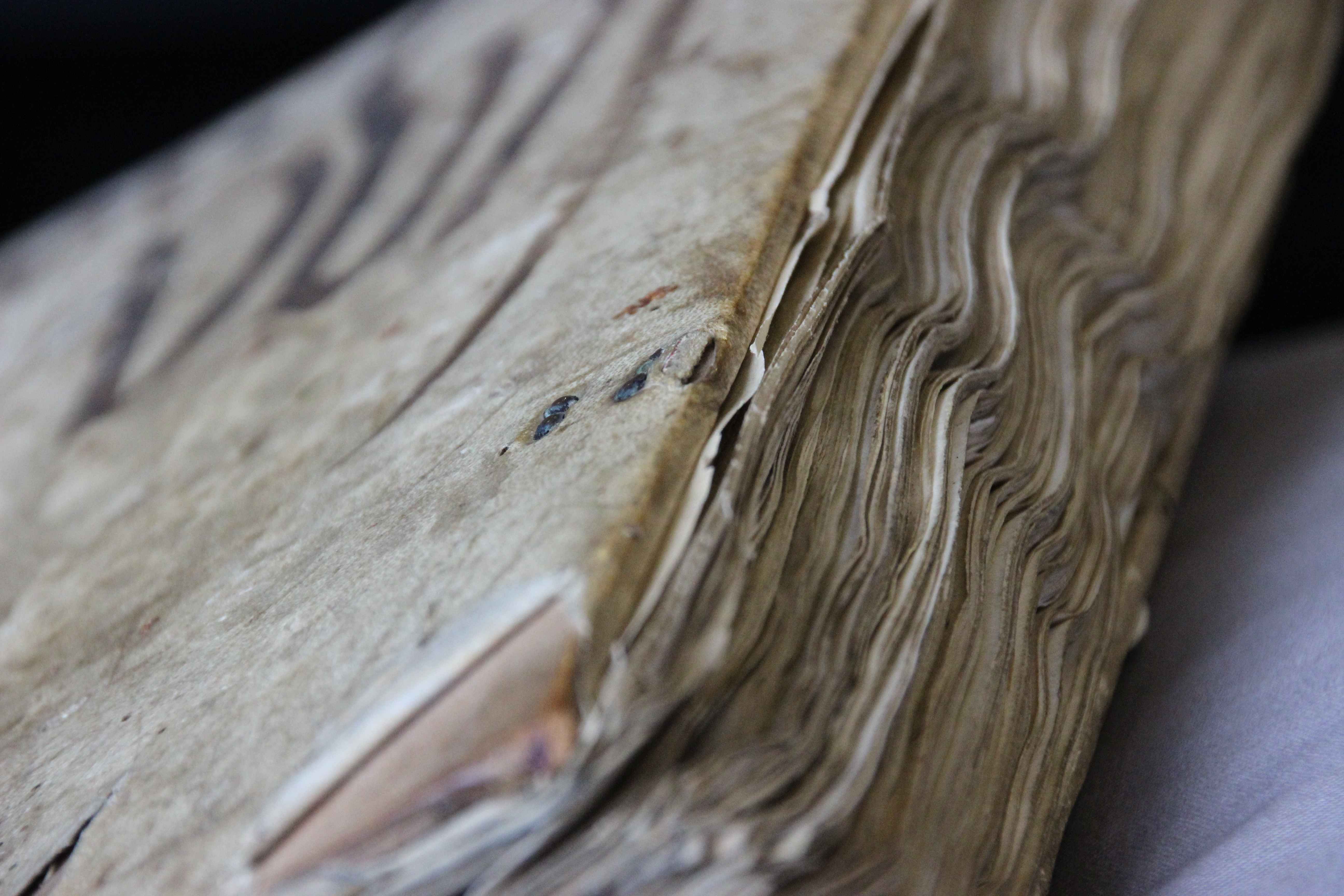
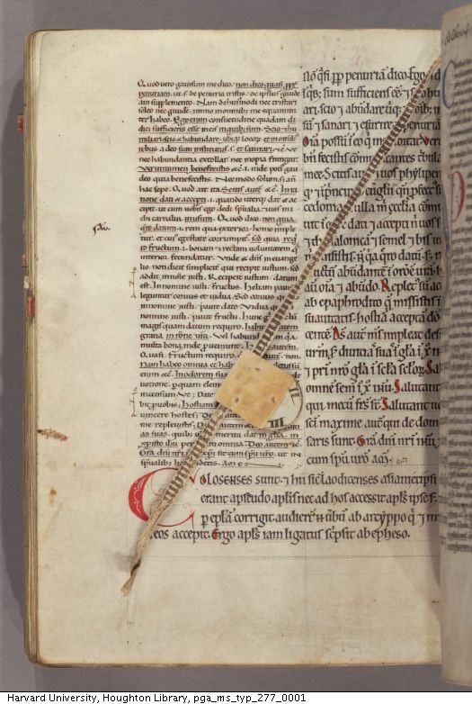
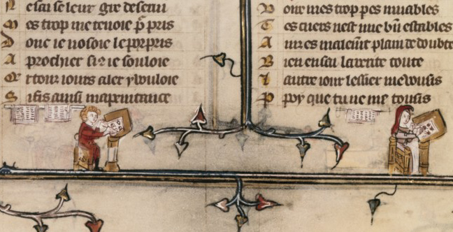
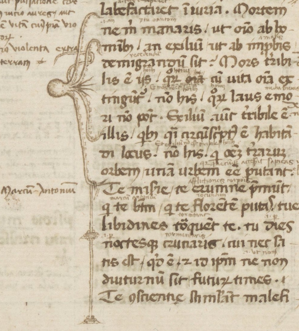
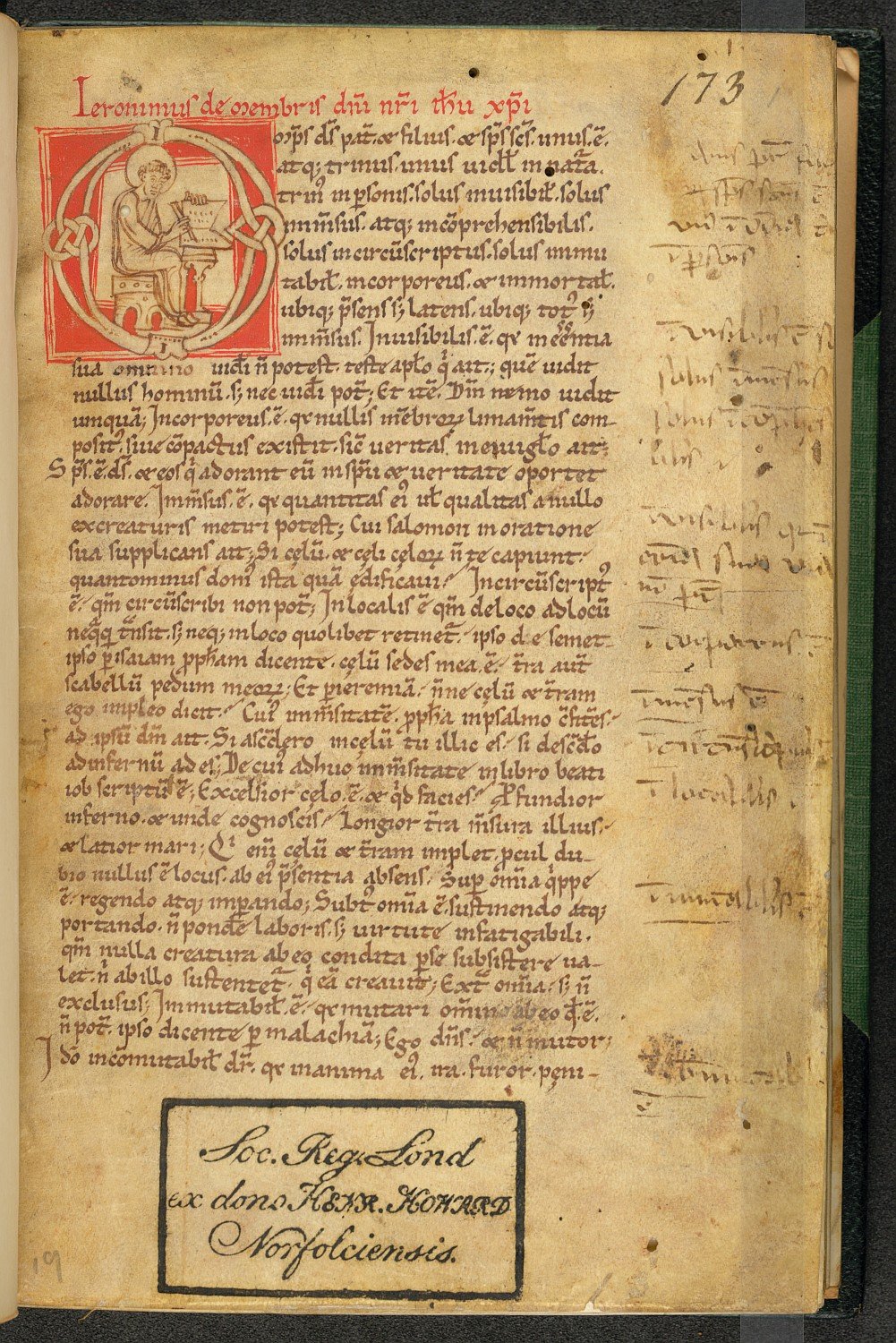
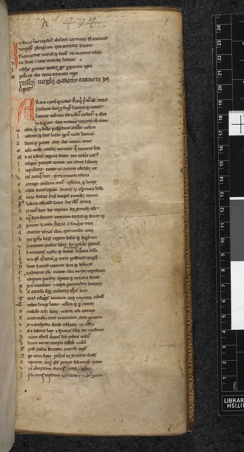
My favourite sections to write are those related to medieval handwriting – script. It is notoriously difficult to do so in clear terms, even in academic papers, when everybody knows precisely what you are talking about. I liked the challenge of providing clear information about such a complex matter as the development from one manner of handwriting to another. Playing with verbal imagery I discuss early-medieval script under the label “The unifier“, while script it develops into is seen as “The divider“. As far as my favourite images are concerned, I’m attached to all of them. Particularly pretty, however, are those that show things you normally don’t see, like a the palimpsest (scratches-away text, vaguely visible) or the backs of the quires, as in Fig. 3.

Leiden, Universiteitsbibliotheek, SCA 28
Fig. 3 – Leiden, Universiteitsbibliotheek, SCA 28 – Photo GM  (Quill source)

Photographing manuscripts (by Giulio Menna)
When I was asked to take pictures of medieval manuscripts for this project I was thrilled; when I was told I would essentially have unlimited access to the manuscripts from the exquisite collection in the Leiden University Library, I was as excited as the proverbial child in the candy store. What an opportunity! But then it dawned on me: How do you take photos of manuscripts? How do I make photos that will interest someone who has never seen a manuscript before?

Thanks to Erik’s MA course in manuscript studies I knew exactly what had to be photographed and where to find it in the books. I spent most of the time browsing through manuscript catalogs and manuscripts’ descriptions, searching for the right book to use for the shots. Once the desired detail was found, the actual photography began. First things first: respect the manuscript! I might find a detail that could make a perfect picture, but to get the photo right I would  have had to mishandle the manuscript in some way: those pictures did not get taken.

Leiden, Universiteitsbibliotheek, VLQ 4 (15th century)
Fig. 4 – Leiden, Universiteitsbibliotheek, VLQ 4 (15th century) – Photo GM (Quill source)

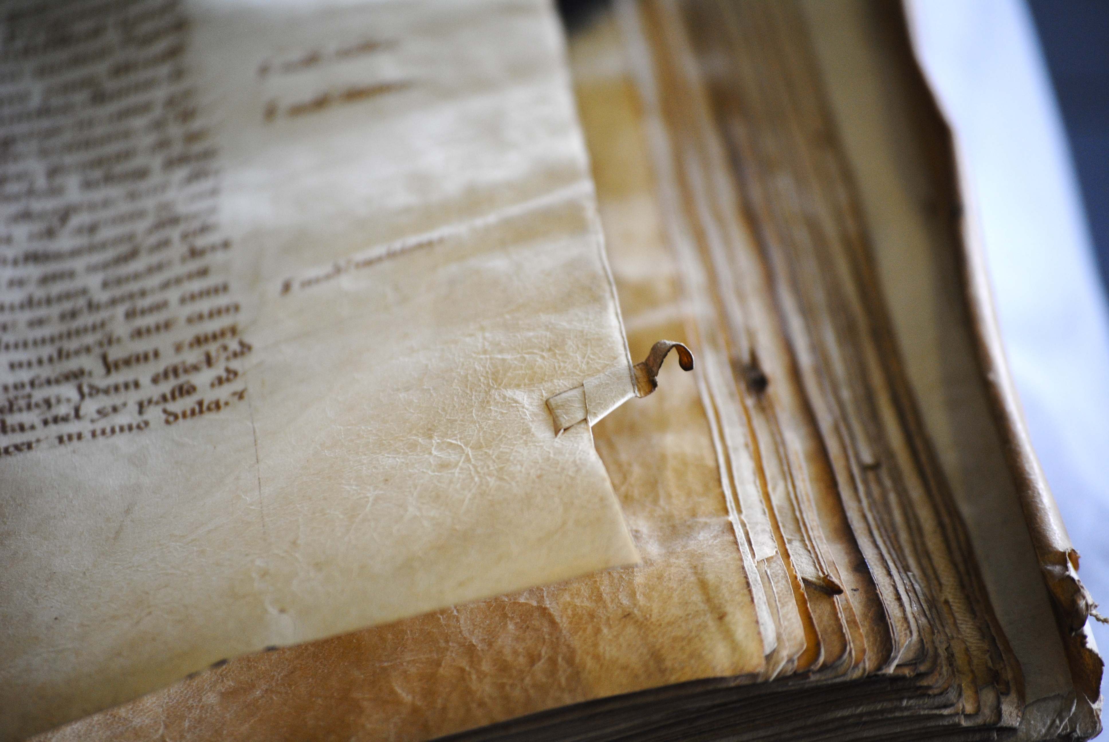
Once an ideal manuscript was found, I used the oldest trick in the book for directing viewer’s attention towards the detail described: depth of field. This would ensure that only the detail in question would be in focus in the picture, and the surroundings would be blurred (Fig. 5 is a good example). I have a very good lens (f/2.8) that allows me to do just that. The lighting was a bit of a problem. Since I was shooting in the Special Collections room I had no direct control over the light. Most of the time I had to wander around the table and find the right angle at which there would be no shadows or reflections.

Leiden, Universiteitsbibliotheek, VLQ 38 (12th century)
Fig. 5 – Leiden, Universiteitsbibliotheek, VLQ 38 (12th century) – Photo GM (Quill source)

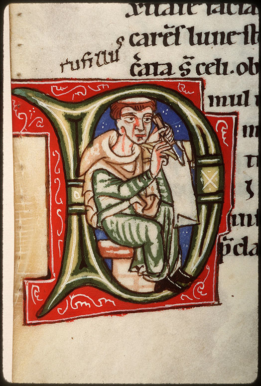
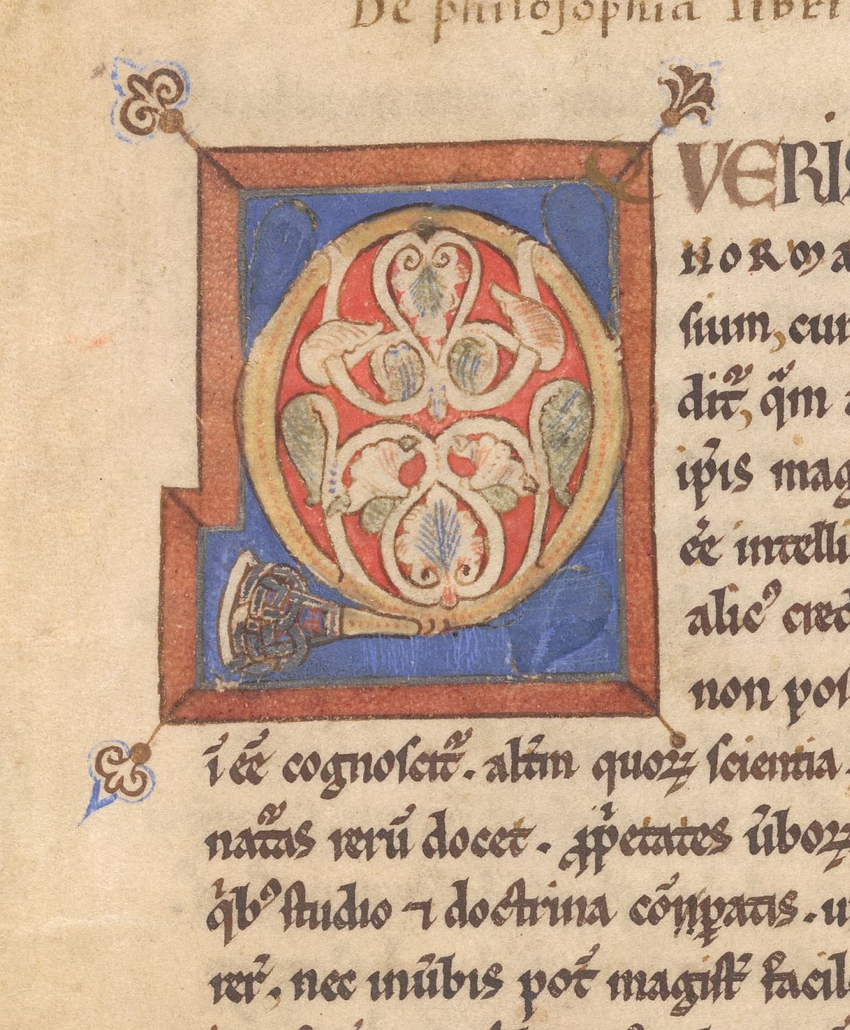
There are two photos I am particularly fond of. One is the initial P (for Plinius) seen in Fig. 5. It is the opening page of the manuscript, and the letter is welcoming us to the book. I like to believe that this photo captures the moment when you open a manuscript you have never seen before, and you are captivated by unexpected decoration. The initial is very pleasing to the eye: I particularly enjoy the contrast between the old parchment on the right and the white modern paper on the left.

Leiden, Universiteitsbibliotheek, BPL 304 (15th century)
Fig. 6 – Leiden, Universiteitsbibliotheek, BPL 304 (15th century) – Photo GM (Quill source)

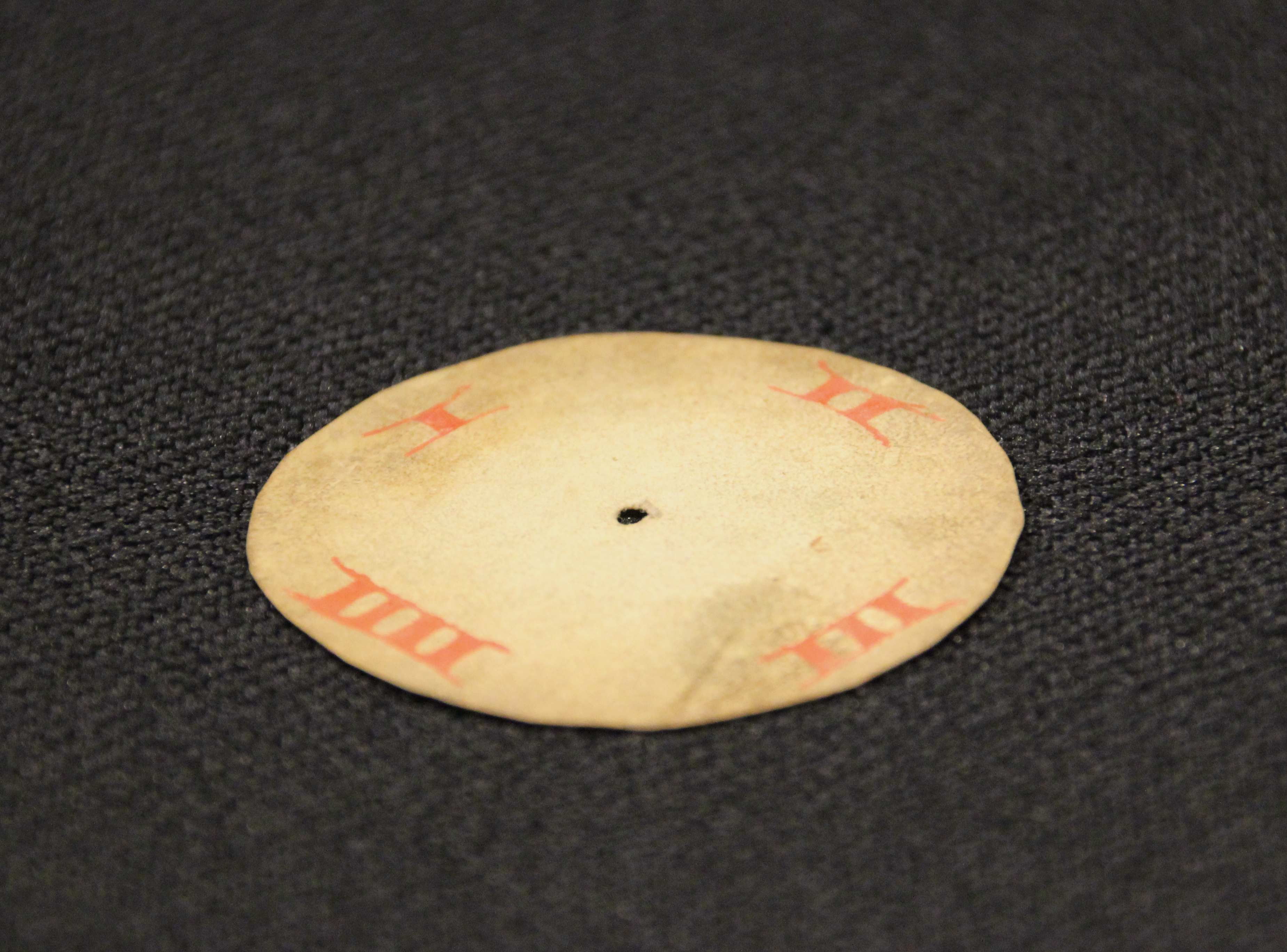
The second image I like very much is of a watermark (Fig. 6). Taking a picture of a watermark was technically challenging: the manuscript’s pages are made of paper, and although paper made in 1600s is more resilient than the contemporary counterpart, it is still delicate and has to be handled with extra care. I had no control over light sources, but I knew that in order to show the watermark I needed a strong light from the back of a page. The plan then became to wait for the sun to go down in the late afternoon, and let some of the light shine through the Special Collections’ windows onto the manuscript. All I had to do then was kneel before the book and take the picture of the naturally bending page.

The last word: enjoy
We hope you will enjoy browsing our website – which was two years in the making – and learn from it at the same time. The site is designed to work optimally with tablets: it’s a true pleasure to swipe the image carousel at the top. We think it provides a sound introduction to making books before print and we hope that the website will be picked up by the broadest possible audience, including instructors at schools and universities. Enjoy!

Leiden, Universiteitsbibliotheek, SCA 38 B
Fig. 7 – Leiden, Universiteitsbibliotheek, SCA 38 B – Photo GM (Quill source)


Credits – Quill: Books Before Print was produced through a grant of De Jonge Akademie (The Young Academy), an offshoot of the Royal Dutch Academy of Arts and Sciences, and with logistical support of Leiden University Centre for the Arts in Society (LUCAS). The website would not have been possible without the invaluable support of Leiden University Library and its Special Collections department.

Medieval Desktops

We are used to having multiple books open at the same time when looking things up at home or writing an essay for class. Whether PDFs, e-books or old-fashioned paper volumes, switching between books in a smooth movement is something we don’t often think about. This was very different in medieval times. In those days, books tended to resist when you tried to move them: they were heavy as a brick and easily twice that size. A related problem was one of space. The average medieval book has a wingspan of at least half a meter wide when open. Consequently, comfortably placing two books in front of you was a stretch, let alone multiple volumes. In an early-sixteenth-century depiction of Erasmus, the scholar cannot even place a single book on his desk as he is writing a letter (Fig. 1).

Albrecht Dürer's portrait of Erasmus, 1526 (detail)
Fig. 1 – Albrecht Dürer’s portrait of Erasmus, 1526 (detail) – source

Interestingly, the challenges of medieval book consultation stands in stark contrast with what we know about reading and studying in the period. Readers browsed through a great number of volumes at the same time, interested as they were in learning different points of view with respect to their topic of inquiry. Sparked by this contradiction, this post explores medieval desktops. How many books are being consulted at the same time in medieval depictions of reading? How are the objects laid out across the available space? In short, how are we to understand the logistics behind the devouring of knowledge in the last four centuries of the Middle Ages? As will become clear, the answers to these questions vary greatly depending on why an individual handled multiple books at the same time.

Scribes
The first group of individuals who had to manage multiple books were scribes. By definition, a scribe had to have at least two books on his desk: the one he was making (a growing pile of quires, which remained unbound until the very end) and the one he was copying from (called the “exemplar”). While keeping track of the loose quires may have been challenging, of the groups discussed here scribes had it the easiest. After all, the individual was only technically reading one book – the one he was copying from. This explains why their deskspace was of limited size, at least judging from surviving depictions.

Brussels, KB, 9278 (15th century)
Fig. 2 – Brussels, KB, 9278 (15th century) – source

In most cases their working space was erect rather than flat (Fig. 1). This famous image of Jean Miélot at work shows how the desktop of the scribe had a 45-degree angle, resulting in an almost erect surface. Clearly visible is also a vertical orientation in the line-up of the books: one was placed above the other. In fact, the desktop in this image is split in half, with the lower half containing the book under production, as well as the scribe’s tools (ink pots and pens), while the upper half holds the exemplar. Miélot obviously needed to go shopping for a larger desk, because we see books laying around on the ground and on a bench.

London, British Library, Royal 18 E.iii (15th century)
Fig. 3 – London, British Library, Royal 18 E.iii (15th century) – source

Interestingly, there are also desks with a horizontal orientation. Fig. 3 shows the translator Simon de Hesdin at work. Although the books are out of sight, the desk clearly provides room for two books. However, they placed next to one another. This may be specially done for the task of a translator, who needed to carefully read the source text and subsequently scribbling down the translation in loose quires or on loose sheets. This way, both books would be right before him: there was no need to look up at a high book platform. (See in this respect also the note added post-publication, below.)

Readers
While it is easy to find images of scribes with a desk full of books,  it is less common to encounter readers in similar situations. That is to say: there are very few medieval scenes in which someone is reading but not writing – where books are present but pens are not. In part, this has to do with medieval study practices. Readers would usually have a pen nearby even when they were just reading. After all, remarks and critiques needed to be added to the margin at the spur of the moment. “Penless” images, while rare, often show a crowded desktop. The scene presented in Fig. 4 shows Christine de Pisan browsing multiple books at a big desk (more about Christine in her study in this article).

Brussels, Bibliothèque, Royale, MS 9009-11
Fig. 4 – Brussels, Bibliothèque, Royale, MS 9009-11

The absence of the pen may result from an urge to depict Christine as an avid reader. This is emphasized, I think, by the various volumes that lay open – note how some open books are facing down, the way we still do today! From the late medieval period a special tool was available for readers who did not like the clutter shown on Christine’s desk: the book carousel (Figs. 5 and 6).

Leiden, Universiteitsbibliotheek, BPL Collection
Fig. 5 – Leiden, Universiteitsbibliotheek, BPL Collection – Photo EK
Oxford, Bodleian Library, Douce 195 (15th century).
Fig. 6 – Oxford, Bodleian Library, Douce 195 (15th century).

These carousels allowed readers to consult multiple manuscripts in a very convenient fashion, by spinning (slowly!) the top part, which moved. The oldest one I could find dates from the fourteenth century (here), but it is possible they were in use even earlier. It is striking that these two scenes show readers – scholars – without pens, even though the second seems to hold an invisible one.

Book hipster
Cleverly, the medieval “spinning wheels” in Figs. 5-6 circumvented the constrictions of the limited space a regular desktop provided. However, what if you need even more real estate than the turning desktop could offer? The answer to this question is perhaps one of the most intriguing and cool pieces of book furniture that survive from the past: the book wheel (Fig. 7).

From "The Diverse and Artifactitious Machines of Captain Agostino Ramelli", 1588.
Fig. 7 – From “The Diverse and Artifactitious Machines of Captain Agostino Ramelli”, 1588.

The image from 1588 shows the bookwheel invented by the Renaissance engineer Agostino Ramelli, whose concept was based on medieval designs. The upside to the carousel is obvious: there was space for a lot of books. This practice is not unlike deciding to hook up a second monitor to your computer, except that the individual is actually watching twelve monitors at the same time – like a trader on Wall Street. I have sat behind one from the 17th century myself and it is truly a majestic feeling to spin the wheel. The click-click sound of the gears hidden inside the device is simply mesmerising.

The last word: laptop
While desktops (in their great variety) are representative of how most scribes and readers handled their books, there is also a surface space that is more exceptional – and that can only be addressed as a “laptop”. The use of such portable desks, which sat on the scribe’s lap, is well documented for the early-modern period (here is one from sixteenth-century Spain; here are a few others). They were used, for example, by noblemen or secretaries drafting documents and letters whilst on the road. It concerns a box with a slightly angled surface, inside which the writing materials were stored, including sheets, ink and pens. Interestingly, this practice – and tool – go back to at least the twelfth century, as Fig. 8 shows. The device contains a hole for the ink pot and inside may well have been blank sheets, in parallel to the portable kits from the Renaissance.

Chartres Cathedral, West Portal (c. 1150)
Fig. 8 – Chartres Cathedral, West Portal (c. 1150) – Source

Apart from the fact that the actual desk space was more limited than what we are used to, the medieval desktop was not so different from ours, including how messy it was. They contained books, both open and closed, as well as writing tools. However, more so than in our present time, desktops were a necessary tool, whether they were packed (as in Christine’s case) or with only one or two books in place (as with most scribes). The medieval quill, after all, needed a stable and even surface. While desktops may seem trivial objects to us, they were crucially important to both medieval scribes and readers.

Note added 22 Dec, 2014: this image of the translator Jean Wauquelin at work (Valenciennes, BM, 772) also shows the translator sitting at two desks with a horizontal rather than a vertical orientation. It raises two questions: was this unusual set-up favoured by translators; and if so, could the reason be that it allowed them to point at the line they were translating, as seen in the Wauquelin image – after all, this would impossible to do with a vertical orientation.

Hugging a Medieval Book

Book historians tend to compare features of the medieval book to body parts. Thus the manuscript’s “head” (top edge) is connected to its “spine” (the back) via the “shoulder” (the area where board meets spine). There are even terms that compare a medieval book’s physical features to human activities or conditions. A large letter with a lively figure inside is called a “gymnastic initial”, while line ruling that is nearly invisible is “blind”. I could go on and explain how other, seemingly unrelated, objects have been used in bookish terminology (the “diaper pattern” is my favourite), but you get my drift. This post takes this projection phenomenon a step further. It shows how one particular feature of the medieval binding eerily resembles a body part, not just in appearance but even in function: the clasp (Fig. 1).

Arm and hand

Leiden, Universiteitsbibliotheek, BPL MS 2579 (15th century)
Fig. 1 – Leiden, Universiteitsbibliotheek, BPL MS 2579 (15th century) – Photo EK

Medieval makers of manuscripts paid just as much attention to closing the book as they did to opening it. In order to preserve the organic pages, which were often made of parchment, it was necessary to keep the volume tightly closed when it was not used. Not only did this keep moisture out, but parchment also has a natural tendency to buckle, especially when handled at room temperature. In fact, parchment pages curl up with so much force that the wooden boards would be pushed open were it not for a smart device designed to keep the lid on: the clasp.

The clasp is like an arm that extends from the one wooden board to the other. Indeed, I find it hard not think of clasps as hugging arms that embrace the leaves, safeguarding them from the harsh reality of medieval book use. Appropriately, the primary purpose of the clasp was to protect the pages. They generated the pressure needed to keep the pages flat, while producing a firm object that could withstand every-day use in a medieval library – like falling off a desk or a shelf. At the end of the arm a tiny “hand” locks into an extension – we could call it a “handle bar” – as clearly visible in Fig. 1. How great that some book binders played with the image of a hand grabbing onto the opposite clasp, as this eighteenth century example shows (Fig. 2).

Book clasp, 18th century (?) -
Fig. 2 – Book clasp in shape of hand, 18th century (?) – Source Daniel Crouch Rare Books

Generally, two clasps were able to contain the force issued by the buckling parchment of a book. However, it was important to get it right as a bookbinder. When the distance between the one end of the arm (the “arm pit”) and the handle bar was too large, there was insufficient pressure. By contrast, if the distance was too little, the book did not close. Medieval manuscripts that have lost their clasps (by far the majority) show what happens to the bookblock when the pressure was too low: unhappy pages with a wavy pattern appeared (Fig. 3).

Leiden, Universiteitsbibliotheek, BPL MS 96 (14th century)
Fig. 3 – Leiden, Universiteitsbibliotheek, BPL MS 96 (14th century) – Photo EK


Exotic arms
Some readers preferred exotic clasps. A particularly remarkable specimen is seen in Fig. 4. The book it helps to close is tiny, no larger than an iPhone. Made c. 1500, it was designed for the road: it concerns a portable Book of Hours (or prayer book) that was carried around by a pilgrim on his religious pilgrimage. The clasp holding it closed is a skull carved out of bone. The theme is fitting for a pilgrim seeking redemption, finding his way along the dusty roads of medieval Europe. Every time he sat down to open his book he was confronted with his future, which looked rather grim: Memento mori, remember that you will die one day. Better smarten up and keep on going!

Stockholm, National Library, MS A 233 (c. 1500)
Fig. 4 – Stockholm, National Library, MS A 233 (c. 1500) – Source

The exoticness of clasps can also be connected to their number in stead of their shape. Clasps are a must for a peculiar binding known as dos-à-dos (or “back-to-back”). While such bindings usually hold two books bound together at their backs (hence the name), the National Library of Sweden owns a unique variant that contains no less than six books (Fig. 5). They are all devotional texts printed in Germany during the 1550s and 1570s (including Martin Luther, Der kleine Catechismus) and each one is closed with its own tiny clasp. A book with six arms and hands: it is quite the display of craftsmanship.

Stockholm, National Library
Fig. 5 – Stockholm, National Library – Source of photos, GIF by EK (source)

The last word: feet
If clasps can be compared to arms, another feature of the bookbinding must be called “feet”. During the later Middle Ages it became customary to store manuscripts on lecterns. In lectern libraries, which were found in monastic houses and churches, readers consulted books on uncomfortable benches. The libraries often had a semi-public function, with outsiders walking in and out to consult books. To facilitate such use – and to make sure no books were unlawfully removed –  the objects were usually chained to the lecterns (Fig. 7).

The chained library in Zutphen, the Netherlands (De Librije)
Fig. 7 – The chained library in Zutphen, the Netherlands (De Librije) – Photo EK

Books in lectern libraries were not read on a flat surface (such as a desk), but erect – the objects were resting, after all, on nearly vertical stands. This kind of use came with a challenge: the shuffling that inevitably happened when the book was read, wore out the lower edge of the binding. More importantly, since the medieval book block was flush with the binding, the constant contact with the lectern as the reader flipped through the book could easily damage the page. A simple tool was invented to prevent such damage: “feet” – tiny pieces of brass that hoisted the book up and made it hover, as it were (Fig. 8). The feet that are attached to bindings are often shiny. It shows just how much the book was used – and how much damage was prevented by the attached feet (Fig. 9).

Leiden, Universiteitsbibliotheek, BUR MS Q 1 (11th century)
Fig. 8 – Leiden, Universiteitsbibliotheek, BUR MS Q 1 (11th century) – Photo EK
Leiden_UB_BPL_67
Fig. 9 – Leiden, Universiteitsbibliotheek, BPL MS 67 (9th century) – Photo EK

There is something very attractive about these body parts. They show just how much bookbinders and readers were in tune with the needs of the book as an object. They packaged them so that they could withstand rough consultation, while their designs also left room for a certain amount of fun – as the hand-clasp and perhaps even the skull-clasp shows. The hug given by these strong arms protected the book’s most precious cargo, the text, both from accidents in the medieval library and, as much as possible, from the inevitable decay of time.

Smart Medieval Bookmarks

Marking pages for future reading predates browsers and the web. In fact, the practice is much older even than printed books. This post introduces various ways in which monks and other medieval readers kept track of the page at which they had stopped reading – and from which they planned to continue in the near future. What tools were available for this purpose? And how did these differ from one another? Apart from addressing these two queries, this post also reports on a genuine discovery: a new specimen of a rare but particularly smart type of bookmark, which I found in my own University Library here in Leiden. Cleverly, and unlike our modern equivalent, the bookmark in question showed medieval readers not only at what page they had stopped reading, but also in which text column and line they had left off.

Static bookmarks

 Leiden, Universiteitsbibliotheek, BPL MS 2001 (12th century) - Pic my own
Fig. 1 – Leiden, Universiteitsbibliotheek, BPL MS 2001 (12th century) – Photo EK

But let’s start at the beginning. If certain bookmarks can be called “smart”, it follows that others were, well, dumb. In bookmark terms that qualifier must go to types that are fixed to one specific page rather than being able to freely move throughout the book. Fig. 1 shows such a static bookmark, perhaps as old as the twelfth century. It was produced by making a small cut in the corner of the page, after which the emerging strip was guided through a small incision, and then folded outwards, so as to stick out of the book. The result (which you will recognize as the banner image of this blog) was as unmovable as it was destructive to the page – adding to its unflattering qualifier “dumb”.

A slightly less invasive version, no doubt preferred by medieval librarians, didn’t involved cutting but glueing a tiny strip of parchment on the long side of the page (Fig. 2). These so-called “fore-edge” bookmarks could even be filled with extra information, for example what section started at the marked location (“B” for “Baptism” in Fig. 2).

Utrecht, UB, MS 146, fol. 17r (detail)
Fig. 2 – Glued-on parchment strip with letter B (Utrecht, UB, MS 146, fol. 17r)  – source

Dynamic bookmarks
Far more interesting from a book-historical point of view are the more dynamic bookmarks, which could be used at any page of the manuscript because they were movable. An unusual example is seen in Fig. 3, which shows heart-shaped bookmarks that could be clipped onto a page. Interestingly, they were cut out of a thirteenth-century manuscript with a Middle Dutch saint’s life. The culprits were nuns in the 20th century, who clearly did not appreciate old books. Only a small number of pages of this very important manuscript have survived undamaged. When you study the book  in the University Library of Amsterdam, as I did a few years back, a curious collection of full leaves and heart-shaped fragments ends up on your desk.

Amsterdam, Universiteitsbibliotheek, MSS I G 56-57 (13th century)
Fig. 3 – Amsterdam, Universiteitsbibliotheek, MSS I G 56-57 (13th century)

The downside of such clip-on bookmarks is that time tended not to be very kind to them. Since they could be separated from the page, many actually were: they fell out or were never re-inserted by the reader. The solution to the vanishing bookmark came in the form of what is called a “register bookmark”, seen in Fig. 4 (I took the composite image from this blog post). This type, which looks like a spider with its legs trapped, was securely fastened to the top of the binding (as visible in Fig. 4, left), so it couldn’t get lost. Additionally, the bookmark allowed the reader to mark multiple locations in the book.

Auckland Libraries, Sir George Grey Special Collections, Med. MS S.1588
Fig. 4 – Auckland Libraries, Sir George Grey Special Collections, Med. MS S.1588

Evidently, these two groups of bookmarks – static and dynamic – provided very different approaches to marking information – and thus to a book’s use. Readers who added clip-on or “spider” bookmarks anticipated they would need to retrieve information not from one single page but from a changing number of pages. In other words, movable bookmarks served an audience with a shifting knowledge “appetite”, while the static ones encouraged a more “ritual” use of a book. In other words, both types are telling, in their own way, about medieval reading culture.

Multi-dynamic bookmarks
And then there is, finally, the multi-dynamic bookmark – and the story of how a new specimen of this type was discovered. The qualifier “multi-dynamic”, which is my own, refers to the fact that this bookmark is of the moving type, while at the same time it is able to do much more than simply marking a page. The bookmark’s use is as simple as it is clever. This becomes clear when we look at the bookmark in action, for example in this twelfth-century Bible in the Houghton Library (Fig. 5).

Harvard, Houghton Library, MS 277 (12th century)
Fig. 5 – Harvard, Houghton Library, MS 277 (12th century) – source

As you can see, the bookmark consists of two components. As with the spider bookmark, it features a string attached to the top of the binding (in this case the string is a strip from a recycled manuscript page). This allowed the reader to mark a certain page. Nothing new here. The second component, however, is what makes this a smart bookmark: a disk with the numbers 1-4 written on it, fitted in a tiny sleeve. The reader would pull down the marker along the string until the flat top hit the line where he had stopped reading. The disk could subsequently be turned to the appropriate column – an open medieval book usually showed four columns of text – meaning the device marked page, column and line.

Discovery
Although such rotating bookmarks were used until well into the age of print (see an example here), only about thirty-five have survived according to an inventory published in the Transactions of the Cambridge Bibliographical Society (2001). It figures that when in 2005 a tiny specimen of 41×22 mm (the size of two thumbnails) was sold off at Sotheby’s, it went for a stunning $ 11,000 (see pic at the top; more here). Just to illustrate that new specimen still emerge, I recently discovered one in the University Library in Leiden, where it was filed in an early-twentieth-century filing cabinet of the Bibliotheca Manuscript Neerlandica – since moved to a fragment collection with shelfmark BPL 3327 (Fig. 6).

Leiden, Universiteitsbibliotheek, BPL MS 3327 (14th century)
Fig. 6 – Leiden, Universiteitsbibliotheek, BPL MS 3327 (14th century?) – Photo EK

The Leiden artifact shows all the characteristics of a rotating bookmark: a small parchment disk with four numbers and a tiny hole in the middle. Interestingly, it is only the second specimen identified in Dutch collections, although the one in Leiden is clearly the oldest of the two (here is the other). While it is hard to date the red roman numbers with precision, it appears they were put on the parchment in the fourteenth century. The striking difference with the Houghton specimen in Fig. 5 is that the new find comes without its sleeve, which does not survive. It is astonishing still that the tiny disk made it to our day and age. It must have been hidden in the darkness of a manuscript  for several hundreds of years until it got separated and became an orphan – sleeveless and without a home.

Medieval Selfies

Self-portraits of medieval book artisans are as exciting as they are rare. In the age before the modern camera there were limited means to show others what you looked like. In the very late medieval period, when the Renaissance spirit was already felt in the air, some painters made self-portraits or included themselves in paintings commissioned by others. Stunningly, the medieval painter Jan van Eyck showed himself in the portrait of Giovanni Arnolfini and his fiance: he is staring at you from the mirror that is hanging behind the couple. For those who still didn’t get it, he painted above it Johannes de eyck fuit hic, Jan van Eyck was here” (Fig. 1, more here). He added the date 1434 to the picture, making it a particularly early selfie.

Jan van Eyck, Giovanni Arnolfini and his fiance, 1434 (right) and mirror detail (left)
Fig. 1 – Jan van Eyck, Giovanni Arnolfini and fiance (right)  and mirror detail (left)

As far as producers of books is concerned, there were only two kinds of artisans who handled a tool with which a selfie could potentially be produced, if the individual was so inclined. Scribes could doodle themselves using ink and pen; and decorators could do the same with brush and paint. In practice, however, we almost exclusively encounter self-portraits made by decorators, perhaps because scribes lacked the skills and equipment to produce something meaningful. Even so, decorators rarely put themselves in the picture. The exceptions to this rule are real treats, as this post aims to show: they provide sneak peeks into the workshops of medieval artists.

Monastic decorators
When a decorator is seen on the page, we must assume that a conscious choice was made to become part of the book’s decoration program. This is particularly evident when the decorator added his or her name and designation (“decorator”). This is precisely what the nun Guda did: she depicted herself inside an initial letter D with a banderole (title banner) that reads “Guda, sinner, copied and decorated this book” (Fig. 2). It seems out of sync with the modest life style of nuns to identify oneself with name and title. Pride was a vice so there must have been another reason behind Guda’s self-identification. Perhaps she did so with a sense of history: she is raising her right hand as if to greet future readers.

Frankfurt, Staatsbibliothek Ms. barth. 42
Fig. 2 – Frankfurt, Staatsbibliothek, MS Barth. 42 (late 12th century)

In spite of this very expressive scene, Guda’s selfie does not give away too much about the medieval artist’s workshop. In fact, if it wasn’t for the words on the banner, we would not have guessed that she was a decorator. Where are the paraphernalia of the trade? Fortunately, there is another example that provides more detail about the working environment of monastic artists (Fig. 3). This image was produced by Rufillus, monk in Weissenau Abbey in Ravensburg, Germany, near the end of the 12th century. In the selfie we catch Rufillus putting the finishing touches on a giant letter R. He wrote his name above his tool: there is no avoiding that we get to know him. Remarkably, in another manuscript we encounter Rufillus again. This time he depicts himself as the scribe of the book – he scribbled, oh vanity, his name above himself (Fig. 4).

Cologny, Fondation Martin Bodmer, MS 127, fol. 244r (late 12th century)
Fig. 3 – Cologny, Fondation Martin Bodmer, MS 127, fol. 244r (late 12th century) – source
Amiens, BM, Lescalopier 30, fol. 29v (late 12th century)
Fig. 4 – Amiens, BM, Lescalopier 30, fol. 29v (late 12th century) – source

Rufillus the decorator places himself in a rich setting: in Fig. 3 we see him surrounded by pots of pigment and various instruments. He provides us, in other words, with a much wanted glimpse into his monastic workshop. Moreover, like the nun Guda, Rufillus was apparently active as a decorator and a scribe, which is another important detail that can be derived from the selfie. What is most striking in light of this post, however, is the similarity of the two portraits: in both, Rufillus shows himself as having bright red hair, big eyes and pronounced wrinkles on his cheeks. The similarity strongly suggests that this is what our decorator really looked like, which is a fascinating thought.

Commercial decorators
Such detail-rich selfies are also encountered in books that were made commercially. A particularly telling self-portrait was made in 1512 by the German book decorator Nicolaus Bertschy (Fig. 5, more information here). In this portrait, which is included in the Lorcher Graduale, he shows himself in the company of his wife, who appears to be drinking from a large mug with her arm around his neck. It is not the scenario you would expect, this rather down to earth setting where drinks and female distraction replace both decorum and concentration.

Stuttgart, Württembergische Landesbibliothek, Cod. mus. I 2 65, fol. 236v (detail)
Fig. 5 – Stuttgart, Württembergische Landesbibliothek, Cod. mus. I 2 65, fol. 236v (detail)

Nicolaus introduces himself in a note beneath the image: in spite of the scene, he clearly saw no need to hide his identity. Next to him we see the scribe Leonhard Wagner (note the “LW” on the white shield), who is said to have known a hundred different kinds of handwriting (more here). The illustration shows the two artisans producing the very choirbook in which it appears, making this a selfie with a fascinating double layer.

Remarkably, a manuscript from fourteenth-century Paris also presents a selfie of a decorator and his wife (Fig. 6). It shows Richard and Jeanne de Montbaston, who worked in the second quarter of the century. In this great image Richard appears to copy the text while Jeanne is busy decorating the pages. Given this division of labour it was likely Jeanne who produced this selfie. There are many more details that prove insightful for artists’ workshops. Parchment sheets that were finished are hanging to dry on clothes lines, for example.

Paris, BnF, fr. 25526, fol. 77v (1325-1350)
Fig. 6 – Paris, BnF, fr. 25526, fol. 77v (1325-1350) – source and full manuscript source

Interestingly, in a commercial setting such selfies can be regarded a kind of advertisement, especially when a name was added. It identified, after all, who had produced the decoration – as if to say, “If you like this, you know who to contact!” It is somewhat perplexing, however, that patrons allowed artists to add put such spam in their newly purchased books – especially when showing a decorator and his wife drinking on the job.

The last word
And what about selfies of scribes? Here things are less clear. Occasionally we encounter a plain pen drawing of an individual copying. However, they are (to my knowledge) never accompanied by name and designation (“scriptor”), meaning we cannot know for sure if the scribe meant to show himself or simply drew a generic “scribe”. The drawing in Fig. 7 is an example of such unclarity: it may be a selfie, or it may not be.

Oxford, Bodleian Library, Douce 104, fol. 52v (dated 1427)
Fig. 7 – Oxford, Bodleian Library, Douce 104, fol. 52v (dated 1427) – source

Studies have shown that the writing figure is a clerk, a copyist affiliated to an institution where documents were made. As it turns out, this particular manuscript containing the text Piers Plowman was produced by a clerk. This is evident, among other things, from the way in which the dated colophon in the back of the manuscript was worded. Moreover, the marginal notation above the clerk’s head, which appears to be in the same hand as the main text, writes over the top of the drawing. This suggests it was  the scribe himself who drew it. A writing clerk drawing a writing clerk: is it enough to call this image a selfie? It’s a great conundrum that shows the limits of taking the modern notion of “selfie” to an age when cameras didn’t exist.

Medieval Super Models

This post is devoted to a particularly attractive and rare kind of medieval manuscript: the model book. A feast to the eye, the object is filled with drawings and paintings that were meant to show scribes and illuminators how to decorate letters, paint initials, or add large segments of decoration to the page. Within this tradition, two types of model books can be distinguished. Some functioned as instruction manuals. In such books, the drawings might be accompanied by a narrative or explanation that instructs the artisan how to proceed, usually in a step-by-step process. Other model books appear to have merely functioned  as  a source of inspiration: they present a wide array of shapes and drawings from which the artisan could take his pick.

The level of sophistication among surviving model books varies considerably. On the lower end of the spectrum there are pattern books that merely show how to make enlarged letters with some minor flourishing. On the higher end, by contrast, there are copies with high-quality stand-alone designs and sophisticated historiated initials inhabited by figures and scenes. Evidently the requirements of the artisans varied; and by proxy, so did the taste of medieval readers. It is this variation that makes model books so fascinating, both as physical objects and as cultural artifacts. This blog illuminates the breadth of the genre – and shows off the attractiveness of these medieval super models.

Plainly decorated letters

Yale, Beinecke Library, MS 439, fols. 30v-31r (1510-1517)
Fig. 1 – Yale, Beinecke Library, MS 439, fols. 30v-31r (1510-1517)

To start at the lower end of the spectrum, some model books merely showed scribes how to execute a certain script or how to draw plain enlarged capitals – the most basic kind of decoration. The book opening seen in Fig. 1 is from Gregorius Bock’s Scribal Pattern Book, which provides instruction on both fronts (more about the manuscript here). Produced in 1510-1517, the first part of the small parchment book contains a series of alphabets in different scripts, some of which are clearly influenced by print typefaces. The second part contains decorative initials arranged in alphabetical order. In the introduction to his manual, Gregorius adds a dedication to his cousin Heinrich Lercher Wyss of Stuttgart, who was scribe to the Duke of Württemberg. The arrangement of the material shows how Heinrich likely used the book: he would thumb through its pages until he had reached either an alphabet or capital letter to his liking (more about the context here).

Cambridge, Fitzwilliam Museum, MS 83-1972 (c. 1175)
Fig. 2 – Cambridge, Fitzwilliam Museum, MS 83-1972 (c. 1150-1175)

While Brock’s letters are a pleasure to look at, especially for the book historian, it was not exactly rocket science. More complex – but still relatively plain – are the models provided by a much older pattern book in the Fitzwilliam Museum in Cambridge (Fig. 2; more here). This appears to be the oldest surviving pattern book for initials: it dates from c. 1150 and was produced and used in a Tuscan workshop. The choice is much more limited than in the previous example: the Cambridge copy does not provide multiple alphabets, nor does it present a wide range of initials (in fact, only about twenty are present). Interestingly, some manuscripts survive in which we encounter decorated letters that could well be modelled from this or a similar model book (like British Library, Harley MS 7183).

Elaborately decorated letters

London, British Library, Add. MS 8887 (15th century)
Fig. 3 – Oxford, Bodleian Library, Ashmole 1504 (1520-30) – Source

On the more upscale end of things is the model book known as the Macclesfield Alphabet Book. It was made and used in fifteenth-century England, apparently for the transmission of ideas to decorators or their assistants (full digital copy here, information podcast here). The artisans were offered quite a lot of choice, given that we encounter no less than fourteen different alphabets on its pages. What makes this book so special, however, is their quality and the manner in which the letters are designed: their shapes are produced by human figures. As in other modelbooks that include letters made out of people (Fig. 3), the figures are shown in most uncomfortable positions, as if doing yoga exercises.

A similar subject matter is encountered in the alphabet book of the Italian artist Giovannino de Grassi (Fig. 4 and image at the very top). This book was created at the Visconti court and features both initial letters and stand-alone drawings. The Visconti’s were known as important patrons of the arts and so it makes sense that we see their generosity extend into the world of book production. Giovannino was known for depicting exotic animals in their natural habitat and this book features such images as well. His pages provided models for other artists who wished to replicate his realistic depictions.

Bergamo, Biblioteca Civica, MS Cassaf. 1.21 (14th century)
Fig. 4 – Bergamo, Biblioteca Civica, MS Cassaf. 1.21 (14th century) – source

Marginal decoration
Even more sophisticated are model books that show how to create elaborate decoration that runs in the margin along the length of the page. These border decorations, with their curly leaves and unexpected turns, could be tricky to produce. The so-called Göttingen Model Book, made around 1450 (Fig. 5, left), provides a solution to this problem. Its pages not only show, step by step, how to build a 3D leaf pattern, they also present detailed instructions like the following:

The foliage one shall first draw with a lead or a point. Then one shall outline the foliage with a pen and with very thin ink or with thin black color. Then one shall polish the foliage with a tooth, so that the color can be applied smoothly, but not too firmly. Then one shall paint it with the colors, one side right and the other side left or reversed, with a brush, namely light red and green. […] (Source of transcription)

Göttingen, Universitätsbibliothek, Uffenb. MS 51 (left) and Gutenberg Bible (right)
Fig. 5 – Göttingen, Universitätsbibliothek, Uffenb. MS 51 (left) and the same decoration executed in an actual book, a  Gutenberg Bible (right)

The drawings and narrative clearly complement one another. From time to time the instructions mention something like “as it is shown here” or “as the image shows”. A model book can hardly be clearer than this: while the alphabet books shown above were more or less meant to simply inspire the artist, the Göttingen book really takes the artist by the hand and guides him through each step of the production process. The instructions apparently worked well, as is shown by a surviving Gutenburg Bible that contains these very leafy borders (see Fig. 5, right, and more here).

The final point
Models are crucial in any learning process. Observing how something is done helps you acquire a skill you lack as much as it encourages you to develop further those you already have. Moreover, there is an additional use to these pattern books that has not yet been mentioned: the beautiful letters and shapes could also be browsed by readers looking for a good image for their newly acquired book. Patrons visiting artisans’ shops could well have been given these objects to find out what the book-maker was capable of providing. Given its many uses, it is hardly surprising that the tradition shown in this blog is also encountered in other cultures, including Byzantine and Arabic book production.

One particularly unusual Arabic specimen deserves to make the final point of this post. The fragment shown in Fig. 6 presented Arabic decorators with models of scenes from the New Testament (more here). It figures that the artisans, used to decorating the Quran, needed a little inspiration when it came to the Bible. This specimen is also interesting because it presents a type of instruction not seen in Western copies, as far as I know: some of the figures have been outlined by tiny holes, meaning that the sheet could be used as “tracing paper” (click the image to see this closer). While this ultimate instruction method took all potential flaws and creativity out of the modelling process, it allowed decorators with lesser talents to produce something beautiful.

Yale, Beinecke Library, MS 553 (1400-1700)
Fig. 6 – Yale, Beinecke Library, MS 553 (1400-1700)


Post-scriptum 16 September, 2014 –  I wish to thank Giovanni Scorcioni (@FacsimileFinder) for providing the Hi-Res image in Fig. 4.

Post-scriptum 19 September, 2014 – Mari-Liisa Varila (@mlvarila) alerted me to a 17th-century equivalent to the Arabic “tracing paper” specimen (here you’ll find more information). More about this technique, which is called pouncing, here.

Getting Personal in the Margin

At its very heart the medieval book is a vehicle of information. It was an expensive receptacle for text, which was poured onto the page by the scribe, and retrieved by the reader. As strange as this may sound, as a book historian I have limited interest in the actual text found on the medieval page. My job is to look at books, not to read them: knowing author, genre and purpose often suffices for what I do. Very different, however, is my attitude towards words found in the margins, placed there “extra-textually” by scribes and readers. Here we may find information about the production circumstances of a given manuscript and the attitude of scribes or readers towards a text. In most books, there was ample room  to add such details, because on average a stunning fifty percent of the medieval page was left blank. It is in this vast emptiness, so often overlooked in editions of texts, that we may pick up key information about the long life of the book.

Pointing a Finger

Kansas University, Kenneth Spencer Library,  MS C54 (15th century)
Fig. 1 – Kansas University, Kenneth Spencer Library, MS C54 (15th century)

We are taught not to point, but in the margin of the page it is okay. Readers frequently felt the need to mark a certain passage, for example for future reference or to debate its meaning (Fig. 1; more here). To do so, they added manicula (Latin for “little hand”) those highly entertaining pointing fingers. This is good news for us, because they facilitate a look into the mind of a medieval reader. It is not uncommon that a person’s interest shines through the collection of marginal hands in a manuscript. While most individuals simply marked spots with an X, the pointing hand provided a much clearer – and more expressive – signpost. A particularly entertaining pair is found in Berkeley’s Bancroft Library. To mark a particularly long passage we encounter a hand where all five fingers have been drafted into service, while in another case the hand is replaced by an octopus with five tentacles (Fig. 2-3).

Berkeley, Bancroft Library,  BANC MS UCB 085 (14th century)
Fig. 2 – Berkeley, Bancroft Library, MS 85 (14th century)
Berkeley, Bancroft Library,  BANC MS UCB 085 (14th century)
Fig. 3 – Berkeley, Bancroft Library, MS 85 (14th century)

From time to time a debatable passage is highlighted by a pointing device that is part of the book’s decoration, like Augustine taking a stance while aiming his spear at a gloss in the text, seen at the top of this post (source).

Critiquing Authorities

Vienna, ÖNB, S.n. 12.857 (14th century)
Fig. 4 – Vienna, ÖNB, S.n. 12.857, fol. 95v (14th century)

There is nothing more inviting to a critical mind than the empty space of the margin. Medieval readers frequently felt the need to vent in that location, for different reasons. Like Augustine and his spear, they would express their dismay about something. There is the Carthusian monk from Herne, for example, who could not handle the poor Latin-Dutch Bible translation he was reading. With a pen shaking from frustration he wrote: “Whoever translated these Gospels, did a very poor job!” (Fig. 4) The same person is encountered in the margins of a different manuscript, where he corrected yet another flawed translation (Brussels, Bibliothèque Royale, MS 2849-51). Providing improved readings in the margins he added the following personal touch: “This is how I would have translated it.” Take that, translator!

While such explicit remarks are exceptional, critiquing the text in the margin was a normal thing to do as a medieval reader. In most cases he or she would jot down a gloss next to the actual text and connect the two with so-called tie marks – the precursor of our footnote (Fig. 5). This practice became particularly popular in the university classroom of the thirteenth century. The De disciplina scholarum, a student guidebook from Paris, stipulated that wax tablets or tiny slips of parchment were taken into the classroom for note-taking. These notes were later added to the margins of students’ textbooks. Aristotle manuscripts, the main textbook for the Arts Faculty, even provided a clever “zoning” system to accommodate criticism: the margins were broken up into vertical columns where the opinions of master and student would settle (visible in Fig. 5).

London, British Library, Harley MS 3487 (13th century)
Fig. 5 – London, British Library, Harley MS 3487 (13th century): marginal notes preceded by tiemarks

Scribes Getting Personal
The examples so far show how marginal additions allow us to peek into the world of those who read manuscripts. Similarly, marginalia bring us closer to those who made the books. Well known are the logistical remarks. From time to time we encounter cross references (“For more on this theme, see this and this page”), remarks about a manuscript’s contents (“Something seems missing here”), or indicators expressing that something is missing (“Vacat”, this is empty). While these statements suggest that book makers put their heart into their scribal work, they can hardly be called “personal”.

That label is appropriate for a rarer type of scribal remark. From the same Charterhouse as the nitty-gritty reader who disliked the Gospel translation comes the following marginal notation: “I put this text here because it also contains work by [the author] Jacob van Maerlant” (Ghent, Universiteitsbibliotheek, MS 1374, fol. 129r). Says the same scribe in another manuscript: “I copied this here because it analyses faith” (Vienna, ÖNB, Cod. 13.708, fol. 218r). With these remarks the scribe appears to deliver a personal message to the reader, sharing his rationale for compiling the collections.

London, British Library, Add. MS 30024, fol. 1v (Mechanical arts)
Fig. 6 – Depiction of the mechanical art “escriture” (writing), showing a commercial scribe, front (London, British Library, Add. 30024, fol. 1v, detail)

Other personal statements come from the world of commercial book production. Here it was all about making a profit out of producing and selling books (Fig. 6). Some artisans wrote their name and location in the margin, like a medieval form of spam (I wrote about it here). Not every paid scribe was equally happy with what he received and from time to time we encounter complaints. On 15 May 1444, at nine o’clock in the evening, the scribe Henry of Damme finished a copy of a chronicle about the city of Brussels, which he had copied for the municipal government. In a corner of a flyleaf he tallies his expenses: “11 golden letters, 8 shilling each; 700 (initial) letters with double shafts, 7 shilling for each hundred; and 35 quires of text, each 16 leaves, at 3 shilling each” (source, in Dutch). Unsatisfied as he was, he wrote the following underneath the last text line: Pro tali precio nunquam plus scriber volo: “For such a (small) amount I won’t write again!” (Brussels, Bibliothèque Royale, MS 19607, fol. CCLXXVr).

The breakdown of these numbers show that Henry had little reason for complaining: he earned 1.4 shilling a day, which is about the same as his fellow scribes working in the chancery. While the Carthusian scribe who explained the reasons for putting a collection together made a positive and personable connection to the readers of his books, Henry’s remarks, by contrast, expose him as a bit of a greedy whiner.

Strange Medieval Books

Written by hand, medieval manuscripts are very different from printed books, which started to appear after Gutenberg’s mid-fifteenth-century invention of moving type. One difference in particular is important for our understanding of manuscripts. While printed books were produced in batches of a thousand or more, handwritten copies were made one at the time. In fact, medieval books, especially those made commercially, came to be after a detailed conversation between scribe and reader, a talk that covered all aspects of the manuscript’s production. This is the only way the scribe could ensure the expensive product he was about to make was in sync with what the reader wanted. Consequently, while printed books were shaped generically and according to the printer’s perception of what the (anonymous) “market” preferred, the medieval scribe designed a book according to the explicit instructions  of its user.

This principle of one-on-one (of scribe-reader and reader-manuscript) explains why we come across some very strange medieval books. Scribes, especially those that were paid for their work, would accommodate any quirky wish – why on earth not? Here is a selection of five striking manuscripts that are literally outstanding as they are shaped unlike the bulk of surviving medieval manuscripts.

1. Fleur-de-Lis

Amiens, Bibliothèque municipale, MS 22 (c. 1555)
Fig. 1 – Amiens, Bibliothèque municipale, Fonds Lescalopier MS 22 (c. 1555)

This Book of Hours has the most peculiar shape (Fig. 1): its pages resemble lily leaves (the yellow background is a paper sheet used for contrast). Such Fleurs-de-Lis were a symbol for French royalty, which puts this special book in a particular setting right away. In fact, we know it was made for king Henry II of France, who used it for private devotion – the Book of Hours contained prayers and other short texts, which were read at set times during the day. Not only does the very shape of the pages testify to the object’s royal patron, so too does the high quality of the decoration (more images here). The manuscript handles extremely well: it measures only 182×80 mm and has a limited number of pages (129 leaves), which means it is light and easy to hold for a long time. Evidently, even during private devotion Henry II was treated like a king.

2. Codex Rotundus

HildesheimDombibliothek728
Fig. 2 – Hildesheim, Dombibliothek, MS 728 (1450-75)

This is one of the most peculiar medieval book formats out there (Fig. 2). While you’d expect to see some corners on a page, the Codex Rotundus lacks any at all. Like the previous item, it concerns a Book of Hours, an instrument used for private devotion. Currently kept in the Dombibliothek at Hildesheim as MS 728 (more here), it was originally made in a Bruges workshop for Adolf of Cleves, whose monogram is engraved on the clasps. Adolf was the nephew of Phillip the Good, Duke of Burgundy, which puts this book in a courtly environment, like the previous item. The pages are only 90 mm in diameter, which means this manuscript was designed as a true portable item, perhaps to be brought to church during journeys away from court. The page design came with its own challenges for the binder, however, who had to add no less than three clasps to keep it closed.

3. Heart-Shaped Book

Kopenhagen, KB, Thott MS 1510 (c. 1550)
Fig. 3 – Copenhagen, KB, Thott MS 1510 (c. 1550)

It kind of makes sense to put love poetry in a heart-shaped book (Fig. 3). Still, very few of them survive. Medieval paintings show actual readers prominently showcasing their heart-shaped books, suggesting it must have been a tradition (an example is found here). Copied in the sixteenth century, this particular one from the Danish National Library is the oldest manuscript with love ballads in Danish vernacular (more information here). It contains 83 of them, all composed at the court of King Christian III. The contents may be royal, the appearance of the manuscript certainly is not. In fact, with its scruffy script and mishmash layout, the heart book is far removed from the high-end manuscripts presented so far. Moreover, judging from this added marginal note, the life of the individual who read the book was far removed from the comforts of court: “May God end and turn my misery into a good and happy ending.” He sounds heartbroken.

4. Narrow Books

St Gall, Stiftsbibliothek, MS 360 (c. 1100)
Fig. 4 – St Gall, Stiftsbibliothek, MS 360 (c. 1100)

This book is unusual in more than one way. It concerns a hymnal, which was carried through the church during processions (Fig. 4). This is why the book is fitted in a box, which was removed when the pages were used to sing from. What is perhaps more striking about this object is its dimensions: the pages are unusually tall and narrow. Medieval scribes were very strict about the relation between a page’s height and width. It more or less resembles our modern standard in that the width is about 0.7 of the page height (which is 1.0). The narrow format made it possible to hold the book with one hand: the pressure of its weight pressed down on the palm of the hand, not on the finger tips. This tall and high “performance” format was also used in early-modern theatres, and some educators favoured it for use in the classroom, as discussed in a previous blog.

5. Miniature Books

London, British Library, Stowe MS 956 (c. 1540)
Fig. 5 – London, British Library, Stowe MS 956 (c. 1540)

And then there are the miniature books. This tiny object holds an English translation of the Psalms and is only 40 mm in height – less than the short side of your credit card (Fig. 5). It was owned by Anne Boleyn, whose life was cut equally short thanks to her husband Henry VIII, recognisably depicted on the opening page. There are several types of movable books (see this blog “Books on the Go”). As the “loops” on the binding show, this book was designed as a girdle book, which means that it likely dangled from Boleyn’s belt. Although some great specimens survive (see this blog post), such small books were infrequently made in medieval times. This was in part because they could not hold much text and it required particular skills to write such small script. In fact, research shows that less than 1% of surviving manuscripts measure less than 150 mm in height.

While these five examples showcase the exceptional in medieval manuscript culture, one ought to keep in mind that the items stand out because the majority of medieval books do not look like this. On an average day (week, month, year) the book historian will not encounter books like the ones seen here. This is important as it underscores just how strictly medieval scribes adhered to very particular – and the same – rules of book production. Remarkably, these rules of book production were not written down but passed on during training, whether in a monastic environment of in the guild system of the late-medieval cities. While the users of the books above may have been keen to own objects that looked different from the pack, their makers knew this is not what a book was supposed to look like – but they penned it anyway.

The First Page of the Medieval Book

This is the first post of my new blog medievalbooks.nl. Until now I have posted short blogs on my Tumblr and longer ones on the collaborative research blog MedievalFragments. As the latter will be coming to an end, this is a good moment to start a blog with longer posts of my own.

For a reader there are few things more exciting than opening a new book and exposing its first page. How will the story start? Where is it set? Who is the main character? For the historian of the medieval book the thrill is the same, albeit for different reasons. As the squeaky wooden board falls open, various questions arise: In what script will the book be written? What layout did the scribe choose? What will the decoration look like?I love the opening page of the medieval book not just because it embodies the start of a new exploration, but also because it reveals the “whole being” of the book. Unique clues can be found on a manuscript’s first page, clues about the artisans that produced the object and the individuals who owned it over the centuries. Moreover, the opening page often provides the first inkling of the purpose for which the manuscript was made. Here we go!

Fig. 1 - Opening page of British Library, Sloane MS 2424 (fol. 1r)
Fig. 1 – Opening page of British Library, Sloane MS 2424 (fol. 1r), 12th century

Artisans
The most “in your face” clue about the individuals who produced the manuscript is provided by the script – the handwriting of a medieval scribe. As you start reading the first page, certain book-historical data starts to flow. The shape of medieval letters transmits two important pieces of information: the scribe’s whereabouts and “whenabouts”. I have blogged about the peculiar process of “sensing” how old a manuscript is (read it here). A similar feeling produces a sense of the country or region where the scribe was trained – and where he, we presume, produced the book. This copy of William of Conches’ Dragmaticon philosophiae (Fig. 1) was clearly produced by a scribe trained in Southern France. Such is suggested, among other things, by the shape of Tironian “et”, which features a firm and long horizontal top that starts far left from centre (Fig. 2).

Fig. 2 - Tironian abbreviation for 'et' (Sloane 2424)
Fig. 2 – Tironian abbreviation for ‘et’ (detail of Fig. 1)

In fact, according to this British Library record François Avril placed the manuscript in Languedoc, in the very south of France. He did so on the basis of the decoration, which is another bookish feature expressing information about the origins of a manuscript. Both the colours of the initial and the “box” placed around it have a Southern-French feel (Fig. 3), showing that both artisans – scribe and decorator – were likely trained in that region. Decoration is a key element in the pursuit of information about the makers of a manuscript. This, in turn, increases the value of the opening page, because many medieval manuscripts (including the one shown in Fig. 1) contain a decorated initial on their first page only. The start of the book had to be celebrated, as it were, providing us with clues as to where that party took place.

Fig. 3 - BL Sloane 2424, fol. 1r (detail), 12th century
Fig. 3 – Decorated initial (detail of Fig. 1)

Owners
The first page is even more important for establishing who owned the manuscript. We often forget that the average medieval book may have had as many as fifteen owners. A thirteenth-century copy, for example, is currently 800 years old. If the average reading life of an individual was forty years (meaning he started to build a library at, say, twenty years of age), we may assume that the thirteenth-century book in question has had twenty different owners. It is no surprise, then, that we often find multiple names and ex-libris inscriptions written down in medieval books.

The first page was a prime location for such details, in part because medieval librarians knew that ownership inscriptions placed on cover- and flyleaves would disappear when the book was rebound. British Library, Sloane MS 2424 features a wide array of  ownership inscriptions on its opening page, both from medieval and modern times. The oldest one is found at the very top: an ex-libris inscription in thirteenth-century cursive script (Fig. 4). It is partly erased (as one does with second-hand books), meaning the identity of the institution who owned the manuscript remains anonymous.

Fig. 4 - British Library, Sloane MS 2424 fol. 1r (ownership inscription, 13th century)
Fig. 4 – Ownership inscription, 13th century (detail of Fig. 1)

The page in question also holds more modern shelfmarks. The number “2424”, written down in an eighteen-century hand, refers to the book’s place in the library of Sir Hans Sloane (d. 1753), who owned the manuscript prior to the British Library (Fig. 5). An earlier shelfmark, “B.27”, scratched out by Sloane, was likely from one of the previous owners – which included Louis Malet and Sir Robert Cotton, as the Schoenberg Database of provenances tells us. A nineteenth-century stamp from the British Library points to the present owner.

British Library, Sloane MS 2424, fol. 1r, 17th century.
Fig. 5 Ownership inscriptions, 18th and 19th centuries (detail of Fig. 1)


Purpose
The hardest thing to read from the first page of the medieval manuscript is the purpose for which the object was made. For this kind of information one may turn to dimensions and layout. The pretty manuscript in Fig. 6, for example, has margins that are slightly wider than normal. Originally the margins would have been even larger, considering that the book was bound at least twice, meaning that its width was reduced twice by the binder’s knife. Such broad margins suggest that this twelfth-century book filled with patristic excerpts was designed to be glossed. In fact, a later user did use the provided space for his (illegible) personal notes.

Opening page of British Library, Arundel MS 173 (fol. 1r)
Fig. 6 – Opening page of British Library, Arundel MS 173 (fol. 1r)

As with layout, a page’s dimensions may also provide information about the purpose for which a medieval book was created. Take the peculiar copy of Virgil’s Aeneis in Fig.  7. The book breaks with the norm of medieval book production in that the page is extremely high and narrow. We know that this format was favoured by individuals who used books in a setting of performance, such as soloists in the church and actors on the stage. Similarly, teachers in monastic schools enjoyed the narrow format, which accommodated their walking through the classroom as Virgil’s text was used to teach novices Latin grammar – a common use for classical manuscripts in this age. In sum, the likely function of Harley 2777 already jumps off its first page.

British Library, Harley MS 2777, fol. 1r, 12th century
Fig. 7 – Opening page of British Library, Harley MS 2777, fol. 1r, 12th century


For the impatient scholar who cannot wait to see the first page, narrow books like the Harley Virgil are perfect. After all, its unusual dimensions, which are so very telling for the manuscript’s purpose, are already evident when the manuscript is still sitting in its box, unopened. Even before the first page is consulted, the manuscript has already transmitted some of its secrets.

Note – You may want to check out the accompanying post devoted to the manuscript’s ‘last’ page, which was published on my project’s collaborative research blog MedievalFragments. It is reposted below (or click here).


The Last Page of the Medieval Book

I love the last page of the medieval book. Not because it means that my research of a particular manuscript is almost completed, but because the last page often provides information pertaining to the origins of the object – information not normally found elsewhere in the manuscript. This post, which discusses some of this information, is devoted to the last text page of a manuscript as well as the last physical page of the book – which are, perhaps surprisingly, not usually the same thing.

The Last Page of the Text
The last page of the text was a podium where the scribe could state information about himself and the circumstances of the book’s production. While few scribes seized this opportunity (about one in seven do say something), such added information, collected in what we call a “colophon”, can enrich our knowledge of a manuscript considerably. Some colophons provide a glance into the reality of the scriptorium or urban workshop, where a scribe toils over a piece of parchment. Well known are colophons that state such cries as “Please give me a drink!” or “Let my right hand be free from pain!” (see Fig. 1 and this MedievalFragments post).

Scribal colophon in Leiden, Universiteitsbibliotheek, VLF 5 (pic Giulio Menna)
Fig. 1 – Scribal colophon in Leiden, Universiteitsbibliotheek, VLF 5, 15th century (Photo: Giulio Menna)

More telling are colophons where a scribe lifts the veil and allows us to peek into his or her working space. The Paris artisan Herneis states on the last page of a book he copied: “If someone else would like such a handsome book, come and look me up in Paris, across from the Notre Dame cathedral” (see Fig. 2 and this MedievalFragments post). There are other cases where a commercial scribe advertises his work. One from mid-fifteenth-century Holland copied the same book up to eight times (the historical books of the Old Testament), showing that his labor is a commercial enterprise. At the end of one of these he writes: “If there is somebody who would like a copy of the New Testament, I would be happy to provide it for payment, because it is beautiful” (Utrecht, Universiteitsbibliotheek, MS 1006, fol. 455r).

Advertisement by Herneis le Romanceur, professional scribe in Paris (Giessen, UB, 945, 13th c)
Fig. 2 – Advertisement by Herneis le Romanceur, professional scribe in Paris (Giessen, UB, 945, 13th century)

While Herneis in Paris was spamming a general audience, telling them where to go for a good book, the anonymous scribe in Holland was likely addressing the individual for whom he just copied the Old Testament. When the reader got to the end of the last page, he stumbled into this not-so-subtle recommendation for more good stuff – not unlike what happens when you search for a good read on Amazon: “If you like that book, you will love this one!”

As exciting as these examples are, the really important colophons are those that read like a title page. The colophon in Leiden, Universiteitsbibliotheek, BPL MS 2541 is an example of a particularly rich source of information about how the manuscript came to be. The colophon on the last page states: “Pray for the person who made this book, which was completed in 1484 in the city of Maaseik, where we were taking refuge after our convent had burned down” (Fig. 3). These few lines provide a wealth of information, most importantly when and where the book was made, but even something extra about the life (and suffering) of the scribe, who recently lost her home in a fire.

Leiden, Universiteitsbibliotheek, BPL MS 2541, 15th century
Fig. 3 – Leiden, Universiteitsbibliotheek, BPL MS 2541, 15th century (Photo: Erik Kwakkel)

The Last Page of the Book
The second kind of last page that this post highlights is the actual last page of the book. As you can see in Fig. 3, the end of the last page sometimes coincides with the end of the book, or at least with the original medieval part of it. What also happens, quite frequently, in fact, is that the last text page is followed by one or more medieval flyleaves. These are often the remaining blank leaves of a last quire, which were left in place as an extra layer of protection. Flyleaves could also be added, usually in the form of a bifolium that was fixed in between the last quire and the board, to which half of the bifolium was appended as a pastedown.

The empty flyleaf – the actual last page of the medieval book – is usually a feast to look at. It was the ideal location to test your pen, to doodle on, or to add informal notes. Some librarians favoured putting the title of the book on the last page, as in Fig. 4, where the librarian wrote “Paterius de opusculis sancta Gregorii” in a book filled with excerpts from works by Gregory the Great.

St Gall, Stifsbibliothek, MS 241, p. 180 (note on contents, 13th century)
Fig. 4 – St Gall, Stifsbibliothek, MS 241, p. 180 (note on contents, 13th century)

Far more entertaining (for us) are, of course, the famous doodles that were frequently placed on flyleaves. Testing the pen was a common occurrence, given that the quill had to be cut several times per day. Scribes turned to the last page of a nearby book to jot short sentences of doodle little drawings to see if the nib’s cut was in order. Interestingly, some of these trials seem to combine testing the pen and trying out decorative elements. A good example of this is the page shown in Fig. 5.

Leiden, Universiteitsbibliotheek, BPL MS 111 I (14th-century doodles)
Fig. 5 – Leiden, Universiteitsbibliotheek, BPL MS 111 I, 14th-century doodles (Photo: Erik Kwakkel)

While testing his pen, the scribe of these lovely doodles actually produced shapes that would not be out of place on an actual text page as decoration. It is almost as if he was refining a skill while also dealing with the nib of his pen. After all, a nib could be tested with just a few squiggly lines. Thus the last page of the book becomes a test ground for artistic creations: it makes for an attractive last thing to glance at before closing the book.

Note: This was originally posted as my last contribution to the collaborative research blog MedievalFragments. A companion piece on “The First Page of the Medieval Book” can be read here.

Erik Kwakkel blogging about medieval manuscripts