Tag Archives: Manicula

Helping Hands on the Medieval Page

We are taught not to point. Pointing with your finger is rude, even though it is often extremely convenient and efficient. Medieval readers do not seem to have been hindered by this convention: in the margins of books before print one frequently encounters a manicula or “little hand”. While the purpose of these “helping hands” was the same (they were usually put there to highlight an important passage), their appearance varies considerably. This is due to the fact that there was no standard format for the hand – beyond the point that it had to resemble one (Fig. 1).

Leiden, Universiteitsbibliotheek, VLQ MS 99 (13th century)
Fig. 1 – Leiden, Universiteitsbibliotheek, VLQ MS 99 (13th century) – Photo EK

Since the reader was able to shape hand and finger as he or she saw fit, we can sometimes recognise a particular reader within a single manuscript, or even within the books of a library. The charming hands function as a kind of fingerprint of a particular reader, allowing us to assess what he or she found important about a book or a collection of books. This post celebrates the variety encountered in these personal and permanent pointers, from the plain hand to the exotic octopus.

Plain hands
The term “manicula” is somewhat deceptive. Pointing hands are almost never just pointing hands. Usually there are arms attached, which may even be fitted in sleeves. Sometimes these sleeves are elaborate and realistic, with folds and all (Fig. 2). It is an exciting thought that the medieval reader who added this tiny drawing in the margin may simply have looked down and replicated his own arm. If this is true, we may potentially be able to tell something about his status, for example whether he is a monk (wearing a habit) or a private individual. This inference potentially prompts an exciting kind of study, which has never been undertaken. It also makes you wonder what to think of a full figure as seen in Fig. 3. It is tempting to think that we are looking at the reader here – although, realistically, this would probably be pushing it too far.

St Andrews, University Library, Typ NL A85 JT (Antwerp, 1487-1490)
Fig. 2 – St Andrews, University Library, Typ NL A85 JT (Antwerp, 1487-1490) – Source
Bodleian Library, Add. A 15 (14th century)
Fig. 3 – Oxford, Bodleian Library, Add. A 15 (15th century) – Source

Looking at surviving maniculae in medieval books sparks yet another correction: tiny hands are often not really tiny. The one seen in Fig. 1 takes up much of the marginal space. It is a very natural looking hand, with the digits in just the right shape and angle. There is even a nail attached to the finger – the first I have encountered. As you would expect, pointing fingers are attached to both left and right hands. Without having done any conclusive research on this, it appears right hands are more common than left ones.

Elaborate hands
Not all pointing hands look realistic. The one seen in Fig. 2 is representative of a phenomenon that is frequently encountered: the pointing finger is stretched well beyond human proportions. The reason, of course, is that the tip of the finger needs to point out one particular line – otherwise the system would fail. The fingers of a pointing hand can easily be more elaborate. The hand in Fig. 4 is not only unusual in the size of the sleeve and the notes written on it, what really jumps out is the size of the fingers and the way in which they are fanning out. The reader no doubt meant to point out an extensive passage and so more fingers were drafted into service. He did the same thing elsewhere in the manuscript, this time using an octopus with spread-out tentacles (Fig. 5). Another way to point out more than one line is seen in Fig. 6: just use two hands!

Berkeley, Bancroft Library,  BANC MS UCB 085 (14th century)
Fig. 4 – Berkeley, Bancroft Library, BANC MS UCB 085 (14th century) – Source
Berkeley, Bancroft Library,  BANC MS UCB 085 (14th century)
Fig. 5 – Berkeley, Bancroft Library, BANC MS UCB 085 (14th century) – Source
Paris, Bibliothèque nationale de France, lat. MS 4935 (15th century)
Fig. 6 – Paris, BnF, lat. MS 4935 (15th century) – Source

Exotic hands
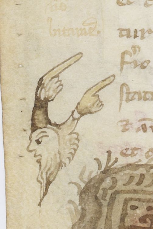
Then there are the really exotic hands, which are turned into a visual feast. Fig. 7 shows and an arm that was turned into the body of a dragon, while the hands in Fig. 8 (which look like ladies’ gloves) are attached to the wrong location on the human body. These hands are not just meant to point out an important passage, they must also have been intended to bring a smile on the reader’s face.

British Library, Royal MS 12 E.xxv (c. 1300)
Fig. 7 – British Library, Royal MS 12 E.xxv (c. 1300): dragon with hand – Source, via
Paris, Bibliothèque nationale de France, Fr. MS 12584 (13th century)
Fig. 8 – Paris, BnF, Fr. MS 12584 (13th century) – Source

Interestingly, while the dragon could easily have been doodled by the reader himself, the depictions seen in Fig. 8 are carefully designed and painted. These pointing hands – the manuscript contains many of them – were probably done professionally. If this inference is correct, it suggests that the reader asked the artisan to insert them during production. This is interesting because it means that the reader already knew what passages he would wanted to have highlighted. It appears he already knew the text well before he owned a copy.

The range of helping hands is remarkable. There were other, easier ways to mark important passages, such as lines and crosses placed in the margin. However, in some cases readers preferred to have a more pronounced signpost. While a tiny line could be overlooked, the hands – particularly if executed with color – really pulled your attention to the thing that mattered. That particular sentiment lives on in modern times, I recently noticed when stopping at a traffic light for bikers in Leiden, The Netherlands, where I live (Fig. 8). “Dear biker”, the modern (sleeveless) manicula expresses, “push the button if you don’t want to stand here all day.” Now that is helpful.

Traffic light in city of Leiden, The Netherlands - Photo EK
Fig. 8 – Traffic light in city of Leiden, The Netherlands – Photo EK

Voices on the Medieval Page (1): The Reader

This is the first part of a series highlighting instances where medieval individuals added information to an existing book, either right after its production or centuries later. What precisely did scribes, readers, booksellers and librarians scribble down? And what do these voices tell us about their relationship to the manuscript? Part 1: the reader.

A medieval book was made because an individual wanted to read, own, the text contained on its pages. However, owning a book in the age before print was a luxury. Due to the long production time (easily half a year for a long text) and the materials used (up to c. 1300 the skins of animals) the cost of a book’s production was steep, even if it contained no decoration or miniatures. This is why up to the later Middle Ages book ownership was generally confined to affluent environments, such as religious houses, courts, and the residences of merchants and patricians.

Considering how special it was to own a manuscript, it may seem remarkable that medieval readers wrote in their books. Indeed, their uninvited contributions could be considerable. While in our modern day scribbling on the page is by many perceived as an almost offensive deed, condoned perhaps only when done for study purposes, medieval readers regarded it a normal practice, an integral part of the reading experience. Marginal notes, underscored text, pointing fingers all helped to digest the text and open a dialogue with the author. Thus the pen was as important as reading glasses.

Leiden, Universiteitsbibliotheek, MS 144 (12th c): annotations added in 13th century
1) Leiden, Universiteitsbibliotheek, BPL 144 (12th c): annotations, 13th century

Annotations
The most common readers’ voices heard on the medieval page concern marginal annotations to the text (Image 1). Reading St Augustine a reader may suddenly remember a relevant passage in the work of another Church Father. With a quick pen action he could opt to place a reference in the margin, perhaps evens with the name of the other authority next to it. He could even quote the referenced text, either by heart or copied from another book. Monks in particular had access to a sizable reference library, a true temptation for the critical reader seeking to interact with the text in front of him.

Alternatively, a reader may jot down a clarifying sentence next to a passage that was hard to understand. In Latin books such notes may start with “Id est”(this is, this means). They are particularly common in university textbooks, but they are also frequently encountered in learned books from other environments – including monasteries. Clarifying notes are usually placed in the margin, that inviting ocean of empty space (as much as 50% of the medieval page was margin). Shorter notes were sometimes scribbled in between the lines. More exceptionally, readers drew clarifying schemes to makes sense of the sense (Image 2).

Deventer, Athenaeumbibliotheek, MS 101 F 23 KL (12th c): diagram added in 13th century
2) Deventer, Athenaeumbibliotheek, 101 F 23 KL (12th c): diagram, 13th century

Highlighting information
Alternatively, a reader may use his pen to highlight important information. He could do so by drawing lines in the margin alongside the text, as we would do today, but there were also more sophisticated means. A particularly attractive one is the pointing finger (Image 3). This well-known signpost comes in different variants. On the one end of the spectrum there is merely the hand with its pointing finger, which is usually extended; on the other end there are hands with elaborated sleeves (like this one), or even those with entire bodies attached to them. A less conspicuous way of pointing out important information was to place the word “nota” (attention) next to it in the margin. The manner in which these signs were executed is highly personal: readers made their own customized pictogram out of the four letters of the word.

St Gall, Stiftsbibliothek, MS 60: finger pointing at marginal note
3) St Gall, Stiftsbibliothek, 60 (11th c): finger pointing at marginal note

Pointing out flaws
Sometimes a reader noticed that something he read was terribly wrong, prompting him to dip his quill in the ink pot. He may, for example, expunge the incorrect words by placing dots underneath them and write the correct reading nearby. Scribes often rid the text of copying flaws after they finished their job, but the picky reader may still find plenty to correct. Some got agitated by the mistakes they encountered as they made their way through the book. The individual who read a late-fourteenth century Dutch Gospel Book now in Vienna remarked the following when he was a third-way into the text, having already corrected dozens of mistakes: “These Gospels have been translated poorly; [the translator] did not understand them very well” (Dese evangelien sijn alte matelec gedietscht, diet dede verstont se qualec). (Image 4).

Vienna, ÖNB, S.n. 12.857 (14th c): "what a poor translation!"
4) Vienna, ÖNB, S.n. 12.857 (14th c): “what a poor translation!”

Personal remarks
This frustrated outcry shows that readers’ corrections did not just concern flaws left behind by the scribe, but also included mistakes that were “baked” into the text from its very conception – when it was first made by the author or translator. They also show how personal (and opinionated!) readers’ remarks may be. There were other reasons to leave personal statements in a book. An enjoyable case for those who love medieval book culture is what Hector van Moerdrecht, Carthusian in Utrecht, had to say about two particularly narrow books in the library. In both he jotted on the flyleaf: “This book does not have the required width; it is too narrow and high”. His verdict was correct because the books do break with the rule for medieval page proportions. Van Moerdrecht’s words sound like those of a disappointed reader, or perhaps they were meant to offer an apology to his fellow monks. As the examples above emphasize, Carthusians were keen on presenting text in a “proper” manner.

Leiden, Universiteitsbibliotheek, MS VLQ 1 (11th c).
5) Leiden, Universiteitsbibliotheek, VLQ 1 (11th c): “Alter liber habet…”.

Logistic remarks
Then there are, finally, instances where it was necessary to add signposts to the page. A reader could, for example, point to another relevant text in the same manuscript (“see also further, on page …”). Particularly interesting are references to books in the library that presented alternative readings of a word or a passage. “Alter liber habet calatis” (our other book has “calatis”) we read in the margin of Leiden, Universiteitsbibliotheek, MS VLQ 1, a late-eleventh century copy of Dioscorides’ De materia medica (Image 5). Such a remark suggests that the individual went through the text critically, comparing it, apparently, with a second copy in his vicinity. Indeed, another reader of the same manuscript frequently placed the letter “r” for “require” (check!) in the margins, showing that he, too, had felt the need to check up on the quality of the text.

Looking at the input of readers on the medieval page makes for exciting research as it allows us to look over the shoulder of the very individuals whose books we study. Evidently, many medieval readers read with a pen in their hand, ready and willing to make their mark on the page and in the text. It is remarkable to observe, finally, how the reader did not shy away from exposing himself as a know-it-all, perfectionist, micro manager, or even, in case of the sneer about the poor translation, as a bit of a grump.

Note: This post was originally written for, and posted on, my project blog MedievalFragments.