Category Archives: Book Culture

Cracking Codes in Medieval Books

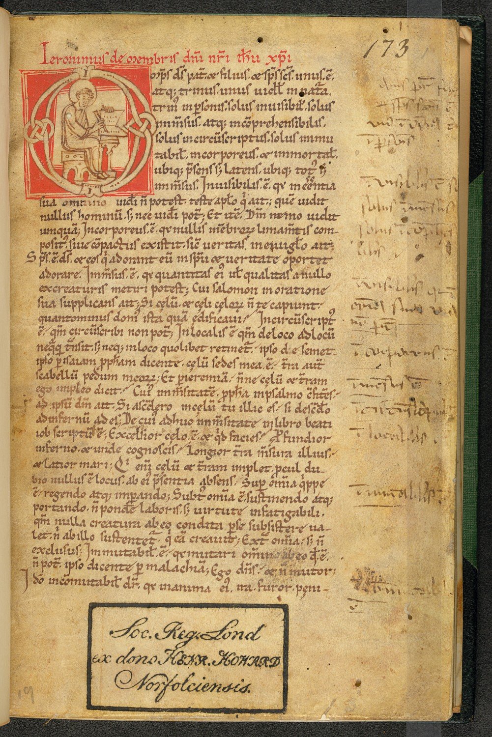
Reading a medieval book may not seem so different from reading a  volume from your own bookshelf: just pick it up, flip to the first page, and start reading. However, apart from the fact that you cannot really hold the average medieval book in your hand – a single volume often weighs as much as a whole pile of today’s books – there is also a problem that occurs when you actually start to read. It turns out you need to decode quite a bit. The first round of decoding happens when your eyes meet the page. The letters on it are shaped very differently from what our brains usually process, so the CPU in our head starts to spin like mad, perhaps even encouraging us to give up. See what happens when you read this snippet from the famous Leiden Glossary (Fig. 1). When you’re done with that, try Thomas Aquinas’ autograph, written in what is appropriately called a ‘littera inintelligibilis’ – indecipherable script (Fig. 2).

Leiden, Universiteitsbibliotheek, VLQ MS 69, fol. 24v, detail
Fig. 1 – Leiden, Universiteitsbibliotheek, VLQ MS 69, fol. 24v, detail (late 8th century) – Source: photo UBL
Vatican Library, Vat. Lat. 9850, autograph Aquinas, 1260-1265
Fig. 2 – Vatican Library, Vat. Lat. 9850, autograph Aquinas, 1260-1265 – Source

The paleographer Lowe defined the first of these as a Pre-caroline Allemannic minuscule, which means it dates from before the establishment of Caroline Minuscule, which came around shortly before c. 800. It is relatively easy to decode the latter with our modern brains. This is because early printers in Italy used Caroline as a model for the Roman typefaces, which ultimately became our Times New Roman. Because we read a version of Caroline on our computer screen every day, we can sort of make sense of a medieval page from the ninth century (Fig. 3).

Leiden, Universiteitsbibliotheek, VLF MS 30, fol. 22v (9th century)
Fig. 3 – Leiden, Universiteitsbibliotheek, VLF MS 30, fol. 22v (9th century) – Source: photo UBL

However, even when you are able to read such easy ‘typefaces’ from before the invention of printing, for example because you happen to be a medieval book historian, there is a second coding problem to overcome, which is much trickier: letters and words are frequently abbreviated with symbols. In fact, sometimes the text of a full page or even an entire book is written in code. Like any cypher, you can only read it if you know the key.

Abbreviations
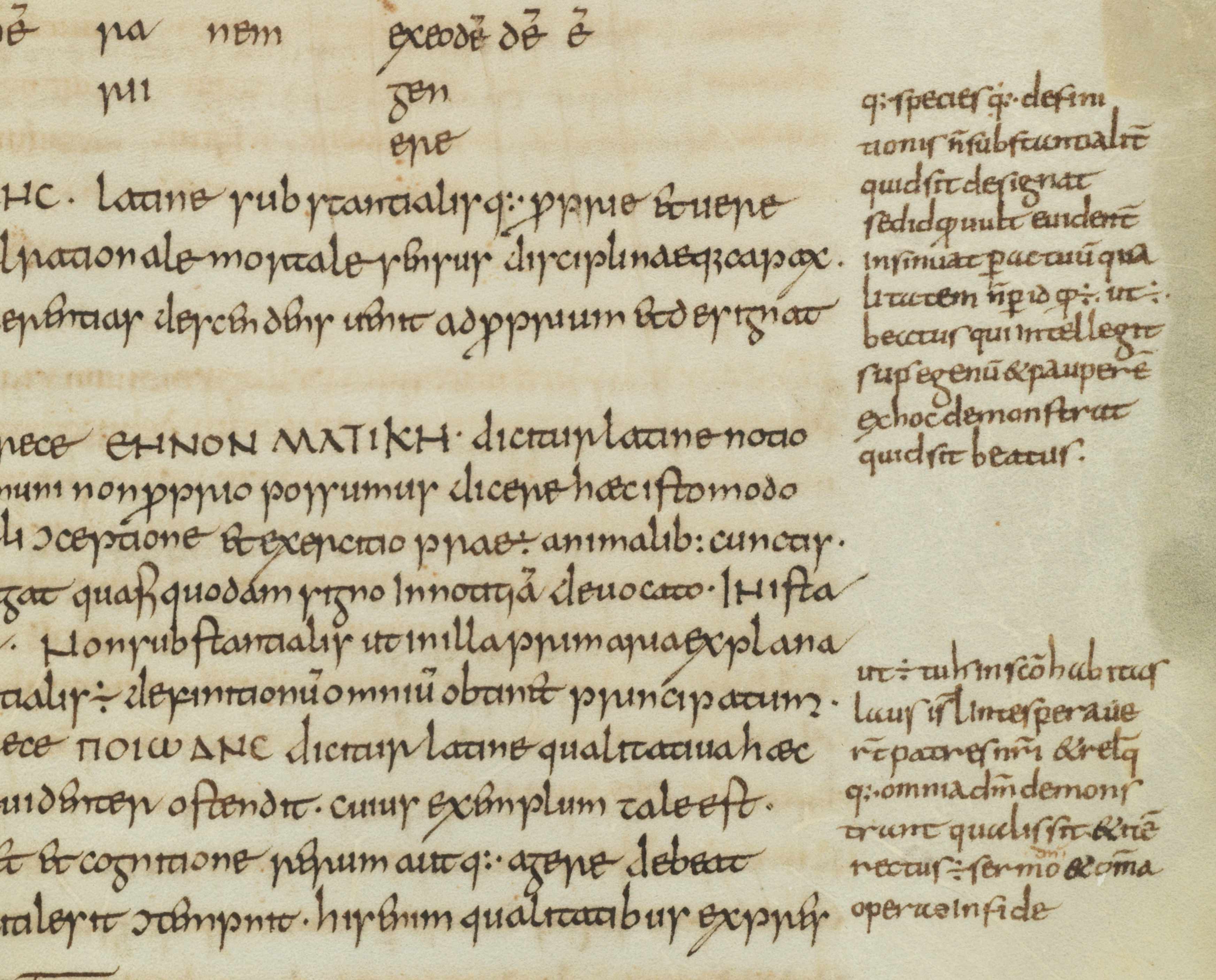
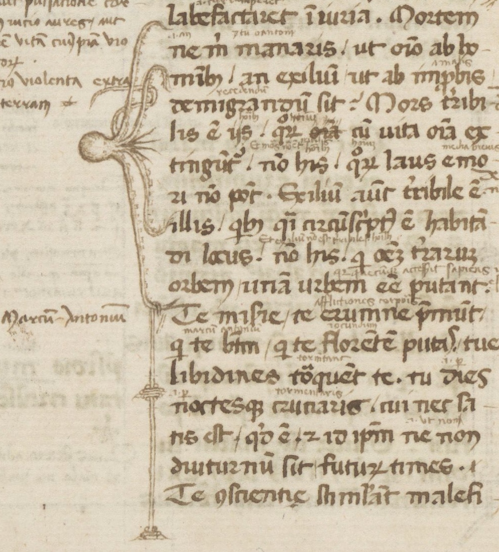
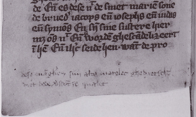
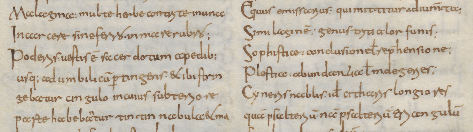
Decoding abbreviated letters and short common words is not rocket science, nor will it have been for medieval readers. Some of these abbreviations are actually still in use today, like the ampersand in the first line of Fig. 3, which starts with ‘Ignibus & ignis’. The ampersand abbreviates the word et (and), from which it, in fact, evolved (more on the genesis here). Less frequent words could also be abbreviated, but this practice was tricky in that the medieval scribe had to judge whether the book’s reader would understand the abbreviations – otherwise the text could not be decoded. Students in the scholastic environment of the emerging universities were masters in coding and decoding words (Fig. 4).

London, British Library, Arundel MS 383 (1250-1300)
Fig. 4 – London, British Library, Arundel MS 383 (1250-1300) – Source

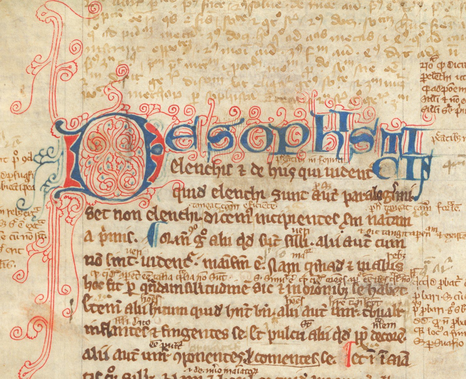
The students who filled this page with notes abbreviated the words like there was no tomorrow. In fact, in the top segment (in the lighter ink) every single word is shortened with the help of lines, half circles, loops, dots and whatnot. It makes sense that students did this: the remarks are for personal use only, so you could do what you wanted. Moreover, shortening text in this fashion saved time and space. Coded words created room for more coded words.

Tironian notes
In the Middle Ages a peculiar abbreviation language existed, which even an experienced reader at the time was not necessarily able to decipher: Tironian notes. This medieval system of shorthand made use of several thousand symbols, which abbreviated entire words. The language is rooted in Antiquity. The poet Plutarch tells us that Cicero had trained scribes to take down notes at a fast pace, including his servant Tiro – hence the name.

Paris, BnF, lat. MS 11553 (9th century)
Fig. 5 – Paris, BnF, lat. MS 11553 (9th century) – Source

In medieval times Tironian notes were used by scholars trained at the highest level (see this excellent blog post). During the ninth century, the heyday of the ‘coding’ symbols, scholars used them to add comments to a text or to criticise them, much like the students in the university textbook in Fig. 4, and for the same reason: to save space and to increase speed. Sometimes such marginal additions are substantial, like those found in a ninth-century Bible kept in Paris (Fig. 5: right margin and in between lines).

Very rarely does one encounter a full text or manuscript copied out in Tironian notes. The ones I know are all filled with the Psalms, such as Paris, Bibliothèque national de France, lat. MS 190 and lat. MS 13160, both from the ninth century (Fig. 6). What is really great about these coded pages is that the first Tironian note of each chapter is executed in the same style as a regular decorated letter would be: enlarged and painted (see also the detail all the way at the top of this post). The result is a big and beautiful nonsensical shape – unless you know what it means.

Paris, BnF, lat. MS 190 (9th century)
Fig. 6 – Paris, BnF, lat. MS 190 (9th century) – Source

At first sight it seems an odd practice to write an entire book out in code, which could only be deciphered by scholars who had enjoyed the same high level of training as the scribe. However, perhaps these peculiar books were used to train individuals in the notation system? Monks knew the Psalms by heart, making them the perfect tool to learn the strange language of Tiro. The Latin titles would prompt a memorised text, after which perhaps the symbols would fall into place. It is striking, in this light, that the Psalms in MS 190 are preceded by a kind of dictionary to look up the meaning of the symbols – as you would want to do when learning a new language. Several of these explanatory texts survive, including in other Paris manuscripts (such as lat. 7493lat. 8777lat. 8778 and lat. 8780).

Leiden, Universiteitsbibliotheek, VLO MS 84 (9th century)
Fig. 7 – Leiden, Universiteitsbibliotheek, VLO MS 84 (9th century) – Photo EK

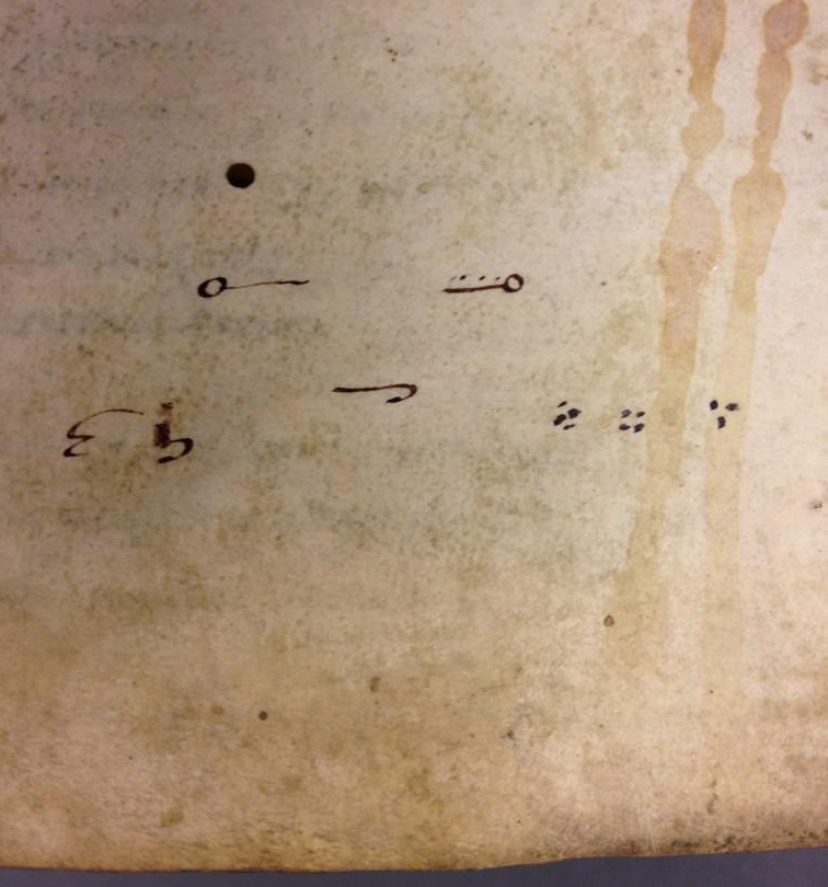
A similar explanatory text is found in Leiden (Fig. 7). The first entries on this page read liber, libellus and librarius (book, booklet and librarian). The symbol for the first looks like a bent line with a dot, in the second the dot is replaced by a comma, while the third shows both dot and comma – a librarian, after all, looks after both books and booklets. Then follow related words, such as parchment (pergamena and, less common, pitacium), page and sheets (pagina, carta, cartula). As this segment shows, the text is not so much a dictionary as a collection of thematic word lists.

Uncrackable code
While not everybody in medieval times would be able to read Tironian notes, probably many scholars could decipher it. However, there is a famous coded book that no one could read but its producer: the Voynich manuscript, which is written in an unknown alphabet (Fig. 8). There is considerable discussion about many aspects of this manuscript, including its precise date (see here) and the meaning  of the text it holds. The latter is perhaps the most striking aspect of the code in which the text is written: no one has been able to crack it.

Yale, Beinecke Library, MS 408 (15th century)
Fig. 8 – Yale, Beinecke Library, MS 408 (15th century) – Source

The manuscript has fascinated scholars for a long time. Until 2013, when news outlets claimed the book had a genuine message (see here), it was not even clear if there was meaning in the madness. Finally, in February 2014 an English professor decoded ten words through the proper names of plants (see here). As intriguing as the book is, from a book-historical point of view it is far less interesting than Tironian notes. After all, while the Voynich manuscript appears to be coded in a highly personal way, placing the book in a relatively isolated position, Tironian notes provide an in-depth look into the fascinating world of medieval scholars. To hear their voices, all you need to do is crack the code.

Books on a Diet

We’re all familiar with that most popular of New Year’s resolutions – and the one that is broken most frequently afterwards. While many oversized medieval books look like they enjoyed life to the max, this post is devoted to a relatively rare kind of manuscript that is much slimmer than what you would expect (Fig. 1). “Expect”, because the relative proportions of manuscripts – the width in relation to the height – form a surprisingly stable feature in medieval book production. In fact, the vast majority of surviving manuscripts have the same relative proportions as our modern paper: their width is around 70% of their height.

British Library, Harley MS 5431 (10th century)
Fig. 1 – British Library, Harley MS 5431, 230×85 mm  (10th century) – Source

This stability ought to surprise you. While readers of printed books had little choice as to the physical appearance of the object they read, owners of manuscripts handled a book that was made especially for them. Consequently, they would commonly have specified what it should look like. You would think that medieval readers might go overboard and abuse this freedom of choice, ordering polka-dotted books with pink letters written upside down on triangle-shaped pages. The opposite turns out to be true. Book owners before print are predictable in that they mostly opted for regular features: their choices are typical, as if they conform to unwritten rules.

This striking act of conformation results from what is a main driving force behind the chosen physical features: the anticipated use of the object. For example, if you anticipated that you would scribble an excessive amount of notes in your book, you would specify to the scribe to extend the size of the margins. And if you knew that you would take a book with you when you left the house, it would make sense to have that copy produced in a suitably small format. This strong link between form and function is good news for us: we may infer that narrow books– sometimes called “holsterbooks” – were put on their diet for good reason.

Ivory Decoration

Frankfurt am Main, Goethe Universität, Barth MS 181 (14th century)
Fig. 2 – Frankfurt, Goethe Universität, Barth MS 181, 402×250 mm (14th century) – Source

One reason to slim books down had to do with their binding; or more precisely, with its decoration. The most prestigious decorative element of a medieval binding was ivory plaques, slabs of tusk on to which elaborate scenes were cut (Fig. 2). They were attached to both the front and back of the manuscript, usually embedded in the wood of the boards. Book projects that involved this costly decoration commonly produced manuscripts that were much narrower (or taller) than the norm. The plaques themselves had to be narrow given the limited width of the tusk. Interestingly, however, manuscript makers appear to have preferred the book to be equally narrow. This was probably done for visual reasons: it looks better when the relative proportions of book and decoration are in sync. Moreover, keeping the book slim meant that more visible space was covered with ivory.

St Gall, Stiftsbibliothek, MS 53 (c. 895)
Fig. 3 – St Gall, Stiftsbibliothek, MS 53, 395×323 mm (c. 895) – Source

This tendency to keep a book narrow when ivory decoration was added is mentioned in a remarkable account by the historian Ekkehart of St Gall (d. 1022). Referring to what is now St Gall, Stiftsbibliothek, MS 53 (Fig. 3) he states that this manuscript was made tall and narrow for good reason. Among the abbey’s treasures, he reports in his chronicle, were two ivory plaques. They once belonged to emperor Charlemagne (d. 814), who used them as a wax tablet, which he kept next to his bed. When it was decided in St Gall that the plaques would be used to decorate the bookbinding of a newly produced Gospel Book, the scribe was asked to design the book in such a way “that it matched the shape of the ivory”. Interestingly, Ekkehart noticed that it was narrower than usual, because he addresses MS 53 as “our tall Gospel Book”.

Books for soloists

St Gall, Stiftsbibliothek, MS 360 (11th century)
Fig. 4 – St Gall, Stiftsbibliothek, MS 360, 255×80 mm (12th century) – Source

A second reason to produce a slim book in medieval times is pragmatic rather than artistic. When one examines what these oddly tall manuscripts contain, as I did in a journal article published in 2012 (details here), it turns out that a fair number consist of texts that were sung by soloists during the church service. Take the Cantatorium and the Troper, two frequently-used musical books. When one limits the view to the period before 1200, as I usually do in my scholarly work, it turns out that all surviving copies are formatted in the slim format discussed here. Another example is the famous St Gall Hymnal, which is not just very narrow, but also very thin (Fig. 4). It is not given a proper binding, but it is stored in a book box, not many of which survive from medieval times.

The reason for these musical books to be designed so awkwardly (in that they break with the norms of medieval book production) is related to how they were used: handheld – literally, as in “while held in one hand”. As I proposed in the article previously mentioned, the effect of the narrow shape was that the weight of the book rested on the palm when it lay open in your hand. This meant that the soloist could easily hold it up for a long period of time. Regularly shaped books, by contrast, executed considerable pressure on the fingertips and the thumb when you held them in one hand. This is not surprising, of course, because they were not designed for holding: they were supposed to rest on a desk or podium while in use. The thinness of the musical books was helpful in this respect, because it greatly reduced their weight, as did leaving off a binding (think St Gall Hymnal). As with the shift in the pressure points, the weight loss helped the reader holding up the book for a long time.

A long tradition

Oxford, Bodleian Library, Douce MS 228 (15th century)
Fig. 5 – Oxford, Bodleian Library, Douce MS 228 (15th century) – Source

While the examples so far focused on the period before 1200, the practice of making slim books is thriving in the later medieval period as well. In the fifteenth century, for example, we see municipal clerks make narrow literary manuscripts, probably conforming to chancery practices. Moreover, there appears to be a real tradition of slender paper books in Middle English literary culture. The Romance of Richard Coeur de Lion in Douce 228, for example, is the slimmest manuscript I know (Fig. 5). It has been argued (here) that this particular manuscript was made for minstrels, in other words that the object was used hand-held. Having read this post, you now know that this makes perfect sense.

Across the board, ivory decoration and handheld use are two significant factors in this long tradition of making “slim” books. When faced with a slender book, we can therefore speculate: was its binding perhaps originally fitted with ivory decoration? Or, if this seems unlikely because the parchment and handwriting suggests a cheap production, perhaps it was made for handheld use? As in modern times, diets and weight loss relating to the medieval book speak to deeper motivations.

Mary Had a Little Book

For the book historian Christmas is a great season. It means that a lot of so-called “Annunciation” scenes make their rounds on social media, the biblical story in which the angel Gabriel announces to Mary that she will give birth to God’s son, Christ. There is something very attractive about these scenes for lovers of medieval books. Especially in the later Middle Ages, Mary is shown to be reading when Gabriel breaks the news. The idea was to show her in a holy place engaged in prayer, studies explain (here and here), and to make this connection to the beholder, she was shown with a book.

While this alone tells you a lot about the role of the book in medieval times, the Annunciation scenes have an even more interesting story to tell. They invited medieval decorators to depict a book and a reader engaged with it, life-like and to the best of their abilities. This implies that we get, by proxy, an unusual visual glimpse into the practice of medieval reading: how is the book held, what does the object look like, and what can we tell about its binding? While not every Annunciation scene contains a book, the seasonal images are like spycams intruding into the intimate world of medieval reading.

The tradition

Aix-en-Provence, Bibliothèque municipale, MS 15 (13th century)
Fig. 1 – Aix-en-Provence, Bibliothèque municipale, MS 15 (13th century) – Source

A quick search in public online databases results in hundreds of Annunciation scenes: the British Library Catalogue of Illuminated Manuscripts returns 160 manuscripts (search here), the French Inititale database no less than 274 (check the result here). This group of 400+ manuscripts provides much information about the tradition of a reading Mary. It is striking, for example, just how many Annunciation scenes depict her with a book. Especially after 1300 there are few without it.

Interestingly, the image databases allow us to gauge in what kind of manuscript the scenes are predominantly found. By far the majority are Book of Hours, but there is also a fair share of Psalters and Bibles, as well as some liturgical books such as Missals. The most popular vehicle of this scene, the Book of Hours, is connected to private devotion, as are many Psalters and some Bibles and Missals. After 1300 private devotion is one of the most common settings for using a book. In other words, the readers of these manuscripts were engaged in precisely the same thing as Mary: praying with a book in their hand.

Paris, Bibliothèque Mazarine, MS 469 (15th century)
Fig. 2 – Paris, Bibliothèque Mazarine, MS 469 (15th century) – Source

It is significant that both Mary and the medieval reader are engaging with the book as an object during one of the most important scenes from Christian devotional culture: the birth announcement of Christ. The object had obviously become an important religious tool. What is also striking is that Mary is shown interacting with the book in different ways. She is often caught reading, with the book placed either in her hand or on a table or podium in front of her (Figs. 2-3 and top pic, Angers, BM, 2048). In other cases she is simply holding the object in her hand, either open or closed (Fig. 1). In most cases Mary is depicted in a room or a building with arches (Figs. 1 & 3), providing the illusion of a church or a holy place in general. She is often raising her hands in surprise – although to our modern eyes she seems to gesture “No, thank you!” (Fig. 2).

London, British Library, Add. MS 49598 (Benedictional of Aethelwold, 936-984)
Fig. 3 – London, British Library, Add. MS 49598 (936-984) –  Source

While it is really easy to find bookish Annunciation scenes from the later medieval period, when the tradition of a reading Mary was well established, examples from before 1100 are rare. The earliest I have been able to find date from the late tenth century. The oldest is the magnificent St Aethelwold Benedictional (Fig. 3), which was made in 963-984 for Aethelwold the Bishop of Winchester (this is a digitised version). Another late-tenth-century example is the so-called Corvey Gospels in Wolfenbüttel, in which Mary is shown with a very thin book in her hand (image here).

Older examples of a reading Mary do exist, but not in books – at least not to such an extent that I was able to easily find them. A scene dating to the ninth century, for example, is found on an ivory situla, a bucket for the holy water used in the Mass (Fig. 4). It shows Mary looking up from her book to see the angel Gabriel making a gesture of blessing with his hand. The arch above her suggests she is in a room, a holy space, as seen in so many manuscript depictions.

New York, Metropolitan Museum, Accession  Nr. 17.190.45 (860-880)
Fig. 4 – Metropolitan Museum, Accession Nr. 17.190.45 (860-880) – Source

Mary had a little book
Apart from providing a peek into rooms where readers are interacting with books, these seasonal images also show us what manuscripts in medieval times looked like. Granted, most objects are shown rather generically, but in some cases the decorator shows us realistic details. It is striking, for example, that many images in which Mary is holding her book show her with a surprisingly small object in her hand (Fig. 1). These are likely meant to represent a portable book, a type of manuscript designed to be carried around.

New York, Metropolitan Museum, Cloisters Collection 56.70 (1427-1432)
Fig. 5 – Metropolitan Museum, Cloisters Collection 56.70 (1427-1432) – Source
The Hague, Royal Library, MS 135 J 55 (c. 1460)
Fig. 6 – The Hague, Royal Library, MS 135 J 55 (c. 1460) – Source

If we expand our scope and include medieval paintings, we are shown more details of the medieval book as a physical object. Notably, the famous Merode Altarpiece from the early fifteenth century shows Mary holding a book fitted in what is called a chemise binding (Fig. 5). This type of binding allowed the reader to fold the book into a piece of cloth or leather extended from the binding. Only a handful survive, so it is a great coincidence that one of them actually covers up an Annunciation scene – albeit that Mary is bookless in this one (Fig. 6).

Curiously, Fig. 5 shows a second book on the table, with a green bag underneath it. This bag is another medieval artifact that survives in very small numbers: the book pouch, which was also used for carrying a book around. The same velvet pouch is seen in the Annunciation scene by Gerard David (c. 1500) – see it here. Both bookbindings in the Merode Altarpiece indicate that the manuscripts Mary is using are portable. More importantly, the beholder would have recognised them as such. By the later Middle Ages, devotional practices had become a “movable feast” and so books used to that end needed to be shown as ambulant. In that sense too the manuscripts depicted here are very realistic.

Metropolitan Museum, Cloister Collections, 54.1.1 (1405-1408)
Fig. 7 – Metropolitan Museum, Cloisters Collections, 54.1.1 (1405-1408) – Source

It is interesting that the Merode Altarpiece shows Mary with two books. It appears that this increase started in the fifteenth century and continued into the age of print. The famous “Belles Heures” of Duc du Berry, produced by the Limbourg Brothers in the early fifteenth century, shows Mary in the vicinity of three books as well as a scroll (Fig. 7). In a sixteenth-century woodcut by the famous Albrecht Dürer there are also three books present (here). Both examples give the traditional church environment the feeling of a modest library. Considering that she would soon be with child, to the modern viewer it makes sense that Mary tries to get as much quality time with her books as possible.

The Medieval Origins of the Modern Footnote

Last week I posted a blog on note-taking in medieval times. It showed how individuals who wanted to jot down a note dealt with the absence of notepads and scrap paper. As in our modern day, the urge to write down a note in medieval times often came while reading a book. And so the margins of the page grew into a prime location where the reader could vent his objections or – albeit more rarely – express his or her approval.

The present post deals with the logistics behind this “window dressing”: it shows how a reader with many important things to say kept track of his marginal comments. Particularly, it deals with a serious problem that came with adding notes to the page: how to connect a particular comment, placed among a dozen others, to the specific text passage it refers to. The clever system that was created for this purpose lives on as our modern footnote.

Disconnected

Bern, Burgerbibliothek, MS 234 (10th century)
Fig. 1 – Bern, Burgerbibliothek, MS 234, fol. 11r (9th century) – Source

The crux of our footnote system is the presence of a symbol that connects the note to the relevant location in the text. Curiously, in medieval times it was quite common not to have such connections in place, perhaps especially in the earlier period (Fig. 1). When few remarks were added to the page, a reader could deduce with relative ease to which passage a marginal note referred. It helped if a text was in popular use or known by heart, as many medieval works were. In such cases the note made sense instantly because the reader was familiar with the referenced literary context. Moreover, as long as notes were few and short, a reader could simply insert them – interlinearly – over the relevant word or passage (Fig. 2).

Alençon, Bibliothèque municipale, MS 12, fol. 21v (9th century)
Fig. 2 – Alençon, Bibliothèque municipale, MS 12, fol. 21v (10th century)
Cologny, Fondation Martin Bodmer, Cod. 89, fol. 59v
Fig. 3 – Cologny, Fondation Martin Bodmer, Cod. 89, fol. 59v (Horace, 12th century) – Source

Cleverly, in this system the very position of the remark identified the word to which it referred. However, as the number and size of such comments increased, it became impossible to place them between the lines. The great blank space provided by the margins was now drafted into service. It is here that the absence of a proper reference system was felt. As the marginal body of remarks and critique began to accumulate, the page became a real messy place, a labyrinth in which it became impossible for readers to find specific pieces of information (Fig. 3). In came the footnote.

Dots and lines
Connecting a marginal remark to the relevant passage in the text was usually done with a duplicated symbol, called a signe de renvoi: one was placed in front of the marginal note, the other near the word or passage that the remark commented upon. While it is hard to deduce a clear pattern of development, it appears that in the early stages of using such footnotes scribes and readers resorted to plain symbols rather than letters or numbers. These symbols varied considerably in shape and sophistication. At the high end of the spectrum we encounter complex symbols, such as the reversed letter E seen in Fig. 4 (magnified).

St Gall, Stiftsbibliothek, MS 4, fol. 170r (10th century)
Fig. 4 – St Gall, Stiftsbibliothek, MS 4, p. 170 (820-840) – Source

More popular, however, were less complex symbols, which could be added to the page much quicker. Dots and lines are particularly common ingredients of such footnote symbols. Interestingly, their first appearance (it seems to me) is not as a connector of comment and text, but as an insertion mark that added an omitted line into the text. In Fig. 5 such an omitted line is placed in the margin accompanied by a symbol made up of a line and a dot. It is repeated in the text itself, near the location where the line belonged. This omission mark may well be the origins of the footnote system that would emerge over the course of the Middle Ages – and that we still use today, almost unchanged.

Einsiedeln, Stiftsbibliothek, MS 172, p. 20 (9th century)
Fig. 5 – Einsiedeln, Stiftsbibliothek, MS 172, p. 20 (9th century) – Source

Scribes used different versions of the line-and-dot symbol. In fact, they had to if they were to produce unique ties between comment and text. When dots were used, their number would increase as more notes were added. Alternatively, the position of the dots could be varied, so that they formed different – unique! – patterns.

Leiden, University Library, VLF MS 69, flyleaf (12th century) - Photo EK
Fig. 6 – Leiden, University Library, VLF MS 69, flyleaf (12th century) – Photo EK

Customising the line-type footnote, scribes usually distinguished one from the other by added circles, which were attached at different locations and in varying numbers. In what is a most unusual find, in a Leiden manuscript we see a scribe practicing his dot and line footnote symbols (Fig. 6). It shows variations in the number and pattern of dots, as well as in the treatments of lines.

Letters
Closest to our modern system of footnotes, finally, is the use of letters to tie a marginal remark to its proper location in the text. In some manuscripts we see the entire alphabet running down the margin. Fig. 7 shows a page from a manuscript with works by Horace (left column) to which a high volume of notes were added (right column), all of which are connected to specific passages with the letters A to Z.

Leeuwarden, Tresoar, 45HS, fol. 45r
Fig. 7 – Leeuwarden, Tresoar, 45HS, fol. 45r (c. 1100) – Photo EK

In the eleventh and twelfth centuries such classical texts were most commonly used in a classroom setting. The instructors who used the books, typically in a monastic school, had many things to explain to their students, as the notes show. It made sense to organise such added information in a clear manner, and the alphabet came in handy in this respect. Some pages in this particular book contain more footnotes than there are letters in the alphabet, which challenged the system. In such cases the user added into the mix symbols made from lines and dots.

The last word: numerals
So where are the medieval footnotes that make use of numbers, like we do today? Curiously, I have not been able to find them, which kind of makes sense. Roman numerals would not be suitable for the task. Placed out of context, as a symbol initiating a segment of text (i.e. the marginal comment) they would easily be mistaken for a letter – which they are, graphically speaking. Moreover, a high Roman numeral would quickly take in a lot of space – not what you want in a note symbol. Arabic numerals were far were less popular than Roman numerals, even in the later Middle Ages. Readers may not have felt comfortable enough with these new numbers to use them in the margin. In fact, some scribes in the later Middle Ages are still confused by the zero. The leap from alphabet to numerals – from the medieval to our modern system – appears to have been taken in the age of print.

Medieval Notepads

We are surrounded by pieces of scrap paper. We chuck tons of them in the waste bin each year, leave them lying on our desks, use them as bookmarks, stuff them in our pockets, and toss them on the street. And so we usually do not have to look hard or long when we need a piece of paper for our shopping list or for writing down a thought. This was very different in medieval times. Writing material – of any kind – was very expensive back then, which meant that scribes used a paper or parchment sheet to the max: everything was used. As a result, there was nothing obvious lying around on one’s desk that was suitable for scrap material. So how did the medieval person make notes?

In the margin

Leiden, University Library, BPL 2888 (Italy, 13th century)
Fig. 1 – Leiden, University Library, BPL 2888 (Italy, 13th century), Photo Julie Somers – Source

The most common and sensible location for putting down thoughts, critique or notes was the margin of the medieval book. Consider this: you wouldn’t think so looking at a medieval page, but on average only half of it was filled with the actual text. A shocking fifty to sixty percent was designed to be margin. As inefficient as this may seem, the space came in handy for the reader. As the Middle Ages progressed it became more and more common to resort to the margin for note-taking. Notably, the thirteenth century gave birth to two particularly smart book designs that accommodated such use. Both types are connected to the emerging university, which makes sense as this was a note-taking environment par excellence – then and now.

The first of these is seen in Fig. 1, which shows a page of a law manuscript that actually contains two kinds of texts. Found in the two central columns is the Digest of Justianian, written in a slightly larger letter. Draped around it, in a smaller letter, is the commentary to this work: these are the notes of smart teachers from the past, put there collectively to help the reader make sense of the law. This specific style of presenting two works on the one page, where the glosses (commentary) are presented as “square brackets”, is called textus inclusus. An Italian reader in the thirteenth century added his own two-cents to these “prefab” opinions that came with the book: in Fig. 1 we see them scribbled between the two central columns.

London, British Library, Harley 3487 (13th century)
Fig. 2 – London, British Library, Harley 3487 (13th century) – Source

The second thirteenth-century book layout that was specially designed to accommodate note-taking is as clever as the text on its pages. We encounter it first and foremost in manuscripts with works by Aristotle, although the design would spread to other domains, including law and medicine. As seen in Fig. 2, the margins surrounding the Aristotle text (which form the two central columns) were left completely blank by the scribe. The tiny writing that is seen there now is from a student in the Arts Faculty, where the works of Aristotle formed the main textbook, called the Corpus vetustius (the old corpus).

If you look carefully you see five vertical commentary columns marked by thin pencil lines, which allowed for five “pillars” of notes. Cleverly, in this page design the start of the note could be placed at the same height as the Aristotle line on which it commented, not just one time, but five times over! Larger comments were placed in the larger blank areas in the lower margin. Some of these Aristotle textbooks contained up to twenty “zones” for notes, which would ultimately be connected to the main text with the help of symbols resembling our current footnotes.

Yellow sticky notes 

Sens CT Library, J 36 (Chartaire 156), 9th century, photo Genevra Kornbluth
Fig. 3 – Sens CT Library, J 36 (Chartaire 156), 9th century, photo Genevra Kornbluth – Source

As stated, paper and parchment sheets were commonly used to the max, meaning no redundant material was left that could be used for scraps. However, when the animal skin was turned into parchment sheets such redundant material was left over. In the process the outer rim of the dried skin was removed, because these “offcuts” were deemed unsuitable for writing on. The material was too thick for a regular page and its surface was slippery and translucent, not to mention that most offcuts were too small for normal pages. They consequently ended up in the recycling bin of the parchment maker.

Interestingly, these small, scrappy slips of parchment were sometimes sold to clients. Offcuts were used for text with a short lifespan, such as letters and drafts. In addition, it was used when a text was “utilitarian” and did not need to be produced from regular – more expensive – parchment. An example is seen in Fig. 3, which shows a short description strapped to a bone that belonged to a saint. Such “relic labels” were important because of course nobody wanted to mistake the big toe of St Peter for that of St Paul. Such information was scribbled on the parchment strip, usually in low-quality (fast) handwriting.

Leiden, University Library, BPL 191 D, fragment (France, 13th century) - Photo Giulio Menna
Fig. 4 – Leiden, University Library, BPL 191 D, fragment (13th century) – Photo Giulio Menna
Birch bark strip used by the student Onfim, dated 1240-1260
Fig. 5 – Novgorod, Museum of History, birch bark strip 202, from pupil Onfim, dated 1240-1260 – Source, blogmore

Offcuts were also frequently used by students and scholars, for example for taking notes in the classroom (Fig. 4, more here). In fact, in De discipline scholarum, a guidebook made in the 1230s for students and teachers at the University of Paris, it is explained how a student should bring such slips of parchment to class for taking notes. Interestingly, some of these slips have survived because they were pasted in a student’s textbook, like the one seen in Fig. 4. These are truly the medieval equivalent of our “yellow sticky notes”. The practice of bringing scrap material into the classroom was a much broader medieval phenomenon, as is shown by the famous birch bark notes that survive from 13th-century Russia. Fig. 5 shows funny “stick figure” doodles drawn by the student Onfim as he was sitting, bored no doubt, in class.

The last word: notepad
There is evidence that multiple parchment offcuts were sometimes bound together, by pricking a hole in them and pulling a cord through. These bundles, which essentially form a true notepad in the modern sense of the word, could be of considerable size. A specimen in the Universitätsbibliothek Würzburg consists of thirty slips. A type of notepad that was even more popular in medieval times was the wax tablet (here is a collection of them). These, too, were often tied together into a bundle, forming a notepad of perhaps six or so “pages” (Fig. 6, note the holes for the cords on the left side). Smart pages, that is, because the contents could be erased from the soft wax (with the flat back of the stylus), presenting vacant space for fresh thoughts.

Michigan, University Library, Papyrology Collection, Inv. 768
Fig. 6 – Michigan, University Library, Papyrology Collection, Inv. 768 (4th-6th century) – Source

Medieval Spam: The Oldest Advertisements for Books

Advertisements are all around us. As I am writing this post, waiting in an airport lobby, I can only escape them if I close my eyes and cover my ears. Marketing and advertising are practices dating back to medieval times and we encounter them even in the world of books. While rare, surviving book advertisements are fascinating because they highlight what salesmen thought potential buyers deemed important about their products. Advertisements form, in an unusual way, a unique keyhole view into the hearts and minds of readers that lived a thousand years ago. Fascinatingly, surviving book advertisements come in very recognisable – modern – formats: some are window displays, others are spam in books, and yet others are flyers posted in public places.

Window displays

The Hague, Royal Library, 76 D 45 (advertisement sheet, c. 1450)
Fig. 1 – The Hague, Royal Library, 76 D 45 (advertisement sheet, c. 1450) – Source

While still rare, the most common surviving book advertisement from medieval times is the so-called ‘advertisement sheet’ from medieval writing masters (Fig. 1). Individuals who could write had a valuable gift, both intellectually and financially: they were able to duplicate any piece of writing, from short letters to full books; and they could do so for money. During the last three centuries of the Middle Ages (1200-1500) the demand for books rapidly increased, in part because of their cheaper production and the growing numbers of readers. Increased demand had a major impact on supply: urban professionals took over book production from the abbeys. They started to charge money, make profit, and build the commercial book market we still have today (more about such commercial activities in this blog post).

As more people became involved in commercial book production, competition among artisans increased. Starting in the thirteenth century, the book world became a market place where producers had to show what they had to offer – and more so than their nearby colleagues (Fig. 2). It is in this context that we are to understand the advertisement sheet in Fig. 1, a handful of which survive from the Middle Ages. Encompassing over ten different scripts, each one more fancy than the next, it displays the expertise of the artisan to potential customers. The sheet was made by one Herman Strepel, who worked around the middle of the fifteenth century, perhaps in the German city of Münster.

Paris, BnF, fr. 25526, fol. 77v (1325-1350)
Fig. 2 – Paris, BnF, fr. 25526, fol. 77v (1325-50): commercial shop with scribe and illuminator – Source

The sheet in Fig. 1 is a clever marketing tool in other ways as well. The samples are accompanied by their proper names, written in attractive letters of shiny gold. This vocabulary allowed the clientele to enter into a professional conversation with the scribe – using such term as ‘fracta’, ‘rotunda’ and ‘modus copiistarum’. The back of the advertisement sheet is blank, which means it was probably displayed in clear sight of potential customers, perhaps in a window or against a wall. A specimen from a German scribe says, ‘If you want to learn to write, do come in.’ It not only shows that artisans extended their services well beyond merely producing books (they were professional trainers as well), but it also that such sheets were put on display right outside the door.

Spam in books

Giesen, Universitätsbibliothek, 945 (advertisement in book)
Fig. 3 – Giesen, Universitätsbibliothek, 945 (advertisement at end of book)

The best way to show off one’s abilities as a book producer was through the book itself: every page is an appraisal of the artisan’s qualities. Some scribes directly addressed potential customers on the last page of a book, where they explicitly referred to the fine quality of the manuscript – and by proxy their abilities. An illuminating case concerns a scribe who calls himself Herneis. On the last page of a book he had copied for a client he wrote the following note: ‘If someone else would like such a handsome book, come and look me up in Paris, across the Notre Dame cathedral’ (Fig. 3). The message ‘lured’ the beholder to the book street of medieval Paris, right opposite the cathedral. It’s a great example of medieval spam.

A slightly less blatant case of spam is from fifteenth-century Holland, the most western province of the Low Countries. Six Middle-Dutch manuscripts survive from an anonymous commercial scribe operating there. They all contain the same text, a History Bible, which suggests that the individual specialized in one particular genre. The surviving copies show variation in layout, writing support (paper/parchment), the inclusion of miniatures, and in the quality of the script. These differences most likely reflect the wishes of the patrons that were served. Interestingly, one of the manuscripts (Leiden, University Library, LTK 231) contains an intriguing message: ‘If you like this copy of the Old Testament, I can also produce a book with the New Testament for you.’ This tempting offer has the feel of iTunes’ ‘Complete my album’ or, more appropriately, the suggestions Amazon makes for further reading.

Flyers

Oxford, Bodleian Library, Arch. G. e. 37
Fig. 4 – Oxford, Bodleian Library, Arch. G. e. 37 (c. 1477) – Source

The rarest kind of medieval advertisement is also the smallest. It measures only 80×146 mm, a little bigger than a credit card. As with historical artifacts in general, the smaller a bookish object is, the slimmer the chances that it survived. The small strip of paper seen in Fig. 4 is an advertisement that promoted William Caxton’s Sarum Pie (‘Ordinale ad usum Sarum’), a religious book he printed in his Westminster shop in 1477 (more here and here). It is a very small flyer that was to be posted in the city, given the Latin closing remark ‘Supplico stet cedula’ (please leave this [strip] posted). It is the earliest printed advertisement in English and it has a lot to tell.

The printed strip shows interesting parallels with the previous two items. As with the spam message of Herneis, Caxton tells customers where to go, which is the bare minimum that an advertisement has to do: ‘late hym come to Westmonester in to the Almonesrye at the reed pole’. Moreover, it stresses that the book has no typos (it is ‘well and truly correct’) and can be bought cheaply (‘and he shal have them good chepe’). Just like the advertisement sheet of Herman Strepel, Caxton’s piece of paper comes with a great marketing trick: it states that the new publication is ‘emprynted after the forme of this present lettre’ (is printed in the same typeface as this very note). In other words, the reader can tell with his own eyes that it is worthwhile heading over to Caxton’s shop.

Marketing tricks, sending out spam, and using colourful letters to attract clients: medieval advertisements are as effective today as they were 600 years ago.

Note – Want to know more? Check out this lecture I gave on commercial book production.

Dressing Up: Medieval Books Wearing Leather

Every book needs a coat, a protective layer. Without it, after all, the pages would be exposed to the elements and the dirty hands of readers. And so from the very early days of the book the object was given a binding. Medieval bindings mostly consist of two components: boards, commonly made out of wood (but in the later Middle Ages also from compressed paper), and something to cover the boards with. While in medieval times the most common covering material was leather, there is great variation observed in the kind that was used, as well as how it was decorated. Readers and reading communities had their own preferences in this regard. As a result one can “read” as much from the outside of the book as from its pages: they both transmit important cultural-historical information. Here is a post with an exotic twist, which includes bindings made from seal and human skin.

Wearing leather

British Library, Add 89000 (7th century)
Fig. 1 – British Library, Add 89000 (7th century) – Source

Most medieval bindings were made out of animal skin: usually it was a calf or pig who involuntarily ended up protecting the manuscript. Leather proved an ideal material for binding books. The material is stiff, which means it does an excellent job protecting the precious cargo inside, while at the same time adding to the desired “firmness” of the book. The material also repels water quite well. This benefit may seem odd, but it’s not. While monks may not have been reading books in the bath tub, they did consult them in the cloister, which was often a damp environment – given that the hallways were in the open air.

An added bonus of leather was that it accommodated blind-tooled decoration, which was applied in mesmerising shapes and patterns. The oldest book to survive with its original binding still in place is the seventh-century St Cuthbert Gospel (which is a Gospel of John, in fact). It shows just how utterly charming early-medieval leather bindings were; and how beautifully they were decorated (Fig. 1). The manuscript in question was placed in the coffin of St Cuthbert shortly after his death in 687. It was discovered when the grave was opened in the early twelfth century. Because by then a cult had grown around St Cuthbert, the book – and its original binding – was well taken care of. In fact, the binding looks like it was made yesterday.

British Library, Papyrus 1442 (dating 716-717)
Fig. 2 – British Library, Papyrus Codex 1442, binding  (716-717) – Source

The use of leather bindings predates books made out of parchment – like the book of St Cuthbert. Before parchment became common, books were made from plants – papyrus. Such papyrus codices were extremely fragile and they needed the protective qualities of leather, which may ultimately be the origins of the tradition of using skin for bindings (Fig. 2). Given that papyrus became in disuse after the fifth century (with some exceptions), very few original bindings of papyrus books survive. The oldest specimens we have are those in the so-called Nag Hammadi Archive, which date back to the third and fourth centuries (look at some images here). As you can see from Fig. 2, these covers of papyrus books were also decorated handsomely.

Exotic leather

National Library of Sweden (c. 1200)
Fig. 3 – National Library of Sweden (c. 1200) – Source

What to do if you need a leather binding, but there are no cows or pigs to slaughter for this purpose? The answer is seen in Fig. 3, which shows a book that was copied and bound in Iceland. Naturally the binder turned to creatures that were available there. This is how a poor seal ended up covering this Old Icelandic book with sermons, which was made around 1200. If you look carefully you can still see a significant amount of hair on the outside. As with other cases where animal hair is found on book covers, the hairs have turned green over time – or perhaps from the liquids involved in processing animal skin into leather.

The story gets even more graphic. The skin used for bookbindings is not limited to animals. Under the name anthropdermic bibliopegy goes the practice of using human skin for binding books. Perhaps surprisingly, it turns out to be a post-medieval practice, particularly popular in the 17th and 18th centuries. The cover seen in Fig. 4 dates from the early 17th century and the skin was taken from the priest Father Henry Garnet. He was executed in 1606 for his role in the Gunpowder Plot, the attempt to ignite 36 barrels of gunpowder under the British Parliament. The book in question actually outlines the story of the plot and the evidence of Garnet’s guilt (more on this book here and here). The origins of the binding must have given the reader significant satisfaction.

Book bound in human skin (early 17th century)
Fig. 4 – Book bound in human skin (early 17th century) – Source

The last word: cloth
Not all medieval books were dressed up in leather. Less commonly used, perhaps because it is more fragile, is cloth. This material handled the frequent use of a book far less well than leather. The real-world use of a medieval book was such that the object would be pushed back and forth over a wooden desk, which did not exactly contribute to a long life. The cloth binding seen in Fig. 5 dates from the middle of the fifteenth century and it covers a monastic rule.

Stockholm, National Library of Sweden (c. 1450)
Fig. 5 – Stockholm, National Library of Sweden (c. 1450) – Source

The manuscript has a particularly pretty button to close the volume up (see image at top of blog), adding further to the charm of this beautiful bookbinding. In the age of the printed book such cloth bindings (and embroidered ones) became more common, perhaps because increasingly more books became owned privately. This meant, of course, that the objects were not consulted on the hard surface of a wooden desk, but on the soft lap of the reader. As with embroidered bindings, which also increased in popularity in post-medieval times, cloth may have been regarded as a more suitable material for private reading. In tune with the dressing code for medieval books, the objects knew when to slip into something more comfortable.

Note – This blog post tells you more about leather bindings; it includes some great images as well.

Getting Personal in the Margin

At its very heart the medieval book is a vehicle of information. It was an expensive receptacle for text, which was poured onto the page by the scribe, and retrieved by the reader. As strange as this may sound, as a book historian I have limited interest in the actual text found on the medieval page. My job is to look at books, not to read them: knowing author, genre and purpose often suffices for what I do. Very different, however, is my attitude towards words found in the margins, placed there “extra-textually” by scribes and readers. Here we may find information about the production circumstances of a given manuscript and the attitude of scribes or readers towards a text. In most books, there was ample room  to add such details, because on average a stunning fifty percent of the medieval page was left blank. It is in this vast emptiness, so often overlooked in editions of texts, that we may pick up key information about the long life of the book.

Pointing a Finger

Kansas University, Kenneth Spencer Library,  MS C54 (15th century)
Fig. 1 – Kansas University, Kenneth Spencer Library, MS C54 (15th century)

We are taught not to point, but in the margin of the page it is okay. Readers frequently felt the need to mark a certain passage, for example for future reference or to debate its meaning (Fig. 1; more here). To do so, they added manicula (Latin for “little hand”) those highly entertaining pointing fingers. This is good news for us, because they facilitate a look into the mind of a medieval reader. It is not uncommon that a person’s interest shines through the collection of marginal hands in a manuscript. While most individuals simply marked spots with an X, the pointing hand provided a much clearer – and more expressive – signpost. A particularly entertaining pair is found in Berkeley’s Bancroft Library. To mark a particularly long passage we encounter a hand where all five fingers have been drafted into service, while in another case the hand is replaced by an octopus with five tentacles (Fig. 2-3).

Berkeley, Bancroft Library,  BANC MS UCB 085 (14th century)
Fig. 2 – Berkeley, Bancroft Library, MS 85 (14th century)
Berkeley, Bancroft Library,  BANC MS UCB 085 (14th century)
Fig. 3 – Berkeley, Bancroft Library, MS 85 (14th century)

From time to time a debatable passage is highlighted by a pointing device that is part of the book’s decoration, like Augustine taking a stance while aiming his spear at a gloss in the text, seen at the top of this post (source).

Critiquing Authorities

Vienna, ÖNB, S.n. 12.857 (14th century)
Fig. 4 – Vienna, ÖNB, S.n. 12.857, fol. 95v (14th century)

There is nothing more inviting to a critical mind than the empty space of the margin. Medieval readers frequently felt the need to vent in that location, for different reasons. Like Augustine and his spear, they would express their dismay about something. There is the Carthusian monk from Herne, for example, who could not handle the poor Latin-Dutch Bible translation he was reading. With a pen shaking from frustration he wrote: “Whoever translated these Gospels, did a very poor job!” (Fig. 4) The same person is encountered in the margins of a different manuscript, where he corrected yet another flawed translation (Brussels, Bibliothèque Royale, MS 2849-51). Providing improved readings in the margins he added the following personal touch: “This is how I would have translated it.” Take that, translator!

While such explicit remarks are exceptional, critiquing the text in the margin was a normal thing to do as a medieval reader. In most cases he or she would jot down a gloss next to the actual text and connect the two with so-called tie marks – the precursor of our footnote (Fig. 5). This practice became particularly popular in the university classroom of the thirteenth century. The De disciplina scholarum, a student guidebook from Paris, stipulated that wax tablets or tiny slips of parchment were taken into the classroom for note-taking. These notes were later added to the margins of students’ textbooks. Aristotle manuscripts, the main textbook for the Arts Faculty, even provided a clever “zoning” system to accommodate criticism: the margins were broken up into vertical columns where the opinions of master and student would settle (visible in Fig. 5).

London, British Library, Harley MS 3487 (13th century)
Fig. 5 – London, British Library, Harley MS 3487 (13th century): marginal notes preceded by tiemarks

Scribes Getting Personal
The examples so far show how marginal additions allow us to peek into the world of those who read manuscripts. Similarly, marginalia bring us closer to those who made the books. Well known are the logistical remarks. From time to time we encounter cross references (“For more on this theme, see this and this page”), remarks about a manuscript’s contents (“Something seems missing here”), or indicators expressing that something is missing (“Vacat”, this is empty). While these statements suggest that book makers put their heart into their scribal work, they can hardly be called “personal”.

That label is appropriate for a rarer type of scribal remark. From the same Charterhouse as the nitty-gritty reader who disliked the Gospel translation comes the following marginal notation: “I put this text here because it also contains work by [the author] Jacob van Maerlant” (Ghent, Universiteitsbibliotheek, MS 1374, fol. 129r). Says the same scribe in another manuscript: “I copied this here because it analyses faith” (Vienna, ÖNB, Cod. 13.708, fol. 218r). With these remarks the scribe appears to deliver a personal message to the reader, sharing his rationale for compiling the collections.

London, British Library, Add. MS 30024, fol. 1v (Mechanical arts)
Fig. 6 – Depiction of the mechanical art “escriture” (writing), showing a commercial scribe, front (London, British Library, Add. 30024, fol. 1v, detail)

Other personal statements come from the world of commercial book production. Here it was all about making a profit out of producing and selling books (Fig. 6). Some artisans wrote their name and location in the margin, like a medieval form of spam (I wrote about it here). Not every paid scribe was equally happy with what he received and from time to time we encounter complaints. On 15 May 1444, at nine o’clock in the evening, the scribe Henry of Damme finished a copy of a chronicle about the city of Brussels, which he had copied for the municipal government. In a corner of a flyleaf he tallies his expenses: “11 golden letters, 8 shilling each; 700 (initial) letters with double shafts, 7 shilling for each hundred; and 35 quires of text, each 16 leaves, at 3 shilling each” (source, in Dutch). Unsatisfied as he was, he wrote the following underneath the last text line: Pro tali precio nunquam plus scriber volo: “For such a (small) amount I won’t write again!” (Brussels, Bibliothèque Royale, MS 19607, fol. CCLXXVr).

The breakdown of these numbers show that Henry had little reason for complaining: he earned 1.4 shilling a day, which is about the same as his fellow scribes working in the chancery. While the Carthusian scribe who explained the reasons for putting a collection together made a positive and personable connection to the readers of his books, Henry’s remarks, by contrast, expose him as a bit of a greedy whiner.

The First Page of the Medieval Book

This is the first post of my new blog medievalbooks.nl. Until now I have posted short blogs on my Tumblr and longer ones on the collaborative research blog MedievalFragments. As the latter will be coming to an end, this is a good moment to start a blog with longer posts of my own.

For a reader there are few things more exciting than opening a new book and exposing its first page. How will the story start? Where is it set? Who is the main character? For the historian of the medieval book the thrill is the same, albeit for different reasons. As the squeaky wooden board falls open, various questions arise: In what script will the book be written? What layout did the scribe choose? What will the decoration look like?I love the opening page of the medieval book not just because it embodies the start of a new exploration, but also because it reveals the “whole being” of the book. Unique clues can be found on a manuscript’s first page, clues about the artisans that produced the object and the individuals who owned it over the centuries. Moreover, the opening page often provides the first inkling of the purpose for which the manuscript was made. Here we go!

Fig. 1 - Opening page of British Library, Sloane MS 2424 (fol. 1r)
Fig. 1 – Opening page of British Library, Sloane MS 2424 (fol. 1r), 12th century

Artisans
The most “in your face” clue about the individuals who produced the manuscript is provided by the script – the handwriting of a medieval scribe. As you start reading the first page, certain book-historical data starts to flow. The shape of medieval letters transmits two important pieces of information: the scribe’s whereabouts and “whenabouts”. I have blogged about the peculiar process of “sensing” how old a manuscript is (read it here). A similar feeling produces a sense of the country or region where the scribe was trained – and where he, we presume, produced the book. This copy of William of Conches’ Dragmaticon philosophiae (Fig. 1) was clearly produced by a scribe trained in Southern France. Such is suggested, among other things, by the shape of Tironian “et”, which features a firm and long horizontal top that starts far left from centre (Fig. 2).

Fig. 2 - Tironian abbreviation for 'et' (Sloane 2424)
Fig. 2 – Tironian abbreviation for ‘et’ (detail of Fig. 1)

In fact, according to this British Library record François Avril placed the manuscript in Languedoc, in the very south of France. He did so on the basis of the decoration, which is another bookish feature expressing information about the origins of a manuscript. Both the colours of the initial and the “box” placed around it have a Southern-French feel (Fig. 3), showing that both artisans – scribe and decorator – were likely trained in that region. Decoration is a key element in the pursuit of information about the makers of a manuscript. This, in turn, increases the value of the opening page, because many medieval manuscripts (including the one shown in Fig. 1) contain a decorated initial on their first page only. The start of the book had to be celebrated, as it were, providing us with clues as to where that party took place.

Fig. 3 - BL Sloane 2424, fol. 1r (detail), 12th century
Fig. 3 – Decorated initial (detail of Fig. 1)

Owners
The first page is even more important for establishing who owned the manuscript. We often forget that the average medieval book may have had as many as fifteen owners. A thirteenth-century copy, for example, is currently 800 years old. If the average reading life of an individual was forty years (meaning he started to build a library at, say, twenty years of age), we may assume that the thirteenth-century book in question has had twenty different owners. It is no surprise, then, that we often find multiple names and ex-libris inscriptions written down in medieval books.

The first page was a prime location for such details, in part because medieval librarians knew that ownership inscriptions placed on cover- and flyleaves would disappear when the book was rebound. British Library, Sloane MS 2424 features a wide array of  ownership inscriptions on its opening page, both from medieval and modern times. The oldest one is found at the very top: an ex-libris inscription in thirteenth-century cursive script (Fig. 4). It is partly erased (as one does with second-hand books), meaning the identity of the institution who owned the manuscript remains anonymous.

Fig. 4 - British Library, Sloane MS 2424 fol. 1r (ownership inscription, 13th century)
Fig. 4 – Ownership inscription, 13th century (detail of Fig. 1)

The page in question also holds more modern shelfmarks. The number “2424”, written down in an eighteen-century hand, refers to the book’s place in the library of Sir Hans Sloane (d. 1753), who owned the manuscript prior to the British Library (Fig. 5). An earlier shelfmark, “B.27”, scratched out by Sloane, was likely from one of the previous owners – which included Louis Malet and Sir Robert Cotton, as the Schoenberg Database of provenances tells us. A nineteenth-century stamp from the British Library points to the present owner.

British Library, Sloane MS 2424, fol. 1r, 17th century.
Fig. 5 Ownership inscriptions, 18th and 19th centuries (detail of Fig. 1)


Purpose
The hardest thing to read from the first page of the medieval manuscript is the purpose for which the object was made. For this kind of information one may turn to dimensions and layout. The pretty manuscript in Fig. 6, for example, has margins that are slightly wider than normal. Originally the margins would have been even larger, considering that the book was bound at least twice, meaning that its width was reduced twice by the binder’s knife. Such broad margins suggest that this twelfth-century book filled with patristic excerpts was designed to be glossed. In fact, a later user did use the provided space for his (illegible) personal notes.

Opening page of British Library, Arundel MS 173 (fol. 1r)
Fig. 6 – Opening page of British Library, Arundel MS 173 (fol. 1r)

As with layout, a page’s dimensions may also provide information about the purpose for which a medieval book was created. Take the peculiar copy of Virgil’s Aeneis in Fig.  7. The book breaks with the norm of medieval book production in that the page is extremely high and narrow. We know that this format was favoured by individuals who used books in a setting of performance, such as soloists in the church and actors on the stage. Similarly, teachers in monastic schools enjoyed the narrow format, which accommodated their walking through the classroom as Virgil’s text was used to teach novices Latin grammar – a common use for classical manuscripts in this age. In sum, the likely function of Harley 2777 already jumps off its first page.

British Library, Harley MS 2777, fol. 1r, 12th century
Fig. 7 – Opening page of British Library, Harley MS 2777, fol. 1r, 12th century


For the impatient scholar who cannot wait to see the first page, narrow books like the Harley Virgil are perfect. After all, its unusual dimensions, which are so very telling for the manuscript’s purpose, are already evident when the manuscript is still sitting in its box, unopened. Even before the first page is consulted, the manuscript has already transmitted some of its secrets.

Note – You may want to check out the accompanying post devoted to the manuscript’s ‘last’ page, which was published on my project’s collaborative research blog MedievalFragments. It is reposted below (or click here).


The Last Page of the Medieval Book

I love the last page of the medieval book. Not because it means that my research of a particular manuscript is almost completed, but because the last page often provides information pertaining to the origins of the object – information not normally found elsewhere in the manuscript. This post, which discusses some of this information, is devoted to the last text page of a manuscript as well as the last physical page of the book – which are, perhaps surprisingly, not usually the same thing.

The Last Page of the Text
The last page of the text was a podium where the scribe could state information about himself and the circumstances of the book’s production. While few scribes seized this opportunity (about one in seven do say something), such added information, collected in what we call a “colophon”, can enrich our knowledge of a manuscript considerably. Some colophons provide a glance into the reality of the scriptorium or urban workshop, where a scribe toils over a piece of parchment. Well known are colophons that state such cries as “Please give me a drink!” or “Let my right hand be free from pain!” (see Fig. 1 and this MedievalFragments post).

Scribal colophon in Leiden, Universiteitsbibliotheek, VLF 5 (pic Giulio Menna)
Fig. 1 – Scribal colophon in Leiden, Universiteitsbibliotheek, VLF 5, 15th century (Photo: Giulio Menna)

More telling are colophons where a scribe lifts the veil and allows us to peek into his or her working space. The Paris artisan Herneis states on the last page of a book he copied: “If someone else would like such a handsome book, come and look me up in Paris, across from the Notre Dame cathedral” (see Fig. 2 and this MedievalFragments post). There are other cases where a commercial scribe advertises his work. One from mid-fifteenth-century Holland copied the same book up to eight times (the historical books of the Old Testament), showing that his labor is a commercial enterprise. At the end of one of these he writes: “If there is somebody who would like a copy of the New Testament, I would be happy to provide it for payment, because it is beautiful” (Utrecht, Universiteitsbibliotheek, MS 1006, fol. 455r).

Advertisement by Herneis le Romanceur, professional scribe in Paris (Giessen, UB, 945, 13th c)
Fig. 2 – Advertisement by Herneis le Romanceur, professional scribe in Paris (Giessen, UB, 945, 13th century)

While Herneis in Paris was spamming a general audience, telling them where to go for a good book, the anonymous scribe in Holland was likely addressing the individual for whom he just copied the Old Testament. When the reader got to the end of the last page, he stumbled into this not-so-subtle recommendation for more good stuff – not unlike what happens when you search for a good read on Amazon: “If you like that book, you will love this one!”

As exciting as these examples are, the really important colophons are those that read like a title page. The colophon in Leiden, Universiteitsbibliotheek, BPL MS 2541 is an example of a particularly rich source of information about how the manuscript came to be. The colophon on the last page states: “Pray for the person who made this book, which was completed in 1484 in the city of Maaseik, where we were taking refuge after our convent had burned down” (Fig. 3). These few lines provide a wealth of information, most importantly when and where the book was made, but even something extra about the life (and suffering) of the scribe, who recently lost her home in a fire.

Leiden, Universiteitsbibliotheek, BPL MS 2541, 15th century
Fig. 3 – Leiden, Universiteitsbibliotheek, BPL MS 2541, 15th century (Photo: Erik Kwakkel)

The Last Page of the Book
The second kind of last page that this post highlights is the actual last page of the book. As you can see in Fig. 3, the end of the last page sometimes coincides with the end of the book, or at least with the original medieval part of it. What also happens, quite frequently, in fact, is that the last text page is followed by one or more medieval flyleaves. These are often the remaining blank leaves of a last quire, which were left in place as an extra layer of protection. Flyleaves could also be added, usually in the form of a bifolium that was fixed in between the last quire and the board, to which half of the bifolium was appended as a pastedown.

The empty flyleaf – the actual last page of the medieval book – is usually a feast to look at. It was the ideal location to test your pen, to doodle on, or to add informal notes. Some librarians favoured putting the title of the book on the last page, as in Fig. 4, where the librarian wrote “Paterius de opusculis sancta Gregorii” in a book filled with excerpts from works by Gregory the Great.

St Gall, Stifsbibliothek, MS 241, p. 180 (note on contents, 13th century)
Fig. 4 – St Gall, Stifsbibliothek, MS 241, p. 180 (note on contents, 13th century)

Far more entertaining (for us) are, of course, the famous doodles that were frequently placed on flyleaves. Testing the pen was a common occurrence, given that the quill had to be cut several times per day. Scribes turned to the last page of a nearby book to jot short sentences of doodle little drawings to see if the nib’s cut was in order. Interestingly, some of these trials seem to combine testing the pen and trying out decorative elements. A good example of this is the page shown in Fig. 5.

Leiden, Universiteitsbibliotheek, BPL MS 111 I (14th-century doodles)
Fig. 5 – Leiden, Universiteitsbibliotheek, BPL MS 111 I, 14th-century doodles (Photo: Erik Kwakkel)

While testing his pen, the scribe of these lovely doodles actually produced shapes that would not be out of place on an actual text page as decoration. It is almost as if he was refining a skill while also dealing with the nib of his pen. After all, a nib could be tested with just a few squiggly lines. Thus the last page of the book becomes a test ground for artistic creations: it makes for an attractive last thing to glance at before closing the book.

Note: This was originally posted as my last contribution to the collaborative research blog MedievalFragments. A companion piece on “The First Page of the Medieval Book” can be read here.