Mary Had a Little Book

For the book historian Christmas is a great season. It means that a lot of so-called “Annunciation” scenes make their rounds on social media, the biblical story in which the angel Gabriel announces to Mary that she will give birth to God’s son, Christ. There is something very attractive about these scenes for lovers of medieval books. Especially in the later Middle Ages, Mary is shown to be reading when Gabriel breaks the news. The idea was to show her in a holy place engaged in prayer, studies explain (here and here), and to make this connection to the beholder, she was shown with a book.

While this alone tells you a lot about the role of the book in medieval times, the Annunciation scenes have an even more interesting story to tell. They invited medieval decorators to depict a book and a reader engaged with it, life-like and to the best of their abilities. This implies that we get, by proxy, an unusual visual glimpse into the practice of medieval reading: how is the book held, what does the object look like, and what can we tell about its binding? While not every Annunciation scene contains a book, the seasonal images are like spycams intruding into the intimate world of medieval reading.

The tradition

Aix-en-Provence, Bibliothèque municipale, MS 15 (13th century)
Fig. 1 – Aix-en-Provence, Bibliothèque municipale, MS 15 (13th century) – Source

A quick search in public online databases results in hundreds of Annunciation scenes: the British Library Catalogue of Illuminated Manuscripts returns 160 manuscripts (search here), the French Inititale database no less than 274 (check the result here). This group of 400+ manuscripts provides much information about the tradition of a reading Mary. It is striking, for example, just how many Annunciation scenes depict her with a book. Especially after 1300 there are few without it.

Interestingly, the image databases allow us to gauge in what kind of manuscript the scenes are predominantly found. By far the majority are Book of Hours, but there is also a fair share of Psalters and Bibles, as well as some liturgical books such as Missals. The most popular vehicle of this scene, the Book of Hours, is connected to private devotion, as are many Psalters and some Bibles and Missals. After 1300 private devotion is one of the most common settings for using a book. In other words, the readers of these manuscripts were engaged in precisely the same thing as Mary: praying with a book in their hand.

Paris, Bibliothèque Mazarine, MS 469 (15th century)
Fig. 2 – Paris, Bibliothèque Mazarine, MS 469 (15th century) – Source

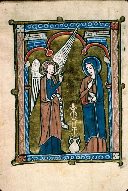
It is significant that both Mary and the medieval reader are engaging with the book as an object during one of the most important scenes from Christian devotional culture: the birth announcement of Christ. The object had obviously become an important religious tool. What is also striking is that Mary is shown interacting with the book in different ways. She is often caught reading, with the book placed either in her hand or on a table or podium in front of her (Figs. 2-3 and top pic, Angers, BM, 2048). In other cases she is simply holding the object in her hand, either open or closed (Fig. 1). In most cases Mary is depicted in a room or a building with arches (Figs. 1 & 3), providing the illusion of a church or a holy place in general. She is often raising her hands in surprise – although to our modern eyes she seems to gesture “No, thank you!” (Fig. 2).

London, British Library, Add. MS 49598 (Benedictional of Aethelwold, 936-984)
Fig. 3 – London, British Library, Add. MS 49598 (936-984) –  Source

While it is really easy to find bookish Annunciation scenes from the later medieval period, when the tradition of a reading Mary was well established, examples from before 1100 are rare. The earliest I have been able to find date from the late tenth century. The oldest is the magnificent St Aethelwold Benedictional (Fig. 3), which was made in 963-984 for Aethelwold the Bishop of Winchester (this is a digitised version). Another late-tenth-century example is the so-called Corvey Gospels in Wolfenbüttel, in which Mary is shown with a very thin book in her hand (image here).

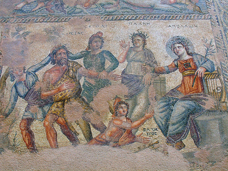
Older examples of a reading Mary do exist, but not in books – at least not to such an extent that I was able to easily find them. A scene dating to the ninth century, for example, is found on an ivory situla, a bucket for the holy water used in the Mass (Fig. 4). It shows Mary looking up from her book to see the angel Gabriel making a gesture of blessing with his hand. The arch above her suggests she is in a room, a holy space, as seen in so many manuscript depictions.

New York, Metropolitan Museum, Accession  Nr. 17.190.45 (860-880)
Fig. 4 – Metropolitan Museum, Accession Nr. 17.190.45 (860-880) – Source

Mary had a little book
Apart from providing a peek into rooms where readers are interacting with books, these seasonal images also show us what manuscripts in medieval times looked like. Granted, most objects are shown rather generically, but in some cases the decorator shows us realistic details. It is striking, for example, that many images in which Mary is holding her book show her with a surprisingly small object in her hand (Fig. 1). These are likely meant to represent a portable book, a type of manuscript designed to be carried around.

New York, Metropolitan Museum, Cloisters Collection 56.70 (1427-1432)
Fig. 5 – Metropolitan Museum, Cloisters Collection 56.70 (1427-1432) – Source
The Hague, Royal Library, MS 135 J 55 (c. 1460)
Fig. 6 – The Hague, Royal Library, MS 135 J 55 (c. 1460) – Source

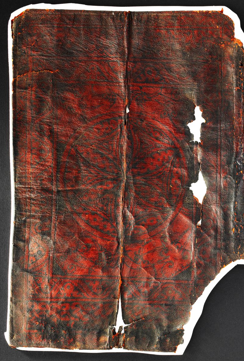
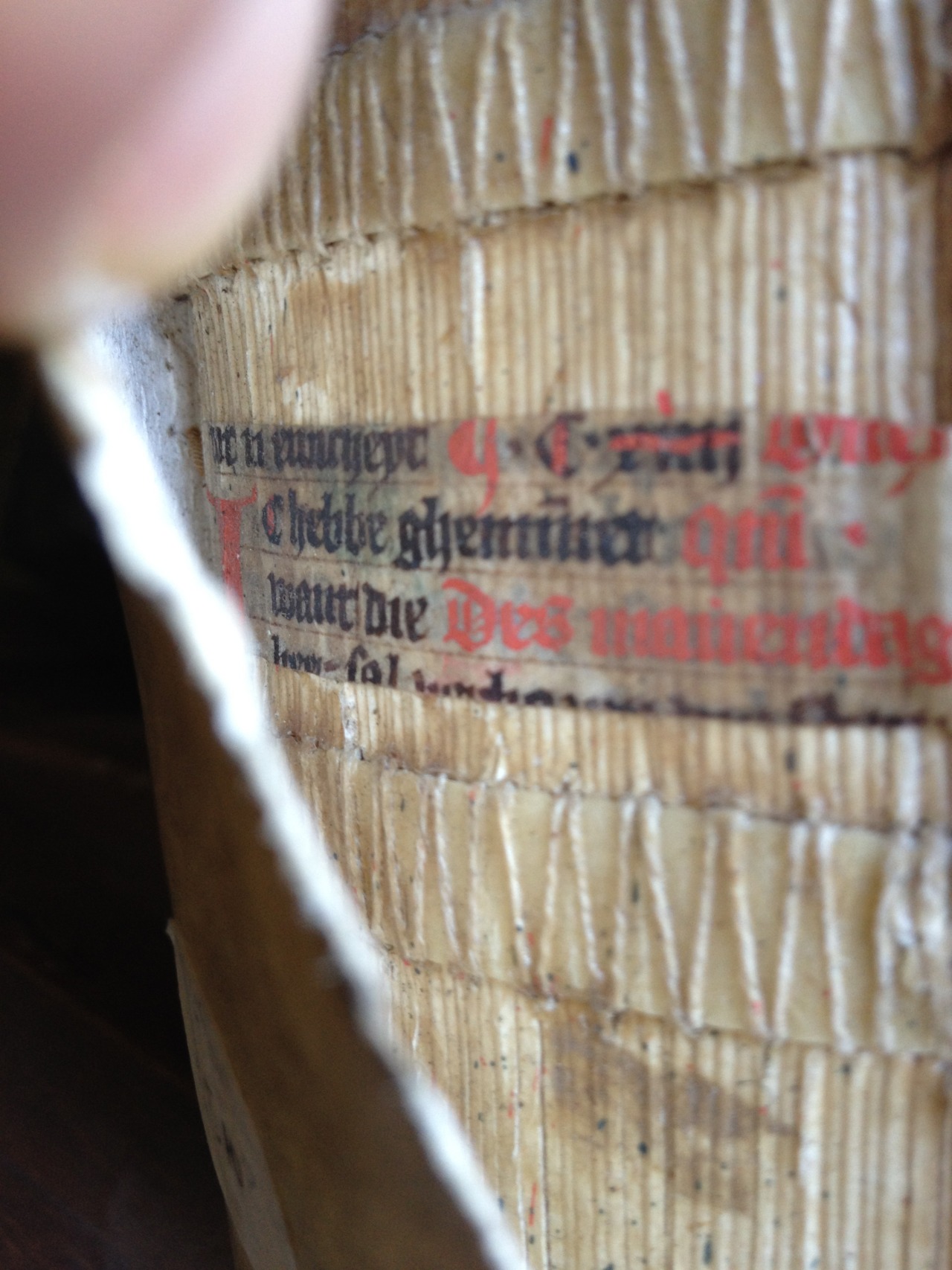
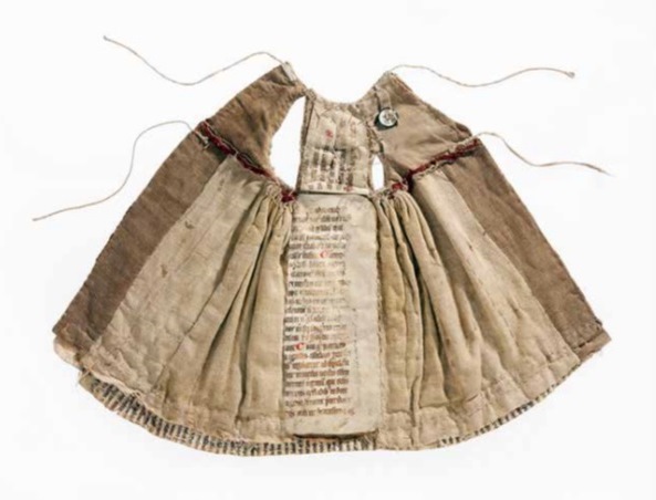
If we expand our scope and include medieval paintings, we are shown more details of the medieval book as a physical object. Notably, the famous Merode Altarpiece from the early fifteenth century shows Mary holding a book fitted in what is called a chemise binding (Fig. 5). This type of binding allowed the reader to fold the book into a piece of cloth or leather extended from the binding. Only a handful survive, so it is a great coincidence that one of them actually covers up an Annunciation scene – albeit that Mary is bookless in this one (Fig. 6).

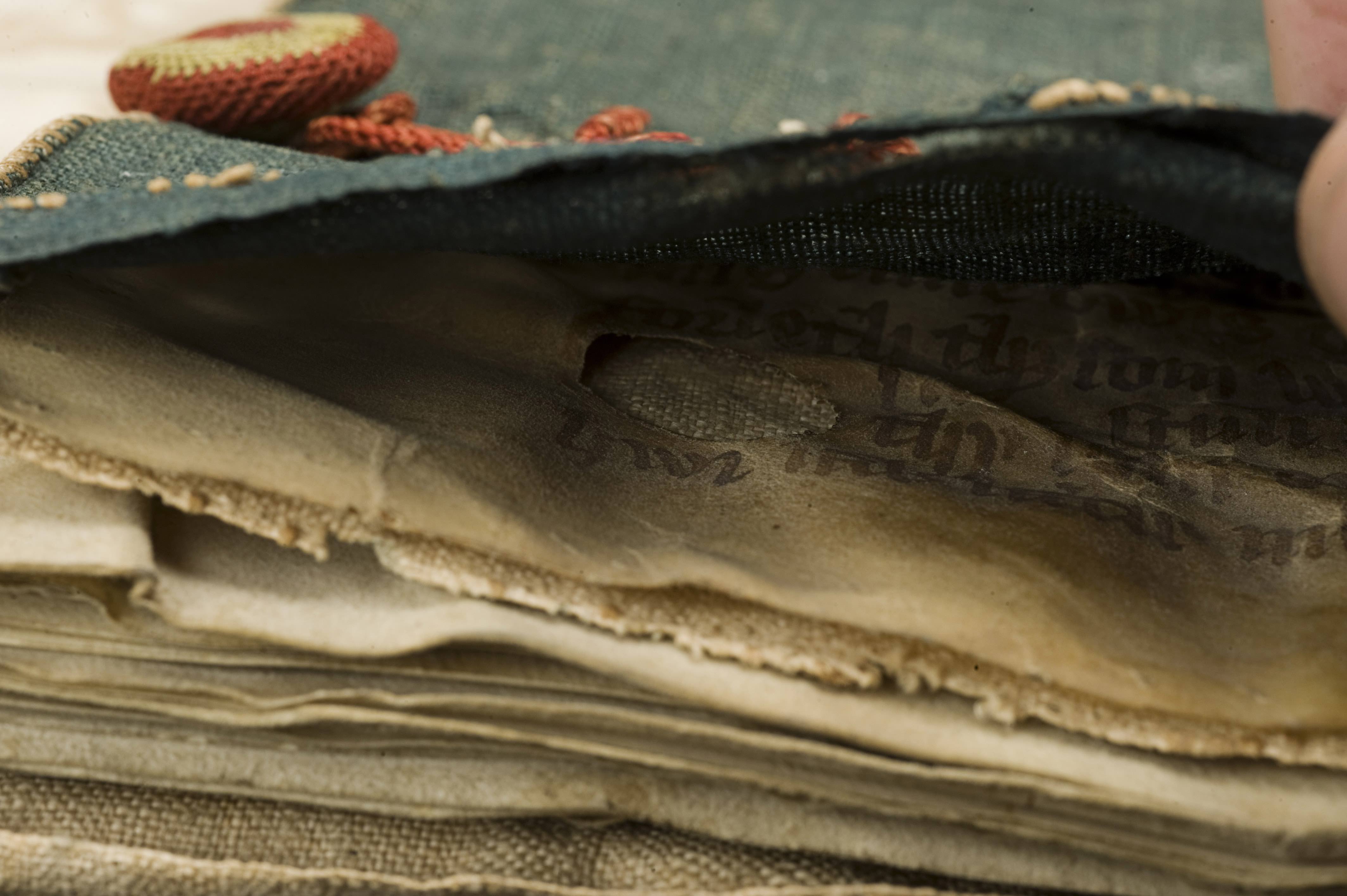
Curiously, Fig. 5 shows a second book on the table, with a green bag underneath it. This bag is another medieval artifact that survives in very small numbers: the book pouch, which was also used for carrying a book around. The same velvet pouch is seen in the Annunciation scene by Gerard David (c. 1500) – see it here. Both bookbindings in the Merode Altarpiece indicate that the manuscripts Mary is using are portable. More importantly, the beholder would have recognised them as such. By the later Middle Ages, devotional practices had become a “movable feast” and so books used to that end needed to be shown as ambulant. In that sense too the manuscripts depicted here are very realistic.

Metropolitan Museum, Cloister Collections, 54.1.1 (1405-1408)
Fig. 7 – Metropolitan Museum, Cloisters Collections, 54.1.1 (1405-1408) – Source

It is interesting that the Merode Altarpiece shows Mary with two books. It appears that this increase started in the fifteenth century and continued into the age of print. The famous “Belles Heures” of Duc du Berry, produced by the Limbourg Brothers in the early fifteenth century, shows Mary in the vicinity of three books as well as a scroll (Fig. 7). In a sixteenth-century woodcut by the famous Albrecht Dürer there are also three books present (here). Both examples give the traditional church environment the feeling of a modest library. Considering that she would soon be with child, to the modern viewer it makes sense that Mary tries to get as much quality time with her books as possible.

The Medieval Origins of the Modern Footnote

Last week I posted a blog on note-taking in medieval times. It showed how individuals who wanted to jot down a note dealt with the absence of notepads and scrap paper. As in our modern day, the urge to write down a note in medieval times often came while reading a book. And so the margins of the page grew into a prime location where the reader could vent his objections or – albeit more rarely – express his or her approval.

The present post deals with the logistics behind this “window dressing”: it shows how a reader with many important things to say kept track of his marginal comments. Particularly, it deals with a serious problem that came with adding notes to the page: how to connect a particular comment, placed among a dozen others, to the specific text passage it refers to. The clever system that was created for this purpose lives on as our modern footnote.

Disconnected

Bern, Burgerbibliothek, MS 234 (10th century)
Fig. 1 – Bern, Burgerbibliothek, MS 234, fol. 11r (9th century) – Source

The crux of our footnote system is the presence of a symbol that connects the note to the relevant location in the text. Curiously, in medieval times it was quite common not to have such connections in place, perhaps especially in the earlier period (Fig. 1). When few remarks were added to the page, a reader could deduce with relative ease to which passage a marginal note referred. It helped if a text was in popular use or known by heart, as many medieval works were. In such cases the note made sense instantly because the reader was familiar with the referenced literary context. Moreover, as long as notes were few and short, a reader could simply insert them – interlinearly – over the relevant word or passage (Fig. 2).

Alençon, Bibliothèque municipale, MS 12, fol. 21v (9th century)
Fig. 2 – Alençon, Bibliothèque municipale, MS 12, fol. 21v (10th century)
Cologny, Fondation Martin Bodmer, Cod. 89, fol. 59v
Fig. 3 – Cologny, Fondation Martin Bodmer, Cod. 89, fol. 59v (Horace, 12th century) – Source

Cleverly, in this system the very position of the remark identified the word to which it referred. However, as the number and size of such comments increased, it became impossible to place them between the lines. The great blank space provided by the margins was now drafted into service. It is here that the absence of a proper reference system was felt. As the marginal body of remarks and critique began to accumulate, the page became a real messy place, a labyrinth in which it became impossible for readers to find specific pieces of information (Fig. 3). In came the footnote.

Dots and lines
Connecting a marginal remark to the relevant passage in the text was usually done with a duplicated symbol, called a signe de renvoi: one was placed in front of the marginal note, the other near the word or passage that the remark commented upon. While it is hard to deduce a clear pattern of development, it appears that in the early stages of using such footnotes scribes and readers resorted to plain symbols rather than letters or numbers. These symbols varied considerably in shape and sophistication. At the high end of the spectrum we encounter complex symbols, such as the reversed letter E seen in Fig. 4 (magnified).

St Gall, Stiftsbibliothek, MS 4, fol. 170r (10th century)
Fig. 4 – St Gall, Stiftsbibliothek, MS 4, p. 170 (820-840) – Source

More popular, however, were less complex symbols, which could be added to the page much quicker. Dots and lines are particularly common ingredients of such footnote symbols. Interestingly, their first appearance (it seems to me) is not as a connector of comment and text, but as an insertion mark that added an omitted line into the text. In Fig. 5 such an omitted line is placed in the margin accompanied by a symbol made up of a line and a dot. It is repeated in the text itself, near the location where the line belonged. This omission mark may well be the origins of the footnote system that would emerge over the course of the Middle Ages – and that we still use today, almost unchanged.

Einsiedeln, Stiftsbibliothek, MS 172, p. 20 (9th century)
Fig. 5 – Einsiedeln, Stiftsbibliothek, MS 172, p. 20 (9th century) – Source

Scribes used different versions of the line-and-dot symbol. In fact, they had to if they were to produce unique ties between comment and text. When dots were used, their number would increase as more notes were added. Alternatively, the position of the dots could be varied, so that they formed different – unique! – patterns.

Leiden, University Library, VLF MS 69, flyleaf (12th century) - Photo EK
Fig. 6 – Leiden, University Library, VLF MS 69, flyleaf (12th century) – Photo EK

Customising the line-type footnote, scribes usually distinguished one from the other by added circles, which were attached at different locations and in varying numbers. In what is a most unusual find, in a Leiden manuscript we see a scribe practicing his dot and line footnote symbols (Fig. 6). It shows variations in the number and pattern of dots, as well as in the treatments of lines.

Letters
Closest to our modern system of footnotes, finally, is the use of letters to tie a marginal remark to its proper location in the text. In some manuscripts we see the entire alphabet running down the margin. Fig. 7 shows a page from a manuscript with works by Horace (left column) to which a high volume of notes were added (right column), all of which are connected to specific passages with the letters A to Z.

Leeuwarden, Tresoar, 45HS, fol. 45r
Fig. 7 – Leeuwarden, Tresoar, 45HS, fol. 45r (c. 1100) – Photo EK

In the eleventh and twelfth centuries such classical texts were most commonly used in a classroom setting. The instructors who used the books, typically in a monastic school, had many things to explain to their students, as the notes show. It made sense to organise such added information in a clear manner, and the alphabet came in handy in this respect. Some pages in this particular book contain more footnotes than there are letters in the alphabet, which challenged the system. In such cases the user added into the mix symbols made from lines and dots.

The last word: numerals
So where are the medieval footnotes that make use of numbers, like we do today? Curiously, I have not been able to find them, which kind of makes sense. Roman numerals would not be suitable for the task. Placed out of context, as a symbol initiating a segment of text (i.e. the marginal comment) they would easily be mistaken for a letter – which they are, graphically speaking. Moreover, a high Roman numeral would quickly take in a lot of space – not what you want in a note symbol. Arabic numerals were far were less popular than Roman numerals, even in the later Middle Ages. Readers may not have felt comfortable enough with these new numbers to use them in the margin. In fact, some scribes in the later Middle Ages are still confused by the zero. The leap from alphabet to numerals – from the medieval to our modern system – appears to have been taken in the age of print.

Medieval Notepads

We are surrounded by pieces of scrap paper. We chuck tons of them in the waste bin each year, leave them lying on our desks, use them as bookmarks, stuff them in our pockets, and toss them on the street. And so we usually do not have to look hard or long when we need a piece of paper for our shopping list or for writing down a thought. This was very different in medieval times. Writing material – of any kind – was very expensive back then, which meant that scribes used a paper or parchment sheet to the max: everything was used. As a result, there was nothing obvious lying around on one’s desk that was suitable for scrap material. So how did the medieval person make notes?

In the margin

Leiden, University Library, BPL 2888 (Italy, 13th century)
Fig. 1 – Leiden, University Library, BPL 2888 (Italy, 13th century), Photo Julie Somers – Source

The most common and sensible location for putting down thoughts, critique or notes was the margin of the medieval book. Consider this: you wouldn’t think so looking at a medieval page, but on average only half of it was filled with the actual text. A shocking fifty to sixty percent was designed to be margin. As inefficient as this may seem, the space came in handy for the reader. As the Middle Ages progressed it became more and more common to resort to the margin for note-taking. Notably, the thirteenth century gave birth to two particularly smart book designs that accommodated such use. Both types are connected to the emerging university, which makes sense as this was a note-taking environment par excellence – then and now.

The first of these is seen in Fig. 1, which shows a page of a law manuscript that actually contains two kinds of texts. Found in the two central columns is the Digest of Justianian, written in a slightly larger letter. Draped around it, in a smaller letter, is the commentary to this work: these are the notes of smart teachers from the past, put there collectively to help the reader make sense of the law. This specific style of presenting two works on the one page, where the glosses (commentary) are presented as “square brackets”, is called textus inclusus. An Italian reader in the thirteenth century added his own two-cents to these “prefab” opinions that came with the book: in Fig. 1 we see them scribbled between the two central columns.

London, British Library, Harley 3487 (13th century)
Fig. 2 – London, British Library, Harley 3487 (13th century) – Source

The second thirteenth-century book layout that was specially designed to accommodate note-taking is as clever as the text on its pages. We encounter it first and foremost in manuscripts with works by Aristotle, although the design would spread to other domains, including law and medicine. As seen in Fig. 2, the margins surrounding the Aristotle text (which form the two central columns) were left completely blank by the scribe. The tiny writing that is seen there now is from a student in the Arts Faculty, where the works of Aristotle formed the main textbook, called the Corpus vetustius (the old corpus).

If you look carefully you see five vertical commentary columns marked by thin pencil lines, which allowed for five “pillars” of notes. Cleverly, in this page design the start of the note could be placed at the same height as the Aristotle line on which it commented, not just one time, but five times over! Larger comments were placed in the larger blank areas in the lower margin. Some of these Aristotle textbooks contained up to twenty “zones” for notes, which would ultimately be connected to the main text with the help of symbols resembling our current footnotes.

Yellow sticky notes 

Sens CT Library, J 36 (Chartaire 156), 9th century, photo Genevra Kornbluth
Fig. 3 – Sens CT Library, J 36 (Chartaire 156), 9th century, photo Genevra Kornbluth – Source

As stated, paper and parchment sheets were commonly used to the max, meaning no redundant material was left that could be used for scraps. However, when the animal skin was turned into parchment sheets such redundant material was left over. In the process the outer rim of the dried skin was removed, because these “offcuts” were deemed unsuitable for writing on. The material was too thick for a regular page and its surface was slippery and translucent, not to mention that most offcuts were too small for normal pages. They consequently ended up in the recycling bin of the parchment maker.

Interestingly, these small, scrappy slips of parchment were sometimes sold to clients. Offcuts were used for text with a short lifespan, such as letters and drafts. In addition, it was used when a text was “utilitarian” and did not need to be produced from regular – more expensive – parchment. An example is seen in Fig. 3, which shows a short description strapped to a bone that belonged to a saint. Such “relic labels” were important because of course nobody wanted to mistake the big toe of St Peter for that of St Paul. Such information was scribbled on the parchment strip, usually in low-quality (fast) handwriting.

Leiden, University Library, BPL 191 D, fragment (France, 13th century) - Photo Giulio Menna
Fig. 4 – Leiden, University Library, BPL 191 D, fragment (13th century) – Photo Giulio Menna
Birch bark strip used by the student Onfim, dated 1240-1260
Fig. 5 – Novgorod, Museum of History, birch bark strip 202, from pupil Onfim, dated 1240-1260 – Source, blogmore

Offcuts were also frequently used by students and scholars, for example for taking notes in the classroom (Fig. 4, more here). In fact, in De discipline scholarum, a guidebook made in the 1230s for students and teachers at the University of Paris, it is explained how a student should bring such slips of parchment to class for taking notes. Interestingly, some of these slips have survived because they were pasted in a student’s textbook, like the one seen in Fig. 4. These are truly the medieval equivalent of our “yellow sticky notes”. The practice of bringing scrap material into the classroom was a much broader medieval phenomenon, as is shown by the famous birch bark notes that survive from 13th-century Russia. Fig. 5 shows funny “stick figure” doodles drawn by the student Onfim as he was sitting, bored no doubt, in class.

The last word: notepad
There is evidence that multiple parchment offcuts were sometimes bound together, by pricking a hole in them and pulling a cord through. These bundles, which essentially form a true notepad in the modern sense of the word, could be of considerable size. A specimen in the Universitätsbibliothek Würzburg consists of thirty slips. A type of notepad that was even more popular in medieval times was the wax tablet (here is a collection of them). These, too, were often tied together into a bundle, forming a notepad of perhaps six or so “pages” (Fig. 6, note the holes for the cords on the left side). Smart pages, that is, because the contents could be erased from the soft wax (with the flat back of the stylus), presenting vacant space for fresh thoughts.

Michigan, University Library, Papyrology Collection, Inv. 768
Fig. 6 – Michigan, University Library, Papyrology Collection, Inv. 768 (4th-6th century) – Source

Medieval Spam: The Oldest Advertisements for Books

Advertisements are all around us. As I am writing this post, waiting in an airport lobby, I can only escape them if I close my eyes and cover my ears. Marketing and advertising are practices dating back to medieval times and we encounter them even in the world of books. While rare, surviving book advertisements are fascinating because they highlight what salesmen thought potential buyers deemed important about their products. Advertisements form, in an unusual way, a unique keyhole view into the hearts and minds of readers that lived a thousand years ago. Fascinatingly, surviving book advertisements come in very recognisable – modern – formats: some are window displays, others are spam in books, and yet others are flyers posted in public places.

Window displays

The Hague, Royal Library, 76 D 45 (advertisement sheet, c. 1450)
Fig. 1 – The Hague, Royal Library, 76 D 45 (advertisement sheet, c. 1450) – Source

While still rare, the most common surviving book advertisement from medieval times is the so-called ‘advertisement sheet’ from medieval writing masters (Fig. 1). Individuals who could write had a valuable gift, both intellectually and financially: they were able to duplicate any piece of writing, from short letters to full books; and they could do so for money. During the last three centuries of the Middle Ages (1200-1500) the demand for books rapidly increased, in part because of their cheaper production and the growing numbers of readers. Increased demand had a major impact on supply: urban professionals took over book production from the abbeys. They started to charge money, make profit, and build the commercial book market we still have today (more about such commercial activities in this blog post).

As more people became involved in commercial book production, competition among artisans increased. Starting in the thirteenth century, the book world became a market place where producers had to show what they had to offer – and more so than their nearby colleagues (Fig. 2). It is in this context that we are to understand the advertisement sheet in Fig. 1, a handful of which survive from the Middle Ages. Encompassing over ten different scripts, each one more fancy than the next, it displays the expertise of the artisan to potential customers. The sheet was made by one Herman Strepel, who worked around the middle of the fifteenth century, perhaps in the German city of Münster.

Paris, BnF, fr. 25526, fol. 77v (1325-1350)
Fig. 2 – Paris, BnF, fr. 25526, fol. 77v (1325-50): commercial shop with scribe and illuminator – Source

The sheet in Fig. 1 is a clever marketing tool in other ways as well. The samples are accompanied by their proper names, written in attractive letters of shiny gold. This vocabulary allowed the clientele to enter into a professional conversation with the scribe – using such term as ‘fracta’, ‘rotunda’ and ‘modus copiistarum’. The back of the advertisement sheet is blank, which means it was probably displayed in clear sight of potential customers, perhaps in a window or against a wall. A specimen from a German scribe says, ‘If you want to learn to write, do come in.’ It not only shows that artisans extended their services well beyond merely producing books (they were professional trainers as well), but it also that such sheets were put on display right outside the door.

Spam in books

Giesen, Universitätsbibliothek, 945 (advertisement in book)
Fig. 3 – Giesen, Universitätsbibliothek, 945 (advertisement at end of book)

The best way to show off one’s abilities as a book producer was through the book itself: every page is an appraisal of the artisan’s qualities. Some scribes directly addressed potential customers on the last page of a book, where they explicitly referred to the fine quality of the manuscript – and by proxy their abilities. An illuminating case concerns a scribe who calls himself Herneis. On the last page of a book he had copied for a client he wrote the following note: ‘If someone else would like such a handsome book, come and look me up in Paris, across the Notre Dame cathedral’ (Fig. 3). The message ‘lured’ the beholder to the book street of medieval Paris, right opposite the cathedral. It’s a great example of medieval spam.

A slightly less blatant case of spam is from fifteenth-century Holland, the most western province of the Low Countries. Six Middle-Dutch manuscripts survive from an anonymous commercial scribe operating there. They all contain the same text, a History Bible, which suggests that the individual specialized in one particular genre. The surviving copies show variation in layout, writing support (paper/parchment), the inclusion of miniatures, and in the quality of the script. These differences most likely reflect the wishes of the patrons that were served. Interestingly, one of the manuscripts (Leiden, University Library, LTK 231) contains an intriguing message: ‘If you like this copy of the Old Testament, I can also produce a book with the New Testament for you.’ This tempting offer has the feel of iTunes’ ‘Complete my album’ or, more appropriately, the suggestions Amazon makes for further reading.

Flyers

Oxford, Bodleian Library, Arch. G. e. 37
Fig. 4 – Oxford, Bodleian Library, Arch. G. e. 37 (c. 1477) – Source

The rarest kind of medieval advertisement is also the smallest. It measures only 80×146 mm, a little bigger than a credit card. As with historical artifacts in general, the smaller a bookish object is, the slimmer the chances that it survived. The small strip of paper seen in Fig. 4 is an advertisement that promoted William Caxton’s Sarum Pie (‘Ordinale ad usum Sarum’), a religious book he printed in his Westminster shop in 1477 (more here and here). It is a very small flyer that was to be posted in the city, given the Latin closing remark ‘Supplico stet cedula’ (please leave this [strip] posted). It is the earliest printed advertisement in English and it has a lot to tell.

The printed strip shows interesting parallels with the previous two items. As with the spam message of Herneis, Caxton tells customers where to go, which is the bare minimum that an advertisement has to do: ‘late hym come to Westmonester in to the Almonesrye at the reed pole’. Moreover, it stresses that the book has no typos (it is ‘well and truly correct’) and can be bought cheaply (‘and he shal have them good chepe’). Just like the advertisement sheet of Herman Strepel, Caxton’s piece of paper comes with a great marketing trick: it states that the new publication is ‘emprynted after the forme of this present lettre’ (is printed in the same typeface as this very note). In other words, the reader can tell with his own eyes that it is worthwhile heading over to Caxton’s shop.

Marketing tricks, sending out spam, and using colourful letters to attract clients: medieval advertisements are as effective today as they were 600 years ago.

Note – Want to know more? Check out this lecture I gave on commercial book production.

Location, Location: GPS in the Medieval Library

Books love to hide from us. While you were sure you put your current read on the kitchen table, it turns up next to your comfortable chair in the living room. As you handle more books at the same time, it becomes increasingly challenging to keep track of their location. In the Middle Ages it was even more difficult to locate a specific book. Unlike today, medieval books lacked a standard size, so you couldn’t really make neat piles – which sort of brings order to chaos. Finding a book was also made difficult by the fact that the spine title had not yet been invented.

So how did medieval readers locate books, especially when they owned a lot of them? The answer lies in a neat trick that resembles our modern GPS : a book was tagged with a unique identifier (a shelfmark) that was entered into a searchable database (a library catalogue), which could subsequently be consulted with a handheld device (a portable version of the catalogue). Here is how to plot the route to a specific book in the medieval library.

Shelfmark
The most effective tool for retrieving a book in medieval times was to give it a number and placing it in the correct sequential order on the shelf. It is still common practice in modern libraries, for good reason: as long as the shelver puts the object back in the right spot, you will be able to find it again quickly. Such book numbers – shelfmarks – come in various forms. The more books a library owned, the more complex the shelfmarks became (had to become, actually). The most simple type merely stated that the book in question was the “twelfth volume” in the cupboard, as seen in the image at the top of this post (British Library, Royal 10 A.xi).

Ghent, Universiteitsbibliotheek, 941 (14th century), flyleaf
Fig. 1 – Ghent, Universiteitsbibliotheek, 941 (14th century), flyleaf with title and faint shelfmark “A” (15th century) – Source

Similarly, in small collections books were marked with single letters. In Bethlehem Priory near Brussels each item in the small library of Middle Dutch (i.e. non-Latin) books was given a letter, which was placed on an empty page in front of the manuscript together with a short title. The first volume in this mini library was a late-fourteenth-century copy of works by the mystic Hadewijch (now Ghent, Universiteitsbibliotheek, MS 941). On a flyleaf we can still faintly read “Visiones haywigis. A”, showing it was the first book on the shelf (Fig. 1).

Larger libraries – exceeding 26 books – needed a more sophisticated shelfmark system. A particularly clever one is found in manuscripts that were placed on lecterns, like those used in chained libraries  (Fig. 2). The shelfmarks had two components: a letter pointed to the appropriate lectern, while a number indicated the book’s position on the shelf. Because manuscripts were placed on both sides of the lectern, a bit of color was added – literally – to distinguish between the sides. Red numbers referred to books placed on the right side, black ones to those on the left.

Chained library "De Librije" in Zutphen, The Netherlands
Fig. 2 – Chained library “De Librije” in Zutphen, The Netherlands – Photo EK
Leiden, Universiteitsbibliotheek, BUR Q 1 (c. 1100), binding 15th century
Fig. 3 – Leiden, Universiteitsbibliotheek, BUR Q 1 (c. 1100, binding 15th century) – Photo EK

The shelfmark tag on the front cover of Lucan’s Pharsalia in Fig. 3 (“Q 2”) is a variation on this theme. Here the letter was made red so as to indicate on what side of the lectern the book was to be placed. It shows that the fifteenth-century owner of the book, the Benedictine Abbey of Egmond, near Amsterdam, owned a lectern library. Much like a modern GPS, the tag “(red) Q 2” ties the manuscript to a unique location: it is the third book on the right side of the sixteenth lectern.

Catalogues
Having a location tag is only useful, of course, if there is a searchable database from which the book’s location may be retrieved. How would you otherwise get to Lucan’s Pharsalia in the library, or even know it is present there? The library catalogue is such a database. Up to 1200 the contents list of a monastic library was usually merely an inventory: it marked the presence of a book, but not its location. The later Middle Ages saw a surge of real catalogues, listing books and their location. Some of these catalogues were written out in books (as we will see in a moment), while others were pasted to the wall in the library.

Leiden, Regionaal Archief, Kloosters 885 Inv. Nr. 208A (15th century)
Fig. 4 – Leiden, Regionaal Archief, Kloosters 885 Inv. Nr. 208A (wall catalogue, 15th century) – Source

A particularly big wall catalogue survives from Lopsen Abbey near Leiden: it originally measured 800×590 mm (Fig. 4). The books in this list are numbered sequentially (1, 2, 3, etc.) within categories such as “libri refectoriales” (books read during the meals) and “libri devoti et utiles” (books for personal, spiritual development). However, there is no clear indication as to where the object may be found (the same in this wall catalogue). Readers had to wander through the library to find the right section and then start counting to find the book they were looking for. Not very efficient.

By contrast, other late-medieval catalogues are very clear about the location of a book. From several monastic libraries in the Forest of Soignes just outside of Brussels, catalogues survive that actually refer to the sophisticated type of shelfmark seen in Fig. 3. The ones from Zevenborren Priory (now Brussels, Koninklijke Bibliotheek, MSS II 1038 and 7602, both early 16th century) refer to books on both the “black side” and the “red side” of the lectern.

Book cupboards in Hereford Chained Library
Fig. 5 – Bookcases in Hereford Chained Library

Handheld device
The catalogue of the lectern library in another abbey in the forest, nearby Rooklooster Priory, is the cleverest of the lot. It comes in the form of a book with a peculiar shape (now Brussels, Koninklijke Bibliotheek, MS II 152). It is long and narrow, a format that indicates it was made for handheld use, as research has shown. Curiously, the shape of the pages resembles the long inventory slips on the side of book cupboards in chained libraries (see the wooden frames clearly visible in Fig. 5). The hand-held Rooklooster catalogue must have been copied directly from such slips on the side of the lecterns.

What a clever tool the user ended up with. The open catalogue in his hand presented two columns, one for books on the “black” (left-hand side) side of the lectern, another for books on the “red” (right-hand) side. Moreover, each column is divided into two halves. The top half lists books placed on the upper shelf of the lectern, the lower half those on the lower shelf (these shelves were placed under the lectern, as seen  in Fig. 6).

Cesena, Bibliotheca Malastestiana
Fig. 6 – Cesena, Bibliotheca Malastestiana: lectern with shelf – Source

Standing in front of a lectern with his handheld device, the reader knew precisely which of the volumes in front of him was the one he was looking for: he could identify it without even opening it. This particular medieval catalogue is not unlike a modern navigation system, with “GPS coordinates” directing readers to such works as Ambrose on the Psalms (Black A 1) and Augustine’s Civitate Dei (Red A 5). The only difference is that it never ran out of batteries.

Facebook Before Facebook: Tagging in Antiquity

This is a guest blog by Sarah E. Bond, ancient historian in the Classics Department at the University of Iowa. The post highlights the link between media in the past and in our own digital world, a theme that is frequently addressed here. Sarah maintains a blog devoted to classical culture. EK


In the digital world, tags are ubiquitous. When we digitally tag items, we are essentially applying metadata (information about your information) to an object. We practice this all the time: when we write a blog post and want to increase viewership, when we upload an image onto Flickr, or when we identify individuals or places in Facebook posts. At Facebook’s Desktop Help center, they attempt to explain the reasons for tagging: “When you tag someone, you create a link to their profile…Your status update may also show up on that friend’s Timeline.” In antiquity, tags functioned in a similar manner to today. Though on stone, ceramics, mosaics, and other media rather than the screen, they still broadcast literary and social networks while also providing context for the viewer.

Fig. 1 - Monticello
Fig. 1 – Monticello Archeological Field School, 2005 – Source: Facebook Sarah Bond

In the book Evolution and Ethics (1893), biologist T.H. Huxley wrote that, “One of the unpardonable sins, in the eyes of most people, is for a man to go about unlabeled. The world regards such a person as the police do an unmuzzled dog, not under proper control.” What Huxley meant was that there is a human proclivity toward labeling individuals, objects, places, and concepts. In short? Our minds prefer to organize knowledge.

I couldn’t help but recall this quote not long ago, while recording an inscription at the Art Institute of Chicago for the U.S. Epigraphy Project (Fig. 1). On display in the newly reopened Greek, Roman, and Byzantine galleries of the ArtIC is a funeral monument from the 4th century BCE shaped like a Greek lekythos, an oil jar (Fig. 2). The marble marker didn’t just imitate a ceramic vessel in regard to its shape; it also replicated the tags that often identify figures on Greek pottery. Interestingly, with steady precision, the stonecutter labeled the three figures: Leon Alaieus, Demagora, and Helike (Fig. 3).

Fig. 2 - Leon
Fig. 2 – Funerary Lekythos, 4th century BCE. Katherine K. Adler Memorial Fund, Mr. and Mrs. Walter Alexander Classical Endowment Fund, Costa A. Pandaleon Greek Art Memorial Fund, and David P. Earle III Fund, 2009.76 – Photo SB
Fig. 3 – Funerary Lekythos, 4th century BCE  (detail of Fig. 2)

One of my jobs—along with the other contributors to the USEP—is to visit museums and record the inscriptions on various objects. Many of these epigraphic notations receive little attention from viewers, not only because most visitors can no longer read Latin or Greek (O tempora!), but also because the modern focus tends to champion the figures rather than the texts. However, we must ask ourselves whether this is a modern bias. By all accounts, there was a strong interplay between texts and images in antiquity that cannot be ignored. Moreover, the inclination toward the organization of information through labeling went beyond simple identification. Much like today, labels functioned in a myriad of ways: to articulate space, to exhibit notions of proper paideia (education) and legitimacy, to trigger collective memory, and to provide deeper engagement with an object.

Fig. 4 - Jerusalem portion of the Madaba Map
Fig. 4 – Jerusalem portion of the Madaba Map, 6th century CE – Source

Moving away from classical antiquity and into the late antique period, the interplay between texts and images became more pronounced, particularly through mosaics. Perhaps the most well known example of this is the Madaba Map, a mid 6th century CE mosaic from Jordan depicting the Holy Land (Fig. 4, interactive version here). Discovered in 1884, the map has a mix of topographical tags and buildings in order to project a worldview of the Christian Near East. The buildings are not to scale, areas are highly distorted, and it would be of little use to a traveller, but then again, the objective of the map is not functionality. To my mind, the incredibly clustered tags are visually advertising the abundance of Christian sites in general. Here the tags and the architecture work together to claim dominion.

It is important to remember that just as there are trends in writing materials or in fonts, there were fashions in tagging based on period, place, and medium. During the later Roman empire, it appears to have become vogue in the East in particular to label mosaics. Mosaics from Cyprus, Syria, and modern day Turkey often have labels overtop figures identifying classical figures such as Dionysus or Theseus. Rather than simply assuming these tags were provided due to the ignorance of the viewer in regard to Greek mythology, we should perhaps think about it as a shift in the landscape of writing. In terms of literacy levels and who could read these captions, labels on mosaics likely required a minimal amount of “recognition vocabulary” (as Greg Woolf calls it) in order to read. They functioned to prompt conversation between dinner guests staring at the floor or perhaps congregants within a basilica, and lured viewers into interaction while perhaps serving to display the education of the patron.

Fig. 5 Apollo Paphos
Fig. 5 Apollo Paphos mosaic, 4th century CE (Apollo enthroned) – Source
Fig. 6 - Theseus Paphos
Fig. 6 – Theseus Paphos, 2nd century CE (Struggle of Theseus and Minotaur) – Source

What are we to make of this apparent increase in the use of labels on mosaics in the late Roman East? One could perhaps argue that it was the expression of the import of writing and literacy within early Christian communities, but as we can see at Paphos, this trend predated the rise of Christianity. More likely is that labels at various times came into vogue as a means of provoking literary or perhaps geographic discussions that could then be tied spatially (or in later memories) back to the owner of house. As they had previously done in funerary or symposium contexts, mosaic labels also worked in tandem with the space and the image to heighten the viewer’s overall engagement. Just like the Facebook tagging of today, these labels helped the ancient viewer to access and to organize information more thoroughly, often while enhancing the prestige of the tagger.

Fig. 7 - Atropos
Fig. 7 –  Wikipedia screen shot showing mosaic with tagged name – Source

Although the digital tags of today link to databases, both ancient and modern tags similarly function to create a network that individuals are visibly situated within. Wikipedia, for example, allows users to translate tags into their own language (Fig. 7). In antiquity, even if the patron or the deceased was not tagged in a vase or a mosaic, there was an implied association. Just think about your friend who constantly tags people to view New York Times articles or posts Kierkegaard quotes on their walls. What are they really telling you? The walls may have changed, but the coded purposes behind curated images and tagging remain ever the same. Viewers of your posts visit your digital home to view tagged images, even if they have no knowledge of the people within them. Tagging still functions to create networks and to elevate the poster in terms of social capital—the principal coinage in the Facebook marketplace.

Drawing with Words

The pages of medieval books are generally filled with two things: words and decoration – and a lot of nothingness, the margins. The divide between the two is evident and clear. Words make up the text and are executed with pen and ink, while illustrations, produced with brush and paint, decorate the text. There are manuscripts, however, in which this self-evident truth is turned upside-down: sometimes decoration is created by words, which were meant to be read. This intriguing scenario blurs the divide between text and illustration: it challenges how we define both.

Decoration forming words

British Library, Arundel 155 (10th century)
Fig. 1 – British Library, Arundel 155 (11th century) – Source

Decorative elements forming readable text  are fairly common in medieval times. High-quality manuscripts often open with words – or even a full sentence – that are painted with a brush rather than copied with a pen. The artist who produced the eleventh-century page in Fig. 1, for example, used his brush to paint the entire first line of Psalm 1: “Beatus vir qui non abiit in consilio impirum” (Blessed is the man who has not followed the advice of the impious). Particularly impressive is the first letter, the B, which is decorated lavishly with gold.

Even more elaborate are some of the pages of the Lindisfarne Gospels, which is perhaps the most impressive manuscript that survives from the early Middle Ages (it was made at Lindisfarne at the coast of Northumberland around 700). The page in Fig. 2 shows the incipit (the opening line) of the Gospel of Matthew. While there is a lot to read on this page, the words are actually executed with brush and paint, apart from a few lines at the top. This decorative page – and the others in the book – are commonly discussed in an art-historical context (they are prime examples of Hiberno-Saxon art) and not as expressions of writing (more about Lindisfarne Gospels in relation to this issue in this article).

London, British Library, Cotton Nero D.IV (c. 700)
Fig. 2 – London, British Library, Cotton Nero D.IV (c. 700) – Source

These magnificent pages blur the boundary between text and image: they present something to read, but nothing has actually been written down – at least not in the traditional sense of the word, with a pen. Curiously, the words on these pages form the start of a text and were meant to be read, not just looked at. In other words, the intriguing hybridity of these pages forced the user to read a painting.

Words forming decoration
Much more unusual is a different mix of text and image: instances where a meaningful scene is made out of words. Delightful examples from manuscript production in the West are Figs. 3 and 4, taken from a ninth-century copy of Cicero’s Aratea, a work of astronomy. The text shows animals that represent constellations (the firm red dots are stars). Curiously, these animal illustrations consist, for the most part, of words written out with a pen.

British Library, Harley 647, fols. 9r (9th century)
Fig. 3 – British Library, Harley 647, fols. 9r (9th century) – Source
British Library, Harley 647, fols. 9r (9th century)
Fig. 4 – British Library, Harley 647, fols. 9r (9th century) – Source

The text in the hare and the swan is not actually the Aratea itself, which is found lower on the page, out of sight in the images above. The animals are actually formed by an explanatory text by Hyginus, called the Astronomica. Segments of this text are used for graphic representations of constellations: Orion (the hunter) is shown as a hare, the hunter’s favourite prey, while the lovely blue bird is the constellation Cygnus (swan). Word and image are engaged in a peculiar symbiotic relationship wherein one would become meaningless without the other.

A similar tradition is witnesses in Hebrew Torah culture of the tenth century. It introduced a phenomenon called “micrography“, the art of decorating the page with meaningful text written in tiny letters. By the thirteenth century Hebrew manuscripts contained elaborate depictions of individuals, animals and objects (Fig. 5). Hebrew religious leaders protested against this practice of drawing with words, as they figured it distracted from taking in their meaning.

British Library, Add. 21160-31 (13th century)
Fig. 5 – British Library, Add. 21160-31 (13th century) – Source
British Library, Add. 21160 (13th century)
Fig. 6 – British Library, Add. 21160 (13th century) – Source

The last word: music
The notion of drawing an image with words was taken a step further in the later Middle Ages. In the thirteenth century, for example, we encounter marginal glosses in the shape of objects and people. A particularly elaborate late-medieval example is a variation on this theme: it presents a drawing in the shape of a heart, except the heart is made out both words and musical notes (Fig. 7).

Chantilly, Musée Condé 564 (14th century)
Fig. 7 – Chantilly, Musée Condé 564 (14th century)

It concerns the so-called “Chantilly Codex”, which contains over a hundred polyphonic songs by French composers. The one seen here is by Baude Cordier and is called “Belle, Bonne, Sage” (listen to it here). As the Renaissance was nearing, word play became a favoured occupation of poets, including in a visual sense. Cordier borrowed the word “Cor” (coeur, heart) from his name and used it for the visual presentation of this song. Cutting-edge design? Hardly. Little did Cordier know that the practice of drawing and writing at the same time was old-school.

Dressing Up: Medieval Books Wearing Leather

Every book needs a coat, a protective layer. Without it, after all, the pages would be exposed to the elements and the dirty hands of readers. And so from the very early days of the book the object was given a binding. Medieval bindings mostly consist of two components: boards, commonly made out of wood (but in the later Middle Ages also from compressed paper), and something to cover the boards with. While in medieval times the most common covering material was leather, there is great variation observed in the kind that was used, as well as how it was decorated. Readers and reading communities had their own preferences in this regard. As a result one can “read” as much from the outside of the book as from its pages: they both transmit important cultural-historical information. Here is a post with an exotic twist, which includes bindings made from seal and human skin.

Wearing leather

British Library, Add 89000 (7th century)
Fig. 1 – British Library, Add 89000 (7th century) – Source

Most medieval bindings were made out of animal skin: usually it was a calf or pig who involuntarily ended up protecting the manuscript. Leather proved an ideal material for binding books. The material is stiff, which means it does an excellent job protecting the precious cargo inside, while at the same time adding to the desired “firmness” of the book. The material also repels water quite well. This benefit may seem odd, but it’s not. While monks may not have been reading books in the bath tub, they did consult them in the cloister, which was often a damp environment – given that the hallways were in the open air.

An added bonus of leather was that it accommodated blind-tooled decoration, which was applied in mesmerising shapes and patterns. The oldest book to survive with its original binding still in place is the seventh-century St Cuthbert Gospel (which is a Gospel of John, in fact). It shows just how utterly charming early-medieval leather bindings were; and how beautifully they were decorated (Fig. 1). The manuscript in question was placed in the coffin of St Cuthbert shortly after his death in 687. It was discovered when the grave was opened in the early twelfth century. Because by then a cult had grown around St Cuthbert, the book – and its original binding – was well taken care of. In fact, the binding looks like it was made yesterday.

British Library, Papyrus 1442 (dating 716-717)
Fig. 2 – British Library, Papyrus Codex 1442, binding  (716-717) – Source

The use of leather bindings predates books made out of parchment – like the book of St Cuthbert. Before parchment became common, books were made from plants – papyrus. Such papyrus codices were extremely fragile and they needed the protective qualities of leather, which may ultimately be the origins of the tradition of using skin for bindings (Fig. 2). Given that papyrus became in disuse after the fifth century (with some exceptions), very few original bindings of papyrus books survive. The oldest specimens we have are those in the so-called Nag Hammadi Archive, which date back to the third and fourth centuries (look at some images here). As you can see from Fig. 2, these covers of papyrus books were also decorated handsomely.

Exotic leather

National Library of Sweden (c. 1200)
Fig. 3 – National Library of Sweden (c. 1200) – Source

What to do if you need a leather binding, but there are no cows or pigs to slaughter for this purpose? The answer is seen in Fig. 3, which shows a book that was copied and bound in Iceland. Naturally the binder turned to creatures that were available there. This is how a poor seal ended up covering this Old Icelandic book with sermons, which was made around 1200. If you look carefully you can still see a significant amount of hair on the outside. As with other cases where animal hair is found on book covers, the hairs have turned green over time – or perhaps from the liquids involved in processing animal skin into leather.

The story gets even more graphic. The skin used for bookbindings is not limited to animals. Under the name anthropdermic bibliopegy goes the practice of using human skin for binding books. Perhaps surprisingly, it turns out to be a post-medieval practice, particularly popular in the 17th and 18th centuries. The cover seen in Fig. 4 dates from the early 17th century and the skin was taken from the priest Father Henry Garnet. He was executed in 1606 for his role in the Gunpowder Plot, the attempt to ignite 36 barrels of gunpowder under the British Parliament. The book in question actually outlines the story of the plot and the evidence of Garnet’s guilt (more on this book here and here). The origins of the binding must have given the reader significant satisfaction.

Book bound in human skin (early 17th century)
Fig. 4 – Book bound in human skin (early 17th century) – Source

The last word: cloth
Not all medieval books were dressed up in leather. Less commonly used, perhaps because it is more fragile, is cloth. This material handled the frequent use of a book far less well than leather. The real-world use of a medieval book was such that the object would be pushed back and forth over a wooden desk, which did not exactly contribute to a long life. The cloth binding seen in Fig. 5 dates from the middle of the fifteenth century and it covers a monastic rule.

Stockholm, National Library of Sweden (c. 1450)
Fig. 5 – Stockholm, National Library of Sweden (c. 1450) – Source

The manuscript has a particularly pretty button to close the volume up (see image at top of blog), adding further to the charm of this beautiful bookbinding. In the age of the printed book such cloth bindings (and embroidered ones) became more common, perhaps because increasingly more books became owned privately. This meant, of course, that the objects were not consulted on the hard surface of a wooden desk, but on the soft lap of the reader. As with embroidered bindings, which also increased in popularity in post-medieval times, cloth may have been regarded as a more suitable material for private reading. In tune with the dressing code for medieval books, the objects knew when to slip into something more comfortable.

Note – This blog post tells you more about leather bindings; it includes some great images as well.

Destroying Medieval Books – And Why That’s Useful

Old furniture, broken cups, worn-out shoes and stinky mattresses: we don’t think twice about throwing things out that we don’t need anymore. And books? Here things are a bit different. Apart from the fact that you may find it morally abject to throw out a book, that noble carrier of ideas, the object retains its economic value much longer than many other man-made things. Old and worn books will usually have a second – third, fourth or fifth – life in them, for example on the shelves of the secondhand bookstore. Indeed, old age may even increase their value dramatically, as visitors of book auctions will know.

The final curtain call of any book, including medieval ones, is when its content is no longer deemed correct, valid, or useful. Between the end of the Middle Ages and the nineteenth century thousands and thousands of medieval manuscripts were torn apart, ripped to pieces, boiled, burned, and stripped for parts. While these atrocities were undertaken to various ends, the ultimate explanation for this literary genocide is the same: the old-fashioned parchment book had run its course. It was forced to bow and leave the stage, where the printed book was now stealing the show. This post sheds light on a dark chapter of wilful destruction – which came with surprising benefits for the culprits.

Culprit 1: The Bookbinder

15th-century fragment inside bookbinding (Rolduc Abbey library) - Photo EK
Fig. 1 – 15th-century fragment inside bookbinding (Rolduc Abbey library) – Photo EK

If you have followed my blogs – both here and on Tumblr – you known I have a soft spot for so-called manuscript “fragments”. Ranging from small snippets no larger than your pinky to full leaves, they were the product of the knives of bookbinders. When Gutenberg invented moving type, handwritten books became old-fashioned overnight. All over Europe they subsequently became the victims of recycling at the hands of binders, who cut them into pieces and pasted them inside bookbindings, where they often still remain. And so we encounter a little strip from a medieval Dutch Bible glued to the inside of a sixteenth-century binding (Fig. 1); and snippets from a medieval Hebrew text peeping out of a damaged binding (pic at the top). These examples show how medieval books were mutilated and stripped for parts, like cars at a scrap yard. Thousands of them disappeared this way – though fortunately not without a trace.

Culprit 2: The Tailor

Copenhagen, Den Arnamagnæanske Samling AM 666 b 4to (13th century)
Fig. 2 – Copenhagen, Arnamagnæanske Samling AM 666 b 4to (13th century)

The strength and durability of parchment made medieval pages ideal for supporting bookbindings. Tailors loved to recycle the material for the same reason. The pages in Fig. 2 form the lining of a bishop’s mitre, to which a layer of cloth was subsequently pasted. The practice is observed in other mitres as well (two examples are mentioned in the comments at the bottom of this blog). What’s really remarkable about the lining seen above is not so much that the poor bishop had a bunch of hidden medieval pages on his head, but that they were cut from a Norwegian translation of Old French love poetry (so-called lais). Lovers were chasing each other through dark corridors, maidens were frolicking in the fields, knights were butchering each other over nothing. All the while the oblivious bishop was performing the rites of the Holy Mass.

Dress made in Cistercian abbey of Wienhausen, Germany
Fig. 3 – Dress made in Cistercian abbey of Wienhausen, Germany – Source

There are other examples where tailors (I’m putting mitre makers under this label for convenience) used leaves from medieval manuscripts to “stiffen” the cloth. Dr. Lähnemann, chair of German Studies at Newcastle University, has identified several such cloth items with hidden content in her work. An unusual case is seen in Fig. 3: a dress made in the late fifteenth century by Cistercian nuns in Wienhausen, Germany. It was not meant to be worn by people, however, but to be draped around a statue in the convent. It’s not unlike doll’s clothes you pick up in the toy store today, except that the remains of a Latin text are hidden inside.

Culprit 3: The Scribe
And then there were the scribes. Surrounded by used books and with a pen knife in their hand, makers of medieval books were bound to do some damage. There are several ways in which old pages could be put to good use in the monastic scriptorium or library. You can make bookmarks out of them, as I have shown in a recent post (here). A more hidden way of recycling concerns the so-called palimpsest, where the words were scraped off a page after which a new text was copied down on it. In the early Middle Ages entire books were palimpsested. There was a definite upside to this practice from the scribe’s point of view. It gave him, without effort, a pile of parchment to fill with something new: it allowed him to cut corners without having to cut corners, so to speak (Fig. 4).

Wolfenbüttel, Herzog August Bibliothek, Guelf. 64 Weiss. (9th century)
Fig. 4 – Wolfenbüttel, Herzog August Bibliothek, Guelf. 64 Weiss. (9th century) – Source

There was a downside as well. As seen in Fig. 4, the scraped away lower text never fully disappeared from sight: it tended to pop up unexpectedly throughout the new book. While the text at the forefront (the upper text) of this spectacular manuscript dates from the eight century, what’s hidden underneath it is much older. To produce this manuscript a fifth-century copy of Paul to the Romans was palimpsested, as well as parts of a sixth-century Gospel Book in Greek uncial letters (the blue text that is shining through).

The last words: the joys of destruction
While it is a thrill to look for bits and pieces of medieval text inside a bookbinding or below the surface of a page, destroying books – especially medieval ones – is bad. However, the cases of recycling shown here also point out how very useful the second life of the manuscript could be. To medieval scribes and post-medieval binders and tailors it must have been a joy to have piles of recyclable parchment books at their disposal. Moreover, to speak as an optimist, their slicing and dicing is proving most useful. Thanks to the destructive practices in the past we at least have some pages or strips left from given manuscripts – which would otherwise have completely disappeared. Seeing a few lines is often enough to identify a text and determine when and where it was copied. In this way fragments become blips on the radar: they add, often significantly, to the study of medieval literary and scholarly culture. While destroying medieval books is bad, it is most useful to have their sorry remains.

Note – More about fragments in bookbindings in this and this post. Take a closer look at a palimpsest here. More on using manuscripts in textiles here.

The Skinny on Bad Parchment

My favourite activity is to touch, smell, and listen to the crackling sound of cows and sheep that have been dead for a thousand years. That’s right, I am talking about medieval parchment, the standard material for books made between the fifth and thirteenth centuries. Animal skin replaced papyrus (standard up to the fifth century) and would ultimately be challenged by paper, which competed for dominance during the later medieval period. Parchment was resilient, however, and it was even used by early printers, including Gutenberg himself – showing the use of animal skin did not die with the medieval manuscript.

There is a lot you can tell from medieval skin. Like a physician today, the book historian can make a diagnosis by observing it carefully. The best quality, for example, feels just like velvet. It usually has an even, off-white colour, and it makes no sound when you turn the page. Bad skin, by contrast, crackles. It is of uneven thickness, and shows staining and a variety of colours. Unlike what you may have thought, looking at imperfect skin is far more interesting than studying its perfect counterpart. This is because a defect tells a powerful story, shedding light on the book’s production and providing clues about its use and storage post-production. Here’s the skinny on bad medieval parchment.

Production

Bamberg, Staatsbibliothek, Msc.Nat.1 (9th century)
Fig. 1 – Bamberg, Staatsbibliothek, Msc.Nat.1 (9th century) – Source

Scribes were usually not the ones to blame for a manuscript’s bad skin. A fair part of that honor goes to the parchment maker. Preparing parchment was a delicate business. In order to clear the skin of flesh and hair, it was attached to a wooden frame, tight like a drum. If the round knife of the parchment maker (the lunellum) cut too deep during this scraping process, elongated rips or holes would appear. As a result the reader is given an unexpected sneak peek onto the next page – where a dragon may just be introduced into the story (Fig. 1). We encounter such holes frequently in medieval books, which suggests that readers were not too bothered by them. Many scribes will have shared this sentiment, because they usually simply wrote around a hole. Some placed a little line around them, as if to prevent the reader from falling in.

The jabs of parchment makers – and the resulting holes – were sometimes stitched together. Fig. 2 shows a former rip (a long one) snaking across the page: the scribe has stitched it up like a patient in post-op. Repairing holes was sometimes done more eloquently, as seen in Fig. 3, as well as in the image at the top of this post (Engelberg, Stiftsbibliothek, MS 16). In both cases the holes are not made to disappear, as with the stitching in Fig. 2, but they are highlighted by coloured threads. In some monastic communities this must have been common practice, given that they repaired a lot of books with such “embroidery” (some examples in this Tumblr post). The practice turned defect into art: good-looking bad skin.

Leiden, Universiteitsbibliotheek, BPL 25 (9th century)
Fig. 2 Leiden, Universiteitsbibliotheek, BPL 25 (9th century) – Photo EK
Uppsala, University Library, MS C 317 (14th century)
Fig. 3 – Uppsala, University Library, MS C 371 (14th century) – Source

Another skin problem encountered by scribes during a book’s production was the animal’s hair follicle – the skin organ that produces hair. These follicles show as pronounced black dots on the white page. Often parchment makers or scribes were able to sand them away, producing the desired smooth and cream-colored surface. However, if the follicles had been too deep in a calf or sheep, no dermatologist could have removed the imperfection, let alone the blunt instruments of the scribe. The only thing to do was to write around the patch (Fig. 4). The follicles are helpful because they allow us to determine – from the distance between them – whether the animal was a calf, a sheep or a goat. This, in turn, may shed light on where the manuscript was produced: the use of goat, for example, often points to Italy.

Leiden, Universiteitsbibliotheek, BPL 191 A (12th century)
Fig. 4 – Leiden, Universiteitsbibliotheek, BPL 191 A (12th century) – Photo EK

Post-production
Bad skin may also tell us something about the individuals who owned, read and stored manuscripts. The presence of holes and rips may for example indicate the cost of the materials. Studies suggest that parchment was sold in four different grades, which implies that sheets with and without visible deficiencies may have been sold at different rates. If this was indeed the case, an abundance of elongates holes in a manuscript may just point at an attempt to economise on the cost of the writing support. In other words, bad skin may have come at a good price.

Parchment provides other information about readers as well, for example that he or she stored a book in an unsuitable location. Damp places, for one, would leave a mark on the manuscript’s skin, as is clearly seen in a manuscript I sometimes call the “Mouldy Psalter” – for mouldy it is (Fig. 5). On nearly every page the top corner shows a purple rash from the mould that once attacked the skin. It is currently safe and the mould is gone, but the purple stains show just how dangerously close the book came to destruction – some corners have actually been eaten away. Similarly, if a book was stored without the proper pressure produced by a closed binding, for example because the clasp was missing (as explained here), the parchment would buckle and produce endearing “waves” on the page (Fig. 6).

Leiden, Universiteitsbibliotheek, BPL 2896 (12th century)
Fig. 5 – Leiden, Universiteitsbibliotheek, BPL 2896 (12th century) – Photo EK
Leiden, Universiteitsbibliotheek, BPL 21 (9th century)
Fig. 6 – Leiden, Universiteitsbibliotheek, BPL 21 (9th century) – Photo EK

Apart from such attacks by mother nature, a manuscript could also be scarred for life by the hand of men – those evil users of books. Well known are cases where scribes and readers erased text with a knife, either because the reading was wrong or because they disagreed with it. However, in the wrong hands a knife could easily have a more severe impact on the book’s skin. All those shiny letters on the medieval page were too much for some beholders. The individual that gazed at the golden letters in the manuscript shown in Fig. 7 used his knife to remove some of them. Appropriately, it concerns a copy of Seneca’s Tragedies.

Leiden, Universiteitsbibliotheek, BPL 59 (14th century)
Fig. 7 – Leiden, Universiteitsbibliotheek, BPL 59 (14th century) – Photo EK

While the velvety softness of perfect skin can be quite appealing to handle, getting to know imperfect parchment is ultimately more interesting and rewarding. Damage is telling, as this post shows, and it may shed light on such things as the attitude of scribes (who did not necessarily mind holes on the page), the manner in which a book was stored by its owner (with a missing clasp or in a wet environment), and even the state of mind of those looking at it (“Must cut out golden letters!”). As a book historian it feels good to work with bad skin.

Note – A few days after publishing this post I found a great image in which a scribe used three holes in the page to produce the face of a laughing man – turning the flaws into art. More here. Also, since posting this I made a brief YouTube film with the Khan Academy, which shows what good and bad parchment looks like – and sounds (!). Here is the link.

Erik Kwakkel blogging about medieval manuscripts