Last week I posted a blog on note-taking in medieval times. It showed how individuals who wanted to jot down a note dealt with the absence of notepads and scrap paper. As in our modern day, the urge to write down a note in medieval times often came while reading a book. And so the margins of the page grew into a prime location where the reader could vent his objections or – albeit more rarely – express his or her approval.
The present post deals with the logistics behind this “window dressing”: it shows how a reader with many important things to say kept track of his marginal comments. Particularly, it deals with a serious problem that came with adding notes to the page: how to connect a particular comment, placed among a dozen others, to the specific text passage it refers to. The clever system that was created for this purpose lives on as our modern footnote.
Disconnected
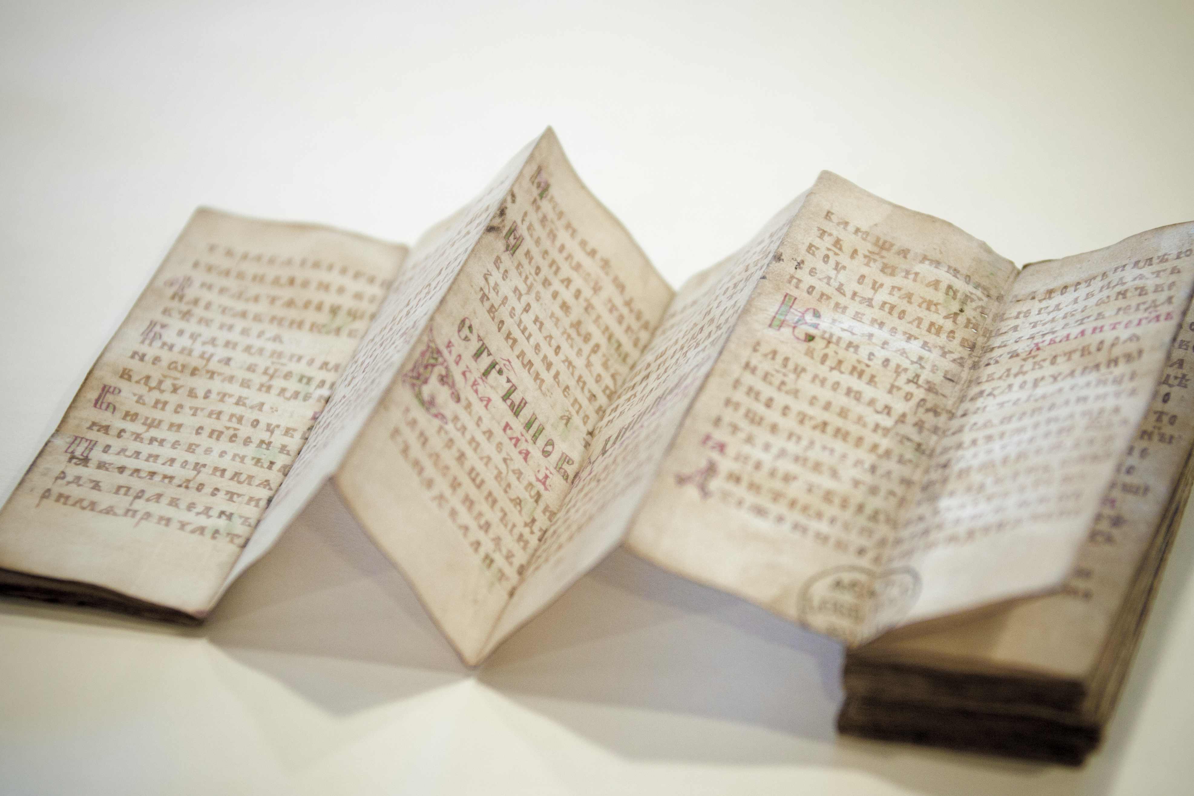
The crux of our footnote system is the presence of a symbol that connects the note to the relevant location in the text. Curiously, in medieval times it was quite common not to have such connections in place, perhaps especially in the earlier period (Fig. 1). When few remarks were added to the page, a reader could deduce with relative ease to which passage a marginal note referred. It helped if a text was in popular use or known by heart, as many medieval works were. In such cases the note made sense instantly because the reader was familiar with the referenced literary context. Moreover, as long as notes were few and short, a reader could simply insert them – interlinearly – over the relevant word or passage (Fig. 2).


Cleverly, in this system the very position of the remark identified the word to which it referred. However, as the number and size of such comments increased, it became impossible to place them between the lines. The great blank space provided by the margins was now drafted into service. It is here that the absence of a proper reference system was felt. As the marginal body of remarks and critique began to accumulate, the page became a real messy place, a labyrinth in which it became impossible for readers to find specific pieces of information (Fig. 3). In came the footnote.
Dots and lines
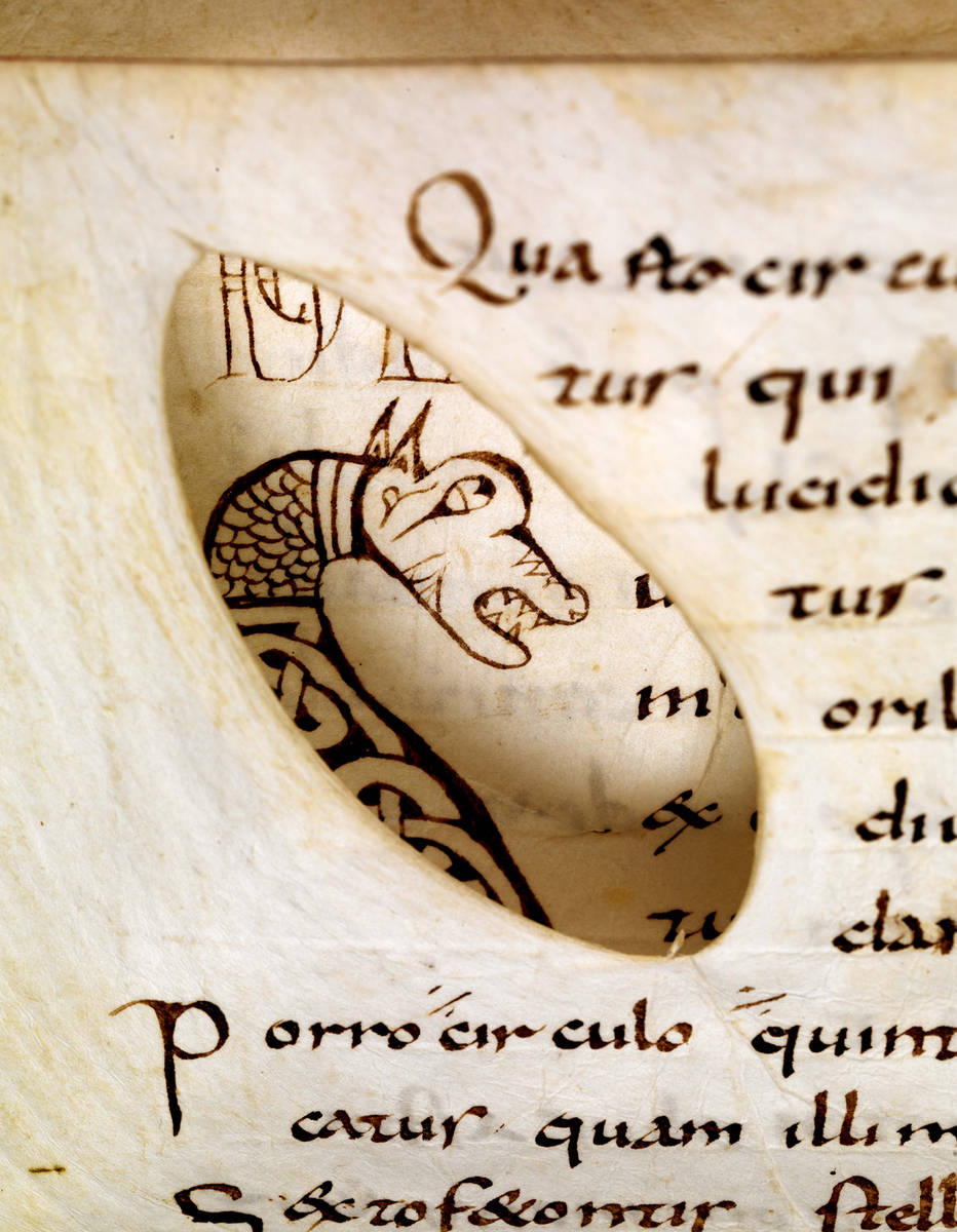
Connecting a marginal remark to the relevant passage in the text was usually done with a duplicated symbol, called a signe de renvoi: one was placed in front of the marginal note, the other near the word or passage that the remark commented upon. While it is hard to deduce a clear pattern of development, it appears that in the early stages of using such footnotes scribes and readers resorted to plain symbols rather than letters or numbers. These symbols varied considerably in shape and sophistication. At the high end of the spectrum we encounter complex symbols, such as the reversed letter E seen in Fig. 4 (magnified).

More popular, however, were less complex symbols, which could be added to the page much quicker. Dots and lines are particularly common ingredients of such footnote symbols. Interestingly, their first appearance (it seems to me) is not as a connector of comment and text, but as an insertion mark that added an omitted line into the text. In Fig. 5 such an omitted line is placed in the margin accompanied by a symbol made up of a line and a dot. It is repeated in the text itself, near the location where the line belonged. This omission mark may well be the origins of the footnote system that would emerge over the course of the Middle Ages – and that we still use today, almost unchanged.

Scribes used different versions of the line-and-dot symbol. In fact, they had to if they were to produce unique ties between comment and text. When dots were used, their number would increase as more notes were added. Alternatively, the position of the dots could be varied, so that they formed different – unique! – patterns.
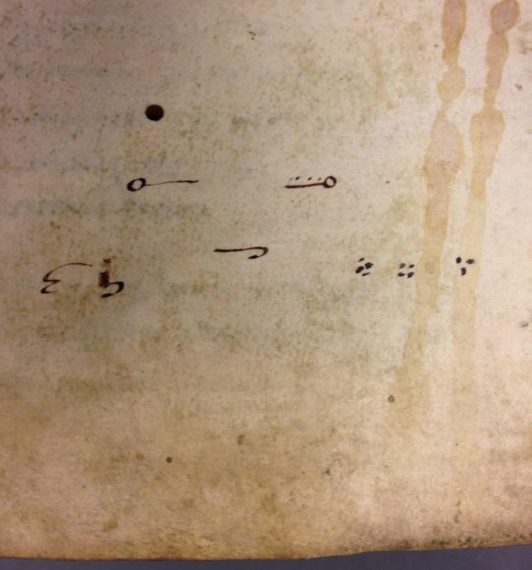
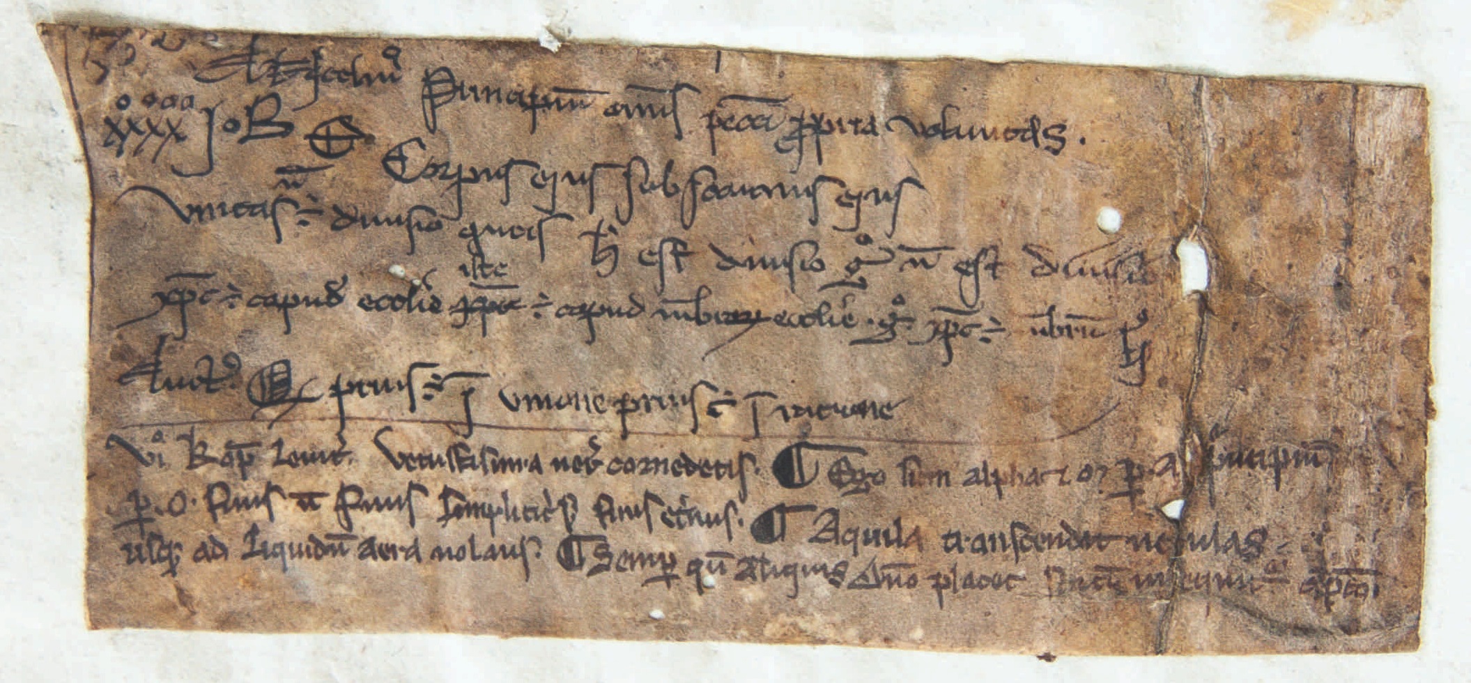
Customising the line-type footnote, scribes usually distinguished one from the other by added circles, which were attached at different locations and in varying numbers. In what is a most unusual find, in a Leiden manuscript we see a scribe practicing his dot and line footnote symbols (Fig. 6). It shows variations in the number and pattern of dots, as well as in the treatments of lines.
Letters
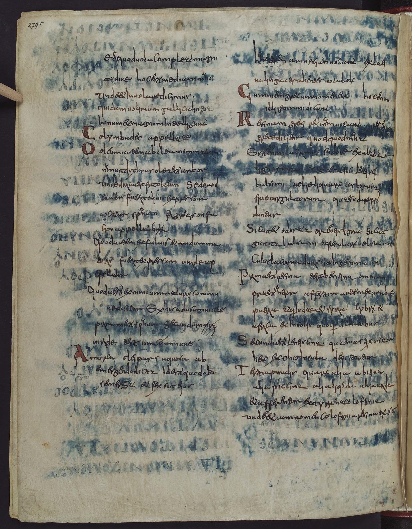
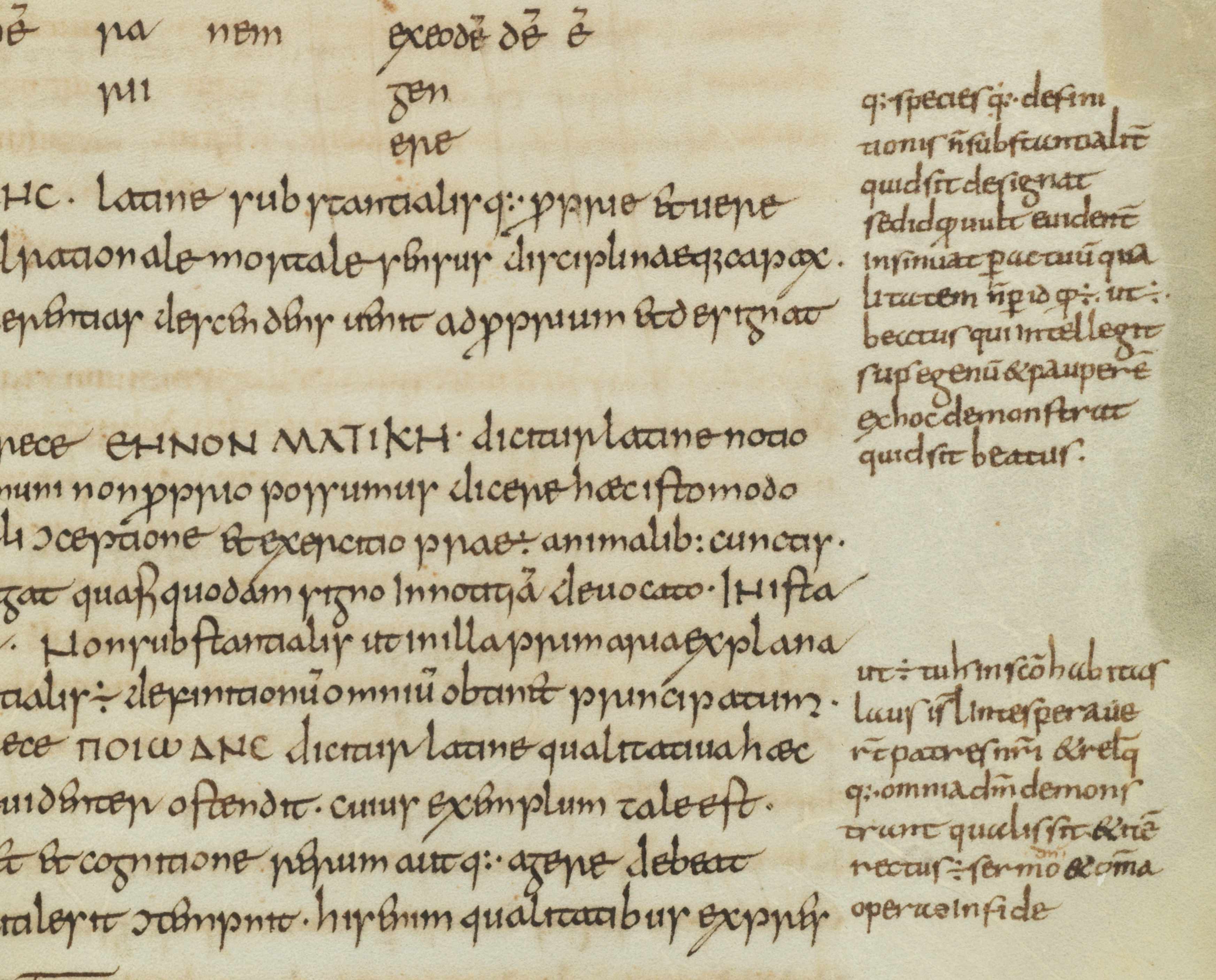
Closest to our modern system of footnotes, finally, is the use of letters to tie a marginal remark to its proper location in the text. In some manuscripts we see the entire alphabet running down the margin. Fig. 7 shows a page from a manuscript with works by Horace (left column) to which a high volume of notes were added (right column), all of which are connected to specific passages with the letters A to Z.

In the eleventh and twelfth centuries such classical texts were most commonly used in a classroom setting. The instructors who used the books, typically in a monastic school, had many things to explain to their students, as the notes show. It made sense to organise such added information in a clear manner, and the alphabet came in handy in this respect. Some pages in this particular book contain more footnotes than there are letters in the alphabet, which challenged the system. In such cases the user added into the mix symbols made from lines and dots.
The last word: numerals
So where are the medieval footnotes that make use of numbers, like we do today? Curiously, I have not been able to find them, which kind of makes sense. Roman numerals would not be suitable for the task. Placed out of context, as a symbol initiating a segment of text (i.e. the marginal comment) they would easily be mistaken for a letter – which they are, graphically speaking. Moreover, a high Roman numeral would quickly take in a lot of space – not what you want in a note symbol. Arabic numerals were far were less popular than Roman numerals, even in the later Middle Ages. Readers may not have felt comfortable enough with these new numbers to use them in the margin. In fact, some scribes in the later Middle Ages are still confused by the zero. The leap from alphabet to numerals – from the medieval to our modern system – appears to have been taken in the age of print.