
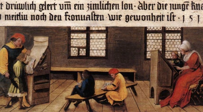
Over the years I have developed a passion for the ways in which medieval scribes and booksellers (i.e. stationer, libraire) promoted their products. Commercial book artisans had a variety of tools available to attract clients to their shops, from spam scribbled in the back of manuscripts (“If you like this, I can make you one too!”) to unsubtle advertisement posters hung outside the shop door (“Pick a pretty letter and I’ll make you a book!”). One of the smallest advertisements surviving from before the close of the Middle Ages dates from 1476/1477 and was produced by William Caxton, Britain’s first printer (Figure 1). This piece of paper, of which two copies survive, is regarded as the earliest surviving printed advertisement in the English language (claim here). It promotes Caxton’s Sarum Pie, or the Ordinale ad usum Sarum, a handbook for priests. Only a handful pages of this text survive today, including one recently rediscovered in Reading University Library (more here; hi-res image of that page here). This post focuses on the 1477 advertisement: how did Caxton advertise his new publication? And what can we learn from a comparison of the two surviving copies?
Marketing
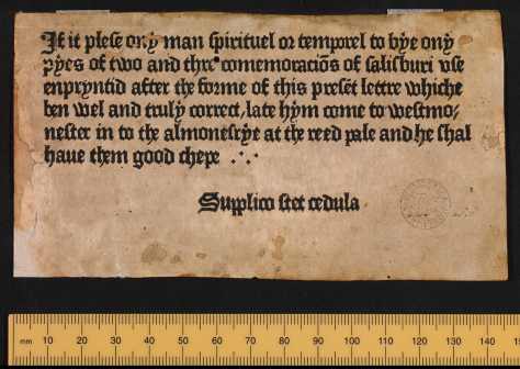
I briefly discussed the paper slip in Figure 1 in this earlier post, because it is one of the few advertisements to survive from the early days of printing. Caxton produced a really clever marketing tool (see the full transcription here, at p. 378). The slip states, for example, that the 1477 handbook for priests is printed in the same letter type as the advertisement (“enpryntid after the forme of this present lettre,” line 3). Even without having seen the new book, its key feature, the type, can thus already be assessed. The advertisement also reassures potential clients that the text of the handbook is “truly correct” (line 4) and that it can be acquired cheaply (“he shal have them good chepe,” lines 5-6). Both features will have been welcomed by priests, the target audience, who needed their textual tools to be flawless and did not have much money to spend on them. In further acts of persuasion, the client is provided with the precise location of Caxton’s shop (“late hym come to Westmo|nester in to the almonesrye at the reed pale,” lines 4-5). The Almonry was a row of houses off Tothill Street in Westminster and the printing shop was set up in a house called the Reed Pale.
The text on the small slip concludes with a fascinating warning in Latin: “Supplico stet cedula,” Please do not remove this notice, showing that it was put on display somewhere. It has been suggested (at p. 378 of this publication) that it was perhaps pinned up in a church porch. Given the modest dimensions of the slip, which measures only 80×146 mm, about the size of a deck of cards, this is clearly a very different beast than the large parchment advertisement sheets that survive from the same period (see my blog post on such medieval posters, here). Rather than a full-page advertisement, the slip is a modest notice, inconspicuously displayed in a location where potential clients passed by. In that sense, a church porch – instead of, say, a busy street – seems a probable location. Additional support for this inference is the observation that the warning at the end is put in Latin, the language used by priests and other church officials.
A Second Copy
While the Incunabula Short Title Catalogue mentions a second surviving copy of the advertisement, kept in the John Rylands Library in Manchester, the Oxford copy in Figure 1 has traditionally been the focal point of scholarly literature. The fact that a digital facsimile was available encouraged this uneven attention. So when I recently happened upon the digital facsimile of the Manchester copy, put online in October 2017, I was quite excited to see if it would add to our understanding of the advertisement. Looking at it, it does not disappoint, for the second copy does show us something new (Figure 2).

The most notable difference between the two copies is the handwritten note at the very bottom of the Manchester copy. It reads: “Pray, do not pull down the Advertisement,” and thus provides an English translation of the Latin rider at the bottom. A tiny cross connects the translation to that Latin line. Being a script expert of the medieval period, I am unable to say much with certainty about the style of handwriting, or the date, but it is clearly not a contemporary hand. It has been suggested to me that the translation was put there by the Cambridge book collector Richard Farmer (d. 1797). One of the surviving notes by Farmer indeed shows striking parallels in the handwriting. As it happens, he actually owned both existing copies of the advertisement. (See for this identication and additional information on the provenance of both the Oxford and Manchester slip the postscript at the bottom of this post.)
Caxton Type 3
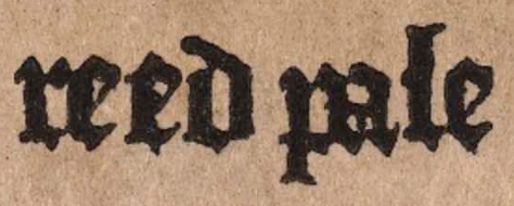
Returning to Caxton’s remark that the letter shape of the advertisement is the same as that of the 1477 publication it promotes, there is much truth to this. Comparing the type of the advertisement to the leaf that recently resurfaced in Reading University, one can only marvel at the strong resemblance (Figure 3). Notably, in both, the letter shapes lack “sharpness:” frequently “blobs” and small hairlines appear at letters, while an individual letter usually has a variety of appearances when looked at in detail. See for example the different shapes of the letter e in “reed pale” (Figure 4). The three presentations vary in the shape of their top and bottom (smooth vs. pointy), the space in the “eye” of the letter e, and even in their height. It is not impossible that the printer deliberately produced this effect, which gave the printed book a more “genuine” – i.e. traditional, “manuscript” – look. In Gutenberg’s B-42 bible the same effect is observed, perhaps for the same reason.

Both the advertisement and the handbook it promotes are printed in what is called Caxton “Type 3,” which is essentially a Gothic bookhand, modelled, by the looks of it, on continental littera textualis, the standard bookhand for manuscripts. It is the formata or high-quality variant that is imitated here, considering the inclusion (or at least attempts to do so) of so-called “diamond feet,” whereby the feet of minims (e.g. in the letters i, m, n) are given a pointy – diamond – appearance. The script features a letter a in two compartments, typical for book script, and lacks the cursive traits of Caxton’s other types, as used in for example the 1491/1492 Canterbury Tales. That particular type, and also those of other English publications by Caxton, features loops at ascenders and a letter a in a single compartment (see one of the Manchester copies here).
William Blades attributes this specific type to two additional Caxton publications (The Life and Typography of William Caxton, England’s First Printer, 1863, pp. 235-42): Horae: ad usum Sarum (Blades nr. 37, datable to 1477-79) and the Psalterium cum cantocis (Blades 38, datable to 1481, image). Judging from the list of Type 3 publications, Caxton reserved his Gothic type, reflective of medieval Gothic book script, for his Latin publications. The audience for these was probably very different from readers who purchased his English works, including the Canterbury Tales. That is: priests and other members of the church will have been used to Gothic script.
Comparing the Two Copies
Comparing the two copies of the advertisement produces interesting observations, for example that the pressure of the press was not always evenly distributed. The two specimens show minor differences in the shape of letters, which possibly result from variation in pressure. If you look carefully at the contours of individual letters, you notice numerous small differences (Figure 5). The top part of the double hyphen at the end is thinner in Manchester, the feet of the letter m are more pointy in that copy, and in general the letters look a bit sharper as well.


Considering these many minute differences, one stable imperfection, found in both copies, stands out. Note how the dotted letter y in “ony” (line 1) uses an inverted comma as a period, as does “pyes” in line 2 (Figure 6, white circles). However, when observing the same letter in the word “enprynted” (line 3), only the lower rim of the inverted comma is visible (Figure 6, blue circles). Both advertisements have this flaw, prompting the hypothesis that the individual lead letter used here was damaged. After all, it seems unlikely that pressure was unevenly executed twice – i.e. in two print runs – in precisely the same location. Given that all other letters y in the document are in perfect order, this particular damaged letter excludes the possibility that the matrix, the hollow form of the letter into which lead was pored, was damaged. The incomplete letter y reveals, interestingly, how Caxton operated when printing these advertisements: it appears he produced one at a time, rather than printing multiple in one go. After all, a damaged letter can only appear once in a single pressing.
Advertising in the Age of Print
For early printers, advertising was an important part of doing business, as it had been for medieval scribes and stationers before them (see this blog post). However, scribes kept on advertising in the age of the printed book. By then, they possessed a skill that had become rare, but which was still in demand. A number of surviving advertisement sheets with script specimens survive from the print era. Some of these even invite clients to come in and learn the trade of writing. This can be seen in one of the most appealing advertisements that survive from around 1500: a signpost painted in 1516 by Hans and Ambrosius Holbein, luring customers (and their children) into the shop to learn to read and write (Figure 7). With its lengthy commercial message and flashy presentation, the sign shows that some 40 years after Caxton’s 1477 advertisement, advertising had evolved into a much more conspicuous affair.

Further reading
Erik Kwakkel, Books Before Print (Leeds: Arc Humanities Press, 2018), Chap. 25 (“Medieval Posters”) discusses advertisement posters, and Chap. 29 (“Second-hand Books Before Print”) the second-hand sales of manuscripts. For the latter, see also see Erik Kwakkel, “Medieval Bargain Books,” Medievalbooks.nl (blog post publioshed May 22, 2015). Various examples of medieval book advertising are discussed in Erik Kwakkel, “Medieval Spam: The Oldest Advertisements for Books,” Medievalbooks.nl (blog post published December 5, 2014). On the broader context of medieval commercial book production, see Erik Kwakkel, “Commercial Organisation and Economic Innovation,” in The Production of Books in England, 1350-1530, ed. Alexandra Gillespie and Daniel Wakelin, Cambridge Studies in Palaeography and Codicology, 14 (Cambridge: Cambridge University Press, 2011), pp. 173-91. On book advertising in the age of incunabula, see Lotte Hellinga, “Advertising and Selling Books in the Fifteenth Century,” in -, Incunabula in Transition: People and Trade (Leiden: Brill, 2018), pp. 20-39.
Postscript
In one of the comments to this post, Arnold Hunt pointed out that the translation note on the Manchester copy was written by Dr. Richard Farmer (1735-1797), a Cambridge book collector. This blog post by The University of Cambridge Special Collections discusses a book that contains a note by Farmer. This image in that post, showing a note by Farmer at the very bottom of the right-hand page, confirms the identity of the person who wrote the translation on the Manchester advertisement. Note, for example, the shape of the ascender at the letter d and the direction of the loop, from right to left, at the h in Cambridge (“hand,” line 2) and t (“Advertisement”) in Manchester.
In another comment to this post, Julianne Simpson at the John Rylands Library provides additional details about the provenance of the Manchester and Oxford advertisement slips. She writes: “Both were part of lot 6017 in the sale of Richard Farmer’s library in 1798 – ‘Scraps of early printed Books, by Caxton, etc.’ This lot was purchased by Francis Douce who then records how he exchanged one copy with Lord Spencer:
‘I had most fortunately acquired two of the very curious slips of Caxton’s book advertisement stuck up by him in the printing office at the Almonry. I shewed this to Edwards who told Lord S[pencer]. of them & he delegated the artful Yorkshireman to negotiate an exchange. Now as there is no third specimen of the kind existing one of these was at least equal in value to one of the books printed by Caxton, & so Edwards admitted. A copy of the Virgil & an old dotted printed were proposed in exchange to which I consented & delivered one of the above slips. When I examined the Virgil I found it wanted the prologue. Notwithstanding this I afterwards heard that the Lord was not satisfied with the exchange, when I voluntarily gave him a very fine & perfect copy of a Lyndwood by W. de Worde, when he somewhat indecorously said to me, ‘Aye this is something’. I was almost tempted to remonstrate on the imperfection of his Virgil, but was not certain that he was aware of it, though I think his Yorkshire agent must have been’. (Francis Douce in MS. Douce e.75, p.15.)”

Thanks for this. Do you mean the link to the Manchester edition, in the paragraph below Figure 4? Is the meta-data of the digital object wrong?
LikeLike
Thank you so much for another informative post! Wonderful insights into these rare survivals. I might point out that the referenced edition of the Canterbury Tales is the 1476-1477 Caxton edition (which is linked). 1491-92 is the Richard Pynson edition. Thank you again!
LikeLike
Interessante Beobachtungen, auch unter dem Aspekt der Geschichte des Unternehmertums/Kapitalismus → Commercial Organisation and Economic Innovation
LikeLiked by 1 person
Thanks for your comment. The statute in Haarlem is for Laurens Coster, by some seen as the inventor of printing at the same time as Gutenberg. See more here: https://en.wikipedia.org/wiki/Laurens_Janszoon_Coster
LikeLike
Thank you so much for this. I am wondering if William Caxton is the same whose statute stands in Haarlem, Holland, as the inventor of the movable type? The letters may very well have differed one from another of the same letter if they were all made by hand, right? I loved the postscript handwriting, too. It is all so interesting for the time.
LikeLike
Thank you very much for this information, Julianna; I really appreciate your taking the time to provide this important information! I added it to the postscript at the end.
LikeLike
Dear Erik,
More on the provenance of these two copies. Both were part of lot 6017 in the sale of Richard Farmer’s library in 1798 – ‘Scraps of early printed Books, by Caxton, etc.’ This lot was purchased by Francis Douce who then records how he exchanged one copy with Lord Spencer:
‘I had most fortunately acquired two of the very curious slips of Caxton’s book advertisement stuck up by him in the printing office at the Almonry. I shewed this to Edwards who told Lord S[pencer]. of them & he delegated the artful Yorkshireman to negotiate an exchange. Now as there is no third specimen of the kind existing one of these was at least equal in value to one of the books printed by Caxton, & so Edwards admitted. A copy of the Virgil & an old dotted printed were proposed in exchange to which I consented & delivered one of the above slips. When I examined the Virgil I found it wanted the prologue. Notwithstanding this I afterwards heard that the Lord was not satisfied with the exchange, when I voluntarily gave him a very fine & perfect copy of a Lyndwood by W. de Worde, when he somewhat indecorously said to me, ‘Aye this is something’. I was almost tempted to remonstrate on the imperfection of his Virgil, but was not certain that he was aware of it, though I think his Yorkshire agent must have been’.
Francis Douce in MS. Douce e.75, p.15.
All the best, Julianne (John Rylands)
LikeLike
I updated the post. Thanks again!
LikeLike
I think you are right: I found a note in Farmer’s hand and the handwriting looks the same.
LikeLike
Thanks so much! Shows you I was off quite a bit with my dating. Do you have a reference to support this identification? I will then add your remark at the bottom of the post.
LikeLike
The English translation on the John Rylands copy is in the hand of Dr Richard Farmer (1735-97).
LikeLike
Actually, that is the best compliment you can give! Classroom use is in part what I have in mind when I write the posts (you are not the only one).
LikeLike
Thanks, Erik, very much for your posts! I learn so much from every one of them! I must confess that I use them in classes, so that Students can easier understand how fascinating this world of manuscripts is! Thank you a lot!!!!
LikeLiked by 1 person
I feel a bit guilty knowing that I got my copy before the author got his. But I don’t think I’ll be giving anything away when I tell you that this book is TERRIFIC. 🙂
LikeLiked by 2 people
Great to hear the posts are useful. The author copies of Books Before Print made it to Vancouver, finally, and I will pick them up from the post office this (!) afternoon.
LikeLiked by 1 person
This is fascinating, Erik — and thanks to you I can both understand and appreciate the sales pitch. I learn so much from every one of your posts! As an aside, thank you also for your marvelous publication of “Books Before Print.” My copy arrived a couple of weeks ago and it’s truly a treasure.
LikeLiked by 1 person
Advertising has deteriorated sadly since those early examples.
LikeLiked by 1 person
Reblogged this on Chris The Story Reading Ape's Blog and commented:
Authors – Did you know that ‘Marketing’ is over 500 years old?
Also, look out for the link, in this article, for MEDIEVAL SPAM: THE OLDEST ADVERTISEMENTS FOR BOOKS…
LikeLiked by 2 people