

One of the fundamental things in a medieval book is letters – those symbols that fill up page after page and that make up meaning. Each one of us human beings writes differently and considering that medieval books were made before the invention of print, it follows that the scripts they carry show a great variety in execution styles. This is perhaps the most amazing experience of spending a day going through a pile of medieval books in the library: the immense variation in the manner in which the text is written on the parchment pages.
No surviving artefact underscores this point of variation better than advertisement sheets of commercial scribes. The one in Fig. 1 was produced by Herman Strepel and through it he shows off his expertise – and in a sense his merchandise – to customers who visited his shop. The blank back shows that the sheet was hanging on the wall, like a menu in a fast-food restaurant. He even wrote the names of the scripts next to the samples, in appealing golden letters, like a good businessman (more about advertisements from the medieval book world in this post).

In this wild party of letter shapes roughly two categories of variation can be observed: first, the shape of medieval letters differs because they belong to different script families; and secondly, their precise execution varies because the scribes opted for a particular size, thickness, quality, and pen angle. Remarkably, this variation is still preserved in our modern notions of typefaces, which represent the families, and fonts, which express the variation within these families, for example concerning size (for their meaning, see here).
If we forget, for a moment, that letters themselves convey meaning, these two levels of variation – choice of script and of its execution – comprise perhaps the greatest value: letters show us when a manuscript was made. This information comes in extremely handy considering that the title page was not yet invented. But how do we find it? Welcome to the secretive world of handwritten letters from the Middle Ages.
Tick, tock
Medieval script tells time, although usually not very precisely. Take for example the three major script families from the medieval period: Caroline minuscule (Fig. 2, sample 1), Pregothic script (Fig. 2, sample 2), and Littera textualis or Gothic script (Fig. 2, sample 3).
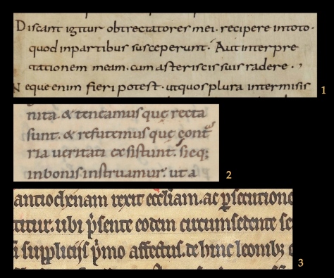
Despite the fact that these three families are relatively easy to distinguish and identify, they were used for extensive periods of time: Caroline (nr. 1) from c. 800 to c. 1050, Pregothic (nr. 2) from c. 1050 to c. 1250, and Gothic from c. 1250 to c. 1500. In other words, merely identifying the family of handwriting is not enough to pinpoint when precisely a book was made. To get that information one needs to do more – and this is where things start to get a bit more complicated.
Data
To know when a book was copied, one needs to investigate where in the timespan of a script the sample in question can be placed. Does a style of writing fit better in the early stages of a script, is it representative of the end of its life cycle, or perhaps rather somewhere in the middle age? To be able to answer this question one needs to know how the font in question developed over time. This is the kind of research I have been doing over the last few years, called quantitative paleography because it uses a high volume of verifiable data. Thus it is possible to map how Pregothic evolved by tracking,for example, the letter pair de (Fig. 3, magnifying glass).

Here the two elements of this letter pair, which was written down in 1156 or 1157, are touching one another, albeit only slightly. Just twenty years earlier these same letters would still have been written fully separated. This becomes clear when we gather data from manuscripts that bear a date (like the one in Fig. 3), which they do every now and then. When this data is gathered one can deduce, with statistical support, when certain features were born or when they died. Thus data shows, for example, that the touching of de is first encountered in the period 1150-1175. The process, which I dubbed “kissing” in this free downloadable book (which also shows how the method works), continues until the two letters fully overlap. This is called “biting” by script experts (Fig. 4, magnifying glass).

In fact, the pair highlighted in Fig. 4 has moved so close together that they share the central vertical pen stroke: the right side of d is also the left side of e. The two have literally become inseparable, because separating them would leave one of them incomplete. The data – gathered from 342 dated manuscripts written between 1075 and 1225 – shows how biting emerged at different moments in different letter pairs: first in pp, then in de and do, and subsequently in some others. (Fig. 5). It shows how even a single script feature needed time to spread to all corners of the script.

Secret – not
The average medieval scribe knew a number of scripts by heart. Commercial producers of books, discussed at the outset of this post, aimed to please a diverse clientele and will therefore likely have known more fonts than any other type of scribe, including the monk (Fig. 6). The latter was very conservative: he did not often have a broad palette of scripts and he was disinclined to adapt his manner of writing on command. Still, even within single scripts monks show variation in the style of execution. Interestingly, he poured into something from his cultural-historical background in the shape of letters, revealing to the attentive beholder when precisely he wrote a book, even when he did not give this piece of information away explicitly.

How the letters were formed may also reveal other things about the scribe, for example where he or she lived, or even that it was a hasty book project. Unveiling this hidden information in handwriting is difficult, because letter shapes do not easily give up their secrets. Still, the increasing popularity of Digital Humanities and the tendency of modern script experts to map the development of handwriting with the help of verifiable data makes it increasingly more difficult for scribes to hide their secrets.
Postscriptum – In response to some helpful remarks on Twitter, I am aware, of course, that scripts and fonts – as used in the title – are not the same thing. However, I like the comparison of the two, and used it here, because just like medieval script, a font relates both to the notion of family (Times New Roman) and its execution (e.g. a 12 point letter). More on fonts and typefaces here (via John Mulloy, @MulloyJohn).

Could you send me this query via email, with context? I will happily look at it when I’m back at campus.
LikeLike
Erik
Thanks for your reply of July 3rd. I’ve tried again and this time the pdf downloaded with illustrations (and not dark grey blanks). Thanks.
LikeLike
Great post and fascinating blog. A post from Feb. ’15 (https://medievalbooks.nl/2015/02/20/cracking-codes-in-medieval-books/) mentions the Voynich Mss. — while your point “As intriguing as the book is, from a book-historical point of view it is far less interesting than Tironian notes. After all, while the Voynich manuscript appears to be coded in a highly personal way, placing the book in a relatively isolated position…” is well taken, your views on the paleography of the script and what that may say regarding the dating and origin of the script (possibly separate from the dating of the vellum it’s written on) would be of interest.
LikeLike
I assume you mean Turning Over a New Leaf (the only downloadable book I published). The images are all there in the back.
LikeLike
Thanks so much for this post. Also, I’ve downloaded your book as a pdf. It is a pity that none of the illustrations are included – I assume that it was a copyright/costs thing?
LikeLike
That’s very kind of you! I’m turning the blog into a book for undergrads at the moment and then I will start a new series of posts.
LikeLike
I nominated you for the Mystery Bloggers Award! See this link for details: http://okotoenigmasblog.com/my-greatest-creation-yet/
LikeLike
It turned out to not be a problem from your end. It was the way the link was displayed on the course site. It was corrected. Happy Holidays
LikeLike
Thanks so much for your message. Which link is the problem, if I may ask?
LikeLike
I’m taking an online class on making medieval manuscripts. I wanted to share this site but the link does not work. It goes to a different site entirely. Just wanted to let you know
LikeLike
A fascinating glimpse into the evolvement of modern typography. Thank you!
LikeLike
Erg leuk om te horen!
LikeLike
Na menig bezoek aan het erfgoedarchief van de Brugse Stadsbibliotheek is jou site een ware openbaring en ondersteuning ,ook voor mijn hobby,middeleeuws boekbinden.
Dirk
http://digeruma2005.skynetblogs.be/
LikeLike
Reblogged this on Economic And Other News and commented:
If you want to know a little about Medieval Fonts, this is a good article.
LikeLike
Thanks for the link!
LikeLike
Very interesting read.
I thought you might be interested in our study on Egyptian Hieroglyphs:
https://icons8.com/articles/ancient-egyptian-hieroglyphs-compared-with-modern-design-guidelines/
LikeLike
Wonderfully informative.
LikeLike
Reblogged this on Talmidimblogging.
LikeLike
Reblogged this on Kate McClelland.
LikeLike
There were other readers who shared your confusion. I rewrote a section in the introduction to clear up my use of “font”.
LikeLike
Nice to hear!
LikeLike
See the Postscriptum.
LikeLike
Very informative post and blog Erik. Thank you. I recently copied Epictetus in italic cursive, inspired by the kind of work you highlight. http://smu.gs/1l0ulwm
LikeLike
Very informative. I recently handcopied Epictetus in italic cursive, inspired by content like this. http://smu.gs/1l0ulwm
LikeLike
Why do you (mis)use “founts” in your title? None of these examples are printed…
LikeLike
Great to hear the blog has been such a help. Keep enjoying manuscripts!
LikeLike
I love reading your blog! Thank you so much for sharing! I’m a newbie in the paleography and history of the book field, and I’m learning a lot from reading your blog every week! I’m currently researching a 16th century manuscript from Spain (I wrote about it briefly here: https://thefamilylibrarian.wordpress.com/2016/04/17/genealogy-through-the-ages/ ) and trying to learn more about the script used. Although it’s not medieval, some of the resources that you’ve shared have been very helpful! Thank you!
LikeLike
Has some similarities the Middle English Dialect Project and the maps they created showing how a corpus of some 320 words was spelt differently around the country according to scribes etc. (A Linguistic Atlas of Late Mediaeval English – LALME) I was briefly involved helping out with some programming as a student some 30 years ago!
See: http://www.amc.lel.ed.ac.uk/?page_id=563
It’s now available on the web: http://www.lel.ed.ac.uk/ihd/elalme/elalme_frames.html
You can see the dot maps created, as well as interactively create your own.
LikeLike
My pleasure!
LikeLike
Reblogged this on Perceval Archeostoria (english site) and commented:
One of the fundamental things in a medieval book is letters – those symbols that fill up page after page and that make up meaning. Each one of us human beings writes differently and considering that medieval books were made before the invention of print, it follows that the scripts they carry show a great variety in execution styles. This is perhaps the most amazing experience of spending a day going through a pile of medieval books in the library: the immense variation in the manner in which the text is written on the parchment pages. Please read this beautiful articole by ERIK KWAKKEL.
LikeLike
So interesting – thank you!
LikeLike
Reblogged this on meatdoesntgrowinmygarden and commented:
would love to be able to write like this
LikeLike