

The human body is one of the most common objects encountered in art, whether in paintings, sculptures or other objects. Things have not changed much since medieval times, when artists loved to fill their work with human figures – commonly saints or individuals affiliated with biblical stories. Among the great diversity of depictions, there is one type that stands out in that the body is used (or rather, abused) to express something other than itself. These particularly fascinating and often amusing depictions are found on the medieval page. We see people bent and stretched into unnatural shapes in order to change them into something for which the book was created: letters (Fig. 1).

Looking at these unfortunate victims of book decorators – in this case the letter G from the Macclesfield Alphabet Book – may bring a smile to your face, which was probably the aim. At the same time, it is easy to overlook the sophisticated design behind such forced yoga exercises. Moreover, when you look a bit closer at this kind of book decoration, different types of letter-people may be discerned.
1. Inconspicuous letter-people
In the least conspicuous type we simply see one or more individuals hanging about near the text, minding their own business. At least, that is what you would think at first sight. When you start reading it quickly becomes clear that these people and their paraphernalia are actually forming the first letter.
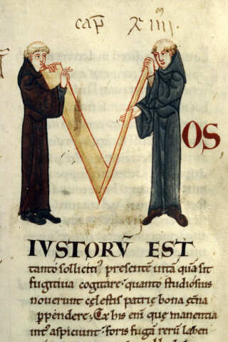
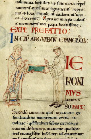
In the first of these two scenes (Fig. 2), two monks hold up a structure made out of planks. When turning to the text (Gregory’s Moralia in Iob) it becomes clear that the monks and the V-shaped structure form the capital letter M (the first line reads “Mos iustorum est”). Fig. 3 is even more subtle: it shows a monk giving a wax tablet to what looks like bishop. In fact, they also form the letter H during the exchange (the start of “Hieronimus”).
2. Bending reality
Subtle as they are, it is hard to believe depictions like these were not meant to entertain. Some letters made up by human figures appear to take the entertainment factor a step further. In the same medieval set of books as the previous decorations this giant letter Q (Fig. 4) can be found.
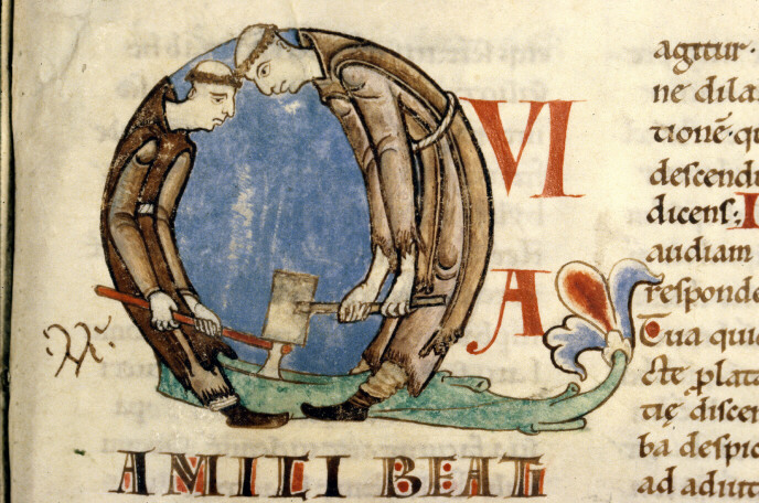
While the individuals forming the M and H (above) are in a natural pose, this Q is formed by two Cistercian monks (lay brothers, actually) in a most uncomfortable position. The team is chopping wood, with one monk placing an axe on the tree, while the other hits the axe with a hammer. While that must have been a common, real sight for the readers of this book, which was produced for a French Cistercian house, the backs of the monks are rounded unnaturally in order to form the Q shape. The result is an uncomfortable-looking pose that provokes laughter.
The case of the two monks shows that bending reality can make it difficult to recognise a letter. A similar feeling surrounds a scene in another twelfth-century manuscript, one that shows a man wrestling with a beam (Fig. 5). It looks as if he is trying to lift it on his shoulders, but it appears to be too heavy. The image below it (Fig. 6) plays into the same theme of lifting. In both cases it takes a while before you recognise the letter that is expressed – the medieval reader probably got it much quicker.
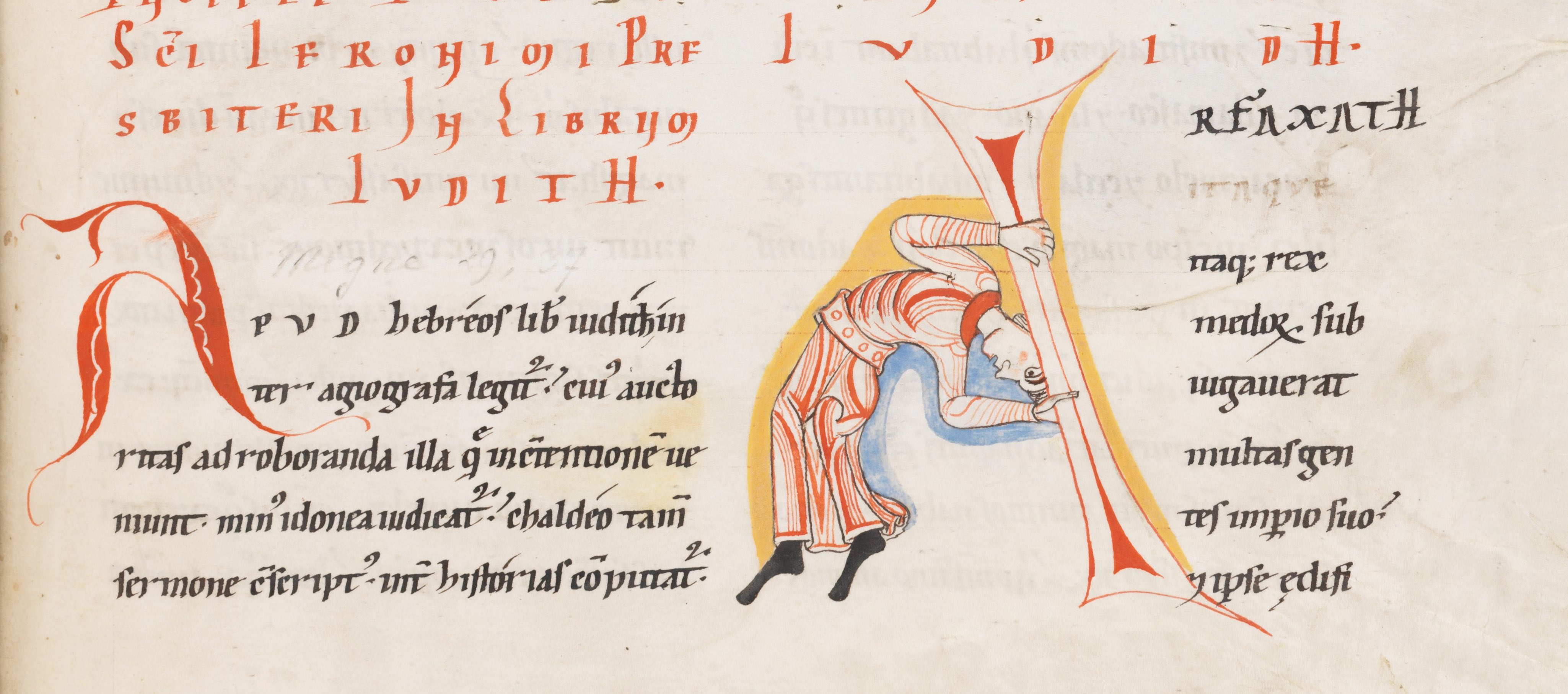
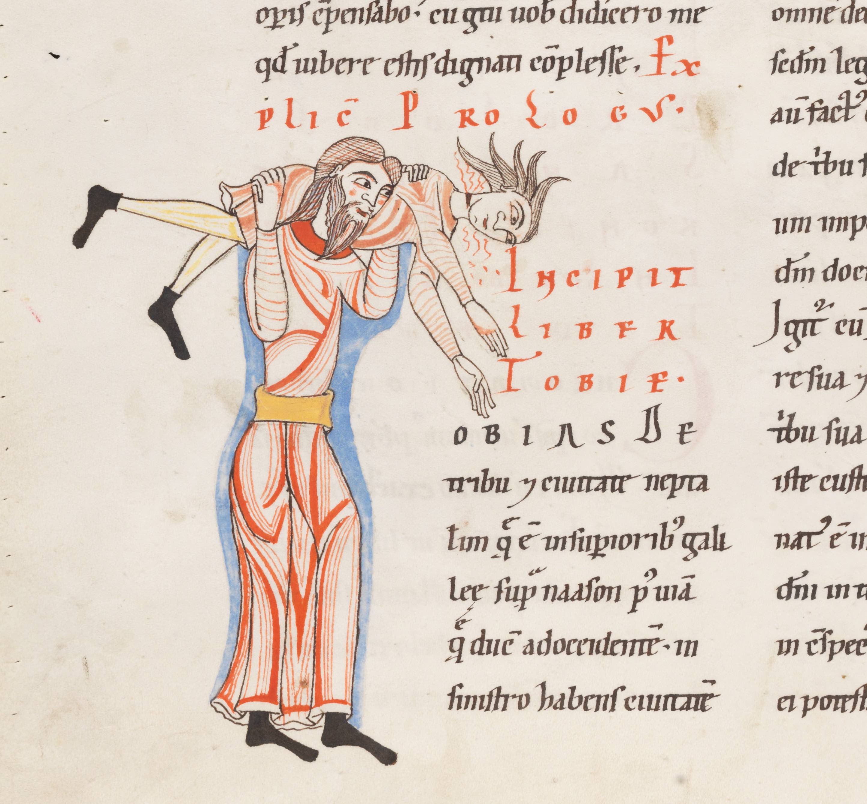
A closer look reveals an A in the top image (the start of the name “Arfaxath”). It has the same peculiar shape as the A seen to the left of the acrobat and his heavy beam. The unnatural pose reminds us of the two monks chopping wood: reality is somewhat stretched – or rather, bent. Fig. 6, from the same manuscript (a Bible), shows the letter T for “Tobias”, which is produced by two individuals wrestling. It is not hard to imagine that the lifted person is spinning around while making a lot of noise (that is at least how I interpret the red lines coming out of his face).
3. Bending reality further
Near the end of the medieval period manuscripts appeared in which the human body was stretched and bent like never before: model books (see my post Medieval Super Models). These objects presented decorators with ideas and actual models for the large initial letters at the beginning of a text. People (as well as animals) form a common subject matter in these model books. Interestingly, they exchanged real-life, natural scenes with sophisticated constructions that feature multiple people in strange collective acrobatic poses (Fig. 5).
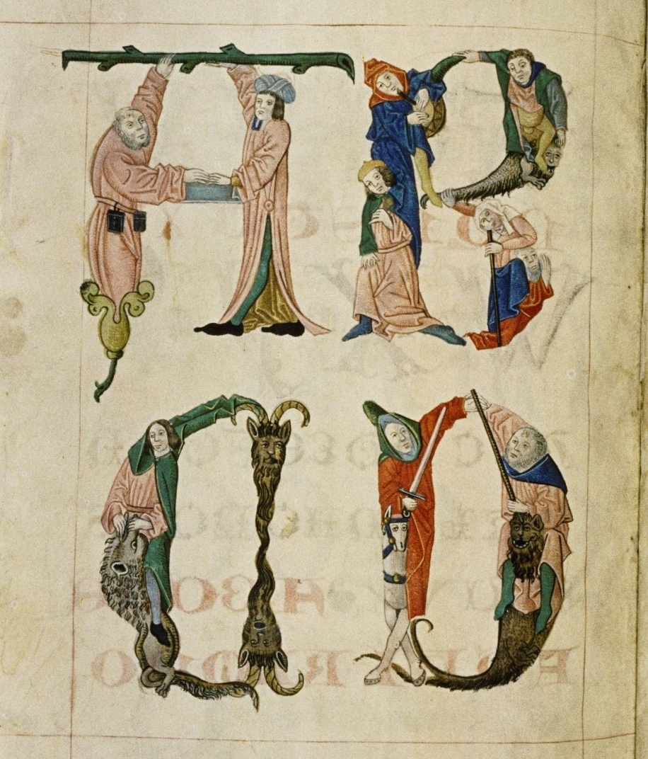
The great thing about this kind of decoration is that they are mini stories. They are much more dynamic than the scenes in Figs. 2-4, which show a single, rather static event. The letter B in Fig. 5, for example, shows a small band of people, who have to work hard for this pose. Still, one is making music, another balances on a dragon, while the old lady is supported by an old man. Readers had a lot to talk about when they saw this letter. Is the old man her husband, who is reduced to a (quite literally) supporting player? Is the man with the green jacket fighting the dragon or merely using it as a chair?
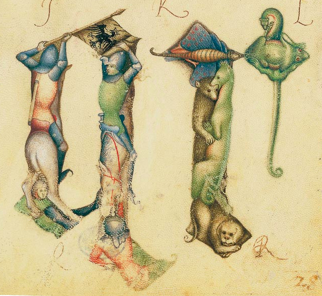
This theme of a bent reality where the lives of people are played out in unreal stories – while forming a letter – is also seen in other model books, such as the one made by Giovannino de Grassi, who worked at the Visconti court in Italy (Fig. 7). The letter q is made up by two knights on horseback, in an almost postmodern pose, while the letter r that follows shows a cute collection of animals.
With the animal theme the tradition has gone full circle. Animals forming letters are encountered as early as the ninth century (Fig. 8).

This scene shows a dog running away with a fish in his mouth, while forming the letter T (“Tum ego”) – and all this in a dead-serious text by the philosopher Boethius. It shows that entertainment using familiar objects, both humans and animals, is something universal, something that binds decorators from all corners of medieval Europe. It was sure to be a hit with the reader, who was given the chance to have a short “breather” from such heavy texts as Gregory’s Moralia and the complex ideas of Boethius. For a moment an unusual take on reality was allowed to take over and entertain.

Loved these-another great blog-thank you .
LikeLike
Reblogged this on Tome and Tomb.
LikeLike
It looks like people back then were just as creative as we are today. I have to wonder what they would have thought of Photoshop and other such applications. It certainly would have made it easier for them to construct these!
LikeLike
THUMBS UP!
LikeLike
Reblogged this on ArtEdutech.
LikeLike
I have created capital letter figures such as these in my own mern Fraktur artwork.
LikeLike
Reblogged this on Ajewole tosin's Blog.
LikeLike
Reblogged this on edgarmeloecosta and commented:
Edgar Melo e Costa
LikeLike
Reblogged this on stayfoolish2day and commented:
Great insights!!
LikeLike
Reblogged this on anneliselatier.
LikeLiked by 1 person
Reblogged this on twiggietruth.
LikeLiked by 1 person
Reblogged this on universalpluspepe.
LikeLiked by 1 person
Dankjewel!
LikeLiked by 1 person
Wow this is fascinating, I’d seen these letters before but I’d never really given them much thought. Great writing!
LikeLiked by 1 person
For a great blog on how to interpret medieval art/latin here’s an example: https://readingmedievalbooks.wordpress.com/2015/01/18/women-hawks-and-english-literature-exams/
LikeLiked by 2 people
Reblogged this on Universalplusjl's Blog.
LikeLiked by 1 person
Figure 7: Letters – remind me of totem poles….they also have stories within their formsa, as well. Fascinating and the illustrations are beautiful.
LikeLiked by 1 person
I am trying to figure out what the horseman in the red coat in fig. 7 has on his back. Japanese soldiers sometimes wore a harness on their back to support a flagpole like modern people wear for parades, but I have never seen a medieval European attaching a banner pole to their back. With historical costume the devil is in the details …
The soft-line, pastel-colour style of the painting also intrigues me. I wish I had the vocabulary to talk about it.
LikeLike
Reblogged this on روما ٱون لاين.
LikeLiked by 1 person
Reblogged this on Teaching Artist.
LikeLiked by 2 people
Reblogged this on First Night History.
LikeLiked by 2 people
Reblogged this on amandakaitlyn02.
LikeLiked by 2 people
Reblogged this on ' Ace History News ' .
LikeLiked by 2 people
Reblogged this on The viewer, es sencillo es mi opinion y no me molestan las criticas..
LikeLiked by 2 people
Reblogged this on Silicon Valley Types and commented:
“Steal Like An Artist”!
LikeLiked by 2 people
Reblogged this on itsmagnificent.
LikeLiked by 2 people
Reblogged this on morristreasuremall.
LikeLiked by 2 people
Reblogged this on Crumbs of Knowledge and commented:
An unusual look on the use of the body in Medeival art. Definetly worth the read!
LikeLiked by 2 people
Reblogged this on De Minimis Non Curat Prætor.
LikeLiked by 2 people
Agree
LikeLiked by 2 people
I love these letters! I remember a book at the library that was similar to the fourth section.
As a wrestler, I regret to tell you that those red lines are probably blood. I know of no move that would move only the head and neck (that doesn’t induce trauma).
LikeLiked by 2 people
Thanks for visiting!
LikeLiked by 2 people
Quite an interesting post… Enjoyed reading it. Wish u were teaching us history back at school
LikeLiked by 2 people
Reblogged this on Do The ReBlog….
LikeLiked by 2 people
Reblogged this on ahigherconscious.
LikeLiked by 2 people
I involuntarily had to think of the animated credits of the Monty Python movies… I guess humor really is something that could unite humanity
LikeLiked by 3 people
Reblogged this on breakfree4rmfateasily.
LikeLiked by 2 people
Great post, loved the history.
LikeLiked by 2 people
Thanks for visiting!
LikeLiked by 2 people
Love reading about history. Thank you for this post, its great!
LikeLiked by 3 people
Reblogged this on Victoria Xuan.
LikeLiked by 2 people
It reminds me of my first lettering class, forty-seven years ago. It was our first class assignment. Many years later I saw the Book of Kells and enjoyed it all the more for having to have made illuminated letters. I enjoyed reading your article.
LikeLiked by 3 people
Reblogged this on Friends Shop.
LikeLiked by 3 people
Good idea. It depends on available I MN ages though.
LikeLiked by 1 person
I enjoyed this blog post and all the examples of contorted body positions. Do you plan to do one just on animals?
LikeLiked by 4 people
Thanks – and happy reading! You may like the Medieval Selfies post.
LikeLiked by 2 people
well, congrats on being freshly posted and thanks for writing this article, was really enjoying it and will have to take a closer look around 😀
LikeLiked by 4 people
You are welcome. Glad you like it!
LikeLiked by 2 people
A wonderful posting. Thank you!
LikeLiked by 5 people
Re “Incipit Liber Tobie”: the red lines aren’t blood? Seems quite a deep gash in his neck … perhaps he’s already dead, being carried to heaven by Christ (surrounding blue, an expensive color, unless it meant “sky”)?
LikeLiked by 3 people
Reblogged this on readwhichnovels.
LikeLiked by 4 people
It’s my favorite too. Thanks for visiting!
LikeLiked by 1 person
I loved the “Incipit Liber Tobie” one. Thanks for sharing this work
LikeLiked by 4 people
Thanks for the link!
LikeLiked by 1 person
You and your readers might be interested in this article on The Getty Iris (The Getty’s online magazine).
http://blogs.getty.edu/iris/the-rise-and-fall-of-a-court-artist-in-renaissance-italy/
It tells about the career of an illuminator at the Visconti court, Belbello da Pavia, who was the successor to Giovannino dei Grassi, mentioned in your post. By a startling coincidence, I read the Getty article yesterday and your post today!
LikeLiked by 3 people
That’s a great thought – and observation. There are references in hidden in medieval art, including book decoration, probably also in these letter-people.
LikeLiked by 1 person
I wonder whether the letter-people contained many references that we don’t know these days – whether to proverbs or events or stories, caricatures of monks, stereotypes… I looked up Tobias the martyr and found he had been blind for while – could the red lines refer to that? It’s a bit of a leap, I realize. But I bet there are all sorts of things we don’t get, as in Shakespeare.
LikeLiked by 4 people
Reblogged this on farahh67.
LikeLiked by 3 people
Great post! The illuminated capitals remind me so much of modern alphabet books that use the whimsy of illustration to educate (and amuse!)
LikeLiked by 4 people
Thanks for your comments!
LikeLiked by 2 people
AHA! Found. Cervera Bible – Zoomorphic, not people but still unusual.
http://www.wdl.org/en/item/14158/
Josef Asarfati, a Jew of French origin who settled in Castile, is found in the last folio of the codex, a colophon in zoomorphic letters, making this a rare example of a Hebrew manuscript containing an explicit signature of the artist.
LikeLiked by 2 people
Loved this…know the Fig 1 letters well. Graphic art of the highest order, clever AND amusing. Sure people smiled! Kells deserves a show altho more visually mysterious than obvious/amusing. And sometime ago I found similar (to Fig 1) in Hebrew lettering as a judaic text’s colophon, which for the life of me I can’t trace in my files, darn. Clearly I have a bad system.
LikeLiked by 4 people
Reblogged this on sutapasinha81.
LikeLiked by 3 people
Thanks for your kind comment. One of the things my blog aims to do is just that: narrowing the gab between then and now, perception-wise.
LikeLiked by 2 people
Your writing style is so fun, and you really make the people of history seem less like shadows, more like actual humans who weren’t so different from us 😀
By the way, I’m sure you noticed that in Fig. 5, one of the guys is actually sprouting out of a flower; so funny!
And I think that the man in green is definitely using the dragon as a chair; it looks pretty defeated and the man doesn’t seem too concerned; although, that’s the expression of a lot of medieval characters’ faces, lol.
LikeLiked by 4 people
I have created capital letter figures such as these in my own modern Fraktur artwork.
LikeLiked by 3 people
Graag gedaan.
LikeLiked by 1 person
Reblogged this on Books I've Enjoyed (and some I haven't).
LikeLiked by 3 people
Schitterend, genieten! Dankjewel.
LikeLiked by 2 people