Margins are both a universal and remarkable feature of books. From the very earliest specimens produced two millennia ago, to the e-readers we use today, books contain pages that hold both text and a significant amount of blank space. What a strange pair they are: words, the primary reason for the book’s existence; and a vast emptiness present on all sides of the text. A particularly remarkable aspect of marginal space is that there is so much of it in medieval books. My own work on the twelfth century, reflecting broader medieval patterns, shows that pages from that period consist of approximately 50% margin, although in some cases it can be significantly more. This implies, astonishingly, that the majority of medieval books are half empty, despite the fact that parchment was expensive and sometimes even hard to come by. Why is this?
Tradition

One answer to this question is a simple one: because this is how books were traditionally made. Medieval scribes took over a great deal of material features first introduced by their counterparts in Antiquity. The book as we know it – i.e. an object produced from quires (bundles of folded sheets) – came into existence in the fourth century, as discussed in my post What is the Oldest Book in the World? The pages of the famous Codex Sinaiticus, a Greek New Testament copied around the middle of the fourth century, measures 381 x 345 mm (height x width), while the text itself only takes up 250×310 mm (height x width). A simple calculation reveals that the text takes up 58% of the page, while 42% is reserved for the outer margins. In other words, a little under half of this magnificent book is empty.

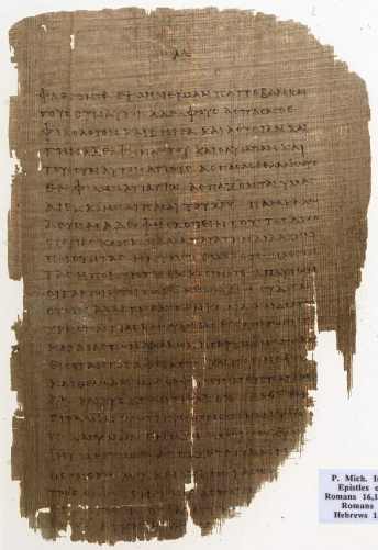
Going back even further, papyrus manuscripts from Antiquity also included a considerable amount of marginal space. This is seen, for example, in Fig. 2, which shows the remains of a copy of Paul’s Epistles written between 150 and 250 CE. While the margins have been reduced post-production through damage (the edges of the papyrus eroded), the upper margin, which is largely intact, shows how the scribe reserved ample marginal space. The extensive medieval margin is, in one way, simply a continuation of an older practice.
Toolbox
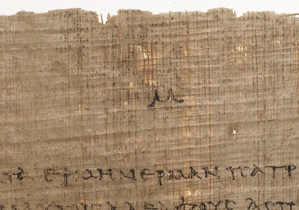
The early papyrus book in Fig. 2 highlights that it was also convenient to have an empty space around the text. It meant that you could fill them with tools that may be helpful when consulting the book. A particularly important reading aid is visible at the top of the papyrus page: the capital version of the Greek letter Mu (looking like an M), which represents the Greek number 40 (Fig. 3). In other words, this is a very early page number (folium number), an instrument that is apparently some two thousand years old and predates the printed book by over a millennium.

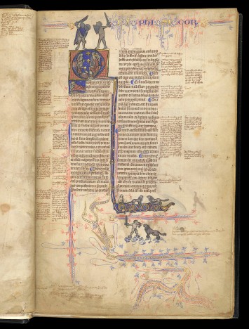
There are many other kinds of aids encountered in the margins of medieval books, including cross references to other books or locations in the same manuscript, quotation marks, labels that indicate who the quoted author is, and chapter numbers. A particularly prominent aid is the running title placed in the upper margin. The one in Fig. 4 states “Physicorum”, indicating this is Aristotle’s Physics. This particular manuscript contains several Aristotle texts, which were popular in the university classroom. The student or teacher who was browsing through the book for certain information was greatly helped by these sign posts.

Notes
While the margin did a good job accommodating the relatively short reading aids, it could be challenging to add large amounts of text to the void surrounding the main text. Fig. 5 shows a schoolbook from c. 1100 that was donated to Egmond Abbey near Amsterdam by one Baldwinus, a teacher in Flanders. The text in the book, Lucan’s Pharsalia, was used in the medieval classroom, and it is therefore no surprise that numerous explanatory notes have been added to the text, probably by Baldwinus himself.

There is something special about these marginal notes: they are preceded by symbols that are the precursor of our modern footnote (more about this early practice in this post). The symbol links a remark in the margin to a specific location in the main text. The symbol seen in Fig. 5 resembles the number 7 and is perhaps the Tironian note for “et”.

Despite these add-ons, the schoolbook from c. 1100 is not really prepared to hold extensive notes. Baldwinus could have crammed more text in the margins, had he copied in a smaller script or increased the number of lines for the marginal text passages (presently, their number corresponds to the main text). However, this was not yet common practice in his day and age. In the scholastic age, by contrast, when university students needed to add a lot of extra information in the margin, these two tricks were applied, as seen in Fig. 3 – note the tiny script of the marginal notes, as well as the increased number of lines compared to the main text.
Convention
The examples in this post have shown different ways in which the margin, that handy device inherited from Antiquity, was put to good use by scribes and readers. However, it has not discussed why medieval margins were so large. Why keep as much as half of the page blank? Surely a quarter would be sufficient to add notes or tools? While there are manuscripts that exhibit pages with tiny or no margins, there are not many. Leiden University library owns one of these exceptions: an early-eleventh-century schoolbook made from scrap parchment, the pages of which were filled to the brim (Fig. 6).

Interestingly, the teacher who copied this book diverted from the medieval convention related to page design in that he opted not to add substantial blank spaces. His use of scrap parchment (offcuts that were left over after the regular sheets were cut from the animal skin) indicates this was a low-cost book project. In other words, making maximum use of the available space on the page is likely motivated by cost considerations: it ultimately limited the number sheets necessary to copy this collection of (classical) texts.
While the choice for large margins may have a basis in a shared idea of perfect proportions, something modern book designers would call the “golden ratio” (see here, here and here), the notion of convention is probably the ultimate drive. There are plenty of conventions in medieval book production that don’t have an obvious explanation. The relative dimensions of the page is one of them: the width of medieval books tends to be about 70% of its height (see my Books on a Diet post for some curious exceptions), but why is this so? And why do quires predominantly consist of four folded sheets? Why are page numbers placed in the upper rather than lower margin? The bottom line is that large margins may simply have been something that medieval readers had come to expect from the object in front of them.
Postscriptum – This post was written in celebration of a conference devoted to the medieval margin, which I attended in June 2015 (details and abstracts here). More on the unusual Leiden scrap manuscript in the essay I wrote for this volume. Also make sure to check out this blog by the Marginal Scholarship project. I owe the title of this post to Julie Somers.


Nice discussion!
One note, sort of a tweak.
The original Sinaiticus, before the trimming (surely by Tischendorf) was quite a bit bigger. Using Metzger’s numbers for the original size, the text is only 45.5% of the page, not 58%. However, Gregory’s number would make it close to 50%.
Details here:
“marginal notes have been partially cut off by the ancient binder.”
http://www.purebibleforum.com/showthread.php?224-quot-marginal-notes-have-been-partially-cut-off-by-the-ancient-binder-quot
Notice the Genesis fragment with large margins.
And I can think of two reasons for the Tischendorf trimming.
(1) Notes on the edges that could hurt the 4th century claims.
(2) Ease of transport for heists.
(1) is more likely since it matches claims that were made at the time that there were margin notes that were discomfiting to Tischendorf.
And it is highly unlikely that Sinaiticus is more than 180 years old. So it does not make a good ancient or medieval example. 🙂 However, there are other examples of low text to parchment ratios, like Codex Claromontanus.
Steven Avery
Dutchess County, NY
LikeLike
It’s the least I can do. Like I’ve said in the past, I love your blog 🙂
LikeLike
I’ll check them out – thanks.
LikeLiked by 1 person
I believe clay tablets were that proportion too – not sure of the chicken/egg of tablets/manuscripts but isn’t the golden mean in man-made objects purely a reflection of what we innately perceive as a perfection proportion. Medieval artist i believe were fully aware of its ‘significance’ – the Wilton Diptych altho not a ms follows that rule I believe. It is after all just like a large book.
LikeLike
Indeed it is. BTW, I’ve scheduled a few posts in the coming weeks based on your work. Expect a number of pingbacks and, hopefully, an increase in your visitors 🙂
LikeLike
It does. Great to see that already in play in modeling of these old books.
LikeLiked by 1 person
I wonder if the width/height ratio of 70%, or 1.4, may have had to do with the Golden Mean, which is 1.6 and was often considered the most aesthetically pleasing ratio in nature.
LikeLike
This is an extremely sensible comment. To answer your question, there are things going on in the margin that help the reader, for example to find his way around the text, to guide him to certain information, and to help him see that something is more important than something else. These efforts are universal for medieval times, but the way in which the effects were produced differed greatly between medieval periods. More to the point, decoration was not the most common way to produce these effects; it was more common to use ink and pen, and for example produce paragraphs, marginal notations, sign-posts etc. The best example of real “decoration” (it is such a broad and unclear term!) is, I think, the use of smaller and larger decorated initials – especially when they are part of the hierarchy of script and help the reading make sense of the structure of the text. Even when letters were amusing, a dynamic referred to a few times in the post, the effects I mentioned above could also be in place. In my opinion a piece of decoration could be appealing/amusing *and* do something else at the same time. Thanks for your comment.
LikeLike
I think a mention of marginal art is worth adding to these interesting comments on an interesting article. In particular, I want to mention Lucy Freeman Sandler’s close analysis of text/image relationships in Gothic manuscripts. The takeaway of her work for me was that manuscript decoration—in the late medieval period, at least—was more than just decoration and amusing pictures. She finds lots of images serving as glosses, commentary and even additions to the meaning of the text. She also argues convincingly that marginal images in Gothic texts seem intended to condition how the text was read. One conclusion she makes is that marginal grotesques promote “active reading rather than passive hearing.”
So, maybe medieval bookmakers and readers sensed a weaker divide between text and image, and that is one circumstance feeding the tradition of leaving open space outside the text? My understanding is that only a small fraction of manuscripts were decorated, but do you see manuscript decoration in the earliest stages of the book?
LikeLike
I try to find images that “pop”, so it’s good to hear you enjoy them. Thanks for your comment.
LikeLike
There are some amazing images on your blog. Thanks for all the great content! When thinking about medieval books, I always recall the Book of Kells, and how it’s such a great visual example mingling cultures. Not enough people appreciate these old gems.
LikeLike
I wrote a long answer, which seems to have disappeared. Thanks for your remark!
LikeLike
Adding notes and glossings was a big cultural factor in Medieval writing for sure – especially in Bibles. It became difficult to tell what was actually biblical word and what came purely from priests’ commentaries – https://library.osu.edu/innovation-projects/omeka/exhibits/show/the-king-james-bible/sections/item/65 for examples. Hence the Lollard desire for one, pure and readable biblical text in the 1380s. Also hence Chaucer mocking priestly glossing in eg) the Wife of Bath’s tale!
LikeLike
WRT dirty margin, I have seen some old herbals that definitely have grubby edges. I think they saw a lot of use in physicians’ still rooms, and readers were handling plants, oils, and writing supplies while they worked. How I wish those books could talk!
LikeLiked by 1 person
I really like the scroll idea: there a white space around the text was truly necessary. The idea about damage sounds appealing, except that current edges are usually not damaged.
LikeLike
Might it be possible that one reason for margins was to protect the text from damage? In the age of papyri and of scrolls, I imagine the risk of damage was highest at the edges, and that should not lead to a loss of text.
Another explanation (for left and right margins) that comes to my mind: If several paginas where put together to form a scroll, you also might have needed some free space without text where they could overlap and be glued together (just an idea, I don’t know if scrolls where made by glueing pages together).
If you put pages together into a book, at least you need a margin in the middle, or else you cannot read what is written where the pages are stiched together. On the outside, it is the margin where the pages are most likely to be touched, damaged and stained. I qouls guess it was such practical reasons that led to margins. Their size and use might just be a result of historical accidents and emerging tradition.
LikeLike
I am not sure, except to say that margins are generally not noticably dirty.
LikeLike
What about protecting texts from dirty fingers? Handling a book after a lunch of greasy mutton without the obsessive hand washing of the 21st century would leave a book brown around the edges. Did scribes plan for this as well?
LikeLike
My pleasure.
LikeLike
I am not sure if scribes were already envisioning future rebinding when they designed a manuscript.
LikeLike
Thanks Eric. Liz….
LikeLike
Wasn’t it also important to have large margins to preserve the text in case a book was rebound in a smaller binding and trimmed in the process? The Texas A&M University library houses some old herbals that suffered a size reduction during prior re-bindings. Not only are the margins gone, but the edges of some of the figures as well.
LikeLike
Reblogged this on Tome and Tomb.
LikeLike
Just to add a bit more detail to my earlier answer, all books have margins, but scholarly copies contain more notations in them than other genres. These books (i.e. those to study from) may also have extended margins, which would then take up 65-70% of the page. It was already anticipated that the standard amount of space would be insufficient. Yes, law manuscripts are among those, as are Bible commentaries.
LikeLike
While all books (with and without margins) could be glosses, the book with the notes you see in Fig. 4 can be connected to an early university environment (due to its contents, primarily). It will have belonged to either a student or a master. The marginal notations were perhaps first jotted down on little slips or on a wax tablet; the text on them was then copied into the book, at home presumably – students did not necessarily bring their books to class. The notes are contemporary, but other pages may contain glosses that were much younger: these objects were often sold secondhand and so we see different generations of users on the pages.
LikeLike
To what extent “established” corpora of commentaries play a role in the se open spaces ? E.g. Copies of the Decretum Gratiani would contain numerous marginal notes, that were part of the teaching of the Decretum. In this case, extra space was needed in order to add notes and comments during class, hence the lay-out ?
Also, is the open space limited to text- and school books ?
LikeLike
Yes, layout greatly reflects use. Also, certain genres came with a preferred layout, though here, too, use (of that specific text) is often an important drive.
LikeLike
The conference referred to at bottom is all about that!
LikeLike
As ever great and thanks. Always happy to see you pop in my email. From a base of “enthusiastic amateur” I looked at Fig 4 with fascination and wondered if you knew more about the footnotes – who added them? over what time frame? and who would have had access to such a book? since that would of course determine who might ‘comment’. That is a LOT to ask, if you can point me to more info, forever grateful..
LikeLike
Is there a difference in lay-out and margins according to the use of the book ? And to what extent “established” corpora like commentaries on e.g. the Decretum, play a role in this particular lay-out ?
LikeLike
Excellent pot, as always ! Anthony Grafton wrote an History of footnotes. What about an History of marginal notes ?
LikeLike
Thanks so much – I have added it to the post.
LikeLike
To add to your citations on the golden ratio, I recommend Craig Mod and Alexander Ross Char for the beginnings of a “digital” take on the topic: http://wp.me/p2AYQg-Lw
LikeLike