

The pages of medieval books are generally filled with two things: words and decoration – and a lot of nothingness, the margins. The divide between the two is evident and clear. Words make up the text and are executed with pen and ink, while illustrations, produced with brush and paint, decorate the text. There are manuscripts, however, in which this self-evident truth is turned upside-down: sometimes decoration is created by words, which were meant to be read. This intriguing scenario blurs the divide between text and illustration: it challenges how we define both.
Decoration forming words
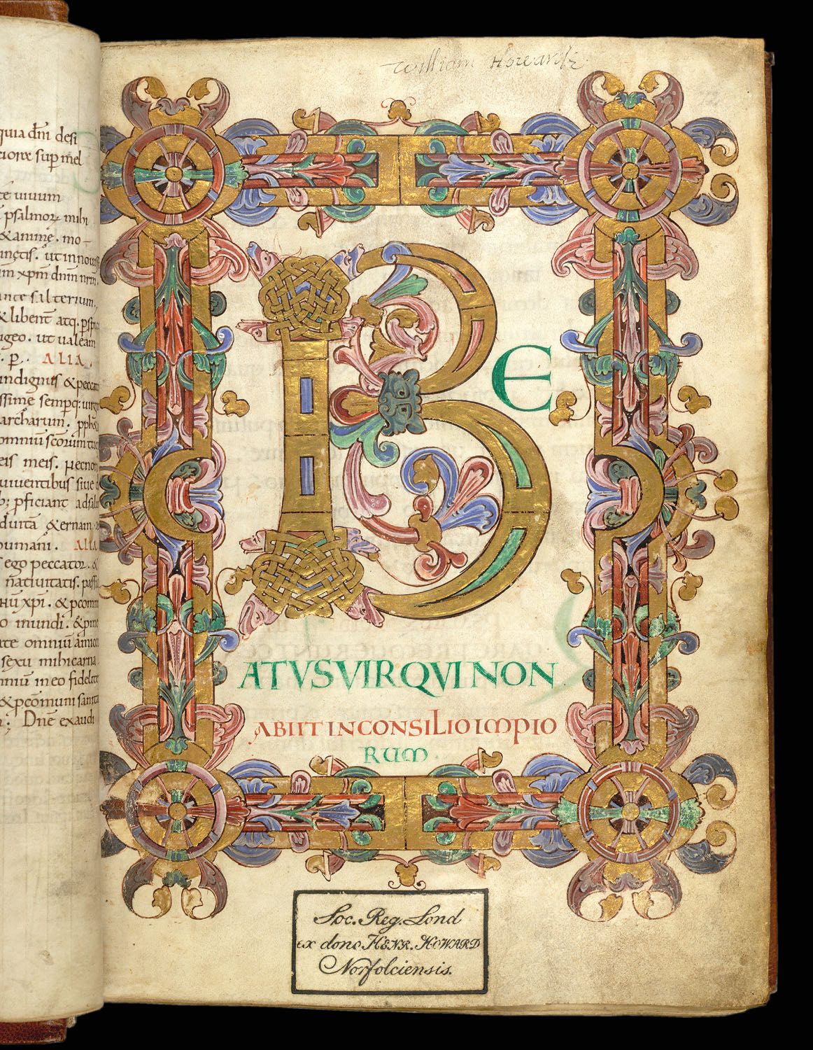
Decorative elements forming readable text are fairly common in medieval times. High-quality manuscripts often open with words – or even a full sentence – that are painted with a brush rather than copied with a pen. The artist who produced the eleventh-century page in Fig. 1, for example, used his brush to paint the entire first line of Psalm 1: “Beatus vir qui non abiit in consilio impirum” (Blessed is the man who has not followed the advice of the impious). Particularly impressive is the first letter, the B, which is decorated lavishly with gold.
Even more elaborate are some of the pages of the Lindisfarne Gospels, which is perhaps the most impressive manuscript that survives from the early Middle Ages (it was made at Lindisfarne at the coast of Northumberland around 700). The page in Fig. 2 shows the incipit (the opening line) of the Gospel of Matthew. While there is a lot to read on this page, the words are actually executed with brush and paint, apart from a few lines at the top. This decorative page – and the others in the book – are commonly discussed in an art-historical context (they are prime examples of Hiberno-Saxon art) and not as expressions of writing (more about Lindisfarne Gospels in relation to this issue in this article).

These magnificent pages blur the boundary between text and image: they present something to read, but nothing has actually been written down – at least not in the traditional sense of the word, with a pen. Curiously, the words on these pages form the start of a text and were meant to be read, not just looked at. In other words, the intriguing hybridity of these pages forced the user to read a painting.
Words forming decoration
Much more unusual is a different mix of text and image: instances where a meaningful scene is made out of words. Delightful examples from manuscript production in the West are Figs. 3 and 4, taken from a ninth-century copy of Cicero’s Aratea, a work of astronomy. The text shows animals that represent constellations (the firm red dots are stars). Curiously, these animal illustrations consist, for the most part, of words written out with a pen.


The text in the hare and the swan is not actually the Aratea itself, which is found lower on the page, out of sight in the images above. The animals are actually formed by an explanatory text by Hyginus, called the Astronomica. Segments of this text are used for graphic representations of constellations: Orion (the hunter) is shown as a hare, the hunter’s favourite prey, while the lovely blue bird is the constellation Cygnus (swan). Word and image are engaged in a peculiar symbiotic relationship wherein one would become meaningless without the other.
A similar tradition is witnesses in Hebrew Torah culture of the tenth century. It introduced a phenomenon called “micrography“, the art of decorating the page with meaningful text written in tiny letters. By the thirteenth century Hebrew manuscripts contained elaborate depictions of individuals, animals and objects (Fig. 5). Hebrew religious leaders protested against this practice of drawing with words, as they figured it distracted from taking in their meaning.


The last word: music
The notion of drawing an image with words was taken a step further in the later Middle Ages. In the thirteenth century, for example, we encounter marginal glosses in the shape of objects and people. A particularly elaborate late-medieval example is a variation on this theme: it presents a drawing in the shape of a heart, except the heart is made out both words and musical notes (Fig. 7).

It concerns the so-called “Chantilly Codex”, which contains over a hundred polyphonic songs by French composers. The one seen here is by Baude Cordier and is called “Belle, Bonne, Sage” (listen to it here). As the Renaissance was nearing, word play became a favoured occupation of poets, including in a visual sense. Cordier borrowed the word “Cor” (coeur, heart) from his name and used it for the visual presentation of this song. Cutting-edge design? Hardly. Little did Cordier know that the practice of drawing and writing at the same time was old-school.

That room in the BL is so impressive!
LikeLiked by 1 person
The lindisfarne gospels are one of my favourite ancient texts. I was so glad to see it in ‘real life’ while visiting the British library. Thanks for creating this great website devoted to beautiful written creations
LikeLike
Thanks for your comment.
LikeLike
An absolutely fascinating article. I had not known about the Hebrew micography before. It’s wonderful.
But I wonder whether ‘Hebrew Torah culture’ is the right expression to use here. I am no expert, and the word Torah has many meanings, the law, the pentateuch, the scroll, etc. But in this context the Torah would indicate the scrolls used for reading each week in synagogue; the rules for writing them are extremely strict and any imperfection or mis-spelling would render them unusable. But the images you show appear to be from manuscript books, or megillah scrolls, used for study and learning or reading at festivals such as Purim. Here images would not be illegal and would be much enjoyed and admired. The term Pentateuch, used in the BL catalogue, would probably be translated as Chumash, and the one here has commentaries, so it is clearly for study. But I am being pedantic, and I much enjoyed the page. Thank you.
LikeLike
Thanks – yes, Hrabanus would be a good topic. I will try to weave it into Friday’ post. Thanks!
LikeLike
This is a really good article, Erik; thanks for putting it up. I hope you’ll write something about the carmina figurata of Hrabanus at some point.
Harley 647 is a real eye-opener: not just because of the images, which are beautiful, but because of the way they reify the metaphor of commentary as illustration.
Good stuff.
LikeLike
Reblogged this on Bestiariusz kulturalny and commented:
[Repost] Teksty w średniowiecznych księgach ułożone w formie obrazków.
LikeLike
I have recently came across an interesting example of ‘drawing with words, the Gospel of Mathew in Hebrew, where part of it is depicted in form of a (Life?) Tree – see it here http://www.sothebys.com/en/auctions/ecatalogue/2012/western-manuscripts-miniatures/lot.20.html
LikeLike
You’re welcome!
LikeLike
Bonjour, ce site est absolument magnifique ! C’est une vraie mine d’or et les publications de toute beauté. Ces calligrammes sont admirables, je ne savais pas qu’ils en existaient dès l’époque Médiévale, belle découverte. Merci .-)
LikeLike
Bonjour, ce site est absolument magnifique ! C’est une vraie mine d’or et les publications de toute beauté. Ces calligrammes sont admirables, je ne savais pas qu’ils en existaient dès l’époque Médiévale, belle découverte. Merci .-)
LikeLike
You reminded me time of Cuniform. Nice
LikeLike
Reblogged this on Stories & Soliloquies and commented:
Another wonderful post from medievalbook.nl – enjoy!
LikeLike
I’ve seen plenty of illuminated medieval manuscripts (and plenty of the modern equivalents), but I had no idea that sheet music was depicted like that as well! Beautiful from a graphic perspective, but I hope that the reader/player isn’t relying on the sheet music for readability!
LikeLike
Reblogged this on Books I've Enjoyed (and some I haven't) and commented:
I LOVE old books! I’m a Fraktur folk artist.
LikeLike
Each time I go to a museum I’m always excited to see illustrated books. Belle Bone Sage is so sweet to listen to. Thank you for the effort.
LikeLike
Drawing and writing at the same time old school? No no.
i am a piano teacher, and the musical heart makes my heart… sing. Romantic, practical, a treat to the eye. for the lay person, almost indecipherable. I teach theory to my students, and the concept of neumes makes their eyes glaze over. An almost lost art. Sigh.
LikeLike
Glorious…so happy to see Lindisfarne up! Word pictures fascinate … and frustrate since one so aches to know what the words SAY. I do know in some of the judaic micrographia it often relates to the image and one of the folios out of the Lisbon Bible has an exquisite central design, apparently the script a poem. And thanks!
LikeLike